It’s Tuesday morning. You're staring at a dashboard, trying to find the one metric that matters before your 9 AM stand-up. But everything is flat. Everything is loud. The colors compete, and every number screams for your attention, making it impossible to focus.
Now, picture this instead.
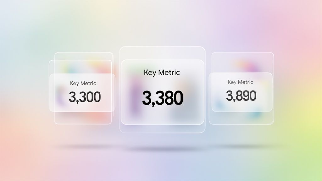
The background is a soft, out-of-focus wash of color. Your key metrics float on top, each housed in a card that looks like a pane of frosted glass. You can just make out the colorful background through them, which creates a feeling of depth without being a distraction.
That’s the core idea behind glassmorphism: bringing a sense of calm and order to complex information. It’s a design style that uses transparency, a background blur, and a subtle border to create a clear sense of depth and hierarchy. It’s how you bring order to a busy dashboard without building heavy, opaque walls between sections.
The Moment Glassmorphism Became Essential
The glassmorphism effect feels futuristic, but its roots go back almost two decades. Like most design trends, it didn't just appear one day. It’s a reaction, a pendulum swing. To really get why glassmorphism is everywhere now, you have to follow the breadcrumbs designers left behind as they tried to find that sweet spot between tangible and digital, between decoration and function.
For most of us, that story starts with Microsoft.
From Aero Glass to iOS 26: A Visual History
Windows Vista’s Aero Glass in 2007 was a bold, almost brutish, first swing at transparency for the masses. Suddenly, window frames were see-through, giving you a blurry peek at your desktop wallpaper. It was a step away from the solid, opaque walls of older UIs. But it was noisy. It lacked subtlety and was a notorious resource hog on most computers at the time.
Still, it planted a seed: interfaces don’t have to be solid.
Then came the great flattening. Around 2013, the design world staged a full-on rebellion against skeuomorphism: the hyper-realistic style of stitched leather calendars and wooden digital bookshelves. In its place came flat design. It was pure, minimalist, and stripped of all ornament. A necessary palate cleanser, for sure. But some argued it went too far, leaving interfaces feeling stark and without a clear sense of depth or hierarchy.
It was in that stark landscape that Apple found the magic ingredient. With iOS 7, they didn’t just make things transparent, they added a heavy background blur. This was the moment glassmorphism as we know it was truly born. The blur, or vibrancy, created a clear separation between layers, fixing the readability problems that haunted earlier attempts at transparency. It gave designers a way to create depth without resorting to the clunky textures of the past.
After iOS 7, the effect simmered. Then, around 2020, it exploded. Why then? I remember a friend at a Series C company telling me their biggest debate was how to evolve past pure flat design without adding clutter. For them, glassmorphism was the answer. It offered a sophisticated middle ground, mixing the clean look of flat design with a sense of physical depth that helps users know where they are.
It was also less controversial than the short-lived neumorphism design, making it a safer and more accessible bet for mainstream products.
Now, in 2026, it’s a standard. Windows 11 updates have refined the effect for better performance, and Apple’s latest OS continues to push it forward. What started as a decorative flourish in Windows Vista is now a core part of modern glass morphism ui design, prized for its ability to create focus and hierarchy in an increasingly crowded digital world.
The 4 Pillars of Glassmorphism Design
To pull off a great glassmorphism effect, you need to strike a delicate balance. Get it wrong, and you're left with an unreadable, cluttered mess. But when you get it right, the interface feels intuitive, focused, and genuinely elegant. It’s not about one single trick, but the careful harmony of four distinct elements.
The basic gist is this: these pillars work together to create an illusion of space and hierarchy. They transform a flat surface into a tangible, layered experience. Mastering them is the secret to effective glass morphism ui design.
Pillar 1: Transparency
First and most fundamental is transparency. This is what lets the background peek through, creating that signature layered feel. The key here, though, is subtlety. If you go too far, your foreground content becomes completely illegible, lost against whatever is behind it.
Your goal is a slightly opaque background color for your element. A little bit of opacity is all you need to signal that the element is a layer sitting "on top" of what's behind it.
Pro Tip: Start with a white or black fill at around 20–40% opacity. This gives you enough of a base for text to stay readable while letting background colors bleed through to create that crucial sense of depth.
Pillar 2: Background Blur
This is where the magic really happens. The background blur creates the iconic "frosted glass" look. Without it, you just have a transparent layer, which can be distracting and hard to read against a busy background. The blur solves this by smudging the details behind the element, pushing them out of focus.
This effect is what really separates glassmorphism from its less successful predecessor, neumorphism, which often tanked due to contrast problems. The blur ensures your foreground content has a clean, simple backdrop to sit on, no matter how complex the background is.
To get this effect, you'll want to use the backdrop-filter property. How much blur is enough? It depends entirely on the background image. A higher blur value creates a more frosted, opaque look, which boosts legibility. A lower value makes the effect clearer and more transparent. It's a constant trade-off between aesthetics and readability.
Pillar 3: A Defined Border
A subtle, 1px border is the unsung hero of the glassmorphism effect. It might seem like a tiny detail, but it’s critical. This fine line catches the light, mimicking how real glass reflects light at its edges. It provides a crisp, defined boundary for your element, separating it cleanly from the blurred background.
Without a border, the soft edges of the glass element can feel like they're bleeding into the background, making the shape feel muddy and undefined. A light-colored border, often a white stroke with low opacity, gives the element a polished finish and drastically improves its structure. It’s a small detail that keeps your design from feeling mushy.
Pillar 4: Layered Hierarchy
Finally, all these elements must come together to create a clear visual hierarchy. Glassmorphism is fundamentally about depth—the z-axis. Your most important interactive elements should feel like they are on the very top layer, closest to the user.
Think about how you stack papers on a desk. The one on top is what you're focused on right now. Glassmorphism uses that same intuitive logic. The blurred layers underneath add context and a sense of place without fighting for your attention. This principle is a cornerstone of good UX design fundamentals. By controlling transparency, blur, and shadows, you guide the user's eye exactly where you want it to go.
The Playbook for Shipping Glassmorphism UI
Theory is one thing; execution is another. A great design idea falls apart without a solid plan. For teams eyeing the glassmorphism trend, the path is littered with small but critical choices. Get them wrong, and your elegant interface becomes an accessibility nightmare.
This is your playbook for getting it right.
This isn’t about just copying some CSS values you found online. It’s about understanding the real-world trade-offs between aesthetics, performance, and usability. The goal is to ship the glassmorphism effect with confidence, knowing you’ve sidestepped the common traps.
The Contrast and Readability Mandate
The single biggest risk with glassmorphism? Poor text contrast. When text sits on a semi-transparent background that changes with whatever is behind it, readability can plummet. So how do you keep your text from disappearing into a blurry mess?
You have to be relentless about hitting accessibility standards.
Your target is a minimum WCAG AA contrast ratio of 4.5:1 for normal text. This isn't a suggestion; it's a hard requirement. The blur effect helps, but it doesn't solve the problem on its own. You have to test your text color against the final, rendered background.
To get there, here are the levers you can pull:
Increase Background Opacity: A slightly more opaque "glass" pane creates a more stable foundation for your text.
Add a Subtle Inner Shadow: A soft, dark inner shadow applied to the text itself can help it pop off the background without looking fake.
Define Edges with a Border: A simple 1px border is a game-changer. It helps delineate the card for all users, but it's especially critical for those with low vision, making the entire UI structure clearer.
Technical Performance and CSS Strategy
The magic behind that frosted look is the backdrop-filter CSS property. It's powerful, but it can also be a performance hog if you get careless. It literally asks the browser to do a lot of heavy lifting, blurring whatever is behind the element in real time.
What this means is you can't just slap glassmorphism css on every single container.
For product managers, this means getting specific in your requirements. Don't just ask for a "glass effect." Specify exactly where and how it should be used. The best approach is to apply it strategically to smaller, less dynamic elements that don't change constantly. Proper designing with grids can also help isolate these elements effectively.
Think of elements like:
Sidebars and navigation menus
Modals and pop-up notifications
Individual cards on a dashboard
Steer clear of applying the filter to large backgrounds that update frequently. If you do, you're asking for janky scrolling and a miserable user experience, especially on phones or older laptops.
Why Glassmorphism Matters at Scale
How does a design fad jump from a Dribbble mood board into the core of enterprise software? It’s a question of utility. The trip glassmorphism took from niche aesthetic to business staple wasn't just about looking slick; it was about working smarter. Its adoption tells us something important about what product teams actually value: clarity.
Not long ago, the first screen a PM saw in the morning was a data-dense dashboard where every metric screamed for attention. Finding a single insight felt like an excavation. Glassmorphism came along and offered a way to create visual order without building clumsy, opaque walls between data points.
The Economics of Reduced Cognitive Load
This is what I mean: in enterprise software, time is money and confusion is a direct cost. Every second an employee spends trying to find a feature or make sense of a chart is a drag on productivity. This is where the business case for adopting glassmorphism gets crystal clear.
According to a 2021 study in the Journal of Usability Studies, interfaces with clear visual hierarchy can improve user task success rates by up to 20%. Glassmorphism design directly enables this by creating an intuitive sense of depth. This style isn't just decoration, it's a tool for managing cognitive load.
For Users: It makes complicated screens easier to scan, which cuts down on frustration and mistakes.
For Businesses: This translates directly to higher engagement, faster task completion, and ultimately, better retention.
This is especially true in data-heavy software, where following established dashboard design rules is critical. A well-executed glassmorphism design can be the difference between a user feeling overwhelmed and feeling in control. You can see this in practice, like in this Intercom dashboard example from the Figr gallery, where frosted cards cleanly separate metrics from the background.
The jump to an enterprise standard happened because glassmorphism solved a real business problem. It provided a visual language that made complex user experience flows more intuitive—a massive advantage in a competitive SaaS market where usability is everything. It helps teams build clearer paths, which is the whole point when you're trying to improve your software by reviewing user flow examples.
Your Next Step with Frosted Glass UI
You’ve seen the principles behind glassmorphism and the common pitfalls. So, what now? The temptation is to jump into a massive, high-risk redesign of your entire application.
Don't do that.
A big-bang rollout of any new design language is a recipe for internal friction and unexpected performance problems. Instead, think like a product manager testing a new feature: start small.
Your First Experiment
The first step is to find one high-impact, low-risk component. This is your sandbox. It’s where you can test both the aesthetic and the technical performance of a frosted glass UI in your product’s unique environment, without derailing core parts of your digital customer journeys.
Good candidates for a first test include:
A confirmation modal: These are simple, self-contained, and their appearance is brief.
A notification toast: They’re small, appear for a moment, and are perfect for testing the blur effect against all kinds of different backgrounds.
A secondary sidebar: Applying the effect here lets you test performance and visual appeal without touching the main content area.
The goal is to isolate the change. Once you’ve picked your component, run a simple A/B test against your current design. Does the new style actually improve user focus? Does it align with your brand’s personality? Use this experiment to gather hard data, not just opinions from the design team.
Validating Before You Scale
Treat glassmorphism just like you would any other product feature. It has to prove its value. A successful small-scale test gives you the green light to think bigger. You’ve validated the concept. You’ve confirmed the glassmorphism effect works for your users, on your platform, and within your performance budget.
Of course, a single component is one thing; a cohesive system is another. For the complete framework on this topic, see our guide to user interface design.
In short, prove the value of glassmorphism before you even think about scaling it across your product.
Once you have that validation, the next challenge is consistency. This is where a tool like Figr can help. Figr generates UI components in any visual style, including glassmorphism. Feed it your product context and specify the glass effect, and it produces design-system-aware frosted glass components with proper transparency, blur, and contrast ratios. You can see examples of generated components in the Figr gallery. It essentially bakes consistency directly into your workflow.
Frequently Asked Questions About Glassmorphism
Even with a clear playbook, teams always have a few lingering questions before committing to a new design style. The move to glassmorphism is no different. It’s a decision that hits aesthetics, performance, and accessibility all at once.
Let’s tackle the most common questions we hear from product managers and designers weighing this modern UI approach.
Is Glassmorphism Bad for Accessibility?
Not on its own, but it absolutely demands careful, deliberate work. The single biggest risk with any glassmorphism design is creating terrible text contrast. When you place text on a dynamic, blurred background, legibility can disappear in a hurry.
To keep things accessible, any text on a glassmorphic surface must have a contrast ratio of at least 4.5:1 against whatever is behind it, which meets WCAG AA standards. A subtle 1px border is also a non-negotiable—it helps define the element’s edges for users with low vision. For a deeper look, you can explore various tools that check product UI for accessibility using AI.
Always, always test your final designs. Use automated checkers, and if you can, get real human users to look at it.
What Is the Difference Between Glassmorphism and Neumorphism?
Both styles popped up as a reaction against pure flat design, but they create depth in completely different ways. Getting this distinction right is critical for any team deciding on a new visual direction.
Glassmorphism simulates a piece of frosted glass floating over a colorful background. It gets its look from three key ingredients: transparency, a background blur, and a fine border. The whole effect is about layering, light, and creating a clear sense of hierarchy on the z-axis.
Neumorphism design, on the other hand, aims for a soft, extruded plastic look where UI elements seem to push out from the background itself. It relies on a tricky combination of inner and outer shadows to create this subtle 3D effect. The problem? It often produces notoriously low contrast ratios, making it a major accessibility hazard that most product teams now steer clear of.
How Does Glassmorphism Affect Performance?
This is a totally valid concern. The main CSS property that creates the glassmorphism effect, backdrop-filter: blur(), can be a heavy lift for a browser's rendering engine. No product manager wants to ship a slow or janky experience.
The good news is that on modern devices and browsers, performance is generally fine. The trick is to be smart and selective about where you use it.
Here’s what I mean:
Do: Apply the effect to smaller, relatively static elements like modals, sidebars, or notification cards. This is where you get the biggest visual bang for the lowest performance buck.
Don't: Slap the glassmorphism css property on large, scrolling page backgrounds or elements that animate a lot. This is a surefire way to create performance bottlenecks, especially on mobile or older hardware.
After you implement it, always profile your app's rendering performance on your target devices. A strategic approach lets you get that modern aesthetic without tanking the user experience.