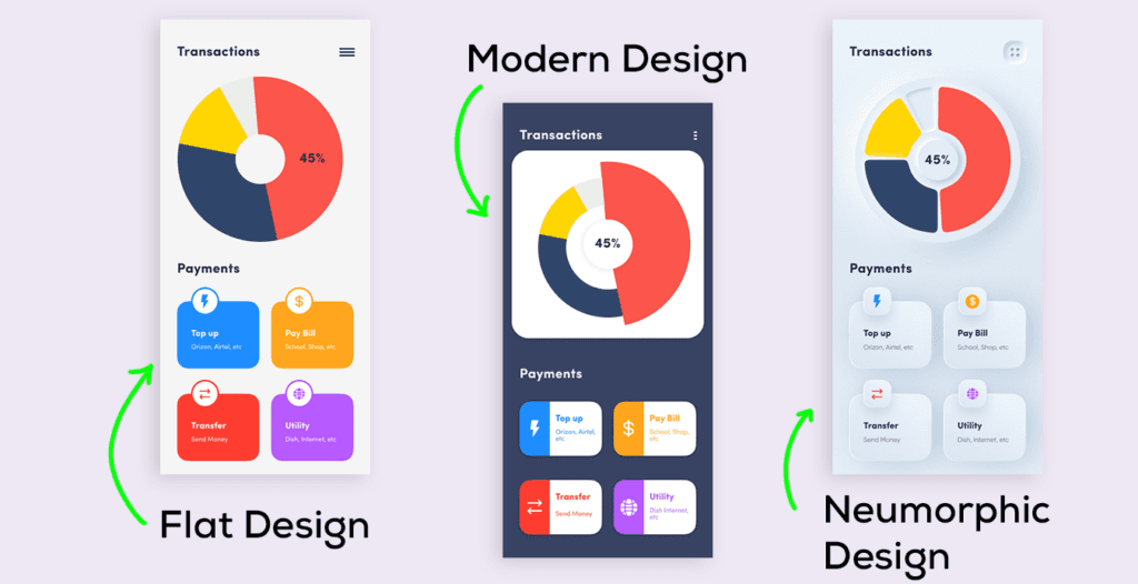
Credit: Yellowslice
Design trends come and go, but only a few leave a lasting impression. Neumorphism is one such trend, sparking curiosity and capturing the attention of UI designers with its fresh approach to merging depth and simplicity.
For years, UI design has struggled to balance realism and minimalism. Neumorphism offers a compelling answer, blending the tactile familiarity of skeuomorphism with the clean lines of flat design to create modern yet approachable interfaces.
However, despite the hype, neumorphism has ignited debates about its practical challenges, making it a style that requires thoughtful application rather than blind adoption.
What is Neumorphism in UI Design?
Neumorphism, short for "new skeuomorphism," is a modern UI design trend that uses soft shadows and highlights to create a three-dimensional effect, making UI components look as though they are gently pushed into or raised out of the background.
With its clean lines, minimal color palettes, and smooth rounded edges, neumorphism offers a cohesive and visually appealing interface that feels both modern and functional.
Neumorphism: The Origin Story
To understand the origins of neumorphism, we need to look at two major design styles that shaped the world of UI design—skeuomorphism and flat design. Neumorphism blends elements from both to create something entirely new.
Skeuomorphism: Bridging the Physical and Digital
- Definition: Skeuomorphism was popular in the early days of UI design, aiming to mimic real-world objects in the digital space.
- Purpose: This design style made digital interfaces intuitive by using familiar visual cues, like a trash can icon for "delete" or a notepad app resembling an actual notepad.
- Drawbacks: While helpful for beginners, skeuomorphism often led to cluttered designs and slower performance due to heavy graphical elements.
Flat Design: The Simplistic Revolution
- Definition: Flat design emerged as a reaction to skeuomorphism, focusing on clean, two-dimensional visuals.
- Key features:
- Simplified icons and shapes
- Bright, bold colors
- Minimal use of shadows and textures
- Purpose: Flat design prioritised functionality and usability, improving loading speeds and offering a more modern look.
- Limitations: It sometimes sacrifices clarity, making it harder for users to identify interactive elements.
The Rise of Neumorphism
Neumorphism emerged in 2019 as a design trend blending elements of skeuomorphism and flat design. The concept was popularised by Michal Malewicz, a designer and educator, through his influential article "Neumorphism in User Interfaces."
Unlike skeuomorphism, which mimicked real-world objects, and flat design, which focused on minimalism, neumorphism strikes a balance by introducing a subtle, tactile aesthetic.
Its signature style features UI elements that appear to rise out of or sink into the background, achieved through subtle shadows, highlights, and monochromatic color schemes.
UI Design Principles Of Neumorphism
Neumorphism relies on a few core principles to create its signature look. These principles focus on achieving designs that are clean yet visually engaging.
Let’s dive into the key elements that define neumorphic UI design:
- Depth and shadows
- Depth is central to neumorphism, achieved by using subtle shadows that make elements look like they are either pushed into or pulled out of the background.
- Use a combination of inner and outer shadows to create this effect, maintaining a soft and natural appearance.
- Color and gradients
- Neumorphic designs often feature muted, pastel tones with minimal contrast.
- Gradients are used to enhance the three-dimensional effect while keeping the overall design smooth and cohesive.
- Minimalism
- True to its roots in flat design, neumorphism keeps the interface simple and clutter-free.
- It avoids excessive textures or flashy elements, focusing on clean and functional designs.
- Rounded corners
- Rounded corners are a hallmark of neumorphism, adding to its soft and approachable aesthetic.
- Sharp edges are avoided to maintain the seamless transition between UI elements and the background.
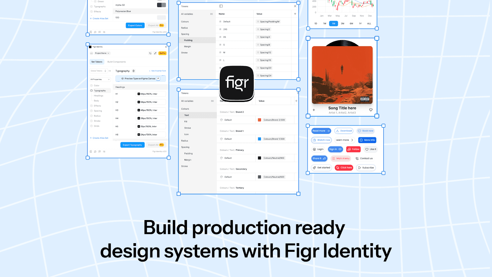
Figr Identity empowers you to bring neumorphic UI principles to life with precision and ease. With features like customizable shadow tokens and gradient presets, you can effortlessly create depth and visual harmony in your designs.
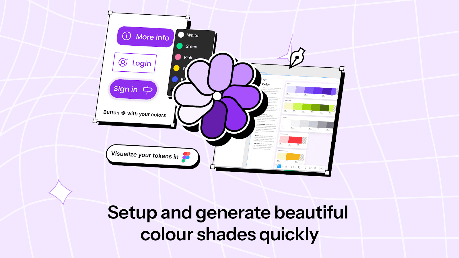
You can generate components with smooth, rounded corners and muted color palettes that align with neumorphism’s clean, minimal aesthetic.
By leveraging Figr Identity for consistent styling and reusable elements, you can focus on crafting interfaces that look polished and professional while staying true to the principles of neumorphism.
Neumorphic UI Components
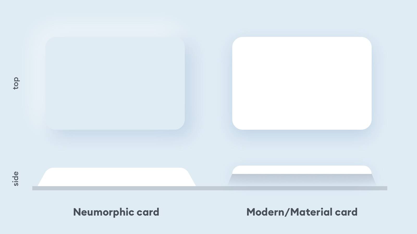
Credit: Michał Malewicz
Neumorphism's unique aesthetic truly shines when applied to specific UI components. These elements, with their soft shadows and subtle depth, create an immersive and cohesive design experience.
Here’s how neumorphism transforms common UI components:

Credit: Figma
- Buttons: Neumorphic buttons are a standout feature, designed to look as though they are seamlessly integrated into the background. Using a combination of inner and outer shadows, these buttons appear gently raised or pressed, depending on their state.
This enhances their tactile appeal and provides clear visual feedback, helping users distinguish between active and inactive buttons.
- Cards: Neumorphic cards break away from the traditional floating design seen in material UI. Instead, they appear as softly raised sections of the background, creating a unified and cohesive look.
The shadows on opposite edges of the card make them feel embedded within the surface, giving a smooth, modern aesthetic.
- Input fields: Input fields in neumorphism are crafted to appear slightly recessed into the interface. This effect is achieved through inner shadows, which give the impression of a carved-in surface, inviting users to enter the text.
This understated yet functional design ensures clarity and usability without detracting from the overall aesthetic.
- Toggle switches: Neumorphic toggle switches mimic physical switches, using gradients and shadows to create a realistic on/off appearance.
The "on" state might appear raised, while the "off" state looks recessed, making the switch’s status intuitive and visually distinct.
- Sliders: Neumorphic sliders integrate depth into their design, with the track and handle appearing three-dimensional. The handle seems to float or slide along the track, thanks to strategic shadow placement.
This tactile design enhances usability and makes sliders more engaging to interact with.

Figr Identity equips you with the building blocks to implement neumorphic UI components effortlessly and consistently. With pre-configured shadow settings and gradient tokens, you can craft buttons, cards, input fields, and sliders that align seamlessly with neumorphism’s aesthetic.
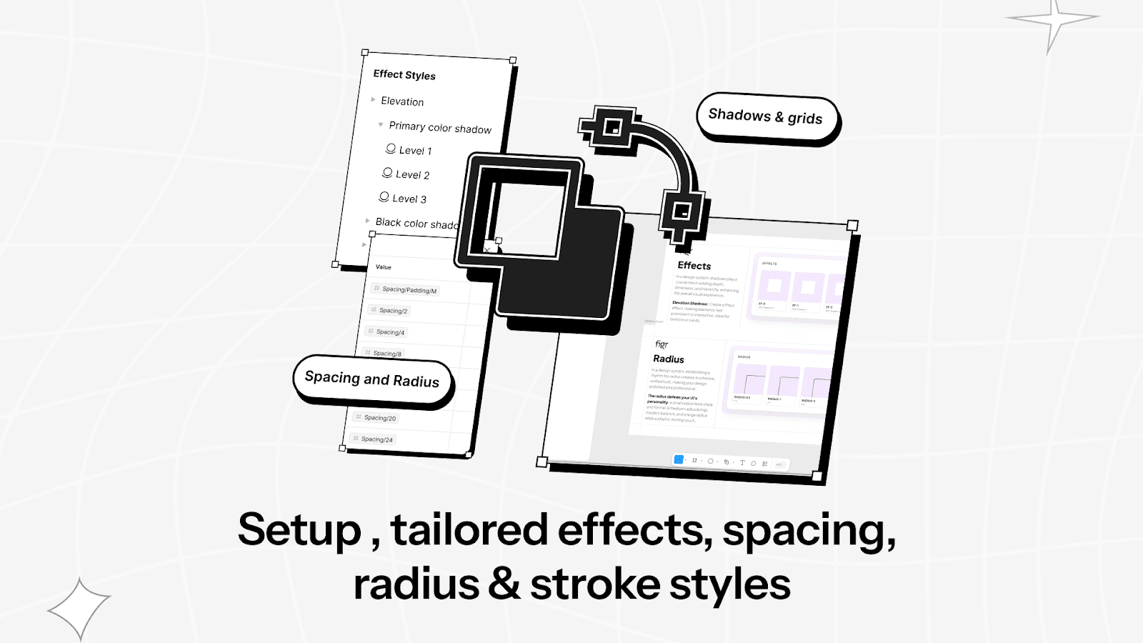
Its reusable components and adjustable tokens ensure your neumorphic sliders and other UI elements maintain clarity, usability, and the polished, tactile feel that users love.
Neumorphic UI Design: Pros vs Cons
Neumorphism brings a refreshing perspective to UI design, however, like any design trend, it has its share of advantages and drawbacks.
Understanding these can help you decide whether this design style suits your project.
Pros of Neumorphic UI Design
- Aesthetic appeal: Neumorphism creates visually pleasing interface that gives designs a modern and minimalistic look. It’s perfect for products aiming to stand out with sleek, polished visuals.
- Seamless integration: Neumorphic components appear as though they are part of the interface itself, creating a unified and cohesive design that feels smooth and inviting.
- Tactile user experience: The use of depth and subtle shadows mimics physical objects, adding a sense of interactivity. Users intuitively understand how to interact with these elements due to their realistic touchpoints.
Cons of Neumorphic UI Design
- Accessibility challenges: Neumorphism’s low-contrast designs can make it difficult for visually impaired users to distinguish interactive elements, posing challenges for accessibility compliance.
- Usability concerns: The soft shadows and minimal contrast may sometimes fail to clearly indicate which elements are clickable, leading to potential confusion.
- Implementation complexity: Creating the subtle depth and shadow effects requires meticulous attention to detail, making implementation time-consuming and resource-intensive, particularly for developers.
- Overuse risk: When overused, neumorphism can make interfaces look monotonous and overwhelming. You must strike a balance to avoid losing clarity and functionality.
Examples of Neumorphism
Here are some examples that demonstrate how this design style can be applied effectively across different interfaces.
Mobile apps
Neumorphism shines in mobile apps, especially those focusing on personal finance, fitness, or task management. For instance, budgeting apps use neumorphic buttons and cards to make financial data more approachable and visually engaging.
Similarly, fitness trackers employ soft, raised components to highlight progress bars, step counters, and goal indicators, offering a modern and tactile interface.
Web interfaces and login pages
Neumorphism is commonly seen in web-based login screens, where subtle shadows and gradients are used to make input fields and buttons appear pressed or raised.
This approach not only enhances usability by guiding users’ interactions but also adds a sophisticated touch to otherwise simple pages. Landing pages and contact forms also benefit from this design style, making interactive elements stand out without overwhelming the user.
Music players and entertainment apps

Credit: Easeout
Music players are a natural fit for neumorphism, as the design mimics physical controls like buttons, knobs, and sliders. Volume dials, equalizers, and playback controls often appear as though they are tactile, creating an engaging and immersive experience.
Streaming apps for podcasts or video content use neumorphic designs to differentiate controls while maintaining a cohesive aesthetic.
Wearables and device controls
Wearables like smartwatches and fitness bands use neumorphic buttons and toggles to enhance the user experience on small screens. For example, volume controls, timers, and notification toggles appear interactive and sleek, improving usability in a compact format.
Similarly, home automation devices such as thermostats and lighting controls integrate neumorphism to blend aesthetics with functionality.
Gaming interfaces
Gaming platforms and in-game menus have also embraced neumorphism to enhance the user experience. Interactive elements like menu buttons, character selection screens, and settings sliders use raised or recessed effects, creating a polished and immersive interface that aligns with the game's aesthetic.
Conclusion
The future of design is ever-changing, and trends like neumorphism prove there’s always room for fresh ideas and creativity in the digital space.
And as design trends evolve, products like Figr Identity help you stay ahead by simplifying the process of bringing creative concepts like neumorphism to life.
From generating reusable components to ensuring visual consistency with gradient and shadow tokens, Figr Identity equips you with everything needed to craft modern, cohesive interfaces.


