Credit: Halo Lab
A dashboard isn’t just a collection of charts and numbers—it’s a powerful tool that transforms raw data into clear, actionable insights. However, many dashboards fail to do so; they’re cluttered, confusing, or visually overwhelming for users.
A well-designed dashboard helps users make quick decisions, reduces confusion, and saves time—all while keeping them engaged. So, how do you design dashboards that aren’t just visually appealing but also genuinely helpful?
This blog will walk you through the key do's and don’ts of dashboard design. You’ll learn practical tips and strategies to create clean, user-friendly, and impactful dashboards!
What is Dashboard Design?
Dashboard design is the process of creating visually appealing and user-friendly interfaces that display critical data and metrics clearly and concisely.
Dashboards are essential tools in various fields, from business analytics to healthcare, as they present real-time data in an organized and intuitive format. Whether it’s tracking sales performance or managing project progress, a good dashboard ensures users can focus on what matters most without getting overwhelmed.
Now that we’ve covered what dashboard design entails, let’s dive into the key do's and don’ts to create functional and visually appealing dashboards.
Key Characteristics of Successful Dashboards
A successful dashboard is more than just a data display; it’s an intuitive tool that empowers users to make informed decisions.
Here are the key characteristics that define exceptional dashboards:
1. Clarity
A dashboard’s primary purpose is to present information clearly. Data should be easy to read and interpret at a glance. Use clean layouts, concise labels, and logical groupings to ensure users can quickly find what they need without confusion.
2. Flexibility
Dashboards should cater to diverse user needs. By offering customizable options, such as filters or adjustable views, users can tailor the data to suit their specific requirements, making the dashboard more versatile and valuable.
3. Responsiveness
With users accessing dashboards across various devices, responsiveness is essential. A successful dashboard adapts seamlessly to different screen sizes, ensuring a consistent experience whether viewed on a desktop, tablet, or smartphone.
4. Real-Time Updates
Timely information is crucial for decision-making. Dashboards that deliver real-time or frequent updates keep users informed, allowing them to act quickly on the latest insights.
5. Aesthetic Consistency
A cohesive visual style builds trust and improves usability. Consistent typography, color schemes, and iconography enhance readability and create a professional, polished look that aligns with the brand.
Do’s of Dashboard Design Rules
There are simple practices that you must adopt when designing your dashboard. Let’s explore
Understand The Purpose of The Dashboard
Before designing a dashboard, it's crucial to understand its purpose. A dashboard isn’t just a visual display—it’s a tool that serves a specific function based on user needs. A clear purpose ensures your dashboard stays relevant and user-friendly.
Here’s how to determine the purpose:
- Define the primary goal: Is it for monitoring, analyzing, or tracking? Focus on what the dashboard should achieve.
- Tailor for specific contexts: Understand who will use the dashboard and tailor it to their specific needs.
- Prioritize key questions: Highlight data that answers critical questions users need for quick decisions.
- Focus on relevance: Emphasize the most crucial information to avoid overwhelming users.
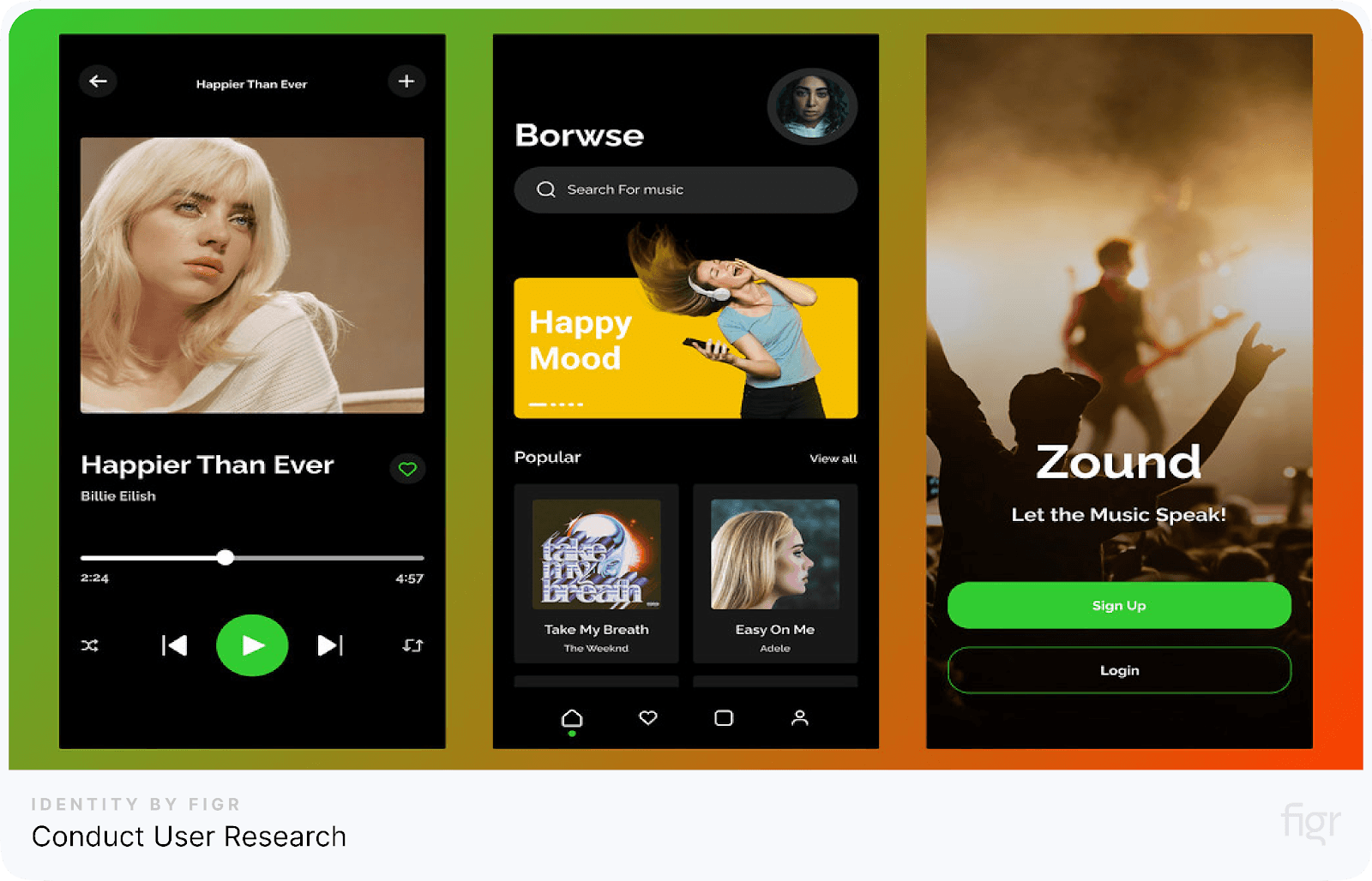
Conduct User Research

User research is the foundation of creating dashboards that genuinely serve their purpose. By understanding who your users are and what they need, you can design a seamless dashboard for them. Without research, dashboards can end up cluttered with irrelevant data or miss the mark entirely.
Here’s how to conduct user research:
- Identify your audience: Determine who will use the dashboard, whether it's managers needing summaries or analysts seeking detailed data.
- Define user goals: Understand what users aim to achieve, like tracking metrics or making quick decisions.
- Collect feedback: Use surveys or interviews to ask:
- What data is most important?
- What challenges do they face with current tools?
- Observe usage: Watch how users interact with existing dashboards to identify pain points and areas for improvement.
- Document insights: Summarize findings to guide design decisions.
Pick Charts and Graphs That Best Represent the Data
Choosing the right charts and graphs is crucial to making your dashboard clear and easy to understand. The right visual choices make your data more intuitive and actionable for your users. Always aim for simplicity and clarity.
Here’s how to select the right charts and graphs:
- Match the chart to the data: Use bar charts for comparisons, line charts for trends, and pie charts sparingly for simple proportions.
- Keep it simple: Avoid overcrowding and stick to visuals that users can easily understand.
- Use familiar visuals: Choose common chart types to ensure clarity.
Use a Consistent Color Scheme
A consistent color scheme makes dashboards easy to read and visually appealing. Using colors thoughtfully helps users quickly interpret information and builds trust and familiarity with the design.
Why it matters:
- Clarifies data: Consistent colors for specific data types help users spot patterns across charts.
- Reduces clutter: A limited palette keeps the dashboard clean and focused.
- Enhances branding: Using brand colors ensures consistency and strengthens identity.
Tips for effective use:
- Use contrasting colors to highlight critical information like KPIs or alerts.
- Stick to a few complementary tones to avoid overwhelming users.
- Ensure accessibility by testing for color vision deficiencies.

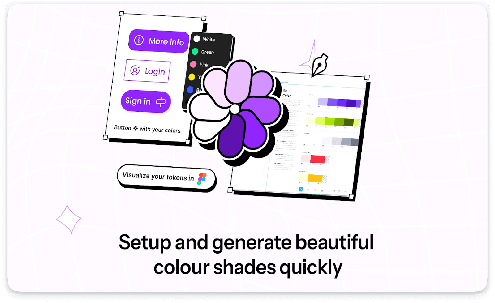
With Figr Identity, you can effortlessly create and manage consistent color schemes for your dashboards.
With its instant color token generation, you can standardize hues for data types, highlights, and alerts effortlessly. This ensures clarity, reinforces your branding, and makes dashboards visually cohesive while accommodating accessibility standards.
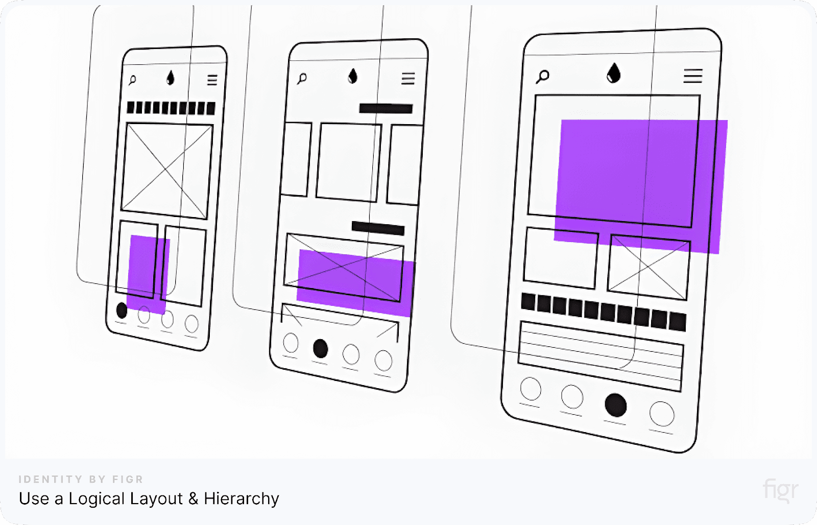
Use a Logical Layout and Hierarchy

Credit: Leonardo Moreno
A well-organized layout makes it easier for users to understand and interact with your dashboard. Prioritize clarity and structure to guide users effectively.
A logical layout keeps users focused and helps them find what they need without frustration.
- Highlight key information: Place essential metrics at the top or top-left for easy visibility.
- Group-related items: Keep similar charts and data points together.
- Use grids: Align elements neatly for a clean, balanced design.
- Create a visual flow: Use size, spacing, and color to emphasize priorities.
- Minimize scrolling: Ensure critical information fits on a single screen.
Add Filters and KPIs
Filters and key performance indicators (KPIs) enhance the usability of dashboards by letting users customize the data they see.
Instead of being overwhelmed with irrelevant information, users can focus on specific details, making decisions faster and more efficiently.
- Include filters: Allow users to narrow data by date, region, or category. Place them consistently for easy access.
- Highlight key metrics: Display essential KPIs like sales or user growth prominently at the top.
- Keep it simple: Use concise filters and relevant KPIs to avoid clutter.
Don’ts for Dashboard Design Rules
Besides the key practices that has to be adopted, there are some activities that should be avoided to make your dashboard design effective.
Neglect key metrics
Leaving out important metrics can make your dashboard ineffective and frustrating for users. Key metrics are the backbone of a dashboard—they provide the insights users need to make informed decisions.
A dashboard should simplify data, not complicate it, by prioritizing metrics that matter most.
Here’s what to avoid:
- Ignoring user priorities: Don’t include metrics that don’t align with the user’s goals or needs.
- Overloading with data: Avoid cramming the dashboard with too many metrics that distract from key information.
- Failing to highlight critical data: Ensure essential metrics are prominent and easy to find.
- Lack of hierarchy: If all metrics are presented with the same emphasis, users won’t know where to focus.
Leave Default Font Settings
Default font settings seem convenient, but they can make your dashboard look generic and hard to read. Ignoring font customization can result in poor usability and inconsistent design. Customizing fonts ensures your dashboard is clear, visually appealing, and easy to navigate.
- Use a clear font hierarchy: Larger fonts for titles, medium for labels, and smaller for details.
- Highlight key elements: Bold important headings or keywords to grab attention.
- Adjust font alignment: Align text to enhance readability and fit your layout.
Designing Without Accessibility and Inclusivity
Ignoring the needs of diverse users can make your dashboard inaccessible and frustrating to use.
Designing for inclusivity ensures that people of all abilities and backgrounds can navigate and understand your dashboard effectively.
Avoid these mistakes:
- Relying only on color to differentiate data, which can confuse users with color blindness.
- Skipping accessibility standards like proper contrast and keyboard navigation.
- Using complex language or not offering multilingual options.
Make your design inclusive:
- Add alternative text for charts and images for screen readers.
- Use simple, straightforward language.
- Test with diverse user groups to identify barriers.
Overdesign
Overdesigning your dashboard with excessive visuals and unnecessary elements creates confusion instead of clarity. By avoiding overdesign, you’ll create a dashboard that’s easy to navigate, visually balanced, and effective in delivering insights.
How to avoid overdesign:
- Limit charts, graphs, and decorative elements to focus on key metrics.
- Stick to a simple color palette and minimal fonts for a clean look.
- Display only essential information, avoiding unnecessary details.
Conclusion
Designing an effective dashboard is about delivering clarity, usability, and value. A well-designed dashboard helps users make informed decisions by presenting data clearly and intuitively.
Figr Identity simplifies every aspect of dashboard design, enabling you to create visually cohesive, user-friendly, and impactful dashboards seamlessly.
With features like consistent color schemes, typography tokens, and reusable components, Figr Identity ensures your dashboards are intuitive, accessible, and aligned with your brand's identity.
By streamlining design workflows and maintaining visual consistency, Figr Identity helps you transform raw data into actionable insights effortlessly.


