Credit: Post Prepress
Typography can make or break a design. If the spacing between letters or lines is off, even the most beautifully crafted typefaces can look unprofessional and difficult to read.
This problem is common for designers and businesses alike, where poor typography disrupts the user experience and leaves a negative impression.
As designs become more complex, ensuring that text remains readable and visually appealing becomes crucial. Designers need to balance aesthetics with functionality by mastering the core concepts of typography—leading, kerning, and tracking.
These elements are often the unsung heroes that ensure your text looks sharp, consistent, and easy to read across all platforms.
In this blog, you'll learn the key differences between leading, kerning, and tracking, and how to apply them effectively in your design projects. We’ll walk you through the best practices for adjusting letter and line spacing to ensure your typography always shines.
Let’s get started!
What is Typography?
Typography is the art and technique of arranging text in a way that makes it visually appealing, readable, and effective.
Typography involves the thoughtful placement of letters, words, and lines to create a harmonious design that communicates clearly with your audience.
To truly understand typography, let's break it down into its key elements:
- Font and typeface:
- A typeface is a set of fonts with a shared design (e.g., Arial, Times New Roman).
- A font is a specific style or weight within that typeface (e.g., Arial Bold, Arial Italic).
- Kerning:
- Kerning is the space between individual letters in a word.
- Leading:
- Leading refers to the vertical space between lines of text.
- Tracking:
- Tracking is the uniform spacing across all letters in a word or sentence.
- Line length:
- The width of a block of text. Keeping line lengths balanced helps maintain readability, especially in longer passages.
- Alignment:
- Alignment refers to how text is arranged on the page—left, right, center, or justified. This affects how clean and organized the text appears.
Now that we have a clear understanding of what typography is and the key elements that shape it, let's dive deeper into why typography plays such a crucial role in design and how it impacts both aesthetics and user experience.
The Importance of Typography in Design
Typography is more than just choosing a font or making text look appealing—it plays a crucial role in how your design is perceived and understood.
Whether you’re creating a website, a poster, or a brand identity, how the text is presented affects everything from readability to user engagement. Here’s why typography is so important in design:
- Enhances readability: Good typography improves readability with balanced leading, kerning, and tracking.
- Establishes visual hierarchy: Varying font sizes, weights, and styles guide user attention effectively.
- Sets aesthetic and tone: Typography choices convey professionalism, creativity, or playfulness.
- Improves user experience (UX): Consistent typography across devices enhances readability and focus.
Mastering typography is essential for any designer looking to create clean, readable, and visually appealing designs.
In the sections ahead, we’ll dive into each typography principles—leading, kerning, and tracking—in detail and explore how to apply them effectively.
Leading in Typography

Credit: Post Prepress
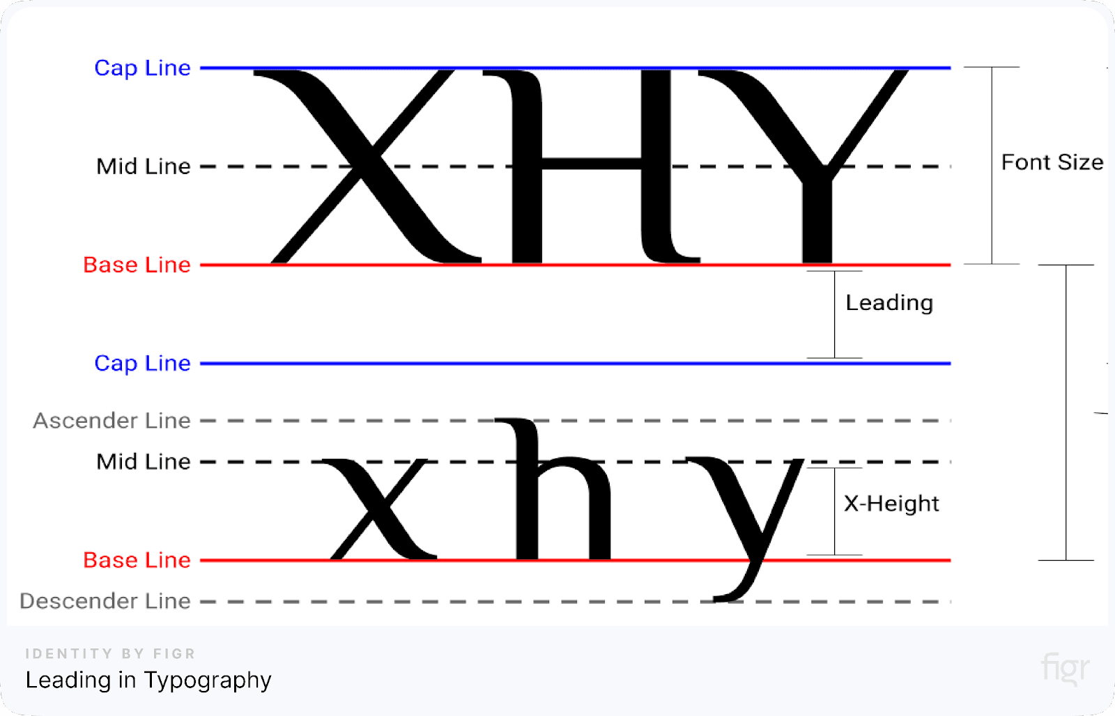
Leading, also known as line spacing, is a fundamental concept in typography that refers to the vertical space between lines of text. The term originates from the days of manual typesetting, where strips of lead were placed between lines of type to create spacing.
In digital design, leading helps improve readability and ensures that text doesn’t feel cramped or difficult to follow.
Why Is Leading Important?
Leading directly affects how comfortable and easy text is to read. If the spacing between lines is too tight, it can cause the text to look cluttered and overwhelming.
On the other hand, too much space between lines can disrupt the reader’s flow, making it hard to track where one line ends and the next begins. Striking the right balance in leading is essential to create clear, legible, and visually appealing content.
Key factors in leading:
- Baseline: The invisible line that text sits on.
- Ascenders: Parts of letters that rise above the baseline, like the top of 'd' or 'h'.
- Descenders: Parts of letters that dip below the baseline, like 'g' or 'y'.
These factors must be considered when setting the leading to ensure the text remains readable and aesthetically pleasing.
How to Adjust Leading
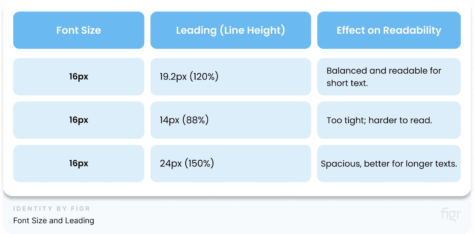
Leading is usually expressed as a percentage of the font size. For example, many design tools default to leading that is 120% of the font size, providing a balanced look.
Designers often need to tweak this value based on the type of content and design goals.
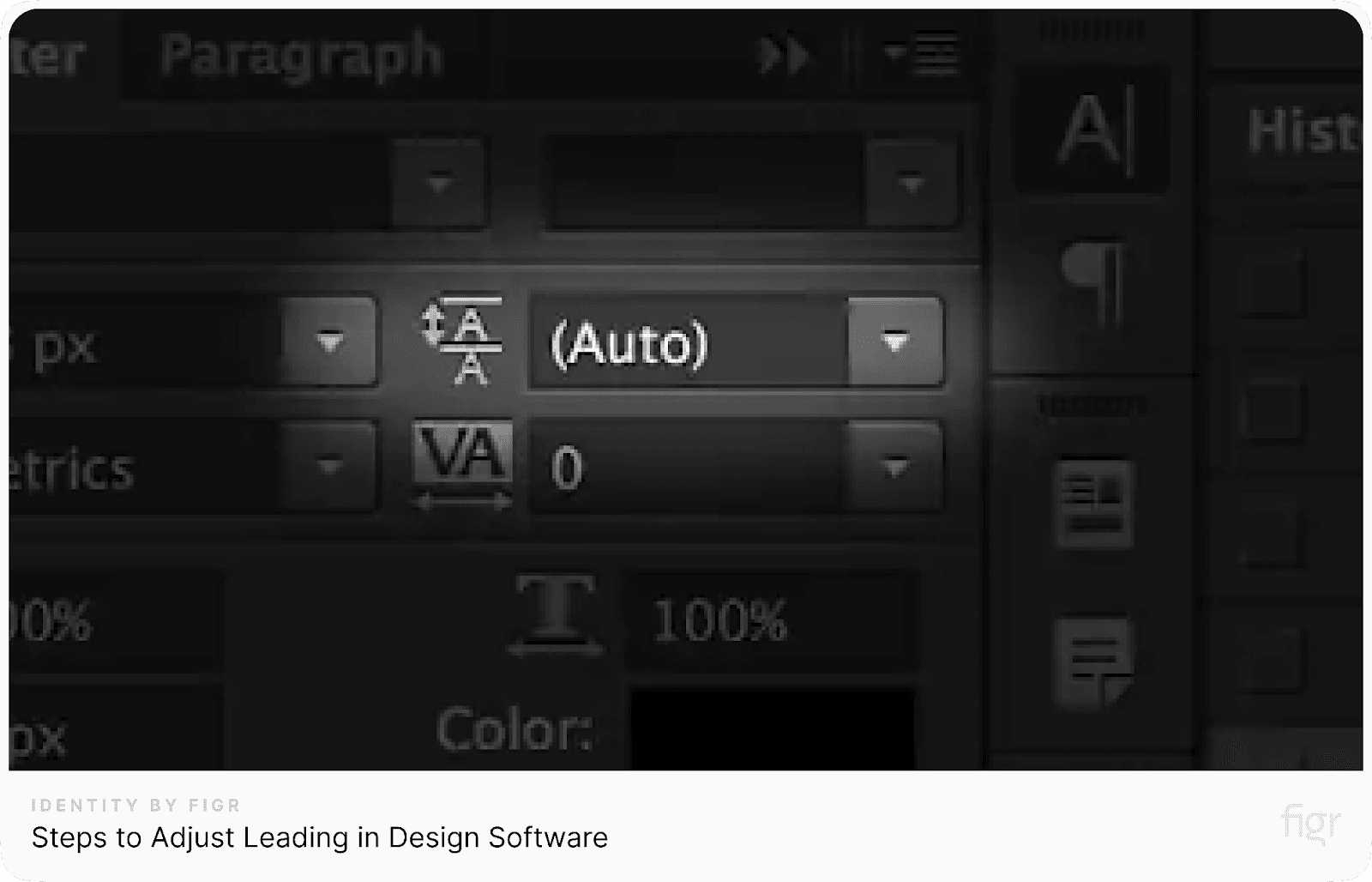
Steps to adjust leading in design software:

Credit: Creative Market
- Highlight the Text: Select the block of text you want to adjust.
- Open the character panel: In tools like Figma, Adobe Photoshop, or Illustrator, find the 'Character' palette.
- Adjust leading: Look for the line-height or leading option. Increase or decrease the value to adjust the spacing.
In Figr Identity, leading adjustments can be made with ease, especially when working on comprehensive design systems.
Figr allows you to quickly set up consistent typography rules, ensuring that your design systems and user interfaces maintain proper readability across different devices and layouts.
Best Practices for Using Leading
- Use larger leading for long reads: For long-form content like articles or blogs, a slightly increased leading makes the text easier on the eyes, enhancing readability.
- Tighter leading for headlines: In titles or headlines, where the text is bold and large, you can reduce the leading to make it feel compact and powerful.
- Balance for multiline text: Make sure that the ascenders and descenders don’t overlap between lines, which can make the text hard to read.
Example of font size and leading:

By carefully managing leading, you create a smooth reading experience and ensure that your content is presented in the most effective way possible.
Now that we've explored how leading impacts the vertical spacing of text, let's look at another crucial typography adjustment—kerning, which focuses on the space between individual letters.
Kerning in Typography
Kerning is another vital element of typography that focuses on the horizontal space between individual letters. Unlike leading, which controls the vertical space between lines of text, kerning deals with fine-tuning the space between specific letter pairs.
This precision can make text appear more balanced and visually pleasing, especially in titles, logos, or headers where large fonts are used.
Why Is Kerning Important?
Kerning directly impacts the overall readability and aesthetics of your text. Improper kerning can result in letters that are either too close or too far apart, making the text look awkward and difficult to read.
For example, letters like "W" and "A" can appear too spaced out if not kerned properly, creating distracting gaps in the word.
Key factors in kerning:
- Letter shapes: Some letter combinations, like "AV" or "Ta," naturally require adjustments because their shapes either clash or leave too much space.
- Font style: Different fonts require different kerning settings. A serif font will need more kerning adjustments than a sans-serif font due to its design details.
Proper kerning is crucial in headlines, logos, and branding materials, where every detail counts for visual impact.
How to Adjust Kerning
Kerning can be manually adjusted in most design software. Here’s how you can do it:
Steps to adjust kerning:
- Select the text: Highlight the specific letters where kerning adjustments are needed.
- Open the character panel: In tools like Figma, Adobe Photoshop, or Illustrator, navigate to the 'Character' panel.
- Adjust the kerning: Use the kerning field or shortcuts (e.g., Alt + arrow keys) to adjust the space between letters.
Best Practices for Kerning
- Use for large fonts: Kerning is most effective in large text, such as headers, titles, and logos, where misaligned letters are more noticeable.
- Avoid over-kerning: Too much kerning can make the text difficult to read. Balance is key.
- Adjust for visual consistency: Always kern based on visual balance, not just mathematical spacing. Some letters may need tighter or looser adjustments depending on their shapes.
Why Designers Should Pay Attention to Kerning:
- Improves visual aesthetics: Fine-tuning letter spacing creates harmony in design.
- Enhances professionalism: Well-kerned text reflects attention to detail, which can elevate a brand or design.
- Boosts readability: Especially in large fonts, proper kerning makes words easier to read and more engaging.
By mastering kerning, you gain control over the fine details that can transform your typography from good to great.
Now that we’ve covered kerning and how it affects individual letter spacing, let’s dive into tracking, which influences the overall spacing across an entire word or block of text.
Tracking in Typography

Credit: Tutplus
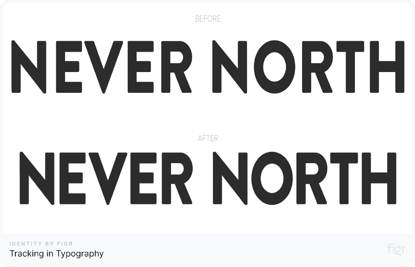
Tracking, also known as letter spacing, refers to the adjustment of space between characters in a block of text. Unlike kerning, which focuses on the spacing between two specific letters, tracking is applied uniformly across entire words, sentences, or paragraphs.
The purpose of tracking is to create a balanced and visually pleasing flow of text, ensuring it is neither too condensed nor too spaced out.
Why is Tracking Important?
- Improves readability: Proper tracking enhances the readability of text, making it easier for the reader’s eye to move smoothly across a line.
- Enhances visual appeal: Tracking can significantly impact the aesthetic of your text, helping you achieve a clean, well-spaced layout.
- Solves design problems: Tracking can be used to fix common design issues like orphans (single words left on a line) and widows (words left alone at the end of a paragraph).
Key Factors Affecting Tracking
When adjusting tracking, several factors must be considered to ensure optimal results:
- Font style: Some fonts require more tracking than others to appear balanced. Bold or condensed fonts may benefit from looser tracking, while light or expanded fonts may need tighter tracking.
- Text size: Smaller text sizes generally require tighter tracking for readability, while larger text (e.g., headings or titles) can afford looser tracking for visual emphasis.
- Context: Tracking should complement the purpose of the text. For example, dense tracking might work for formal documents, while looser tracking can give a modern, spacious feel for creative designs.
How to Adjust Tracking in Design Software
Most design tools, such as Adobe Illustrator, Photoshop, or Figma, allow you to manually adjust tracking through a simple control slider or input field. Here's how:
- Select the text block: Highlight the text you want to adjust.
- Locate the tracking option: In the character settings panel, find the tracking option (usually marked with 'VA' or 'Tracking').
- Adjust as needed: Increase or decrease the tracking value to find the ideal balance for your text.
Leading, kerning, and tracking are the foundational pillars of typography that directly affect readability, aesthetics, and user experience.
Mastering these elements allows designers to craft visually pleasing and highly functional typography, no matter the medium.
However managing leading, kerning, and tracking across multiple designs can be a time-consuming and meticulous task.
But Figr Identity makes this process effortless by automating these crucial adjustments, ensuring that your typography is consistently optimized for readability and visual harmony.
Whether you're designing a complex UI or building a brand identity, Figr Identity allows you to apply precise typographic controls with just a few clicks, helping you focus on creativity while maintaining professional-level accuracy in your designs.
Applications and Examples in Typography Design
Typography plays a vital role in both digital and print design, as the correct use of leading, kerning, and tracking can drastically enhance readability and aesthetics.
Let’s explore how these principles apply in various design contexts and provide some real-world examples of their impact.
Leading Applications in Design
Leading is essential for multi-line text, particularly in areas such as:
- Website content: Ensuring paragraphs are easy to follow on screen. Proper leading improves readability by allowing the eyes to flow smoothly from one line to the next.
- Printed media: Brochures, magazines, and newspapers need balanced line spacing to maintain clarity.
For example, an article with tight leading may overwhelm the reader, while too much spacing can make the text appear disconnected.
- Mobile UI design: In mobile apps, leading helps ensure that text remains readable on smaller screens. Content that is packed tightly can strain the user’s eyes, negatively affecting the user experience.
Example: See an e-commerce website's product descriptions. Correct leading can improve readability on both desktop and mobile versions, making sure customers engage with the content easily, regardless of the platform.
Kerning Applications in Design
Kerning, the adjustment of space between individual letters, is critical for maintaining a balanced and harmonious appearance in typography. It is often applied in:
- Logos and branding: Kerning is key to ensuring that brand names and logos appear visually cohesive. Without proper kerning, even a well-designed logo can look unbalanced and amateur.
- Headlines: Large fonts, particularly for magazine covers or posters, rely on kerning to prevent awkward gaps or overcrowded letters that disrupt the aesthetic.
- Product packaging: Kerning ensures that text on labels or packaging is both visually appealing and easy to read.
Example: A poorly kerned logo may cause letters to look uneven, which can undermine brand credibility. Proper kerning can make a significant difference in brand perception.
Tracking Applications in Design
Tracking refers to adjusting the overall spacing between letters across a word or sentence. It is often used for:
- Corporate presentations: Professional documents or presentations often require enhanced readability, particularly when using long titles or headings. Tracking adjustments helps to create an airy, readable feel.
- Posters and advertisements: In large-scale designs, tracking can be used to create emphasis or balance. Widening the tracking for titles makes them stand out without feeling too dense.
- Editorial design: Magazines or books often rely on tracking adjustments to fit content into limited space without affecting legibility.
Example: On a conference banner, designers may increase tracking to space out letters in the headline, giving it a bold, modern feel without compromising legibility.
Understanding how to apply these techniques ensures that your designs are visually appealing, functional and easy to read.
Figr Identity simplifies the whole process of adjusting leading, kerning, and tracking, ensuring designers can create polished designs in no time.
Figr Identity allows you to generate design systems and apply consistent typographic adjustments across your entire project.
Whether you’re working on a mobile app UI or a large branding project, Figr Identity automates the process of maintaining typographic balance, making it a must-have product for any modern designer.
Common Typography Mistakes and How to Avoid Them
Even seasoned designers can make errors when working with typography, but knowing these common mistakes and how to avoid them can ensure your designs look polished and professional.
Let’s walk through some typical pitfalls and practical solutions to help you enhance your typography skills.
1. Overusing Tight Leading
Mistake: Using too little space between lines of text (leading) can make paragraphs look cramped and hard to read. It puts strain on the reader’s eyes, especially in body text.
How to avoid it:
- Use appropriate leading based on the font size and context. A general rule is to set the leading value to about 120% of the font size.
- Ensure that leading balances readability with aesthetic appeal, especially for multi-line paragraphs or in mobile and web designs.
Example: In a dense article, tight leading might cause the lines of text to blend into each other, making it difficult for readers to follow. By increasing the space between lines slightly, you can improve clarity without losing style.
2. Ignoring Kerning in Logos and Headlines
Mistake: Poor kerning can make logos, titles, or headlines appear uneven or awkward. Letters may appear too far apart or too close together, making the design look unbalanced.
How to avoid it:
- Manually adjust kerning in large fonts or display text. Pay extra attention to pairs of letters that commonly cause problems, like “V” and “A.”
- Use design software to tweak kerning settings for a more harmonious visual outcome.
Example: A logo with inconsistent letter spacing can give off an amateurish vibe, which undermines brand professionalism. Fine-tuning kerning ensures that each character looks properly spaced and cohesive.
3. Excessive Tracking
Mistake: Applying too much tracking (spacing between all letters in a word) can spread out text to the point where it becomes difficult to read, especially in body text. This can break the flow of reading and make text look disconnected.
How to avoid it:
- Use tracking sparingly, especially in body text. Reserve tracking adjustments for headlines or display text where emphasis is needed.
- Maintain a balance between readability and visual space when applying tracking.
Example: A headline with excessive tracking might look stretched and lose impact. By tightening the tracking slightly, you create a bold, readable heading that draws attention.
4. Neglecting Font Size for Mobile
Mistake: Using the same font size across all platforms without considering mobile screen sizes can make text difficult to read on smaller devices. Tiny font sizes result in poor readability, while oversized fonts may disrupt layout balance.
How to avoid it:
- Adapt font sizes based on the platform and screen size. For mobile, ensure that body text is large enough to be read comfortably without zooming.
- Test your typography across various devices to ensure readability and consistency.
Example: A website that displays perfectly on desktop may look cluttered on mobile if the fonts are too small. By optimizing font sizes for mobile, you ensure that users can navigate the site easily on any device.
5. Inconsistent Type Hierarchy
Mistake: Failing to establish a clear hierarchy in typography can confuse the reader. Without distinct headings, subheadings, and body text, the content may appear disorganized, and important information could get lost.
How to avoid it:
- Create a clear type hierarchy by differentiating font sizes, weights, and styles for headings, subheadings, and body text.
- Use consistent heading styles throughout your design to guide the reader’s attention.
Example: A blog post without distinct heading styles can make it hard for readers to skim and find relevant sections. A well-defined hierarchy improves navigation and readability.
6. Misusing Fonts with Too Many Styles
Mistake: Overloading a design with multiple font styles can clutter the layout and overwhelm the reader. It makes the design look inconsistent and unprofessional.
How to avoid it:
- Stick to a maximum of two to three fonts in your design: one for headings, one for body text, and a possible third for emphasis or decoration.
- Use variations of weight, size, and style within the same font family to create contrast without sacrificing cohesion.
Example: A website with five different fonts in one paragraph may look chaotic. Instead, using one font family with bold or italic variations keeps the design clean and structured.
By staying aware of these common typography mistakes and following best practices, you can elevate your designs to a professional level.
Conclusion
Typography is one of the most important elements of design, playing a crucial role in both aesthetics and functionality. By understanding and mastering techniques like leading, kerning, and tracking, designers can dramatically improve the readability and visual appeal of their work.
While these concepts might seem small in scope, they have a huge impact on the overall success of your designs. Balancing these typography techniques is a skill every designer should develop.
Thankfully, products like Figr Identity make it extremely easy to implement these adjustments consistently across your projects.
With Figr Identity, you can instantly generate pre-set tokens for colors, typography, spacing, effects, radius, and grids, allowing you to streamline your workflow and maintain precise, polished typography.
As you move forward in your design journey, keep experimenting with these typography techniques, refining your style, and using Figr Identity to save time and enhance the precision of your designs.
Good typography isn't just about aesthetics—it's about crafting a seamless, enjoyable reading experience for your audience.


