Let’s say, you're designing a poster for a music festival. The image is perfect, the colors are vibrant, but something feels off. The text looks all wrong—different fonts, sizes, and styles everywhere. How would you feel? This is where a good typography system comes in.
Did you know 38% of users will stop interacting with a website if the layout is unattractive? It makes sense. If your text is hard to read or doesn’t match the design, it throws everything off. That's why typography system creation is so important. It helps organize your text, ensuring it fits seamlessly with your design and is easy to read.
What is Typography?
Just like the words you choose, the way you present those words matters a lot. Typography is how you communicate your message effectively. The right fonts can make your brand feel modern and edgy, while others can give it a classic and timeless look.
When you create a typography system, you think about how all these pieces work together. It’s about finding the right balance between style and readability. Whether it’s for a website, poster, or brand identity, your typography shapes how people connect with what you’re saying.
Why Does a Typography System Matter?
- Consistency: A solid system ensures your design looks polished and professional. No more clashing fonts or sizes that confuse the message.
- Better Readability: A structured typography system makes text easier to read. This keeps people engaged with your content longer.
- Brand Identity: Your typography should reflect your brand’s personality. It helps set the tone and lets people instantly recognize your business.
- Hierarchy: A well-thought-out system helps prioritize your messages. It makes sure the most important parts stand out and guide the reader's eye.
- Trust: Clear, easy-to-read text builds credibility. People are more likely to trust content that’s easy to understand and looks organized.
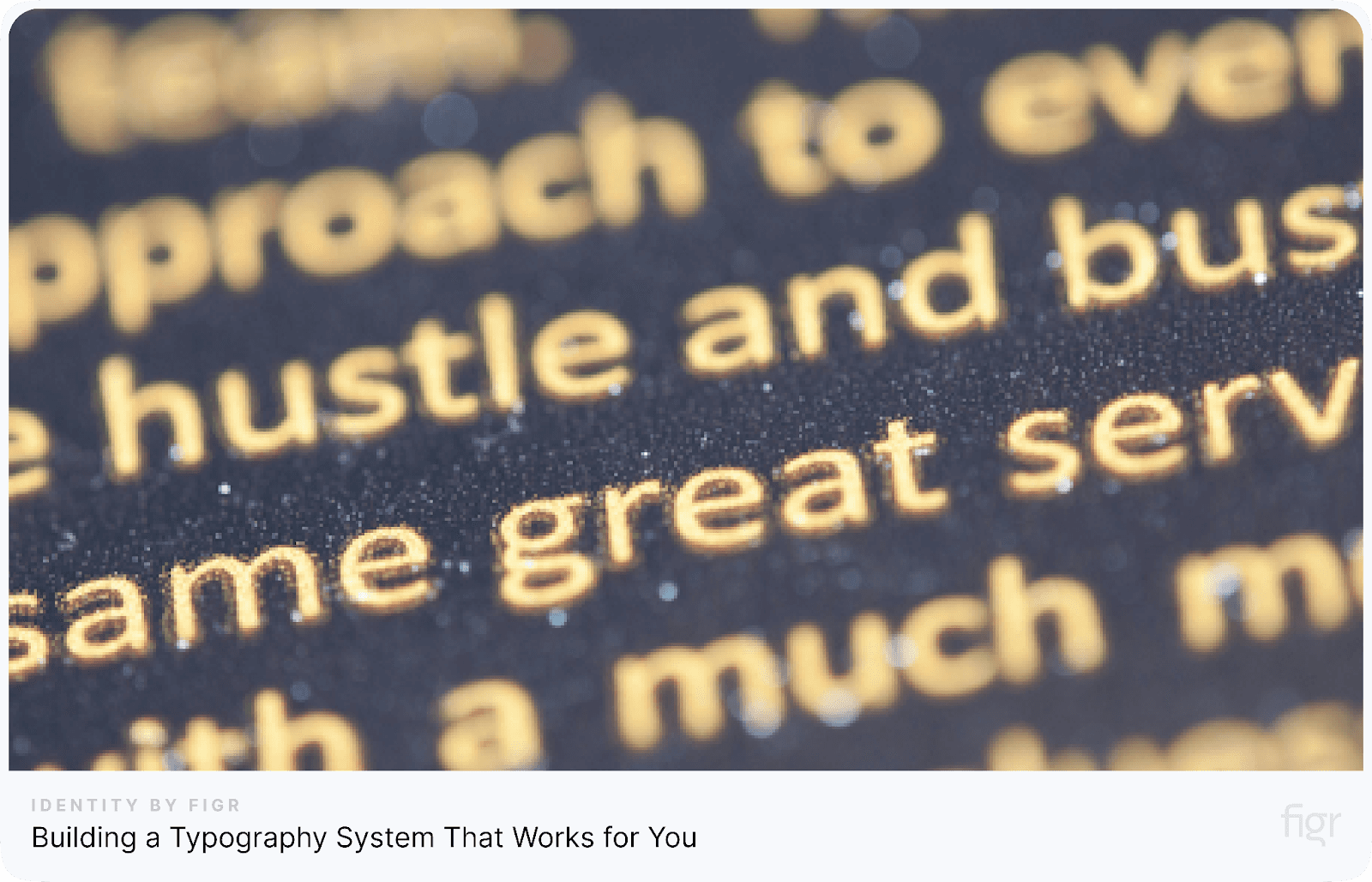
Building a Typography System That Works for You
Your typeface is the foundation of your design's voice. It's the first impression people get from your brand, and it sets the tone for everything that follows.
Credits: Pixels
Step 1: Finding the Right Typeface for Your Typography System
Choosing the right typeface is the foundation of creating a typography system that truly works. It’s not just about picking something pretty; it’s about finding a typeface that represents your brand while ensuring the text is readable across all platforms. Here’s how you can do it:
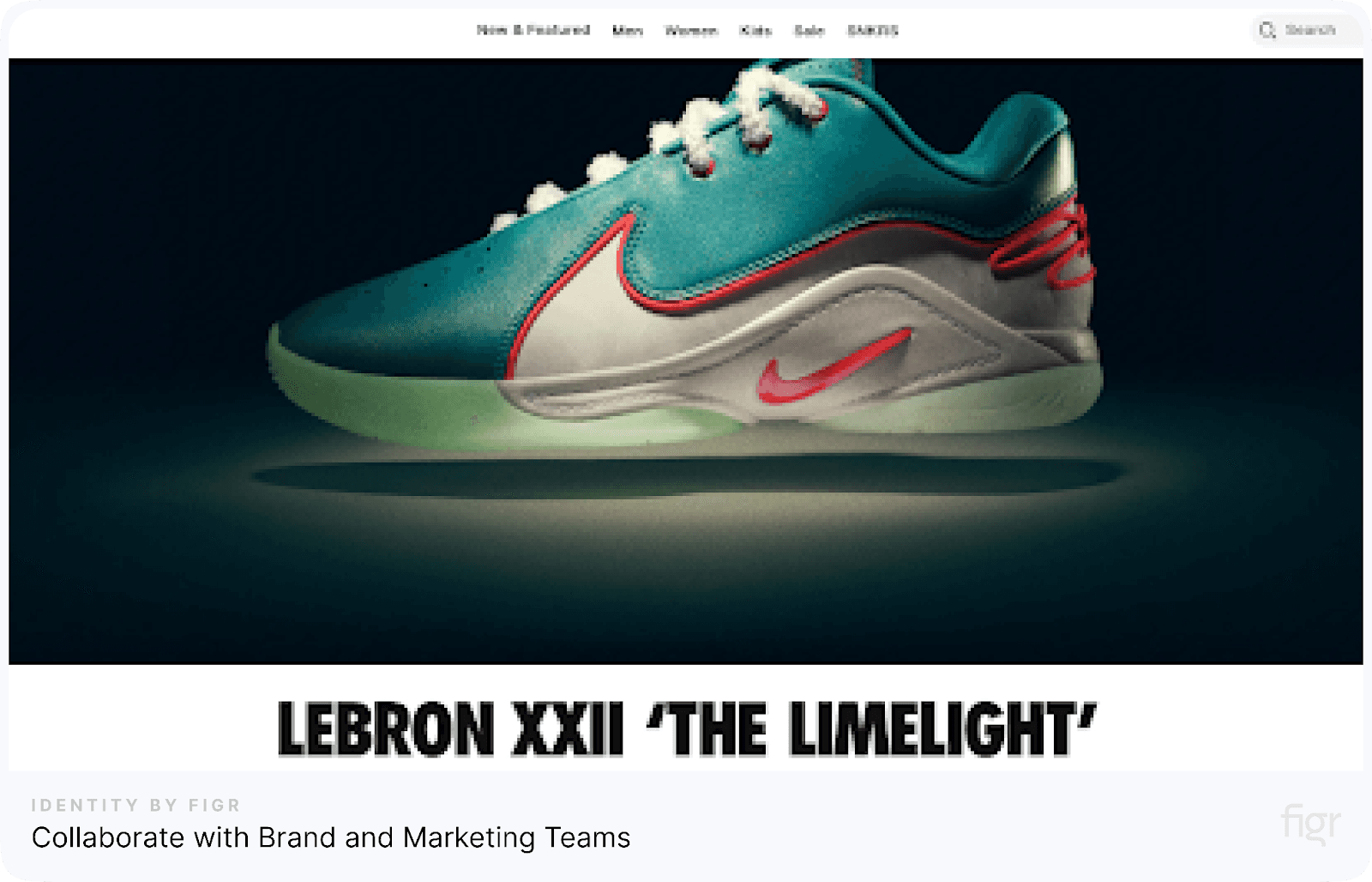
a) Collaborate with Brand and Marketing Teams
Credits: Nike
Work closely with your brand and marketing teams to align on the brand’s voice and tone. Ask questions like:
- Does the brand aim to be playful like Slack, elegant like Chanel, or bold like Nike?
- Who is your audience? A younger crowd may prefer modern, playful fonts, while a corporate audience may appreciate clean, professional styles.
For example, a tech startup might choose clean, modern fonts like Roboto, while a luxury brand may opt for elegant serifs like Garamond.
b) Balance Brand Personality with Functionality
Your font choice, a crucial part of typography system creation, must reflect your brand while also staying practical.
- Use fonts like Open Sans or Roboto for easy readability on screens.
- Avoid overly stylized fonts like Brush Script for body text; they can be hard to read.
For instance, a bakery could use Pacifico for headlines to convey warmth and charm but stick to a clean font like Source Sans Pro for menus or descriptions.
c) Consider Typeface Performance and Pairings
Every font behaves differently on screens and in print. Always test how fonts look and work together:
- Screen and Print: Check if your fonts perform well on websites, mobile apps, and print materials. Fonts like Proxima Nova excel digitally, but some serif fonts like Georgia are better for print.
- Font Pairing: Combine a serif like Playfair Display for headlines with a sans-serif like Inter for body text. This contrast keeps the design interesting but clean.
- Avoid Overload: Stick to 2-3 typefaces. Too many styles can overwhelm your design.
By choosing fonts thoughtfully, creating a typography system helps you build a strong, consistent brand identity. Don’t rush. Test how they look in real scenarios, refine your choices, and let your typography tell your brand’s story.
Step 2: Design a Harmonious Typography Scale
Now that you're convinced of the power of typography system creation, let's get down to business! This step involves creating a scale that defines the sizes of your fonts for different elements, like headings, subheadings, and body text.
a) Design a Harmonious Typography Scale
Start by assigning proportional sizes to text elements:
- Headings: Large and bold to grab attention, such as H1 for titles and H2 for subheadings.
- Body Text: Smaller and easy to read, typically 14–16px.
- Captions and Footnotes: These are smaller and less important, so 12px to 14px works well.
For example, a news website might use a 24px H1 for headlines, an 18px H2 for subheadings, and 16px for body text to maintain clarity and hierarchy.
b) Use Modular Typography Scales and Grids

Credits: Pexels
Implementing modular scales can help you maintain consistency:
- Modular Scales: Use ratios like 1:1.5 or 1:1.618 (golden ratio) to create text size relationships.
- 8-Point Grids: Align text and other elements on an 8-pixel grid for neat spacing and alignment.
This approach works wonders for responsive design, ensuring your typography looks great on both mobile and desktop.
c) Use Tools for Scale Creation
To make your life easier, use tools that take the guesswork out of creating typography systems. Figr Identity is perfect for this. It helps you generate consistent text sizes, spacing, and styles across your designs in just a few clicks. With Figr Identity, you can easily manage and apply typography rules across your projects, ensuring everything aligns perfectly without the hassle.
Here are some more tools you can try:
- Type Scale – Create modular typography scales quickly and easily.
- Font Pair – Find perfect font pairings for your designs.
- Modular Scale – Build consistent text scales for different elements.
- Google Fonts – Choose from a wide range of free, web-friendly fonts.
- Fontjoy – Discover font combinations that work well together.
- Typekit – Access a vast library of high-quality fonts through Adobe.
These tools save you time and help you stay consistent while creating a strong typography system for your brand.
Step 3: Fine-Tuning Your Typography System for Clarity and Impact
Now that you've chosen your fonts, it's time to get specific about how your text will look and function. Customizing text properties during typography system creation is where you make sure everything works smoothly together.
Here’s how to do it effectively:
a) Set Key Properties
- Font Family: Choose fonts that match your brand’s personality. For example, if your brand is fun and casual, you might go for something like Montserrat for headings and Open Sans for body text. If you want something more professional, try Roboto for both.
- Font Weight: Make headings bold to stand out. For example, use bold for your main heading (like "About Us") and regular weight for body text. For example, "Welcome to our website!" should be bold to grab attention.
- Font Size: Size matters. For body text, a common size is 16px. This is comfortable to read. Your headings should be bigger—around 32px for the main title and 24px for subheadings.
- Line Height: This is the space between lines of text. For body text, a line height of 1.5x the font size works well. So, if your body text is 16px, set the line height to 24px. This keeps the text easy to read and not cramped.
b) Adjust Letter Spacing & Paragraph Spacing
- Letter Spacing: You don’t want your letters too close or too far apart. For example, in a title like "Creating a Typography System," you might want to add a little more space between letters to make it look clean and polished. For body text, you don’t need much letter spacing—keep it normal.
- Paragraph Spacing: Give your paragraphs room to breathe. A good rule is to use about 1.5x the line height for space between paragraphs. So, if your line height is 24px, use around 36px for paragraph spacing. This makes your content more digestible and easier to follow.
- Let Size Drive the Hierarchy, Not Weights: During typography system creation, font size is the best way to show what’s most important. You don’t need to change weights too much. Instead, just adjust the size. Bigger text means more important, and smaller text means less important.
Example: Your main headline might be large, bold text, while the subheading can be smaller, and body text can be even smaller.
c) Exclude Non-Essential Properties
When creating a typography system, less is more. Focus on the essentials to keep things clean and readable. Here's how:
- Keep it Simple: Stick to font size, weight, and spacing as your primary focus. These are the most important aspects to control.
- Avoid Overuse of Decorations:
- Use bold or italics sparingly to highlight key points.
- Only underline text when necessary (e.g., for links) to keep it functional, not cluttered.
- Don’t Overdo it: Too many different text decorations can distract the reader. Keep it streamlined for clarity.
By customizing these details, you're giving your typography system the final polish it needs for consistent and smooth design execution.
Step 4: Fine-Tune Line Height and Tracking for Readable Design
When creating a typography system, line height and tracking play a big role in making your text readable. Here’s how to get it right:
a) Set Appropriate Line Height
Line height is the space between lines of text. If the lines are too close, it feels crowded. If they’re too far apart, it looks disconnected.
Pro Tip: For body text, set the line height to 1.4 to 1.6 times the font size.
For example, if your font size is 16px, set your line height between 22px (16px x 1.4) and 25px (16px x 1.6). This will make the text easy on the eyes.
b) Understand Tracking’s Role
Tracking is the spacing between all letters in a block of text. Adjusting this for large blocks can significantly enhance legibility.
Example: If your text feels too tight, increase the tracking slightly. For headlines, you can tighten it up a bit to make them more compact and punchy.
c) Follow Industry Standards
There are some general rules of thumb that help maintain readability during typography system creation. For body text, a line height of around 1.5x the font size is standard. For headings, adjust based on the weight and context of the design.
Example: For a 16px body font, a 24px line height ensures comfortable reading.
By adjusting these two elements, your typography system will be much easier to read and more visually appealing!
Step 5: Organize Text Styles and Colors for Consistency
A well-organized design system is the foundation of cohesive, professional UI. Typography and colors play a critical role in ensuring consistency, clarity, and efficiency in your designs. Here's how to organize and name text styles and colors effectively:
a) Create a Naming Convention for Text Styles
A well-defined naming system is key to typography system creation, keeping everything organized and easy to find. Name your text styles based on their function, size, and context. For example:
- Heading 1 for the main title
- Body Copy for paragraph text
- Caption for image captions
This way, everyone knows exactly what each style is for, and there’s no confusion.
b) Use Prefixes or Libraries for Easy Organization
Organizing text styles into a library or using prefixes is essential when creating a typography system, making your workflow even more efficient. For instance, prefix your text styles with “h1” for headings, “p” for paragraphs, or “btn” for buttons.
This helps when you need to quickly access or modify styles, keeping your designs consistent and easy to work with.
c) Define and Name Colors
1) Build a Standardized Color Palette
Set up a palette of primary, secondary, and neutral colors with specific roles:
- Primary Color: For important elements like buttons.
- Secondary Color: For accents or complementary elements.
- Neutral Colors: For backgrounds, text, and dividers.
Define color usage to avoid overcomplicating your designs and ensure visual balance.
2) Assign Functional, Descriptive Names
Name your colors based on their function and purpose rather than their appearance. Examples:
- Primary Blue: Main action buttons.
- Error Red: Alerts and error messages.
- Background Gray: Default background areas.
3) Use Prefixes or Categories for Clarity
Organize colors with prefixes for easy access. Examples:
- bg-primary for the primary background color.
- text-muted for subtle text.
- btn-hover for button hover states.
By organizing text styles and colors with clear naming conventions and categories, you’ll ensure consistency, simplify collaboration, and speed up your workflow across projects.
Step 6: Finalize Your Typography System for Consistency and Clarity
Once you’ve completed your typography system creation, it’s time to make sure everything is polished and ready for use. Here's how you can wrap up your typography system effectively:
a) Review and Refine Your Typography System
Take a step back and check every element of creating a typography system. Does the heading look distinct enough from the body text? Are your line heights consistent across the board?
A great example is ensuring that all "Heading 1" styles are the same size and weight, and that line heights don't crowd the text. If your typography system isn't cohesive here, readers may feel the design is unbalanced.
b) Document the System
Create a detailed style guide with a clear breakdown of your typography choices. Include specific examples like, "Heading 1: 36px, bold, Line Height: 1.4" and "Body Text: 16px, regular, Line Height: 1.5".
Having this reference means your team can quickly align on design decisions during typography system creation. For instance, when working on a new webpage, a designer can refer to this guide to maintain consistent fonts and styles across headings and paragraphs.
c) Test Your Typography System
Finally, test the system across different devices.
- View it on desktop, tablet, and mobile to ensure text is legible.
- Scale your text to see if it still maintains readability on different screen sizes.
- Adjust any font sizes or line heights that look out of place.
For example, a 36px heading may look great on desktop but could be too large on mobile. Refine these details for a smooth, consistent experience.
How Figr Simplifies Typography System Creation
Okay, we've got our fonts, our scale, and all the technicalities sorted. Now, how do we keep this whole creating a typography system from turning into a chaotic mess?
The answer lies in organization.
Figr Identity helps you create consistent UI designs faster and more efficient. It reads your existing design system from Figma, organizes it, and brings your team on the same page. This speeds up product development while keeping everything clean and consistent.
Organize Text Styles Clearly: Figr Identity reads your existing text styles from Figma and sorts them into headings, body text, and captions. This makes it easy for everyone to use the right style without confusion.
Generate Design Tokens Automatically: Create tokens for font sizes, spacing, and weights instantly. These tokens ensure every part of your design stays consistent across platforms.
Customize in Real-Time: You can tweak and preview your typography directly with Figr Identity. This saves time and ensures your text looks perfect in every layout.
Use 80+ Components for Speed: Choose from over 80 pre-designed components to build your interface quickly. These are ready to use and fully customizable, so you can skip starting from scratch.
Create Shareable Style Guides: Figr generates detailed typography guidelines that your whole team can follow. This keeps everyone aligned and avoids mistakes.
Figr Identity makes creating a typography system simple, fast, and organized, so you can focus on designing great products.
Wrap Up
"Design is not just what it looks like and feels like. Design is how it works." – Steve Jobs
Creating a typography system isn’t just about looking good—it’s about making your designs clear and consistent. When your text styles are organized, your message becomes stronger, and your brand feels unified.
That’s where Figr Identity comes in. It helps you create and manage typography systems effortlessly. You can organize styles, generate design tokens, and keep everything consistent - all while working directly in Figma. It’s designed to make your process faster and smoother.
Ready to step up your design game? Try Figr Identity today. Start creating a typography system that works as beautifully as it looks! For the complete framework covering tokens, components, documentation, and measurement, see our guide on design system best practices.