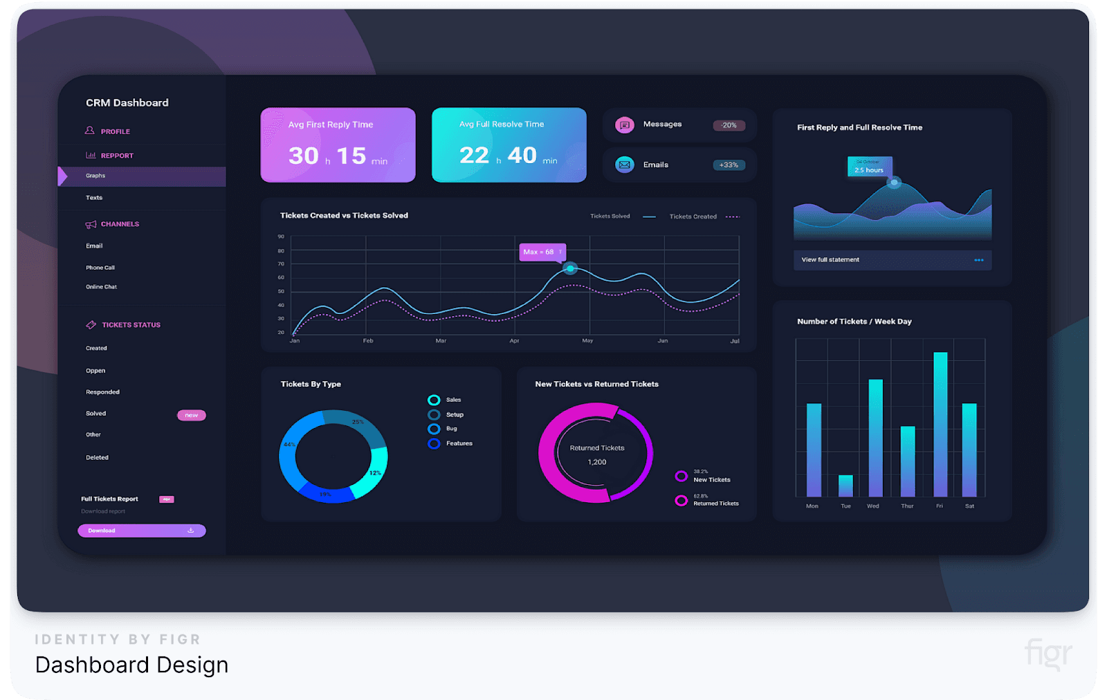
Data is everywhere, but making sense of it is a different story. If you’ve ever found yourself staring at a cluttered dashboard, struggling to extract the insights you need, you’re not alone. Poorly designed dashboards can leave you frustrated, wasting precious time trying to decode confusing visuals instead of making informed decisions.
The truth is, a confusing dashboard can cost your business more than just time—it can lead to missed opportunities, flawed strategies, and lost revenue.
Imagine having a tool that instantly shows you what’s working, what’s not, and what you need to do next. That’s the power of a well-designed dashboard. It transforms raw data into a clear, visual story that guides your next move.
This guide is your roadmap to mastering dashboard design. Whether you’re looking to streamline your current dashboard or build one from scratch, we’ll walk you through every step—from understanding your audience’s needs to creating an intuitive, impactful dashboard design.
By the end, you’ll know exactly how to turn your data into insights that drive action and results. Ready to transform your dashboard from confusing to compelling? Let’s get started!
What is Dashboard Design?
A dashboard is more than just a collection of charts and numbers; it’s a visual representation of key data that helps you make informed decisions at a glance.
A well-designed dashboard provides an overview of your most critical metrics, tailored to your audience, and arranged in a way that’s easy to understand and act upon.
Whether it’s tracking sales performance, monitoring website analytics, or managing project timelines, dashboards serve as a centralized hub for data-driven decision-making.
Why Dashboard Design Matters
Transitioning from our introduction, it’s clear that the effectiveness of a dashboard lies in its design. A poorly structured dashboard can overwhelm users with too much information or, worse, present the wrong information in a confusing way.
On the other hand, a thoughtfully designed dashboard streamlines data, highlights what’s important, and provides clarity at a glance.
The Core Elements of Dashboard Design
- Purpose and Audience: Every dashboard should start with a clear purpose and a deep understanding of its intended audience. Is the dashboard for executives who need high-level overviews or for analysts who require detailed data breakdowns? Defining the purpose and audience helps in choosing the right metrics and visualizations.
- Key Metrics: Focus on the metrics that matter most. A cluttered dashboard with too many KPIs can lead to information overload. Instead, apply the 80/20 rule: prioritize the 20% of metrics that drive 80% of decisions.
- Visual Hierarchy: Organize information using a clear visual hierarchy. Place the most critical metrics at the top or in the top-left corner, as users naturally start scanning from there. Use size, color, and placement to guide the user's attention to what's most important.
- Simplicity and Clarity: Keep it simple. Use clean, minimalistic designs without unnecessary elements. Avoid chartjunk—decorative elements that do not add value to the data—like excessive colors or 3D effects.
- Interactivity: Allow users to interact with the dashboard through filters, drill-downs, and hover-over details. This makes the data more engaging and allows users to explore insights on their own.
- Consistency: Maintain consistent colors, fonts, and styles throughout the dashboard. This enhances the aesthetic and also makes it easier for users to read and interpret the data.
Real-World Example: Spotify’s Artist Dashboard
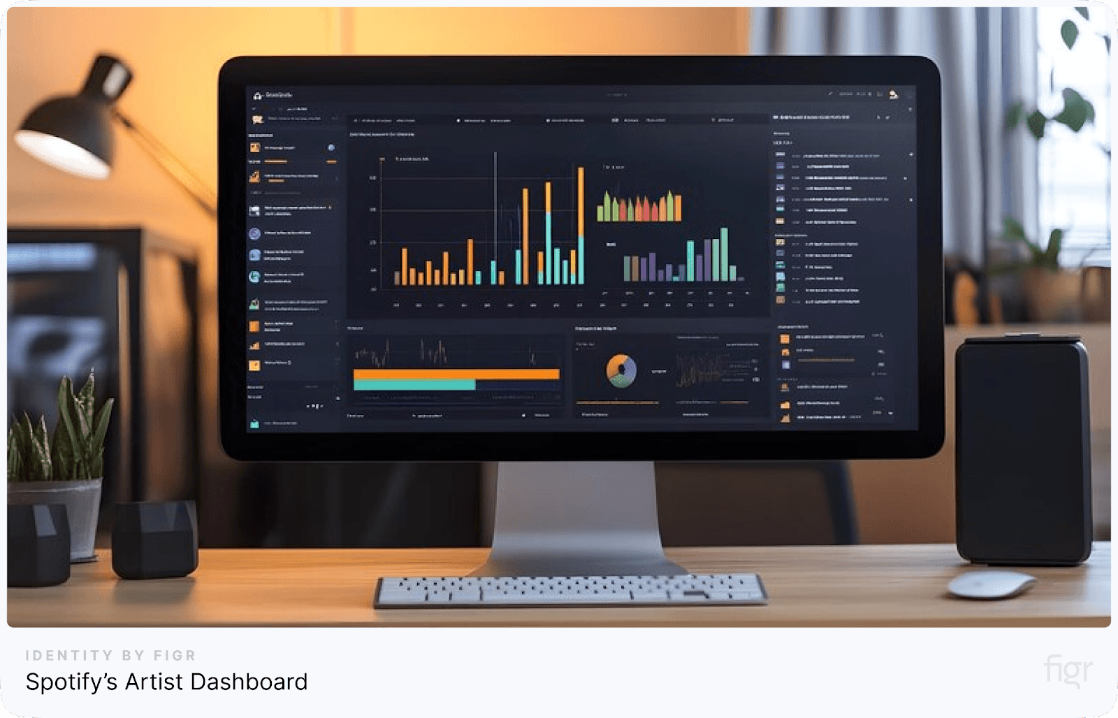
Spotify provides artists with a dashboard that displays their streaming data, audience demographics, and playlist placements. The design is clean and focused, with key stats like total streams and top songs prominently featured. The use of visual hierarchy ensures that artists can quickly grasp their performance at a glance.
Now that we’ve covered what dashboard design is and why it matters, let’s dive deeper into the step-by-step guide to creating effective dashboards that can truly transform your data into actionable insights. Ready to learn how? Let’s move on!
Step-by-Step Guide to Dashboard Design Principles and Best Practices
Creating an effective dashboard is more than just arranging charts and graphs on a screen. It’s a process that requires a thoughtful blend of design, data, and user understanding.
A well-designed dashboard not only presents data but also tells a compelling story, highlights key insights, and empowers users to make informed decisions.
In this section, we’ll walk you through each critical step in detail, ensuring you have all the knowledge and tools needed to build dashboards that truly serve your business objectives.
Step 1: Know Your Audience and Define Goals
Your dashboard’s success depends on how well it meets the needs of its audience. If you design a dashboard without considering who will use it, you risk creating something too complex, too simplistic, or irrelevant.
Understanding your audience and setting clear goals are the foundation of effective dashboard design. Different user groups have different requirements. Tailoring the dashboard to your audience ensures that you present the right information, in the right format, at the right level of detail.
Let’s break down this crucial step into manageable tasks:
1. Identify Your Audience: Before you even start thinking about visualizations or metrics, ask yourself: Who will use this dashboard? Every dashboard user is different. The information that matters to a marketing executive may not be relevant to a financial analyst. To start, segment your audience based on their roles:
- Executives: Require high-level overviews with quick insights for decision-making.
- Managers: Need a mix of both detailed and summarized data.
- Operational Staff: Need granular details for day-to-day tasks.
- Data Analysts: Require deep-dive data and customizable views for complex analysis.
Example: Imagine you’re designing a dashboard for a sales team. The dashboard should include metrics like monthly sales targets, individual performance, and conversion rates. In contrast, a dashboard for the C-suite would focus on overall revenue trends, customer acquisition cost, and strategic KPIs like customer lifetime value (CLV).
2. Define Dashboard Goals: Once you know who will use the dashboard, define what you want to achieve with it. Consider the following questions:
- What decisions will this dashboard help inform?
- What are the key performance indicators (KPIs) that need to be tracked?
- How frequently will the data be updated and viewed?
Example: For a marketing dashboard, the goal might be to track the effectiveness of campaigns. KPIs could include conversion rates, cost per acquisition (CPA), and return on ad spend (ROAS). The dashboard would update daily to reflect the latest campaign data.
3. Create User Personas: To get a clearer picture of your audience’s needs, create user personas. These fictional characters represent different user types that might use your dashboard. Define their roles, what metrics they care about, their technical proficiency, and their pain points.
User Persona Example:
- Name: Sarah
- Role: Marketing Manager
- Goals: Monitor the performance of ongoing campaigns and identify underperforming ones.
- Metrics: Conversion rates, click-through rates, cost per lead.
- Pain Points: Struggles with data overload and finding specific insights quickly.
This sets the groundwork for building a dashboard that is visually appealing and also deeply functional and aligned with business needs.
Next, let’s define our goals to ensure your dashboard provides clear and actionable insights.
Defining Goals: The WHY Behind Your Dashboard
Once you’ve identified the audience, the next step is defining clear goals for your dashboard. Without clear objectives, your dashboard risks becoming an overcrowded collection of metrics with no purpose.
1. Set SMART Goals:
- Specific: What specific outcome do you want from the dashboard? For example, a sales dashboard should focus on tracking conversion rates or sales pipeline health.
- Measurable: Ensure the goals are measurable. Metrics like "reduce average response time by 20%" or "increase sales by 15%" provide clarity.
- Achievable: Goals should be realistic based on available data and the organization’s capabilities.
- Relevant: Make sure the data being visualized directly supports business objectives. Don’t include unnecessary metrics that clutter the dashboard.
- Time-bound: Define a time frame in which these goals should be achieved (e.g., "increase revenue by Q2").
Example: For an e-commerce platform, a dashboard's goal might be to increase customer retention by monitoring key metrics like repeat purchases, cart abandonment rates, and customer feedback scores.
2. Break Down Your Goals into Key Metrics (KPIs):
- Identify 3-5 key performance indicators (KPIs) that align with your goals. Too many metrics can overwhelm users.
- Apply the 80/20 rule: Focus on the 20% of data that will drive 80% of the impact.
Example: A project management dashboard might prioritize KPIs like:
- Project completion rates
- Budget adherence
- Resource allocation efficiency
Why This Step is Crucial?
- Relevance to Business Strategy: By aligning your dashboard goals with your business objectives, you ensure that the data on display is not just informative but actionable.
- Improves Efficiency: Knowing your audience and having clear goals cuts down unnecessary data, making the dashboard more efficient. A focused dashboard saves time by reducing the mental load on users, allowing them to act on key insights faster.
Pro Tip: Align Metrics with Business Goals: Ensure that every metric on your dashboard ties back to a business goal. Avoid the temptation to include metrics just because they’re available. A well-designed dashboard is like a well-told story: it’s focused and relevant.
Do’s and Don’ts:
- Do focus on actionable metrics like customer acquisition cost, conversion rates, and churn rate.
- Don’t clutter your dashboard with vanity metrics like social media likes or website hits, unless they directly impact your business goals.
Real-World Example: Amazon's Seller Central Dashboard
Amazon's Seller Central dashboard is a prime example of user-centric design. It’s tailored for e-commerce sellers, providing them with real-time data on orders, inventory, and sales performance. The dashboard is intuitive and focuses on metrics that sellers care about, like sales growth and order defects.
Understanding your audience and defining clear goals is the foundation of a well-designed dashboard. By knowing who will use the dashboard and what information is most critical to them, you set the stage for data-driven success.
Now that you know how important it is to define your audience and goals, the next step is selecting the right metrics and visualizations that best serve your purpose.
Step 2: Choose the Right Metrics and KPIs
After, you have a clear understanding of your audience and goals, it’s time to dive into the heart of your dashboard: selecting the right metrics and key performance indicators (KPIs).
Choosing the correct metrics ensures that your dashboard remains focused and actionable, providing meaningful insights that align with your business objectives.
The metrics you choose will dictate the story your dashboard tells. Relevant and well-chosen metrics can empower decision-makers, drive strategy, and highlight key areas of success and improvement.
Types of Metrics to Consider
Different types of metrics serve different purposes. Let’s break down some common categories:
- Performance Metrics: These show how well a specific process or team is performing. Examples include sales revenue, profit margins, and production efficiency.
- Health Metrics: These indicate the overall health of the business, such as customer satisfaction, employee turnover, and system uptime.
- Operational Metrics: These track day-to-day activities, like order processing time, customer support response time, and inventory levels.
Example: For a retail business, performance metrics might include sales per store, while health metrics could track customer satisfaction scores.
How to Choose the Right KPIs?
Selecting the right KPIs involves a few key steps:
- Align with Business Goals: Ensure that each KPI directly supports a strategic business goal. For example, if your goal is to improve customer satisfaction, relevant KPIs might include Net Promoter Score (NPS) or average response time to customer inquiries.
- Make Them Actionable: Choose KPIs that drive action. If a KPI doesn’t inspire a response or decision, it’s not useful. For example, tracking website visits is less actionable than tracking conversion rates.
- Ensure They’re Measurable: KPIs should be quantifiable. Avoid vague metrics like “customer happiness” and opt for measurable ones like “customer satisfaction score.”
- Limit the Number: Focus on a few key metrics that matter most. A good rule of thumb is to keep it between 5-10 KPIs to avoid overwhelming users.
Example of Actionable KPIs:
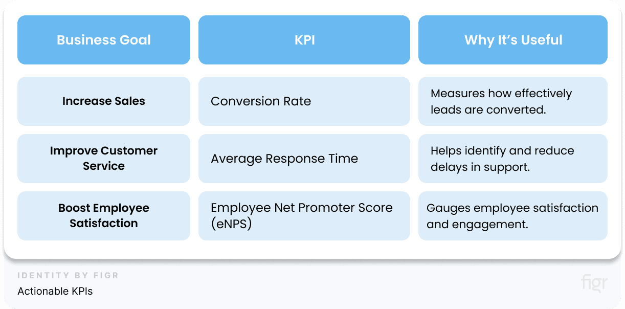
Selecting the right metrics and KPIs is the backbone of effective dashboard design. In the next step, we’ll explore how to craft a compelling data story to present these metrics in a way that is both engaging and guides them to take meaningful actions.
Step 3: Craft a Compelling Data Story
After identifying your audience and choosing the right metrics, it’s time to bring your data to life by crafting a compelling data story.
A data story combines data and narrative to communicate complex information in a simple and engaging way. It's more than just presenting numbers and charts—it's about guiding your audience through the data, highlighting key insights, and helping them understand the underlying message.
A strong data story presents information and drives decisions and actions. Data storytelling essentially bridges the gap between data and decision-making.
Elements of a Strong Data Story
Crafting a compelling data story is essential for transforming raw data into actionable insights. But what makes a data story strong, and how should you structure it to engage your audience effectively?
A compelling data story has five essential elements:
- Purpose and Focus
- Clarity of Intent: Every data story should start with a clear purpose. Are you trying to highlight a trend, uncover an anomaly, or explain a cause-and-effect relationship?
- Focused Narrative: Keep your story focused on a single main point. Avoid diluting your message with too many sub-stories.
- Context and Relevance
- Contextual Background: Provide context for your data by explaining what it means, why it’s relevant, and how it fits into the bigger picture.
- Relevant Comparisons: Use benchmarks, historical data, or industry standards to make your data more relatable and meaningful.
- Emotional Connection
- Humanize the Data: Use stories, quotes, or testimonials to put a human face on the data. This helps your audience connect emotionally with the message.
- Impactful Visuals: Use visuals that evoke emotion—colors, images, and symbols that resonate with your audience.
- Clear and Compelling Insights
- Key Takeaways: Highlight the most important insights clearly. Use annotations, callouts, or summaries to draw attention to these points.
- Actionable Recommendations: A strong data story doesn't just present facts; it provides actionable recommendations based on the insights.
- Example: A sales dashboard could highlight that 70% of revenue comes from repeat customers, recommending a focus on loyalty programs.
- Logical Flow and Structure
- Narrative Arc: Like any good story, a data story should have a beginning (introduction of the issue), a middle (presentation of data), and an end (conclusion and recommendations).
- Seamless Transitions: Ensure each section flows logically into the next, using transitions that guide the viewer through the story.
How to Structure Your Data Story
- Introduction: Setting the Stage
- Define the Problem: Start by clearly defining the problem or question your data story aims to address.
- Set Expectations: Give a brief overview of what the audience can expect to learn from the story.
- Example: "This dashboard explores the factors influencing customer churn rates over the past year."
- Background: Providing Context
- Present the Context: Offer relevant background information that frames the data story. This could include historical data, industry benchmarks, or key events.
- Establish Relevance: Explain why this data story matters to the audience.
- Example: "Customer churn increased significantly in Q3 due to increased competition and product issues."
- Data Presentation: Telling the Story
- Build the Narrative: Present data in a logical sequence, starting with the broad overview and drilling down into specifics.
- Use Visuals Strategically: Choose visuals that best represent your data and guide the audience through the story.
- Highlight Key Insights: Use callouts, color coding, or annotations to emphasize critical insights.
- Example: "The line graph shows a steady increase in churn over the last two quarters, peaking in September."
- Analysis: Interpreting the Data
- Explain the Findings: Interpret the data, explaining the ‘why’ behind the numbers. Discuss potential causes, correlations, or anomalies.
- Provide Contextual Comparisons: Compare the current data with previous periods or benchmarks to provide context.
- Example: "The peak in September coincided with a competitor's new product launch, which attracted a significant portion of our customer base."
- Conclusion: Drawing Insights
- Summarize Key Takeaways: Recap the main insights from the data story.
- Actionable Recommendations: Suggest specific actions or strategies based on the findings.
- Example: "To reduce churn, we recommend enhancing product features and launching a targeted marketing campaign."
- Call to Action: Next Steps
- Guide the Audience: Suggest the next steps your audience should take, based on the data story.
- Encourage Engagement: Invite your audience to explore additional data or contribute their insights.
- Example: "Explore the interactive dashboard to see how different factors impact churn across regions."
A well-structured data story is the cornerstone of an effective dashboard. It guides your audience through the data, highlighting key insights and driving meaningful action.
By understanding the elements of a strong data story and how to structure it effectively, you can create dashboards that not only inform but also inspire.
Now that you’ve structured a compelling data story, the next step is to choose the right types of visuals to bring your data story to life visually.
Selecting the appropriate visuals is crucial for making your data easy to understand and impactful for your audience.
Step 4: Choosing The Visuals For Your Data Story
Choosing the right visuals for your data story is as much an art as it is a science. It requires an understanding of your data, your audience, and the message you want to convey.
First, let’s talk about the most important visual for your data story: Charts.
Types of Charts:
Choosing the right type of charts for your dashboard is crucial for effectively communicating your data story. The wrong choice can lead to confusion, misinterpretation, and a lack of actionable insights.
In this section, we’ll explore the various chart types, their best use cases, and how to select the right chart to tell your data story effectively.
Here’s a guide to the common types of charts and their best uses for choosing the right visualizations:
1. Comparison Chart: These charts are ideal for comparing different sets of data or tracking changes over time.
- Bar Charts:
- Best for: Comparing different categories or tracking changes over time.
- Example: Monthly sales comparison across different regions.
- Pros: Simple and easy to understand.
- Cons: Can become cluttered with too many categories.
- Line Charts:
- Best for: Showing trends over time.
- Example: Website traffic over a year.
- Pros: Excellent for showing continuous data and trends.
- Cons: Can be misleading if used with non-continuous data.
- Column Charts:
- Best for: Comparing data points side-by-side.
- Example: Quarterly revenue by product category.
- Pros: Easy comparison across multiple categories.
- Cons: Limited space for many data points.
2. Composition Charts: These charts are used to show parts of a whole, making them ideal for displaying distribution or share.
- Pie Charts:
- Best for: Showing the proportion of categories in a dataset.
- Example: Market share of different smartphone brands.
- Pros: Visually shows parts of a whole.
- Cons: Difficult to interpret with too many categories.
- Stacked Bar Charts:
- Best for: Comparing parts of different groups.
- Example: Sales composition by product category over time.
- Pros: Effective for showing cumulative totals.
- Cons: Hard to read with many segments.
- 100% Stacked Column Charts:
- Best for: Showing proportional differences without focusing on the absolute value.
- Example: Percentage of different user age groups across multiple regions.
- Pros: Shows relative percentage of components.
- Cons: Difficult to compare segments across different categories.
3. Distribution Charts: Distribution charts are used to show how data is spread across different categories or variables.
- Histogram:
- Best for: Showing the distribution of a single variable.
- Example: Distribution of ages of users visiting a website.
- Pros: Simple and clear representation of data distribution.
- Cons: Only useful for showing a single variable distribution.
- Box Plot:
- Best for: Displaying the spread and skewness of data.
- Example: Salary distribution in a company.
- Pros: Highlights median, quartiles, and outliers.
- Cons: Not intuitive for users unfamiliar with statistics.
4. Relationship Charts: These charts are ideal for showing the relationship between two or more variables.
- Scatter Plot:
- Best for: Displaying correlation between two variables.
- Example: Sales vs. advertising spend.
- Pros: Shows the strength of correlation between variables.
- Cons: Can be hard to interpret with too many data points.
- Bubble Chart:
- Best for: Adding a third dimension to a scatter plot.
- Example: Sales (X-axis) vs. Profit (Y-axis) with bubble size representing the number of customers.
- Pros: Adds more data dimensions in a single chart.
- Cons: Can become cluttered and hard to read.
How To Choose the Right Chart Type For Your Data Story?
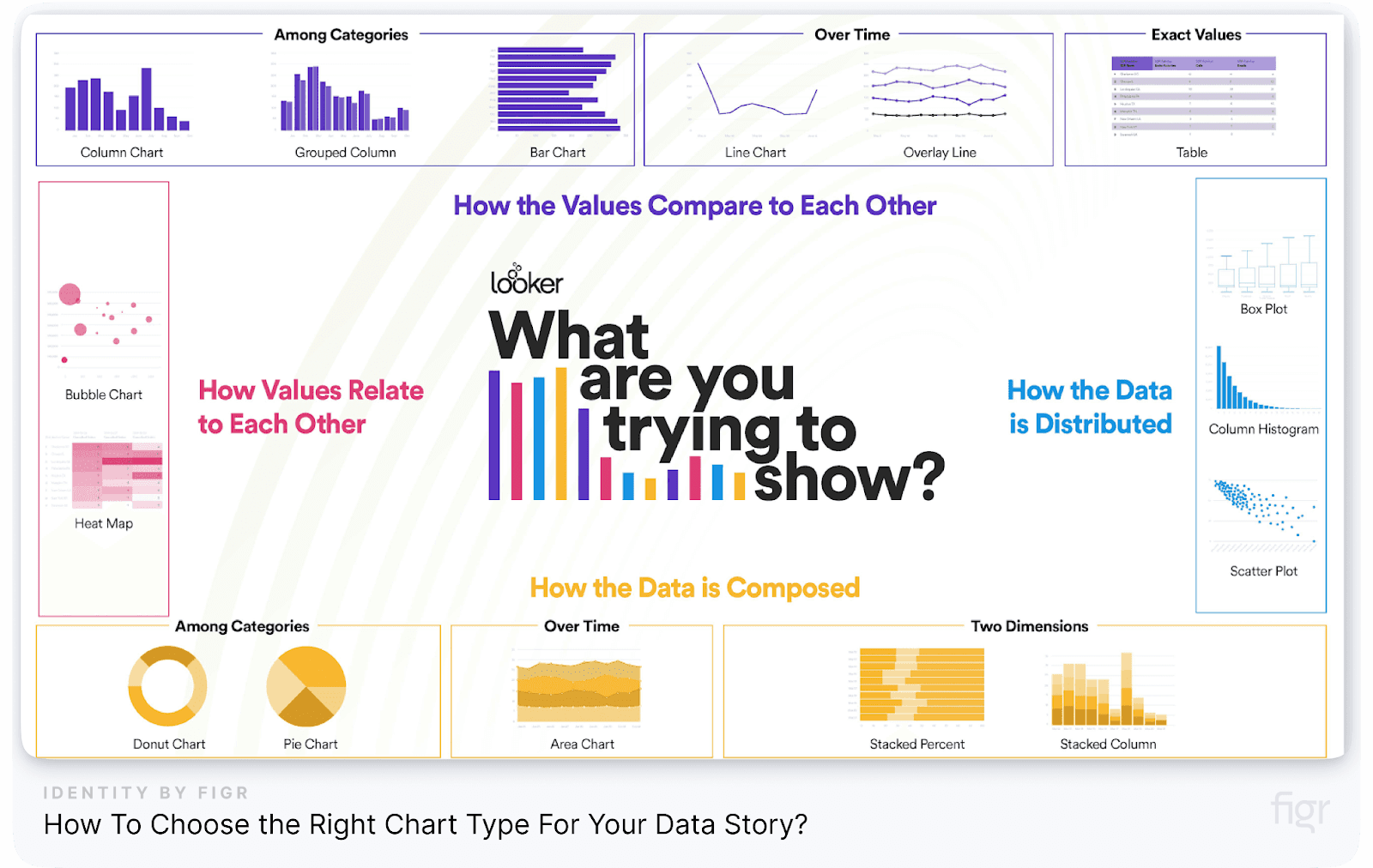
Choosing the right chart involves understanding the nature of your data and the message you want to convey. Here’s a step-by-step guide to help you choose the right chart:
- Identify the Data Type:
- Is your data categorical, continuous, or both?
- Do you want to compare, show composition, distribution, or relationships?
- Determine the Objective:
- What question are you trying to answer with your data?
- Do you want to show trends, patterns, or correlations?
- Consider Your Audience:
- How familiar is your audience with the data?
- Are they technical or non-technical users?
- Select the Appropriate Chart Type:
- Use a bar or line chart for comparison.
- Use a pie or stacked bar chart for composition.
- Use a histogram or box plot for distribution.
- Use a scatter plot or bubble chart for relationships.
- Validate with Usability Testing:
- Test different chart types with a small group of users to see which one communicates the data most effectively.
Table: Chart Selection Guide
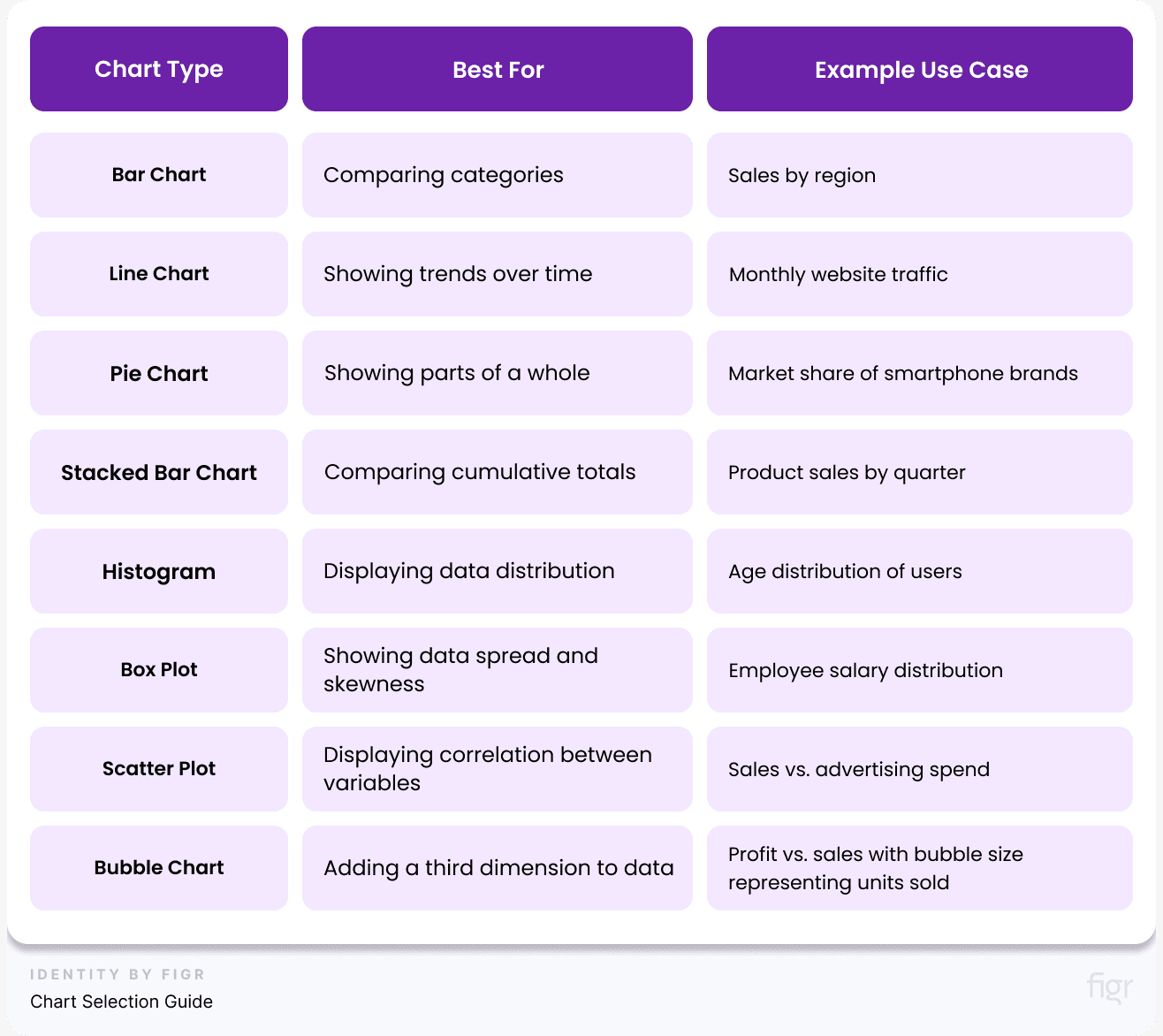
Tip: Avoid cluttered visuals. Each chart should serve a clear purpose and align with the narrative of your data story.
Common Mistakes to Avoid When Choosing Charts
- Using Pie Charts with Too Many Categories: Pie charts are best for showing a few segments. More than 4-5 categories can make them hard to read.
- Using Line Charts for Non-Continuous Data: Line charts should only be used for data that flows continuously, like time series data. Avoid using them for categorical data.
- Overcomplicating Scatter Plots: Adding too many variables or data points can make scatter plots confusing. Keep them simple and focused.
- Ignoring Accessibility Needs: Avoid using color alone to distinguish data points. Always include text labels or markers to make charts accessible.
The Best Practices for Using Charts in Dashboards
- Keep It Simple: Choose charts that are easy to understand at a glance. Avoid overloading them with too much information.
- Use Consistent Colors: Use a consistent color scheme that aligns with your brand and makes it easy to distinguish between different data sets.
- Label Clearly: Always include clear labels for all data points, axes, and chart elements.
- Test for Clarity: Conduct user testing to ensure that the charts are easily understood by your target audience.
A Very-Useful Checklist for Choosing the Right Chart:
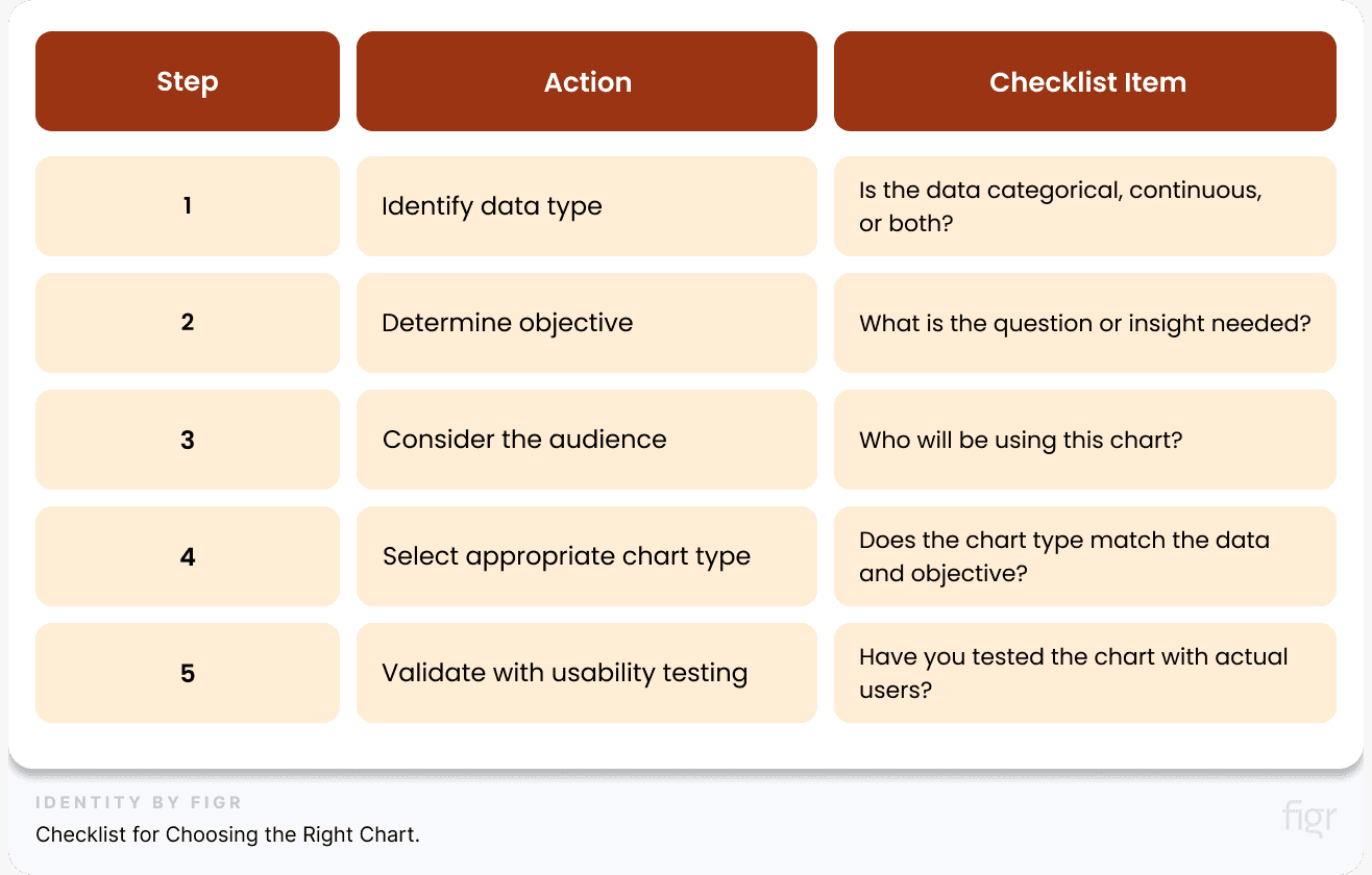
By carefully choosing the right chart type, you can effectively communicate your data story and help users gain valuable insights.
That’s a whole mini masterclass on choosing the perfect chart type for your data story, now let’s talk about how to choose the right visual for your data story because charts are just one part of it.
How to Choose the Right Visuals for Your Data Story
Like I said, charts are just one piece of the puzzle. To truly make your data story impactful, you need to choose the right visuals that complement your charts and help convey your message effectively.
From using icons and images to enhance understanding to applying color coding and annotations for added context—let’s explore how to choose the right visual elements to elevate your data storytelling to the next level.
- Identify Your Data Story:
- What is the main message you want to convey? Is it a trend over time, a comparison between categories, or the relationship between variables? Your visual should reflect this narrative.
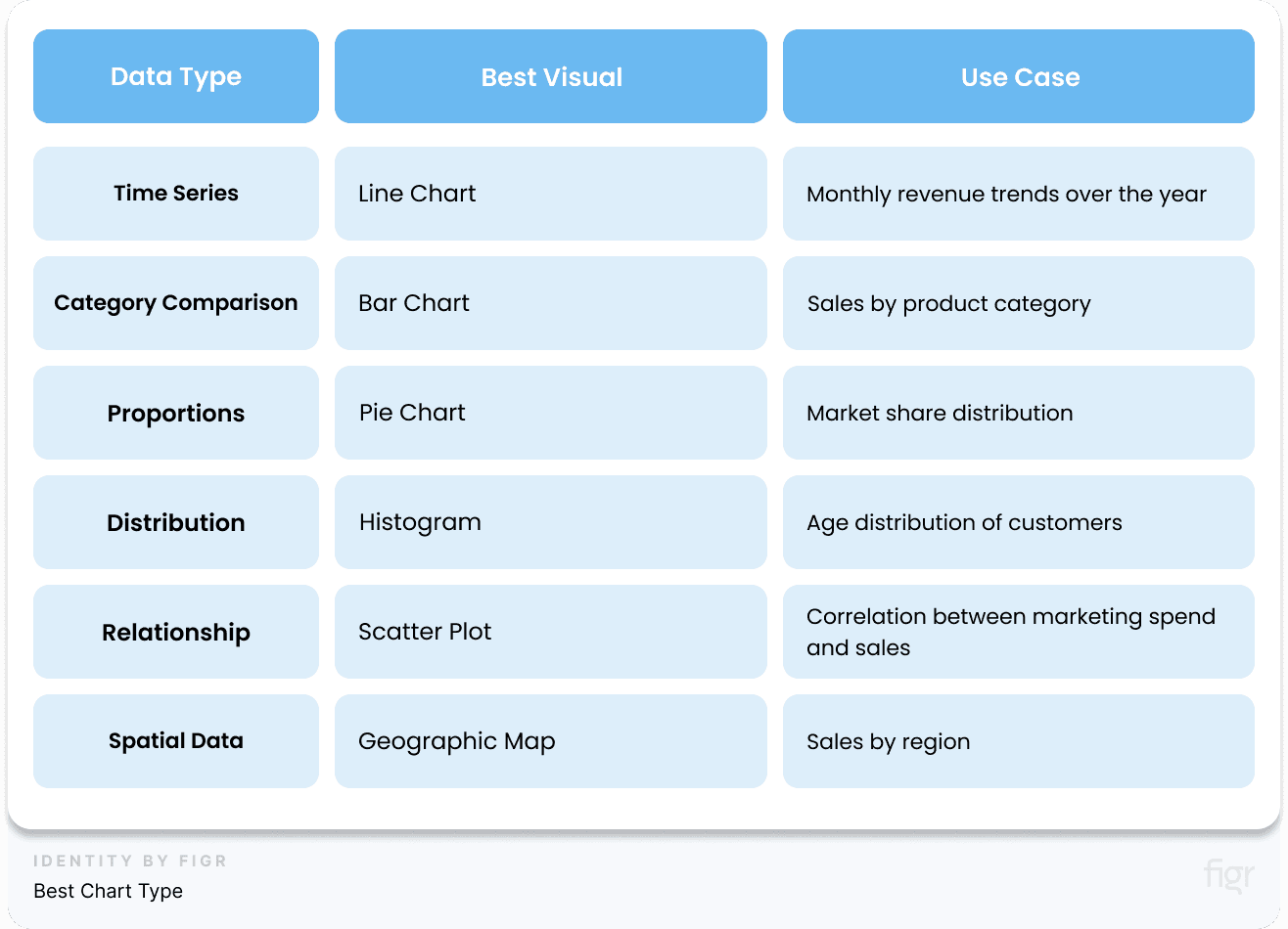
- Example: If you want to show sales trends over time, use a line chart. If you’re comparing the sales performance of different products, a bar chart would be more appropriate.
- Determine the Best Chart Type:
- Simplify Complex Data:
- Break down complex data into simpler visuals. Use filters, drill-downs, or multiple small charts instead of one large, complicated visual.
- Example: Instead of using a single cluttered scatter plot, break it down into smaller charts, each highlighting a different variable relationship.
- Utilize Visual Cues:
- Use color coding, icons, and labels to guide the viewer’s eye and emphasize key insights. (We’ll explore this in more detail in Step 4)
- Example: Use red and green colors to indicate negative and positive trends, respectively.
Real-World Examples of Effective Data Visuals:
Tesla’s Sales Performance Dashboard: Tesla employs geographic maps to show sales performance by region. This helps stakeholders quickly identify top-performing areas and regions that need more focus.
The Role of Color and Design in Storytelling
Color and design are powerful tools in data storytelling. Visual cues and color coding are essential elements in dashboard design as they guide users' attention and help them quickly interpret complex data.
They reduce cognitive load by providing a visual shorthand for understanding data trends, status, and actions that need to be taken. Think of them as signposts that guide users through the information presented on the dashboard, making it more accessible and actionable.
- Use Color to Highlight Key Insights: Use a consistent color scheme to differentiate between various data sets. And use colors that convey specific meanings, such as green for success or positive trends, red for errors or negative trends, and yellow for warnings.
- Apply Visual Hierarchy: Place the most critical data points and insights prominently on the dashboard. Use size and position to direct attention.
- Utilize Color Gradients for Data Intensity: Apply color gradients to show the intensity or magnitude of data. Darker shades can represent higher values, while lighter shades indicate lower values.
- Ensure Consistency with Design Tokens: Design tokens, like those generated by Figr Identity, ensure that your visual elements remain consistent across different dashboards and reports. This consistency helps in maintaining a cohesive visual narrative.
“Good design is as little design as possible. Make the complex simple, not the simple complex.” – Dieter Rams
Supercharge Your Data Storytelling with Figr Identity:
Figr Identity allows you to effortlessly create and customize your dashboard’s design elements, ensuring your data story is clear, compelling, and consistent. With features like automated design token generation and preset templates, Figr Identity takes the complexity out of design so you can focus on crafting a powerful narrative.
Whether you’re showcasing sales trends or operational efficiency, Figr Identity ensures that your story is visually stunning and easy to follow.
Figr Identity doesn’t just simplify design—it empowers you to tell stories that resonate and inspire action and by following these best practices you can create dasboards that look good but also drive better decisions.
Step 5: Design the Dashboard Layout and UI
A compelling data story needs a well-designed stage to shine. It involves a meticulous balance between aesthetics, functionality, and user experience.
An intuitive, visually appealing design helps users focus on what matters most and makes it easier to draw actionable insights.
Also, a well-structured dashboard layout ensures that the right information is presented in the right way, allowing users to extract valuable insights quickly and easily. Below are the key principles to consider when designing a dashboard layout and UI.
Key Principles of Dashboard Layout and UI Design
1. Clarity and Simplicity: Use a minimalist design approach to avoid overwhelming users. Remove any unnecessary elements that don't contribute to understanding the data.
Example: Apple’s product dashboards are known for their clean and minimalist design, focusing on core metrics and visuals without unnecessary clutter.
2. Visual Hierarchy: Arrange elements in a way that guides the user’s eye to the most important information first.
3. Consistent Alignment: Keep your layout clean and organized by aligning elements consistently. Also, maintain consistent use of colors, fonts, and chart types throughout the dashboard. This helps users quickly understand and navigate the dashboard.
4. White Space: Use white space strategically to separate different sections and make the dashboard more digestible. Ensure there’s enough spacing between elements to prevent a cramped appearance and enhance readability.
5. Responsive and Adaptive Design: Design dashboards that adapt to different screen sizes, ensuring usability across devices.
6. Guided Interactions and Tooltips: Use tooltips, legends, and labels to provide additional context for complex data points. This helps users understand the data without cluttering the layout.
To streamline the design process and ensure your dashboards adhere to these principles, consider using Figr Identity. With Figr, you can create a cohesive design system in minutes, using pre-built templates and design tokens that align with these best practices.
It’s a game-changer for designers looking to create efficient, visually appealing, and user-friendly dashboards without starting from scratch.
By implementing these principles, you can design dashboards that look great and also provide a seamless user experience, making it easier for users to derive insights and make data-driven decisions.
Creating an Intuitive Layout
An intuitive dashboard layout is key to helping users navigate complex data effortlessly. It ensures that information is accessible and comprehensible at a glance.
This section will explore the core principles of creating a layout that enhances usability and drives better decision-making.
1. Use Visual Hierarchy to Guide Users: Visual hierarchy helps prioritize information, making it easier for users to scan and understand the dashboard. Here’s how you can establish a strong visual hierarchy:
- Placement: Place the most critical information and metrics at the top left, as users' eyes naturally start there. Use larger fonts and bolder colors for key data points to draw attention.
According to Nielsen Norman Group, users spend 80% of their time viewing the left half of the screen and the top of the page. This highlights the importance of strategically placing the most critical information in these areas.
- Size and Scale: Use larger fonts and bigger visual elements for the most crucial data points to make them stand out. Conversely, use smaller elements for less important data. Tip: Reserve large, bold numbers for critical metrics like total sales or conversion rates, and use smaller, more detailed tables for additional data insights.
- Color Contrast: Apply color strategically to differentiate between various data types and highlight critical information. Use high-contrast colors for essential data points and muted colors for background or supporting elements.
- Typography and Text Styles: Use typography to establish a hierarchy in text elements. Bold and larger text sizes for headings, subheadings, and key data points help create a clear visual structure.
- Visual Cues: Incorporate visual cues like arrows, lines, or borders to guide users through the flow of information on the dashboard. This helps direct attention and clarifies the relationship between different data points.
- Consistent Alignment: Align charts, tables, and text consistently to create a clean and organized look.
- Logical Grouping: Group related metrics together to help users find relevant information quickly. Use sections, borders, or background colors to visually separate different groups of information and add clear and concise titles to each group to help users understand what the data represents.
Example: In an e-commerce dashboard, place key performance indicators (KPIs) like total sales or average order value prominently at the top, with supporting data like traffic sources or customer demographics grouped nearby.
Use Figr Identity’s pre-designed templates to make it easy to implement visual hierarchy in your dashboards. With customizable design tokens and elements, you can quickly create a visually appealing and well-structured layout that ensures users focus on the most critical data first.
2. Align and Space Elements Consistently: Consistent alignment and spacing are crucial for creating a clean, organized dashboard that’s easy to navigate. Proper alignment ensures that elements are visually connected, reducing cognitive load and enhancing the user experience. Here are some tips to align and space your elements consistently:
- Grid System: Use a grid system to align elements uniformly. This provides a structured layout where all visual elements are evenly spaced and aligned, making the dashboard look professional and cohesive.
- Equal Spacing: Maintain equal spacing between elements such as charts, text, and images. Consistent spacing prevents the dashboard from appearing cluttered and makes it easier for users to process information. Tip: Set a standard margin and padding for all elements to maintain uniformity throughout the dashboard.
- Alignment: Align charts, tables, and text to create a clean, structured appearance. Use alignment guides to ensure that all elements are aligned along a common axis, whether vertically or horizontally. This creates a sense of order and helps users follow the data flow more naturally.
One Product For Every Use Case: Figr Identity's design system setup also includes alignment and spacing guides to help you create well-organized dashboards effortlessly. Use Figr to standardize your design elements, ensuring consistency across all your dashboard layouts
Enhancing Usability with UI Elements
With a well-structured layout in place, it's time to focus on the finer details that can make or break user experience—leveraging UI elements to enhance usability.
User Interface (UI) elements such as buttons, filters, and icons play a crucial role in guiding users through the dashboard, making complex data interactions feel simple and natural.
Let’s dive into how you can enhance usability by strategically integrating these UI elements.
1. Using Buttons, Icons, and Tooltips: Icons, buttons and tooltips can significantly enhance the usability of a dashboard by providing additional context and guiding users through their data journey.
These elements help reduce visual clutter while still delivering the necessary information. Here’s how to use them effectively:
- Buttons: Use buttons for interactive elements like filtering data or navigating between different dashboard views. Make them prominent and intuitive.
- Icons: Use intuitive icons to represent common actions or data categories. For example, a magnifying glass icon for search or a gear icon for settings. This visual shorthand helps users quickly understand what actions they can take.
- Tooltips: Tooltips provide supplementary information without cluttering the dashboard. Hovering over an icon or data point can reveal details such as definitions, calculations, or source data. Tip: Use tooltips to explain complex metrics or to provide additional insights that would otherwise take up too much space on the dashboard.
- Figr Identity offers pre-designed icon sets and tooltip components that seamlessly integrate into your dashboards. These elements can be customized to match your design system, ensuring a cohesive look and feel.
Example: In a marketing dashboard, you can use icons to differentiate between different social media platforms, and tooltips to provide more information about each platform’s performance metrics.
2. Incorporating Interactive Filters and Drill-Downs: Interactive filters allow users to customize the data displayed on the dashboard, enabling them to focus on what matters most to them. This flexibility is vital for dashboards serving multiple user roles or data analysis needs.
- Interactive Filters: Use dropdowns, sliders, or checkboxes to let users filter data based on time period, category, or other dimensions.
- Drill-Downs: Allow users to click on a data point to explore more detailed information. For example, clicking on a sales figure could show a breakdown by product or region.
Example: A sales dashboard could have a filter to view sales by month, product category, or region. Users could also click on a product category to see a detailed breakdown of individual product performance.
By integrating these UI elements thoughtfully, you can significantly enhance the usability of your dashboards, making them more accessible, interactive, and user-friendly. This, in turn, leads to more effective data-driven decision-making and a better overall user experience.
The Best Practices for Dashboard UI Design
Now that we’ve explored the importance of UI elements in enhancing usability, let's delve into the foundational principles that guide effective dashboard UI design.
By following these best practices for dashboard UI design, you can craft a dashboard that is not only visually appealing but also intuitive and powerful in delivering insights.
1. Use Color Intentionally: Colors play a significant role in making your dashboard visually appealing and easy to navigate. However, using too many colors can lead to confusion. Follow these best practices:
- Limit the Color Palette: Use a maximum of 3-5 colors to maintain a clean and cohesive look.
- Use Color Wisely: Apply colors to highlight important data and create visual contrast. Avoid using too many bright colors that can overwhelm users.
- Consistent Color Usage: Use the same color for similar data points across different charts. For instance, use the same shade of blue for revenue metrics and the same shade of green for growth metrics.
- Accessibility Considerations: Ensure that your color choices are accessible to users with color blindness. Tools like the Color Contrast Checker can help verify color accessibility.
The Web Content Accessibility Guidelines (WCAG) recommend a minimum contrast ratio of 4.5:1 for normal text and 3:1 for large text to ensure readability source.
Example: Apple’s dashboard for monitoring product sales uses a minimalistic color palette of gray, blue, and green to keep the focus on the data rather than the design.
2. Maintain Consistency with Design Tokens: Design tokens, like those generated by Figr Identity, ensure that all your design elements remain consistent across different dashboards and projects. Design tokens act as reusable building blocks for elements like colors, fonts, and spacing.
- Consistency Across Projects: By using design tokens, you can ensure that your UI elements remain consistent across all your dashboards.
- Ease of Updates: Updating a design token automatically updates all instances where that token is used, ensuring that your design stays consistent even when changes are made.
With Figr Identity, you can generate and manage design tokens effortlessly, ensuring that every aspect of your dashboard design is aligned with your brand guidelines.
Common Pitfalls to Avoid To When Designing The Dashboard
While designing the layout and UI of your dashboard, be mindful of these common mistakes:
- Overloading with Information: Avoid placing too much information on a single screen. Use tabs or drill-downs to distribute data.
- Inconsistent Design Elements: Ensure that all design elements, like colors and fonts, are consistent across the dashboard.
- Neglecting Responsiveness: Make sure your dashboard is responsive and functions well on different devices, especially mobile.
Ready to create a user-friendly, visually appealing and a dashboard that is accessible to everyone? Let’s move on to Step 5: Ensuring Accessibility and Inclusivity
Step 6: Ensure Accessibility and Inclusivity
Creating a dashboard that is accessible and inclusive is not just a good practice—it’s essential for ensuring that everyone, regardless of their abilities, can interact with and benefit from your data.
By prioritizing accessibility and inclusivity, you make your dashboard usable for a wider audience, including people with disabilities, different cultural backgrounds, and varying levels of technical expertise. An accessible dashboard enables:
- Equal Access: Everyone can use the dashboard regardless of their physical or cognitive abilities.
- Compliance with Standards: Meeting accessibility guidelines like the Web Content Accessibility Guidelines (WCAG) helps you avoid legal risks and enhances your brand reputation.
- Improved User Experience: Accessible designs are often more user-friendly for everyone, not just people with disabilities.
Key Accessibility Considerations for Dashboard Design
When designing an accessible dashboard, consider the following key aspects:
1. Color Contrast and Perception:
- Ensure High Contrast Ratios: Use colors that have a high contrast ratio (at least 4.5:1) between the background and foreground elements to make text and visuals easily readable. Tools like WebAIM’s Contrast Checker can help verify compliance.
- Avoid Reliance on Color Alone: Don’t use color alone to convey information. For example, using red for negative values and green for positive values might not be clear for users with color blindness. Supplement with icons or text labels.
Example: In a financial dashboard, use both color and symbols (like ▲ for increase and ▼ for decrease) to represent stock performance. This ensures that users who cannot perceive color differences can still understand the data.
2. Keyboard Navigation and Focus Management
- Enable Keyboard Navigation: Ensure that all interactive elements, such as buttons, dropdowns, and sliders, are accessible via keyboard navigation. Users should be able to move through the dashboard using the Tab key and interact with elements using Enter or Spacebar.
- Focus Indicators: Use clear focus indicators to show which element is currently selected. This helps users who rely on keyboards to navigate the dashboard easily.
Tip: Test your dashboard using only a keyboard to ensure that all features can be accessed and operated without a mouse.
3. Screen Reader Compatibility
- Use Semantic HTML Elements: Use proper HTML elements (e.g., <header>, <main>, <footer>, <nav>) to define the structure of your dashboard. This helps screen readers understand the layout and content hierarchy.
- Aria Labels: Use ARIA (Accessible Rich Internet Applications) labels to provide additional context for screen reader users. For example, use aria-label to describe the purpose of a button or input field.
Example: For a dropdown filter, use the aria-label="Filter by Date" attribute to let screen reader users know the purpose of the dropdown.
Designing for Inclusivity
Inclusivity goes beyond accessibility and ensures that your dashboard can be used by people from diverse cultural, linguistic, and educational backgrounds.
1. Multilingual Support:
- Language Options: Provide language options for users who speak different languages. This can be done using a language selector that allows users to switch between supported languages.
- Right-to-Left (RTL) Support: If your audience includes users who read from right to left (e.g., Arabic or Hebrew speakers), ensure that your dashboard layout can adapt to RTL text alignment.
Example: Google Analytics offers dashboards in multiple languages and supports RTL languages, making it accessible to users worldwide.
2. Simplifying Complex Data:
- Use Plain Language: Avoid jargon and complex terminology. Use simple, straightforward language that is easy to understand for all users.
- Tooltips and Explanations: Provide tooltips or explanatory text to clarify complex metrics or data points. This helps users who may not be familiar with certain terms or concepts.
With Figr Identity, you can create clear and consistent labels and descriptions across your dashboard elements, making your design more inclusive and easier to understand for all users.
The Best Practices for Ensuring Accessibility and Inclusivity
After understanding the key accessibility considerations, let’s explore the best practices that will help you implement these principles effectively, ensuring your dashboard is truly inclusive for all users.
1. Use Accessible Color Palettes: Choosing the right color palette is essential for both accessibility and brand consistency. Use products like Figr Identity to generate accessible color palettes that meet contrast requirements and align with your brand identity.
Figr Identity can generate a range of color variations for your brand colors, ensuring that your dashboard remains accessible without sacrificing visual appeal.
2. Provide Alternatives for Visual Content: Not all users can interpret visual data. Provide text alternatives and descriptions for charts, images, and other visual content.
- Alt Text for Images: Use descriptive alt text for images, especially those that convey critical information.
- Text Descriptions for Charts: Include a brief text summary of the key takeaways from each chart or graph.
Example: For a bar chart showing monthly sales, include a text description like, “Sales increased steadily from January to March, peaking at $50,000.”
3. Test with Real Users: Conduct user testing with people who have disabilities to identify potential barriers and make necessary adjustments.
- Invite Feedback: Encourage users to provide feedback on the dashboard’s usability and accessibility.
- Iterate and Improve: Use the feedback to make iterative improvements to your dashboard design.
A study by Forrester (a paid report) found that every $1 invested in user experience (UX) yields a return of $100; That 9,900 ROI! This shows that ensuring accessibility and inclusivity is a key part of delivering a positive UX.
Real-World Examples of Accessible Dashboards: BBC Accessibility Dashboard
- High Contrast Mode: The BBC’s accessibility dashboard features a high-contrast mode that makes text and visual elements easier to read.
- Keyboard Navigation: All interactive elements are accessible via keyboard navigation, and clear focus indicators guide users through the dashboard.
- Screen Reader Support: The dashboard uses semantic HTML and ARIA labels to provide a seamless experience for screen reader users.
Step 7: Iterate and Improve Based on Feedback
After doing the meticulous process of documenting and managing your dashboard design, it’s time to embrace a culture of continuous improvement. Iteration is not just about making changes; it’s about refining your dashboard based on user feedback and evolving business needs.
This step is crucial to ensuring that your dashboard remains relevant, effective, and aligned with the goals of your organization.
Why Iteration is Crucial?
No matter how well-designed your initial dashboard is, it’s unlikely to be perfect on the first try. User needs evolve, business priorities shift, and new data sources become available.
Regularly revisiting and refining your dashboard based on user feedback ensures that it remains a powerful tool for decision-making. Some of the key benefits of iteration are:
- Adaptability: Allows the dashboard to evolve with changing business needs and user expectations.
- User Satisfaction: Incorporating user feedback enhances usability and effectiveness, leading to higher user satisfaction and engagement.
- Data Accuracy: Regular updates help maintain data accuracy and relevance, ensuring users are making informed decisions.
Gathering Feedback: Methods and Best Practices
Effective iteration begins with collecting meaningful feedback from your dashboard users. There are several methods you can use to gather insights, each with its own advantages.
1. User Surveys and Questionnaires: Create surveys with specific questions about the usability, design, and functionality of the dashboard. Use tools like Google Forms, Typeform, or SurveyMonkey to collect responses efficiently.
Key Questions to Ask:
- How often do you use the dashboard?
- Are there any metrics or features you find confusing or difficult to use?
- What additional data or features would make the dashboard more useful for you?
- How would you rate the overall usability of the dashboard on a scale of 1-10?
Example: A retail company like Amazon might ask its sales team whether the current sales dashboard provides enough insights on seasonal trends, or if additional metrics like competitor pricing data would be valuable.
2. Direct User Interviews: One-on-one interviews allow for more in-depth feedback. You can ask users to walk you through their experience using the dashboard, highlighting any pain points or areas for improvement.
Best Practices:
- Prepare a list of open-ended questions.
- Encourage users to share their screens and demonstrate how they interact with the dashboard.
- Record the session (with permission) for later review and analysis.
Example: A finance company like Goldman Sachs might conduct interviews with financial analysts to understand their challenges in navigating the dashboard during high-pressure situations like market volatility.
3. Usability Testing: Usability testing involves observing users as they complete specific tasks on the dashboard. This method helps identify usability issues that may not be evident through surveys or interviews.
Steps for Usability Testing:
- Define Test Scenarios: Identify key tasks users should be able to complete, such as finding a specific KPI or generating a report.
- Select Participants: Choose a diverse group of users representing different roles and experience levels.
- Observe and Record: Watch how users interact with the dashboard, noting any difficulties or confusion.
Example: A healthcare provider like Mayo Clinic might use usability testing to see if their medical staff can easily access patient data and generate reports for various health metrics.
Use Figr Identity to quickly implement changes and test new iterations of your dashboard based on user feedback. Figr Identity can help you adjust color schemes, update design tokens, and modify components without disrupting the overall design.
Implementing Changes
Once you’ve gathered feedback, the next step is to prioritize and implement changes. Not all feedback can be addressed immediately, so it’s important to focus on the most impactful improvements first.
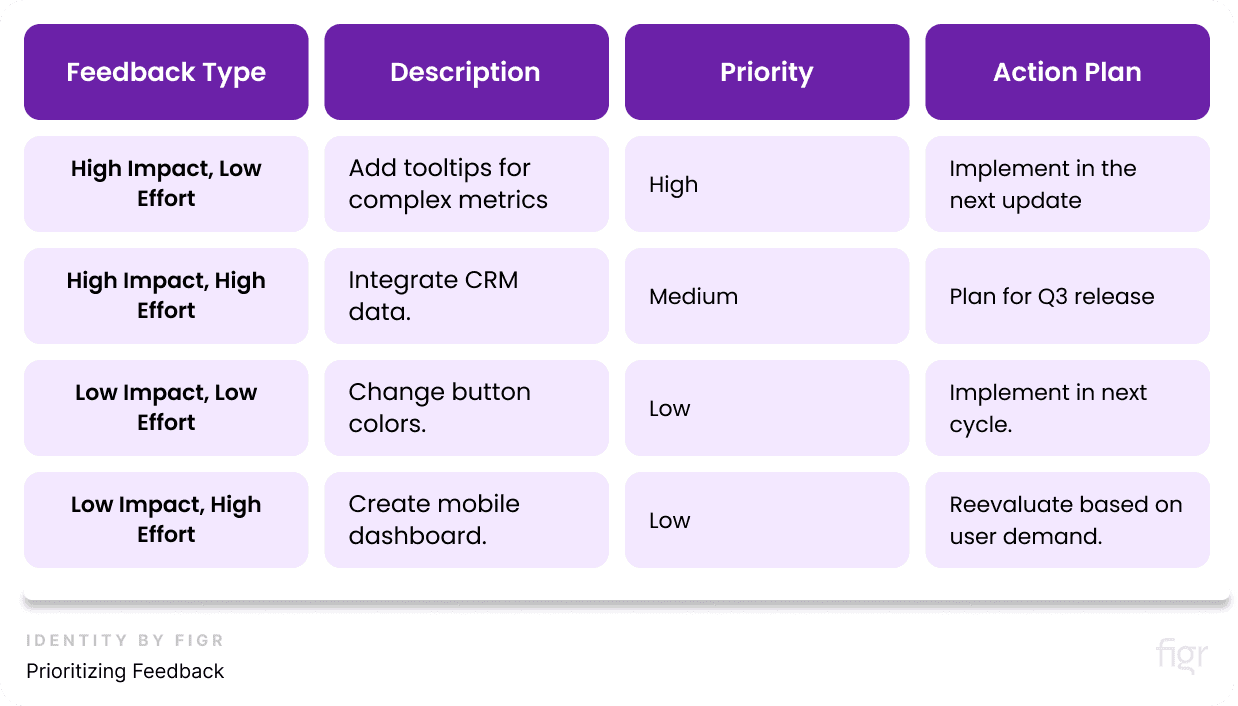
1. Prioritizing Feedback:
- High Impact, Low Effort: Start with changes that significantly improve user experience but require minimal effort, such as updating labels or adding tooltips.
- High Impact, High Effort: These are major changes that require more resources, such as adding new data sources or overhauling the layout. Plan these for future releases.
- Low Impact, Low Effort: Small tweaks that improve aesthetics or usability but don’t have a huge impact. Consider implementing these as time permits.
- Low Impact, High Effort: These changes are typically not worth the investment unless they are critical for a specific user group.
Example of Prioritizing Feedback:
2. Making Iterative Changes
- Start Small: Implement small, incremental changes to test their impact before making larger updates.
- Test and Validate: Use A/B testing to compare the effectiveness of new features or design changes.
- Document Changes: Keep a detailed changelog to track what modifications were made and why.
Example: A tech company like Microsoft might start by updating the font size and color contrast on their internal dashboards based on user feedback, before rolling out larger changes like new data visualizations.
Monitoring the Impact of Changes
After implementing changes, it's essential to monitor their impact to ensure they’ve improved the dashboard as intended. This involves both qualitative and quantitative analysis.
1. Quantitative Metrics
- User Engagement: Track metrics like login frequency, time spent on the dashboard, and the number of reports generated.
- Error Rates: Monitor error logs and user support tickets to identify any issues arising from the new changes.
- Performance Metrics: Check loading times and responsiveness, especially if new data sources or visualizations were added.
2. Qualitative Feedback
- User Surveys: Conduct follow-up surveys to gauge user satisfaction with the new changes.
- Direct Feedback: Encourage users to provide ongoing feedback through dedicated channels like email or Slack.
Example: After adding a new feature, Spotify might track how often users interact with it and conduct surveys to see if it improves their experience or not.
The Best Practices for Effective Iteration
- Create a Feedback Loop: Establish a continuous feedback loop where users can easily share their thoughts and suggestions.
- Be Transparent: Communicate the changes being made and why, to keep users informed and engaged.
- Stay Agile: Use agile methodologies to implement changes quickly and efficiently, adapting to new requirements as they arise.
- Leverage Automation: Use Figr Identity to automate the implementation and testing of design changes, ensuring consistency and accuracy.
Checklist for Iteration and Improvement:
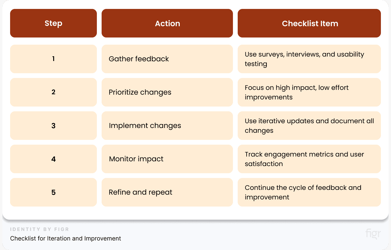
By continuously iterating and improving your dashboard design, you can create a dynamic tool that adapts to changing user needs and business goals, ultimately driving more informed and effective decision-making across your organization.
Conclusion
Dashboards have the power to transform complex data into clear, actionable insights. A well-designed dashboard serves as a navigational tool, guiding users through data landscapes to uncover trends, patterns, and opportunities that might otherwise remain hidden.
Whether you’re building dashboards for a small team or a global organization, the principles remain the same: understand your users, keep it simple, and focus on what truly matters.
Creating a cohesive and scalable dashboard design can be daunting, but it doesn't have to be. With Figr Identity, you have the power to streamline this process, ensuring consistency, efficiency, and top-notch quality across all your dashboard designs.
Whether you're generating design tokens, creating a color palette, or setting up a comprehensive design system, Figr Identity simplifies each step, helping you transform complex workflows into manageable tasks.
By automating repetitive processes and providing intuitive tools, Figr Identity enables you to focus on what truly matters—creating innovative and user-centred dashboard designs that elevate your brand.
Ready to take your design system to the next level? Say goodbye to data chaos and hello to streamlined, impactful dashboards, use Figr Identity today!


