
Credit: Mind Mash
Building a recognizable brand isn’t just about having a catchy logo or a clever tagline. It's about consistency. But for many companies, keeping their brand message and design consistent across various teams, platforms, and materials can feel like an overwhelming challenge.
Without a clear set of rules, even the best brands can end up looking disorganized, confusing their audience and weakening their brand’s identity.
This is why companies need a structured, clear brand guidelines style guide which acts as a roadmap, providing clear instructions on how your brand should be represented visually and verbally across all platforms.
In this blog, we’ll take you through a step-by-step process to create your brand guidelines style guide.
You’ll learn how to define your brand identity, set logo guidelines, establish a color palette, choose typography, and develop consistent messaging. Let’s get started!
What Is Brand Identity and Why Consistency Matters?
Credit: Grammarly
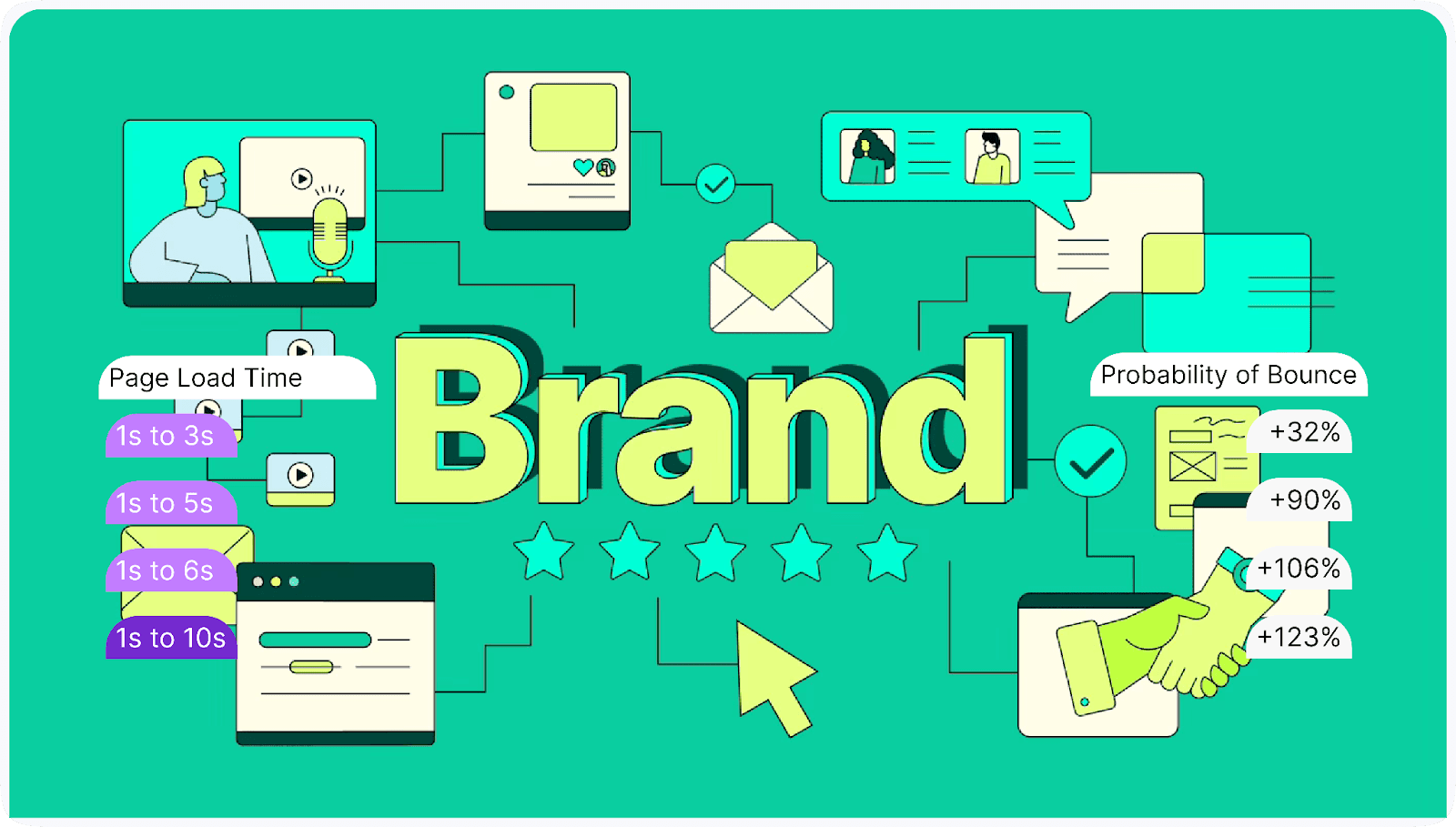
Brand identity goes beyond just your logo or color scheme. It’s the combination of every element that visually and emotionally represents your business to the world.
Your brand identity includes your company’s values, mission, tone of voice, and design choices, creating a unique personality that distinguishes you from competitors.
Why is Brand Identity Important?
A clear and strong brand identity is essential for helping your audience recognize, trust, and remember your business. It gives your brand a personality that customers can connect with. Here’s why it’s important:
- Builds recognition: A consistent identity makes it easier for customers to recognize your brand across different platforms.
- Inspires trust: A cohesive identity builds trust because customers know what to expect from your brand.
- Sets you apart: In a crowded market, a distinctive brand identity helps you stand out and communicate your unique value.
Want to see how leading brands define themselves? Explore Brandfolio.design, a collection of brand strategies and visual identities that highlights how successful brands establish their presence and resonate with their audiences.
Why Consistency is Key
Just think how you would feel when you see your favorite brand using a different logo or color scheme on every social media platform or website. It would be confusing, right?
This is why brand consistency is critical. Consistency ensures that every interaction a customer has with your brand—whether it’s on a billboard, in an email, or on Instagram—feels the same.
Without consistency, your brand risks appearing unprofessional and unreliable. Here’s how consistency benefits your brand:
- Improves brand recall: When your brand looks and feels the same everywhere, it becomes more memorable.
- Reinforces trust: Consistency shows professionalism, which reinforces the trust you’ve built with your audience.
- Enhances credibility: A uniform brand appearance signals reliability and quality, making your brand more credible in the eyes of consumers.
For example, top brands like Apple and Nike are masters at maintaining brand consistency. Apple’s sleek, minimalistic design and signature logo are instantly recognizable across all platforms—from their website to product packaging.
Nike’s iconic swoosh and “Just Do It” slogan remain consistent in their messaging, whether on a billboard or a social media post. This unwavering uniformity strengthens their brand identity, making them household names globally.
Now that we’ve explored why maintaining a consistent brand identity is so crucial, let’s dive into the practical steps you can take to create a brand guidelines style guide.
This guide will ensure that everyone, from designers to marketers, is on the same page, which strengthens your brand's presence and consistency across all platforms.
How to Create Your Brand Guidelines Style Guide Step By Step
Credit: U Brand
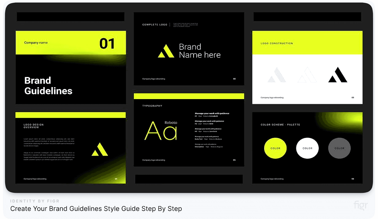
Creating a brand guidelines style guide is essential for ensuring consistency across all aspects of your brand.
Whether you’re defining your logo, color palette, typography, or voice, a comprehensive guide serves as a reference point for everyone involved in building and promoting your brand.
In this section, we’ll walk through practical, easy-to-follow steps to help you create a detailed brand guidelines style guide that ensures consistency and professionalism, even as your business grows.
Step 1: Define Your Brand Identity

Credit: Direct Lync
Before diving into the visual elements of your brand, it’s important to have a clear understanding of your brand identity.
This step is the foundation of your brand guidelines, as it outlines what your brand stands for and how you want to be perceived by your audience.
A well-defined brand identity ensures that every decision, from design to messaging, aligns with your brand's core values.
Here’s how you can define your brand identity:
- Brand Mission: What is the purpose of your brand? Why does it exist? This should be a clear and concise statement that defines the bigger reason behind your business.
- Vision Statement: Where do you see your brand in the future? Your vision reflects the long-term goals and aspirations for your company, and it should guide the tone and direction of all your branding efforts.
- Core Values: What are the guiding principles that drive your brand's decisions and behaviors? These values will help shape your brand's personality and should resonate with both your team and your customers.
- Target Audience: Who are you speaking to? Understanding your audience’s needs, challenges, and preferences is critical to ensuring that your branding resonates with the right people.
- Brand Personality: How do you want your brand to feel? Is it playful, professional, or bold? Defining the personality of your brand will help inform everything from your logo to the tone of your marketing content.

Nike’s Brand Identity
Example from Top Brands: Companies like Apple and Nike have crystal-clear brand identities. Apple focuses on innovation and simplicity, while Nike’s mission centers around empowerment and performance.
Their messaging, design choices, and customer interactions consistently reflect these core values, making their brands easily recognizable across the globe.
When defining your brand identity, products like Figr Identity can be extremely helpful. Figr Identity allows you to generate design systems with preset tokens for typography, color, and grids, making it easier to build a cohesive and scalable brand identity.
This ensures that every design choice is aligned with your brand’s mission, vision, and values, streamlining the process for designers and marketers alike.
With a clear understanding of your brand's identity in place, the next essential step is to ensure your logo—the visual cornerstone of your brand—reflects that identity consistently and effectively. Let’s move on to setting the guidelines for your brand’s logo.
Step 2: Develop Your Logo Guidelines
Credit: Ebaq Design
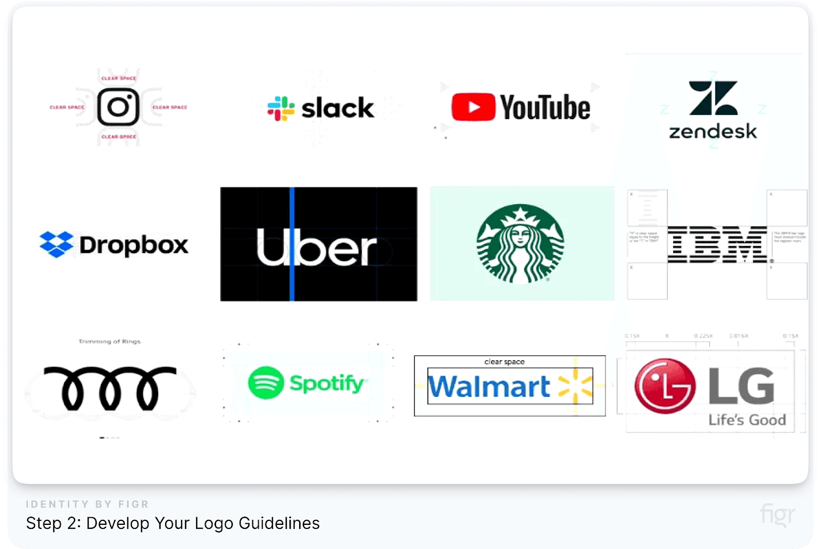
Your logo is the face of your brand—it's often the first thing people associate with your business. Having clear guidelines for how your logo should be used ensures consistency and helps maintain a professional image across all platforms.
Without defined rules, logos can be altered, stretched, or misused in ways that dilute your brand identity. This step will help you ensure that your logo is always presented in the best possible light.
Key elements to include in your logo guidelines:
- Logo variations: Specify the different versions of your logo (e.g., full logo, icon-only version, horizontal and vertical layouts). Include clear instructions on when to use each version.
- Clear space and padding: Define the amount of space that should be maintained around your logo to ensure it remains legible and uncluttered in various layouts.
- Minimum size: Establish the smallest acceptable size for your logo in both print and digital formats to prevent it from becoming unreadable.
- Color usage: Provide specific color codes (HEX, RGB, CMYK) for your logo in both its full-color and monochrome variations. Specify when to use the primary version versus black-and-white or reversed logos.
- Unacceptable modifications: Show examples of what not to do with your logo, such as stretching, changing colors, or adding effects like shadows or gradients.
By setting clear logo guidelines, you ensure that your brand identity remains cohesive, no matter where or how your logo is displayed.

Figr Identity helps streamline this process by allowing you to set design systems for logo use, enabling faster, consistent application across all brand assets.
Whether you're defining color schemes or clear space, Figr Identity ensures that your logo is consistently applied across your design system, maintaining a cohesive and professional appearance.
With your logo guidelines in place, let’s explore how to establish the right color palette for your brand in the next step.
Step 3: Establish Your Brand’s Color Palette

Credit: Jo Agency
Your brand’s color palette plays a critical role in creating visual recognition and setting the mood for your brand.
Colors can evoke emotions, influence decisions, and help differentiate your brand from competitors.
A consistent color palette ensures that no matter where your brand appears—on social media, in a brochure, or on your website—your audience will instantly recognize it.
How to create and use your color palette:
- Primary colors: These are the key colors that define your brand's identity. They should dominate your most prominent assets, such as your logo, website, and packaging, ensuring a consistent and recognizable brand presence.
- Secondary colors: Secondary colors support the primary colors and offer more flexibility. These can be used for backgrounds, accents, or in places where your primary color might not work as well.
- Tertiary colors: These colors are used sparingly, often for accents or to provide contrast. They should complement your primary and secondary colors without overshadowing them.
- HEX, RGB, HSL and CMYK codes: For every color in your palette, include the specific HEX (for digital use), RGB (for screen displays), HSL (hue, saturation and luminosity) and CMYK (for printing) codes to ensure consistent color reproduction across platforms.
- Color combinations: Provide examples of how the colors should (and should not) be combined. This helps avoid clashes and ensures a harmonious look.
- Accessibility considerations: Make sure your color palette is accessible for users with color blindness or vision impairments. Tools like contrast checkers can help ensure text is readable against background colors.
A carefully chosen color palette ensures brand cohesion, enhances recognition, and strengthens your brand’s presence across all platforms.
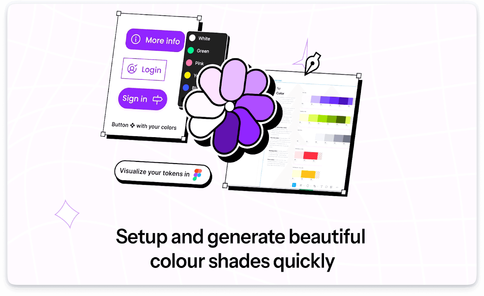
When building your brand's color palette, consistency is key. That's where Figr Identity can make the process seamless.
With Figr Identity’s instant token generation, you can create color tokens that maintain accuracy across all platforms, ensuring that your brand's color codes—whether RGB, HEX, or CMYK—are applied consistently throughout your projects.
This feature allows designers to set and share a precise palette instantly, helping your team stay aligned with your brand’s visual identity at all times.
With your brand's color palette in place, the next crucial element to consider is typography. Just like colors, the fonts you choose communicate your brand's personality and impact readability.
Step 4: Choose Typography That Matches Your Brand

Credit: Venngage
Typography plays a vital role in how your brand communicates visually. The fonts you choose can evoke emotions and convey your brand’s personality just as much as color or imagery.
Fonts, sizes, and spacing all contribute to how people perceive your brand, making it essential to get typography right for consistency and impact.
Here’s how to choose typography that fits your brand:
- Understand your brand's tone: If your brand is professional and corporate, you might want to choose clean, sans-serif fonts. For brands with a more artistic or casual approach, you might consider creative or handwritten fonts.
- Choose a primary and secondary font: Your primary font is used for headings, and the secondary font is typically for body text. Ensure that both fonts complement each other and align with your brand’s identity.
- Consider legibility: Your font should be easy to read on all platforms, whether it’s for print, web, or mobile. Test the fonts in different sizes to ensure clarity.
- Define font styles and weights: Specify how different font weights (like bold or regular) and styles (italic, underline) should be used for headings, subheadings, and body text. Consistency across platforms is key.
- Include font hierarchy: Establish a clear hierarchy for your typography. For example:
- Heading 1: Bold, 36pt
- Heading 2: Regular, 24pt
- Body text: Light, 16pt
Figr Identity makes managing typography a breeze. With its instant token generation feature, you can effortlessly create predefined typography styles, including font sizes, weights, and spacing for your brand.
Whether you're defining headers, subheaders, or body text, Figr Identity ensures that your fonts stay consistent across all platforms and design files. This saves time, reduces errors, and ensures that your brand’s voice is visually cohesive, no matter where it's seen.
With your typography in place, it’s time to focus on how your brand speaks. Let’s move on to the next crucial step: defining your brand’s voice and tone to ensure your messaging resonates consistently with your audience.
Step 5: Define Your Brand’s Voice and Tone
Your brand’s voice and tone go beyond the visuals—they shape how your audience feels when interacting with your business.
Whether it's through website copy, social media, or customer service, your voice and tone set the stage for how your brand is perceived.
This step ensures that every piece of communication stays true to your brand's personality, fostering trust and connection with your audience.
What is Brand Voice?
Brand voice refers to the distinct personality and style in which your brand communicates. It's the way you express your brand’s message and values.
- Voice: The unique personality of your brand that stays consistent across all channels.
- Tone: The way the voice adapts to different situations or emotions, depending on the message and audience.
Here’s How to Define Your Brand Voice and Tone:
- Identify Your Brand’s Personality: Start by thinking of your brand as a person. Ask yourself:
- What kind of language does my brand use?
- Does it speak formally or casually?
- Is it more humorous, or does it have a professional, authoritative tone?
- Choose 3-5 adjectives that describe your brand’s personality, such as:
- Friendly
- Confident
- Knowledgeable
- Playful
- Know Your Audience: Your brand voice and tone should resonate with your target audience. For example:
- A playful and casual tone might work best for a younger, tech-savvy audience.
- A more formal, authoritative voice is ideal for professional industries like finance or law.
- Adjust Tone Based on Context: While your brand voice remains consistent, the tone may vary depending on the context. For example:
- A social media post might use a light and informal tone, while a company blog post might take on a more educational and informative tone.
- Customer service interactions may require a more empathetic and supportive tone, especially when resolving issues.
By keeping your brand’s voice and tone consistent, you ensure a unified message across all touchpoints, whether you're sharing news on social media or communicating directly with customers.
Now that you’ve nailed down your brand’s voice and tone, let’s move forward to the next essential step: establishing image and data visualization guidelines to maintain consistency in your brand’s visual storytelling.
Step 6: Create Image and Data Visualization Guidelines
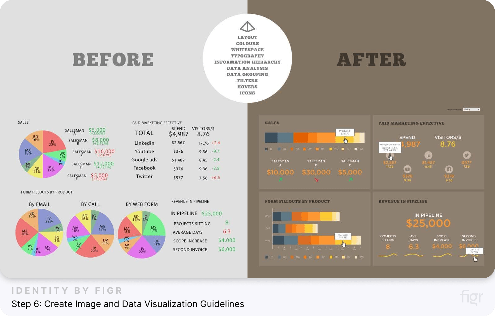
Credit: Datalabs Agency
Images and data visualizations are powerful tools for telling your brand’s story. Whether you're using product photos, infographics, or charts, consistency in your visuals is just as crucial as your brand’s logo or color palette.
Well-defined image and data visualization guidelines ensure that every visual element aligns with your brand identity, creating a cohesive look across all platforms.
Why Are Image and Data Visualization Guidelines Important?
Consistency in imagery helps your audience instantly recognize your brand. Without guidelines, your visuals can become disjointed, leading to confusion or a lack of brand recognition.
By creating specific rules around images and data visualizations, you ensure that:
- Your brand’s visuals reflect its personality and tone.
- All visuals are high-quality and visually aligned, whether for a website, social media, or internal presentations.
- Complex data is communicated clearly and engagingly through consistent chart styles, colors, and layouts.
Here’s How to Create Effective Guidelines for Images:
- Define Image Style: Outline the types of images that suit your brand’s tone. For example:
- Photography style: Does your brand use candid, lifestyle shots or more polished, professional photography?
- Color tones and filters: Should your photos use warm tones, natural light, or black-and-white filters?
- Subject matter: What types of images align with your brand? For example, a fitness brand might use action shots, while a tech company may feature sleek product images.
- Set Image Composition Rules: Provide clear guidelines for image layouts:
- Framing: Specify how close or far subjects should be within the frame.
- Backgrounds: Should images have clean, solid-colored backgrounds or environmental, contextual settings?
- Exclusion zones: Define any minimum spacing or exclusion zones for text overlay or logo placements on images.
- Define Usage Contexts: Set rules for when and where specific types of images should be used:
- Product photos for e-commerce listings
- Lifestyle images for social media
- Promotional banners for advertisements
Now that you’ve laid the foundation for a consistent and cohesive brand identity, the final step is ensuring your brand guidelines remain relevant and adaptable over time.
Let’s explore how to maintain and evolve your brand guidelines to keep your brand fresh and aligned with changing trends.
Step 7: Maintain and Evolve Your Brand Guidelines
Creating a brand guidelines style guide is just the beginning. Brands evolve, markets shift, and technology changes, which means your brand guidelines must stay up-to-date and aligned with your business growth.
Regularly maintaining and evolving your brand guidelines ensures your brand remains relevant and effective across all touchpoints.
Why Maintenance Matters:
Your brand guidelines should be a living document, adapting to new trends, technologies, and the evolving nature of your business.
Without regular updates, your brand could become outdated or inconsistent, which can weaken your overall brand identity.
Here’s How to Maintain and Evolve Your Brand Guidelines:
- Schedule periodic reviews: Set up regular check-ins (quarterly or annually) to evaluate whether your brand guidelines are still relevant and reflect your current market position.
- Gather feedback from your team: Encourage designers, marketers, and stakeholders to provide input on how the guidelines are being applied. Are there any gaps or areas where updates are needed?
- Stay updated with industry trends: Keep an eye on design trends, new technologies, and changes in customer preferences. Incorporating these trends can help keep your brand fresh while maintaining its core identity.
- Adjust based on your brand’s growth: As your business grows or expands into new markets, your guidelines may need to accommodate new products, services, or even cultural differences across regions.
- Keep digital versions accessible: Your team and external partners should always have easy access to the latest version of your guidelines. Digital formats ensure they are available in real time and can be updated as needed.
When creating or updating your brand guidelines, staying organized and efficient is key. Figr Identity is designed to simplify the process of building and managing your brand's visual identity.
From generating design systems to instantly creating scalable components, Figr Identity helps ensure that your brand guidelines are seamlessly integrated across your team.
Whether you need to standardize your color palette, set typography guidelines, or manage design tokens, Figr Identity makes the entire process faster and more accurate.
Streamline your brand's visual consistency with Figr Identity—your go-to tool for creating cohesive, production-ready brand guidelines.
Tools and Resources for Creating and Managing Brand Guidelines
Creating and managing brand guidelines requires the right set of tools to keep everything organized, accessible, and easily scalable.
Whether you're designing a logo, setting typography, or defining a color palette, these tools make the process easier and more efficient.
Let’s explore some of the best tools available.
1. Figma

Figma is a versatile and collaborative design tool that has quickly become a favorite among designers for creating and managing brand guidelines.
Its real-time collaboration feature allows teams to work together seamlessly on a single platform. From wireframes to detailed design systems, Figma provides everything you need to build and maintain brand consistency across all digital products.
2. Adobe Illustrator
Adobe Illustrator is widely used for creating detailed vector graphics like logos, icons, and typography.
It offers a solid set of tools for creating high-quality visuals that can be easily scaled without losing quality, making it ideal for designing brand assets.
3. Canva
For non-designers or teams looking for an easier, template-based approach, Canva provides an accessible platform to create simple brand elements.
Canva’s brand kit feature allows you to store your brand’s logo, colors, and fonts in one place, making it easy to apply them consistently to new designs.
4. Google Drive or Dropbox
For storing, organizing, and sharing your brand guidelines and assets, Google Drive or Dropbox are excellent options.
These cloud-based storage solutions ensure that everyone on your team can access the most updated version of the brand guidelines, regardless of location.
5. Zeroheight
Zeroheight is a documentation tool that integrates with design tools like Figma to create living style guides. It allows teams to document design systems, brand guidelines, and other UX/UI elements in one centralized place.
This ensures that everyone working with the brand has quick access to the latest guidelines.
6. Bynder
Bynder is a digital asset management tool that helps teams store, organize, and share their brand assets, such as logos, images, and videos.
It ensures that all marketing materials are on-brand and compliant with the brand guidelines.
Having the right tools makes a world of difference in creating and managing brand guidelines. Figma, paired with the Figr Identity plugin, offers the most powerful and flexible solution for managing every aspect of your brand’s visual identity.
Examples of Top Brand Style Guides
Looking at real-world examples of successful brand style guides can inspire your own.
Many global brands have mastered the art of creating cohesive and recognizable guidelines that ensure consistency across all their marketing channels, platforms, and products.
Let’s explore some of the most renowned brand style guides and see how they maintain brand identity so effectively.
1. Apple
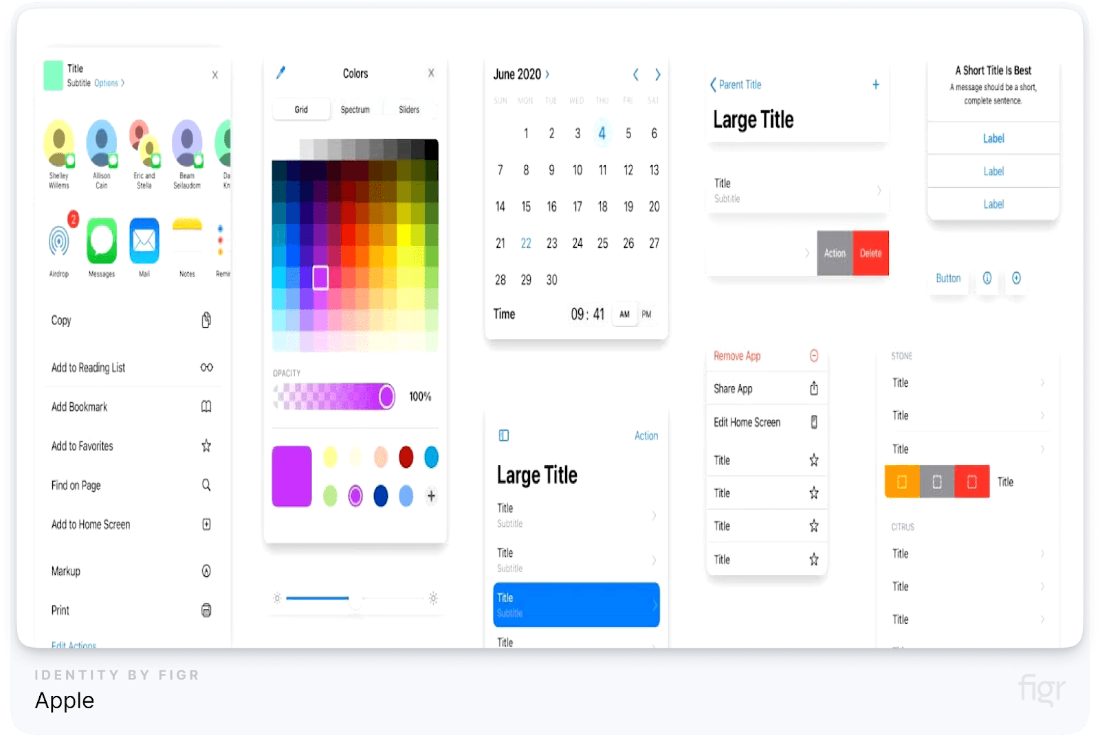
Apple’s brand style guide is a prime example of minimalism, simplicity, and consistency. Known for its clean, sleek design language, Apple uses a limited color palette and typography to convey a futuristic and user-friendly brand.
Their guidelines focus heavily on product imagery, whitespace, and the proper use of the iconic Apple logo.
Key highlights from Apple’s brand style guide:
- Strict logo usage guidelines: Apple’s logo is never altered or crowded with other elements.
- Minimalist typography: Apple uses a clean, legible font, San Francisco, across all its products and marketing.
- Product imagery focus: Photos of Apple products follow strict guidelines to highlight the sleek, modern design.
2. Nike
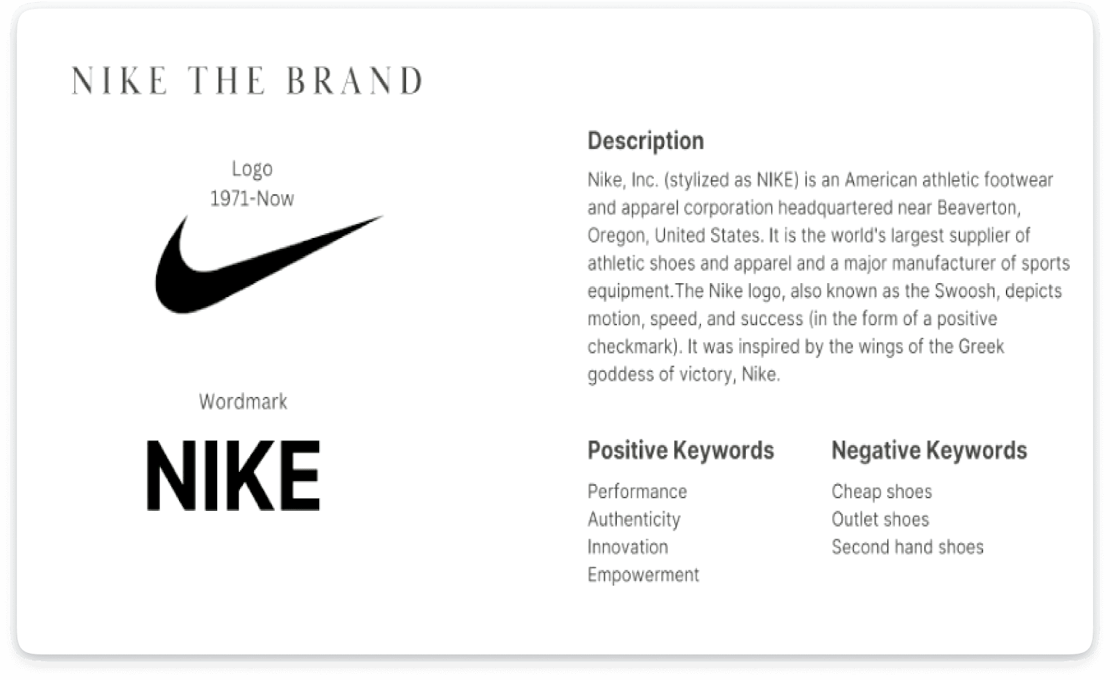
Nike’s brand style guide revolves around energy, movement, and empowerment. Their "Just Do It" slogan is synonymous with motivation, and their branding reflects the same boldness.
The guide emphasizes the proper use of their swoosh logo, typography that invokes action, and colors that exude strength and vitality.
Key highlights from Nike’s brand style guide:
- Bold typography: Nike uses strong, impactful fonts that communicate power and action.
- Swoosh logo rules: Clear guidelines on spacing, color usage, and the unaltered presentation of the swoosh.
- Color consistency: Nike uses black, white, and a striking red as its primary color palette, ensuring brand recall.
3. Google

Credit: Gingersauce
Google’s brand style guide focuses on simplicity and accessibility, reflecting the company’s mission to make information universally available.
Google’s playful yet professional color scheme of red, blue, yellow, and green is instantly recognizable across all its platforms, and their typography emphasizes clarity.
Key highlights from Google’s brand style guide:
- Playful, consistent color usage: Google’s brand colors are used in playful ways while maintaining clarity and professionalism.
- Material design principles: Google’s design system (Material Design) encourages consistency across platforms while allowing creativity within the structure.
- Universal typography: Google prioritizes fonts that are easy to read across different screen sizes and devices, ensuring accessibility.
4. Coca-Cola

Credit: Kaizenaire
Coca-Cola’s brand is known for evoking emotion and nostalgia. Their brand style guide focuses on the iconic red and white color palette, with strict rules for how the logo should be used across different mediums.
Coca-Cola’s branding is centered on happiness, which is reflected in the tone and imagery throughout their guidelines.
Key highlights from Coca-Cola’s brand style guide:
- Iconic red color: The brand’s red hue is a fundamental part of its identity and is never compromised.
- Classic typography: Coca-Cola uses traditional script fonts to emphasize the timeless nature of their brand.
- Emotion-driven imagery: Their visuals focus on people sharing happiness, often with a Coca-Cola in hand, keeping their message consistent.
5. Spotify

Spotify’s brand style guide is bold, modern, and geared toward the digital space. With a focus on entertainment and user engagement, Spotify’s branding uses vibrant green as its primary color, paired with a dark background to enhance visibility and contrast.
Their typography is bold and simple, designed to work well on both mobile and desktop.
Key highlights from Spotify’s brand style guide:
- Vibrant, modern design: Spotify’s green is instantly recognizable and used consistently across platforms.
- Digital-first typography: Fonts are chosen to ensure readability on digital devices, especially mobile screens.
- Consistent iconography: Spotify’s icons and logos are clean and easy to recognize, maintaining clarity across all platforms.
6. Slack
Credit: Ignite Branding and Marketing
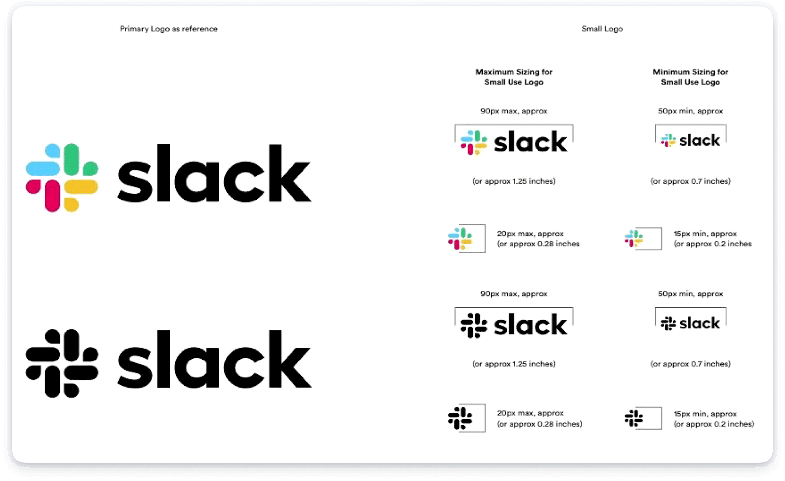
Slack’s brand style guide reflects its friendly, collaborative, and efficient tone.
It focuses on creating a welcoming and productive environment for users, with clear rules for logo usage, tone, and color schemes that reinforce a sense of calm professionalism.
Key highlights from Slack’s brand style guide:
- Friendly, professional tone: Slack’s guidelines focus on maintaining a casual yet respectful tone in all communications.
- Logo flexibility: Slack provides clear instructions on how to use its unique logo across different channels without losing brand integrity.
- Soft, welcoming colors: The use of pastels and soft tones reinforces Slack’s position as a tool for ease and collaboration.
If you’re aiming for the same level of consistency and flexibility in your branding as these top brands, Figr Identity is the ideal product to get started.
Whether you need to maintain strict color usage like Coca-Cola or build a flexible design system like Google, Figr Identity allows you to instantly generate design tokens, customize components, and build scalable brand systems directly in Figma.
With Figr Identity, creating a cohesive, scalable, and dynamic brand identity is easier than ever.
Conclusion
Creating a brand guidelines style guide is not just about defining rules - it’s about building the foundation for how your brand communicates with the world.
A well-crafted style guide ensures that every touchpoint, whether it’s a website, social media post, or advertisement, conveys the same message, look, and feel.
No matter the size of your business, Figr Identity helps streamline the entire process of creating and maintaining brand guidelines.
Ready to take control of your brand’s identity? Get started with Figr Identity today, and make brand consistency easier than ever. For the complete framework covering tokens, components, documentation, and measurement, see our guide on design system best practices.


