Building a color palette for your design system can feel like a daunting task, but it’s a crucial step in ensuring that your digital products look consistent and professional.
In today's world, where users interact with your brand across multiple platforms—websites, mobile apps, and digital interfaces—it’s more important than ever to maintain a cohesive visual identity.
Without a proper color system in place, teams can struggle to maintain consistency, leading to mismatched colors, accessibility issues, and wasted time trying to fix these problems.
In this blog, we’ll guide you through the entire process of building an effective and functional color palette for your design system. You’ll also learn how to define your base colors, how to create state colors for different UI interactions, the best practices for naming conventions and also ensuring your colors meet WCAG 2.0 accessibility standards.
By the end of this post, you’ll be equipped with all the tools and tips to create a color palette that enhances user experience, ensures brand consistency, and simplifies the design process for your team.
What is a Color Palette?

A color palette is a fundamental element in design that helps maintain visual consistency. A color palette is like a collection of crayons you use to color your design. It’s not just random colors—it’s a carefully curated set that defines the aesthetic and functionality of your design system.
Here’s a breakdown of different types of color palettes, their ideal use cases, and why they are essential for your design system.
First, let's take a look at the Types of Color Palettes
Types of Color Palettes
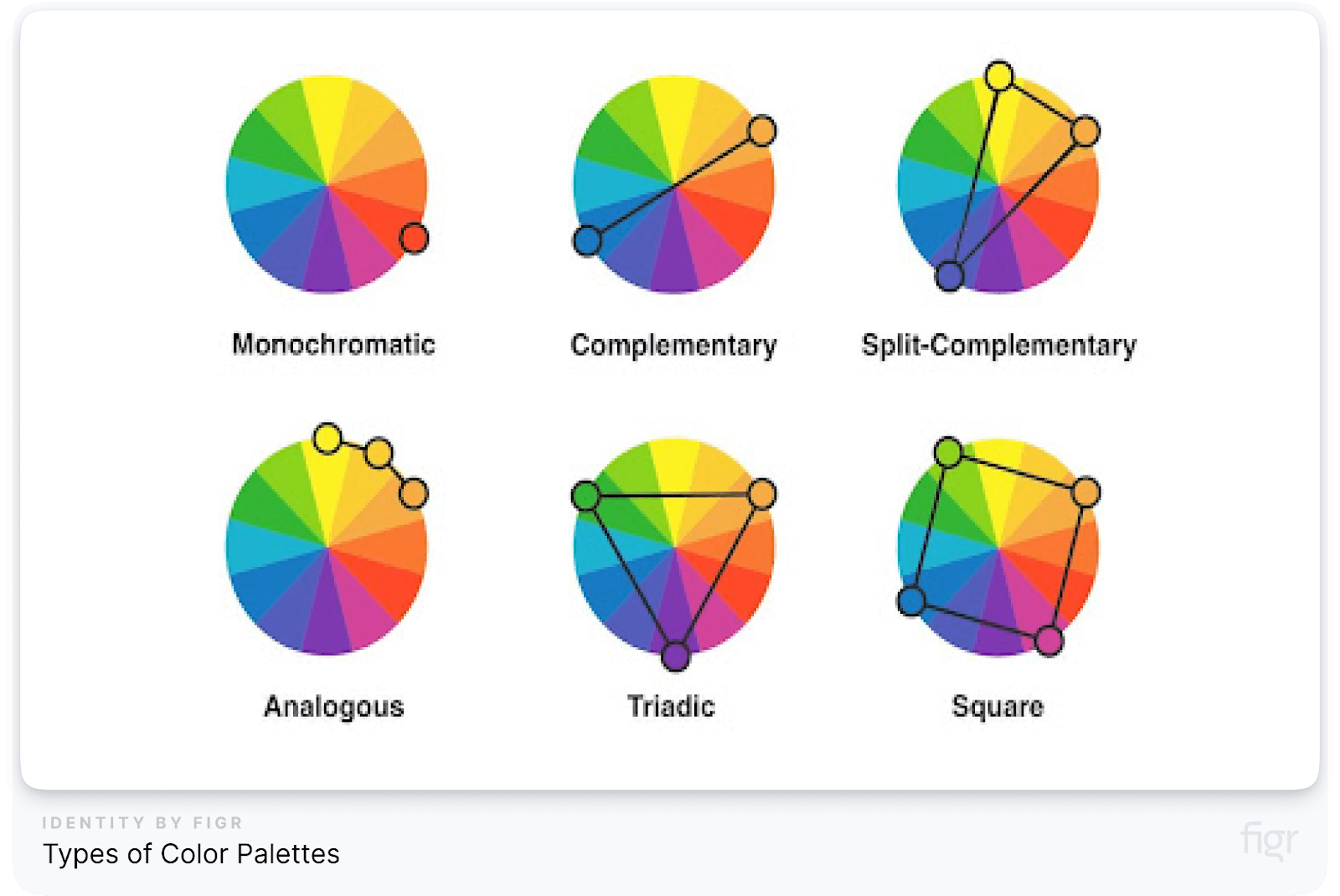
Here are some types of color palettes:
- Primary Colors: Primary colors are the basic colors that are used to create all other colors. These are the main colors used throughout the design system like red, blue, or yellow.
- Secondary Colors: You get these by mixing primary colors. For example, Green: (Blue + Yellow), Orange: (Red + Yellow).
- Complementary Colors: These colors are opposite each other on the color wheel, like blue and orange. They create a strong contrast.
- Analogous Colors: These colors sit next to each other on the color wheel, like blue and green, and give a smooth, matching look.
- Triadic Colors: These are three colors evenly spaced on the color wheel, like red, yellow, and blue.
- Tints and Shades: Tints are colors mixed with white (lighter), and shades are mixed with black (darker).
- Monochromatic Colors: Monochromatic colors come from using different shades and tints of a single color. This means you take one color and change its lightness (how light or dark it is) and saturation (how bright or dull it is) to create multiple versions of the same color.
Monochromatic colors are great when you want your design to look consistent and smooth. Since all the colors come from the same base, they naturally fit well together. This makes your design look organized without being too overwhelming.
Color Pairs
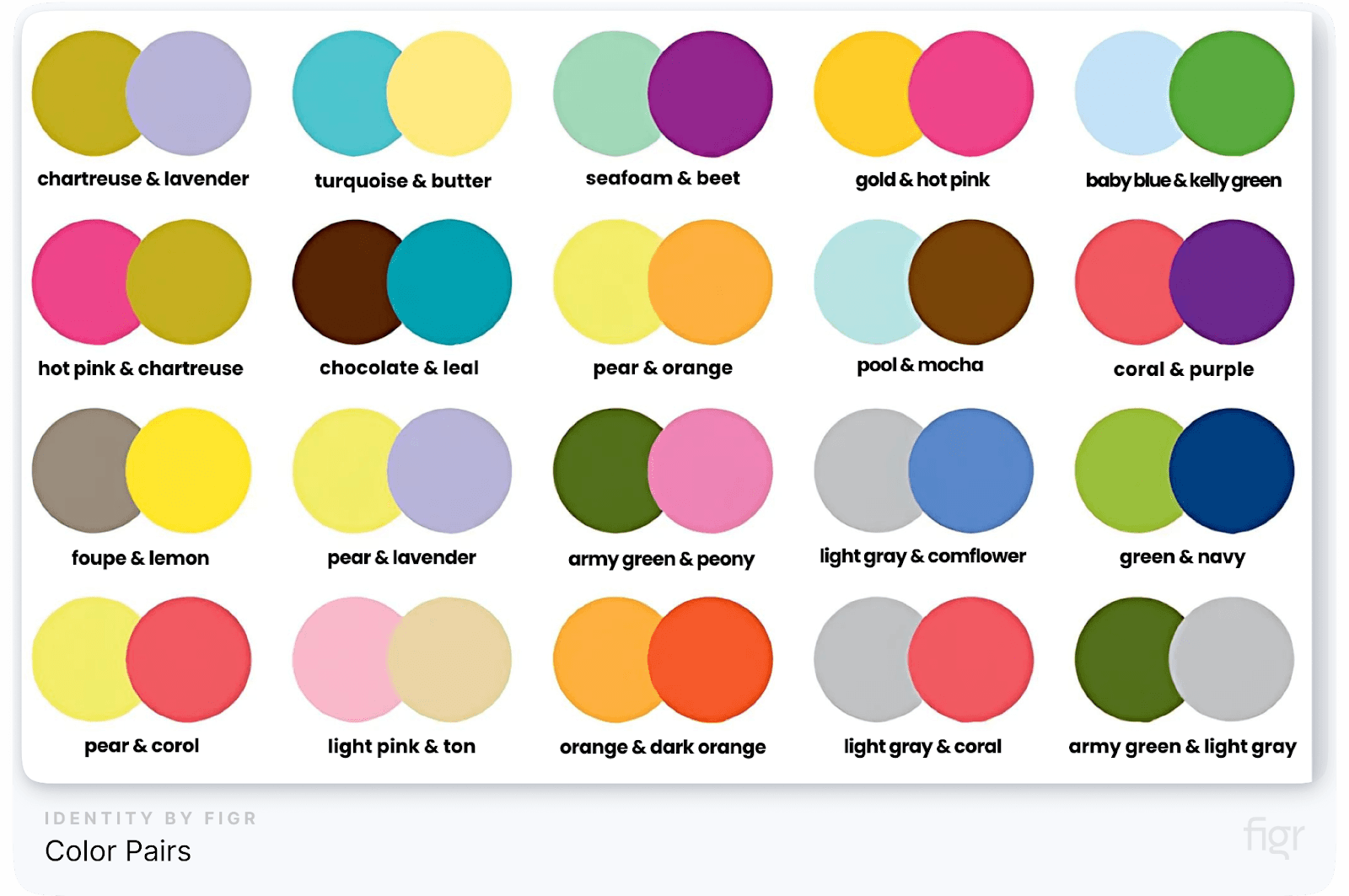
Color pairs are important in UI (User Interface) design because they help guide the user’s attention and make the design easier to use. Using the right color combinations can create visual hierarchy (showing which parts of the design are most important) and improve legibility (making things easier to read).
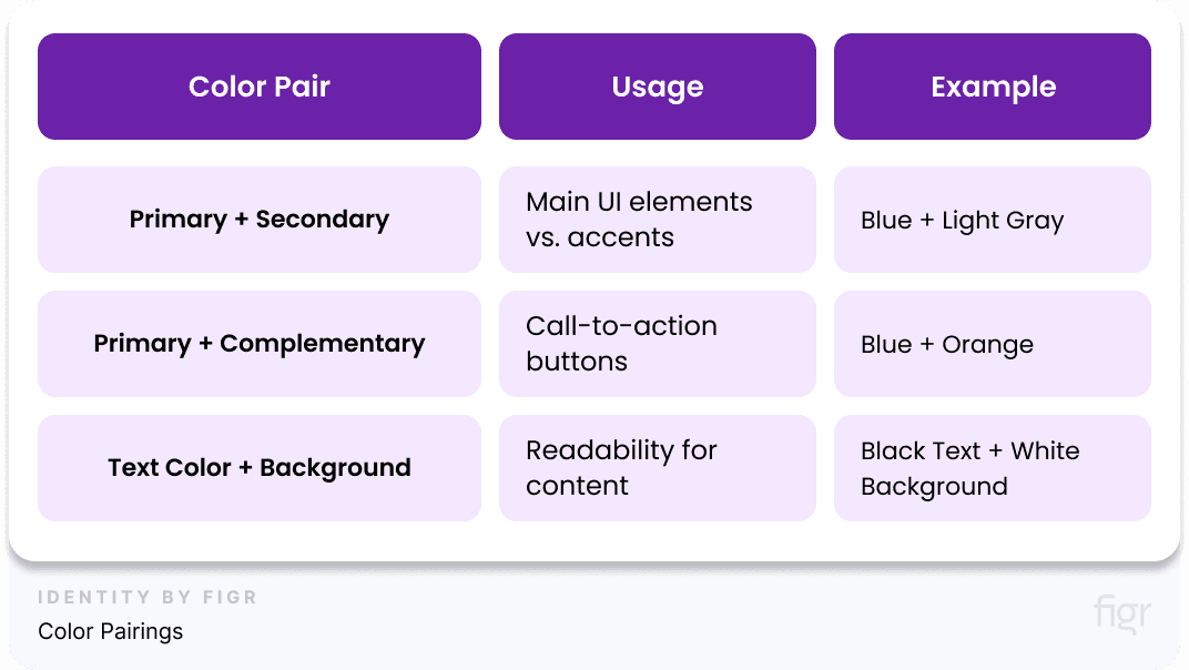
Here are some common color pairs and how they’re used:
1. Primary + Secondary Colors
- What Are They? The primary color is the most important color in your design (like the color of your main buttons or the brand color). The secondary color is used for less important elements, like backgrounds or borders.
- When to Use It: Use this pair when you want to create contrast between important items and supporting content.
- Example: A blue button (primary) against a light gray background (secondary). The blue button stands out and tells the user it’s important to click.
2. Primary + Complementary Colors
- What Are They? Complementary colors are opposite each other on the color wheel (like blue and orange or red and green). When used together, they create a vibrant look.
- When to Use It: This pair is perfect for buttons, call-to-action components, or anything interactive that you want to grab attention.
- Example: A blue background with an orange "Sign Up" button. The button pops because of the strong contrast between blue and orange.
3. Text Color + Background Color
- What Is It? This is about making sure text is easy to read by choosing colors that have a lot of contrast. Usually, this means dark text on a light background or light text on a dark background.
- When to Use It: Always! High contrast between text and background is key for readability.
- Example: Black text on a white background is a classic and readable combination.
Example of Color Pairings:
A well-crafted color palette is the backbone of an effective design system. It ensures that every design element is cohesive, consistent, and visually appealing, making the user experience intuitive and engaging.
But building and managing a color palette can be time-consuming and complex. That’s where Figr Identity comes in. With Figr Identity, you can effortlessly create and manage a pre-determined set of balanced and brand-aligned colors.
This allows designers to focus on creativity rather than repetitive tasks, ensuring your brand identity shines through every design, across all platforms.
Whether you’re defining primary/secondary pairs or experimenting with complementary hues, Figr Identity helps you make informed, impactful color choices, streamlining the design process and enhancing brand recognition.
Color choices play a huge role in how users interact with your design, so choosing wisely can make all the difference!
Where You Can Use Color Palettes?
- UI Components: Colors are used for things like buttons and text.
- Component States: Different colors show when you hover over a button or it’s clicked.
- Illustrations: Colors can make pictures in your design stand out.
- Design Style: Colors set the overall mood of your design.
How to Balance Your Color Palette
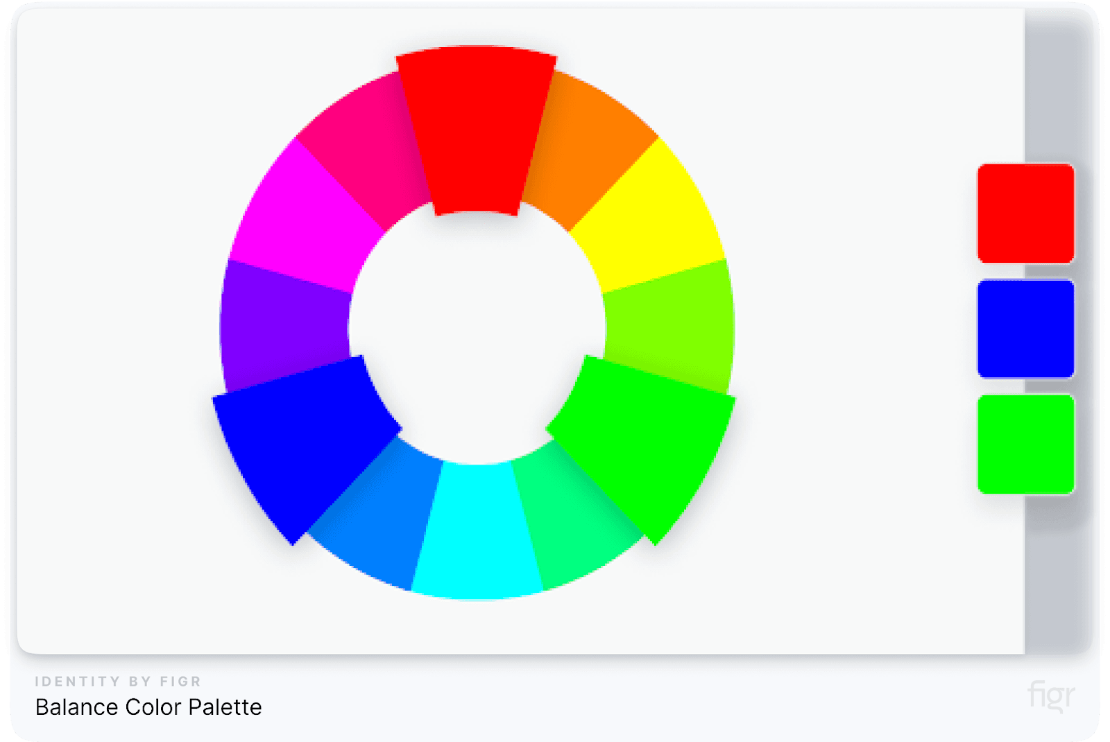
A well-crafted palette balances aesthetics with functionality. So when picking colors, make sure they work well together, are easy to read, and can be adjusted as your project grows.
It's important to pick colors that are accessible to everyone by meeting the rules for good contrast, like the WCAG 2.0 standards.
Example of a Basic Color Palette:

Now you have a solid idea of what a color palette is and why it’s important for making designs look organized and appealing, it's time to create your very own color palette for your design system.
Step-by-Step Guide to Creating a Color Palette
As you learned, creating a solid color palette is one of the most important aspects of building a design system. A well-crafted palette ensures consistency across different parts of a product and reinforces the brand's identity.
This section will break down every step of creating a color palette in detail; giving you all the valuable information needed to make a standout color palette for your design system.
Step 1: Finding Your Base Colors
Your base colors, also known as primary colors, are the cornerstone of your design system. They represent your brand's core identity and will be used consistently across major components, such as headers, buttons, and backgrounds.
The base colors significantly influence how everything looks, feels, and functions.
- Brand Alignment: Colors should reflect your brand's personality. For example, an eco-friendly company might use green to symbolize sustainability, while a tech company could lean toward sleek, modern colors like blue or gray.
- Audience Perception: The colors you choose can influence how your audience views your brand. Blue is often associated with trust and reliability, making it a popular choice for financial institutions (e.g., PayPal or Chase Bank). On the other hand, red can evoke excitement or urgency, often used by brands like Coca-Cola or Target.
- Competitor Analysis: Look at what colors your competitors are using. You want to stand out, but your palette should also resonate with your industry norms.
- Example: Coca-Cola’s Base Colors: Coca-Cola’s red creates an emotional response, symbolizing excitement and passion. Apple’s Base Colors: Apple primarily uses white and black, reflecting its values of simplicity and elegance.
Here’s How to pick your Base/Primary Brand Colors that Align with Your Brand Identity:
- Start with One Dominant Color: Choose one color that will represent your brand. This is the first color people will think of when they see your product. For example, Netflix’s red is bold and memorable.
- Supporting Colors: Choose one or two secondary colors that complement your primary color. These colors will help provide balance without overshadowing the dominant color. For instance, Spotify uses green as the main color, supported by shades of black and gray.
- Test in Different Contexts: Your colors should look good everywhere—on websites, in apps, or in printed materials.
Starting with base colors ensures that your design has a strong, consistent anchor point. If you skip this step or get it wrong, your entire palette may lack cohesion and fail to represent your brand effectively. This step lays the groundwork for all subsequent steps.
Step 2: Expanding Your Color Palette with Secondary and Accent Colors
Once you’ve chosen your base colors, you can begin adding depth and flexibility with secondary and accent colors. These additional colors support your base colors and provide visual hierarchy and distinguish between various elements.
- Secondary Colors: Use secondary colors to add variety without overwhelming your design. For instance, light gray can be used for background elements, allowing primary colors to stand out.
- Accent Colors: These are used sparingly to emphasize key elements, such as call-to-action buttons or important notifications. A bright color like orange or yellow can work well as an accent, drawing attention to critical elements.
- Example: Spotify’s Color Palette: Spotify uses green as its primary color and various shades of gray as secondary colors. Bright accent colors like pink or purple highlight buttons and important elements.
Using Tools to Generate Shades and Tints
Product like Figr Identity can generate shades (darker versions) and tints (lighter versions) of your chosen colors in seconds. Darker versions of your base colors can be used for text, while tints (lighter versions) can be used for backgrounds.
Step 3: Creating Variations with Shades and Tints
With your primary and secondary colors in place, you can now create shades and tints to provide further versatility. These variations are crucial for maintaining consistency while allowing for diverse visual elements, such as different states of buttons or background colors.
- Shades: Shades are created by adding black to a base color, resulting in a darker variation. For example, if your base color is blue, adding black will create a deeper, richer version known as "dark blue." These darker shades are often used for text, headers, or primary action buttons to make them stand out.
- Tints: Tints, on the other hand, are made by adding white to the base color, resulting in lighter versions. For example, light blue is a tint of the original blue. Tints are often used for background elements or subtle design elements to maintain visual hierarchy without overpowering the primary focus.
Importance of Variations for UI Components
- Hierarchy and Emphasis: Darker shades can highlight essential elements like buttons, icons, or key text, while lighter tints help de-emphasize less critical parts of the design, such as backgrounds or secondary information. This creates a visual hierarchy that guides users to the most important actions or content.
- State Changes: Variations in shades and tints are also essential for representing different states in a user interface (UI). For instance, when a user hovers over a button, it might change from a light tint to a darker shade to indicate interactivity. Similarly, different shades can be used for active, disabled, or focus states, offering users clear feedback on their interactions with the product.
By leveraging shades and tints, your color palette can provide flexibility while maintaining consistency, creating a seamless experience for users across different components and devices.
If you create these variations before establishing secondary and accent colors, you risk overcomplicating the palette and making it harder to manage.
Step 4: Defining Contrast and Accessibility Standards
After developing a comprehensive palette, it’s essential to ensure it meets accessibility standards. Color contrast is crucial for readability and usability, especially for users with visual impairments.
Addressing accessibility after defining your colors ensures that all your chosen colors work together harmoniously while being inclusive to all users. This means people with vision problems, like color blindness, can still use and enjoy your design.
Here’s how to make sure your colors follow the rules and are accessible!
1. Ensure Adherence to WCAG 2.0 Rules
Web Content Accessibility Guidelines (WCAG) 2.0
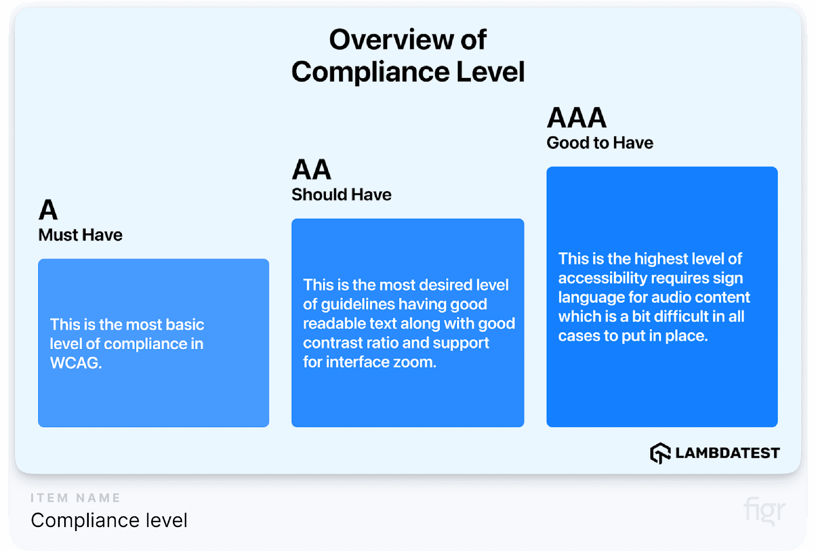
- Contrast Ratios: This is a number that tells us how much a color stands out against another. The higher the number, the better the contrast.
- AA Level: The contrast should be at least 4.5:1 for normal-sized text and 3:1 for large text.
- AAA Level: For even better contrast, the ratio should be 7:1 for normal text and 4.5:1 for large text.
Table: Contrast Ratio Requirements
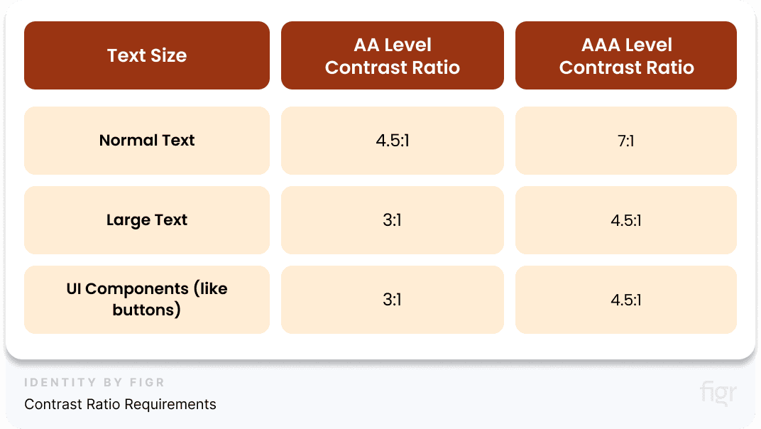
Make sure to use tools like the WebAIM Contrast Checker to measure the contrast ratio between your text and background colors!
2. Regularly Test Color Pairs to Maintain Contrast
It’s important to test different color pairs to make sure they meet the contrast rules. This helps everyone read and see your design clearly.
- Use Contrast Tools: There are online tools that help you check if your colors meet the rules. Some good ones are WebAIM Contrast Checker and Coolors Contrast Checker.
- Test Different Scenarios: Try your colors on buttons, text, backgrounds, and other parts of your design to make sure they always stand out well.
Testing Color Pairs:
- Foreground vs. Background: Check that text is readable against the background.
- Interactive Elements: Make sure buttons and links are easy to spot.
- Visual Indicators: Don’t use just color to show information—add text or symbols too!
3. Explore Accessible Color Choices Across Ranges
Choosing colors that work for everyone, even those who are color blind, is key. This means picking color combinations that everyone can see clearly.
- Color Blindness Considerations: Some people have trouble telling certain colors apart, like red and green. Tools like Color Oracle or Coblis can show you what your design looks like to people with color blindness.
- Provide Alternatives: Don’t just rely on color! You can use patterns, shapes, or text to make sure your information is clear to everyone.
“Designing for accessibility means creating a more inclusive experience. By testing and validating color contrast, we ensure that our designs are usable by everyone.”
By following these steps and testing your colors, you ensure that your design works for everyone, no matter how they see color.
Step 5: Documenting and Organizing Your Color Palette
Now that your palette is complete and accessible, it’s time to document and organize it. This step ensures that everyone in your team—designers and developers alike—can use and implement the palette correctly.
How to Document Colors in Your Design System
In your design system, how you name and organize things is super important. It helps everyone on your team understand what’s what, and it keeps everything neat and easy to find. But managing, organizing and documenting these colors manually can be tedious and prone to errors.
Figr Identity simplifies the entire process by automatically generating, organizing and documenting your color palette into design tokens. It helps you define intuitive and consistent naming conventions for every color in your palette, such as primary-blue or accent-orange, making it easy to identify and use them across your project.
So let’s break down why naming and organizing your colors palette matters—and how to do it right!
Logical and Understandable Naming

Credit: Kevin Muldoon
Imagine if all your colors were just a bunch of random codes, like "#1F6AE3." That would be confusing, right? Instead, we want to give each color a clear, easy-to-understand name. Here’s how:
- Descriptive Names: Give colors names that explain what they do instead of using a color code. This makes it easy for your team to know which color to use.
- Example: Instead of calling a color "#1F6AE3," call it "Primary Blue."
- Example: Use "Accent Orange" instead of "#FF5733."
- Consistent Naming: Keep the naming the same throughout your design system so no one gets confused.
Here are some examples of Naming Conventions
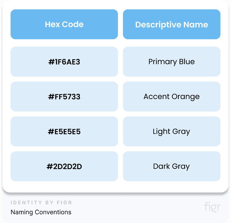
By naming colors like this, you make the design process simpler for everyone!
The next thing you need to do is create your Design Tokens!
How To Use Design Tokens?
Design tokens are a way to assign standardized names to colors and other design elements. They act as reusable variables that represent design decisions, like colors, spacing, and typography.
For example, instead of using the raw hex code #1F6AE3, you would assign it a name like primary-blue. This makes the code more readable and easier to maintain, especially when working across teams or platforms.
Design tokens ensure that the same color is used consistently throughout the design, whether it's for buttons, headers, or backgrounds. By assigning clear and descriptive names, developers can implement these colors across the product seamlessly, without needing to remember specific hex codes.
- Define Tokens: Create tokens for each color.
- Example: -color-primary-blue: #1F6AE3;
- Example: -color-accent-orange: #FF5733;
- Use Tokens: Once you have these tokens, you can use them in your code or design system. Instead of manually defining and using tokens across your project, Figr Identity automates the process by generating and organizing your design tokens in one centralized location; making managing your design tokens effortless.
For example, if you have a design token called “color-primary-blue”, Figr Identity can instantly apply it across your design system. If you ever need to update this color, simply change it in Figr Identity, and watch it update seamlessly throughout your entire design system.
With Figr Identity, maintaining consistency, scalability, and collaboration between designers and developers has never been easier!
Table: Design Token Examples
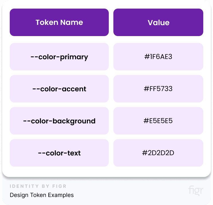
Centralized Documentation: To maintain consistency, store your color palette and all related tokens in a centralized location that everyone can access. Centralizing the documentation prevents miscommunication and ensures that everyone is using the correct colors and design standards.
If you’re looking for an efficient way to manage your design tokens and document your color palette, Figr Identity is an excellent tool. It helps you generate design tokens for your colors, shades, and tints while ensuring everything is organized.
Figr Identity automatically documents your colors into structured design tokens that can be seamlessly integrated with your development process.
Example: How Figr Identity Can Help You Automate Everything:
Imagine you’ve defined a primary color (#1F6AE3 as primary-blue) and now need a range of tints for backgrounds and shades for buttons. Figr Identity automatically creates these variations, defines tokens like primary-blue-light and primary-blue-dark, and generates the necessary CSS variables or SCSS tokens for developers to use.
By using Figr Identity, you can centralize your color palette documentation, automate token creation, and ensure seamless collaboration between designers and developers.
This leads to a more organized, scalable, and consistent design system, making future updates or changes easier to manage.
Organizational Tips
To make sure everything stays organized, here are a few tips:
- Categorize Colors: Group your colors into categories like "Base Colors," "Accent Colors," and "State Colors" (like red for error messages) to make it easy to find what you need.
- Create a Palette Library: Keep all your colors and design tokens in one place that everyone can access. This way, your team can always find the right colors quickly.
Pro Tip: It’s a good idea to regularly check your naming and tokens to see if they need updating—especially when design trends change or your project grows!
By using logical names and design tokens, you can create a design system that’s organized, easy to use, and flexible enough to grow with your needs.
Step 6: State Colors

Credit: Atmos Style
Your next step in creating a color palette is defining your State colors!
State colors indicate the status of interactive elements like buttons and forms; giving users clues about what’s happening and what they need to do next.
Defining these colors after establishing your primary palette and accessibility standards ensures that your state colors fit seamlessly into the overall design and meet contrast requirements. Let’s break down what state colors are and how to use them.
- Active State: Shows what is currently selected or being used. Often matches the brand’s main color.
- Focus State: Typically a shade of blue, this color highlights when a user clicks on or hovers over something, like a button or text box.
- Negative State: Red tells you something is wrong, like an error or warning. Pro Tip: Pair red with clear error messages so users understand what went wrong.
- Positive State: Green means good things are happening, like when an action is completed successfully.
- Notice State: Yellow or orange signals important information that needs attention but isn’t an error. Pro Tip: Combine notice colors with short, clear messages so users know what action to take.
Table: Examples of State Colors
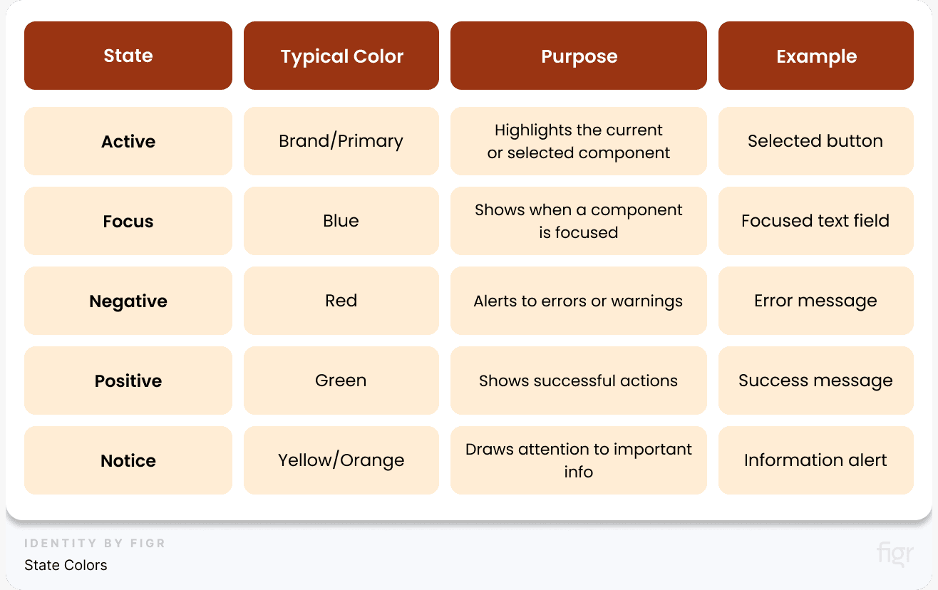
Using state colors helps people understand what’s happening in your design system, making it easy for them to navigate and interact confidently.
Step 7: Creating Extended Palettes
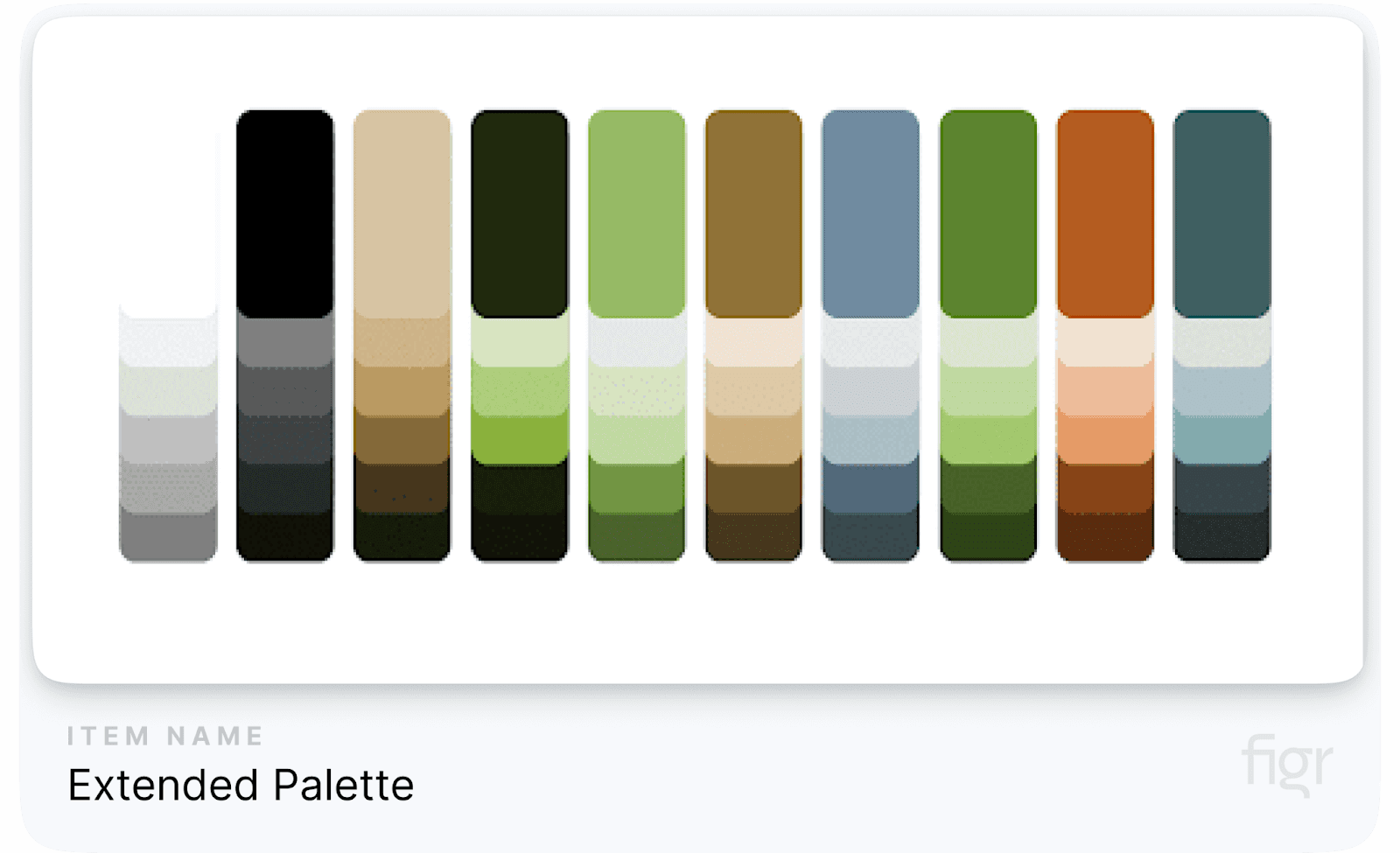
An extended color palette is like having more colors in your crayon box—it gives you extra shades and options to create designs that are flexible and eye-catching.
This enhances flexibility and allows for more nuanced and sophisticated designs.
This is the last step because it builds upon the foundational palette and ensures that any added complexity aligns with your established design principles and accessibility standards.
Here's how to effectively create and use extended palettes in your design system.
Step-by-Step Process to Creating An Extended Palette Through Figr Identity
Creating an extended color palette is a critical process in building a strong and flexible design system.
This section will walk you through how to create and manage an extended palette, explain the tools you can use, and help you understand why it's important to adjust aspects like hue, saturation, and brightness.
Figr Identity is an all-in-one product that helps you generate a wide range of color variations based on your base colors. It simplifies the process of creating lighter and darker shades, adjusting contrast, and ensuring your colors are accessible to all users, including those with visual impairments.
Why Use a Tool Like Figr Identity?
Figr Identity doesn’t just simplify the process; it elevates it. With Figr Identity, you can automatically generate and manage a wide range of color variations based on your base colors, ensuring every shade you create is aligned with your brand identity and accessible to all users, including those with visual impairments.
Example: If your base color is blue, Figr Identity will create an entire spectrum of variations, from subtle tints for backgrounds to deeper hues for buttons and text, all while checking for color contrast and accessibility compliance.
Defining Variations in Hue, Saturation, and Brightness

Once you’ve selected your base colors, you need to tweak their properties to create variations. These properties include:
- Hue: This refers to the actual color itself, like red, green, or blue. Small changes in hue can result in colors that are related but feel different (like moving from blue to teal). Example: If your base color is red, you could shift the hue slightly toward orange or pink to create new colors in the same family.
- Saturation: This determines how intense or vibrant a color is. Higher saturation means a color looks brighter, while lower saturation makes it look more muted. Example: Bright red might work well for a button, but a muted red could be better for a background element.
- Brightness: This controls how light or dark the color appears. Higher brightness makes the color lighter, and lower brightness makes it darker. Example: A dark blue might be used for a footer, while a light blue works better for hover states on buttons.
Advantages of Adjusting These Properties:
- Customization: By tweaking hue, saturation, and brightness, you can create a unique and functional palette that fits your brand.
- Visual Appeal: It allows you to create a more engaging and visually appealing design, as you're not limited to just the base colors.
Steps for Using Figr Identity:
Let’s break down how to use Figr Identity to create an extended palette step-by-step:
- Select Base Colors: Start by picking a few core colors from your design system. These are usually your brand’s primary and secondary colors. For example, if your brand color is blue (#003A70), use this as your base.
- Generate Variations: Use Figr Identity to create lighter and darker versions of your base colors. For example, for your base blue, you can generate a lighter blue for backgrounds (#A0C4FF) and a darker blue for text or buttons (#003A70).
- Review and Adjust: Make sure the shades and tints of each color work well together. Ensure that your new color variations maintain contrast and adhere to accessibility standards (like WCAG guidelines).
- Save and Apply: Once you're happy with the generated colors, save them and integrate these variations into your design system. These new colors will now be part of your extended palette, and you can use them for different UI components like headings, buttons, and backgrounds.
An extended palette adds depth and versatility to your design system and Figr Identity simplify the whole process and makes creating visually dynamic designs while maintaining consistency easier.
Just remember the principles of adjusting hue, saturation, and brightness and you’ll be good to go.
With testing and fine-tuning, you can create a color palette that works well across all your design needs. One last thing you need to do is ensure consistency.
Ensuring Consistency
Consistency is key to making sure your palette looks good everywhere:
- Apply Consistent Settings: Use the same methods for adjusting hue, saturation, and brightness for all colors.
- Create Guidelines: Write down rules for how your palette should be used so everyone on your team stays on the same page.
Pro Tip: Regularly check your extended palette to make sure it still fits your design and is accessible to all users or just use Figr Identity to take care of everything.
By extending your palette, you’ll create more versatile designs that can adapt to different needs while still maintaining a professional look!
Use Figr Identity to Create Your Entire Color Palette in Minutes

Building a comprehensive color palette for your design system is often a time-consuming and tedious process. However, with Figr Identity, you can create a complete and cohesive color palette in just a few clicks.
With Figr, you can create tints (lighter versions) and shades (darker versions) of your brand colors and apply them effortlessly to your design elements like buttons, backgrounds, or hover effects. Figr ensures that every color you create fits perfectly within your design system.
Let’s break down how Figr Identity can streamline this process for you:
- Automated Color Generation: Figr Identity allows you to quickly generate a wide range of color variations based on your primary brand colors. By simply inputting your base colors, the plugin can create an entire spectrum of shades and tints automatically. This automation saves countless hours of manual adjustment and ensures that all generated colors are harmonious and aligned with your brand identity.
- Customization and Precision: With Figr Identity, you have complete control over the hue, saturation, and brightness of your colors.
- Instant Accessibility Compliance: Ensuring that your color palette meets accessibility standards is critical. Figr Identity automatically checks the contrast ratios of your generated colors against WCAG guidelines. This means you can be confident that your designs will be accessible to all users, including those with visual impairments, without having to conduct separate checks manually.
- Effortless Integration with Design Systems: Figr Identity uses design tokens to store and manage your colors. If you ever need to update a color, you can do so in one place, and the change will be reflected everywhere the token is used.
- Real-World Examples: Imagine you’re working on a financial app where the primary color is blue. Using Figr Identity, you can instantly create a range of lighter and darker blues for various components such as backgrounds, call-to-action buttons, and hover states. Additionally, you can generate high-contrast versions for error and success messages, ensuring that your app visually appealing and also functionally solid.
- Seamless Workflow Integration: Figr Identity integrates directly into your workflow, allowing you to make real-time adjustments to your color palette as you design. This integration means that you can see how different colors interact in various UI components without leaving your design environment.
An Example Color Palette Along With Their Usage in Design Systems
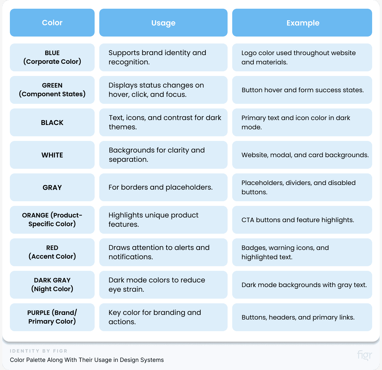
By using Figr Identity, you can create a cohesive, accessible, and well-documented color palette in minutes, freeing up your time to focus on other critical design tasks.
Whether you’re working on a new brand or refining an existing design system, Figr Identity provides the tools you need to ensure visual consistency and efficiency across your project.
Step 8: Testing and Validation
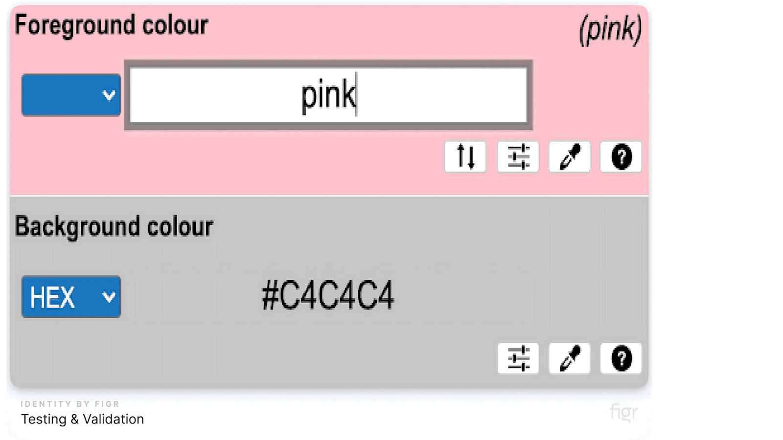
Testing your color palette helps you make sure that the colors work well on your design. Proper testing helps maintain consistency, accessibility, and visual appeal in your design system. So let’s explore how to test and check your colors.
Verify Tints and Shades on Design Components
Colors can be lighter or darker, called tints and shades. It’s important to test these variations to see how they look on buttons, backgrounds, and text. Here’s how you can do it:
- Apply Variations: Use lighter tints of your colors for things like hover effects (when you move your mouse over something) and darker shades for when buttons are clicked.
- Example: Use a lighter version of your primary color when someone hovers over a button.
- Evaluate Contrast: Contrast means how easy it is to see text on a background. For example, dark text on a light background is good contrast. We need good contrast so everyone can read easily.
Table: Contrast Ratio Guidelines

Make sure your colors pass these contrast checks so that your design is accessible to everyone!
Adjust Transparency Values as Needed
Sometimes, you might want your colors to be a little see-through, like when using overlays or backgrounds. This is called transparency, and you need to adjust it carefully to make sure it looks good and doesn’t hide important information.
- Set Opacity Levels: Opacity is a fancy word for how see-through something is. You can set it at different levels to get the right effect.
- Example: An overlay might use 50% transparency so you can still see what’s underneath.
- Test in Context: Try using transparent colors on different parts of your design (like buttons or backgrounds) to see if they look right.
Things to keep in mind when adjusting transparency:
- Use transparent colors for backgrounds and overlays to keep things visible without covering too much.
- Adjust button transparency so they still look clickable and clear.
Validate New Color Palettes Through Real-World Usage and Feedback
Once you’ve created your color palette, it’s time to test it out with real people. Testing in real-world situations helps you find out if the colors are working well.
- Conduct User Testing: Let people use your design and see how they feel about the colors. You can create a prototype (a model of your design) to test it out.
- Pro Tip: Use A/B testing to compare two different color schemes and see which one users like more.
- Gather Feedback: Ask users, designers, and developers for feedback on your colors. Do they look good? Are they easy to read? Do they help users navigate your design?
Table: Use these feedback categories to validate your new color palette:
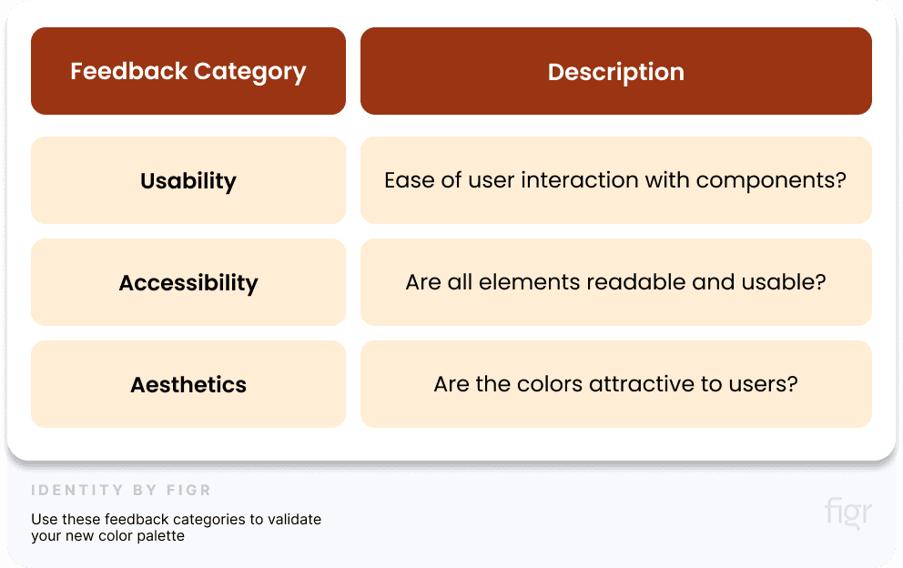
By testing your colors carefully, you ensure that they not only look good but also work well for everyone using your design.
Conclusion
Creating a color palette for your design system is more than just picking pretty colors - it's about building a cohesive visual language that enhances your brand identity and user experience. With the right approach, you can establish a palette that looks beautiful and works seamlessly across different platforms and design elements.
Color is foundational, but it's just one piece of the puzzle. See how it fits into the full set of design system best practices from tokens to adoption.
To help you in this process, products like Figma and Coolors and other design tools at Toools.design can assist you in experimenting with color variations and testing accessibility, ensuring your design system is ready for any challenge.
Ready to streamline your design process and maintain consistency across all your projects? Figr Identity can help you manage your color tokens, generate accessible color variations, and ensure your designs stay true to your brand guidelines. Color is foundational, but it's just one piece - see how it fits into the full design system creation process.
Say goodbye to design inconsistencies and hello to a smoother, more efficient workflow. Start using Figr Identity today and elevate your design system to the next level!


