
It's 4:47 PM on Thursday. Your VP just asked for something visual to anchor tomorrow's board discussion. You have a PRD. You have bullet points. You have 16 hours and no designer availability. A user flow isn't just a diagram of boxes and arrows; it's the story of your product. It’s the critical difference between a user feeling guided and one feeling completely lost. How do you translate a strategic goal into a sequence of screens that feels inevitable?
This article is your blueprint. We will move beyond abstract theory and dive into a curated collection of tactical user flow examples, from seamless onboarding sequences to graceful error-handling states. Each example is a deep dive, breaking down not just the what but the why. We'll analyze the goals, pinpoint key screens, and identify the silent friction that kills conversion rates. You won't find generic praise here, only actionable enhancements tied to real product challenges.
These are the flows that get teams aligned, reduce engineering rework, and help you ship features with genuine confidence.
1. The Onboarding Flow: The First Five Minutes
The first interaction a user has with your product is not a neutral event. It's a high-stakes handshake that determines future engagement. This initial user flow is the single biggest predictor of long-term retention. Its job is to systematically guide someone from a state of questioning ("What is this?") to a moment of clarity: the first "Aha!" moment. A confusing or lengthy onboarding is a retention killer.
Like this.
Last week I watched a PM onboard to a new analytics tool. They spent 12 minutes clicking around before finding the dashboard they needed. The tool was powerful, but the path to that power was hidden. That's a flow problem. This is what I mean by making the path obvious. The goal is to shrink the time-to-value by revealing core functionality in a structured, progressive way.
Among the best user flow examples for this is Slack’s initial journey. It doesn’t just dump you into an empty workspace. It guides you to send your first message to a helpful bot, immediately demonstrating the app's core purpose. For instance, mapping Cal.com's setup against a competitor like Calendly reveals a masterclass in reducing friction. You can see a detailed breakdown of this speed showdown in Figr, a journey that uncovers hidden friction points.
2. Authentication and Login Flow
The login screen isn't a simple gate: it's your product’s front door. An authentication flow that is cumbersome or feels insecure doesn't just block entry, it erodes trust from the very first click. This journey encompasses sign-up, login, password resets, and multi-factor authentication (MFA). The core tension is balancing airtight security with a frictionless user experience.
A friend at a B2B startup shared a story about their password reset flow. A user, locked out before a major client demo, churned after failing to reset their password three times. They lost a five-figure account over a single broken flow. This is what I mean by authentication being more than a utility. It's a key part of the product promise. The goal is to make security feel empowering, not punishing.
Among the best user flow examples for this is Google's single sign-on (SSO). It removes the need for new credentials, turning a potential friction point into a one-click confirmation. This approach radically simplifies access while leveraging a security framework the user already trusts.
3. Checkout and Payment Flow
The final few clicks before a purchase are where user trust is either solidified or shattered. This flow is the digital equivalent of the cash register, and any friction here is lost revenue. It must guide a user from a state of consideration ("Is this worth it?") to a state of confident completion ("My order is confirmed"), making the exchange of money feel secure.
I once abandoned a cart for a SaaS tool because the payment form, embedded via a third party, looked jarringly different from the rest of the site. It felt insecure. That momentary hesitation is all it takes. This is what I mean by maintaining trust. The checkout flow’s job is to eliminate doubt through clarity, consistency, and a palpable sense of security.
Among the best user flow examples is Shopify's conversion-optimized checkout. It systematically removes distractions and pre-fills information, making the path to purchase nearly frictionless. We analyzed Shopify’s checkout setup for merchants and redesigned the entire experience, which you can explore in this new setup flow built with Figr.
4. Search and Discovery Flow
A search bar isn't just a utility, it's a conversation with your product. When a user types a query, they're revealing their intent, their needs, and their frustrations. A great search and discovery flow anticipates these needs and guides the user from a vague question to a precise answer. This is the difference between a library where you know the Dewey Decimal System and one with a helpful librarian who points you to the exact shelf.
Last quarter, a colleague tried to find a feature in a dense enterprise tool. They typed "export settings," got zero results, then tried "CSV download," also nothing. The feature was actually called "Data Extraction." The tool was technically correct, but the user was lost. The goal is to bridge the gap between the user's vocabulary and the system's terminology.
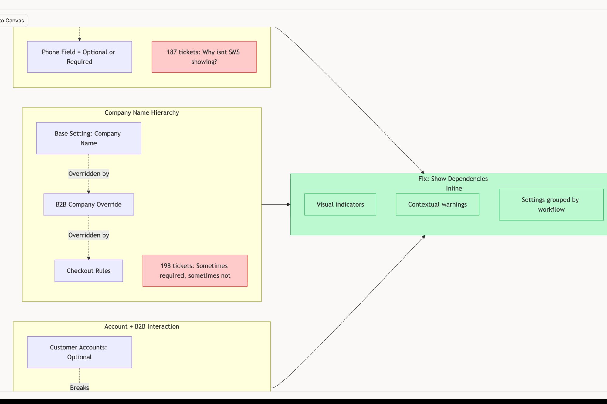
Among the best user flow examples for discovery is Airbnb’s faceted search. It layers filters, a map, and rich previews to create an exploratory experience. This turns a simple search into a powerful decision-making engine. Analyzing a flow like Skyscanner’s reveals how crucial accessibility is, especially for older users. An accessibility audit, like this one done in Figr, can uncover these hidden barriers.
5. Error Handling and Recovery Flow
A user flow is not a perfect, straight line. It's a path with potential pitfalls, from a network drop to a validation mistake. A great product anticipates these failures and treats them not as dead ends, but as detours with clear signposts. This flow is the system's safety net. Its job is to catch a user before they fall, explain what happened without jargon, and guide them back onto the path gracefully.
A colleague recently tried to upload a large file. The connection timed out, and the UI simply froze. No message, no progress bar reset, nothing. They had to refresh the page and start over, unsure if the first attempt partially worked. The goal is to design for resilience, ensuring the user always knows their status and their next step, even when things go wrong.
Among the best user flow examples for this is Stripe's payment processing. When a credit card fails, it doesn't just say "Declined." It provides specific reasons and suggests actionable next steps. Similarly, Slack’s subtle "Trying to reconnect..." banner is a masterclass in transparency. You can explore a detailed map of network degradation edge cases for an app like Zoom in this Figr canvas to see how deep recovery paths can go. You can also learn more about AI tools that create contextual error messages.
6. Multi-Step Form Flow: Deconstructing the Long Ask
Asking a user for twenty pieces of information at once is like asking them to climb a mountain in a single leap. The multi-step form breaks that mountain into a series of manageable hills. It transforms a monolithic data request into a conversational, step-by-step journey, reducing cognitive load and dramatically improving completion rates.
I once worked with a fintech company struggling with merchant account activation. Their single-page form had a 60% abandonment rate. We broke it into five logical steps with a progress bar. Completion rates jumped by 40%. This is what I mean by managing user momentum. A progress bar and clear steps turn a chore into a guided process.
Among the best user flow examples for this is Stripe’s merchant setup. It doesn't present a wall of fields; it asks for information in contextually relevant chunks. Similarly, Airbnb’s host listing flow is a masterclass in progressive disclosure, guiding new hosts without ever feeling intimidating. To facilitate seamless group interaction, it's essential to understand the best collaboration tools for remote teams. The goal is to make a large request feel small.
7. Navigation and Menu Flow
Good navigation isn't a feature; it's the nervous system of your product. When it works, it’s invisible. When it fails, the entire experience feels broken. This flow is the architecture of access: the menus, sidebars, and breadcrumbs that make an application feel explorable rather than labyrinthine. A poor navigation flow creates friction everywhere.
A few years back, I consulted for a B2B SaaS company whose churn was bafflingly high. Heatmaps showed users erratically clicking the main menu, lost. They had nine top-level navigation items, each with its own submenu. The path to value was there, but it was buried. The user should feel oriented, not overwhelmed.
Among the most instructive user flow examples is Notion’s combined sidebar and breadcrumb system. It provides both a global map (the sidebar) and a local "you are here" marker (the breadcrumbs). Similarly, Figma’s layer panel provides a hierarchical view that mirrors the visual canvas, creating a logical link between seeing an object and finding it in the structure.
8. Collaboration and Sharing Flow
A product for one is a tool. A product for many is an ecosystem. The jump between the two happens in the collaboration flow: the sequence of clicks that invites a colleague into your digital workspace. This user flow is the product’s circulatory system. Get it wrong, and your product remains a siloed utility, never embedding itself into a team's daily rituals.
I once saw a project management tool make inviting external contractors a nightmare. It required an admin to provision a full license, a process that took two days. The friction was so high that teams reverted to sharing screenshots in Slack. The goal isn't just to let people in, it's to make sharing feel as natural as starting a conversation.
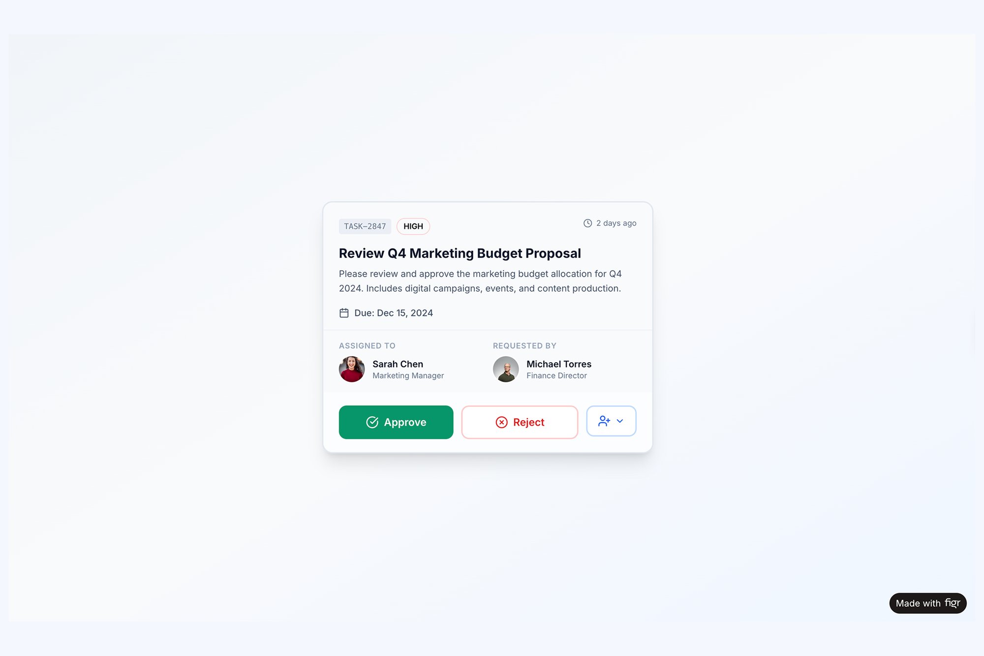
Among the best user flow examples for this is Figma’s share modal. It’s a masterclass in contextual permissions. You don't just invite someone, you decide precisely what they can do (view, edit, comment) right at the point of sharing. You can see the logic for an equally critical component state, a task assignment card with all its collaborative actions, mapped out in this Figr prototype.
9. Settings and Preferences Flow
The settings page isn't a feature, it's the product's control panel. This is where trust is codified into toggles and preferences. A poorly designed settings area communicates that the user’s control is an afterthought. Its job is to make customization feel like an act of empowerment, not a chore.
A product leader I know spent an afternoon trying to find the setting to disable email notifications from a new tool. She found it buried three layers deep under "Workspace Administration" instead of "My Profile." This is what I mean by mismatched mental models. The goal is to organize customization in a way that mirrors the user's own logic.
Among the best user flow examples is GitHub’s approach to notification settings. It doesn't offer a single "on/off" switch. Instead, it provides a matrix of controls, allowing developers to fine-tune alerts by repository and event type. This respects the user's context and prevents notification fatigue.
10. Notification and Alert Flow
A notification is not just a pop-up. It's a tap on the shoulder from your product. This flow is the delicate art of interrupting a user with information that is genuinely valuable, not just noise. A poorly designed notification flow doesn't just get ignored, it actively builds resentment and drives users to revoke permissions. The goal is to deliver timely, relevant information that respects the user's attention.
I once worked with a team whose app sent a push notification for every minor status update. Engagement cratered. Users felt harassed by their own tool. This is what I mean by respecting attention. The difference between a helpful alert and spam is context and control. We had to rebuild the system from the ground up.
Among the best user flow examples here is GitHub's granular notification control. It allows developers to subscribe to updates at the repository or issue level, ensuring they only get alerts that directly impact their work. Similarly, Linear’s focused notification queue treats alerts not as interruptions but as an inbox to be processed. Delving into AI customer journey mapping can provide a comprehensive view of how users interact with your product. Learn more about effective notification UI and UX design to master this balance.
From Map to Movement
The user flow examples we have dissected, from onboarding to error recovery, all share a common thread. They are not merely static diagrams. They are the codified empathy of a product team, a tangible representation of how a user moves through a digital space to achieve a goal. A well-designed flow feels like a conversation. A poorly designed one feels like an interrogation.
This matters at scale because user flows directly impact activation rates, retention cohorts, and ultimately, revenue. As highlighted in a Nielsen Norman Group report, users often blame themselves for usability problems, leading to silent churn instead of support tickets. The economic incentive is to find and fix this silent friction before it impacts your metrics. The true value of analyzing these user flow examples is not in direct imitation. It's in grasping the underlying principles. To understand where individual flows fit within the bigger picture, read our guide to user journey mapping.
Turning Insight into Action
Your next step is not to open a design tool and replicate these flows. That is like studying maps of famous expeditions and believing you have made the journey. The real work begins now.
In short, choose one critical user flow in your own product. It could be account setup, a core feature activation, or even the cancellation path. Document it exactly as it exists today. A screen recording is a powerful starting point. A friend at a Series B company recently did this for their checkout flow. They thought it was a five-step process; the recording revealed it was actually nine steps with two hidden loops.
Once you have the ground truth, you can ask the right questions:
- Where is the hesitation? Pinpoint the screens where a user has to stop and think.
- What is the cognitive load? Count the decisions, the fields, and the options on each screen.
- Where does the happy path break? Use this edge case map for Zoom's network degradation as inspiration for thinking through every failure point.
This granular analysis is what separates products that feel intuitive from those that feel like work. It is the difference between a map on a wall and actual movement on the ground. Your goal is to create momentum for your users, and that starts by clearing their path, one stone at a time.
Mapping these complex journeys, from screen recordings to interactive prototypes, can feel daunting. That is precisely why we built Figr. Instead of spending hours in a diagramming tool, you can capture a flow, have AI analyze it, and generate test cases, edge cases, and even redesigned prototypes in minutes. Start your first analysis for free at Figr and turn your product maps into real user movement.