Notifications are everywhere—reminding us to complete tasks, nudging us to explore new features, or alerting to important updates, yet many designers struggle to strike the right balance.
Often treated as an afterthought, notifications are either too intrusive, demanding immediate attention, or so subtle they go unnoticed. Poorly designed notifications overwhelm users, cause confusion, and damage trust, while well-designed ones guide users, share updates, and enhance experiences.
This blog explores what makes UI notifications effective, the different types, and key design principles. We'll also highlight real-world examples, common pitfalls, and actionable strategies to create a notification system that truly works.
What are UI Notifications?

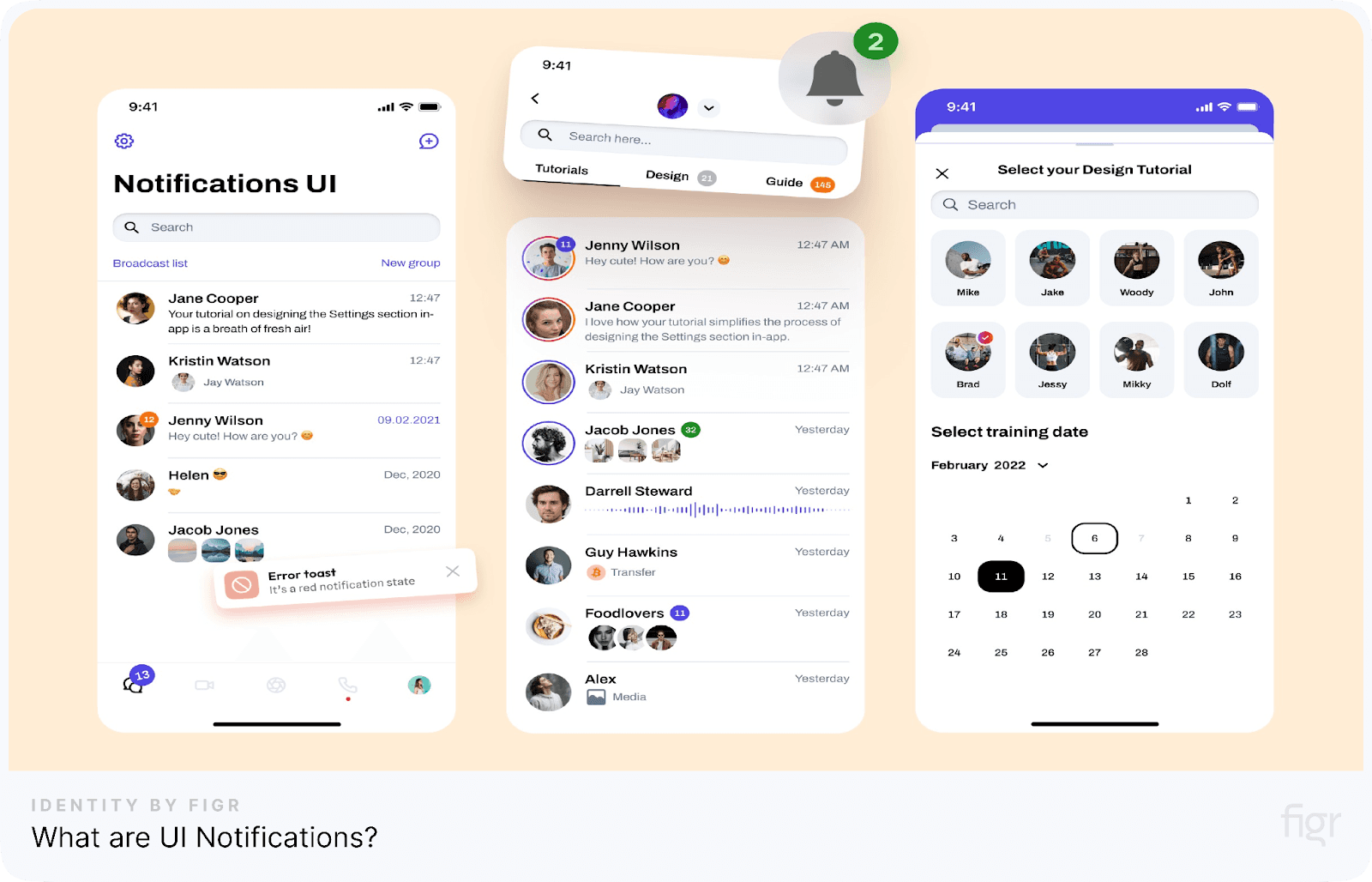
Credit: Roman Kamushken
UI notifications are messages or alerts displayed within a digital interface that provide users with information, updates, or prompts. They are a key part of interface design, acting as a communication bridge between the system and the user.
Notifications keep users informed, guiding or alerting them to take necessary actions.
Depending on the urgency and type of information, these notifications can appear in various forms, such as pop-ups, banners, badges, or modal dialogs.
Why Are Notifications Important?
- Keep users informed and enhance user engagement: Notifications keep users updated on changes, events, or progress while driving engagement by encouraging feature exploration and task completion.
- Support error handling: By providing instant feedback on errors or exceptions, notifications guide users toward corrective actions.
- Build trust: Transparent communication through notifications boosts user trust and creates a more reliable user experience.
Types of UI Notifications
UI notifications come in various forms, each designed to deliver specific information or guide users effectively. Understanding these types will help you choose the notification that is suitable for your product’s needs. Below are the primary types of UI notifications and their use cases:
Badge notifications
Badges are small visual indicators, often appearing as numbers or dots on icons, to signal updates or new activity.
- Show the number of unread messages or tasks
- Use dots for a simpler, less intrusive update
- Ideal for highlighting ongoing updates without interrupting the user
In-app notifications
These appear while users actively use the app, providing real-time guidance or feedback.
- Toasts: Small, temporary messages that fade in and out, typically for confirmations like "Message sent."
- Snackbars: Similar to toasts but often include actions like "Undo."
- Dialog boxes: Require user interaction and are often used for confirmations or critical alerts.
Push notifications
Push notifications appear outside the app on a user's device, aiming to re-engage users or provide time-sensitive updates.
- Notify users of upcoming events or reminders
- Prompt actions like completing a purchase or reviewing an activity
- Customizable to suit user preferences for relevance
Email notifications
Emails extend notifications beyond the app, keeping users informed and engaged.
- Summarize account activity or updates
- Deliver transactional details like order confirmations
- Re-engage users with promotional offers or reminders
Full-screen overlays or modals
These are large notifications that take over the screen, used for high-priority messages.
- Announce critical updates or system errors
- Guide users through onboarding steps or new features
- Ensure user acknowledgment before proceeding
Now that we’ve explored the types of notifications, let’s dive into their essential components to understand what makes them truly effective.
Key Components of Effective Notifications

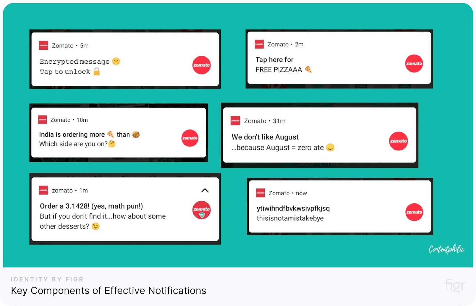
Credit: Content Philic
Creating impactful notifications goes beyond simply delivering messages—they must be clear, actionable, and engaging. Here’s a breakdown of the essential elements that make notifications effective:
1. Title
The title is the first thing users notice. It should grab attention while clearly explaining the notification’s purpose.
- Use concise and direct language
- Highlight the action or event, like "Payment Successful" or "New Message."
- Avoid vague or generic titles to reduce confusion
2. Description
The description provides additional context, ensuring users understand the notification’s purpose without feeling overwhelmed.
- Keep it short and to the point, explaining the action or update
- Include necessary details only, avoiding unnecessary jargon
- Make it scannable by breaking long texts into smaller sentences
3. Action area
The action area drives user engagement by allowing them to respond or proceed.
- Include clear call-to-action buttons, like "View Details" or "Reply."
- Make actions easy to spot and accessible
- Avoid cluttering the action area with too many options
4. Icons and imagery
Visual elements help users quickly understand notifications without reading too much text.
- Use intuitive icons that represent the notification’s purpose (e.g., an envelope for a new message)
- Keep imagery simple and aligned with the app’s design
- Avoid using unnecessary visuals that may distract from the message
5. Timing and placement
Deliver notifications at the right time and place to maximize their impact.
- Time notifications based on user behavior or context, like sending reminders before a deadline
- Place in-app notifications strategically, ensuring they don’t obscure critical content.
- Use animations sparingly to make notifications noticeable without being disruptive.
For example, take a fitness app sending progress updates to its users. A well-designed notification might say: “You’ve hit 10,000 steps today! Tap to view your activity summary.”
Designing intuitive and effective notifications is all about combining clarity, functionality, and aesthetic precision. With Figr Identity, you can seamlessly create notification badges, icons, and layouts that enhance user engagement.
By generating custom components and ensuring cohesive typography and colors, Figr Identity helps designers craft notifications that are functional and perfectly aligned with your brand’s style.
How To Create a Notification Strategy
A well-crafted notification strategy ensures that users stay engaged without feeling overwhelmed. This involves understanding user needs, prioritizing messages, and balancing relevance and frequency. Here's how to create a solid notification strategy:
1. Define the purpose of notifications
Understand why each notification is necessary and what value it brings to the user.
- Identify key goals, such as guiding users, announcing updates, or encouraging actions
- Ensure notifications align with user expectations and the app’s purpose
- Avoid sending unnecessary or repetitive notifications
2. Group notifications by importance
Categorize notifications based on their priority to ensure users only see what matters most.
- High-priority notifications: Critical alerts like security issues or payment failures
- Medium-priority notifications: Updates like feature announcements or reminders
- Low-priority notifications: Informational messages such as newsletters or non-urgent updates
3. Personalize notifications
Tailor notifications to individual users to make them more relevant and engaging.
- Use user data, such as preferences and past behavior, to customize messages
- Segment users into groups (e.g., new users, active users, dormant users) and create tailored notifications for each group
- Include names or specific details to make notifications feel personal
4. Timing and frequency
Send notifications at the right time and control their frequency to avoid annoying users.
- Trigger notifications contextually, such as reminding users about unfinished tasks
- Allow users to set their preferences for notification timing and frequency
- Avoid sending too many notifications in a short time frame
5. Enable user control
Let users decide how they want to interact with notifications.
- Allow users to opt out of certain types of notifications or mute them temporarily
- Include an easy way to dismiss notifications
6. Test and iterate
Continuously improve your notification strategy by testing and analyzing its impact.
- Conduct A/B testing on different designs, timings, and messages
- Gather user feedback to understand pain points and areas for improvement
- Track metrics like open rates, click-through rates, and user retention to evaluate success
Real-World Examples of Effective Notifications
Seeing how top brands effectively use notifications can provide valuable inspiration for your design process.
Let’s explore some real-world examples and understand why they work so well.
1. Duolingo’s motivational nudges

Duolingo uses gamified notifications to encourage users to keep learning. Its notifications often include streak updates or achievement milestones, boosting a sense of accomplishment.
- Congratulates users on streaks or completed lessons
- Provides motivational nudges to continue learning
- Uses playful language and visuals to capture attention
2. Slack’s notification settings
Slack allows users to customize notification preferences based on their needs. Features like “Do Not Disturb” and activity-specific notifications give users control over when and how they receive updates, ensuring minimal distractions.
- Allows users to set work hours for receiving notifications
- Offers channel-specific alerts for focused communication
- Includes options for muting channels or threads
3. Instagram’s engagement reminders
Instagram sends notifications to re-engage users without overwhelming them. These updates often highlight activities like likes, comments, or new follower notifications, which keep users informed and connected.
- Highlights key user interactions to maintain engagement
- Groups notifications for a cleaner inbox
- Uses subtle but effective language to prompt user actions
4. Spotify’s personalized updates
Spotify sends notifications about new music releases or curated playlists based on a user’s listening history, ensuring content feels personalized and valuable.
- Informs users about new releases from their favorite artists
- Includes direct links to explore new music or playlists
- Uses a casual, friendly tone to create a sense of connection
5. Google Calendar’s event reminders
Google Calendar sends timely notifications that help users stay on schedule. The alerts are short and actionable, often including links for more details or quick actions like snoozing or dismissing the reminder.
- Sends reminders minutes or hours before scheduled events
- Includes options for customizing alert timings
- Integrates seamlessly with other Google services
Designing notifications that stand out like Duolingo's motivational nudges or Spotify’s personalized updates requires a robust design system. With Figr Identity, you can create consistent, scalable notification badges, icons, and layouts effortlessly.
Conclusion
Notifications are more than just alerts—they are an essential part of the user experience that guides, informs, and engages users. When designed thoughtfully, notifications can add immense value to your product while avoiding unnecessary distractions.
With Figr Identity, designing thoughtful and impactful notifications becomes a seamless process, giving designers the building blocks to work smarter, not harder.
From crafting consistent design tokens to building scalable UI components, Figr Identity equips teams with all the features to create visually cohesive and user-centric notifications.
Simplify your workflow, maintain design consistency, and ensure every notification aligns perfectly with your brand identity. Take your notification design to the next level—try Figr Identity today and experience design without limits!


