

In today’s tech-driven world, the success of any digital product—whether it's a website, mobile app, or software—relies heavily on User Interface (UI) Design. Whether you're creating a website, mobile app, or software, the user experience you design will determine if they stay engaged or leave your product behind.
Imagine you’re using an app that’s confusing or hard to navigate; it would be frustrating, right? That’s exactly why a good UI is so important.
When businesses or designers focus too much on functionality and ignore the design, even the best features become hard to use. A smooth, intuitive interface ensures users can easily understand and interact with the product.
Essentially, UI design bridges the gap between technology and people and it’s the first thing users see, so it needs to look good and work well.
In this guide, we’ll break down what UI design really is, its key elements, the types of interfaces, and the best practices for creating user-friendly interfaces. Let’s dive in and learn how to design products that keep users engaged from the very first click!
What is User Interface (UI) Design?
User Interface (UI) design focuses on creating the visual structure and interactive features of a digital product. At its essence, UI design is about making user interactions with an app or website simple, efficient, and intuitive. The aim is to build a smooth experience where users can easily navigate, understand, and engage with your product.
UI design goes beyond just making things look good; it’s equally about functionality and ease of use. Even the most visually stunning interface will fail if it’s not user-friendly. A successful UI brings together all the visual and interactive elements—buttons, menus, icons—in a way that helps users achieve their goals effortlessly.
Key Aspects of UI Design:
- Aesthetic Appeal: The look of the interface, including colors, fonts, and layout, should match the brand’s identity while being visually pleasing and easy to interact with.
- Functionality: Every element in the UI should serve a purpose. Buttons should be easy to locate, navigation should be straightforward, and interactions should feel intuitive.
- User Engagement: A well-designed UI encourages users to explore further. For example, Apple’s sleek designs and Netflix’s intuitive navigation keep users engaged and satisfied.
Ultimately, UI design is about ensuring that users can interact with your product easily and enjoyably, without unnecessary obstacles.
Now, let's take a deeper look into the key components of UI design that form the backbone of any great interface.
Key Components of User Interface (UI) Design
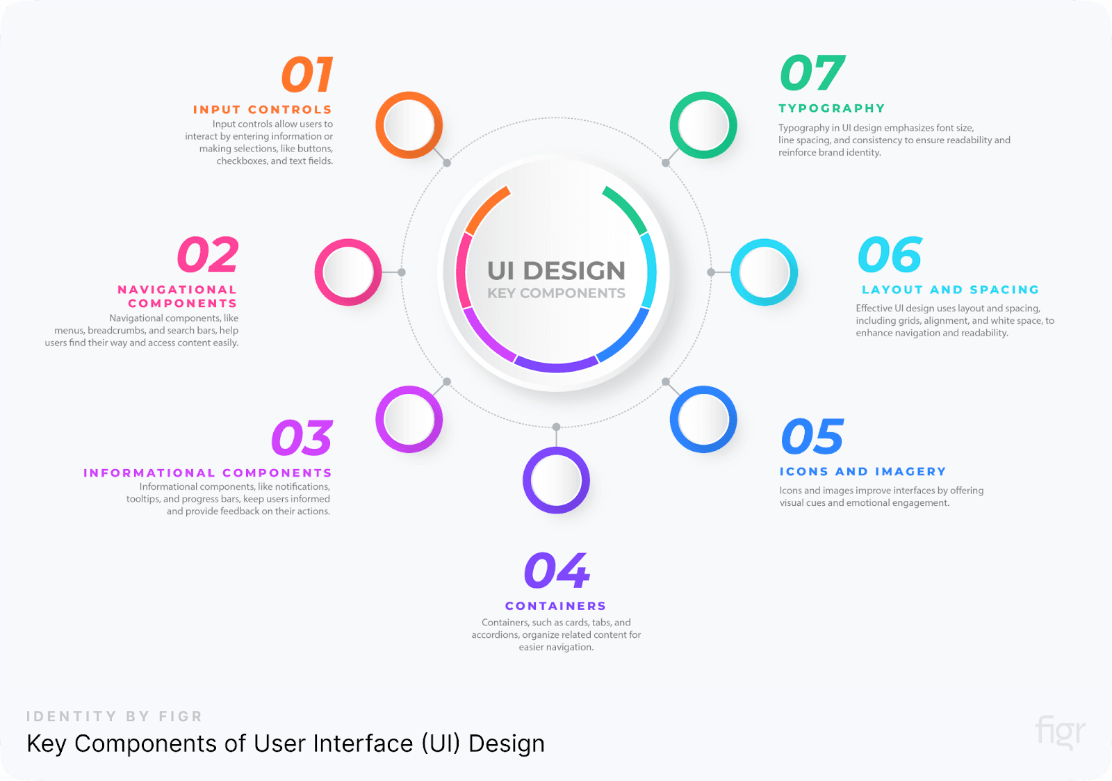
Creating an intuitive and efficient user interface requires a solid understanding of its key components. Each element of a UI serves a specific function to make the user’s interaction with the product as seamless as possible. Below, we’ll explore the primary components that make up a well-structured UI design:
1. Input Controls
Input controls are interactive elements that let users interact with the system by entering information or making selections. They are crucial for guiding users to complete actions, such as filling out forms or choosing options. Input controls include:
- Buttons: Allow users to perform actions like submitting a form or starting a process. Buttons should be clearly labeled with an action word, such as “Submit,” “Send,” or “Buy.”
- Checkboxes: Let users make one or multiple selections from a set of options. They’re often used in forms where multiple answers are allowed.
- Radio Buttons: Similar to checkboxes but used when only one option can be selected from a set. These are commonly used in surveys or account settings.
- Text Fields: Allow users to type in information, such as login credentials or search queries. These fields should be clear and easy to use, with appropriate labels.
With Figr Identity, you can create and customize these input controls with ease, ensuring consistent design across projects while speeding up the development process through its pre-built, editable components.
2. Navigational Components
Navigational components help users move through the interface smoothly. They provide structure and make it easy for users to find what they’re looking for without getting lost. Examples of navigational components include:
- Menus: Organized lists of options or actions. They can be drop-down menus, sidebars, or hamburger menus on mobile devices. Menus should be well-structured to guide users toward their desired actions.
- Breadcrumbs: A visual path that shows users their current location within a site or app. Breadcrumbs are particularly helpful for large websites, allowing users to quickly backtrack or understand the site’s hierarchy.
- Search Bars: Allow users to quickly find specific content by typing keywords. An effective search bar includes predictive text or auto-suggestions to improve the user experience.
Just like input controls, Figr Identity also simplifies the creation of navigational components, ensuring that your design remains clean, intuitive, and adaptable to different screen sizes.
Plus, its AI-powered flow generation can help you create user journeys and navigation paths at incredible speed.
3. Informational Components
These components provide feedback or updates to the user based on their interactions with the system. Informational components ensure that users always understand what’s happening, which helps build trust in the product. Examples include:
- Notifications: Inform users of important updates or changes in real-time. For example, a pop-up may inform the user that their settings have been successfully saved.
- Tooltips: Small pop-up boxes that provide helpful information when a user hovers over or clicks an element. Tooltips are especially useful for explaining the function of less obvious interface elements.
- Progress Bars: Show the current status of a task or process, such as a file download or form submission. Progress bars help manage user expectations by visually representing how much of a process is complete.
4. Containers
Containers are used to group related content or elements within the interface, helping organize the layout in a way that’s easy to navigate. Common container elements include:
- Cards: Individual containers that group content like images, text, and buttons together. Cards are commonly used in dashboards, e-commerce sites, and social media feeds.
- Tabs: Allow users to switch between different views or sections without navigating away from the current page. Tabs help keep the layout clean by grouping related information.
- Accordions: A type of collapsible container that allows users to expand and view hidden content. Accordions are great for organizing large amounts of information while maintaining a minimalist interface.
Figr Identity also provides customizable templates for containers like cards and tabs, making it easier to design layouts that are both functional and aesthetically pleasing. You can generate and modify container elements instantly, maintaining consistency throughout your product.
5. Icons and Imagery
Icons and images are crucial for creating a visually appealing and functional interface. They provide visual cues to guide the user through actions and information without relying solely on text.
- Icons: Simple, recognizable images that represent actions or content. For example, a trash can icon represents “delete,” and a magnifying glass icon represents “search.”
- Imagery: Includes photos, illustrations, or graphics that enhance the interface and add emotional engagement. For example, an e-commerce site may include product images, while a travel website may use location-based photos to inspire users.
6. Layout and Spacing
A well-designed UI depends heavily on how elements are arranged. Layout and spacing determine how easy it is for users to navigate through your interface. Key aspects of layout include:
- Grids: Help organize content consistently. Grids are especially important in responsive design, allowing the layout to adjust gracefully on different screen sizes.
- Alignment: Ensures that all elements are positioned in a way that’s pleasing to the eye and easy to follow. Proper alignment improves readability and flow within the interface.
- White Space: Also known as negative space, white space is the empty area between elements. It may seem counterintuitive, but ample white space actually improves the user experience by reducing clutter and focusing attention on important elements.
7. Typography
Typography is the art of arranging text in a readable, clear, and visually appealing manner. It plays a significant role in UI design because text is one of the primary ways users interact with content.
- Font Size and Style: Ensures readability across devices. For example, headings should stand out, while body text should be easy to read.
- Line Spacing: Controls the amount of space between lines of text, improving legibility.
- Consistency: Using a consistent typeface across the interface strengthens brand identity and ensures that the UI looks polished and professional.
Understanding these core UI components, you’ll be better equipped to design user interfaces that are both functional and visually appealing and by leveraging Figr Identity, you can take full control of these UI components, making your design process more efficient, consistent, and adaptable.
Whether you're creating for web or mobile, Figr Identity helps streamline your workflow and ensures that every element in your design system works harmoniously together.
In the next section, we’ll explore the different types of UI and how they vary depending on the interaction style.
Types of User Interfaces
User interfaces (UIs) are essential to how we interact with devices and technology. While UI design encompasses a broad range of components, the type of user interface you implement greatly depends on how users will interact with the system. There are several types of UIs, each with its own unique interaction style. Understanding these types will help you select the best one for your product.
Here are the four most common types of user interfaces:
1. Graphical User Interfaces (GUIs)
A Graphical User Interface (GUI) is the most common and widely used type of user interface. GUIs rely on visual elements, such as buttons, icons, and menus, that users interact with using devices like a mouse, keyboard, or touchscreen. This type of UI focuses on making interactions intuitive and visually appealing.
Key Features of GUIs:
- Icons and Visual Cues: Instead of entering text commands, users can interact with icons and buttons, making navigation easier and faster.
- Drag-and-Drop Functionality: Users can move objects around the screen by dragging them with a mouse or finger. This is common in applications like file management systems, where users drag files into folders.
- Windows and Menus: GUIs typically use windows and dropdown menus to organize content and allow for multitasking. This makes it easier to handle multiple operations at once.
Examples of GUIs:
- Operating Systems: Microsoft Windows and macOS are classic examples of GUIs where users interact with visual desktops, icons, and file folders.
- Mobile Applications: Most smartphone apps, such as Instagram or Facebook, use GUIs to present images, buttons, and interactive elements in a visually structured way.
GUIs are designed to be intuitive, allowing users to interact with software without needing to understand complex commands. This type of UI is widely used across computers, smartphones, and tablets due to its user-friendly nature.
2. Voice-Controlled User Interfaces (VUIs)
A Voice-Controlled User Interface (VUI) enables users to interact with a system using spoken commands. As speech recognition technology has improved, VUIs have become more common, particularly with the rise of smart devices and virtual assistants.
Key Features of VUIs:
- Natural Language Processing (NLP): VUIs rely on NLP to understand and interpret spoken words. The interface needs to correctly recognize different accents, dialects, and contexts.
- Hands-Free Operation: Users interact with the interface without needing to touch any devices. This is especially useful for multitasking or when physical interaction isn’t practical (e.g., driving a car).
- Personalized Responses: VUIs can often respond in personalized ways based on user preferences or past interactions.
Examples of VUIs:
- Virtual Assistants: Amazon Alexa, Apple’s Siri, and Google Assistant are prominent examples of VUIs. Users can ask them to play music, answer questions, set reminders, and more, all through voice commands.
- Smart Home Devices: Many smart home systems, such as lights or thermostats, can be controlled using voice commands via VUIs.
VUIs offer convenience and accessibility, allowing users to interact with devices without physical input. This makes them ideal for environments where hands-free control is beneficial, like in smart homes or while driving.
3. Gesture-Based User Interfaces
Gesture-Based User Interfaces allow users to interact with digital systems through physical movements. These interfaces interpret human gestures—such as hand motions, body movements, or facial expressions—and translate them into commands within the system.
Key Features of Gesture-Based UIs:
- Motion Tracking: The system uses cameras or sensors to track user movements in real-time. It can detect gestures like swiping, pinching, or waving.
- Immersive Experience: Gesture-based UIs create an immersive experience by allowing users to engage with the system in a more natural and physical way, especially in 3D environments.
- Touch-Free Interaction: Like VUIs, gesture-based UIs can offer touch-free interaction, which is particularly useful in virtual reality (VR) or augmented reality (AR) settings.
Examples of Gesture-Based UIs:
- Virtual Reality (VR) Games: Many VR games, such as those on the Oculus Rift or PlayStation VR, allow users to interact with the game through gestures, such as swinging a controller to simulate actions like sword-fighting or archery.
- Augmented Reality (AR): In AR applications, users can manipulate 3D objects using gestures. For example, Microsoft's HoloLens lets users grab, rotate, and resize virtual objects in mid-air.
- Touchless Interfaces in Public Spaces: Some public kiosks and interactive displays use gesture controls to minimize contact, which has grown in popularity during the COVID-19 pandemic.
Gesture-based interfaces provide an immersive and intuitive experience, enabling users to interact with technology in more natural ways. These are particularly useful in entertainment, gaming, and even healthcare settings, where physical gestures offer a more engaging user experience.
Choosing the Right Type of UI
When deciding which type of user interface to use, it’s important to consider your target audience, the device, and the context of use. Each UI type has its own strengths and is suited to different types of interactions. GUIs are ideal for visually rich applications, VUIs work best for hands-free environments, gesture-based UIs excel in immersive experiences, and menu-driven UIs are great for structured tasks.
No matter the type of UI, the ultimate goal is to make the interaction as simple and intuitive as possible, ensuring that users can easily complete their tasks with minimal friction.
In the next section, we’ll discuss the Principles of Good UI Design and how to apply them to create effective and user-friendly interfaces.
Principles of Good UI Design
Designing an interface isn’t just about making something look visually appealing—it’s about making the user’s experience smooth, intuitive, and enjoyable. Good UI design follows certain guiding principles that ensure users can easily interact with your product without confusion or frustration.
Here are the most important principles and how you can apply them to your UI design projects.
Visibility of System Status
A good user interface always keeps users informed about what’s happening. Whether it’s a loading bar, a confirmation message, or a simple success notification, the system should always give feedback that lets users know their actions are being processed.
How to Apply It:
- Loading Indicators: Whenever users are waiting for a process to complete (e.g., submitting a form or uploading a file), use a loading spinner or progress bar to show that something is happening. For example, an upload progress bar informs users how much time is left for a file to upload, preventing them from refreshing the page.
- Confirmation Messages: After users complete an action (like submitting an order or signing up for an account), display a clear success message. This reassures them that their action was successful.
Example: When you order food through a delivery app, you often see a progress tracker (e.g., "Preparing your order" or "Driver on the way"). This gives you peace of mind, knowing your order is being processed and will arrive soon.
Match Between the System and the Real World
Your interface should speak the user’s language. Use familiar words, phrases, and concepts that make sense to the user, not technical jargon. The design should also follow the conventions of the real world, reflecting familiar actions and visual metaphors that users understand.
How to Apply It:
- Use Familiar Terms: For instance, use terms like "cart" instead of "shopping basket" for e-commerce sites, as it’s what users expect.
- Real-World Actions: Actions like dragging and dropping, pinching to zoom, or swiping to delete should be natural and intuitive because they mimic real-world interactions.
Example: In most email apps, the trash icon looks like a garbage bin, which immediately tells users that clicking it will delete the email. This is an example of using a real-world metaphor that’s easy to understand.
User Control and Freedom
Users make mistakes. A good UI design provides easy ways to undo those mistakes, giving users control over their actions. Error prevention is ideal, but when mistakes do happen, make sure there’s a clear way to correct them.
How to Apply It:
- Undo/Redo Options: Allow users to undo actions, like deleting an item or editing a file. For instance, in Google Docs, users can undo their last few changes with a simple keyboard shortcut (Ctrl+Z or Cmd+Z).
- Clear Exit Paths: Whenever users are in a situation where they may want to back out (e.g., in a pop-up window or form), offer a clear way to exit, like a close button or "Cancel" option.
Example: In e-commerce apps, users should be able to remove items from their cart, change the quantity, or even back out of the checkout process if they aren’t ready to make a purchase.
Consistency and Standards
Consistency is key to making users feel comfortable and confident when navigating your interface. When design elements behave the same way throughout the interface, users don’t need to relearn how things work on different pages. Familiar patterns also reduce the cognitive load, making the interface easier to navigate.
How to Apply It:
- Uniform Design Elements: Buttons, icons, and actions should be consistent across the platform. For example, if you use a blue button for "Submit" on one page, make sure that same style is used across all submission actions.
- Follow Platform Standards: Ensure that your app’s design elements match the guidelines of the platform it’s built for. For example, iOS and Android have specific design standards, like how buttons look and where navigation should be placed.
- Example: Most apps use a hamburger menu (three horizontal lines) for navigation. Users recognize this icon and know to click it for the menu. Changing this icon would cause confusion.
By using Figr Identity, you can easily standardize your design components across platforms, ensuring that all elements—from icons to navigation menus—are consistent, familiar, and easy to understand for your users.
Figr Identity automates consistency across multiple touchpoints, freeing your team to focus on more complex tasks.
Error Prevention
It’s always better to prevent errors from happening in the first place than to fix them afterward. A well-designed interface anticipates potential user errors and offers ways to avoid them.
How to Apply It:
- Form Validation: If a user leaves a required field blank or enters an invalid email address, show a message immediately, before they submit the form. Highlight the problematic field and provide a clear solution, such as, "Please enter a valid email address."
- Warnings for Irreversible Actions: If an action cannot be undone (e.g., permanently deleting a file), make sure to show a confirmation dialog that asks users, "Are you sure?"
Example: When you’re about to delete a file on your computer, the system usually prompts you with a message, "Are you sure you want to delete this?" This extra step prevents users from accidentally deleting important files.
Recognition Rather Than Recall
Instead of making users remember information from one part of the interface to another, keep all necessary options visible. It’s easier for users to recognize something they’ve seen before than to recall information from memory.
How to Apply It:
- Visible Actions: For example, when users are filling out a form, keep the relevant options visible (such as "Save Draft" and "Submit") at all times rather than hiding them under a drop-down menu.
- Autofill and Suggestions: Use features like autofill for text fields or suggestions for search terms to make tasks quicker and reduce cognitive strain.
Example: When typing an email address in most email clients, the system automatically suggests addresses from your contact list, saving you from having to remember or type out the full email address.
Flexibility and Efficiency of Use
A good UI accommodates both beginners and experienced users. While novice users might need step-by-step guidance, power users may want shortcuts to speed up repetitive tasks.
How to Apply It:
- Keyboard Shortcuts: Provide keyboard shortcuts for advanced users to speed up navigation and interactions. For instance, in most word processors, Ctrl+C and Ctrl+V are universal shortcuts for copying and pasting text.
- Customization Options: Allow users to customize their experience, such as rearranging widgets on a dashboard or changing the theme of the interface.
- Figr Identity: Figr Identity allows you to easily adapt your UI components across different platforms and screen sizes without losing consistency or functionality.
Example: Photoshop provides a toolbar with all the available tools for beginners, but it also allows professionals to customize their workspace and use keyboard shortcuts to perform actions more quickly.
Aesthetic and Minimalist Design
While aesthetics are important, good UI design avoids unnecessary clutter. Every element in the interface should serve a clear purpose, helping users complete their tasks efficiently. Avoid overloading users with too much information or too many visual elements.
How to Apply It:
- Prioritize Important Content: Make sure that the most important content is front and center, and eliminate any unnecessary distractions.
- Use White Space: White space (or negative space) helps focus the user’s attention on key elements, making the interface feel clean and uncluttered.
Example: Apple’s website is a great example of minimalist design. The layout is simple and sleek, with ample white space that allows users to focus on the most important information, like the latest product releases.
Help Users Recognize, Diagnose, and Recover from Errors
If errors occur, it’s crucial to help users understand what went wrong and how to fix it. Error messages should be clear and guide users toward a solution.
How to Apply It:
- Clear Error Messages: Avoid technical jargon in error messages. Instead, use simple language that explains the problem and offers a solution. For example, "Your password must be at least 8 characters long" is more helpful than "Invalid password."
- Provide Recovery Options: If a user deletes something by mistake, provide options to undo or recover it.
Example: Many websites use friendly 404 error pages. Instead of a cold message like "Page Not Found," they provide a helpful message like, "Oops! Looks like the page you're looking for doesn’t exist. Try searching for something else."
Help and Documentation
Even with a well-designed UI, users might sometimes need help. Providing easily accessible help documentation or tooltips can guide users through more complex tasks.
How to Apply It:
- Tooltips and Hints: Use tooltips or hover effects to provide extra guidance without overwhelming users with information. For example, hovering over an icon might show a brief description of what it does.
- Help Sections: Include a help section or FAQs that cover common issues and offer step-by-step solutions.
Example: Google Docs offers a "Help" menu where users can search for how-to guides or view keyboard shortcuts, making it easier to find solutions without leaving the document.
Use Clear Visual Hierarchy
A clear visual hierarchy helps guide the user’s eye to the most important elements on the page, making navigation easier and ensuring that the interface serves its intended purpose.
How to apply it:
- Use size, contrast, and color to differentiate between primary actions and secondary actions. For example, make the "Sign Up" button larger or brighter than the "Cancel" button.
- Figr Identity provides easy-to-implement templates with pre-set hierarchies, making it straightforward to guide users through your interface without confusion.
When it comes to creating a user interface that’s intuitive, efficient, and scalable, following key UI design principles is essential. But implementing these principles across different projects and platforms can often be a challenge.
With Figr Identity, you don’t just follow the key principles of good UI design—you integrate them seamlessly into every aspect of your workflow. Figr Identity ensures that your designs are consistent, user-friendly, and adaptable, helping you create exceptional user experiences with minimal effort.
By incorporating Figr Identity into your UI design process, you can streamline development, enhance usability, and deliver polished products that stand out in the marketplace.
Now that you have Figr Identity to apply these Principles of Good UI Design, you’re well on your way to creating intuitive, efficient, and enjoyable user interfaces
Keep in mind that the key to successful UI design is empathy—understanding the user’s needs, anticipating their challenges, and offering solutions that enhance their experience.
Ready to implement these principles in your design? Let’s explore the Key Differences Between UI and UX Design in the next section.
UI vs UX: What's the Difference between UI & UX Design?
User Interface (UI) and User Experience (UX) are two closely related concepts in design, but they focus on different aspects of the user’s journey. While both are essential for creating successful digital products, they serve distinct purposes. Let’s dive deeper into what sets them apart and how understanding these differences can help you design better experiences.
Focus of UI: The Look and Feel
UI (User Interface) Design is all about how things look and feel when you interact with them. It deals with the visual elements of a product, like colors, typography, buttons, and icons, to make sure the interface is aesthetically pleasing and functional.
The goal of UI design is to create a seamless interaction between the user and the product, making it enjoyable to use while ensuring that it reflects the brand's identity.
Think of UI as the paint job and dashboard of a car. It’s what you see and touch—the interface that allows you to control and interact with the machine.
How UI Works:
- Visual Elements: UI designers focus on crafting the perfect visual details like icons, buttons, and navigation bars.
- Interaction Elements: This includes creating animations and transitions that guide users through their tasks.
- Consistency: A good UI is consistent across different screens and platforms, ensuring the design feels cohesive and familiar to users.
Example: When you open a food delivery app, the UI designer ensures that the color of the “Order Now” button is prominent and the layout of the app is easy to navigate.
Figr Identity helps you to streamline this process by providing pre-built, editable components like buttons, forms, and typography. These components are not only aesthetically aligned with industry standards but can also be customized to match your brand's unique look, saving time and ensuring consistency across projects.
Focus of UX: The Experience and Journey
On the other hand, UX (User Experience) Design focuses on the entire user journey—how a user feels when they interact with the product. UX designers aim to make the product easy to use, efficient, and satisfying. They focus on understanding the user’s needs, behaviors, and challenges to create a smooth and enjoyable experience.
If UI is the paint job of a car, UX is the engine—the overall driving experience, from how smoothly the car runs to how easy it is to navigate through different features. It's about ensuring the car (or the app) gets you where you need to go efficiently and without frustration.
How UX Works:
- User Research: UX designers begin by researching the needs of the target audience through interviews, surveys, and user testing.
- Flow and Structure: They map out how users move from one point to another, ensuring there are no pain points or friction.
- Prototyping and Testing: UX designers build wireframes and prototypes to test the user flow and make improvements based on feedback.
Example: When using the same food delivery app, the UX designer focuses on how easy it is to search for restaurants, select dishes, and complete the payment process. If users can’t find what they’re looking for easily, or if the checkout process is confusing, the user experience suffers.
By utilizing Figr Identity, UX designers can efficiently create user flows and wireframes, ensuring a smooth journey from start to finish. Figr Identity offers templates and style guides to help you define these journeys with precision, reducing time spent on manual processes and allowing you to focus on optimizing the experience.
UI vs. UX: The Importance of Collaboration
While UI and UX have different focuses, they complement each other and should work together to create a product that is both visually appealing and easy to use. A great interface with poor user experience will frustrate users, while a smooth experience with a clunky interface won’t engage them effectively.
How UI and UX Work Together:
- UX Defines the Structure, UI Adds the Details: UX designers map out the user’s journey—how they get from one task to the next, while UI designers make sure the journey is visually pleasant and functional.
- Both Teams Need to Communicate: UI and UX designers often need to collaborate to ensure the visual elements (UI) match the user flows (UX). For example, a UX designer might define that a user needs to click a button to move forward in a process, and the UI designer ensures that the button is prominently placed and visually appealing.
- Feedback Loop: UX designers rely on user feedback to improve the journey, and UI designers ensure that improvements look polished and consistent across platforms.
Example: In a food delivery app, the UX designer ensures that it’s easy for users to navigate from browsing a menu to placing an order. The UI designer ensures that buttons, images, and text are easy to read and interact with.
Figr Identity is ideal for teams who need to bridge the gap between UI and UX. It provides ready-made design systems that ensure both visual and functional consistency. UI designers can leverage these components, while UX designers use Figr Identity’s flow-charting tools to map out user journeys seamlessly.
How Figr Identity Makes UI/UX Design Easier
With Figr Identity, both UI and UX designers can collaborate efficiently using pre-built design systems, editable templates, and component libraries that ensure consistency across platforms. Figr Identity offers:
- Editable Designs: Both UI and UX teams can use editable designs to maintain a cohesive interface that works smoothly.
- Chart Outflows: UX designers can quickly map out user journeys and screen flows, ensuring there are no gaps in the user experience.
- Wireframe Drafting: Create low-fidelity wireframes that UX designers can test, while UI designers can later apply Figr’s style guides for final design.
- Design Systems Setup: Figr Identity turns your styles into design systems, providing a consistent structure across all projects for both UI and UX teams.
Why Understanding UI and UX is Crucial for Designers
For any product to be successful, both UI and UX designers need to work in sync. A well-designed interface with a smooth experience ensures users feel satisfied, confident, and willing to return. Whether you’re building an app, website, or software, recognizing the differences between UI and UX will help you create more efficient workflows and better products.
By integrating Figr Identity into your design process, you can streamline both UI and UX design, saving time, reducing manual work, and ensuring that the final product is polished and user-friendly from start to finish.
UI and UX may be different, but together, they create the complete digital experience. The success of your product depends on how well these two areas work together to ensure a seamless, enjoyable user experience.
Here’s a one-glance difference between UI and UX:

UI Design Tools
When it comes to UI design, using the right tools can make all the difference. These tools streamline the design process, enhance collaboration, and enable designers to create polished and user-friendly interfaces. While there are many options available, one tool stands out for its versatility and collaborative capabilities—Figma. Along with the powerful Figr Identity plugin, Figma offers a seamless way to create and manage design systems.
Let’s dive into the tools that every UI designer should know, starting with Figma and Figr Identity.
1. Figma
Figma is widely recognized as one of the most collaborative UI design tools on the market. It’s cloud-based, meaning designers, developers, and stakeholders can work together in real-time, no matter where they are.
Figma allows for the creation of wireframes, prototypes, and high-fidelity designs, all within one interface. Its ease of use makes it ideal for both beginners and experienced designers.
But Figma becomes even more powerful when combined with Figr Identity. Figr Identity is a plugin that enhances Figma’s functionality by helping designers set up design systems faster and more efficiently.
Whether you’re building a new project from scratch or refining an existing interface, Figr Identity can automate much of the work involved in creating a cohesive design system.
Here’s how Figma and Figr Identity work together:
- Real-time Collaboration: Figma’s cloud-based nature allows designers and teams to collaborate in real-time. With Figr Identity, you can instantly share your design system with team members, ensuring everyone is on the same page.
- Design System Setup: Figr Identity lets you generate editable design systems quickly, including components, typography, colors, and more. This helps maintain consistency across your entire project.
- Pre-built Components: The Figr Identity plugin offers pre-built components that align with best design practices, so you don’t have to start from scratch. You can customize these components to fit your brand's needs.
- Customizable Style Guides: Figr Identity automatically generates style guides, making it easy for designers to apply consistent visual elements throughout the project.
- Efficiency with Design Tokens: By managing design tokens—which store values for colors, typography, and spacing—Figr Identity ensures consistency across multiple platforms. Any changes made to the tokens are reflected across the design instantly.
- Prototyping and Feedback: Figma’s solid prototyping features, combined with Figr Identity’s design system management, make it easy to iterate and gather feedback. You can share working prototypes with stakeholders to validate designs faster.
In short, Figma’s intuitive interface, combined with the time-saving features of Figr Identity, makes it the ultimate tool for modern UI design. Whether you're working solo or as part of a team, these tools ensure that your design process is smooth, efficient, and effective.
2. Sketch
Sketch is another popular design tool, particularly known for its vector-based design and prototyping capabilities. It offers a solid set of tools for creating wireframes and high-fidelity designs.
While Sketch is powerful, it lacks the real-time collaboration features that Figma excels at. However, it’s still a favorite for many designers, especially when working on smaller projects or for those who prefer a desktop-based tool.
3. Adobe XD
Adobe XD is an all-in-one tool for UI/UX designers. It offers tools for wireframing, prototyping, and collaboration. One key feature is its ability to seamlessly integrate with other Adobe products like Photoshop and Illustrator, making it a good choice for designers already in the Adobe ecosystem.
However, like Sketch, it doesn’t offer the same level of real-time collaboration that Figma does.
4. Balsamiq
Balsamiq is a wireframing tool known for its simplicity and ease of use. It’s particularly helpful for creating low-fidelity wireframes quickly.
It uses drag-and-drop elements, making it ideal for beginners who want to map out the structure of a design without getting bogged down in the details.
5. InVision
InVision is a prototyping tool that enables designers to create interactive, clickable prototypes. It’s known for its great feedback system, where stakeholders can leave comments directly on designs.
InVision also integrates with many other design tools, but it falls short compared to Figma’s all-in-one design and prototyping capabilities.
When choosing the right UI design tool, it’s essential to consider the features you need. For teams looking to build and manage design systems efficiently, Figma combined with Figr Identity offers a comprehensive solution.
The ability to collaborate in real-time, create responsive designs, and generate consistent, brand-specific design systems makes it a game-changer in the UI design landscape.
The Importance of Accessibility in UI Design
Accessibility in UI design ensures that digital products are usable by everyone, regardless of their abilities or disabilities. By designing with accessibility in mind, you are not only meeting the needs of people with disabilities but also improving the overall experience for all users.
This is crucial in creating inclusive, user-friendly interfaces that accommodate different ways of interacting with technology.
Let’s break down why accessibility is a core component of good UI design and how it impacts both users and businesses.
Inclusivity Matters
When designing user interfaces, it's essential to consider users who might have visual, auditory, cognitive, or motor impairments. If these users can’t easily navigate or interact with your product, you risk alienating a large portion of your audience.
By implementing accessible design practices, you ensure that everyone can engage with your product, which broadens your reach and boosts inclusivity and equity.
For example, adding alt text to images helps visually impaired users who rely on screen readers to understand the content of an image. Ensuring sufficient color contrast between text and background helps those with color blindness or low vision read your content comfortably.
Legal and Compliance Requirements
Accessibility is not just a best practice—it's often a legal requirement. Many countries, including the U.S. and Europe, have implemented accessibility standards for websites and digital products.
Failing to comply with accessibility guidelines, such as the Web Content Accessibility Guidelines (WCAG), can lead to legal consequences, including lawsuits and fines. By incorporating accessibility from the start, you ensure that your product is not only compliant but also future-proof.
Enhanced User Experience
Accessible design improves the overall user experience for everyone. For example, captioning videos isn’t just helpful for individuals with hearing impairments; it benefits users who may be in a noisy environment or prefer reading to listening.
Accessible interfaces with clear navigation, consistent layouts, and easily understandable error messages create smoother, frustration-free experiences.
By making your product more intuitive and easier to use, you increase engagement and retention rates. This is why accessibility is a key principle of good UI design.
Boosts SEO and Performance
Incorporating accessibility features, such as properly structured HTML and the use of descriptive text, also improves SEO (Search Engine Optimization). Search engines rely on clear, descriptive content to index websites accurately.
An accessible website is often better structured, which can lead to improved rankings on search engine results pages (SERPs).
Faster load times and simpler navigation—both outcomes of good accessible design—also improve your product’s overall performance, which can reduce bounce rates and increase conversions.
How Figr Identity Supports Accessibility
Figr Identity makes incorporating accessibility into your UI design easier than ever. By streamlining the process of creating design systems, Figr Identity helps designers ensure consistency in elements like color contrast, typography, and layout, all while considering accessibility needs.
- Automatic Contrast Checks: Figr Identity includes built-in contrast checking tools to ensure your color choices meet WCAG standards, helping designers create accessible visual elements without manual checks.
- Pre-built Accessible Components: The plugin offers pre-built UI components that are optimized for accessibility, including clear labels, high-contrast designs, and scalable text options, ensuring users with varying abilities can interact with your product seamlessly.
- Style Guide Generation: Figr Identity automatically generates style guides that include accessibility guidelines, helping teams maintain consistent and compliant design practices across all projects.
By incorporating Figr Identity into your workflow, you can ensure that your design system adheres to accessibility standards from the very start, improving both user satisfaction and compliance.
In summary, accessibility is a fundamental aspect of UI design that benefits everyone. By prioritizing inclusivity, ensuring compliance with legal standards, and enhancing user experience, you’re creating a better product and also expanding your audience reach.
With products like Figr Identity, making your designs accessible becomes an integrated, efficient process, helping you stay on top of best practices with ease.
Examples of Successful UI Designs
Great UI design has the power to shape user experiences in ways that are both seamless and delightful. To inspire you, let’s look at some prime examples of successful UI designs across different industries and why they stand out. You can explore these examples further in our latest blog, where we dive deep into what makes these designs truly exceptional and how you can apply similar principles to your own work.
Airbnb
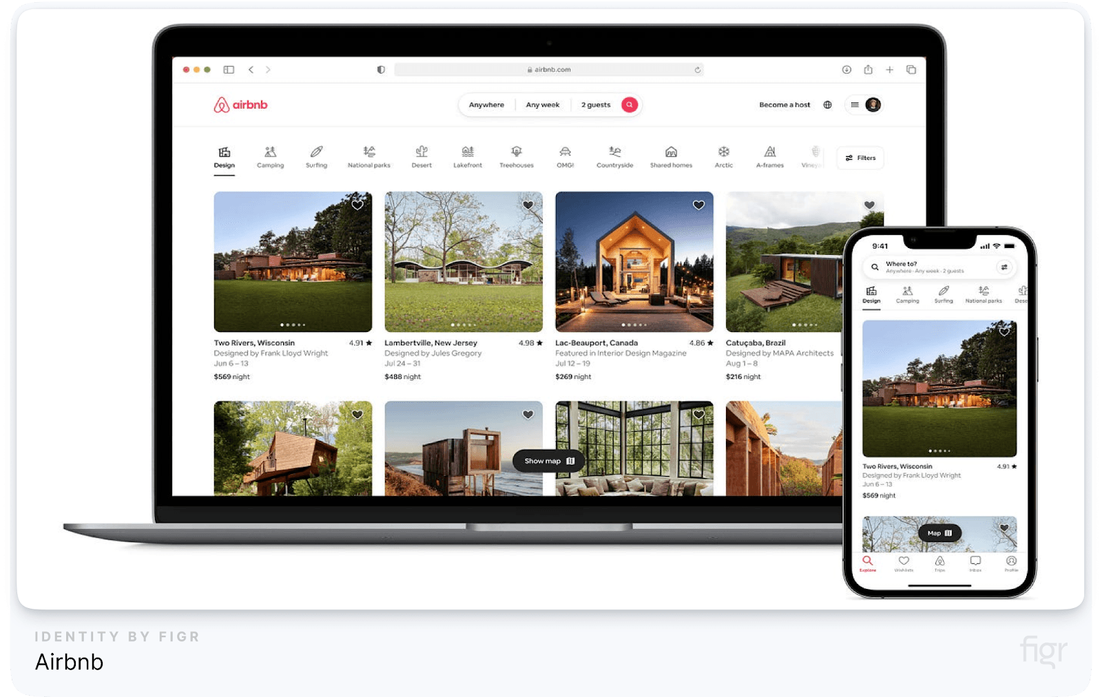
Airbnb is widely recognized for its clean, intuitive, and visually appealing interface. Their UI design focuses on making it easy for users to search for accommodations, view property details, and make bookings—all with minimal effort. The layout is well-organized, and the visuals (high-quality images, clear typography) guide users through the experience effortlessly.
Key Highlights:
- Minimalist Layout: The use of white space, coupled with clear fonts and sharp imagery, creates a clutter-free experience.
- Responsive Design: Whether on mobile, tablet, or desktop, Airbnb’s design adjusts fluidly to provide a consistent experience across devices.
- User-Centric Navigation: Navigation is simple, with easy access to search filters, listings, and booking processes, ensuring that users can accomplish their goals without friction.
- How Figr Identity Can Help: By using Figr Identity, designers can create responsive design systems with a library of customizable components, ensuring consistent user experiences across platforms, just like Airbnb does.
Slack
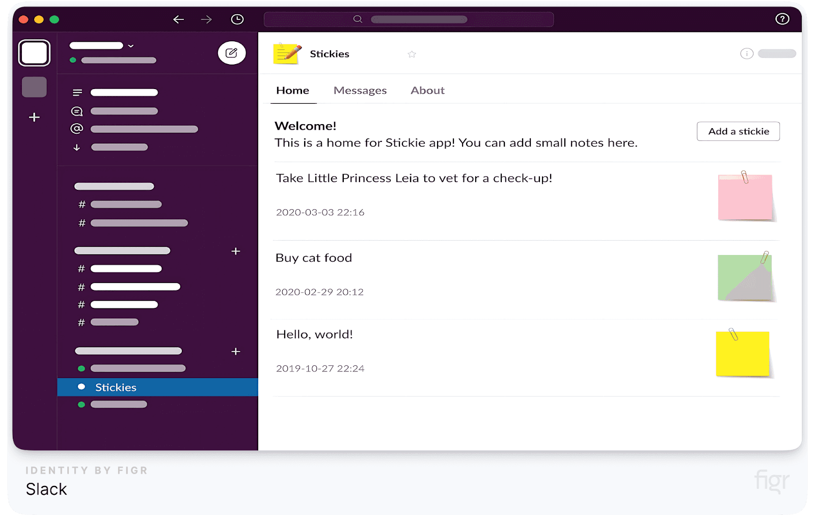
Slack’s user interface strikes the perfect balance between functionality and simplicity. Known for its efficient team communication tools, Slack focuses on making interactions between teams fluid and enjoyable. The use of color, iconography, and intuitive navigation makes Slack’s UI an industry standard for chat-based platforms.
Key Highlights:
- Clean Interface: Despite being packed with features, Slack’s UI is not overwhelming. Color-coded channels, simple icons, and easy-to-access buttons make the platform simple for even non-tech users.
- Customization: Users can personalize notifications, themes, and workflows, enhancing the usability and efficiency of the platform.
- Collaborative Tools: Slack integrates well with other apps like Google Drive, Asana, and Trello, giving users seamless control of their workflows without leaving the platform.
Apple’s Human Interface
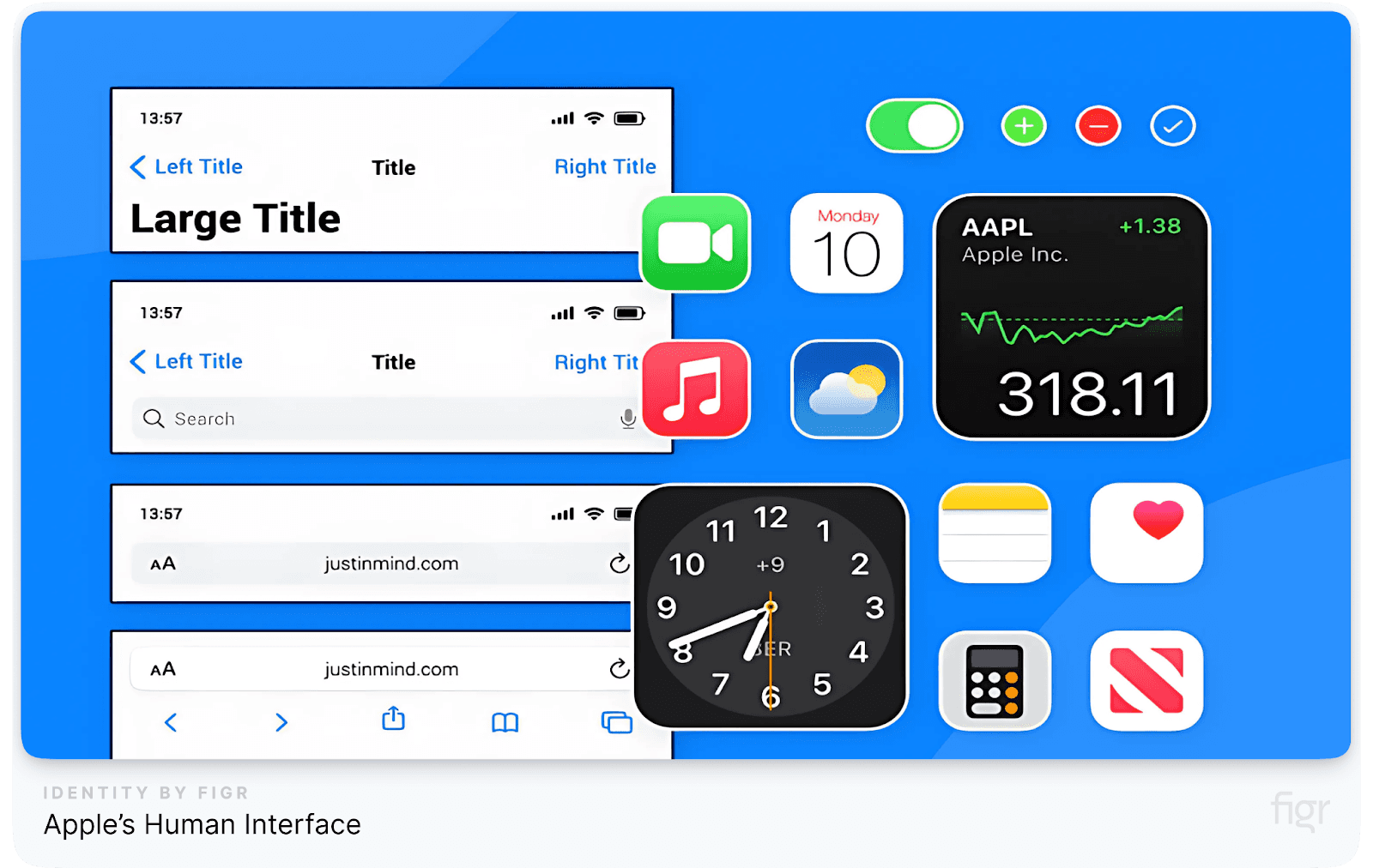
Apple is renowned for its intuitive and aesthetically pleasing UI design across all its devices. Whether you’re using an iPhone, iPad, or MacBook, Apple’s Human Interface Guidelines ensure consistency in interactions, visuals, and functionality.
Key Highlights:
- Simple, Yet Powerful: Apple’s UI focuses on minimalism, using only essential elements to guide users and make interactions smooth.
- High Accessibility: Apple is a leader in accessibility, with features such as VoiceOver and Zoom, allowing users with disabilities to navigate the interface easily.
- Seamless Integration: The design system across all Apple products remains consistent, making it easy for users to switch between devices without having to learn new interfaces.
- How Figr Identity Can Help: Figr Identity enables designers to follow Apple’s approach by creating cohesive, minimal design systems that are scalable and accessible across multiple platforms, ensuring an easy-to-use experience for all users.
In addition to the tools we’ve discussed, we also offer DesignKit, a carefully curated collection of UI kits designed by our in-house team. DesignKit includes some of the most popular and highly sought-after UI kits, such as those from industry-leading brands like Duolingo, TikTok, YouTube and others. These resources empower you to easily integrate proven design patterns into your system, further enhancing your workflow.