Creating an intuitive user interface is one of design’s biggest challenges. Even the most visually appealing interfaces can confuse users when navigating complex applications or new features. Without clear guidance, users may feel frustrated, lost, or abandon the product entirely.
This is where tooltips help. These small but powerful UI elements provide immediate, specific instructions exactly when users need them. But as simple as they seem, designing, creating, and using tooltips effectively requires thoughtful planning.
In this blog, we’ll explore what tooltips are and how to create them for seamless, user-friendly designs that enhance engagement and usability. You’ll also learn about different types of tooltips and common mistakes to avoid, ensuring your tooltips improve your UI rather than hinder it.
What is a Tooltip?

Credit: NALSengineering
A tooltip is a small, informative UI element that provides additional guidance or context to users. It appears when a user interacts with a specific element on a webpage or application, such as hovering over an icon, button, or text link.
Tooltips are designed to enhance understanding without interrupting the user’s flow, offering quick information exactly where and when needed.
Types of Tooltips and Their Use Cases
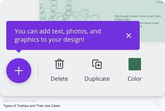
Tooltips come in various forms, each designed to serve specific purposes within an interface. Choosing the right type of tooltip for your design ensures users receive the guidance they need in the most effective way.
1. Descriptive tooltips
- Purpose: Provide additional information about an element, such as an icon or button.
- Use cases:
- Explaining the function of unfamiliar icons (e.g., “Save as draft”).
- Clarifying ambiguous actions, like a camera icon that allows “Search by image.”
2. Interactive tooltips
- Purpose: Allow users to perform actions directly within the tooltip.
- Use cases:
- Offering a quick walkthrough or tutorial with actionable steps (e.g., filling in a field or selecting an option).
- Displaying editable forms or links to additional resources.
3. Validation tooltips
- Purpose: Provide real-time feedback on user inputs in forms or fields.
- Use cases:
- Highlighting errors, such as invalid email formats.
- Offering suggestions or examples to correct user input (e.g., “Password must include at least one uppercase letter”).
4. Instructional tooltips
- Purpose: Guide users through multi-step processes or complex workflows.
- Use cases:
- Onboarding new users with a step-by-step tutorial.
- Explaining how to use advanced features or tools.
5. Contextual tooltips
- Purpose: Deliver highly specific information based on user interaction or location within the app.
- Use cases:
- Highlighting changes or updates to a feature in response to user activity.
- Providing additional details for niche or advanced functionality.
6. Warning tooltips
- Purpose: Notify users of potential issues or restrictions in their actions.
- Use cases:
- Alerting users about unsaved changes when exiting a form.
- Explaining why certain features are disabled (e.g., “You need admin access to use this feature”).
7. Persistent tooltips
- Purpose: Stay visible until manually dismissed by the user, ensuring important information is not overlooked.
- Use cases:
- Announcing new features that require attention.
- Providing detailed explanations for critical user actions.
Tooltip vs. Popup Tip
Tooltips and popup tips are often confused due to their overlapping functions, but they serve distinct purposes in user interface design.
Popup tips are also called "toasts" or "snackbars," depending on their style and placement. Understanding their differences can help you use each element effectively to enhance user experience.
Key differences between tooltips and popup tips:
- Trigger mechanism
- Tooltips: These are activated when a user hovers over or focuses on an element, typically with a mouse or keyboard.
- Popup tips: These appear automatically and are often triggered by specific actions, such as opening a page or completing a task.
- Purpose
- Tooltips: They provide concise, contextual help about a specific element or action without interrupting the user's workflow.
- Popup Tips: They deliver more extensive information or announcements, often used to highlight new features, show confirmation messages, or guide users through a process
- Design and placement
- Tooltips: Compact and positioned close to the element they describe, keeping the focus on the specific feature or action.
- Popup Tips (Toasts/Snackbars): Larger in size, often designed to appear in prominent areas of the screen to capture user attention while being dismissible or timed.
With these distinctions in mind, you can strategically use tooltips and popup tips (or their variations) to enhance user experience.
Now, let’s dive into the practical side of things—How to create tooltips using different methods and tools!
How to Create Tooltips: Methods and Tools
Creating effective tooltips involves balancing simplicity, clarity, and functionality. Below, we break down various methods for creating tooltips based on technical requirements and design preferences. Let’s explore how you can create tooltips using Bootstrap and jQuery:
How to Create Tooltips Using Bootstrap
Bootstrap is a popular open-source framework that provides ready-to-use components for tooltips. Here's how you can use Bootstrap to create tooltips:
- Include Bootstrap and Its Dependencies: To utilize Bootstrap's tooltip functionality, you must include Bootstrap's CSS and JavaScript files, along with Popper.js (a library Bootstrap relies on for positioning).
You can include these via a Content Delivery Network (CDN) or by hosting them locally.
- Add Tooltip Markup to Your HTML Elements: In your HTML, add the data-bs-toggle="tooltip" attribute to the elements you want to have tooltips.
Use the title attribute to specify the text that should appear in the tooltip.
- Initialize Tooltips with JavaScript: Tooltips in Bootstrap are opt-in for performance reasons, so you need to initialize them explicitly using JavaScript.
So after including the necessary files and setting up your HTML elements, initialize the tooltips using JavaScript. This step activates the tooltip functionality, enabling the tooltips to appear when users interact with the specified elements.
By following these steps, you can effectively implement tooltips in your project using Bootstrap.
How to Create Tooltips Using jQuery UI
jQuery UI is a collection of GUI widgets, effects, and themes built on top of the jQuery JavaScript Library. You can use it to create simple, customized tooltips without relying on a full framework like Bootstrap.
- Include jQuery and jQuery UI: Ensure that both the jQuery library and jQuery UI are included in your project. You can add them via a Content Delivery Network (CDN) or host them locally.
Including the jQuery UI CSS file is also necessary to apply default styling to the tooltips.
- Add Title Attributes to HTML Elements: In your HTML, assign the title attribute to the elements for which you want to have tooltips. The value of this attribute will be the text displayed in the tooltip.
For example, adding title="Your tooltip text" to a button or link will enable the tooltip for that element.
- Initialize Tooltips with jQuery: After including the necessary libraries and setting the title attributes, initialize the tooltips using jQuery. This involves calling the .tooltip() method on the desired elements.
You can target specific elements or initialize tooltips with a title attribute for all elements.
By following these steps, you can effectively implement tooltips in your web projects using jQuery UI.
How to Create Tooltips From Scratch with JavaScript, HTML, and CSS
Creating tooltips from scratch using HTML, CSS, and JavaScript allows for complete customization to fit your application's design and functionality. Here's a step-by-step guide to building a basic tooltip:
1. HTML Structure
Start by defining the HTML elements that will display the tooltips. Use attributes like data-tooltip to store the tooltip text directly within the element. This ensures your tooltip content is easily accessible and decoupled from other components. Assign classes or IDs to elements for styling and scripting.
2. CSS Styling
Style the tooltips using CSS to make them visually distinct and functional. This involves:
- Base design: Define the appearance of the tooltip, such as background color, text color, padding, border-radius, and font styling, ensuring it complements your application's design.
- Positioning: Use relative positioning for the parent element and absolute positioning for the tooltip to place it near the target element. You can position the tooltip above, below, or to the side of the element.
- Transitions: Add smooth transitions for effects like fading in and out, making the tooltip more interactive and user-friendly.
- Visibility management: Set the tooltip to be hidden by default (e.g., using opacity: 0 or display: none) and make it visible when the user hovers over or interacts with the element.
3. JavaScript for Enhanced Functionality
Use JavaScript to handle dynamic behavior and interactions, such as tooltip positioning and responsiveness. Key tasks include:
- Event handling: Add event listeners for mouseenter and mouseleave events on tooltip-enabled elements to manage when the tooltip appears and disappears.
- Dynamic tooltip creation: Create tooltip elements dynamically (e.g., div or span) during runtime and populate them with the text stored in the data-tooltip attribute.
- Position calculation: Calculate the position of the tooltip based on the target element's dimensions and its location in the viewport. Adjust the tooltip position to prevent it from being cut off or overlapping other elements.
- Cleanup: Ensure tooltips are removed from the DOM when the user moves the mouse away or the interaction ends.
Explanation of the Workflow
- HTML: The data-tooltip attribute stores the tooltip text, keeping the content accessible and flexible.
- CSS: The tooltip's visual design, positioning, and transitions are handled through styles, providing a polished user experience.
- JavaScript: Adds interactivity, including dynamic creation, precise positioning, and cleanup, ensuring the tooltip behaves as expected in all scenarios.
This method provides a highly customizable and lightweight solution, making it ideal for applications that require unique tooltip designs or functionality. It also eliminates reliance on external libraries, keeping your codebase lean and efficient.
But creating tooltips doesn’t have to be a complex, time-consuming process.
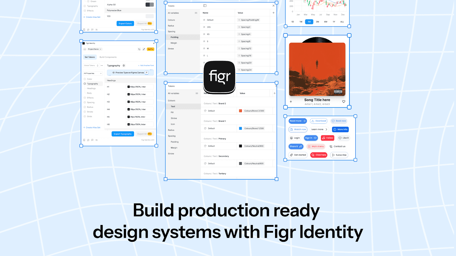
With Figr Identity, you can simplify your design process and ensure tooltips match your brand style perfectly, using tokens for consistency and visual appeal.
Here’s how Figr Identity helps:
- Predefined styles and tokens: Generate tokens for colors, typography, and spacing to maintain consistent tooltip designs across your product.
- Customizable components: Build and refine tooltips with live previews and adjust styles to match your brand’s identity.
- Seamless exports: Export production-ready components directly into your design system, saving time and reducing manual effort.

Figr Identity empowers designers to focus on crafting meaningful user interactions while the technical details are handled with precision. It’s your go-to tool for creating professional-grade tooltips that enhance user experiences.
Now that you understand how to create tooltips, let’s explore real-world examples of effective tooltips and how they enhance user experiences.
Real-World Examples of Effective Tooltips:
Now that you understand how to create tooltips, let’s explore real-world examples of effective tooltips and how they enhance user experiences.
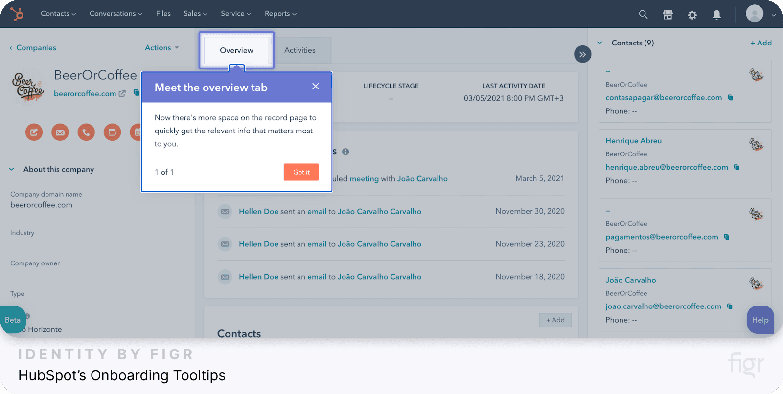
1. HubSpot’s Onboarding Tooltips
Credit: Hubspot
- How they’re used: HubSpot, a leading marketing platform, guides new users with interactive tooltips during the onboarding process. These tooltips:
- Highlight key features.
- Provide step-by-step walkthroughs for completing tasks.
- Use progress bars to show onboarding stages.
- Why they’re effective: The tooltips are concise, action-driven, and customizable for different user types.
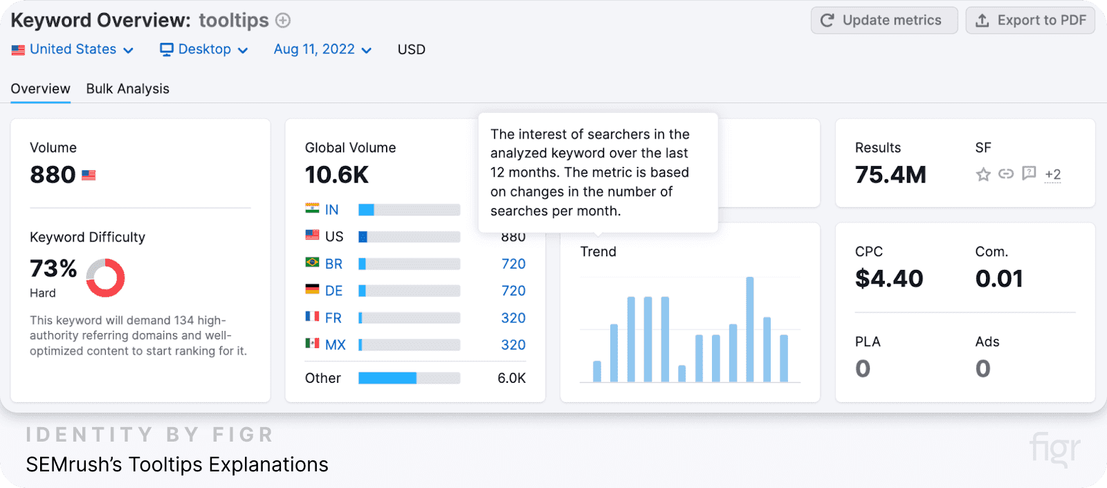
2. SEMrush’s Tooltips Explanations
Credit: Semrush
- How they’re used: SEMrush uses tooltips to explain technical SEO terms in its interface. These tips pop up when users hover over certain metrics, offering quick definitions or explanations.
- Why they’re effective: They provide valuable context without overwhelming users with too much information.
3. Buffer’s Tooltips
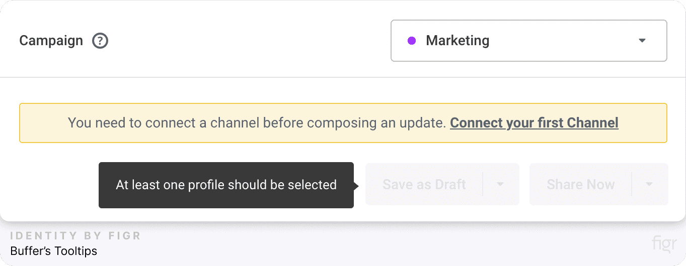
Credit: Buffer
- How they’re used: Buffer, a social media management tool, uses tooltips to inform users why certain actions are restricted (e.g., connecting accounts). These tips:
- Use color-coded warnings.
- Direct users toward resolving the issue.
- Why they’re effective: They combine clarity with actionable guidance, helping users stay on track.
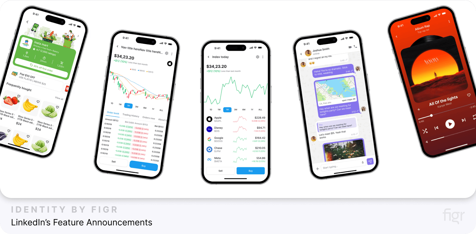
4. LinkedIn’s Feature Announcements
- How they’re used: LinkedIn uses tooltips to introduce new features. These tooltips:
- Are non-intrusive and visually aligned with the interface.
- Contain brief messages, such as “Try this feature now!”
- Why they’re effective: The tooltips draw attention to updates without disrupting workflow.
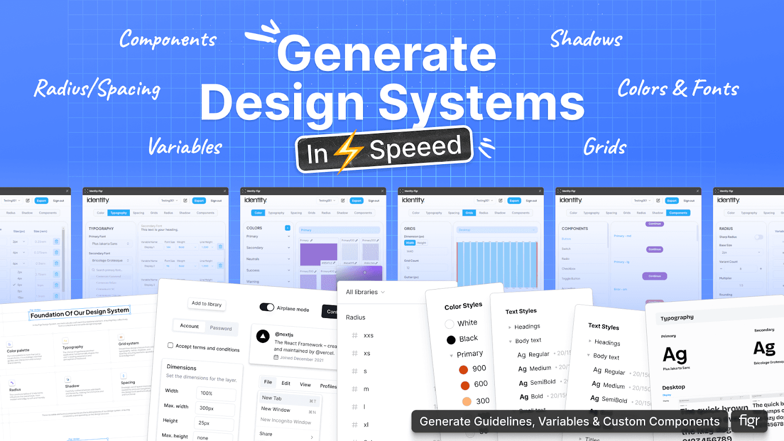
Creating tooltips that engage and guide users, as seen in successful examples like SEMrush or LinkedIn, requires precision and consistency. Figr Identity empowers designers to achieve this with ease.
- Dynamic styling for diverse use cases: Customize colors, typography, and layouts to align your tooltips with various design scenarios, from onboarding flows to feature walkthroughs.
- Pre-built design tokens: Use Figr Identity’s pre-set tokens for faster implementation of tooltips, ensuring every tooltip blends seamlessly with your brand’s UI.
- Consistency at scale: Maintain uniformity across tooltips and other UI components, making your product feel cohesive and professional.
While effective tooltips can elevate user experience, poorly implemented ones can frustrate users and hinder engagement. So, let’s dive into common mistakes to avoid when designing tooltips.
Common Mistakes to Avoid When Creating Tooltips:
From overloading users with information to neglecting accessibility, there are several pitfalls to be aware of when designing tooltips.
In this section, we’ll highlight common mistakes to avoid and provide insights on how to ensure your tooltips are both functional and user-friendly.
1. Overloading tooltips with information
Tooltips should deliver concise, actionable tips, not detailed explanations or tutorials. Long tooltips can overwhelm users and make quick guidance ineffective.
Solution: Keep the content short—ideally one or two sentences. If additional details are necessary, include links to external resources for further reading.
2. Blocking key interface elements
When tooltips overlap or obscure important UI components, they can frustrate users and disrupt their workflow.
This creates unnecessary friction, as users may need to close the tooltip to access vital information, which defeats the purpose of providing seamless guidance.
Solution: Test tooltip placement in various scenarios to ensure they complement the interface rather than obstruct it. Position tooltips strategically so they enhance usability without interfering with key elements.
3. Triggering tooltips at the wrong time
Tooltips that appear at inappropriate moments or without context can confuse users rather than guide them.
For instance, showing an advanced feature tooltip to a beginner-level user might overwhelm them instead of providing helpful guidance.
Solution: Implement event-based triggers to ensure tooltips are contextually relevant. For example, display a tooltip only when a user interacts with a feature or reaches a specific step in their workflow, aligning the guidance with their current needs and actions.
4. Making tooltips non-dismissable
Tooltips that cannot be dismissed force users to interact with them, creating unnecessary friction and frustration.
This can disrupt the user experience, especially when users already understand the information or find the tooltip irrelevant.
Solution: Always include a clear “Dismiss” or “Skip” option for tooltips. This empowers users to bypass tips they don’t need, allowing them to maintain control over their experience while keeping the interface unobtrusive.
5. Inconsistent design and messaging
Tooltips that vary in style, font size, or tone can confuse users and erode trust in your application. Lack of uniformity makes the interface look unprofessional and detracts from the overall user experience.
Solution: Establish a standard design system for tooltips, including consistent styles, font sizes, and messaging tone. Ensure every tooltip aligns with your brand’s voice and design guidelines to create a cohesive and polished interface.
6. Ignoring accessibility
Tooltips that work only on mouse hover leave out users who depend on keyboard navigation or screen readers, limiting inclusivity. Accessibility gaps hinder user experience and fail to meet universal design standards.
Solution: Make tooltips accessible by supporting keyboard triggers (like the Tab key) and ensuring compatibility with screen readers. Follow established accessibility guidelines such as WCAG to make your tooltips usable for all users, regardless of their abilities.
7. Misusing tooltips for critical information
Placing essential instructions, such as password requirements, in tooltips forces users to remember key details that should be immediately visible. This misuse creates unnecessary cognitive load and can lead to frustration.
Solution: Display critical information directly on the interface where users can easily access it. Reserve tooltips for supplemental or non-critical guidance that enhances the user experience without withholding necessary instructions.
Conclusion
Tooltips serve as a bridge between the user and your product’s full potential. As we’ve explored, creating effective tooltips is an art that combines thoughtful design, user-centric insights, and technical precision.
With Figr Identity, creating and managing tooltips becomes an intuitive and efficient process. It accelerates workflows by generating scalable design systems with pre-built tokens for colors, grids, and typography, saving time and effort.
It ensures consistency across all tooltips and UI components, reinforcing your brand's identity while maintaining a polished look.
Whether you're onboarding users, introducing new features, or crafting contextual guides, Figr Identity offers the flexibility to adapt to any project seamlessly.
By simplifying complex design challenges, Figr Identity empowers designers to focus on what truly matters—enhancing user experiences and driving engagement. Elevate your design process with Figr Identity today.

