It's 10 PM. You’re staring at a screen, trying to make a new dashboard component feel like it ‘belongs.’ You nudge it five pixels left, then three right. Something is still off, a feeling of imbalance you can't quite put your finger on. This isn't a failure of creativity. It's a failure of structure.
To design with grids is to lay a foundational structure of columns and rows that organizes every UI element with intention. This isn't about neatness: it's about turning subjective arguments over alignment into an objective, scalable system. This is the invisible architecture that separates a chaotic layout from an intuitive, professional interface.
The Invisible Architecture of Great Product Design
Great product design isn’t just about crafting beautiful components; it's about the silent framework holding them all together. A grid is that framework. It transforms subjective debates about "what looks right" into objective conversations grounded in a shared system.
This is where a deep understanding of user experience (UX) design becomes critical, because grids are the bedrock of a consistent and predictable UI.
A grid isn’t a cage that restricts you. It’s a scaffold that enables predictable, scalable, and faster design decisions. You’re not just aligning pixels; you’re building a shared language for your entire product team.
From Ancient Cities to Modern UI
The impulse to use grids for order is deeply human. The ancient city of Mohenjo-daro, built around 2600 BC, was designed on a meticulous grid of straight streets intersecting at perfect right angles. These grids were more than just practical, they symbolized order and harmony.
Do the same principles echo in modern UX?
Absolutely. A consistent grid helps users predict where to find information, creating a sense of calm and control.
Why Structure Unlocks Speed and Quality
I once watched a product team at a B2B SaaS company burn an entire sprint debating the layout of a new analytics page. The conversations were circular, all rooted in personal preference. "It feels too crowded," one person would say. "The hierarchy is unclear," another would add. Their problem wasn't the components, it was the absence of a system.
By introducing a simple 12-column grid, they established clear rules for spacing and alignment.
Suddenly, the debate shifted from opinion to logic. That’s the real power of a grid system:
- It creates consistency: Every screen feels like it belongs to the same product family.
- It speeds up design: Decisions about placement become mathematical, not philosophical.
- It simplifies handoff: Developers can implement designs with precision, which means far less rework.
This structured approach is the difference between endless pixel-pushing and focused, high-impact product development.
Choosing Your Grid Foundation: The 8-Point System
Picking a grid is like laying out a city. Are you building Manhattan, with its rigid avenues that make scaling effortless? Or are you building Boston, with its organic streets that grew around unique terrain? One optimizes for efficiency, the other adapts to the content.
The basic gist is this: let your content's nature dictate your grid's structure.
The Default Standard: 8 Points of Harmony
For most digital products, the debate has largely settled on a specific standard: the 8-point grid system. This just means every UI element’s dimensions, margins, and padding are set in multiples of 8px (think 8, 16, 24, 32, 40, and so on). Why this number?
It’s not arbitrary. It’s a pragmatic choice rooted in the simple math of the screens we use every day. Most common screen resolutions are cleanly divisible by 8. This means scaling interfaces up or down from mobile to desktop results in crisp rendering without those awkward half-pixels.
Adopting an 8-point system is the first step in moving from subjective alignment to an objective, shared language. It’s a rule that simplifies countless future decisions.
Why This System Creates Calm
The human brain seeks patterns. Consistent spacing reduces cognitive load, letting users focus on the content, not the container. The 8-point system enforces a predictable rhythm across an entire application. This is what I mean by building a shared language. When a designer specifies a 24px margin, the developer knows exactly what that means.
No ambiguity.
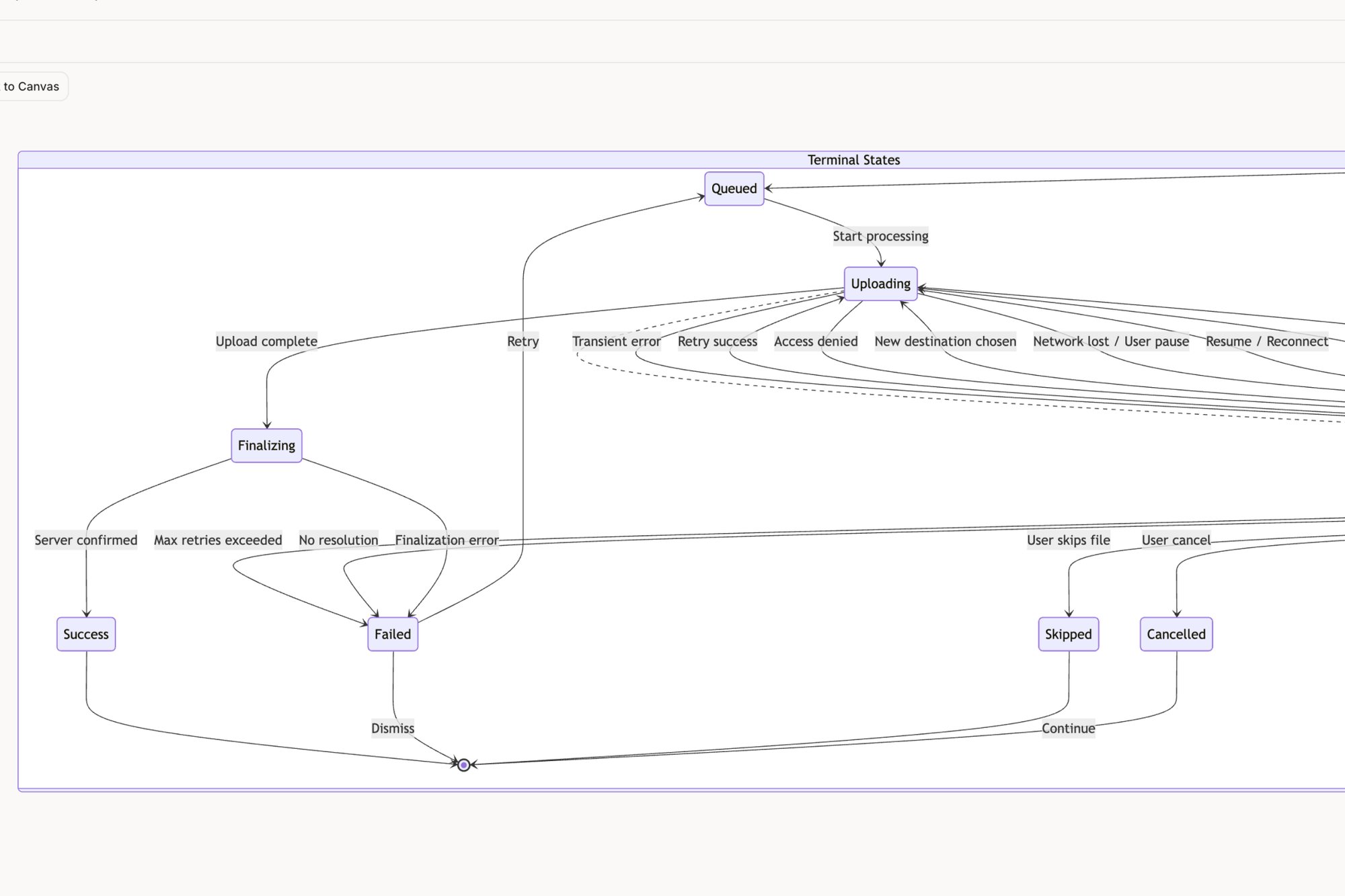
This consistency is crucial for building scalable and maintainable products. You can see this principle in action when mapping out a complex user flow, where consistent spacing for each state is critical for comprehension. We mapped all the edge cases for a feature like this in our Dropbox File Upload Pathfinder canvas.
This system also aligns with best practices for creating accessible and usable interfaces. As documented in Alan Cooper's About Face: The Essentials of Interaction Design, predictable patterns and a clear visual hierarchy are fundamental to good design. The 8-point grid provides the scaffolding for that hierarchy. You can learn more about responsive design best practices. This is the foundation upon which intuitive experiences are built.
Translating Grid Theory Into a Figma Setup
Theory is great, but the real test is turning abstract grid principles into a tangible, team-wide system inside Figma. This is where the blueprint becomes the building. And it all starts not with columns or margins, but with a single, foundational decision: your base unit.
For nearly all digital work, this will be 8px. From there, every component, every margin, every piece of your UI will be a multiple of this number. It's the atomic unit of your design language.
The grid is the crucial bridge between your content strategy and the final UI. It’s what makes sure the structure actually serves the information.
From Base Unit to Responsive Layout
Once your 8px base unit is set, you can start configuring your layout grids in Figma. But you're not just creating one grid; you're creating a set of rules for different screen sizes. Here’s a common setup:
- Mobile (e.g., 375px wide): A 4-column grid. Set your margins to a multiple of 8, like 16px or 24px, to give content breathing room. Gutters, the space between columns, should also be a multiple of 8, often 16px.
- Tablet (e.g., 768px wide): An 8-column grid. You can increase your margins and gutters here, maybe to 24px or 32px, to better suit the wider canvas.
- Desktop (e.g., 1440px wide): A 12-column grid. This gives you maximum flexibility for complex layouts. Here, margins can be set to "auto" to center the main content area, while gutters stay consistent.
This systematic approach is the bedrock of modern interface design, but it has roots in the post-WWI Swiss Grid Style. Pioneers like Josef Müller-Brockmann refined these systems, and today, that precision lives on in code. A study by the Nielsen Norman Group found that users' task success rates improve significantly on sites with strong visual hierarchies, a direct outcome of grid-based design.
The Bridge to Engineering: Design Tokens
A grid defined in Figma is only half the battle. To make it truly scalable, you have to codify your spacing rules as design tokens. Instead of telling a developer "use a 24px margin," you tell them to use the spacing-large token, which is defined as 24px.
A friend at a Series C fintech told me his team cut design-dev alignment meetings by 40% simply by standardizing their Figma grid and linking it to tokens.
The grid became the undisputed source of truth.
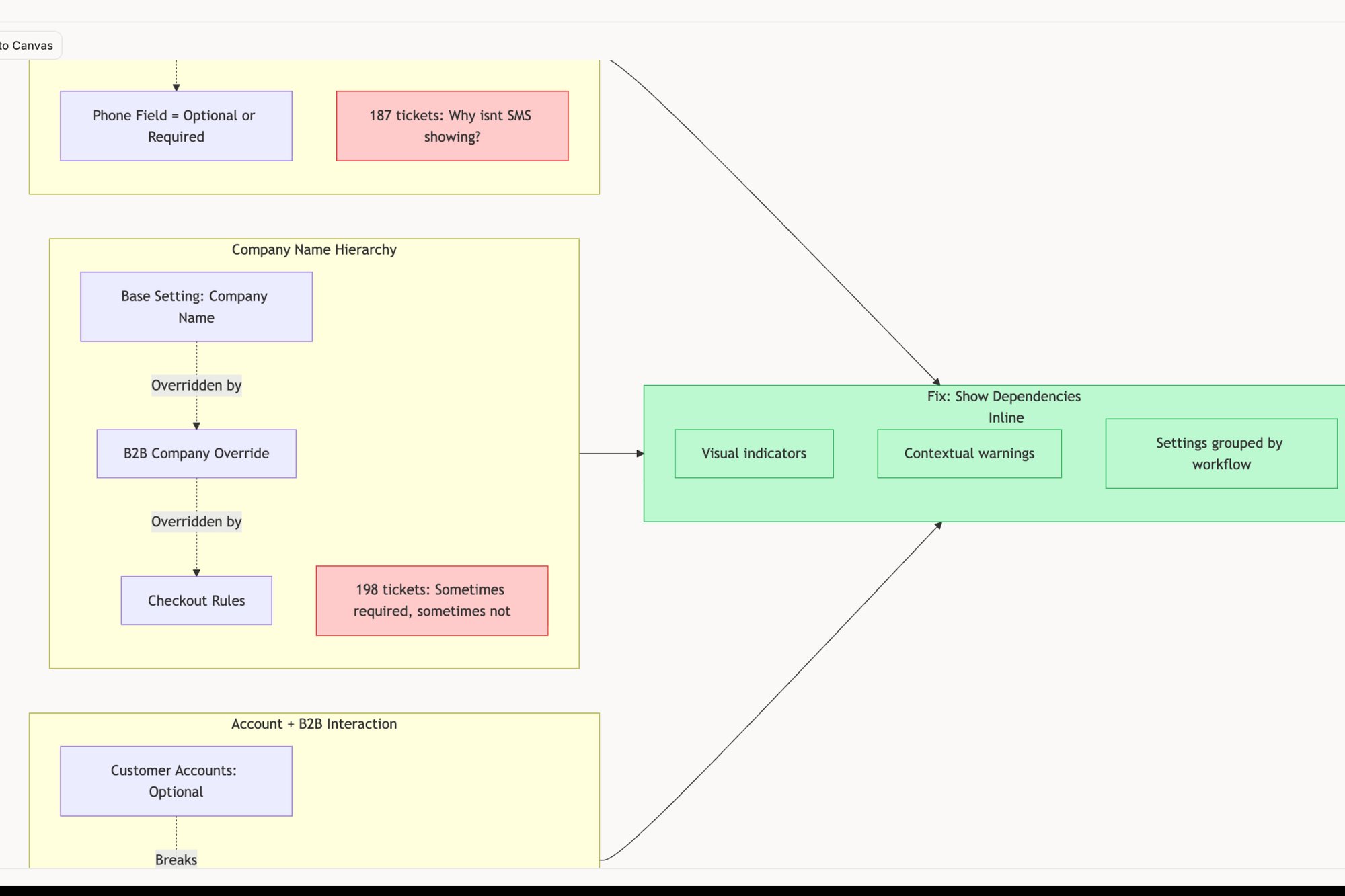
This is what I mean by building a shared language. The token is a contract between design and engineering. This is also where AI tools can dramatically speed things up. For instance, they can analyze an existing product to recommend a grid and token system, as seen in this Figr canvas for a Shopify checkout redesign. When your grid is expressed as tokens, it stops being a suggestion and becomes a rule. Check out our guide on how to use design tokens for a deeper dive.
Scaling Your Grid System for Handoff and Growth
A grid system living in a single Figma file is a good start. A grid system that scales across an entire product organization? That’s a competitive advantage. This is where we stop talking about pixels and start talking about economics.
Why do so many design systems fail at enforcement? They treat the grid as a design-only artifact, a polite suggestion engineers can safely ignore. But real scalability only happens when the grid becomes a shared language. Think of it like a national railway. For trains to travel seamlessly, every region must agree on a standard track gauge. Your grid is that standard gauge.
From Blueprint to Production
When your grid is a shared concept, handoff becomes less of a painful translation and more of a quick confirmation. This alignment slashes rework and accelerates onboarding. To make this work as your product grows, understanding the nuances of comparing adaptive and responsive web design is critical for nailing performance across every device.
Last quarter, I watched a PM spend days documenting every single state for a simple task assignment component. By building it on a strict grid from the start, she ensured every state was visually consistent. It prevented ambiguity before it started. You can see how that structure brings clarity by flipping through the component states in this interactive prototype.
The Economics of Order
This idea, imposing structure to unlock growth, has a powerful historical precedent. The Commissioners’ Plan of 1811 laid a rectilinear grid over Manhattan, transforming chaotic growth into a structured masterpiece. That grid fueled explosive development. You can read more about the history of the master plan of Manhattan.
For product teams, a shared grid works the same way. It cuts down on endless debates, aligning the entire team on proven patterns that just work.
To make your grid truly scalable, you have to do three things:
- Document the Rules Clearly: Don’t just show the grid; explain its logic. Define your base unit, your breakpoints, and your token naming conventions.
- Automate the Handoff: Use tools that translate your Figma grid properties directly into code snippets or design tokens.
- Make it a Team Responsibility: The grid isn't just design's job. Pull engineering in early to make sure the grid you design is one they can actually build and maintain.
This system becomes the backbone of an efficient process. For a complete guide on closing the gap, check out our developer handoff playbook.
From Theory to Tangible Action
Alright, we’ve covered the principles, the practical setup, and the systems-level view. But knowledge without action is just trivia. What can you do in the next hour to make this real?
In short, don't try to boil the ocean.
Pick one single, high-traffic screen in your product. Not the whole app. Just one screen. Open up Figma, grab a screenshot of its current state, and drop a simple 12-column, 8-point grid over it.
Put One Screen to the Test
Now for the revealing part. Start nudging the existing elements into alignment. You’re not redesigning anything, just aligning what’s already there to your new grid lines and spacing rules.
You will almost immediately notice a few things:
- Hidden inconsistencies: An input field that’s 14px from its label, while another is 18px away for no apparent reason.
- A jumbled hierarchy: Elements that looked fine before now clearly seem out of place or fight for attention.
- A clear path forward: You'll get a tangible sense of how a simple structure feels instantly more professional.
This quick exercise is surprisingly powerful for surfacing hidden issues. A recent accessibility audit we ran on Skyscanner’s search interface revealed that minor alignment inconsistencies were contributing to a cluttered feeling for users with low vision. It's often the small things that add up.
The final step is to document what you found. Create a simple one-page summary with "before" and "after" screenshots. Share it with just one designer and one engineer.
Then ask them a simple question: "Would this make our lives easier?"
That single action is the first real step away from chaotic alignment and toward a shared, systematic language for your product.
Common Questions About Product Design Grids
Even with a solid plan, a few questions always pop up when a team really starts designing with grids. These aren't just technical issues: they're about navigating team dynamics and managing expectations. They represent the real-world hurdles between grid theory and a truly cohesive product.
Let's tackle the most common ones.
What Is the Difference Between a Grid and a Design System?
A grid is a core piece of a design system, but it’s not the whole thing.
The grid is the skeleton. It provides the underlying structure, defines all the spacing, and creates a predictable rhythm. A design system is the entire body. It includes that skeleton, but also brings in the color palettes, typography rules, interactive components, and even the tone of voice.
The grid tells you where to put things. The design system tells you what those things are and how they should behave. Can you have a robust design system without a coherent grid? No.
How Do I Convince My Team to Adopt a Strict Grid System?
Focus on outcomes, not the rules themselves. Nobody gets excited about following rules for the sake of it. Instead of saying, "we need to start using an 8-point grid," frame it in terms of benefits your colleagues actually care about.
For engineers, this means fewer CSS overrides and less guesswork. For product managers, it means faster prototyping and fewer visual bugs. A PM I worked with saw a 30% reduction in design-related churn after her team adopted a grid because it eliminated an entire category of subjective debates.
Start with a small pilot project. A successful pilot that ships faster and with higher quality is the most powerful argument you can make.
Are There Situations Where You Should Break the Grid?
Yes, but it has to be intentional, rare, and serve a clear purpose. Breaking the grid should be a deliberate choice to draw attention to a specific element, not an accident born from carelessness.
The best analogy is in music. A musician has to master the scales (the grid) before they can effectively use dissonance (breaking the grid) for emotional impact. If you break the grid for a primary call-to-action, it can be powerful. If you do it all the time, the result is just chaos.
You have to know the rules before you can break them effectively.
Can AI Help Create and Manage Grid Systems?
Absolutely. Modern AI-powered design tools can speed this process up significantly. An AI agent, for instance, can analyze your entire application, identify dozens of inconsistent spacing patterns, and then recommend a standardized grid based on what it finds.
This is a game-changer for teams trying to retrofit a grid onto a legacy product. A task that might take a designer weeks of manual auditing can be crunched down into a few minutes of analysis. It grounds your decision-making in real data from your own product, much like this UX audit of Linear vs Jira surfaces objective patterns. What used to be a monumental effort becomes an achievable starting point.
Ready to stop debating pixels and start shipping faster? Figr is an AI design partner that learns your product's context, design system, and analytics to help you create user flows, prototypes, and edge cases that are already on-brand and on-grid. Explore Figr and build with confidence.