
The weekly metrics review starts five minutes late. A revenue chart fills the screen, twelve widgets fight for attention, and someone from leadership points to a dense scatter plot and asks the question every dashboard has to answer: what should we do differently tomorrow?
No one has a clear answer.
I have seen teams hit that wall even with dashboards that are accurate and visually polished. The problem is rarely missing data. The problem is that the screen was designed to display information, not to support a decision. In practice, that gap is what separates a dashboard people admire in a gallery from one a team can put to use under pressure.
Strong dashboard examples are useful for that reason. They show more than chart styling. They reveal what a team chose to prioritize, what they made visible first, what they buried, and which actions they expected a user to take next. Layout, density, labels, and interaction patterns are all management decisions in interface form. Teams that get this right usually follow clear dashboard design best practices, and they use designing with grids and the right types of grids to make hierarchy feel obvious.
That distinction is important because dashboards do not live in isolation. They sit inside operating rhythms, reporting rituals, and product workflows. If the dashboard is unclear, the next conversation slows down, ownership gets fuzzy, and the decision often falls back to whoever speaks loudest in the room.
Teams usually struggle at the same moment. The canvas is blank, every stakeholder wants one more widget, and the chart debate starts before anyone agrees on the decision the page is supposed to support.
Figr is relevant here in a practical way. It generates dashboard layouts from product context, analytics requirements, and an existing design system, so teams can start with structured hierarchy instead of arranging cards by instinct. Teams at Visma and Zoho use Figr for this workflow. This Intercom analytics dashboard is a good example of how a vague reporting request can become a usable starting point with clear widget placement and responsive behavior.
The examples below are worth studying for a simple reason. Each one shows how a team translated priorities into interface decisions.
Financial dashboards for banks
Dashboard design examples that teach real decision-making
1. Tableau Viz Gallery
Monday morning review. The KPI is down, someone asks why, and the dashboard has to support the next three questions without sending the room into a report maze.
The Tableau Viz Gallery is useful because it lets you study dashboards under that kind of pressure. Many examples are interactive, so you can test filters, hover states, and drill paths instead of judging a static screenshot. That makes the gallery more than visual inspiration. It shows how teams structure analysis when people need answers in sequence.
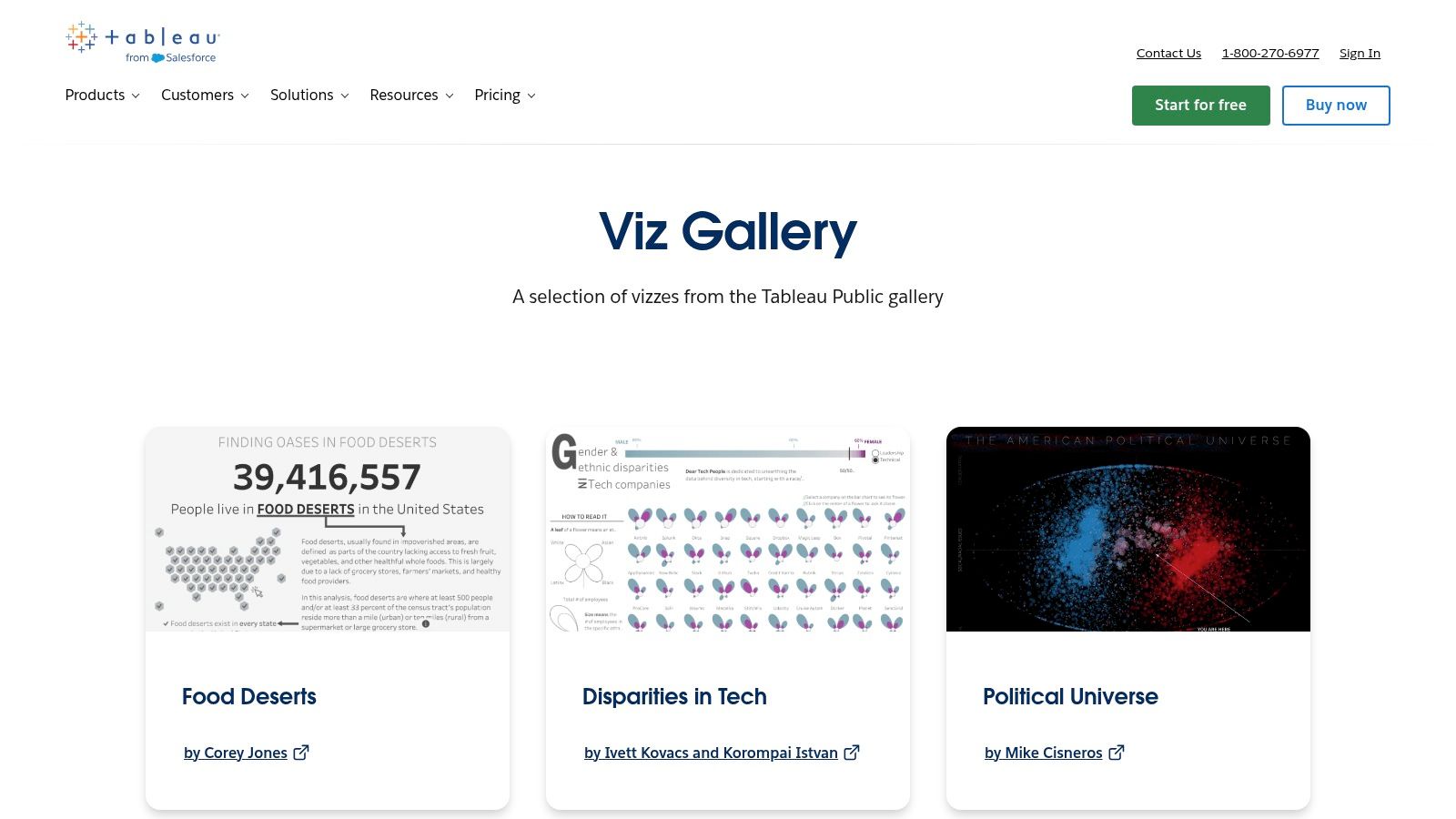
What stands out is inspectability. You can often move from the gallery into the underlying Tableau Public work and see how the dashboard was assembled. For product teams, that matters. The core lesson is not the color palette or chart choice. It is the decision model underneath, what gets summarized first, what gets segmented next, and what the author decided to hide until a user asks for more.
What Tableau gets right
The strongest examples handle layered analysis well. They open with a headline view, then let users move into segments, cohorts, time periods, or outliers. That mirrors how real review meetings work. Leaders start with movement, managers ask what changed, and operators need to find the exception they can act on.
A dashboard that cannot answer the second question rarely survives the first.
Tableau is also good for studying interaction discipline. You can see the difference between a filter that sharpens a decision and one that creates extra work. After reviewing enough examples, the pattern becomes obvious. The better dashboards treat interactivity as a way to reduce ambiguity, not as a feature to show off.
A few recurring traits show up in the strongest entries:
Clear framing: The title and first row establish the business question quickly.
Useful interactivity: Filters support comparison, segmentation, or investigation.
Controlled density: The page starts with orientation, then adds detail where users need it.
Visible hierarchy: Important numbers and explanations do not compete for the same visual weight.
Where it breaks down
The trade-off is variation. Community work ranges from rigorous operating dashboards to polished story pieces that would struggle in day-to-day use. That is part of the value, but it means teams need taste and judgment. A beautiful narrative visualization is not always a good model for an internal product, finance, or operations dashboard.
I usually pair gallery review with practical guidance on dashboard design best practices and more specific product velocity dashboard best practices. The gallery shows how people arrange information. The harder job is deciding which questions your own team needs answered in one screen versus a second view.
For teams building analytics dashboards with heavy drill-down needs, Tableau remains one of the strongest places to study interaction patterns. The lesson is straightforward. Flexibility helps only when the path from metric to explanation stays clear.
2. Microsoft Fabric Community Data Stories Gallery
Power BI dashboards often reveal enterprise reality faster than polished design showcases do.
The Microsoft Fabric Community Data Stories Gallery is full of shared reports built in and around Power BI conventions. That's why it's useful. You see slicers, bookmarks, page tabs, and layout decisions that are feasible inside a large company stack, not speculative concepts detached from implementation.
If you're looking for dashboard ui examples that survive enterprise constraints, this gallery is one of the better places to study. It reflects the compromises that happen when finance, operations, and leadership all need something from the same reporting environment.
Why Power BI examples matter
The strongest reports in this gallery understand role-specific scanning. Executives need top-line movement. Managers need team breakdowns. Operators need exception handling. Power BI's native interaction model forces some discipline around that because overloading a page with slicers and cards quickly becomes painful.
That pain is useful. It teaches restraint.
A friend at a Series C company told me their first internal Power BI dashboard had every available metric on one page. Adoption lagged. When they narrowed each dashboard to a smaller set of decision-driving metrics and split deep dives into separate views, usage improved. That's a common pattern. Clarity usually arrives after teams admit that one dashboard can't serve every audience.
The trade-offs to watch
The gallery is broad, but breadth creates noise. Visual quality is uneven, and some examples explain almost nothing about why the report is structured the way it is. That means you have to read the artifact, not just admire it.
Use it for these questions:
How are slicers staged: Are they global, local, or buried where they won't hijack the main read?
How is navigation handled: Does the report split executive summary from analysis, or force them together?
What gets promoted: Which metrics earn the top row and which get pushed down?
A dashboard often fails long before the chart choice. It fails when the page doesn't know who it's for.
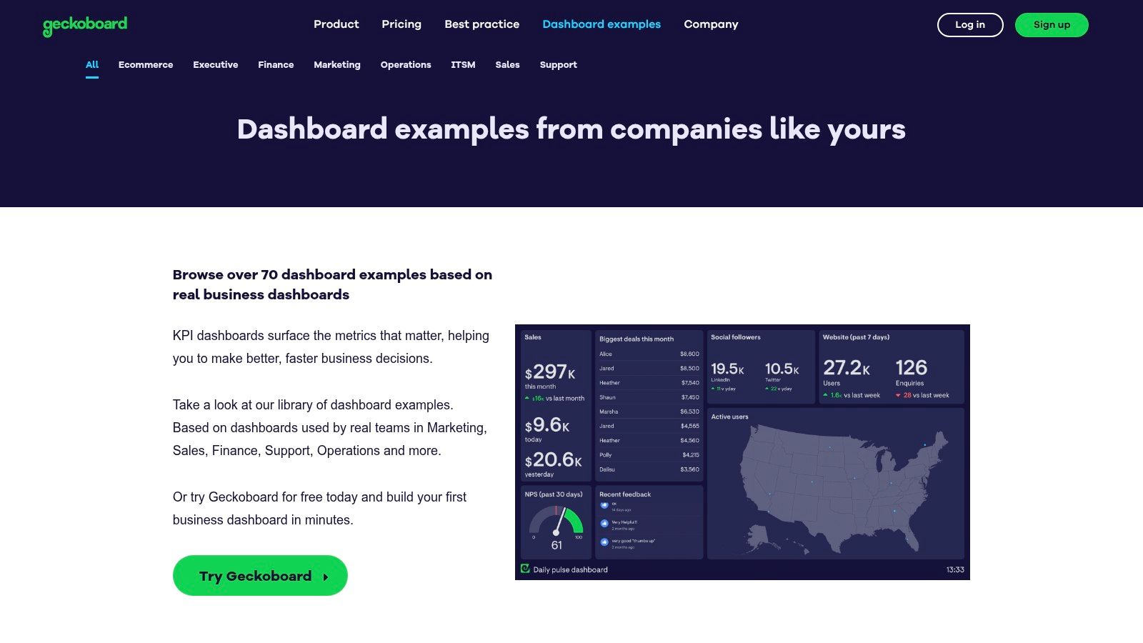
That is why Power BI galleries are good for governance thinking, not just visual inspiration. The examples force you to confront standardization. Large organizations need repeatable structures, and the Geckoboard ecosystem alone now hosts libraries of more than 70 real-world dashboard examples across functions and industries, a signal that standardized architectures have become central to faster business decisions according to Geckoboard's dashboard examples library.
If your current admin dashboard design feels busy, study Power BI pages that separate monitoring from investigation. Then apply the same discipline to your own reporting. That's one of the fastest ways to improve dashboard UI.
4. Metabase Example Dashboards and Made with Metabase
A leadership team is in a Monday metrics review. Revenue is soft, trial volume is up, and nobody can tell from the dashboard whether the problem sits in pricing, activation, or sales follow-up. Then someone opens a cleaner Metabase dashboard. One row for business health, one section for funnel movement, one path into investigation. The meeting changes because the page makes the decision path obvious.
That is why Metabase is useful to study. The Metabase examples library and Made with Metabase collection tend to show dashboards built for recurring operational questions, not visual theater. You can see the organizational choices in the interface. Which metrics get summary cards. Which charts earn full-width treatment. Which filters stay visible because the team expects constant slicing by segment, owner, or time period.
These examples are especially strong for B2B teams because they respect attention.
The better Metabase dashboards usually make a clear product decision early. The landing view answers, "Are we on track?" The next interaction answers, "Where is the problem?" Tabs, grouped sections, and restrained chart counts create that separation. It sounds simple, but teams miss it all the time. They combine status monitoring, diagnosis, and raw exploration on one screen, which makes every audience work harder than necessary.
Metabase also exposes a trade-off that polished galleries often hide. Minimal dashboards age well, but only if the information architecture is solid. A sparse layout with weak metric definitions is still a weak dashboard. Clean spacing does not rescue unclear ownership, inconsistent time windows, or KPIs that no one uses in planning. In that sense, these examples are less about decoration and more about disciplined user interface design.
I use this gallery to evaluate three things. First, whether the top row reflects decisions or vanity metrics. Second, whether the page density matches the review cadence. Daily operational dashboards can carry more alerts and exceptions than a monthly strategy readout. Third, whether interactivity supports a real workflow or just adds motion.
The downside is that restraint can become generic. Some examples are so pared back that they tell you little about hierarchy beyond "keep it clean." That means the gallery works best for teams refining structure, especially teams building internal tools, SaaS admin views, or KPI dashboards that need to survive repeated use. The lesson is not to copy the exact cards. The lesson is to notice how layout, density, and drill paths reflect what the team needs to decide, and how often they need to decide it.
4. Metabase Example Dashboards and Made with Metabase
Metabase is what I reach for when I want to study restraint.
The Metabase examples library doesn't overwhelm you with ornamental experimentation. It tends to favor clean layouts, sensible defaults, and dashboards that look like someone built them to answer a repeated business question rather than win a design award.
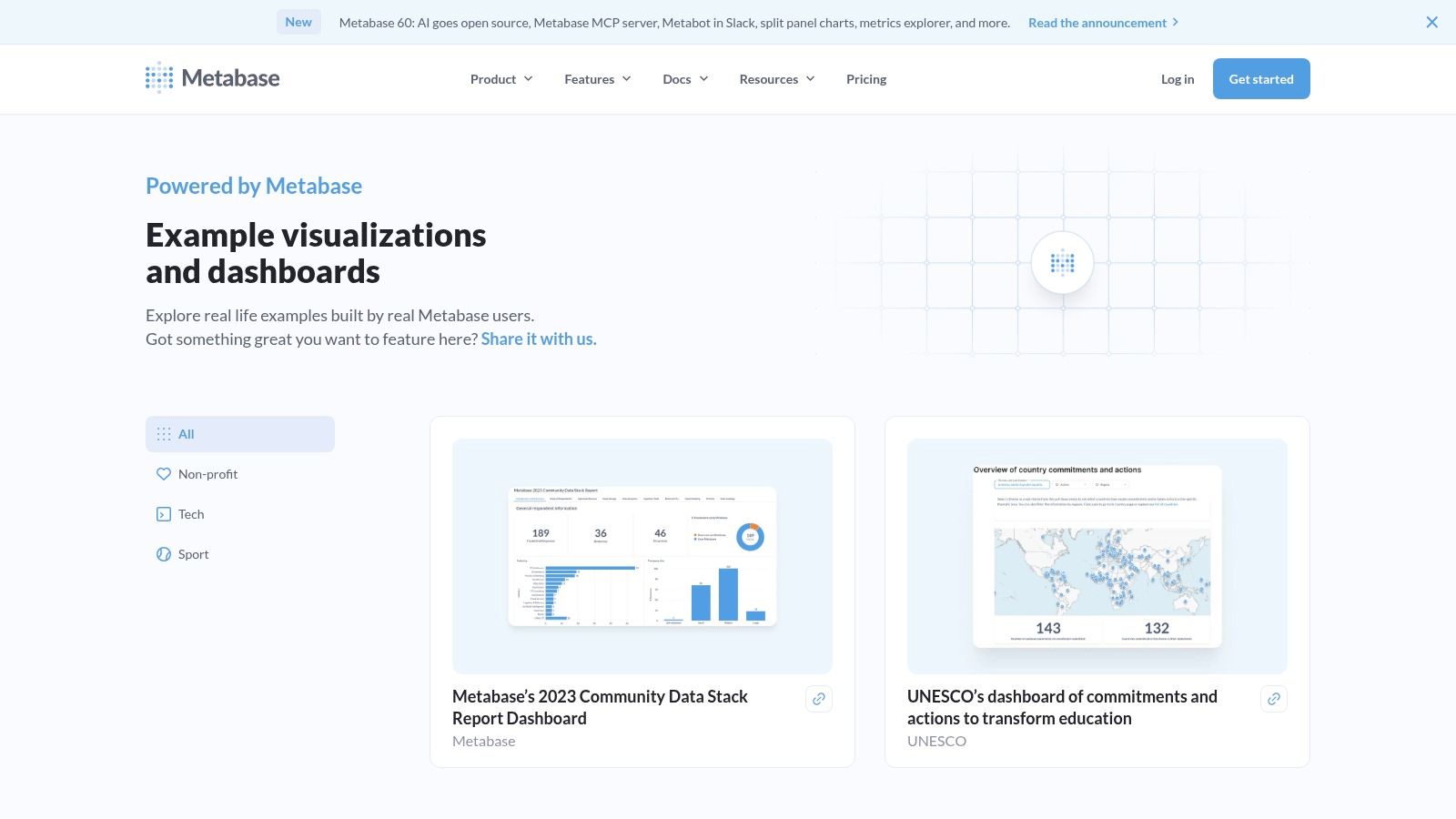
That's why these are some of the better dashboard layout examples for B2B teams. They show what happens when clarity, not flourish, sets the constraints.
Why minimal dashboards often age better
Metabase examples usually make one good product choice early: they don't ask the user to process everything at once. Tabs, filters, and modular grouping create containment. The main page says, here is the state of the system. Secondary views say, here is where to investigate.
That pattern aligns with what research summaries have noted about cognitive load in dashboards. A 2021 Smashing Magazine study cited in a FusionCharts trends paper found that excessive interactive elements increase decision time by 25 to 40 percent, while many reviewed examples overloaded primary views without progressive disclosure as summarized in the FusionCharts dashboard trends whitepaper.
You can feel that lesson in Metabase's better examples. They don't make the first screen do everything.
Good dashboards stage complexity. They don't eliminate it, they delay it until the user asks for it.
The trade-off
The gallery is smaller than Tableau or Power BI, and some examples are closer to vendor-guided baselines than organic community artifacts. That's fine if what you need is a stable starting point. It matters more if you're searching for unusual visual patterns or highly bespoke admin dashboard design references.
Metabase is especially good for teams evaluating embedded analytics or internal tooling. The layouts tend to foreground tables, KPI clusters, and trend comparisons that are common in operations and product environments. They also remind designers of a basic truth from user interface design: the interface isn't there to prove sophistication. It's there to reduce uncertainty.
If your current dashboard feels over-instrumented, Metabase is a useful corrective. Study how little it takes to create confidence when hierarchy is doing its job.
6. Geckoboard Dashboard Examples Library
A sales floor screen is flashing red at 9:12 a.m. The team lead does not need filters, drilldowns, or a clever chart type. They need to know whether pacing is off, where it broke, and whether someone should intervene before the next standup.
That use case explains why Geckoboard's examples hold up. The Geckoboard dashboard examples library is built around glanceability. These dashboards are designed for shared screens, team rituals, and fast status checks, not long analytical sessions.
That difference shapes every design decision.
Geckoboard's broader example set spans industries and functions, and the recurring pattern is easy to spot. Priority KPIs sit at the top. Trend or workload visuals occupy the center. Supporting detail drops lower on the page. Teams did not arrive at that structure by accident. It reflects a clear decision about consumption: what must be visible from a distance, what deserves a few more seconds of attention, and what can wait.
This is what makes the library useful beyond aesthetics. It shows dashboards as operating tools shaped by management cadence. A support dashboard reveals whether the organization values SLA risk, backlog age, or agent throughput. A sales dashboard reveals whether leadership cares more about target pacing, pipeline coverage, or rep activity. The layout is a record of what the team decided matters first.
What Geckoboard gets right
Geckoboard is strongest when the audience already knows the context and only needs current status. In that environment, dense exploration is a liability. Large numeric cards, blunt status colors, and clear grouping reduce the effort required to interpret the screen.
I like these examples for another reason. They force discipline.
A wallboard has limited space and limited patience from its audience. That pressure often produces better prioritization than dashboards designed for a solo analyst at a laptop. Teams have to choose the few metrics that change behavior. If they cannot make that choice, the dashboard usually exposes the confusion.
The trade-off
The same clarity that makes Geckoboard effective can make some examples feel narrow. These are less useful as references for exploratory product analytics, complex financial modeling, or multi-step investigation. If your user needs to compare segments, trace anomalies, and ask follow-up questions, this style can become too shallow.
That is not a flaw. It is a design boundary.
Use this library to study how teams communicate urgency, status, and accountability with very little visual friction. It is one of the better places to learn a practical lesson that many dashboard galleries blur: dashboard quality is not about how much data fits on a screen. It is about whether the screen supports the decision speed the situation demands.
7. Mobbin Real App and Web Dashboard Patterns
A product team ships a dashboard that looks polished in review. Two weeks later, support cannot find the right records, account managers ignore half the widgets, and admins keep leaving the page to finish basic tasks elsewhere. That failure usually is not about chart style. It is about product structure. The screen did not match the work.
The Mobbin library is useful because it exposes dashboards inside real products, where analytics has to share space with navigation, permissions, tables, filters, alerts, and detail views. These are shipped interfaces, not isolated concept shots.
That makes Mobbin one of the better references for admin dashboard design and dashboard UI examples grounded in product reality.
What these patterns reveal
A BI gallery can show how to present data clearly. Mobbin shows a different question. How does a dashboard earn its place inside a working application?
That question changes what you study. The interesting part is often not the hero chart. It is the surrounding product decisions. Where filters live. How much table density the team allows before scanning breaks down. Whether the primary action is investigate, monitor, approve, or correct. Those choices reveal who the product is for and what the organization expects users to do next.
I use Mobbin less for visual inspiration and more for interface judgment. Good examples show restraint. They do not force every metric onto the landing screen. They separate summary from action, and they give recurring users enough context to move without rereading the page every time.
Why shipped dashboards teach better lessons
Shipped dashboards carry visible trade-offs. Dense enterprise views often sacrifice whitespace to keep operators in one screen. Lighter SaaS dashboards reduce cognitive load but may hide important controls behind secondary states. Neither approach is automatically right.
That tension is exactly why Mobbin is worth studying.
You can compare how different teams handle the same constraints. Some products prioritize overview first and push editing into side panels or detail pages. Others bring operational controls directly into the dashboard because speed matters more than visual simplicity. Looking at those patterns as decision artifacts is more useful than treating them as a swipe file of nice screens.
Mobbin is also strong for role-specific interfaces. You see admin panels, analytics views, moderation queues, reporting centers, and settings-heavy products where the dashboard is only one stop in a larger workflow. That context matters. A dashboard that works for an executive snapshot often fails for a user who needs to triage exceptions all day.
Best use and limitation
Use Mobbin when you need to understand how dashboards behave inside products people ship.
Do not use it as your only source if the team is designing a data-heavy BI experience from scratch. The library is strongest at product patterns, navigation decisions, and applied UI structure. It is less useful for studying analytical rigor, annotation strategy, or complex data storytelling.
That boundary is part of its value. Mobbin helps teams stop treating dashboards as standalone visuals and start designing them as working surfaces shaped by roles, tasks, and product constraints.
7. Mobbin Real App and Web Dashboard Patterns
Mobbin is not a dashboard gallery in the BI sense. That's exactly why it's so useful.
The Mobbin library gives you real product screenshots from shipped apps and websites, including analytics surfaces, admin views, tables, filters, and navigation patterns across SaaS products. If Tableau shows data storytelling and Geckoboard shows wallboard clarity, Mobbin shows product reality.
That makes it one of the most practical resources for admin dashboard design and dashboard ui examples rooted in interfaces people ship.
Why shipped patterns matter
Shipped dashboards carry the scars of real constraints. Navigation has to coexist with data density. Tables have to behave. Empty states need to make sense. Filters can't break the page. You see all of that in Mobbin.
For PMs and design leads, this matters because dashboards rarely exist alone. They sit beside settings, workflows, alerts, and record-level pages. Studying shipped products helps you design a dashboard that belongs to a product, not just to a presentation.
This is also where niche adaptation becomes visible. Generic KPI-first examples often ignore roles like QA teams and UX researchers who need edge-case views, accessibility checks, and flow-aware context. A recent design analysis noted that only a small share of dashboards enforce WCAG 2.2 AA through automated checks, and that user-centric designs in a 100-plus dashboard analysis reduced error rates by 35 percent when edge-case heatmaps were included as summarized in this dashboard design analysis.
The limitation you need to accept
Mobbin screenshots are static. You can't test live interaction or data behavior. So don't use it to validate drill-down logic or dynamic filtering patterns. Use it to benchmark structural decisions:
Navigation density: How much chrome can a data-dense product tolerate?
Table treatment: When do products switch from charts to records?
Context handling: What sits near the dashboard because users need it in the same session?
A lot of teams jump from dashboard sketches straight into component assembly. That's backwards. First decide how the dashboard relates to the rest of the product. Then solve the widgets.
Mobbin also pairs well with broader journey work. If the dashboard is one stop in a larger workflow, you should examine adjacent user experience flows and downstream digital customer journeys. The screen gets clearer when you understand what comes before and after it.
From inspiration to implementation
Monday morning, five minutes before the leadership review, the growth lead is filtering a dashboard that looked reasonable on Friday. Now the room wants one answer. Why did conversion drop? The screen offers twelve cards, three time ranges, and two competing definitions of "active user." Everyone can see the data. No one can make the call.
That failure usually starts long before visual design. It starts when a team tries to represent every stakeholder request instead of the decisions the dashboard needs to support. The strongest examples in the galleries above work because they reflect a point of view. They give one audience the right level of detail for one operating cadence, whether that is a daily support check, a weekly pipeline review, or a monthly product readout.
A useful dashboard is an argument about priority. Layout shows what deserves attention first. Density shows how much context a user needs before acting. Interactivity shows whether the user is expected to monitor, diagnose, or investigate. Those choices are not decorative. They are traces of how the team works.
I have seen teams spend weeks debating chart types when the actual problem was ownership. If nobody can say which metric drives the decision, the interface turns vague fast. You get equal-sized tiles for unequal signals, crowded filters, and a top row designed to avoid conflict rather than direct action.
The practical move is smaller and less glamorous.
Take one dashboard your team already relies on and name the decision it exists to support. Then audit every element on the screen against that decision. Keep what helps a person decide. Demote what only adds context. Remove what exists because it was politically safer to include than exclude. That exercise often reveals more about the organization than about the UI.
If the dashboard is being rebuilt, define four things in order. User, decision, cadence, and required drill-down path. Only then should the team choose charts, set hierarchy, and tune visual polish. Teams that reverse that order usually ship something attractive but indecisive.
Reference galleries help at this stage, but only if they are used well. Do not copy a sales dashboard into a product review just because the layout looks clean. Steal the reasoning, not the screenshot. Ask why the summary row is sparse, why one view uses heavy filtering, or why another keeps interaction to a minimum. Those are operating choices.
Figr can support that implementation step for teams that already know their requirements and design system. It generates dashboard layouts from product context, which is useful when the team wants to test structure and flow without starting from a blank file.
The best dashboard design examples are not galleries of polished screens. They are records of decisions about what matters, who needs to know, and how fast a team needs to act.
Figr helps product teams move from dashboard idea to production-ready UI without starting from a blank file. It learns from your product context, design system, and requirements, then generates layouts, flows, edge cases, and high-fidelity prototypes that reflect how your team works.