
Most design conversations get stuck on the visible stuff: colors, fonts, slick animations. But under every great digital product, there’s an invisible architecture, a silent partner that guides the eye and makes the whole experience feel effortless. That architecture is a grid. Understanding the different types of grids is fundamental to creating order from chaos.
The Invisible Architecture of Great Products
Imagine a city with no streets. Buildings are just dropped wherever they seem to fit. Getting from the library to the market is a frustrating maze of dead ends and backtracking. Now, picture that same city with a planned street grid. Suddenly, you know where you are. You can see the patterns. You know how to get where you’re going.
A digital product without a grid is that chaotic city. It’s a jumble of disconnected elements that forces users to work harder, cranking up their cognitive load and leading to frustration. A grid system provides the streets. It creates predictable pathways, a clear visual rhythm, and a sense of calm.
A grid isn't a cage that restricts creativity; it's the framework that enables it. It’s the difference between a random pile of components and a cohesive, scalable design system. A well-defined grid is the contract between design and engineering, making sure everyone is building on the same foundation. You can find more detail on how to nail this in our guide to designing with grids.
Last week I watched a PM at a startup tear his hair out over their homepage redesign. The mockups looked amazing in Figma, but the live site just felt cluttered and "off." The problem wasn't the colors or the copy. It was the lack of a unifying grid. Elements were almost aligned, but not quite, creating a subtle visual tension that undermined the entire experience.
The basic gist is this: different problems demand different types of grids, just like a dense downtown needs a different street plan than a sprawling suburb. Throughout this guide, we’ll break down the essential grid systems that product teams use to bring order from chaos. Each type offers a unique way to solve specific layout and organizational challenges. For teams looking to get this right from the start, working with a skilled UI/UX design consultant can make all the difference.
Mastering these systems is the first step to building products that feel less like a maze and more like a well-planned city.
The Column Grid: The Backbone of Responsive Design
If digital design has a workhorse, it’s the column grid. This is the invisible scaffolding holding up the vast majority of websites and apps you use every day. Think of it as a versatile shelving unit: you can arrange items of different sizes on its shelves, but they all line up to the same vertical supports. The result is an immediate sense of order.
The system carves the screen into a series of vertical columns, with small gaps called gutters between them and margins on the outer edges. Content doesn’t just float around; it snaps to these columns. This simple constraint is the secret to creating layouts that feel balanced and intentional.
Why does this work so well? It's all about predictability. A consistent column grid means that as a user moves from one screen to the next, the underlying structure feels familiar. This reduces the mental gymnastics needed to process information, a core principle of effective responsive design. For a deeper look, check out our guide on responsive design best practices.
The Magic of the 12-Column Grid
You'll often hear designers and developers talk about a 12-column grid. Why twelve? Because it's a fantastically divisible number. You can split a 12-column layout into clean halves (6 columns each), thirds (4 columns each), or quarters (3 columns each).
This flexibility is a lifesaver for responsive design. It allows layouts to adapt gracefully from a wide desktop monitor all the way down to a narrow mobile screen. On a desktop, your main content might span 8 columns while a sidebar takes up 4. On a tablet, those elements could stack, each taking up the full 12 columns of the narrower viewport. This system is just as effective for a complex SaaS dashboard as it is for a simple marketing page.
This isn't just about lining things up. A grid provides the fundamental architecture for clarity, rhythm, and scale in any product.
The grid isn’t just an alignment tool. It is a strategic decision that makes a product understandable and scalable for both users and the teams building it.
From Print to Pixels: A Quick History
The power of grid-based design is nothing new. The Swiss Grid Movement of the 1940s and 1950s, led by designers like Josef Müller-Brockmann, made grids the bedrock of modernist design and corporate branding for decades.
With the rise of the web, and especially the game-changing arrival of CSS Grid in 2017, these principles became central to digital product development. It's a trend that's only accelerating; HTTP Archive data shows that CSS Grid usage on websites grew by over 50% between 2021 and 2022.
This is what I mean: a column grid is your starting point for sanity. It’s the simplest of the different types of grids, but its impact is massive. It creates a shared language for designers and developers, cutting down on ambiguity and speeding up the path from Figma to finished code. For any product manager, pushing for a standard column grid is one of the easiest wins for enforcing consistency and improving the user experience across your entire product.
The Modular Grid: For Precision and Organization
Sometimes, just having vertical columns isn’t enough. When you’re dealing with a screen packed with complex, repeating elements, you need another axis of control. That's where the modular grid comes in. It takes a column grid and adds horizontal rows, creating a matrix of individual cells, or modules.
Think of it as a spreadsheet or a well-organized set of index cards. Each cell holds its own little piece of the story, but it all fits together into a coherent whole. This is the secret weapon for taming dense interfaces like e-commerce product listings, complex dashboards, and photo galleries, anywhere you need absolute consistency.
Vertical and Horizontal Rhythm
The real power of a modular grid is how it creates both horizontal and vertical rhythm at the same time. Every module has a consistent width and height, and the gutters between them are identical. This builds a layout that’s not just stable, but also incredibly easy for the eye to scan.
I was in a user testing session last week for a new analytics dashboard. The user was squinting, his mouse just kind of floating over the screen. All the data was there, but the cards were slightly misaligned, some taller, some shorter, with uneven gaps between them. His hesitation wasn't about the data itself; it was the quiet chaos of the layout. It was the perfect argument for a modular grid.
A modular grid doesn't just align elements; it aligns expectations. Users learn the pattern instantly, allowing them to focus on the content, not the container.
This system is the bedrock for any scalable design system. It gives you clear, hard rules for how components should be spaced and aligned, rules that can be baked directly into reusable code. You can see this discipline at work in a well-structured component for task assignments, where every state has to fit perfectly inside its designated module.
When to Use a Modular Grid
So, when should you reach for a modular grid? It excels anytime you have a collection of repeating, self-contained blocks of content. Just ask yourself: am I presenting a collection of similar items?
If the answer is yes, a modular grid is probably your best bet. Think about these classic use cases:
- Dashboards: Juggling various data widgets, charts, and key metrics.
- E-commerce: Showing off product cards with their images, prices, and names.
- Galleries: Arranging photos, videos, or portfolio work in a clean, browsable format.
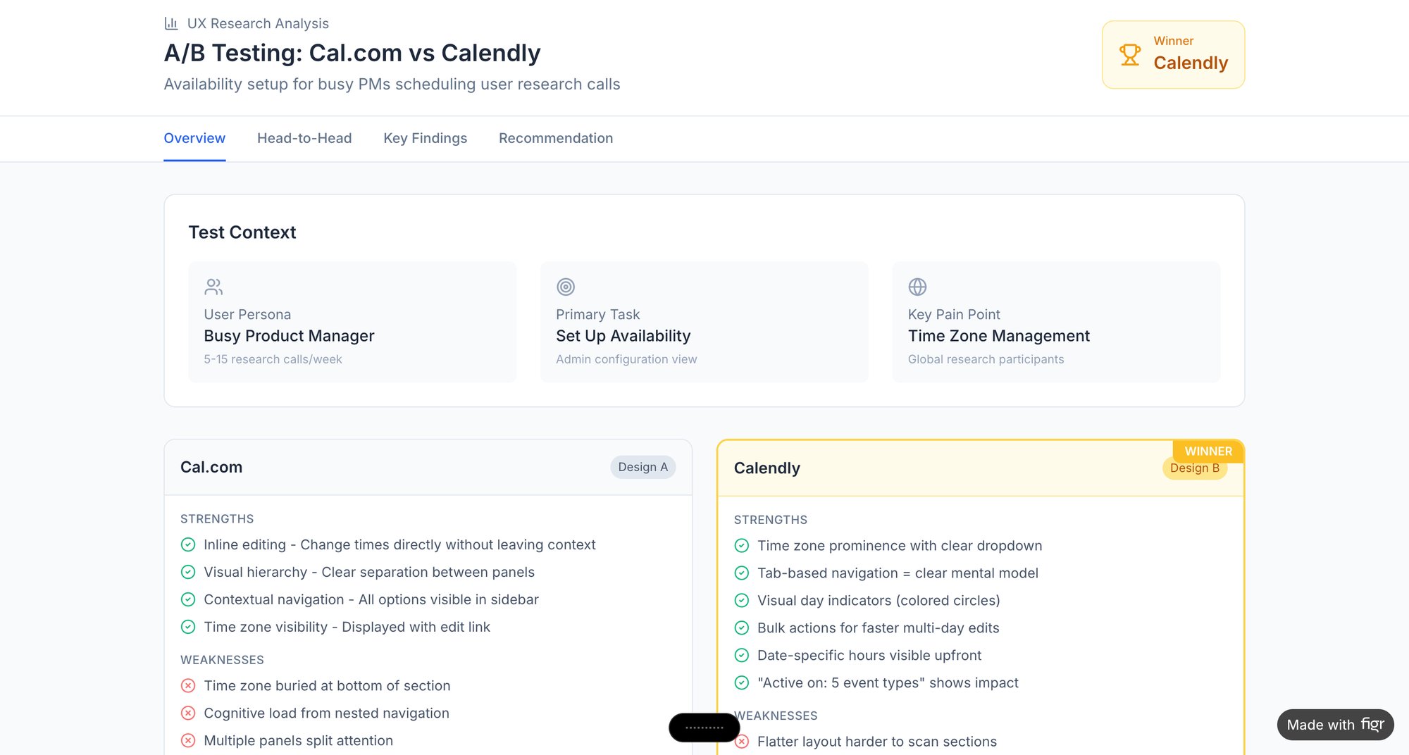
Basically, whenever you face the challenge of making a large amount of information digestible, the modular grid provides the structure you need. This thinking can even be seen in A/B tests, like this side-by-side comparison of Cal.com and Calendly, where a modular layout helps compare features cleanly.
A modular grid gives every piece of content a home. It transforms a potential flood of information into an orderly, navigable landscape. For products that can't afford to be messy, it's the architecture of precision.
The Baseline Grid: To Master Typographic Rhythm
If a column grid gives your layout streets, the baseline grid is the invisible pulse that gives every word its rhythm. Text is an interface, after all. A baseline grid makes sure every line of it sits perfectly, creating a serene, professional feel that users might not consciously notice, but will absolutely feel.
It’s one of the most subtle yet powerful tools in a designer's kit.
The concept is dead simple. Picture a sheet of ruled notebook paper. A baseline grid is just that: a set of invisible horizontal lines that all your text, from the tiniest caption to the biggest headline, snaps to. This tiny detail has a massive impact on readability, especially when text flows across multiple columns.
Setting a Consistent Vertical Cadence
So how do you establish this rhythm? It all starts with your body text. The entire grid is almost always derived from the line-height of your main paragraph font.
Let's say your body text has a line-height of 24px. Your baseline grid increment will often be a fraction of that, like 8px or even 4px. This means every element’s vertical spacing, every margin, every piece of padding, should be a multiple of that base number. A heading’s top margin might be 32px (8x4), and the space after it could be 16px (8x2). This mathematical precision is what makes a design feel “right” when you can’t quite put your finger on why. It's a fundamental part of building a solid typography system in design.
A baseline grid removes guesswork. It replaces subjective decisions about spacing with a logical system, creating a consistent vertical rhythm that guides the reader’s eye effortlessly down the page.
The Impact on Cognitive Load
This isn't just about making things look pretty. There’s a direct link between visual rhythm and cognitive load. A consistent vertical rhythm reduces the mental work needed to scan and process information. When text lines up perfectly across columns and sections, the brain doesn’t have to struggle to track lines. This leads to a measurably better and less tiring user experience.
Last year, I watched a PM review two designs for a feature announcement. The layouts were almost identical, but one felt polished while the other felt jarring. The only difference? The second design had abandoned its baseline grid. Text elements were misaligned by just a few pixels, but it was enough to create a sense of visual noise that undermined the whole composition.
A baseline grid forces discipline. It’s the invisible framework that ensures your interface is a cohesive, readable document, not just a collection of text boxes. For any product leader, understanding this principle is crucial for spotting what separates good design from great design. It’s the quiet, essential rhythm that makes everything work.
The Hierarchical Grid: To Guide User Attention
Sometimes, your content just won't play nice with rigid columns and modules. When the narrative is more important than the container, you need a different tool. This is where the hierarchical grid comes in.
Also called an organic grid, it arranges elements based on their importance, not a repeating spatial pattern. The goal is to create a deliberate visual path for the eye to follow.
Think of a well-curated museum exhibit. The curator doesn't just line things up by size. They create a journey, placing the star attraction in the most prominent spot to grab your attention, then arranging secondary pieces to tell the rest of the story. A hierarchical grid does the same thing for a user's focus on a screen. This makes it perfect for landing pages, creative portfolios, and editorial content where you need to make a point, fast.
Balancing Freedom with Order
This isn’t an excuse for chaos. A good hierarchical grid is an intentional departure from rigidity, not a total rejection of order. It still relies on the fundamental principles of alignment to feel coherent.
A massive hero image might dominate the top of a page. Below it, a headline might be twice the size of the sub-header, while the main body copy settles into a more traditional, readable column. Every element's size and position is a conscious choice, a signal of its place in the pecking order.
The hierarchical grid is a tool for editorial judgment. It allows you to make opinionated choices about what the user should see first, second, and third.
A well-designed news article is the classic example. The huge font of the headline, the placement of the lead image, and the width of the main column all conspire to pull you through the story. It’s a carefully choreographed experience, not a free-for-all.
We saw a team wrestling with this last month. They were designing a complex flow for a video conferencing tool where users had to track connection quality, participant status, and meeting controls simultaneously. A modular grid just made it feel cluttered. By switching to a hierarchical approach, they could give the most critical information, like a banner screaming "Your connection is unstable," the space it needed. You can see a similar approach in this deep dive on Zoom’s network degradation states, where visual hierarchy communicates the severity of a problem.
Ultimately, the hierarchical grid is where design becomes storytelling. It’s one of the most expressive types of grids because it trusts the designer to guide the user’s focus with confidence, purpose, and a clear point of view.
From Theory to Production: How Grids Power Faster Development
A grid in a Figma file is a beautiful theory. But a theory is useless if it doesn't survive the trip to production. This is the gap where so many teams fall apart, somewhere between the clean lines of a design file and the messy reality of code.
A well-defined grid isn't just a visual aid; it's a contract. It's the agreement between design and engineering that replaces subjective arguments with objective rules, saving everyone from endless debates over a few pixels.
A friend at a Series C company told me their biggest bottleneck last quarter was undocumented grid assumptions. The designs looked pixel-perfect, but developers had no concrete rules for spacing or alignment. That gap cost them weeks on a key feature launch.
The contract was never written.
The Role of Design Tokens and Modern CSS
So how do you bridge that gap? You need a shared language. Today, that language is built on two things: design tokens and modern CSS like Flexbox and CSS Grid.
Design tokens are your single source of truth. Instead of hard-coding a value like "16px" into a design, you define a token, something like spacing-medium. That token is then used everywhere, from the initial design file straight through to the final codebase.
When you pair these tokens with CSS Grid and Flexbox, they become incredibly powerful. A developer no longer has to guess the designer's intent. They can implement the system's rules directly, ensuring the finished product doesn't just look like the design but is built on the same structural logic.
From Electrical Grids to Digital Products
This concept of a unifying system isn't new. In the early 1990s, the idea of grid computing, inspired by electrical power grids, started to change how we handled distributed systems. The LHC Computing Grid, for example, processes 200 petabytes of data a year across 170 data centers with 99.9% uptime. For a deeper dive, check out Tim Rodenbroeker's analysis on grid thinking.
For product teams, the parallel is clear. Just as a power grid organizes immense complexity, a design grid brings order to a product. Why does this matter at scale? A unified grid system is an economic decision. It drastically reduces waste in the form of redesigns, bug fixes, and developer-designer miscommunication. This is the zoom-out moment: a consistent grid isn't a design luxury, it's a development accelerator.
Making the Handoff Seamless
This is where automation becomes essential. A manual handoff document is better than nothing, but it's still just a document. An AI design agent can analyze an existing product, automatically surface its grid system (or lack thereof), and generate new prototypes that follow those established rules from the start.
Imagine you're adding a new flow to a complex feature like Shopify's checkout setup. Instead of starting from a blank canvas, you can generate it directly on the app's existing grid. You get instant visual consistency without the usual back-and-forth.
In short, the goal is to make the grid an executable specification, not just a visual guideline.
By turning grid rules into code-ready assets, you finally close the loop between design and development. For more on this, our developer handoff playbook is a good next step. It’s how you turn an abstract concept into a practical tool that drives faster, more consistent work.
Your Next Step: Audit Your Own Product's Grid
All this talk about grids is great, but the real "aha" moment comes when you see them, or their absence, in your own product. The best way to understand how grids create order is to find where that order has broken down.
Go ahead, grab a screenshot of a key screen. Your main dashboard, a settings page, maybe a core user flow. Now, draw lines over it. Can you spot the underlying structure?
Are elements lining up in clean vertical columns? Is there a clear rhythm to the spacing, or does it feel random? Can your eye easily follow a path through the information, or does it jump around, unsure where to land next?
This simple exercise uncovers the invisible architecture holding your UI together. Or, it reveals the quiet chaos that makes an interface feel just a little bit off. You’ll start to see exactly where a column grid is doing the heavy lifting, or where the lack of a baseline grid makes your typography feel unsettled.
This isn’t about pointing fingers. It’s about gathering evidence. Your goal is to build a shared understanding with your team, using a concrete visual to start the conversation. This is how you reframe grids from a rigid constraint into a tool that makes everyone’s job easier, boosting both development speed and the quality of the user experience.
This manual analysis is exactly what Figr was built to automate. Instead of spending hours with screenshots and a line tool, you can get a full UX review that pinpoints every grid inconsistency and spacing issue across your entire app. See how it works at https://figr.design.