
It’s 4:47 PM on Thursday. Your VP just asked for something visual to anchor tomorrow's board discussion on the Q3 roadmap. You have a PRD. You have bullet points. You have 16 hours and no designer availability. What do you do?
This is the moment teams realize a product isn't a collection of static screens; it's a series of actions connected by a story. That story is the user experience flow.
It’s the invisible script dictating every interaction.
Why a Good UI Is Never Enough
It’s 10:23 PM. Your team just shipped a new onboarding sequence. Analytics show a 40% drop-off at step three, but nobody can agree on why. The design looks clean. The copy is approved. Yet users are vanishing into thin air. Where did the disconnect happen?
A friend at a scaling startup told me their team spent an entire quarter polishing the look of their settings page. They redesigned icons, tweaked fonts, and perfected the spacing. The problem? Engagement with the features controlled by those settings didn't budge. They had perfected the room but completely ignored the hallways leading to it. Users couldn't find the page, and those who did got confused trying to save their changes. The flow was broken, even if the final screen was perfect.
The Invisible Script of Interaction
User experience flows force us to stop thinking about how a product looks and start focusing on how it works over time. Time isn't a conveyor belt; it's a switchboard of choices and consequences. Every click sends the user down a different path, and one poorly placed switch can lead them straight to a dead end.
Mapping these journeys reveals critical problems a UI mockup never will:
Logic Gaps: Where does a user get stuck because the next step makes no sense?
Decision Overload: Are we asking for too much information before delivering any value?
Hidden Friction: Which tiny, seemingly minor step is causing a massive delay or drop-off?
The basic gist is this: mapping a flow makes the user's thought process visible. You stop designing screens and start designing a conversation. This shift is critical. A great way to get started is by understanding the fundamentals of what is task analysis.
By focusing on the sequence, you move from just building features to building successful outcomes. You can see how a user gets from A to B, and more importantly, all the places they might get lost along the way. This is how you prevent those late-night fire drills and turn a confusing product into one that feels effortless.
Choosing the Right Map for the Journey
Not all maps are made for the same terrain. A subway map is clean and simple. Its only job is to get you from station A to station B. An atlas, on the other hand, shows you the world in all its messy, interconnected glory, full of mountains and rivers you might have to navigate.
So why do we treat all our UX diagrams like they’re the same document?
The term "user flow" gets thrown around as a catch-all, but that’s like calling every vehicle a car. To communicate with any real precision, we have to distinguish between the different tools we have. Each one is a lens for seeing the user's experience, and choosing the right lens determines what you can actually see.
The Close-Up Shot: Task Flows
A Task Flow is your subway map. It shows the single, ideal path a user takes to complete one specific task, assuming no detours or mistakes. Think of it as the "happy path" for a core action, boiled down to a linear, focused diagram.
When you map out "reset password" or "add item to cart," you're creating a task flow.
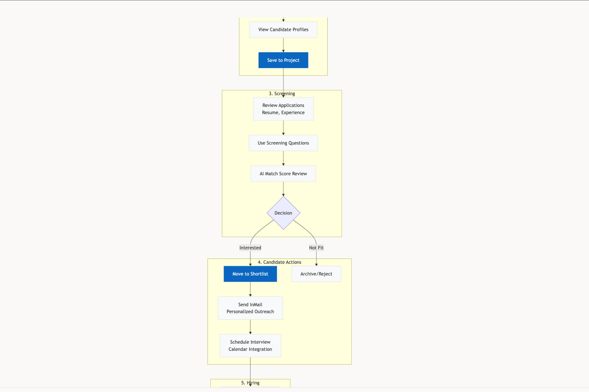
This is the tool you grab when you need to optimize a single, critical action. It's perfect for conversations with engineers about a specific feature because it strips away all ambiguity. There’s no branching, just a straight line from start to finish. It answers one question with ruthless clarity: what is the most direct way to get this done? You can see this focused approach in the user flow mapping of the LinkedIn Recruiter Flow.
The Wide Shot: User Flows
A User Flow, by contrast, is the atlas. It accepts the reality that users have choices and rarely follow your perfect script. This diagram shows the different routes a user can take toward a goal, complete with decision points and alternative branches. It starts with a specific user and their entry point, then maps out their potential journey through the system.
For example, a user might land on a product page from a Google search, an email link, or a social media ad. Each entry point creates a different context and, therefore, a different path forward. The User Flow is what makes these branching possibilities visible.
Just last week, I watched a team debate their checkout process. Mapping the full user flow revealed that users coming from Instagram ads were abandoning carts at twice the rate of other users. Why? The flow forced them to create an account too early, a point of friction that only became obvious when we looked at the entire journey, not just the checkout sequence itself.
A user flow is essential for understanding the system from the user's perspective, not just the feature's perspective. It helps you see how different parts of your product connect and, more importantly, where users might get lost in the seams between them.
The Storyboard: Wireflows
A Wireflow is a hybrid. It merges the sequential steps of a flow diagram with the visual layout of a wireframe. Instead of abstract shapes like diamonds and rectangles, a wireflow uses low-fidelity screen designs to represent each step. It's less about the internal logic of a single screen and more about the architectural connection between screens.
This is your storyboard. You pull out a wireflow when the conversation needs to be about the actual user interface and how it supports the journey. It answers the question: "What will the user see at each step of this process?" It's the perfect tool for getting alignment with stakeholders on the overall feel and sequence of an experience before you commit to high-fidelity design. For a clear picture of how these visuals connect, check out this artifact showing a redesigned setup flow for Shopify.
Each map serves a different purpose. Getting the distinction right is the first step toward building products that don't just look good, but feel guided. To go deeper on the overall experience, check out our guide on what is a user journey map.
How to Map User Flows from Start to Finish
A great user flow isn't pulled from thin air. It's discovered. Think of it less like an artistic sketch and more like a journalistic investigation into your user’s world. This is where theory gets real.
Mapping a user flow is a bit like planning a drive through an unfamiliar city. You wouldn't just start the car and hope for the best. You’d figure out your destination, pinpoint your starting location, and then trace the actual streets in between, noting key turns and potential traffic jams.
This is what I mean: anchor every map in a clear objective before you draw a single line.
Define the Destination and Starting Point
Before you can map the journey, you have to know where it begins and ends. This sounds obvious, but it’s the step most teams rush past when a deadline is looming. The result? Maps that are either too broad to be useful or too narrow to capture what’s really happening.
Start by asking two brutally simple questions:
What is the user trying to accomplish? This is your destination. Be specific. Not “manage their account,” but “freeze a lost credit card” or “change their primary shipping address.” The goal has to be a tangible outcome.
Where does this journey start? This is your entry point. Does it kick off from an email notification? A push alert? A bookmark? A Google search? Each starting point provides crucial context about the user's mindset.
A product manager at a fintech company, for example, might map the ‘freeze card’ flow. The destination is clear: the user sees a confirmation that their card is secure. But the start? A user who logs into the app first has a different mindset than someone who taps a "Lost your card?" link directly from the login screen. Each is a valid entry point that changes the ideal flow.
Capture the Sequence and Uncover the Reality
With your start and end points locked in, the next step is to document the path between them. This isn't about inventing the ideal path. It’s about capturing the current one, warts and all. The best way to do this is to walk through the process yourself, taking a screenshot of every single screen, modal, and pop-up.
This manual process forces you to feel the friction your users feel. How many clicks does it really take? Where is the copy confusing? Which steps feel totally pointless? This raw capture becomes your source material. For a deeper dive, our guide on user flow examples shows how different products structure these kinds of journeys.
The diagram below breaks down the key distinctions between the different types of flows you might end up creating.
This visual makes it clear: a Task Flow is linear, a User Flow branches out with decisions, and a Wireflow bakes in the actual screen layouts. Knowing the difference helps you pick the right map for the job.
Accelerate Mapping with AI Assistance
That manual capture process is valuable, but let's be honest: it’s slow. It’s also easy to miss the subtle but critical details that live between the screens. This is where AI-assisted tools completely change the game. Instead of just documenting screens, an AI agent can analyze the underlying structure of a flow to reveal what you can't see on the surface.
Here’s what I mean: you can feed screenshots into an agent, and it won't just diagram the happy path. It will automatically flag potential failure states, like what happens if the network drops mid-transaction or if the user enters an incorrect password three times. An example of this is a detailed exploration of edge cases for a Wise card freeze.
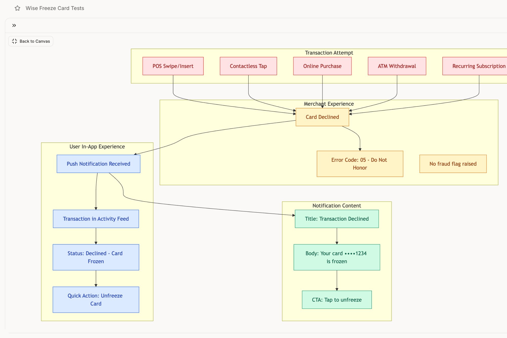
For that same fintech PM mapping the ‘freeze card’ flow, an AI agent can instantly surface edge cases they might have overlooked. Better yet, it can generate a comprehensive set of test cases for the QA team directly from the flow map. What was once a multi-day task of capturing, diagramming, and documenting becomes a single, focused session.
This turns mapping from a chore into a powerful discovery tool. Your next step is to pick one critical flow in your product. Define its start and end points, capture every screen, and identify every decision point. This simple act makes the invisible visible, and it's the first concrete step toward a truly better user experience.
Designing for Reality Instead of Just Happy Paths
It’s an unspoken rule in most design sprints: assume the user has a perfect internet connection. Assume they’ll never mistype their password. Assume their file upload won’t be interrupted. So, teams spend weeks polishing this single, ideal route to success, the "happy path."
But users don't live on a path. They live in the world.
The real world is a messy place, full of spotty Wi-Fi, distracting notifications, and plain old human error. When we design only for sunshine, engineering estimates blow up and user trust evaporates. A truly great user experience flow is like a bridge designed by a civil engineer. It’s not just built for calm weather; it's engineered for hurricanes.
From Ideal Paths to Resilient Systems
When you map out a user flow, are you just drawing the straight line from A to B? Or are you asking the hard questions about what happens when that journey gets messy?
What happens when things go wrong?
This shift in thinking is what separates designing a feature from engineering a resilient system. It’s the difference between a product that feels brittle and one that feels dependable. The best products don’t pretend failure doesn't exist; they anticipate it and design a graceful way through it, turning potential chaos into a manageable hiccup.
Last quarter, a PM at a fintech company shipped a file upload feature. Engineering estimated 2 weeks. It took 6. Why? The PM specified one screen. Engineering discovered 11 additional states during development. Each state required design decisions. Each decision required PM input. The 2-week estimate assumed one screen. The 6-week reality was 12 screens plus 4 rounds of 'what should happen when...' conversations.
Mapping the Storms Before They Hit
The most robust user experience flows are the ones that explore the so-called "unhappy paths." These aren't just edge cases; they are the reality for a huge portion of your users.
Think about these common storms your users regularly face:
Network Failures: What happens when connectivity drops mid-action? Does the app crash, hang indefinitely, or provide a clear message with a "retry" option?
Invalid Inputs: How does the system respond to a mistyped email or a password that doesn’t meet security rules? Is the feedback immediate and helpful, or generic and frustrating?
Permission Errors: What does a user see when they try to access something they aren’t allowed to? Is it a dead end, or a clear path to request access?
You have to design for these moments with the same care you give your primary user flow. For example, a detailed exploration of Zoom's network degradation states shows just how many things can go wrong during a video call and how gracefully a well-designed system can handle them. Similarly, mapping Dropbox's upload failure states reveals the dozens of potential conflicts that must be managed to create a reliable experience.
When designing for reality, it's also important to consider how support channels fit into these journeys. If a user hits a dead end, a well-placed option to integrate live chat can turn a moment of frustration into a positive support interaction, preventing churn.
The Economic Case for Designing Defensively
This focus on resilience isn't just about good design; it’s about good business. Every moment of user confusion or failure has a direct cost. According to Forrester Research, every dollar invested in UX brings $100 in return, an ROI of 9,900%. Poorly designed user experience flows bleed revenue. Handling the messy, real-world conditions isn't just polish; it’s a direct lever for growth. You can read more about these powerful UX statistics.
A robust user flow anticipates the moment of failure and offers the user a clear way forward. It replaces the user’s question of "What went wrong?" with the system’s answer of "Here's what to do next."
Your next step is simple. Take one of your core user flows and ask yourself: what are the three most likely ways this can break in the real world? Map them out. Design the error messages. Define the recovery path.
That is how you start building a product that works not just in theory, but in reality.
Using Analytics to Optimize Your User Flows
A user experience flow without data is just a collection of beautifully arranged boxes and arrows. It’s a hypothesis. To turn it into a tool for growth, you have to connect it to the messy, undeniable reality of how people actually behave.
Think of a plumber trying to find a leak inside a wall. They could start tearing down drywall randomly, hoping to get lucky. Or they could use a thermal camera to see exactly where the heat is escaping, pinpointing the problem without destroying the entire house. Analytics are your thermal camera for user experience flows.
Instead of guessing where friction exists, data shows you precisely where users get stuck, confused, or just give up.
Finding the Leaks in Your Funnel
The most direct way to tie data to your flows is through conversion funnels. For any key action, signing up, checking out, creating a project, you can map the corresponding steps in your analytics tool. This gives you a clear, quantitative picture of your flow's performance.
The most important metrics to watch are:
Drop-off Rate: The percentage of users who bail on the flow at a specific step. A sudden spike is your biggest red flag, the equivalent of a massive heat signature on the thermal camera.
Task Completion Time: How long does it take the average user to get from start to finish? If a simple-looking flow is taking minutes instead of seconds, you have a hidden friction problem.
Conversion Rate: The final, bottom-line number. What percentage of users who start the flow actually complete it?
A high drop-off rate doesn't just tell you something is wrong. It tells you where. A 35% drop-off at the "Enter Payment Details" step isn't a generic problem; it’s a specific crisis that demands an investigation into that single screen. Is the form too long? Is a certain field broken on mobile? Is there a trust issue? Analytics turn broad frustration into sharp questions.
From Data Points to Design Decisions
Once you've identified a leak, the next step is to diagnose the cause. A high drop-off rate is a symptom. Your job is to find the disease. This is where you combine quantitative data (the what) with qualitative insights (the why). Watching session recordings for users who dropped off at that exact step can be incredibly revealing.
You might discover a common rage-click pattern or see users hesitating over a particular field. You could even discover that mobile users are having a completely different, and far worse, experience. This is non-negotiable, as mobile devices now drive over 50% of global traffic. If a mobile page takes longer than three seconds to load, 53% of visitors will leave, and a staggering 85.65% will abandon their carts if the flow isn't optimized for their device.
This data-driven approach closes the loop between design decisions and business outcomes. You're no longer just "improving the UX"; you're methodically increasing your conversion rate by fixing specific, measurable problems. To track the impact of your changes precisely, a good Conversion Rate Calculator is essential.
A user flow backed by analytics is no longer a static map. It becomes a dynamic diagnostic tool that shows you exactly where to invest your design and engineering resources for the greatest impact.
Your next move? Choose one critical user flow and build a funnel for it in your analytics platform. Identify the single biggest drop-off point. Now you have your mandate. That’s not a vague problem to solve someday, it’s a specific, data-validated priority for your next sprint. For more on this, check out our guide on product analytics tools that integrate AI for better insights.
Your First Step From Map to Mandate
You've read the theory, seen the diagrams, and you get the value. So, now what? The idea of mapping an entire product can feel paralyzing. It's tempting to file "user experience flows" under "nice to have" for some mythical, less chaotic future sprint.
But that’s a total misunderstanding of the job.
The goal isn't to boil the ocean. It’s to fix one leaky pipe. Mapping should be a recurring, lightweight habit, not some monumental project that demands a two-week kickoff and a dedicated war room. Your next step is not to map your entire application.
It's to pick one thing.
Find One Point of Friction
Where are users struggling right now? Is it that checkout process where analytics show a massive drop-off rate? What about the confusing password reset sequence that keeps flooding your support queue? Or is it the job posting flow that recruiters complain takes way too many clicks?
Pick the one that causes the most pain. That's your mandate.
Last week, a PM at an HR tech company told me he spent ten minutes just trying to post a job on a competitor's platform. Instead of just getting frustrated, he recorded his screen. He fed that recording into a tool and got back a complete user flow, instantly revealing seven unnecessary steps. That single act of investigation became the entire brief for their next design sprint.
You can see a similar deep dive into LinkedIn’s recruiter flow right here.
Your Task for Tomorrow
Don't wait for permission or a perfect process. The whole point is to start small and create immediate clarity.
Here’s your checklist:
Isolate the Flow: Choose one high-impact, high-friction user experience flow.
Capture Reality: Go through the flow yourself. Take a screenshot of every single screen, every modal, every dead end. No shortcuts.
Identify Decisions: Pinpoint the exact moments where a user has to make a choice. What questions are they asking themselves right then?
Ask "What If?": For each step, think about what could go wrong. What if the network fails? What if they type in the wrong info? What if they get distracted and come back an hour later?
In short, your job is to find one user, one goal, and draw their path from start to finish. That’s it. That one map, grounded in the reality of your product today, is more valuable than a hundred pages of abstract strategy.
Start there.
Your Questions About User Experience Flows, Answered
We get it. The term "user experience flows" sounds important, but it can feel a little abstract. You know you should be making them, but the practical questions are what stop you from starting. Let’s clear up a few of the most common ones.
How Detailed Should a User Flow Be?
This is a classic "it depends," and what it depends on is your audience.
Are you walking executives through a new feature to get buy-in? A high-level, simplified map is your best friend. It tells the story of the user's journey without getting bogged down in every last technical detail.
But if you’re handing off the designs to engineering? That’s a whole different ballgame. The flow needs to be a granular schematic for every state, every error message, and every possible interaction. For example, check out the level of detail captured in this artifact exploring the various component states for a task assignment.
The rule of thumb is this: a flow should be just detailed enough to remove ambiguity. If an engineer looks at your diagram and still has to ask, "So, what happens if the user does X?" you probably need another layer of detail.
What Is the Biggest Mistake Teams Make?
The single most common mistake is treating the user flow as a one-and-done artifact. Teams will spend a week creating a beautiful, comprehensive diagram at the start of a project, get it signed off... and then promptly forget it exists. The product evolves, but the map stays frozen in time.
A user flow should be a living document, not a museum piece. As you gather new analytics and ship new features, the flow has to be updated to reflect reality.
When you treat it like just another checkbox to tick, you end up with a product that no longer matches its own documentation. That's a recipe for confusion for everyone involved.
How Do I Convince My Team to Invest Time in This?
Focus on the economics. You need to frame user experience flows as a risk-reduction activity, not a design luxury.
Explain that a few hours spent mapping a complex interaction today can save weeks of engineering and design rework later. Why? Because you catch logical gaps and painful edge cases before a single line of code is ever written.
Find a real pain point in your product right now. Use your analytics to highlight a spot with a high drop-off rate in a key funnel. Then, propose a small pilot project: "Let's just map this one problematic flow and see what we learn." When you show the clarity it brings, the return on that initial time investment becomes impossible to ignore.
Mapping these flows can feel slow and manual, but it doesn't have to be. Figr is an AI design agent that can analyze your live app from a simple screen recording, automatically generate user flows, and even identify hidden edge cases your team might have missed. Instead of starting from a blank canvas, you start with a data-driven map of reality. Design confidently and ship faster with Figr.