
It's 4:47 PM on Thursday. Your VP just asked for something visual to anchor tomorrow's board discussion on the checkout drop-off problem. You have a PRD. You have bullet points from analytics. You have 16 hours and no designer availability.
This is the moment where numbers on a screen create more questions than they solve.
You know that users are leaving, but you don't understand the story behind their exit. The data tells you where the leak is, but not what caused the pipe to burst. To find that, you need a different kind of tool. You need a user journey map.
The Hidden Story in Your User Clicks
A user journey map is a visual story of every interaction a person has with your product or service. It's a strategic tool that moves beyond what users do to reveal why they do it, how they feel, and where they get stuck. This map translates cold data into a human narrative.
Think of it not as another static diagram, but as a diagnostic tool. Time isn't a conveyor belt of user actions; it's a switchboard of emotions and decisions. A user journey map helps you see that switchboard clearly.
Translating Clicks into a Coherent Narrative
A good user journey map is like a film storyboard. Each frame shows a specific interaction: the moment a user first hears about your product, their first click on your website, the confusion they feel at a poorly worded form field, and the relief of completing their task. Together, these frames don't just show a sequence of events.
They reveal an emotional arc.
A friend at a Series C company recently described this perfectly. His team was obsessed with their funnel metrics, treating each stage as a separate problem. They were patching holes in a boat without ever looking at the map to see if they were sailing in the right direction. Their data was a collection of disconnected facts. For a deeper dive, exploring how the best product analytics tools integrate AI can show you how to start connecting these dots automatically.
Beyond a Simple Diagram
Why does this matter so much? Because software isn't built for clicks; it's built for people trying to achieve a goal. A user journey map shifts your team's perspective from internal processes to the user's reality.
The basic gist is this: it forces you to answer critical questions.
- Where does our user’s journey really begin, often long before they land on our site?
- What are they thinking and feeling at each step? What anxieties or hopes are driving their actions?
- Which moments create delight, and which ones introduce friction that quietly pushes them away?
Answering these questions transforms your approach. You stop shipping features and start solving problems within a larger context. The map becomes a shared source of truth, aligning your entire team around the actual experience you are delivering.
Deconstructing the Map: The Anatomy of Empathy
A map is more than just lines on a page; it’s a story with layers. A user journey map’s real power comes from peeling back these layers, with each one adding another dimension to the human experience. It's not just a path; it's an anatomy of empathy.
Imagine a traveler navigating a new city. Their journey isn't a series of lefts and rights. It's a sequence of distinct neighborhoods, each with its own vibe and its own challenges.
This is what I mean: a great map connects cold metrics to a visual layout, and that layout to the bigger human story. When you layer these elements together, a simple timeline becomes a powerful tool.
The Core Layers of Experience
To really understand what a user journey map is, you have to look at its parts. Each component answers a different question about the user’s experience.
- Stages: These are the high-level phases of the journey, the "neighborhoods" the user visits. Think of Awareness, Consideration, Purchase, and Retention. They give the map its chronological backbone.
- User Actions: These are the specific things a user does. What are the concrete steps they're taking? This could be a Google search or trying to find the contact support page.
- Thoughts and Feelings: This is your user's internal monologue. What questions are popping into their head? Are they feeling confident or confused? This emotional layer gets to the why behind their actions.
- Pain Points: Here are the roadblocks. Where did the user get stuck? What part of the process felt harder than it needed to be? Finding these moments of friction is the goal.
- Opportunities: For every pain point, there's an opportunity. This is where the map becomes an actionable tool. How can we simplify this step? This layer turns analysis into a product roadmap.
A Journey in the Real World
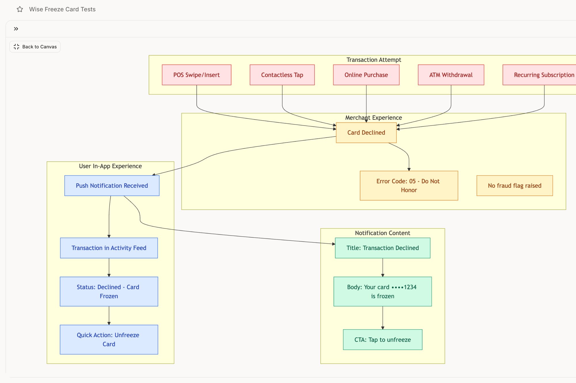
Last week I watched a product team analyze a map for their banking app. A user was frantically tapping, trying to find the "freeze card" button. The actions were clear: open app, tap menu, scroll, tap settings. But the feelings told the real story: panic, urgency, mounting frustration.
The pain point wasn't just a poorly placed button; it was the cognitive overload during a moment of high stress. The opportunity was obvious: elevate that feature to the main dashboard. We mapped this exact flow in a Wise Card Freeze analysis, showing how a journey map turns panic into a clear design directive.
The entire process is rooted in good data. To build that anatomy of empathy, you must see how journey mapping fits into mastering the UX research process.
The map’s true value isn't in documenting the path a user takes. It’s in revealing the emotional and cognitive friction they experience along the way.
Of course, each layer is built on a deep understanding of who the user is. The map isn't for a generic "user"; it's for a specific persona. If you want to build an effective map, you must first understand UX personas to enhance user experience design.
From Theory to Tangible Insights: Real-World Examples
Abstract diagrams are useful, but what does a user journey map look like in the wild? How does it actually function when a product launch is on the line?
A map’s power isn’t in its neat boxes and swimlanes. It’s in its ability to make the invisible visible. These maps are working documents that prevent costly rework by translating complex user behavior into a shared visual language.
Visualizing Negative Paths and Failure States
Most teams are great at mapping the "happy path," where everything works perfectly. But users don't live on the happy path. Their connections drop, they upload the wrong file, and they hit unexpected errors.
This is where a journey map becomes a critical diagnostic tool: visualizing these negative user paths.
What happens when a user's connection degrades mid-call? It's not one thing. It's a cascade of potential states: packet loss, bandwidth throttling, reconnection loops. A static list of requirements can’t capture this complexity.
But a visual map can.
A project I saw recently did exactly this by creating a Zoom network degradation flow map that laid out every potential failure point. Suddenly, the engineering and design teams weren't just talking about "handling errors." They had a shared visual reference for dozens of specific scenarios. This is what a user journey map does at its best.
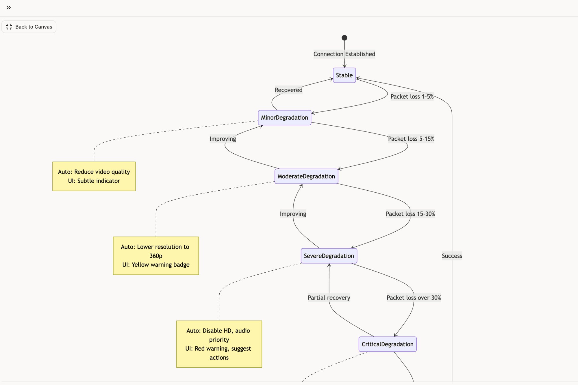
It provides a blueprint for resilience.
Uncovering Hidden Edge Cases
A journey map also excels at revealing the complexity behind seemingly simple actions. Take a file upload, for instance.
From a user's perspective, it’s one click. From a system's perspective, it's a web of possibilities.
What if the file is too large? Or the network drops? What if there’s a duplicate file name? Each question represents an edge case that leads directly to user frustration. Mapping this process transforms a simple feature into a state machine diagram. By visualizing the Dropbox file upload journey in this Figr project, a team can see how one action branches into numerous outcomes. You can deepen your understanding by exploring different user experience design research methods.
Driving Strategic Redesigns
Finally, journey maps are indispensable for redesigning core product flows. When analytics show a drop-off, a map helps diagnose the root cause.
Consider the challenge of setting up a checkout flow. For a merchant, this is a high-stakes process where friction means lost sales.
A team I know used a journey map to overhaul this critical path. They plotted the existing flow and pinpointed every moment of confusion. This initial map became the foundation for a complete redesign, as seen in this new Shopify checkout setup flow.
The map didn't just suggest cosmetic changes. It drove a fundamental rethinking of the information architecture to boost conversions. This is the goal: turning a visual story into measurable business impact.
The Right Time and Way to Build Your Map
A user journey map isn’t a trophy you create once and hang on a wall. It’s a tool. And like any tool, it’s meant for a specific job at a specific time. So when does creating one deliver value?
The answer is not "always." It's "when the stakes are high and assumptions are expensive."
Timing isn’t about slotting a workshop onto a conveyor belt of product tasks. It's a switchboard. You flip the journey mapping switch when a specific event demands clarity, not just because the calendar says it's time.
Identifying the Triggers for Mapping
Certain moments in a product’s lifecycle practically beg for a journey map. These triggers are signals that your team is about to navigate complex territory.
Think of them as inflection points:
- Launching a new feature: You're carving a new path. Mapping it ensures the trail connects logically to old ones.
- Redesigning a core flow: Before you tear down the old structure, you need a blueprint of how people currently use it.
- Diagnosing a drop-off: When a key metric plummets, a map helps you retrace a user’s steps to find the break.
- Aligning a new team: A map is the fastest way to give new members a shared, user-centered understanding.
The Way to Build a Living Map
A friend at a startup told me his team spent a week creating a beautiful journey map. It was presented, everyone nodded, and it was never looked at again. Why? They treated it like a final exam, not a study guide.
A useful map is built through a clear framework.
- Define the Scope: Don't map everything at once. Pick one persona and one specific scenario, like a new user completing onboarding.
- Gather the Research: A map built on assumptions is fiction. You need real data: user interviews, support tickets, session recordings.
- Plot the Touchpoints: Lay out the user’s actions, thoughts, and feelings across each stage. Visualize the emotional highs and lows.
- Identify Opportunities: For every pain point, brainstorm a concrete opportunity. This turns the map from a diagnostic tool into a strategic one.
As you consider these steps, dedicated customer journey mapping software can speed up the process, turning scattered data into a coherent visual story.
A study from Harvard Business School states that a map challenges internal assumptions and identifies more opportunities for innovation than raw data alone. The map forces a company to see its service from the outside in, revealing friction points the organization itself is often blind to.
The biggest pitfall? Creating these maps in a vacuum. Your next step is to choose one of those trigger moments and just begin.
Why Your Old Maps Are Failing You
Picture a whiteboard plastered with sticky notes. The final map gets photographed, maybe celebrated. Then, it slowly turns into a relic, a snapshot of a world that ceased to exist the moment you shipped your next feature.
Static journey maps are failing you.
They are photographs of a river. They capture its shape at a single moment but tell you nothing about the current. In a world of continuous deployment, your understanding of the user journey must also be continuous.
The Economic Cost of Static Thinking
This isn't just a philosophical problem; it's an economic one. What’s the real cost of an outdated map? It’s the unbudgeted expense of rework. It’s the delayed launch caused by a dozen "what should happen when..." conversations you could have seen coming.
A PM I spoke with last month told me a story that captured this perfectly. Her team spent weeks debating a new onboarding flow based on a journey map created six months prior. When they shipped, engagement tanked.
Why? The map didn't account for a new user segment that had popped up. Their static map wasn't just wrong; it was expensive. It led to weeks of wasted engineering time building a solution for a user who no longer existed in the same way. A static map creates a dangerous illusion of understanding.
From a Photograph to a Live GPS
So, what's the alternative? Turn the map from a static art project into a dynamic, data-driven diagnostic tool.
The old way involves workshops and manual updates that never happen. The new way involves connecting your map directly to the source of truth: your live product. Imagine an AI agent that doesn't just look at screenshots but actively learns your live application.
It’s the difference between a photograph of the user's path and a live GPS.
A GPS doesn’t just show you a pre-planned route. It adapts. It reroutes you around traffic jams and updates based on real-world conditions. A modern user journey map must do the same. It should surface friction points as they emerge, not six months after the fact. For instance, analyzing a process like the LinkedIn Recruiter Flow, a dynamic tool can spot inefficiencies a static diagram would miss.
Your product evolves with every deployment. Your understanding of the user journey must evolve with it. Stale insights lead to stale products.
The market is already signaling this shift. The customer journey mapping platforms market is projected to grow substantially, from $17.2 billion in 2025 to $74.5 billion by 2034. Yet, usability remains a hurdle, with 27% of users finding current tools demand heavy mental effort. This gap highlights the need for more intuitive solutions. You can read more about these market trends and projections.
The Grounded Takeaway
Your next step is to challenge the static artifacts in your own organization. Find one journey map that's more than three months old and hold it up against your current analytics and user feedback. Where are the discrepancies? What new behaviors or pain points has the old map failed to capture?
This simple audit will reveal the gaps. It’s the first step toward navigating with a live, intelligent guide. The goal isn't just to build a better map, but to build a better product.
Map One Critical Flow This Week
Theory can feel distant, can't it? All the diagrams and frameworks only matter when they connect to the real world. So, where do you actually begin? Not with a grand, company-wide mapping initiative.
Start smaller.
In short, pick one critical user flow in your product this week. Specifically, one with a known friction point. Choose the onboarding sequence that analytics shows is leaking users, or the feature setup that swamps your support team with tickets. You know the one.
Your First Step Toward Clarity
Once you have your target, the next step isn’t a workshop with sticky notes. It’s to capture reality. Use a tool that can perform a one-click capture of that live flow. This generates an initial map grounded in what your product actually does, not what you assume it does.
This approach provides an immediate, tangible asset. You can instantly see the actual steps and decision points a user hits. We’ve done this for everything from financial tools to productivity apps, and you can see a ton of examples in our deep dives on user flows. For example, capturing the flow of something as critical as a task assignment component can reveal hidden states and complexities in minutes.
From Abstract Idea to Concrete Action
Why does this work so well? Because it demystifies the entire process. It provides immediate value by revealing at least one insight or hidden state the team hadn’t considered.
What button appears after this action? What happens if the user clicks back? Suddenly, these questions have visual answers.
This approach moves the concept of user journey mapping from an abstract idea into a concrete, repeatable action you can start right now. It builds momentum. And it gives your team an accurate foundation to build on for every journey map that comes next.
Frequently Asked Questions
A few questions always pop up when teams first dive into user journey mapping. They usually live right at the intersection of theory and practice. Getting them sorted is what turns a good idea into a repeatable, valuable process.
What Is the Difference Between a User Journey Map and a User Flow?
"Isn't this just a fancy user flow?" It's a fair question, but they solve for two very different things.
Think of it this way: a user flow is the blueprint for a single room in a house. It’s tactical. It shows the literal clicks and steps someone takes to do one specific thing, like reset their password. It’s the architectural plan, focused purely on the how.
A user journey map is the story of the person living in that house for a week. It’s strategic. It includes those same actions but layers on their thoughts, feelings, and frustrations across many different touchpoints. It's the how plus the why and, most importantly, how it all felt.
For tactical examples of these flows in action, explore our collection of user flow examples across onboarding, checkout, and error recovery.5. In "Map One Critical Flow This Week" section, add: For a deeper look at non-linear paths in today's AI-driven landscape, read our guide on digital customer journeys.
How Much Data Do I Need for a Useful Journey Map?
The fear of not having "enough data" paralyzes many teams. You don't need a mountain of quantitative data to build a valuable map. In fact, starting small is usually better.
You can create a powerful journey map with qualitative insights from just 5 to 8 user interviews. According to the Nielsen Norman Group, this is often enough to uncover the vast majority of core usability issues and pain points.
From there, you augment what you learn with data you already have: support tickets, customer feedback surveys, and product analytics. The goal isn't perfection on day one. It's to build a foundation on real human experience.
Who Should Be Involved in Creating a User Journey Map?
Journey mapping is a team sport, not a solo mission. The fastest way to create a map that gathers digital dust is to build it in a vacuum. You need a cross-functional group.
Your core crew should include:
- A Product Manager to provide strategic context and business goals.
- A UX Designer to champion the user's perspective and emotional state.
- An Engineer to give a reality check on technical feasibility and constraints.
- A Customer Support Rep to bring the raw, unfiltered stories from the front lines.
When you bring these different perspectives into the room, you create a map that's grounded in reality from all angles.
How Often Should a User Journey Map Be Updated?
A user journey map is a living document, not a historical artifact. If your product is changing, your understanding of the user’s experience has to change with it.
As a rule of thumb, plan to review and refresh your key journey maps at least quarterly. A major product change, like a big redesign or a new feature launch, is an automatic trigger for an update. Same goes if you spot a weird new trend in your analytics.
Using dynamic tools for this makes it less about starting over and more about iterating. This ensures your map always reflects the reality of what your users are actually experiencing now, not six months ago.
A user journey map is your lens into the customer's world. To make that world clearer, Figr acts as your AI design agent, capturing your live product flows and transforming them into dynamic maps, edge cases, and prototypes grounded in reality. Stop guessing and start seeing. Explore Figr today.