
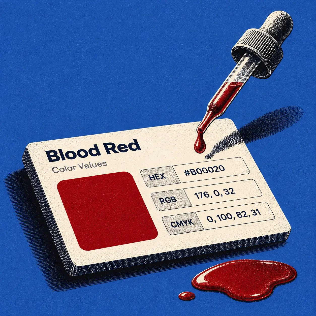
Blood Red Color: Hex, RGB and CMYK Values Explained
The blood red color hex code used in this guide is #880808, or RGB 136, 8, 8. Its calculated HSL value is approximately 0°, 89%, 28%, and its mathematical, profile-independent CMYK approximation is 0%, 94%, 94%, 47%. Blood red has no universal digital standard: other color references choose different reds. Use this code as a consistent starting point, not a measurement of actual blood or a promise of identical print output.
If you need a color for a product interface, the code is only the beginning. Its background, role, adjacent text, and light or dark theme determine whether people can see and understand it.
Blood Red Color Code at a Glance
#880808 is a useful representative blood red for digital work, with copyable values below. The swatch shows the sRGB color; displays and surrounding colors may change how you perceive it.
| Format | Copyable value | What it describes |
|---|---|---|
| HEX | #880808 | An sRGB-oriented digital color value |
| RGB | rgb(136, 8, 8) | Red, green, and blue channels on a 0 to 255 scale |
| HSL | hsl(0, 89%, 28%) | Calculated hue, saturation, and lightness, rounded |
| CMYK | 0%, 94%, 94%, 47% | Approximate mathematical conversion, not a press-ready recipe |
The HEX conversion is direct: 88 in hexadecimal is 136, and each 08 is 8. For a quick CMYK estimate, black is approximately 1 - 136/255, or 47%; magenta and yellow are each about 94% after accounting for black. A real print conversion requires a destination ICC profile.
Different directories make different naming choices. Design Your Way's blood red specification uses #8B0000, Figma's blood-red reference lists #780606, and Color-name.com's blood entry gives #B30E08. These are named references, not mutually exclusive corrections. Design Your Way also lists HSL 0°, 100%, 27% and CMYK 0%, 100%, 100%, 45% for its own #8B0000 value, not for #880808.
Be careful with RGB percentages, too. Figma describes its 120, 6, 6 channels as percentages of each channel's maximum; Color-name.com presents percentages of the combined channel total for 179, 14, 8. Those are different denominators, so don't compare the figures as if they use one scale.
What Color Is Blood Red?
Blood red is a deep, saturated red, but its appearance varies with the reference and viewing conditions. Our #880808 starting point has only a little green and blue, giving it a dark, relatively neutral red impression. A brighter reference can look scarlet; a darker one can read as maroon.
Real blood is more complicated than a swatch. Hemoglobin's absorption changes with oxygen binding; LibreTexts' overview of biological dioxygen transport provides the chemistry behind that distinction. The hemoglobin spectroscopy paper reports oxyhemoglobin absorption features near 541 and 576 nanometers and an oxidized-hemoglobin feature near 630 nanometers. These wavelengths describe absorption behavior, not HEX values. Each hemoglobin molecule has four oxygen-binding heme groups, as explained by Oregon State's gas-transport chapter.
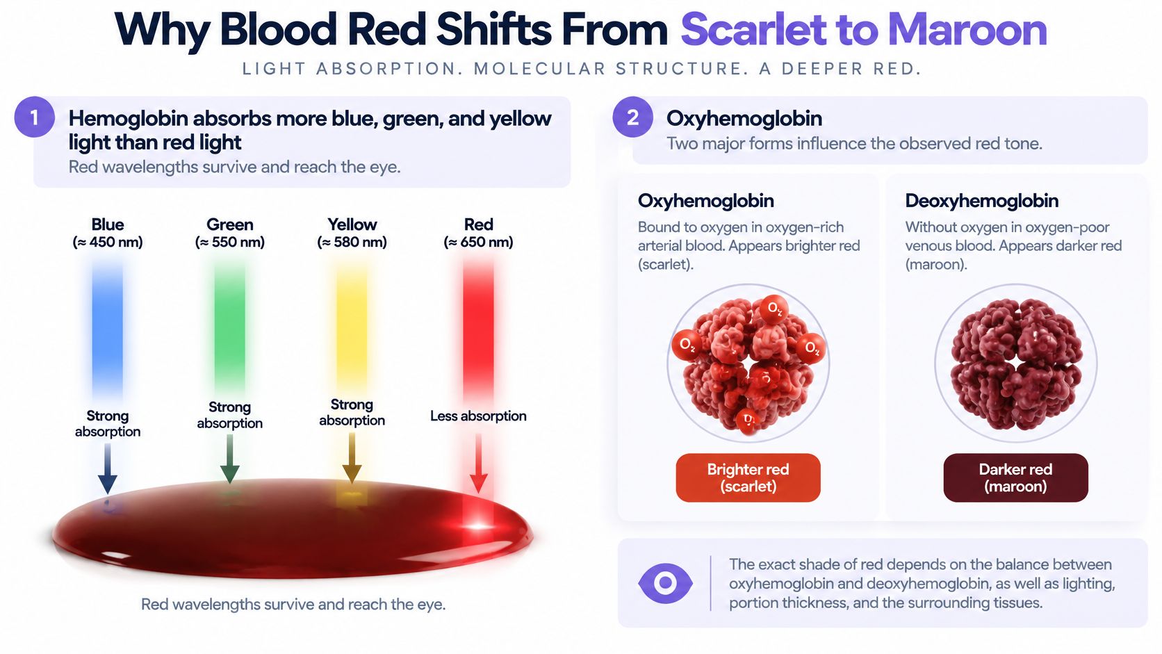
As blood releases oxygen, the balance between oxygenated and deoxygenated hemoglobin changes; deoxygenated blood remains dark red, not blue. The University of Zurich's explanation of hemoglobin and veins describes the role of skin and light in blue-looking veins. A Transfusion paper on hemoglobin absorption offers further spectral context. Oxygenation, lighting, depth, and material all affect appearance, so an illustration color cannot establish a diagnosis. Oxidized hemoglobin is also not simply another name for deoxygenated hemoglobin.
Meaning varies as much as appearance. The Smithsonian's history of red describes associations ranging from celebration and prosperity to warfare and destruction. In a product, test whether users understand the message, not merely whether they recognize the hue.
Blood Red Shades and Variations
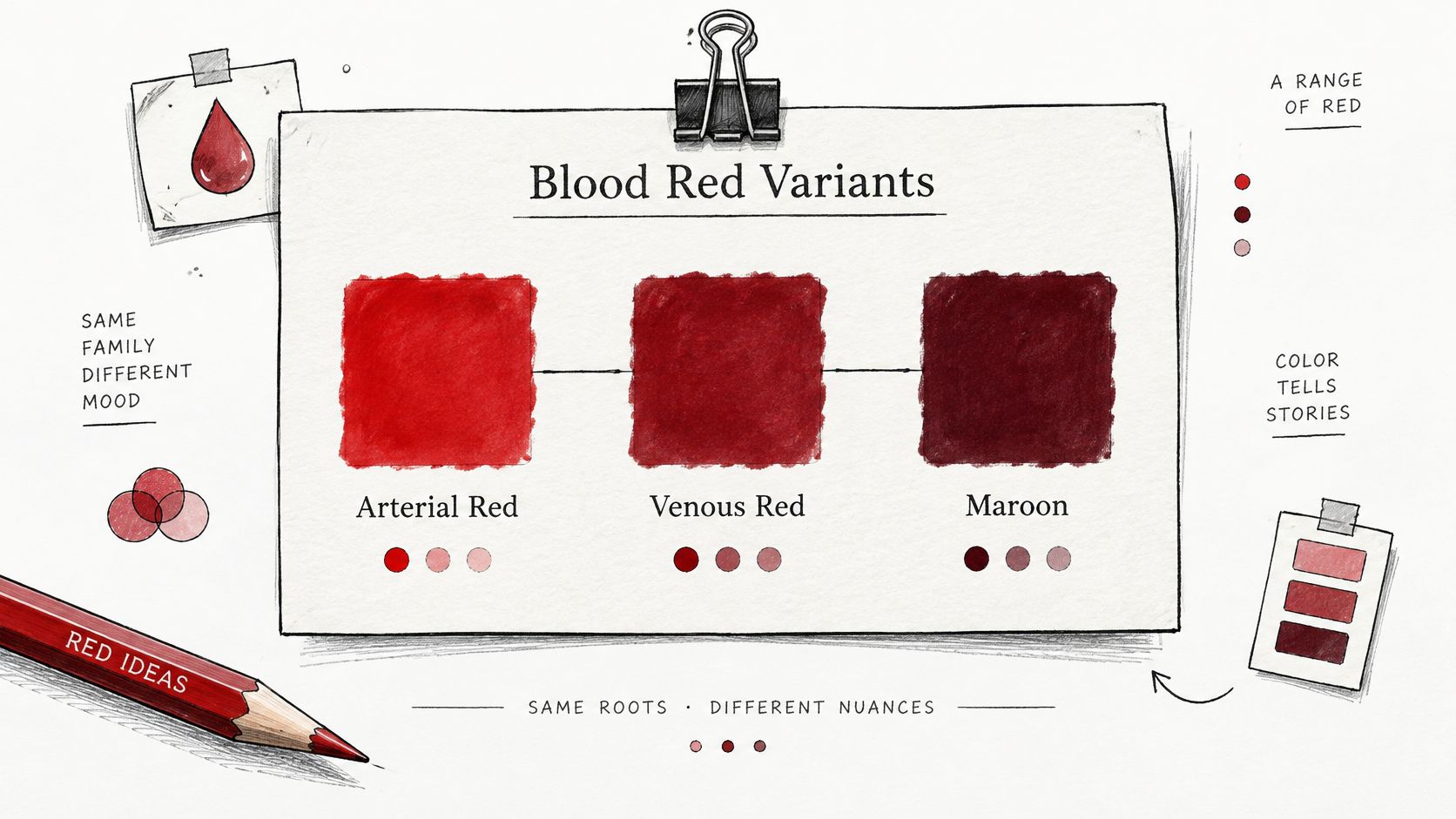
A blood red color palette can range from near-black red to a brighter, more noticeable crimson. The codes below are design references, not calibrated samples of arterial or venous blood. Their swatches are illustrative, and the labels describe intended visual use.
| Shade | Swatch | HEX | RGB | Design impression |
|---|---|---|---|---|
| Dark blood red | #660000 | 102, 0, 0 | Restrained, very dark | |
| Deep blood red, guide value | #880808 | 136, 8, 8 | Deep, saturated | |
| Alternative deep red | #8B0000 | 139, 0, 0 | Slightly different published reference | |
| Brighter blood reference | #B30E08 | 179, 14, 8 | More prominent accent | |
| Crimson comparison | #DC143C | 220, 20, 60 | Brighter, pinker red | |
| Soft tint, illustrative | #F2DADA | 242, 218, 218 | Subtle background, not a blood sample |
The dark reference #660000 belongs to the wider range of blood-related color naming; the RGB channels above follow directly from its HEX code. Don't copy a CMYK number from one shade to another. For broader naming context, see the overview of red and its variations.
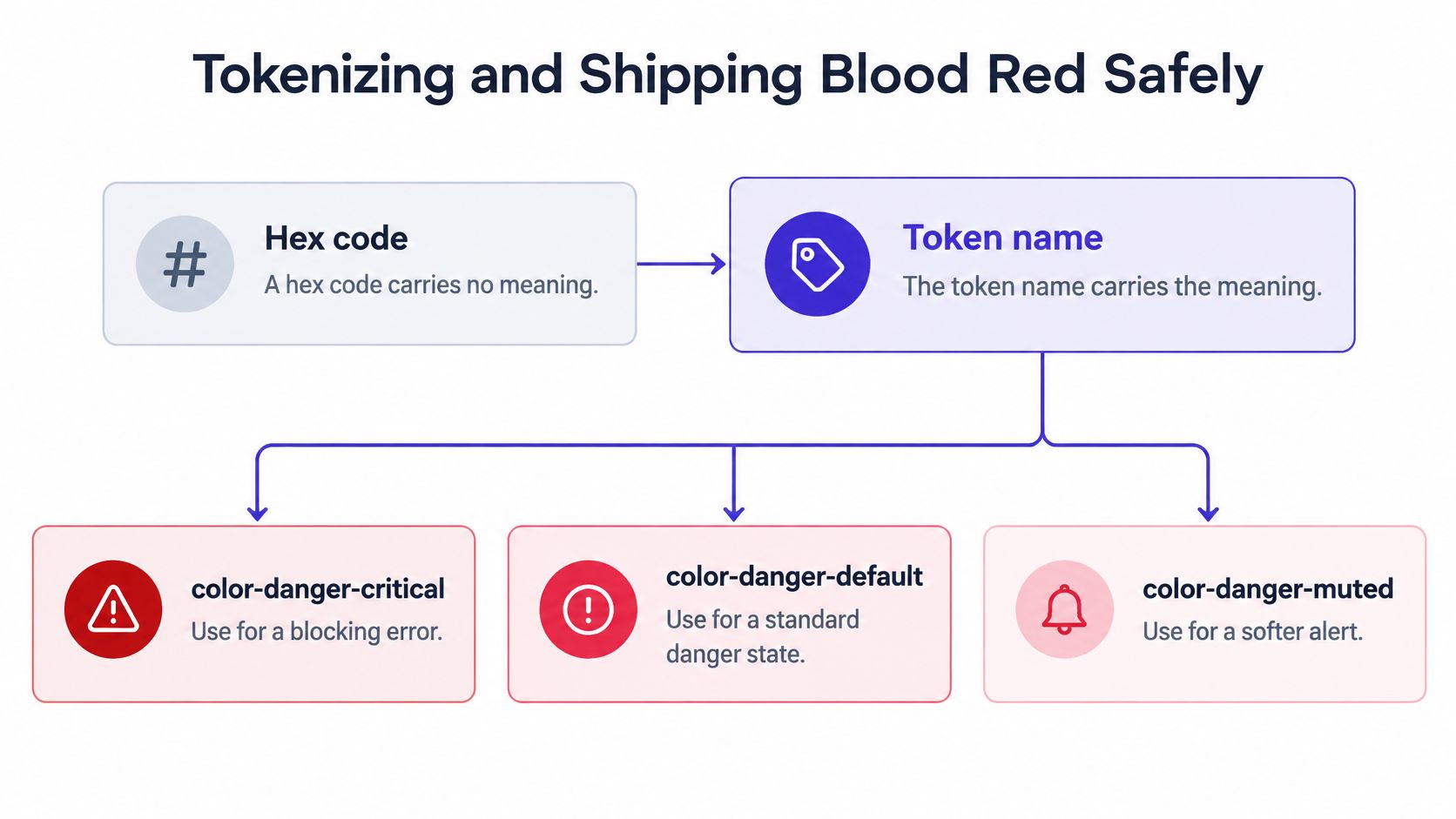
For clinical illustrations, names such as color-blood-arterial and color-blood-venous tell collaborators what a color represents. For interfaces, a token should identify the action or state instead. This distinction matters when an illustrator revises the visual palette without intending to change an error component.
Blood Red Color Palettes for Design
Pair blood red with quiet neutrals for readability, or use selected warm and cool accents for contrast. These five combinations are starting palettes, not blanket accessibility approvals. The swatches show the main pairing; test every actual foreground and background separately.
| Palette and swatches | Background | Blood red role | Supporting colors | Good starting use |
|---|---|---|---|---|
| Editorial | Ivory #FAF7F2 | Heading #880808 | Ink #202020; muted gold #A67C52 | Articles and packaging concepts |
| Clinical | White #FFFFFF | Labeled illustration #880808 | Slate #334155; pale blue #EAF1F5 | Anatomical diagrams with legends |
| Dramatic | Charcoal #1C1C1C | Decorative accent #880808 | Cream #F7F2E9; copper #C48A6A | Mood boards; not red text on charcoal |
| Cool contrast | Pale blue #EAF1F5 | Accent #880808 | Navy #17324D; white #FFFFFF | Data-rich layouts with labels |
| Warm monochrome | Rose #F2DADA | Dark accent #880808 | Cream #FFF8F2; graphite #303030 | Brand exploration and cards |
Use the listed dark ink or navy for long text where appropriate. Avoid assuming that blood red will be readable over a photograph: put important copy on an opaque surface or tested scrim. BEDHEAD's white-background image workflow is one example of why controlled production backgrounds matter. Figr's brass color guide also illustrates how a named hue benefits from explicit palette context.
Blood Red vs Burgundy vs Maroon
Blood red, burgundy, and maroon overlap visually, but they suggest different undertones and design roles. Names are not enough to reproduce a color; specify the HEX alongside the label.
| Color | Illustrative HEX | Typical impression | Potential use |
|---|---|---|---|
| Blood red | #880808 | Deep red with little visible purple | Editorial emphasis, labeled illustration |
| Burgundy | #800020 | Dark red with a purple or wine undertone | Premium branding, warm accents |
| Maroon | #800000 | Darker-looking, browner red | Heritage identity, subdued surfaces |
These are comparison swatches, not assertions that every palette uses those exact definitions. A darker visual impression may also depend on neighboring colors. When naming an approved palette, explain the role rather than expecting a teammate to infer it from “maroon.”
Using Blood Red in UI and Product Design
In an interface, assign blood red to a defined role rather than using it for every urgent-looking element. It can work as a brand accent, a headline on a light surface, or a destructive-action color once the actual component passes contrast and comprehension checks. A realistic-looking red is not automatically a good warning color.
A useful token structure separates the primitive color-red-880808 from roles such as color-danger-critical and color-blood-arterial. An arterial illustration should never silently inherit the app's blocking-error meaning. Figr's design-token guide and its advice on consistent palette naming offer ways to document those layers.
| Token | Role | Non-color explanation |
|---|---|---|
color-danger-critical | Blocking error or destructive flow | State label, clear action text, optional icon |
color-blood-arterial | Oxygen-rich depiction | Legend or text label |
color-blood-venous | Oxygen-poor depiction | Legend or text label |
color-blood-stylized | Decorative artwork | None if it conveys no status |
A destructive confirmation needs wording about consequences; a form error needs wording about correction. Neither can rely on red alone. Interface contrast guidance helps establish hierarchy, but copy and interaction behavior establish meaning. Figr's accessibility guide is useful when reviewing those states as a system rather than isolated swatches.
Is Blood Red Accessible?
#880808 is highly readable as text on white but too dark as text on black. Using the WCAG relative-luminance method, the opaque sRGB color has luminance of approximately 0.051. These rounded results assume solid backgrounds and no transparency.
| Foreground and background | Approximate contrast | Normal text at 4.5:1 | Meaningful graphics at 3:1 |
|---|---|---|---|
#880808 on #FFFFFF | 10.4:1 | Pass | Pass |
#FFFFFF on #880808 | 10.4:1 | Pass | Pass |
#880808 on #000000 | 2.0:1 | Fail | Fail |
#880808 on #1C1C1C | 1.7:1 | Fail | Fail |
Under WCAG 2.2's minimum text-contrast guidance, normal text needs at least 4.5:1; large text needs 3:1. The non-text contrast criterion applies a 3:1 minimum to relevant visual information such as required component boundaries and states. A focus indicator needs its own check against the adjacent colors; don't assume the component's text result proves the focus ring works. Figr's guide to design-system accessibility covers reviewing complete component states.
Test hovered and disabled treatments, dark mode, image overlays, and color-vision-deficiency simulations. Remove the red cue temporarily: can a user still tell which field needs attention and what to do? For a broader workflow, Figr's design-system accessibility guide and its advice on accessible product flows emphasize checking the interaction, not just the palette.
Blood Red RGB vs CMYK: Screen and Print
RGB 136, 8, 8 defines the guide's screen color; CMYK 0%, 94%, 94%, 47% is only an approximation for print planning. RGB describes emitted light, while CMYK describes ink amounts in a specified production process. Two print shops can produce different CMYK recipes for the same source RGB color.
For production, keep or assign the correct source profile, ask the printer for the destination ICC profile and substrate, then convert and inspect a proof. Adobe's commercial-print preparation guidance explains profile-based conversions; Adobe's color-management printing documentation adds output context. Cobra DTF's guide to color shifts in DTF printing shows why material-specific workflows deserve separate checks.
Don't invent an exact Pantone match from a HEX value. Screen appearance, ink gamut, paper, lighting, and press settings all matter. A printer-approved proof, not an online CMYK conversion, is the final reference.
Medium matters for historical references as well. Getty's history of red ochre describes uses beyond contemporary screen design. Historical pigment names such as vermilion, associated with mercury-containing cinnabar, are cultural references, not material-safety recommendations. TattoosAI's color-theory discussion for tattoos offers another reminder that a color's medium changes the practical decision.
Common Blood Red Color Mistakes
The most common mistake is treating a named shade as a finished design specification. A source code does not settle accessibility, meaning, or production output.
- Using one dark red everywhere: Keep illustration, decoration, warnings, and destructive actions distinct through semantic tokens and usage rules.
- Trusting saturation instead of contrast: A vivid red can still disappear on charcoal. Test the real foreground-background pair.
- Making status depend on color: Add specific labels, instructions, and appropriate icons or patterns.
- Assuming print matches screen: Use a destination ICC profile and approve a proof.
- Changing a swatch without checking states: Review buttons, errors, borders, focus indicators, and dark-theme versions together.
A palette adjustment may be easy; an ambiguous recovery flow is harder to fix after release. Before approving the red, ask whether someone can identify the condition and next step without seeing its hue.
Applying Blood Red with Figr
Figr can help teams keep a chosen blood red consistent across existing product components and states. Figr is a product-aware AI design tool that can use existing Figma files, components, tokens, screenshots, and written guidelines as context. Its Design System Intelligence works with the product's visual rules, helping generated designs respect established components and tokens. This is a design-system workflow, not a color-conversion or print-matching service.
Define a primitive such as color-red-880808, then document semantic roles and prohibitions: danger states may use the approved error treatment, while arterial and venous illustration tokens remain outside app status. Component guidance should identify variants, states, usage rules, and accessible pairings. Figr's design-system guide and design-system context discussion explain how that information supports system-aware work.
Use Figr to explore a feature in its existing product context, review the resulting Figma-ready starting point, and refine the design. Its documented Direct Editing workflow supports detailed canvas changes, including color and layout adjustments. Designers still need to validate contrast, labels, and state behavior before handoff. Figr's design-system maturity discussion provides context for that ongoing human ownership.
To put the palette into practice, visit Figr and explore a feature flow using your approved red tokens, then check its light theme, dark theme, and recovery states.
Blood Red Color FAQ
The short answers below use #880808 as this guide's representative color, not a universal blood red standard.
What is the HEX code for blood red?
#880808 is the representative blood red hex code used here; other published references use different values.
What are the RGB values of blood red?
For #880808, the blood red RGB values are 136, 8, 8.
What is the CMYK code for blood red?
A mathematical approximation for #880808 is 0%, 94%, 94%, 47%. Final print values depend on the destination ICC profile and proof.
What colors go well with blood red?
Ivory, white, slate, navy, pale blue, and muted gold can complement it. Check the contrast of the exact color pair before using it for text or controls.
Is blood red the same as maroon or burgundy?
No. Blood red generally reads as deep red; maroon often looks browner, and burgundy often looks more purple. Specify HEX values when precision matters.