

A designer opens a shared button component and sees a green success state. An engineer opens the code and finds a different focus treatment, a missing accessible name, and no documented keyboard behavior. The product still looks consistent, but design system accessibility has already fractured.
Those inconsistencies spread through forms, dialogs, tables, and entire workflows. A low-contrast token can affect every screen that uses it. A dialog with weak focus management can trap keyboard users at a critical moment. A component may pass an isolated check while the surrounding flow leaves people without a clear error, announcement, or recovery path.
An accessible design system turns accessibility from individual vigilance into repeatable product infrastructure. It places WCAG requirements in tokens, components, states, documentation, code review, and governance, so teams can identify risks earlier and preserve accessible behavior as products evolve.
What is design system accessibility
Design system accessibility means embedding usable access into the foundations, components, interactions, patterns, and complete product flows that teams reuse across a product. It includes contrast and typography, but also semantic structure, accessible names, keyboard behavior, focus order, announcements, error recovery, motion preferences, and the relationship between design files and implementation.
A color token can support readable text. A button component can expose the right role and name. A dialog can move focus predictably. Those decisions matter, but each one operates inside a larger experience. An accessible button inside a poorly labeled form still creates confusion. A compliant input inside a dialog that never announces its error still fails the person trying to recover.
That distinction is the core vocabulary for a WCAG design system. Accessibility belongs at several layers:
- Foundations: Color, typography, spacing, motion, iconography, and responsive behavior establish the constraints that every component inherits.
- Components: Buttons, fields, menus, tabs, dialogs, and tables need semantics, states, names, and interaction rules.
- Patterns: Search, authentication, invitation, checkout, and onboarding flows combine components in ways that can introduce new barriers.
- Product journeys: The full sequence must preserve context, communicate changes, support recovery, and work with the user's input method and assistive technology.
The World Health Organization estimates that 1.3 billion people experience significant disability worldwide, approximately 16% of the global population, or 1 in 6 people. The estimate includes physical, sensory, intellectual, and mental-health-related impairments that can affect digital use through interface structure, contrast, typography, input methods, motion, and content alternatives. WHO's disability and health fact sheet provides a useful strategic baseline: a shared accessibility defect can affect a population larger than many national markets.
Practical rule: Treat every reusable component as a decision about future screens, not merely a visual asset.
WebAIM's 2025 analysis of one million home pages found 50,960,288 distinct accessibility errors, with an average of 51 errors per page, and 94.8% of pages had at least one detectable WCAG 2 failure. WebAIM's 2025 Million report found that common failures included low-contrast text, missing alternative text, missing form labels, empty links, and empty buttons. These patterns map directly to design-system choices, which is why fixing only the final screen often leaves the source of the problem intact.
For product teams, the practical scope is clear. Your system needs accessible defaults, documented exceptions, and a way to test composition. A practical guide for product teams can help establish the broader system structure, but accessibility must remain an explicit quality dimension inside that structure.
How WCAG 2.2 applies to design systems
WCAG 2.2 applies to design systems by translating the POUR principles into reusable visual, semantic, and interaction requirements. POUR stands for Perceivable, Operable, Understandable, and Robust. A system should help teams satisfy those principles by default, while product teams still verify the completed experience.
The most useful approach is to map each requirement to the layer where teams can prevent it. The table below is a working model for design reviews and engineering tickets.
WCAG 2.2 specifies a visible focus indicator with an area at least equivalent to a 2 CSS-pixel perimeter around the unfocused component, plus a 3:1 contrast ratio between focused and unfocused states. It also defines a 44 by 44 CSS-pixel minimum target size for pointer inputs under Success Criterion 2.5.5, while the newer minimum-target-size criterion allows 24 by 24 CSS pixels subject to exceptions. Teams should map the applicable criterion to their target conformance level and product context rather than treating target size as a purely visual preference. The W3C WCAG 2.2 guidelines define these mechanics directly.
Prioritize conformance without confusing the levels
Level A covers foundational barriers whose absence can prevent access. Level AA adds requirements that teams commonly use as their practical baseline, including text contrast, keyboard focus, reflow, and understandable navigation. Level AAA sets stronger or broader requirements, but WCAG states that AAA isn't recommended as a general policy for entire sites because some success criteria cannot reasonably apply to all content.
Set AA as the system baseline when that matches your product, legal, and customer requirements. Consider AAA techniques where the risk or audience justifies them, then document the decision. A token that supports a higher contrast option can be valuable even when the default product target is AA.
Color architecture deserves its own review because palette decisions influence nearly every component. Teams can use guidance on how to organize design system color palettes, then validate actual foreground and background pairings in every theme and state. A named color such as blue-500 doesn't prove accessibility. A semantic relationship such as text-on-action-primary can carry the intended constraint into implementation.
How to create accessible design tokens
Accessible design tokens should encode semantic relationships, measurable constraints, and permitted exceptions instead of exposing raw values alone. The goal is to make a safe choice the easy choice for designers and engineers.
Start with semantic color roles
Use roles such as surface-default, text-primary, text-muted, border-strong, action-primary-background, and focus-ring. Then define approved combinations rather than asking every team to pair arbitrary colors. Test normal text at 4.5:1, large text at 3:1, and applicable non-text boundaries or controls at 3:1. The official WCAG 2.2 quick reference is the appropriate source for criterion details and exceptions.
A muted text token needs a documented use boundary. It may be suitable for supplementary information, but it shouldn't carry the only instruction, error, or action label. Disabled content also needs careful treatment because reduced contrast doesn't excuse ambiguity about whether a control is available or how the user can proceed.
Make interaction constraints explicit
A useful accessibility token set might include:
focus-ring-widthfocus-ring-offsetfocus-ring-colorinteractive-target-min-sizemotion-duration-preferredmotion-duration-reducedtext-scale-stepcontent-max-width
The component API should consume these tokens rather than allow local overrides by default. Check focus against dark and light themes, forced-colors modes, zoom, sticky headers, overlays, and scrolling containers. A visible ring that disappears behind a dialog or header isn't providing focus integrity.
Typography tokens should preserve readable hierarchy when users enlarge text or change display settings. Avoid encoding line height and container height so tightly that text clips at increased zoom. Spacing tokens should leave enough room for labels, error text, translated content, and larger pointer targets.
Treat motion and contrast themes as first-class modes
Reduced motion requires more than removing a decorative animation. Components should avoid essential information that depends on movement, and state changes should remain perceivable when transitions are shortened or removed. High-contrast and forced-colors modes can replace your visual assumptions, so borders, focus indicators, icons, and selected states need semantic behavior rather than color-only styling.
Exceptions belong in the system record. A decorative image can use an empty alternative, a disabled control may follow a different contrast treatment, and a brand color may require a specific permitted use. Record the reason, owner, affected components, and verification method. Teams can use design tokens for automatic updates, but automated propagation only helps when the token relationships are valid.
Accessibility requirements for common UI components
Accessible UI components need correct semantics, names, keyboard behavior, focus management, validation, and announcements in both design specifications and code. A component's visual appearance is only one part of its contract.
Component contracts should describe behavior
Buttons need an accessible name that explains the action, a native button element where possible, a visible focus state, and predictable activation with Enter and Space. Inputs need programmatic labels, instructions when necessary, error association, and a value format that doesn't depend on placeholder text. Checkboxes and selects should expose their current state, while custom controls must justify every ARIA decision against the native alternative.
Menus, tabs, and dialogs require interaction models rather than decorative variants. A menu needs an expected arrow-key model and escape behavior. Tabs need a relationship between tab and tabpanel, a clear selected state, and a documented focus strategy. A dialog needs an accessible name, an intentional initial focus target, escape behavior where appropriate, and focus restoration when it closes. Teams can compare their modal decisions with Figr on avoiding modal friction, while still testing the implemented pattern with assistive technology.
Tables need a meaningful caption or surrounding context, correctly associated headers, and a responsive strategy that doesn't erase relationships. If a table becomes a set of cards on narrow screens, the underlying information hierarchy still needs to remain understandable.
A practical component checklist
Use this checklist during component acceptance, not only during a final audit:
- Semantics: Does the implementation use the native element or the correct role?
- Name: Can a screen reader identify the purpose without relying on nearby visual context?
- Keyboard: Can users reach, operate, and leave every interactive part?
- Focus: Is focus visible, logically ordered, and restored after overlays close?
- State: Are expanded, selected, checked, disabled, loading, and invalid states exposed?
- Validation: Is the error connected to the field and explained in plain language?
- Announcements: Do dynamic updates reach assistive technology without unnecessary interruption?
- Responsive behavior: Does the component work at zoom, reflow, localization, and touch sizes?
Consider a B2B SaaS invitation flow. A Product Manager selects “Invite members,” a dialog opens, and focus moves to its heading or first meaningful field. The email input has a visible label. If submission fails, the summary identifies the problem, the invalid field receives an associated message, and focus moves according to the documented recovery pattern.
If the inviter lacks permission to assign an administrator role, the role control should communicate that condition and explain the available path. When an invitation succeeds, the status message should announce the result without unexpectedly moving the user into another part of the page. These behaviors need design states, implementation notes, and test cases. A component library alone can't infer the right product flow.
Common design system accessibility mistakes
The most damaging mistakes are usually small system decisions that repeat across many screens. WebAIM's 2025 findings show how often recurring patterns, including low contrast, missing labels, missing alternatives, empty links, and empty buttons, appear across the web. The repair starts by changing the source pattern, not by patching each page.
Color carries the only meaning
A red border alone doesn't explain an error to someone who can't perceive the color difference. Pair color with text, an icon that has an accessible name or supporting text, and a programmatic invalid state. The same principle applies to selected, required, successful, and permission states.
Focus is styled away
Removing the browser outline without replacing it leaves keyboard users without a reliable location signal. Define a focus ring token, verify its contrast and area, and test it inside dialogs, menus, sticky layouts, and dense tables. A focus style that works in a static Figma frame can disappear in the browser because another layer covers it.
ARIA compensates for weak structure
ARIA can expose semantics, but it doesn't repair a broken interaction model. Teams often add roles to clickable div elements while missing keyboard activation, focus behavior, or state updates. Start with native HTML, then use the WAI-ARIA Authoring Practices for patterns that need custom behavior.
Errors exist only in the design file
A red field and a helper note aren't enough. The implementation must connect the label, input, error, and summary through reliable relationships. It should also define where focus goes after submission and how a screen reader receives the change.
Figma and code describe different components
A design file may show a disabled state that the component doesn't implement. Code may support a loading announcement that the Figma library never documents. Resolve this mismatch by giving each component a shared contract: states, semantics, keyboard behavior, content rules, and a reference implementation.
Teams test the happy path only
Loading, empty, permission, timeout, validation, and recovery states often carry the greatest accessibility risk. Add them to the component's required state set, then test them inside representative flows. The system becomes safer when incomplete states are considered defects rather than future polish.
How to test and govern design system accessibility
A component passes its audit, then fails inside a product flow because a state, token, or announcement was never tested in composition. A durable testing model therefore combines automated checks, keyboard review, assistive technology testing, visual inspection, and governance that can block regressions. Automation catches repeatable violations quickly, but it cannot show whether a complete journey makes sense to someone using a screen reader or another accommodation.
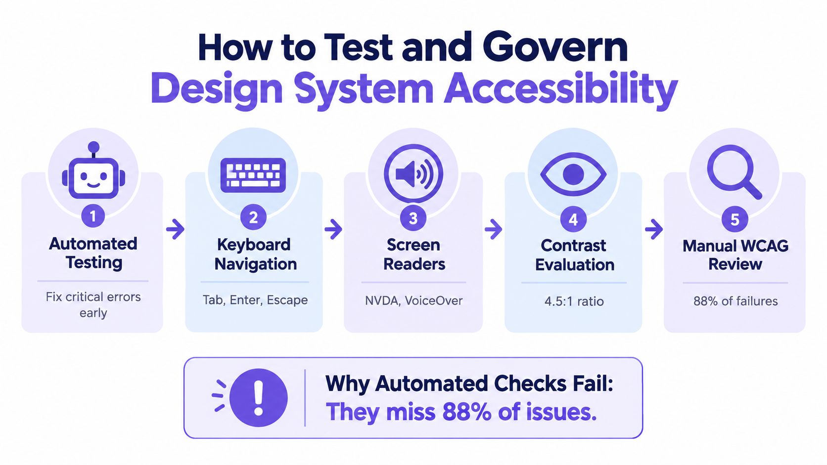
GOV.UK's design-system team combines automated deployment tests, axe and WAVE, browser accessibility reports, HTML and accessibility-tree inspection, sensory review, and manual assistive-technology testing. Its accessibility strategy for design-system components makes a related point: adopting accessible styles and components does not automatically make a service accessible.
Build a layered release workflow
- Run automated checks on primitives and stories. Check names, labels, roles, contrast, duplicate IDs, image alternatives, and common keyboard violations in CI. Test token combinations too, since a compliant color or spacing value can become inaccessible in a specific state.
- Operate every component with a keyboard. Verify Tab order, Enter, Space, Escape, arrow keys, focus visibility, absence of traps, and logical focus restoration.
- Test representative screen-reader journeys. Use combinations such as NVDA with a supported browser and VoiceOver with Safari. Check announcements, landmarks, names, relationships, and dynamic updates.
- Inspect zoom and reflow behavior. Test 400% zoom, responsive layouts, text enlargement, localization pressure, and content that appears after validation.
- Complete manual WCAG review. Review success criteria that automated tools cannot judge reliably, including comprehension, sequence, cognitive clarity, and end-to-end recovery.
- Include people who use assistive accommodations. Their experience can reveal interaction friction that code inspection and expert review miss.
The U.S. Web Design System's March 2025 component assessment of 44 components recommends combining automated, semi-automated, and manual testing with people who use assistive accommodations. An industry survey of more than 1,500 developers, engineers, QA, UX, and legal professionals reported that many organizations lack the expertise, resources, or release process needed for continuous accessibility testing. That finding points to a governance problem as much as a tooling problem.
Release rule: A component is not ready when the automated report is green. It is ready when its states, composition, documentation, and assistive-technology behavior have evidence.
Record the browser, assistive technology, component version, state, criterion, finding, severity, owner, decision, and regression test. Define which findings block release and which require a documented exception. Teams can use Figr on design system governance as a related governance reference, while release authority remains with the product organization and its accessibility owners.
How Figr supports accessibility-aware product design
Figr can help product teams surface accessibility considerations during exploration and handoff, while formal WCAG verification still requires engineering, QA, accessibility specialists, and people with disabilities. Its role is to bring product context and design-system rules into earlier decisions, where teams can still change the flow.
Figr's Design System Intelligence uses existing tokens, components, variants, states, usage rules, and product patterns. That matters when a new experience must fit an established system rather than a generic template. Teams can use UX Reasoning, UX Review, Custom Skills, multi-state prototypes, Direct Editing, Figma Sync, and Figma-ready screens to explore a feature while keeping system constraints visible.
Its Visual Context Graph connects five layers:
- Visual: Existing screens and visual patterns.
- Behavioral: Flows, transitions, states, and user actions.
- Design System: Components, tokens, variants, and usage rules.
- Product Knowledge: PRDs, research, decisions, and domain context.
- Implementation: Code constraints and delivery realities.
That structure supports useful questions during design exploration. Does the invitation flow expose an error recovery path? Does the loading state preserve context? Does the selected tab communicate its state beyond color? Does a proposed variant reuse the established focus and disabled behavior? Does the handoff include the states that engineering needs to implement?
AI can also propose accessibility acceptance criteria and QA cases alongside design artifacts. It may identify a missing label, a suspicious contrast pairing, an incomplete state, or a flow that needs a screen-reader announcement. A 2025 systematic mapping study covering 31 studies found AI applications including automated compliance assessment, correction suggestions, alternative-text generation, and alternative interface design. The systematic mapping study also reinforces the need for human judgment because AI-generated interfaces and AI checks can remain unreliable for assistive-technology use.
The safe operating model is traceability. Record the rule tested, affected component state, evidence, confidence, human decision, and regression test. AI is a review assistant, not an accessibility authority, and Figr doesn't guarantee WCAG conformance or replace human testing.
Design system accessibility checklist
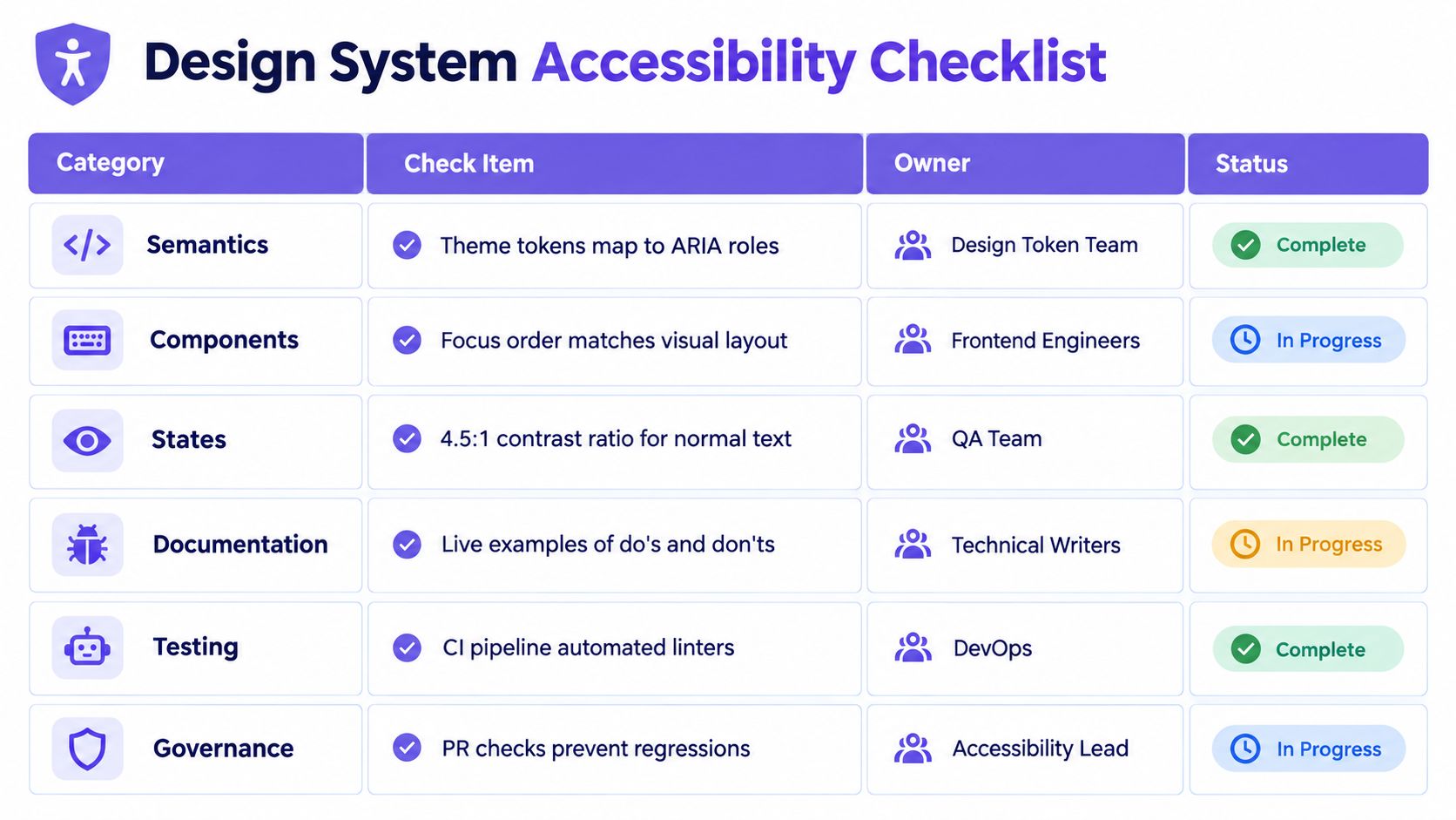
A reusable design system accessibility checklist should assign each requirement to an owner and a verification method. This turns accessibility from a general expectation into work that can enter Jira, a pull request, or a design-system release record.
Foundations and components
- Tokens, Design Token Team: Validate semantic color pairings, text contrast, non-text contrast, focus tokens, target size, typography scaling, reduced motion, forced-colors behavior, and documented exceptions. Verify with token tests and theme review.
- Semantics, Frontend Engineers: Confirm native elements, accessible names, labels, roles, states, values, table relationships, and alternative-text behavior. Verify with accessibility-tree inspection and component tests.
- States, Component Owners: Cover default, hover, focus, disabled, loading, error, success, empty, selected, expanded, and permission states. Verify with stories, interaction tests, and assistive technology review.
- Composition, Product Designers and Engineers: Test representative flows, including dialogs, validation, dynamic updates, localization, zoom, and responsive layouts. Verify through journey-level acceptance criteria.
Interaction and evidence
- Keyboard, Accessibility Lead: Document Tab order, activation keys, arrow-key behavior, Escape handling, focus entry, focus exit, and restoration. Verify manually across supported browsers.
- Documentation, Technical Writers: Publish usage guidance, accessible variants, anti-patterns, content rules, keyboard specifications, and live examples of good and bad implementation. Verify during component release review.
- Testing, QA and DevOps: Run automated linting and accessibility checks in CI, then combine them with manual WCAG review and screen-reader testing. Store evidence with the component version.
- Governance, Design System Lead: Assign severity, define release-blocking findings, review exceptions, and schedule reassessment after implementation changes. Verify through pull-request checks, audit records, and release sign-off.
The checklist works only when owners have authority to act. If QA can report a critical issue but nobody can pause release, the process records risk without controlling it. Governance should make the decision path explicit, including who approves exceptions and how teams prevent the same defect from returning.
Figr helps teams bring existing components, tokens, product context, and accessibility questions into exploration before handoff. Use Figr to reason through states, generate review criteria, and prepare Figma-ready product work, then validate the result through code, assistive technology, and human testing.
Design system accessibility becomes dependable when teams encode requirements in foundations and component contracts. Tokens prevent invalid choices, documented states preserve behavior, and flow-level testing catches failures that isolated component checks miss.
The responsibility remains shared. Designers, engineers, Product Managers, QA teams, accessibility specialists, and people with disabilities each contribute evidence that the product works in practice.
FAQ
What is design system accessibility?
Design system accessibility is the practice of embedding accessible visual, semantic, keyboard, interaction, and content behavior into reusable foundations, components, patterns, and product flows.
How do you make a design system accessible?
Start with semantic tokens and accessible defaults, define component contracts for names, states, focus, and keyboard behavior, document exceptions, and test both components and complete product journeys.
Which WCAG 2.2 criteria apply to design systems?
Relevant criteria include contrast, non-text contrast, non-text content, structure and relationships, keyboard operation, focus visibility, focus not obscured, target size, error identification, status messages, and name, role, value.
How do you test accessible components?
Combine automated checks with keyboard-only operation, screen-reader testing, accessibility-tree inspection, zoom and reflow review, manual WCAG evaluation, and testing by people who use assistive accommodations.
Can AI help improve design system accessibility?
AI can suggest criteria, identify possible violations, generate test cases, and surface missing states, but it can't prove accessibility. Human review, assistive-technology testing, and product accountability remain necessary.