
A modal in web design is a focused window that appears on top of the main content and requires the user to deal with it before returning to the page underneath. The pattern goes back to the Xerox Star in 1981, and early Macintosh analyses found modals made up 30-40% of dialog interactions.
It usually shows up at the most politically loaded moment in a product review. The PM wants to stop accidental damage. The designer worries about interruption. Engineering asks whether this will become another accessibility trap. Everyone is arguing about a box on a screen, but the core question is bigger: are you helping the user make a decision, or are you hijacking their flow?
That’s why what is a modal in web design isn’t a trivial definition question. It’s a product judgment question. A modal can protect a destructive action, tighten an onboarding step, or lift a key conversion point. It can also wreck mobile usability, hide context, and create avoidable QA debt.
Last week I watched a PM defend a confirmation modal for account deletion. The room split fast. One side called it friction. The other called it safety. Both were right.
This is what I mean: a modal is never just a component. It’s a decision about attention, risk, and cost.
The Moment of Interruption
A modal enters the screen like a door closing behind the user. The page dims. The next move becomes binary. Continue or cancel. Confirm or back out.
That pressure is why teams keep debating them.
A product manager usually meets the modal during a tense moment in the flow. Maybe it’s a billing change. Maybe it’s “Delete workspace.” Maybe it’s the final step in a setup sequence. The user is about to do something meaningful, and the team needs a pattern that can pause momentum long enough to get a clear choice.
Why this pattern gets so much scrutiny
A modal design pattern interrupts by design. That’s its strength. It removes competing signals from the page and asks for one action. If the task is critical, that focus helps. If the task is routine, that same interruption feels clumsy.
That’s why modals attract more debate than many other UI components.
A modal should earn the right to interrupt.
When teams get this wrong, they usually confuse importance to the business with importance to the user. A consent step before a destructive action is user-important. A pop-up that blocks reading so marketing can ask for an email is business-important. Those are not the same thing.
The PM lens
For a PM, the modal sits at the intersection of risk and momentum. You’re balancing error prevention, task completion, accessibility, and conversion. If you want a stronger mental model for the surrounding journey, it helps to think in terms of mastering UX flows, not isolated screens.
A good modal clarifies the next move.
A bad modal creates a new problem just to solve an old one.
The Anatomy of a Modal Window
A modal looks simple because the user sees only one layer. Under the hood, it’s a bundle of decisions. Strip it down and you’ll find four parts.
The four parts that matter
The overlay blocks the background and signals that the page below is temporarily unavailable.
The container holds the modal itself, usually centered on desktop and often full-screen on mobile.
The content area carries the job, text, form, warning, or confirmation.
The close mechanism gives the user an exit, whether that’s a close icon, a cancel action, Escape key support, or overlay dismiss when appropriate.
The hidden mechanic is the focus trap. Keyboard focus shouldn’t drift into the page behind the modal. It should loop inside the modal until the user exits. Then focus should return to the control that opened it. If that sounds technical, it is, but the product implication is simple: if focus escapes, the user loses orientation.
Why this pattern has lasted
The modal window started with the Xerox Star in 1981, which used the pattern to disable the parent window and force attention to a critical task. Early Macintosh analyses later found modals accounted for 30-40% of all dialog interactions, which helps explain why this interaction still feels familiar decades later, as documented in the history of the modal window.
This wasn’t an accident of interface fashion. It solved a real coordination problem between system and user. The machine needed certainty. The user needed a clear decision point.
Practical rule: If your component can’t explain what the user must decide in one glance, it probably isn’t a modal yet. It’s a page trying to hide inside a box.
Consistency matters here too. Size, spacing, layering, and elevation should follow a system, not a one-off opinion. That’s the same discipline behind managing design tokens in UI kits.
The Core Job of a Modal: Forcing a Decision
The basic gist is this: a modal manufactures focus.
That’s not good or bad in itself. It’s a trade. You remove optionality from the interface for a short period so the user can finish one important choice with less noise. A lot of teams call this “reducing distraction,” but that phrase is too soft. A modal doesn’t merely reduce distraction. It imposes a temporary rule on attention.
Why forced focus sometimes works
In product terms, a modal is useful when hesitation is dangerous. Destructive actions. Security checks. Critical confirmations. Short tasks that need a clean boundary.
A user who’s editing a dashboard can ignore banners, side hints, and tooltips. They can’t ignore a modal. That’s the point. The product is saying: stop for a second, this action has consequences.
That’s also why modal dialog UX is tied to economics, not just aesthetics. Every interruption has a cost. If you interrupt too late, users make mistakes. If you interrupt too early, they abandon. The PM’s job is to decide which failure mode is cheaper, and which one is more humane.
The behavioral trade-off
A modal changes the market of options on screen. It narrows the user’s world to a smaller set of choices. That often helps completion because fewer visible paths mean less drift. But it also raises the emotional weight of the moment. The user feels stopped.
That’s why a good modal needs a crisp decision architecture:
One primary action that states the outcome clearly
One secondary exit that feels safe, not hidden
Language tied to consequence, not vague labels like “Submit”
A clear cost of continuation, especially for destructive actions
When teams skip this discipline, the modal becomes theater. It looks serious without helping the user think.
For error cases, this gets sharper. If the user triggered a failure, don’t just tell them something broke. Tell them what they can do next. A lot of weak modal work is really weak recovery design, which is why it’s worth reviewing Figr's guide to error states when you’re mapping edge cases.
When to Use a Modal for Maximum Impact
A modal earns its place when the interruption improves the outcome. Not when it merely grabs attention.
The strongest use cases tend to fall into a few patterns.
Critical decisions with real consequence
Delete account. Remove user access. Discard unsaved changes. Confirm payment method updates.
These are classic modal moments because the user benefits from a pause. You’re not adding friction for its own sake. You’re preventing irreversible damage or making the consequence legible before it happens.
If the action can’t be undone, a modal is often the cleanest way to create a deliberate checkpoint.
Short tasks that benefit from isolation
Log in. Enter a one-time code. Confirm an invitation. Rename a project.
These tasks are self-contained. They don’t require broad page context. They’re narrow enough that placing them in a modal popup design can reduce drift and get the user back to the main task quickly.
That logic also shows up in conversion data. A 2022 OptinMonster analysis of over 1 million campaigns found modals for email capture or sign-ups produced an 18-35% uplift in form submissions, and a HubSpot study on B2B sites found modals in onboarding flows increased completion rates by 27%, both cited in Halo Lab’s write-up on modal use in web design.
One missing input that unblocks the journey
Sometimes the user doesn’t need a whole page. They need one decision to proceed.
Examples include:
Choosing a workspace or team before entering a dashboard
Accepting terms tied to a specific feature at first use
Entering a quick detail such as a task name or due date
This works because the task boundary is obvious. The user can see the finish line from the first second.
Use a modal when the user can complete the task without needing to study the page behind it.
That last condition matters. Once the user needs reference material, comparison, or multiple steps of reflection, the modal usually stops helping.
What Is a Modal in Web Design and When Should You Avoid It
The easy answer to what is a modal in web design is “a popup that blocks the page until the user responds.” The useful answer is stricter: it’s a high-friction pattern that should be reserved for high-value interruptions.
A lot of teams know when to use modals in theory. Fewer know when to refuse them.
The obvious failure modes
Don’t put a long, complex form in a modal if the user needs room to think. Don’t hide reference-dependent tasks inside a box when the user has to compare settings, prices, or records on the page behind it. Don’t make modals your default navigation pattern because you’re trying to avoid creating a proper page.
Those choices create claustrophobic UX. The user feels trapped in a container that’s too small for the job.
The mobile problem teams underestimate
The expense of the trade-off becomes clear. A projected 2025 Google Mobile UX Report found modals led to 52% higher bounce rates on mobile devices compared to desktops, and a projected 2026 A11y Project audit found 41% of multi-step modals in SaaS apps violated ARIA rules, increasing error rates for screen reader users by 33%, as summarized by the U.S. Web Design System modal page.
Even if you ignore the future-dated nature of those findings and treat them cautiously, the warning is clear. Complex mobile modals are fragile. They break on small screens, they create input pain, and they often fail accessibility basics.
Three times to say no
The user needs background context: editing something while comparing it to information on the page below
The task has branching logic: multi-step processes that are closer to a wizard than a quick interrupt
The content is educational or exploratory: anything the user should be allowed to scan, revisit, or ignore
If the user needs to look back, don’t black out the room.
That’s the core of the decision. A modal is for commitment. It’s rarely good for exploration.
Choosing the Right Pattern: Modal vs Drawer vs Inline
Most teams don’t really have a modal problem. They have a pattern selection problem.
The debate usually sounds like “should this be a popup?” The better question is about context preservation. Is this a full interruption, a side task, or a lightweight expansion inside the flow?
Modal
Choose a modal when the task is self-contained and the user should make a decision before continuing. The page behind it becomes temporarily irrelevant. That’s why destructive confirms, quick auth prompts, and narrow setup steps fit well.
A modal says, “pause the journey.”
Drawer
Choose a drawer when the task is secondary but still connected to what’s already on screen. The user may need the underlying page for reference. Editing metadata, viewing details, or adjusting filters often works better in a drawer because it preserves orientation.
A drawer says, “stay in the journey, but step to the side.”
Here, the modal vs drawer decision becomes practical. If your designer says the user needs to keep seeing the list, card, or canvas they came from, a drawer is usually the stronger pattern.
Inline
Choose inline expansion when the interaction is low stakes and belongs directly inside the page. Accordions, expandable sections, inline edits, and contextual validation often work best here because they introduce almost no flow disruption.
An inline pattern says, “keep moving.”
The decision test I’d use in review
Ask three questions:
Does the user need the page behind the layer? If yes, lean drawer or inline.
Can the task be completed quickly without branching? If yes, a modal is still in play.
Is interruption the point, or just a convenience for the team? If it only helps implementation, that’s a warning sign.
For adjacent patterns that don’t need forced focus at all, it also helps to review a solid UI notification design guide. Many teams use modals where a toast, banner, or inline status would do the job with less friction.
Designing an Effective and Accessible Modal
A polished modal doesn’t happen because the box looks clean in Figma. It happens because the behavior holds up under keyboard use, screen readers, mobile constraints, loading states, and failure paths.
That’s where many teams stumble.
Accessibility isn’t a layer you add later
For a modal to be accessible, it should use role="dialog" and aria-modal="true", focus should stay trapped inside the modal while it’s open, and focus should return to the trigger element when the modal closes. According to the technical implementation notes from Helsinki’s accessibility guidance, WebAIM audits show 20-30% of modals on top sites fail this focus trap requirement, which is one reason so many implementations feel broken under keyboard navigation. The same guidance is useful if you need the implementation details behind accessible modal focus management.
That’s not a minor QA detail. It changes whether the component is usable at all.
If your team needs a practical baseline, the wcag 2.1 aa guidelines are worth reviewing before sign-off. They make the discussion less subjective.
Responsive behavior changes the pattern
Desktop habits don’t transfer cleanly to mobile. Carbon Design System defines four responsive modal sizes, xs, s, m, and l, and uses viewport-relative widths instead of fixed assumptions. Carbon also notes that on mobile, full-screen modals show 15-25% higher task completion rates in multi-step flows than centered dialogs, according to its modal style guidance.
That detail matters. A centered desktop-style modal shrunk onto a phone often creates the exact tunnel vision and input awkwardness teams claim they’re trying to avoid.
What good modal dialog UX includes
Here’s the standard I’d expect before approval:
Clear title and consequence: the heading should tell the user what decision they’re making
One obvious primary action: use action labels like “Delete workspace” or “Save changes”
A safe exit: cancel, close icon, or overlay dismiss when the task allows it
Support for loading and error states: the modal can’t disappear into uncertainty once the user commits
Escape key and scroll handling: opening the modal shouldn’t leave the background scrollable or trap the viewport in a weird state
A lot of teams also miss layout discipline. Modals look better when they inherit a clear spacing system and predictable alignment rules. That’s the same logic behind designing with grids, understanding different types of grids, and applying the golden rules of interface design.
A quick visual walkthrough helps here.
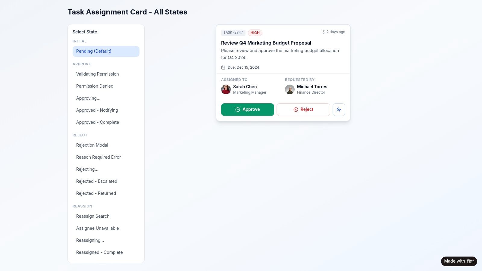
You can also study live examples in the Figr gallery, especially the task assignment artifact shown above, which is useful because it makes state changes visible instead of treating the modal as a single static frame.
The real quality bar for a modal isn’t how it opens. It’s how it behaves when something goes wrong.
Your PM Checklist for Shipping Better Modals
By the time a modal reaches QA, most of the important mistakes have already happened. The fix is to move the review earlier, into the PRD and flow definition.
Questions to answer before design starts
What exact decision is this interrupting for? If the answer is fuzzy, the component will be fuzzy too.
What starts the modal, and why here? Entry point matters because timing shapes whether the interruption feels protective or annoying.
What happens on success, failure, and cancel? A modal without all three is still unfinished.
Does the user need background context? If yes, revisit the pattern choice.
A PM who thinks in journeys will catch more modal mistakes before they harden into tickets. That’s why I’d review the surrounding user flow examples and place the component inside broader digital customer journeys, not just a single screen.
What to check in review and QA
Use a simple pass:
On small screens: should this become full-screen rather than a centered box?
On keyboard: does Tab stay inside the modal, and does focus return correctly on close?
On copy: do button labels name the outcome instead of using generic verbs?
On handoff: did engineering get state logic, not just the happy path?
For the handoff side, tie modal behavior into your developer handoff best practices. A screenshot isn’t enough. Engineers need open, close, error, loading, and dismissal logic spelled out.
The final filter
If the modal is short, consequential, and self-contained, it’s probably right. If it’s long, contextual, or exploratory, it probably isn’t.
For the complete framework on this topic, see our guide to user interface design.
Figr helps product teams turn this kind of judgment into shippable UX. It generates modal designs with the right states, including open, close, overlay dismiss, error within modal, and loading, and it knows when a modal is the right pattern and when a drawer or inline expansion is the better call, based on 200k+ real UX patterns. If you want to explore production-ready examples and speed up flow design, start with Figr.