
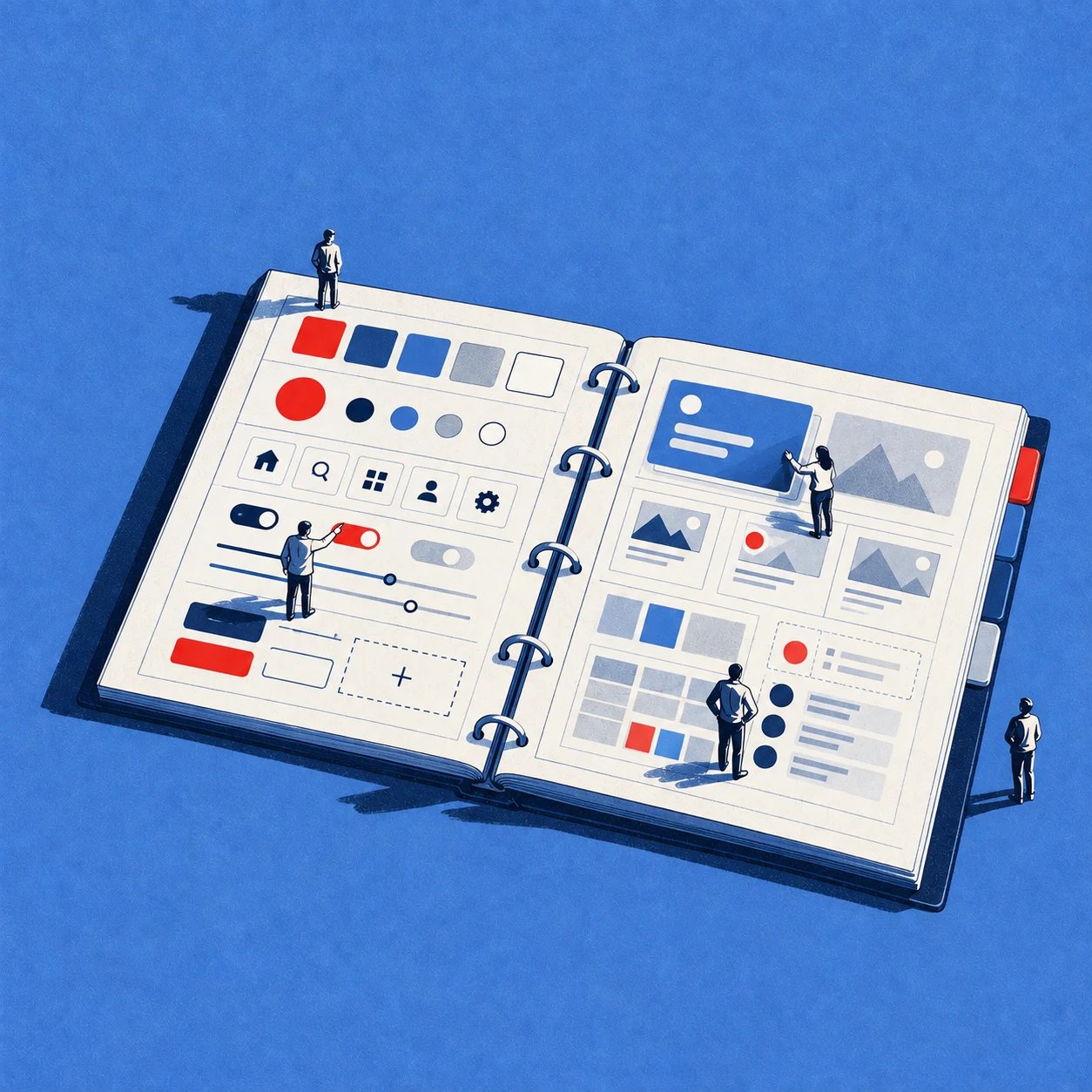
A product can feel inconsistent before anyone can explain why. The onboarding button has one height, the settings button has another, and an engineer rebuilds the same table pattern for the third squad in a row.
If nobody resolves that inconsistency, users learn different rules on different screens. Designers detach components, developers create shadow versions, accessibility states disappear, and product reviews become debates about pixels instead of decisions.
A working design system guide gives the team a shared operating model. It connects foundations, design tokens, components, patterns, documentation, code, and governance so people can move faster without making every product surface feel unrelated.
What a Design System Actually Is
A design system is a governed set of reusable design decisions, coded components, patterns, documentation, and working agreements that help product teams create and maintain a coherent experience.
That definition matters because a Figma file alone isn't a design system. A library can contain polished buttons and inputs while production code uses different spacing, states, and behavior. The team has an asset collection, but it doesn't yet have a shared system.
A design system answers practical questions:
Which component should a team use?
What does it look like in every state?
How does it behave with a keyboard, screen reader, or slow network?
When is the pattern appropriate?
Who can change it?
How do design and code stay aligned after the change?
The strongest systems combine reusable parts with decision guidance. The GOV.UK design guide demonstrates this pairing through component guidance and coded examples. A button page needs to show more than appearance. It needs to explain intent, usage, behavior, and implementation.
The four artifacts teams confuse
A shared Figma library is useful, but it represents only one part of the model. The distinctions below prevent teams from claiming adoption before design and engineering actually share the same source of truth.
| Artifact | Contains | Owns | Best for |
|---|---|---|---|
| Design system | Foundations, tokens, components, patterns, guidelines, code, documentation, and governance | Cross-functional product decisions | Long-lived products and multiple teams |
| UI kit | Reusable visual components, styles, icons, and templates in a design tool | Design assets | Fast exploration and interface composition |
| Style guide | Brand, typography, color, spacing, iconography, and voice rules | Visual and editorial direction | Defining how the product should feel and communicate |
| Component library | Reusable coded components and APIs | Frontend implementation | Building interfaces consistently in production |
A UI kit helps a designer assemble a screen. A component library helps an engineer assemble a screen. A design system connects both artifacts to the rationale and rules that make them reliable.
That distinction also clarifies the relationship with Atomic Design. Teams can build consistent UIs with Atomic Design, but the hierarchy of atoms, molecules, and organisms doesn't replace ownership, contribution rules, or implementation alignment.
Why the operating model matters
A team often says, “We have a design system,” because it has shared Figma components. Then a Product Manager opens the shipped product and finds three table headers, two modal behaviors, and a different empty state in every workflow.
That gap is the core problem. The system exists as a file, while product development runs on local decisions.
A mature system gives designers and engineers a common vocabulary. It also gives product leaders a way to decide when a local variation is justified and when it creates avoidable design debt. The aim isn't visual uniformity for its own sake. The aim is to make recurring decisions deliberate, reusable, and easy to change.
Practical rule: If the Figma component, coded component, usage guidance, and release process don't describe the same behavior, you have a library, not a dependable system.
Core Elements of a Design System
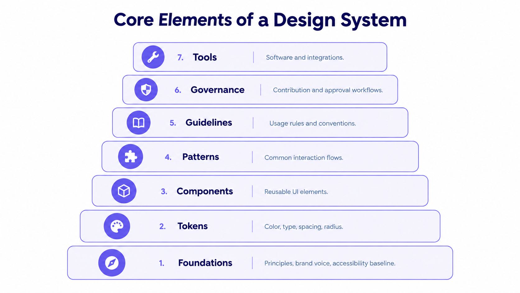
A working design system has seven connected layers: foundations, tokens, components, patterns, guidelines, governance, and tools. Each layer answers a different product question, and the layers become valuable when they reinforce one another.
The architecture
| Layer | Responsibility | Typical deliverable |
|---|---|---|
| Foundations | Define principles, brand voice, typography, color intent, and accessibility baseline | Principles, type scale, color roles |
| Tokens | Store named values for color, type, spacing, radius, elevation, motion, and states | Structured token schema |
| Components | Package repeatable interface mechanics | Buttons, inputs, navigation, tables |
| Patterns | Solve recurring user tasks and interaction flows | Form validation, filtering, empty states |
| Guidelines | Explain when and how to use the system | Usage rules, examples, do's and don'ts |
| Governance | Control contribution, ownership, review, release, and deprecation | Contribution workflow and changelog |
| Tools | Connect design, code, documentation, and testing | Figma libraries, Storybook, token pipeline |
Foundations establish intent. Tokens turn intent into machine-readable variables. Components consume those variables, patterns combine components into task-level solutions, and documentation explains the decisions. Governance keeps the whole structure current.
Tokens are the contract
A token shouldn't be a color value buried in prose. It should be a named variable with a type, value, description, alias, and theme scope. A semantic token such as color.text.primary communicates purpose, allowing themes to change raw values without forcing component code to change.
A technically mature token model covers:
Color, including text, background, border, accent, success, warning, and error roles
Typography, including family, size, weight, line height, and tracking
Spacing, with approved values that prevent arbitrary gaps
Radius and elevation, for shape and depth
Motion, including duration, easing, and reduced-motion behavior
Interaction states, including hover, focus, disabled, loading, selected, and error
Structured token schemas make decisions reviewable, diffable, and exportable to design files, CSS variables, native constants, and documentation. They also create a place for automated checks. A token can be rejected when its color pairing fails contrast or when a component uses an unapproved spacing value.
Teams working with tokens should follow automatic updating with design tokens as an architectural principle, not as a convenience feature.
Components need behavior, not just shape
A component is a governed unit of intent, constraints, states, content rules, and implementation. The button needs focus behavior, loading behavior, disabled behavior, icon rules, label guidance, and a coded equivalent. The input needs error association, help text, validation timing, and a predictable screen-reader name.
WCAG 2.0, published by the W3C on 11 December 2008, established 12 guidelines around perceivable, operable, understandable, and resilient experiences, with conformance levels A, AA, and AAA. WCAG 2.1, published on 5 June 2018, added 1 guideline and 17 success criteria, while WCAG 2.2, published on 5 October 2023, added 9 further success criteria and retired the obsolete 4.1.1 Parsing criterion. The W3C WCAG standards history shows why accessibility belongs in the system's evolution and governance.
WCAG 2.2 also gives teams rules that can become token constraints. Normal text generally needs a contrast ratio of at least 4.5:1, while focus appearance includes an area equivalent to a 2 CSS pixel thick perimeter and a 3:1 contrast difference between focused and unfocused states, subject to the specification's exceptions. See the WCAG 2.2 focus and contrast requirements when defining state tokens.
The system supplies tested foundations. The product team still validates the assembled page, because context can introduce inaccessible labels, focus placement, overlays, or interaction sequences.
How to Build a Design System Step by Step
Build the smallest system that solves real product friction. A settings-heavy B2B SaaS product usually gets more value from reliable inputs, tables, permissions, alerts, and empty states than from a large showcase library.
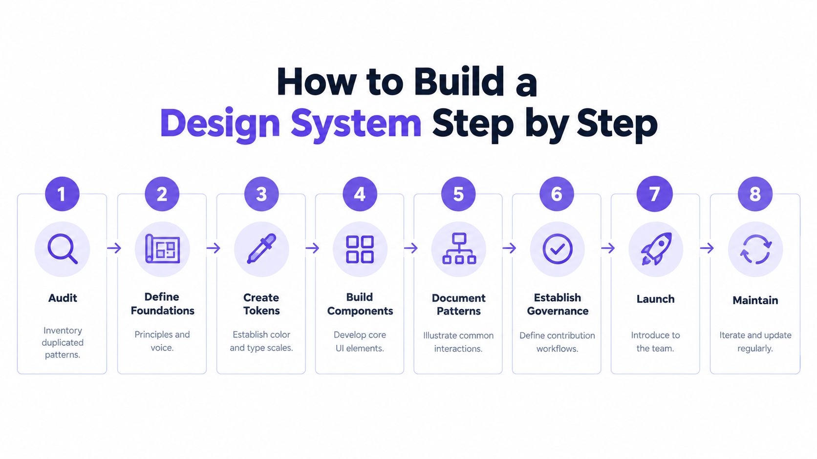
An eight-step build sequence
Step 1. Audit the existing product.
Owner: Design Lead, with an engineer and Product Manager.
Capture screens from onboarding, permissions, billing, and reporting. Inventory duplicated buttons, inputs, tables, dialogs, states, and token values.
Deliverable: A pattern inventory ranked by repetition, user impact, and migration difficulty.Step 2. Define foundations.
Owner: Design Lead and Product Manager.
Write principles that help teams choose between competing solutions. Establish typography, color roles, spacing intent, brand voice, and the accessibility baseline.
Deliverable: A foundation document that explains decisions, not only values.Step 3. Choose the token model.
Owner: Design Systems Designer and Frontend Engineer.
Separate raw values from semantic roles. Define naming, aliases, theme scope, deprecation, and validation rules before building component variants.
Deliverable: A token schema that can drive Figma variables, CSS custom properties, and documentation.Step 4. Build semantic tokens before components.
Owner: Design Systems Designer and Engineer.
Map roles such ascolor.text.primary,color.surface.default, andcolor.border.errorto raw values. Test contrast and interaction combinations before publication.
Deliverable: Approved token sets for color, type, spacing, radius, elevation, motion, and states.Step 5. Build components and variants.
Owner: Component Designer and Frontend Engineer.
Start with high-frequency components from the audit. Define default, hover, focus, disabled, selected, loading, error, and empty states where relevant.
Deliverable: Matched design and code components with a clear API and variant naming.Step 6. Document usage and code examples.
Owner: Content Designer, Designer, and Engineer.
Explain when to use a component, when not to use it, how to write its content, and how to implement it. Show realistic examples from the product's permission workflow.
Deliverable: A page for every published component and pattern, with design examples and working code.Step 7. Connect design to code.
Owner: Design Systems Engineer.
Map Figma variables to code tokens and align component properties with frontend APIs. A design variant calledsize=compactshouldn't become an undocumenteddensity=smallprop in code.
Deliverable: A tested synchronization path, shared release notes, and a visible source of truth.Step 8. Test and launch version one.
Owner: Cross-functional system group.
Test keyboard behavior, screen-reader names, focus order, responsive behavior, loading, error handling, and page-level composition. Pilot the system on one live permission-management flow.
Deliverable: A trusted v1, migration guidance, known limitations, and a contribution path.
The Figr on design system creation resource can support teams documenting this sequence, but ownership still belongs to the people responsible for the product and its implementation.
How to know v1 is ready
V1 doesn't need every possible component. It needs enough coverage to earn trust in a real workflow. If designers must detach the library for ordinary screens, or engineers must recreate basic behavior in code, the system launched too early.
Choose one product surface with meaningful complexity. A permissions page exposes tables, filters, badges, dialogs, alerts, validation, and empty states. It gives the team a better learning environment than a marketing landing page.
V1 is the smallest system that makes the correct path easier than the local shortcut. It isn't the finish line.
Implementing a Design System Across Product Teams
Implementation succeeds when the shared path is easier to use than the private path. Publishing a library doesn't migrate a product, and asking every squad to pause feature work creates resistance before the system has demonstrated value.
Consider a B2B SaaS company with an admin product built by three squads. Its permission screens contain shadow components, undocumented table variants, and local color values that never entered the shared library. The design team has a Figma file, while engineering has a partially matching component package.
Start with a controlled pilot
The Design Lead creates a Figma library with clear publishing permissions and selects one permissions workflow for migration. The engineer maps approved semantic tokens to CSS variables and platform constants, while the Product Manager protects enough delivery capacity to migrate the workflow alongside planned feature work.
The team doesn't rebuild every screen. It identifies the route that generates the most repeated UI and replaces its highest-risk patterns first. A table component might expose selection, sorting, density, loading, empty, and error states. A permission dialog might need destructive confirmation, validation, disabled actions, and focus management.
The pilot produces evidence about missing variants. That evidence should improve the system, not become a reason to fork it.
Connect Figma and code deliberately
Figma libraries provide reusable design assets, but engineers need a matching implementation contract. Token mapping should answer where a Figma variable becomes a CSS custom property, native constant, or component prop. Component properties should use equivalent names and meanings across both environments.
A practical review cadence includes:
Design review: Confirm the proposed screen uses approved components, tokens, patterns, and content guidance.
Implementation review: Compare the shipped component with its design counterpart, including states and responsive behavior.
Migration review: Track what remains legacy, why it remains, and when the team will revisit it.
Release review: Publish Figma updates, code packages, documentation, and migration notes as a coordinated change.
Tools such as Figma Sync can help connect design artifacts with implementation workflows, but synchronization doesn't resolve an ambiguous component API. The team still needs agreement about ownership and behavior.
Treat migration as product work
Legacy screens rarely migrate cleanly. A table may look like a standard table but contain a product-specific bulk-action flow. A button may appear reusable while its loading behavior differs across billing and permissions. The right response is to separate the reusable mechanic from the product-specific pattern.
Track migration debt openly. Give each legacy surface an owner, a reason, and a decision. A dashboard should show approved component coverage, token coverage, known exceptions, accessibility findings, and unresolved shadow components.
The Figr on scaling design systems perspective is useful here because governance must support contribution and migration, not only approve new components.
The economic point is simple. Teams resist systems that add steps to every feature, but they adopt systems that remove repeated decisions from every feature. The system earns adoption by reducing local effort.
Design System Examples Worth Studying
Public systems are valuable because they reveal decisions that teams usually keep private. Study them for the problems they solve, not for their surface styling.
Material Design
Material Design is a useful reference for breadth, theming, component behavior, and motion guidance. It treats the system as an ecosystem that spans foundations, components, interaction principles, and implementation resources.
A smaller team can borrow its discipline around state completeness and theming. It shouldn't copy the full surface area if the product only needs a focused B2B workflow. Material's scale can become distracting when a team uses it as a catalog instead of deciding which product problems recur.
Atlassian Design System
The Atlassian Design System is especially instructive for teams supporting several related products. Jira, Confluence, Trello, and Bitbucket need shared language while serving different contexts, which makes contribution, semantic tokens, content guidance, and accessibility part of the system's practical work.
A mid-sized SaaS team can borrow the separation between reusable components and product-specific patterns. It can also borrow the expectation that a change needs documentation, ownership, and a clear reason. It shouldn't imitate Atlassian's organizational complexity without having comparable product needs.
Polaris
Polaris is shaped around commerce and merchant workflows. Its strength is domain depth, especially in admin interfaces where forms, tables, data density, destructive actions, and operational feedback need careful treatment.
Teams building marketplaces or B2B administration tools should study how Polaris connects components to merchant tasks and content decisions. Consumer product teams may find the workflow assumptions less transferable, but the pattern-layer thinking remains useful.
| System | Optimizes for | Borrow this | Avoid copying |
|---|---|---|---|
| Material Design | Broad ecosystem, theming, motion, and component coverage | State completeness and adaptable foundations | Its full breadth |
| Atlassian | Multi-product consistency and contribution | Semantic language and context-aware patterns | Governance overhead without need |
| Polaris | Merchant and admin workflows | Domain-specific patterns and content guidance | Commerce assumptions |
The best system encodes decisions. It tells a team why a pattern exists, which problem it solves, and where its boundaries are. For more references, compare these design system examples for product teams by product shape rather than popularity.
How to Maintain and Scale a Design System
Launch is the midpoint. A system stays healthy when teams can contribute, consume updates, and understand exceptions without waiting for a central team to solve every request.
The 2025 Design Systems Report found that only 50% of respondents reported wide or full company adoption, while the other half reported no adoption, minimal adoption, or adoption by only some teams (Design Systems Report 2025). That finding changes the leadership question. It isn't “How do we publish a system?” It's “How do we make using the system the lowest-friction path?”
Build a maintenance operating system
A useful model has four loops:
Contribution loop: A product team proposes a change with a user problem, usage context, design proposal, implementation impact, and owner.
Release loop: The system team reviews, versions, documents, tests, and communicates the change through a changelog.
Migration loop: Teams receive codemods, replacement guidance, deprecation dates, and support for legacy surfaces.
Learning loop: Maintainers review adoption data, support questions, accessibility findings, and recurring exceptions.
Versioning needs a clear contract. Use semantic versioning for token and component changes where it fits your release model, document breaking changes, and deprecate with migration instructions instead of deleting a component without warning.
Measure effective adoption
Nominal adoption means a team imports a component. Effective adoption means the team uses the approved token, respects the documented states, follows the content guidance, and ships the coded behavior correctly.
Track measures that reveal this distinction:
Surface coverage: The share of shipped product surfaces using approved components.
Token coverage: The share of visual decisions represented by approved semantic tokens.
State coverage: Whether interactive components include required focus, error, loading, disabled, and empty behavior.
Migration debt: The number and impact of legacy patterns still in production.
Contribution health: The time from a valid proposal to a reviewed decision.
Defect signals: Repeated implementation, accessibility, and visual inconsistencies found in review.
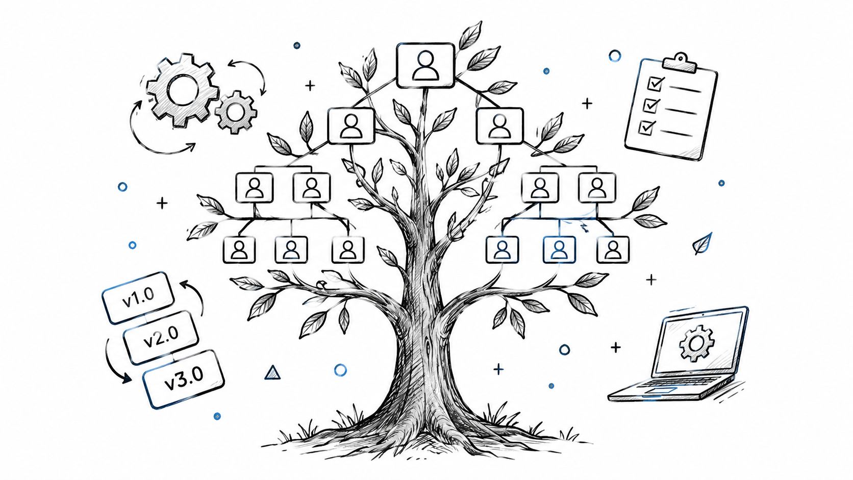
Office hours, contribution reviews, team-level dashboards, and migration debt tracking remove the social friction that documentation can't solve. Teams need a fast answer when a component doesn't fit.
For deeper operating guidance, use Figr's resources on design system adoption, design system governance, and design system versioning. Keep each spoke focused on its specialized question, while this pillar remains the broad operating model.
Common Design System Mistakes and How to Avoid Them
Most design system failures are governance failures wearing an execution costume. The team usually knows how to build a button. It hasn't decided who owns the button, how variants enter the system, or what happens when a product team needs something new.
| Failure | Detection signal | Concrete fix |
|---|---|---|
| Duplicated components | Similar components have different names or APIs | Create an inventory, assign ownership, and publish one preferred replacement |
| Unclear variants | Designers use “other” or engineers add one-off props | Define variant purpose, allowed combinations, and rejection criteria |
| Missing states | QA finds broken loading, error, focus, or empty behavior | Make state coverage part of component acceptance |
| Outdated documentation | Examples don't match the current coded component | Publish docs from the same release process and review examples in pull requests |
| Design-only tokens | Figma uses variables while production uses raw values | Add token validation to code review and the build pipeline |
| Excessive flexibility | Every squad creates a custom option | Narrow the API and move legitimate differences into patterns |
| Low adoption | Teams detach components or bypass the library | Prioritize migration debt, improve discoverability, and reduce contribution friction |
The most damaging mistake is treating governance as overhead. Without a decision path, the system accumulates silent exceptions. Without an exception policy, teams either fork the system or stop using it.
A component should earn flexibility through repeated product evidence. One team's urgent request isn't automatically a new variant. Ask whether the need recurs, whether the behavior belongs at component level, and whether a pattern can solve it without expanding the component API.
The reliable system is the one that makes the approved decision easier to find, understand, and ship than the workaround.
How AI Changes Design System Workflows
AI changes design work when it can reason over context, not when it can merely retrieve a component name. An agent that ignores the system generates generic interface patterns. An agent that copies assets without understanding their usage rules creates a different class of inconsistency.
A context-aware workflow combines:
Existing product screens and visual relationships
Semantic tokens and theme scope
Components, variants, and interaction states
Usage rules and content guidance
Product requirements, research, and workflow behavior
Implementation constraints and available code components
This is why a design system MCP matters. Model Context Protocol can expose governed design assets and rules to an AI agent in a structured, reviewable format. Access alone isn't correct application. The agent still needs product context, and a designer or engineer still needs to review the result.
Teams exploring AI-assisted visual work can also study these real-world AI ad creative examples to see how context changes the quality of generated outputs.
Figr's Design System Intelligence uses tokens, components, variants, states, and usage rules to apply existing design decisions within product flows. Its Visual Context Graph connects five layers:
Visual, screens and interface relationships
Behavioral, flows and interaction logic
Design System, tokens, components, variants, and states
Product Knowledge, PRDs, research, and requirements
Implementation, code constraints and delivery context
Capabilities such as Figma Sync, Direct Editing, multi-state prototypes, and Figr MCP support different points in that workflow. The practical distinction matters: the system remains owned and governed by the product organization, while AI helps apply its decisions during exploration and iteration.

A Product Manager adding bulk permissions might begin with an existing admin screen, a PRD, and the approved table and dialog patterns. The agent can explore the flow, generate multi-state screens, surface edge cases, and use design-system values through Direct Editing. The team still checks whether the flow fits user research, whether the states are complete, and whether engineering can implement the result.
AI closes part of the distance between having a system and using it correctly. It doesn't replace system ownership, accessibility review, product judgment, or design craft.
Figr helps product teams apply existing tokens, components, variants, states, and usage rules while they explore real product flows. Import your design context, iterate on multi-state UX, and send Figma-ready work back to the team through Figr.
Conclusion
Create the smallest design system that solves repeated product problems. Start with an audit, establish semantic foundations, build components around real workflows, and document the decisions that make reuse safe.
Implement the system across design and code together. Migrate representative product surfaces, track legacy patterns, and make approved components easier to use than private alternatives.
Maintain the system as an operating model. Govern contributions, version changes, measure effective adoption, and give teams a clear path for exceptions and improvements.
FAQ
What is a design system?
A design system is a governed collection of foundations, design tokens, components, patterns, documentation, code, and contribution rules that helps teams make consistent product decisions.
How do you create a design system?
Audit existing interfaces, define foundations, create semantic tokens, build components and patterns, document usage, connect design to code, test accessibility and behavior, then launch a focused first version.
What should a design system include?
It should include foundations, tokens, reusable components, interaction states, patterns, accessibility rules, documentation, coded implementations, governance, versioning, and tools that connect the artifacts.
What is the difference between a design system and a UI kit?
A UI kit is mainly a collection of visual components and styles in a design tool. A design system adds behavior, documentation, code, patterns, ownership, contribution workflows, and release practices.
How do AI tools work with existing design systems?
AI tools can use product screens, tokens, components, states, usage rules, product requirements, and implementation constraints as context. Teams still need to review whether generated work applies the system correctly in the product context.