
Designing a consistent and user-friendly digital experience can feel like a never-ending challenge. As your business scales, so do your design needs, making it increasingly difficult to keep your brand cohesive across multiple platforms.
You’ve probably faced the frustration of mismatched colors, inconsistent button styles, and wasted time on repetitive design tasks. This inconsistency confuses your users and diminishes your brand's credibility.
Sound familiar? You’re not alone. Many businesses struggle with maintaining design consistency as they grow. The solution? A well-crafted design system that serves as a single source of truth for all your design elements and guidelines.
But building an effective design system isn’t easy—it requires time, strategy, and the right resources. In this blog, we’ll dive into the best design system examples and resources from leading brands like Google, Apple, and Salesforce.
You’ll discover how they maintain their design integrity and efficiency, and how you can apply these strategies to your own projects to create a seamless user experience.
Ready to end the chaos and create a cohesive brand experience? Let’s explore how the pros do it and how you can too.
What is a Design System?
A design system is more than just a collection of UI components and design assets. It’s a comprehensive guide that defines the visual, interactive, and functional elements of a brand, ensuring a cohesive user experience across all digital platforms. But what exactly does that mean? Let’s break it down.
A design system is a centralized resource that includes reusable components, code snippets, style guides, and documentation.
It provides designers and developers with the building blocks they need to create consistent and on-brand user interfaces, whether they’re working on a website, mobile app, or any digital product. Essentially, it’s the blueprint for your brand’s digital presence.
Why Are Design Systems Important?
In the ever-evolving digital landscape, where user expectations are higher than ever, design systems have emerged as a critical tool for organizations aiming to deliver consistent and scalable digital experiences. But why are they so important? Let's dive into the key reasons:
1. Consistency Across Platforms: One of the primary reasons design systems are crucial is that they ensure visual and functional consistency across all digital touchpoints. Whether it’s a website, mobile app, or internal tool, users should have a seamless experience that feels familiar and reliable.
Example: Google’s Material Design System provides a unified design language that is used across Google’s products, from Gmail to Google Drive, ensuring users experience the same look and feel, no matter the platform.
2. Efficiency and Speed in Design and Development: A well-established design system allows designers and developers to reuse components and code, reducing the time and effort required to create new pages or features. This efficiency is especially beneficial for scaling products rapidly.
Example: Shopify’s Polaris design system helps its team quickly build new features or even whole products using pre-defined components, cutting down the time to market and maintaining a consistent user interface.
3. Collaboration and Communication: Design systems serve as a shared language between designers, developers, product managers, and other stakeholders. With clear guidelines and reusable components, everyone involved in the product development process is aligned, minimizing misunderstandings and redundant work.
4. Scalability and Flexibility: As organizations grow, maintaining a cohesive brand identity across multiple products, teams, and platforms becomes challenging. A design system provides the structure needed to scale design efforts without losing consistency.
Example: IBM’s Carbon Design System is used across a multitude of products and services, allowing for scalability while maintaining a unified design language that reflects IBM’s brand values.
5. Improved User Experience: A consistent and cohesive design system enhances the user experience by providing predictable interactions, reducing cognitive load, and building trust with users. When users know what to expect, they are more likely to engage with the product and have a positive experience.
Example: Apple’s Human Interface Guidelines ensure that every app designed for its ecosystem follows specific usability and design standards, making the user experience intuitive and enjoyable.
6. Reducing Design and Technical Debt: Without a design system, teams often end up with disjointed designs and fragmented code, leading to what’s known as design and technical debt. This makes future changes and updates more complicated and costly.
7. Enhancing Brand Identity and Recognition: A consistent design system ensures that all digital products and touchpoints reflect the brand’s identity, values, and message. This strengthens brand recognition and builds trust with users.
Example: Mailchimp’s design system is infused with its brand personality, from its playful illustrations to its unique tone of voice, creating a distinctive and recognizable brand identity.
Understanding the importance of design systems sets the stage, but to truly grasp their impact, we need to dive into the building blocks that make up a successful design system. These components ensure the system functions seamlessly and provides maximum value across different teams and projects.
Key Components/Elements of a Design System
A solid design system consists of several key components that work together to provide a cohesive framework for creating, maintaining, and scaling digital products. Let’s break down these essential elements:
1. Design Principles
Design principles are the foundational guidelines that define the overall philosophy and approach to design within the system. They help ensure that all design decisions are aligned with the brand’s values and user experience goals.
Example: Atlassian’s design principles include being practical, purposeful, and inclusive, guiding the team to create experiences that empower users and promote collaboration.
2. Component Library

The component library is the heart of any design system. It includes reusable UI elements such as buttons, forms, cards, and navigation bars, which are used consistently across various products and platforms. Each component is accompanied by documentation outlining its usage, states, and variations.
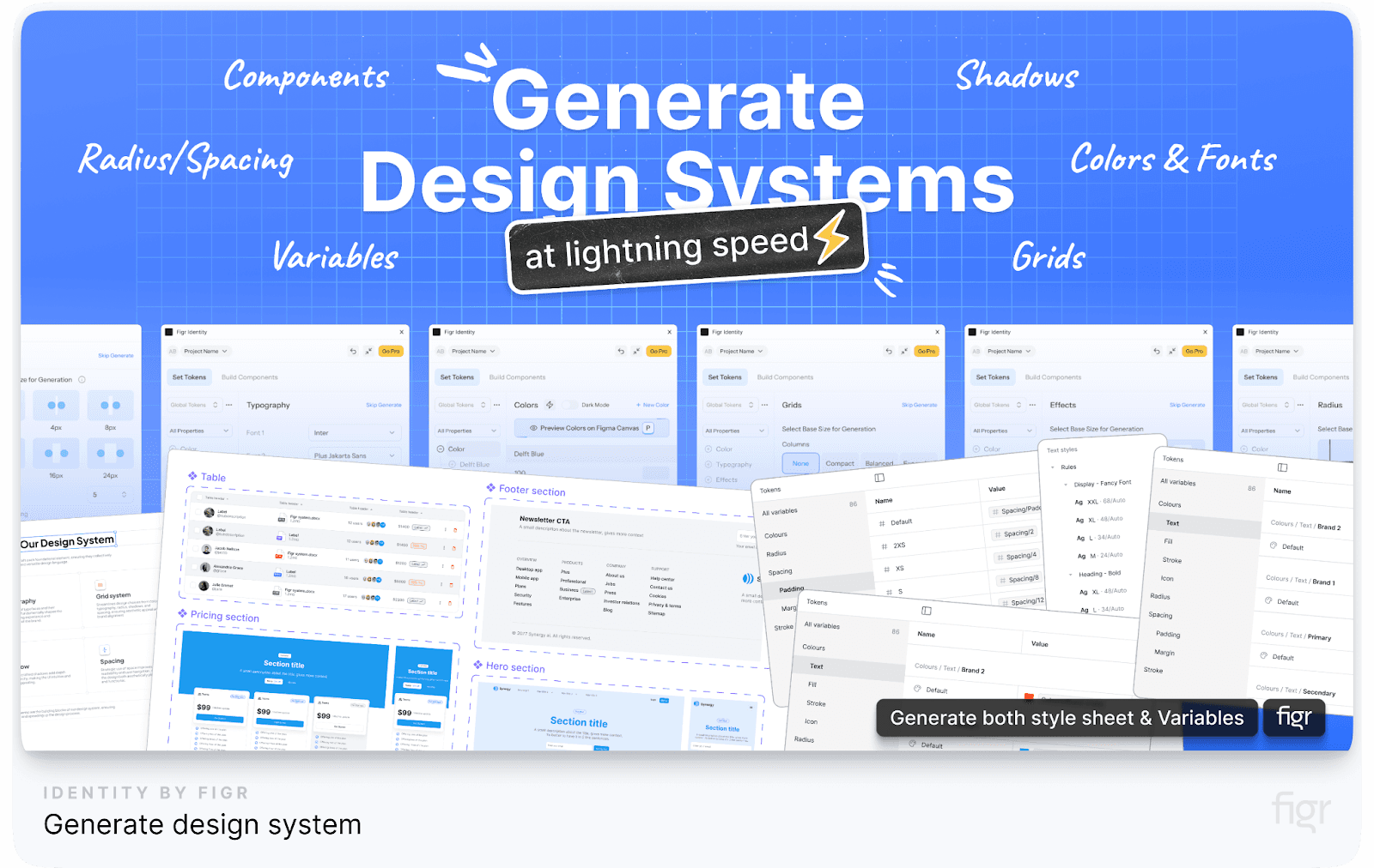
With Figr Identity, you can unlock the real power of components—you unlock a toolkit for creative freedom.
Figr Identity provides a comprehensive library of editable components that can be customized to reflect your brand’s unique style. With Figr, you can effortlessly adapt these components to your specific design needs, ensuring consistency and flexibility across all your projects without the need to start from scratch every time.
3. Pattern Library
While a component library provides individual UI elements, a pattern library offers combinations of these components to solve common design challenges, such as form layouts, modals, or navigation structures. These patterns ensure that teams are not reinventing the wheel and are adhering to best practices.
But why settle for static, one-size-fits-all patterns? With Figr Identity, you get dynamic, editable patterns that can be customized on the fly.
Whether you’re building a new app feature or revamping your website’s UX, Figr Identity lets you mold and adapt patterns in real-time, creating a seamless bridge between design and development that’s as unique as your brand.
Figr Identity is like having a design assistant that provides best-in-class patterns and also adapts them to fit your brand’s unique needs instantly—saving time, reducing errors, and unleashing your team's creativity.
4. Style Guide
A style guide outlines the visual elements of the brand, including color palettes, typography, iconography, spacing, and imagery. It ensures a consistent look and feel across all touchpoints and provides guidelines on how to use these elements effectively.
Example: Mailchimp’s style guide includes a vibrant color palette and playful illustrations that reflect the brand’s personality and make the user experience more engaging and cohesive.
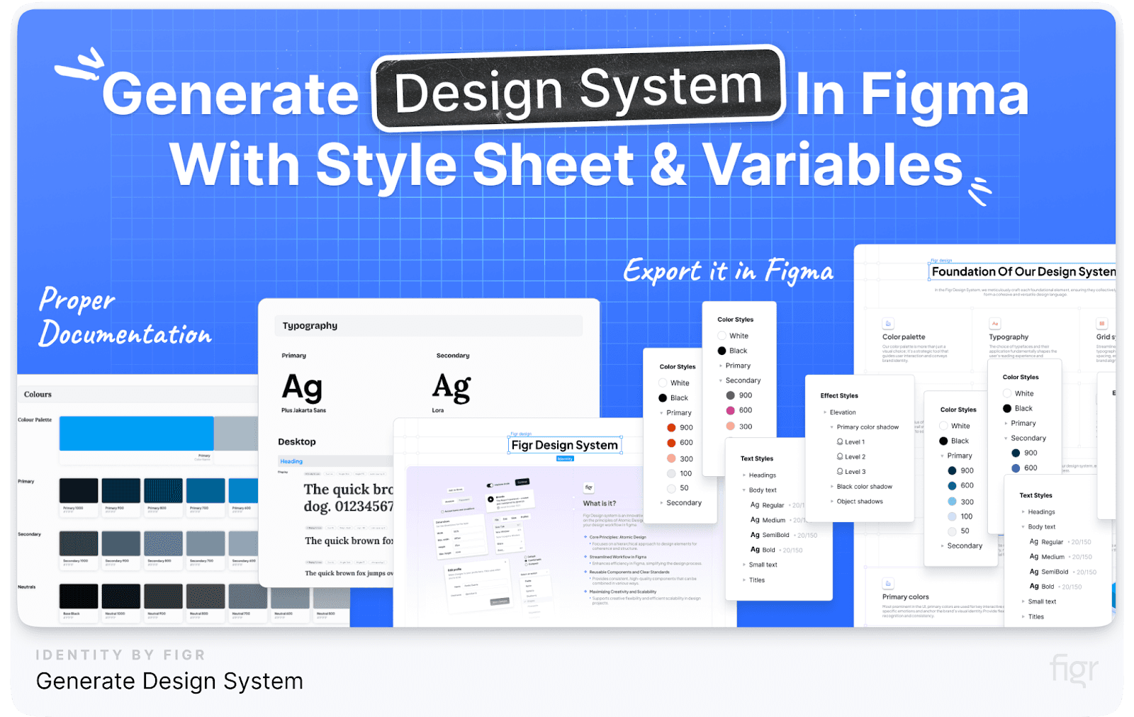
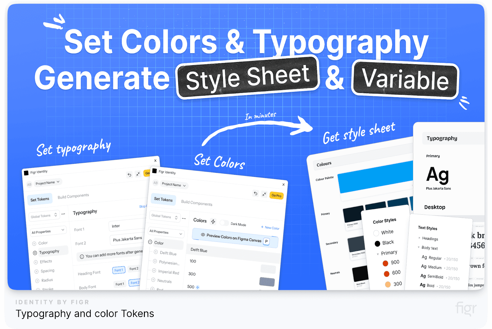
Figr Identity allows you to generate complete style guides in minutes that are instantly accessible to your team, making it easier to apply visual elements consistently across all projects.
5. Design Tokens
Design tokens are the smallest, most granular elements of a design system. They store visual design attributes such as colors, font sizes, spacing values, and other properties in a format that can be used by both designers and developers to ensure consistency across all platforms.
Imagine if your design tokens could automatically get managed and sync across every project, screen, and device. That’s what Figr Identity does.
Figr Identity supercharges your design tokens with smart automation—updating styles, syncing components, and keeping every detail in check across your entire design ecosystem.
Say goodbye to manual updates and hello to a seamless, unified design language everywhere, all the time.
6. Content Guidelines
Content guidelines define the voice, tone, and style of the text used in the product. They ensure that the messaging is consistent and aligns with the brand’s personality, helping to create a unified experience for users.
7. Accessibility Guidelines
Accessibility guidelines ensure that the design system supports inclusive design practices. They provide rules for making digital products usable for people with disabilities, including guidelines for color contrast, keyboard navigation, screen reader support, and more.
8. Brand Guidelines
Brand guidelines define the visual and verbal identity of the brand. They cover everything from logo usage and photography styles to brand values and mission statements. These guidelines ensure that all communications and designs reflect a consistent brand image.
Example: Apple’s Human Interface Guidelines are a prime example, offering detailed instructions on how to maintain the iconic Apple aesthetic across all platforms.
Using Figr Identity, you can make your design system just like Apple’s HIG because it provides all the tools to document and share your brand guidelines with your team, helping you maintain a strong and consistent brand identity.
9. Resources and Tools
A design system often includes additional resources and tools to support designers and developers. This can range from downloadable UI kits to plugins and code snippets that help teams implement the design system quickly and accurately.
10. Governance and Contribution Model
A well-documented governance and contribution model is essential for maintaining the integrity and evolution of the design system. It outlines who can contribute to the system, how changes are proposed and reviewed, and the process for adding new components or updating existing ones.
Incorporating these key elements into your design system will ensure consistency, and efficiency and will empower your team to create digital experiences that truly resonate with your audience.
And with Figr Identity, you have the power to build a comprehensive design system that rivals those of the world’s leading brands.
So, now that we’ve broken down the key components of a design system, let’s explore some of the best design system examples from industry leaders like Google, Apple, and Salesforce.
These examples serve as benchmarks and inspiration for building your own solid design framework.
Let’s begin with one of the most influential design systems in the industry—Google's Material Design System.
Google Material Design System
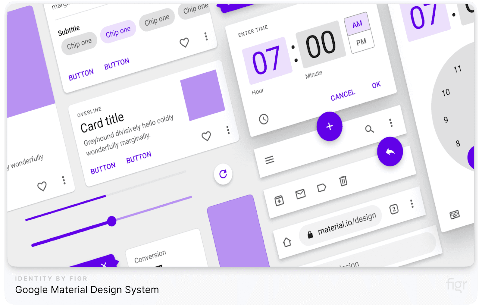
Google’s Material Design System is a comprehensive and meticulously crafted design language that has set the standard for modern digital interfaces. Launched in 2014, this design system aims to create a unified and intuitive experience across all Google products and platforms, from Android apps to web applications.
Material Design goes beyond just visual aesthetics; it incorporates interaction patterns and accessibility features to ensure a seamless user experience.
Key Components of Google Material Design System
- Material Theming: Allows brands to customize Material Design components to reflect their own visual identity while retaining the core principles of the design system. For example, Google’s own apps like Gmail and Google Drive use Material Theming to maintain consistency while accommodating unique branding elements.
- Color Customization: Designers can choose custom color palettes that align with their brand, including primary and secondary colors, background colors, and accents.
- Example: Spotify utilizes Material Theming to maintain its distinct green and black palette while following Material Design guidelines for structure and usability.
- Component Library: A vast collection of reusable UI components like buttons, cards, and dialog boxes, each with detailed usage guidelines and coded examples. Example: Developers can directly implement these components using pre-built code snippets available for popular frameworks like React and Angular.
- Typography: Google uses a standardized typographic scale, which includes recommendations for font sizes, weights, and line heights to maintain readability and visual hierarchy. Example: Roboto and Noto are the primary typefaces, providing versatility for different languages and platforms.
- Color System: Offers a flexible color palette that maintains visual consistency while supporting multiple themes, such as light and dark modes.
- Motion and Animation: Motion guidelines define how UI elements should behave and transition, ensuring smooth and intuitive interactions. Example: Subtle animations in navigation or loading states help reduce cognitive load and guide users naturally through the app.
- Iconography: A cohesive set of icons that follows a consistent visual language, available for both outlined and filled styles to suit different contexts. Example: Google’s material icons are used across various applications and are available for download, making them widely accessible for developers.
- Accessibility: Material Design places a strong emphasis on accessibility, ensuring that components are usable by people with disabilities.
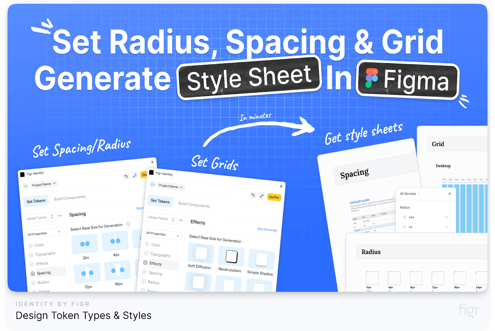
Figr Identity amplifies these foundational elements by allowing you to generate and customize layout grids, typographic scales, and color palettes tailored specifically to your brand’s needs—all within minutes.
Need to adapt your design for different devices or tweak your typography for better readability? Figr Identity makes it effortless, so you can maintain a cohesive visual language across every touchpoint, without breaking a sweat.
Real-World Applications of Material Design
- Google Workspace Apps: Applications like Google Docs, Sheets, and Slides utilize Material Design to provide a cohesive experience across web and mobile platforms.
- YouTube: The YouTube app and website use Material Design components like cards, bottom navigation, and dialog boxes to offer a seamless browsing experience.
- Third-Party Apps: Popular apps like Airbnb and Lyft have adopted Material Design principles to maintain a clean and intuitive user interface.
How Figr Can Help You Implement Material Design Principles:
Implementing such an extensive design system can be daunting, but Figr Identity simplifies this process by automating much of the setup:
- Automated Design Systems: Figr Identity can help you set up a customized design system based on Material Design principles in just a few clicks.
- Editable Designs: Access editable components and layouts that align with Material Design, making it easier to maintain consistency across your projects.
- Collaboration Features: With tools to share and collaborate within your team, Figr ensures that your design system is well-defined and easy to manage and evolve as your brand grows.
After a deep dive into Google’s Material Design System, which emphasizes usability and consistency across platforms, let’s shift our focus to another powerhouse in the design world—Apple’s Human Interface Guidelines.
This system sets the gold standard for creating seamless and elegant user experiences across the Apple ecosystem.
Apple Human Interface Guidelines
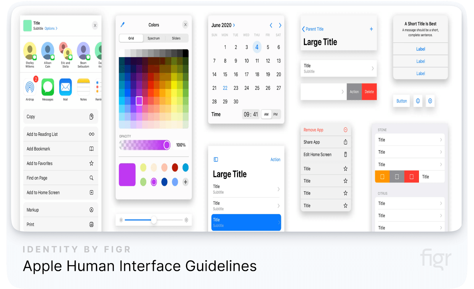
Apple’s Human Interface Guidelines (HIG) are among the most respected and widely adopted design systems globally. Developed to ensure consistency across all Apple products, from macOS to iOS, watchOS, and now visionOS, the HIG sets the standard for designing apps and user interfaces that feel intuitive and delightful on every Apple device.
Let's dive into the key components and philosophies that make the Apple HIG a cornerstone for designers worldwide.
Key Components of Apple Human Interface Guidelines
- Design Principles: Apple’s design philosophy is rooted in simplicity, clarity, and consistency, aiming to create interfaces that are not only visually appealing but also highly functional. Example: The "Design with Purpose" principle emphasizes creating interfaces that make information clear and accessible without unnecessary decoration.
- Components Library: A comprehensive library of UI components such as buttons, navigation bars, and modals that maintain consistency across different Apple platforms. Example: Apple’s predefined components like "SF Symbols" allow developers to use a consistent set of icons across different devices, supporting a wide range of use cases and accessibility requirements.
- Typography and Layout: Apple uses a hierarchical typographic system with the San Francisco typeface, which is optimized for clarity and readability across all devices, from Apple Watch to iMac.
- Human-Centric Design: Emphasizes creating experiences that are tailored to the human body and mind, considering factors like reachability, touch targets, and navigation. Example: The iOS HIG recommends using large, tappable targets for interactive elements to reduce the risk of user error.
- Motion and Interaction: Apple integrates motion into its design to provide users with a sense of spatial awareness and continuity between actions. Example: The use of "spring" and "bounce" animations when scrolling through content helps users understand the bounds of the interface, providing a more natural and satisfying interaction.
- Adaptivity and Layout: Apple’s adaptive layout system allows interfaces to scale beautifully across different screen sizes and orientations. Example: Auto Layout in iOS helps developers design apps that automatically adjust to different screen sizes, orientations, and devices, ensuring a consistent experience across iPhone, iPad, and even Apple TV.
- Dark Mode: The HIG includes comprehensive guidelines for implementing Dark Mode, which provides a darker color palette for all screens, views, menus, and controls.
- Accessibility: Accessibility is a cornerstone of Apple’s design ethos, with comprehensive guidelines to ensure apps are usable by people with disabilities.
Design Philosophy: Crafting Seamless User Experiences
Apple’s design philosophy is rooted in six fundamental principles that guide every aspect of the user interface:
- Clarity: The design should be visually clear, easy to understand, and free of unnecessary clutter. Every visual element should serve a purpose and contribute to great user experience. Example: The use of simple, minimalistic icons in iOS apps that are instantly recognizable and convey meaning without overwhelming the user.
- Deference: Interfaces should never compete with the content. The UI should subtly enhance and support the experience, putting the content front and center. Example: The translucent elements in macOS that create a sense of depth while maintaining focus on the content.
- Depth: Using visual layers and realistic motion, developers create a sense of hierarchy and depth, guiding users through the interface. Example: The parallax effect on iOS home screens, which subtly shifts the background when the device is tilted, creating a sense of space and immersion.
Platform-Specific Guidelines for Apple Platforms
Apple’s HIG is extremely focused on great user experience, that’s why it provides platform-specific guidelines to ensure a cohesive experience across all devices.
Each platform has unique requirements and best practices to create apps that feel native and intuitive.
- iOS Guidelines:
- Focuses on touch interactions, direct manipulation, and intuitive gestures. The guidelines emphasize simplicity and clarity, with a strong focus on minimalism and usability.
- Example: The use of the swipe gesture for deleting items in a list, a standard interaction that is consistent across all iOS apps.
- macOS Guidelines:
- Desktop-specific guidelines that address the complexities of multi-window environments, extensive toolbars, and advanced user interactions using a mouse and keyboard.
- Example: The Menu Bar at the top of the screen, which provides users with a consistent way to access app-specific commands.
- watchOS Guidelines:
- Focus on glanceable interactions and quick access to information, ensuring that apps are usable within the constraints of a small screen.
- Example: The use of haptic feedback on the Apple Watch to provide subtle, tactile notifications without requiring visual attention.
- tvOS Guidelines:
- Designed for the living room experience, focusing on immersive content and simplified navigation using the Siri Remote.
- Example: The use of focus-based navigation, where elements are highlighted as the user navigates through the interface using the remote.
- visionOS Guidelines:
- With the introduction of Vision Pro, Apple has laid the foundation for immersive, spatial computing. The guidelines emphasize creating intuitive 3D interfaces that integrate naturally with the user’s physical environment.
- Example: Using natural gestures like pinching to select or dragging to move objects in the virtual space, making interactions feel more intuitive.
- Comprehensive Documentation:
- Each platform's section includes downloadable resources like UI elements, templates, and even code snippets, making it easier for developers and designers to follow best practices.
- Example: Designers can download design files for popular tools like Sketch and Figma, which include pre-made components that align with Apple’s standards.
Accessibility: Designing for Everyone
Apple’s commitment to accessibility is deeply embedded in the HIG. The guidelines provide detailed instructions on how to make apps accessible to users with disabilities, ensuring that everyone can enjoy the full potential of Apple products.
- VoiceOver Support: Providing descriptions for UI elements and actions, enabling visually impaired users to navigate apps using spoken feedback. Example: Including accessibility labels for buttons and images so that VoiceOver can describe them accurately to the user.
- Dynamic Type: Supporting adjustable font sizes, allowing users to increase or decrease text size based on their preference without breaking the app’s layout.
- High Contrast and Color Filters: Using colors and contrast effectively to accommodate users with color blindness or other visual impairments. Example: Ensuring that interactive elements like buttons and links have sufficient contrast against their background to be easily distinguishable.
Fields and Labels, Window and View, Touch Bar
The HIG provides a wealth of information on how to design input fields, labels, and other UI elements that are essential for user interaction:
- Fields and Labels: Guidelines ensure that input fields and labels are designed to be user-friendly and accessible. This includes recommendations on text size, spacing, and placement.
Example: Placeholder text should be distinct from entered data to avoid confusion and improve usability.
- Window and View: For macOS, Apple provides specific guidance on how to design windowed interfaces, ensuring that applications work seamlessly with the macOS ecosystem’s window management system.
Example: Using the appropriate window types—like document windows or utility panels—ensures that the app’s interface is intuitive and functional.
- Touch Bar: The Touch Bar, exclusive to certain MacBook models, offers a new way to interact with applications. The HIG provides detailed advice on how to design for this dynamic interface element.
Indicators, Selectors, Extensions
These components play a crucial role in providing feedback, navigation, and enhanced functionality:
- Indicators: Indicators, such as activity spinners and progress bars, are used to show users that a process is ongoing. Apple provides guidelines on their size, placement, and behavior.
Example: A loading spinner should be clearly visible when the app is processing a request, helping to manage user expectations.
- Selectors: Selectors, such as date pickers and segmented controls, should be intuitive and easy to use. The HIG offers specific recommendations for designing selectors that are consistent with the platform’s look and feel.
Example: Date pickers on iOS use a spinning wheel interface, which is familiar to users and leverages the platform’s touch-based interaction model.
- Extensions: Extensions allow apps to offer features outside of their main interface, such as widgets or custom keyboard options. Apple’s guidelines ensure these extensions are designed in a way that is both useful and non-intrusive.
Example: Widgets should provide glanceable information and quick actions without requiring the user to open the full app.
Real-World Examples of Apple’s HIG in Action
- Spotify for iOS: Spotify’s app for iOS is a prime example of adhering to Apple’s HIG. It uses the San Francisco font, consistent navigation patterns, and appropriate use of motion and gestures, providing a seamless experience that feels native to the platform.
- Slack for macOS: Slack’s macOS app effectively uses Apple’s design patterns, such as a split view for managing channels and direct messages, and a top navigation bar that integrates with macOS’s Menu Bar.
- Nike Run Club for watchOS: The Nike Run Club app uses glanceable information, haptic feedback, and simple interactions, making it an excellent example of how to create a user-friendly experience on the Apple Watch.
- Third-Party Integrations: Even apps like Microsoft Office have adopted the HIG to provide a consistent experience on iOS and macOS, ensuring that the user interface feels native and cohesive with other Apple apps.
IBM Carbon Design System

The IBM Carbon Design System is an open-source design system designed to unify IBM’s digital products and create a seamless user experience across all platforms. It serves as the backbone for IBM's digital transformation, allowing teams to build consistent and high-quality user interfaces at scale.
This system, deeply rooted in IBM’s design philosophy, provides a comprehensive set of guidelines, components, and resources that are freely available to the global community.
What Makes the IBM Carbon Design System Unique?
The Carbon Design System stands out due to its focus on enterprise-level requirements, which include scalability, accessibility, and extensive documentation. It is designed to meet the needs of both designers and developers, offering a range of tools and resources that facilitate the creation of cohesive user experiences across diverse platforms and applications.
- Open-Source Platform: One of the most significant aspects of the Carbon Design System is its open-source nature. This means that it is not only available to IBM employees but also to designers and developers worldwide.
The open-source approach encourages community contributions, enhancing the system's capabilities through shared knowledge and collaboration.
IBM’s commitment to open-source is evident in their GitHub repository, where anyone can access, use, and contribute to the Carbon Design System, making it one of the most flexible and adaptive systems in the industry.
- Community-Driven: The system thrives on community feedback and contributions. This collaborative environment allows for continuous improvement and innovation, ensuring that the design system evolves to meet the changing needs of users.
Developers and designers can contribute new components, report issues, and propose enhancements through the Carbon GitHub repository.
- Scalability and Modularity: Designed to scale, the Carbon Design System can be used for a wide range of applications, from simple websites to complex enterprise-level solutions. Its modular nature allows teams to pick and choose the components they need, ensuring a tailored fit for any project
Example: A team building a dashboard for data visualization can integrate just the necessary components like tables, charts, and filters, without needing to incorporate the entire library.
- Comprehensive Documentation: Carbon provides detailed documentation for each component, pattern, and guideline, making it easy for teams to understand how to use the system effectively.
Key Components of the IBM Carbon Design System
The Carbon Design System offers a wide array of components and resources designed to streamline the design and development process. Below are some of the core elements that make this system stand out:
- Design Kits for Figma and Sketch: Carbon provides comprehensive design kits for designers. These kits include pre-built components, such as buttons, forms, and icons, that adhere to the Carbon Design Language, making it easy for designers to create mockups and prototypes that align with IBM’s standards.
- Data Visualization Components: Data visualization is a crucial aspect of IBM’s product offerings, especially for enterprise clients who rely on data to make informed decisions. The Carbon Design System includes a strong set of data visualization components, such as bar charts, line charts, pie charts, and more.
- Reusable Patterns and Components: Carbon offers a library of reusable components that are tested and ready to use, significantly reducing development time. These components come with guidelines for usage, ensuring consistency across different products and platforms.
- Accessibility and Inclusivity: Accessibility is at the core of the Carbon Design System. Every component is designed to be usable by as many people as possible, including those with disabilities. The system includes tools for checking color contrast, keyboard navigation, and screen reader compatibility.
- In comparison, Figr Identity takes flexibility and efficiency to the next level. With its extensive collection of editable components, it allows designers to effortlessly modify styles, adjust layouts, and customize every detail to fit their unique brand requirements. This level of adaptability ensures that every design element can be fine-tuned without compromising consistency, making the design process faster, more intuitive, and perfectly aligned with your brand’s identity.
Real-World Examples of the Carbon Design System in Use
Several large organizations have successfully implemented the Carbon Design System to streamline their design and development processes.
- IBM Watson: IBM Watson leverages the Carbon Design System to provide a consistent and intuitive user experience across its suite of AI-powered products. From data visualization to natural language processing interfaces, Carbon ensures that Watson’s tools are both powerful and easy to use.
- American Airlines: American Airlines uses Carbon for its internal applications, such as flight management tools and customer service portals. The system’s scalability and comprehensive documentation have enabled the airline to build solid, user-friendly interfaces that improve operational efficiency.
- Figr Identity: For organizations looking to implement a design system like Carbon, Figr Identity offers a quick and effective solution. By providing pre-built, editable components that adhere to Carbon’s guidelines, Figr Identity simplifies the process of setting up a design system, allowing teams to focus on building great products without getting bogged down in the details.
Having explored the powerful capabilities and collaborative nature of IBM’s Carbon Design System, let’s now shift our focus to another design system that has redefined digital interaction for businesses around the world.
Welcome to the Salesforce Lightning Design System, where accessibility meets enterprise-level efficiency and scalability.
Salesforce Lightning Design System
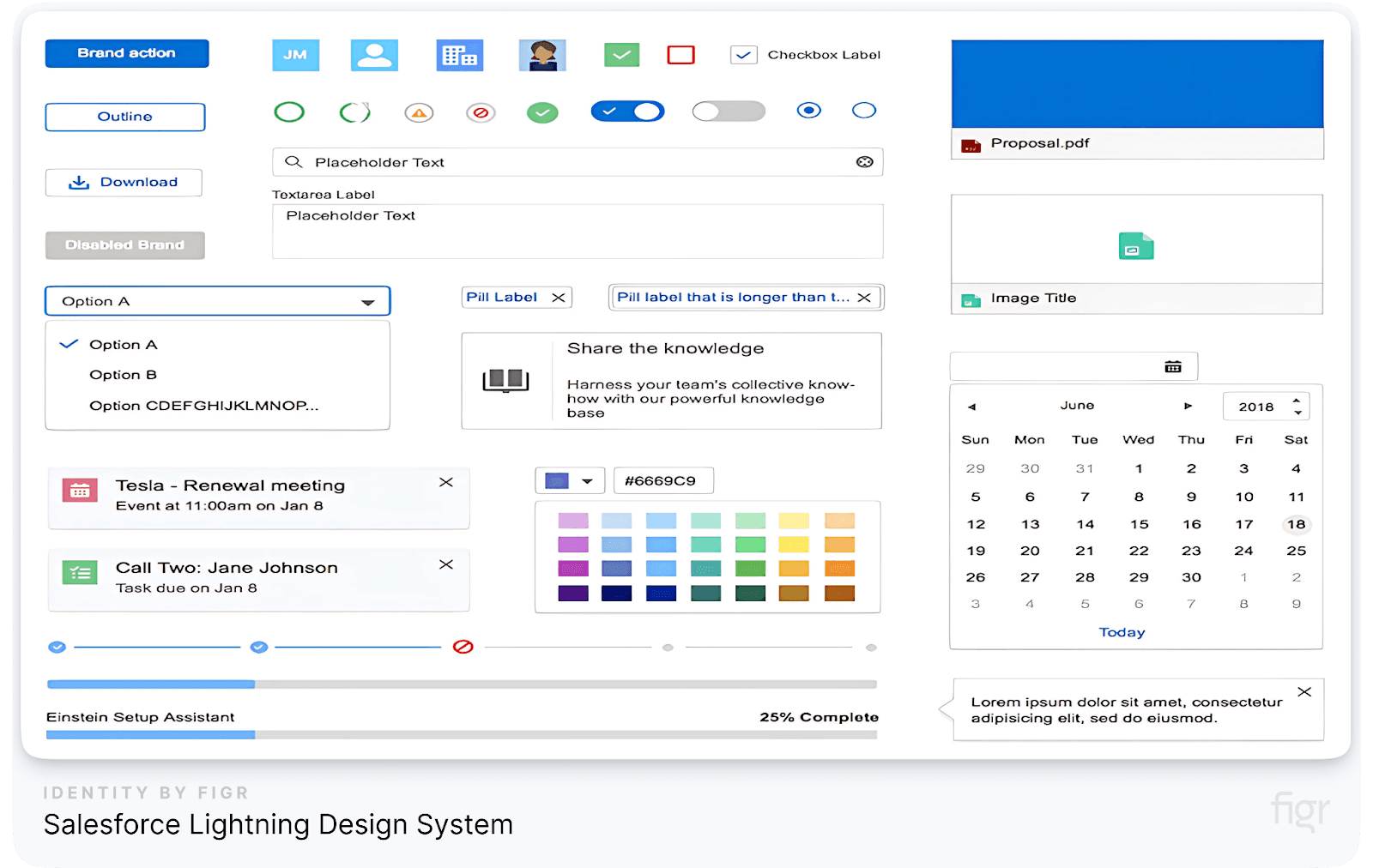
The Salesforce Lightning Design System (SLDS) is a comprehensive toolkit designed to help businesses create intuitive, accessible, and consistent user interfaces across their cloud-based applications.
As a leader in customer relationship management (CRM), Salesforce has crafted a design system that not only supports its suite of products but also provides developers and designers with the resources they need to build custom solutions on the Salesforce platform.
With a focus on scalability, accessibility, and seamless integration, SLDS has become a cornerstone for Salesforce’s design philosophy, enabling developers and designers to create intuitive and accessible user experiences.
But What Sets the Salesforce Lightning Design System Apart?
Salesforce Lightning Design System is unique in its deep integration with the Salesforce ecosystem, providing a set of tools, components, and guidelines tailored to the specific needs of CRM applications.
SLDS offers a set of resources that cover everything from visual styling to interaction patterns and component functionality.
Its emphasis on modularity and flexibility allows teams to build complex applications that can scale with business needs while maintaining a consistent user experience.
- Designed for CRM Applications: Salesforce’s focus on CRM means that SLDS includes components and patterns specifically designed for customer management, data visualization, and business workflows.
Example: The "Opportunity Timeline" component is tailored for sales teams to track customer interactions and sales progress in a visually intuitive manner.
- Component Blueprints and Design Tokens: SLDS includes detailed blueprints for UI components, along with design tokens that include visual styling attributes such as colors, fonts, and spacing.
But Figr Identity enhances this whole process with its powerful customization capabilities. Figr Identity offers pre-defined tokens and also allows designers to dynamically create and manage design tokens directly. This means you can effortlessly adjust colors, typography, and spacing on the fly, ensuring every component reflects your brand’s unique identity and maintains a cohesive look across all digital touchpoints.
- Guidelines for Accessibility: Accessibility is a top priority in SLDS. Salesforce is committed to building accessible products, and SLDS includes extensive accessibility guidelines and ARIA (Accessible Rich Internet Applications) specifications to ensure all users, including those with disabilities, can use the platform effectively.
Key Components of the Salesforce Lightning Design System
SLDS is built around several core components that provide a strong foundation for developing CRM applications. These components are designed to work together seamlessly, offering a consistent user experience across the Salesforce ecosystem. Let’s explore the essential components that make SLDS an industry-standard design system:
- Utility Classes: Utility classes are a set of CSS classes that allow for rapid and consistent styling of UI components without the need to write custom CSS. These classes cover a wide range of properties, such as spacing, alignment, and positioning, which helps maintain design consistency.
For Example: Utility classes like slds-m-around_medium can be used to add consistent margin spacing around elements, ensuring a clean and structured layout.
- Grid System: The SLDS grid system is a flexible layout framework that helps designers and developers create responsive designs that adapt to different screen sizes. It provides predefined grid classes for setting up columns, gutters, and alignment.
Example: Using the SLDS grid system, developers can create a responsive, multi-column layout that adjusts gracefully to various devices, from desktops to mobile screens.
- Data Tables and Forms: SLDS includes a wide set of components for creating data tables and forms. These components are designed to handle complex data interactions and form validations while providing an intuitive and accessible user experience.
Example: The Data Table component supports features like sorting, filtering, and inline editing, making it easy to manage large datasets within a consistent design framework.
- Icons and Illustrations: The system includes a rich library of icons and illustrations that are used to enhance the user interface and provide visual cues. These assets are designed to be consistent with Salesforce's brand identity and can be easily integrated into various components.
- Documentation and Resources: SLDS offers extensive documentation and resources on how to use each component, along with examples and best practices. This helps teams understand how to implement and customize components effectively, making it a valuable resource for both designers and developers.
While Salesforce Lightning Design System (SLDS) offers a wide set of components and resources that make developing cohesive CRM applications easier, it can sometimes feel overwhelming to navigate through multiple tools and guidelines.
Figr Identity simplifies this process with an intuitive interface that provides a comprehensive design system and streamlines the entire workflow for designers and developers.
By offering editable design kits, pre-built components, and seamless Figma integration, Figr Identity helps teams create and manage design systems more efficiently, saving time and reducing the complexity of implementation.
Real-World Applications of the Salesforce Lightning Design System
Several organizations have leveraged SLDS to create powerful, user-friendly applications that integrate seamlessly with the Salesforce platform.
- Airbnb: Airbnb uses SLDS to manage its customer interactions and reservations. By customizing Salesforce with SLDS, Airbnb has created a consistent user experience across its customer service platform, making it easier for agents to access customer information and provide support.
- T-Mobile: T-Mobile uses SLDS for its customer service and sales applications. The design system’s components help maintain a consistent look and feel across various customer touchpoints, enhancing the user experience and improving operational efficiency.
- American Express: American Express uses SLDS to manage its customer data and interactions, enabling a streamlined and cohesive user experience across its CRM applications.
Conclusion
Creating a world-class design system like those of Google, Apple, IBM, and Salesforce might seem like a monumental task, but with Figr Identity, you can blaze through the entire process from start to finish.
Inspired by these examples? Follow our comprehensive guide to design system best practices to build your own from the ground up.
From automating design system generation to managing component libraries, Figr Identity ensures that your team has everything they need to create cohesive, scalable, and high-quality digital experiences effortlessly. Inspired to build your own? Follow our step-by-step guide to creating a design system.