

Generic AI keeps producing interfaces that look acceptable in review and feel wrong in use, and most product teams can sense the gap even when they can't name it.
I watched this happen recently on a design review: a screen had clean cards, decent spacing, and polished buttons, yet nobody trusted it. The primary action was visually equal to everything else. The status colors looked loud but said nothing. The layout borrowed familiar patterns, but from the wrong product logic. Teams ship screens like this and then spend cycles fixing hesitation, missed actions, broken handoff assumptions, and quiet UX debt.
The fix starts when you stop treating UI design principles as a checklist and start treating them as a contextual grammar. That shift is also why product teams look for tools that can understand the product before drawing the interface, whether through Figma files input, live screens, or design systems. The principles stay the same. The application changes with context.
Why Most Good UI Still Feels Wrong
A product review goes the same way every time. The screen looks polished, the spacing is clean, the components are current, and someone still says, "I don't trust this."
That reaction usually has nothing to do with taste. It comes from a mismatch between the interface and the product logic underneath it.
I saw it on an AI-generated admin screen recently. It had tabs, filters, metrics, and a card layout that looked production-ready. But the eye had nowhere to land. A warning state felt quieter than the default state. The empty state could have belonged to any SaaS tool. Every pattern was recognizable, yet none of them reflected what the user needed to decide on that screen.
That is why so much "good UI" still feels wrong. The parts are plausible. The intent is missing.
The missing ingredient is context
Pattern libraries and model training produce interfaces that resemble software. They do not automatically produce interfaces that express priority, risk, sequence, or domain meaning. A billing dashboard, a clinical workflow, and an ad campaign manager may share cards, tables, and buttons, but they should not distribute attention in the same way.
UI design principles work more like grammar than decoration. Hierarchy, contrast, spacing, alignment, consistency, and feedback only become useful when they respond to user intent, task criticality, system rules, and the expectations the rest of the product has already set.
Good UI tells the truth about what matters on this screen, in this product, for this user.
That is also where many AI design tools break down. They apply patterns as if visual principles were static rules. In practice, every principle bends to context. A dense enterprise table may be the clearest solution in one workflow and a terrible one in another. A loud primary button may improve conversion on a marketing page and create risk inside an irreversible admin action.
Teams usually feel this before they can explain it. Reviews get stuck on vague comments like "it feels off" or "it looks generic." What they are reacting to is a loss of product intelligence inside the visual layer.
Figr on preventing bad user experience is a useful companion here, because many visible UI problems start earlier as context mistakes, then show up later as hesitation, errors, and low trust.
The Principle of Intentional Hierarchy
A user opens a dashboard to answer one question fast, and the screen responds with twelve equally loud things. Nothing looks broken. The typography is polished, the cards are tidy, and the buttons look finished. The problem is priority. The interface has not decided what matters first, so the user has to do that work alone.
Hierarchy is how an interface assigns attention in the order the task requires.

Hierarchy starts with user goals, not decoration
The strongest hierarchy usually comes from one blunt question: what decision is this screen helping someone make right now? In data-heavy products, that question matters more than the full inventory of available metrics, filters, and controls. Good screens stage information around the decision, then release detail as the user asks for it.
That is why AI-generated layouts often feel plausible and still fail in review. They can reproduce familiar patterns, but they rarely understand which object on the screen carries consequence. A billing exception, a failed sync, and a healthy usage trend should not compete for the same visual weight, even if all three arrive as cards inside the same component library.
A practical hierarchy also needs to hold up under accessibility constraints. Color can support emphasis, but color alone cannot carry it. WCAG color contrast standards are a baseline check, not a finishing touch, because users need to distinguish priority, state, and action under real viewing conditions.
A practical way to evaluate a screen
Step 1. Name the primary action.
Write it as a sentence.
If the screen cannot be summarized clearly, the visual order usually drifts and every element starts asking for attention.
Step 2. Check the first three eye landings.
Glance at the page for a few seconds, then look away.
The first things remembered should be the current state, the main task, and the next safe action.
Step 3. Reduce equal emphasis.
Pull weight away from secondary metadata, explanatory text, and low-impact controls.
Save stronger size, placement, and contrast for the objects that change user decisions.
I often use Figr's guide to UI hierarchy as a quick review lens because it shows hierarchy in terms of screen behavior and scanning patterns. That is the right level to judge it. Users do not experience hierarchy as a theory. They experience it as confidence, hesitation, or error.
Teams care about hierarchy for a business reason too. Products become easier to trust when the interface exposes value clearly instead of burying it under equal-weight chrome. In practice, that affects conversion, adoption, support load, and the number of mistakes people make in high-stakes flows.
How Do You Create Contrast That Clarifies
A common failure mode in AI-generated UI is easy to spot. The screen has plenty of contrast, yet you still have to stop and decode it. A bright badge pulls harder than the task. A destructive action looks as calm as a secondary filter. A selected state depends on a faint tint that disappears on a laptop in daylight. The interface looks finished, but its signals are out of tune with the product's actual priorities.
That is contrast's primary function. It gives visual force to meaning.
Contrast has to match consequence
Good contrast helps people answer a few questions instantly:
What can I act on right now
What state am I in
What carries risk
What needs attention before I proceed
Those cues sound obvious until you review a real product. In enterprise tools, a low-contrast warning can hide a costly mistake. In consumer flows, an overbuilt promo panel can outrank the next step and pull users off task. The principle stays the same, but the emphasis changes with context. That is why UI design principles work more like grammar than a checklist. The same visual device means different things depending on the sentence the product is trying to say.
Generic design output usually misses that point. It can produce visible differences, but those differences often have no clear relationship to role, urgency, or outcome. Users notice contrast first. They trust it only when it maps cleanly to intent.
A quick diagnostic for contrast
Practical rule: If you hide the labels and users can no longer spot the main action, current state, and risky path, the contrast system is carrying too little meaning.
One fast review method is to check a screen in grayscale. If the interface still reads clearly, structure is doing its share through size, weight, spacing, and placement. Then color can reinforce semantics and speed recognition.
Accessibility still sets the floor. Teams that need a reliable reference for text and interactive states should keep WCAG color contrast standards close at hand. They establish a baseline for legibility. They do not tell you whether the strongest contrast is assigned to the right element.
I see better results when teams define semantic roles early and tie them to reusable tokens. That keeps emphasis from drifting screen by screen, especially as more contributors touch the product. If you are refining that layer, organizing your color palette with design tokens is a practical next step.
Contrast earns its place when it makes role, status, and consequence easier to read. That is what turns a polished interface into one people can use with confidence.
The Unseen Force of Alignment and Proximity
A screen can have strong typography, clean colors, and polished components and still feel off. The usual problem is structural. Elements sit near the wrong neighbors, align to competing edges, or create gaps that suggest meaning the product never intended.

Alignment and proximity are where visual principles start acting like grammar instead of decoration. They tell users what belongs together, what can be scanned as a unit, and what deserves a pause. AI-generated UI often misses this because it copies surface patterns. It can place tidy cards on a canvas, but it often lacks the product judgment to decide which relationships should feel tight, which should stay separate, and which objects need a stable shared axis.
Spatial relationships teach before copy does
Users read position before they read explanation. A label tucked close to its field feels connected. An action placed inside the boundary of a table row feels row-specific. A destructive control pushed too close to routine actions creates hesitation, even if the button styling is technically correct.
That is why grouping affects comprehension so directly. In dashboard and enterprise work, weak grouping forces people to reconstruct the interface's logic from scratch. They stop trusting the layout and start checking every move. Earlier research referenced in this article made the same point. Cluttered screens and poorly grouped controls increase mistakes and make abandonment more likely.
Grids help, but only if the grid serves the product's logic. A 12-column system or an 8-point spacing scale gives teams a repeatable frame. It does not decide whether filters belong above a table, beside it, or inside an expandable panel. That decision comes from context. Figr's guide on UI grids is useful if you're tightening the layout foundation behind those choices.
A form exposes bad structure fast
Settings screens make alignment problems obvious because the user is already trying to map labels, controls, helper text, defaults, and consequences into one mental model. Break the alignment anchors and the form starts to feel unstable. Separate related toggles with decorative spacing and users begin to wonder whether they are changing one rule or three.
Here's a useful visual example before going deeper:
The underlying pattern is simple. People infer relationships from space before they parse the sentence-level detail.
I see the same issue in AI-assisted design workflows. Tools can generate neatly arranged settings panels that look plausible in a screenshot, then fall apart in use because the grouping reflects component similarity instead of task logic. Teams working through that gap usually need better review habits, not just faster generation. AI collaboration frameworks for creators covers that human judgment layer well.
What to review in a real product
Check vertical rhythm
Similar blocks should repeat spacing intervals.
Random gaps create hierarchy by accident.
Check alignment anchors
Titles, labels, values, and actions should snap to a small set of deliberate edges.
Every extra alignment path adds cognitive noise.
Check grouping logic
Put controls close to the object or state they modify.
Separate distinct tasks clearly enough that users do not merge them.
Check container boundaries
Cards, panels, and table regions should reflect real task groupings, not just visual balance.
If a border can disappear without losing meaning, the spacing system may be doing the actual work.
When a screen looks polished but still feels harder than it should, alignment and proximity usually explain why. This is the layer where context shows up. The same spacing pattern can feel disciplined in one product and confusing in another, because good UI principles only work when they reflect the job the screen is there to help people do.
Is Your AI Building Brand Consistency or Generic Sameness
Open three screens from the same product. The dashboard looks restrained, the settings page shifts to a different spacing logic, and the modal reads like it came from another company's design kit. Nothing is obviously broken. The product still feels unreliable.
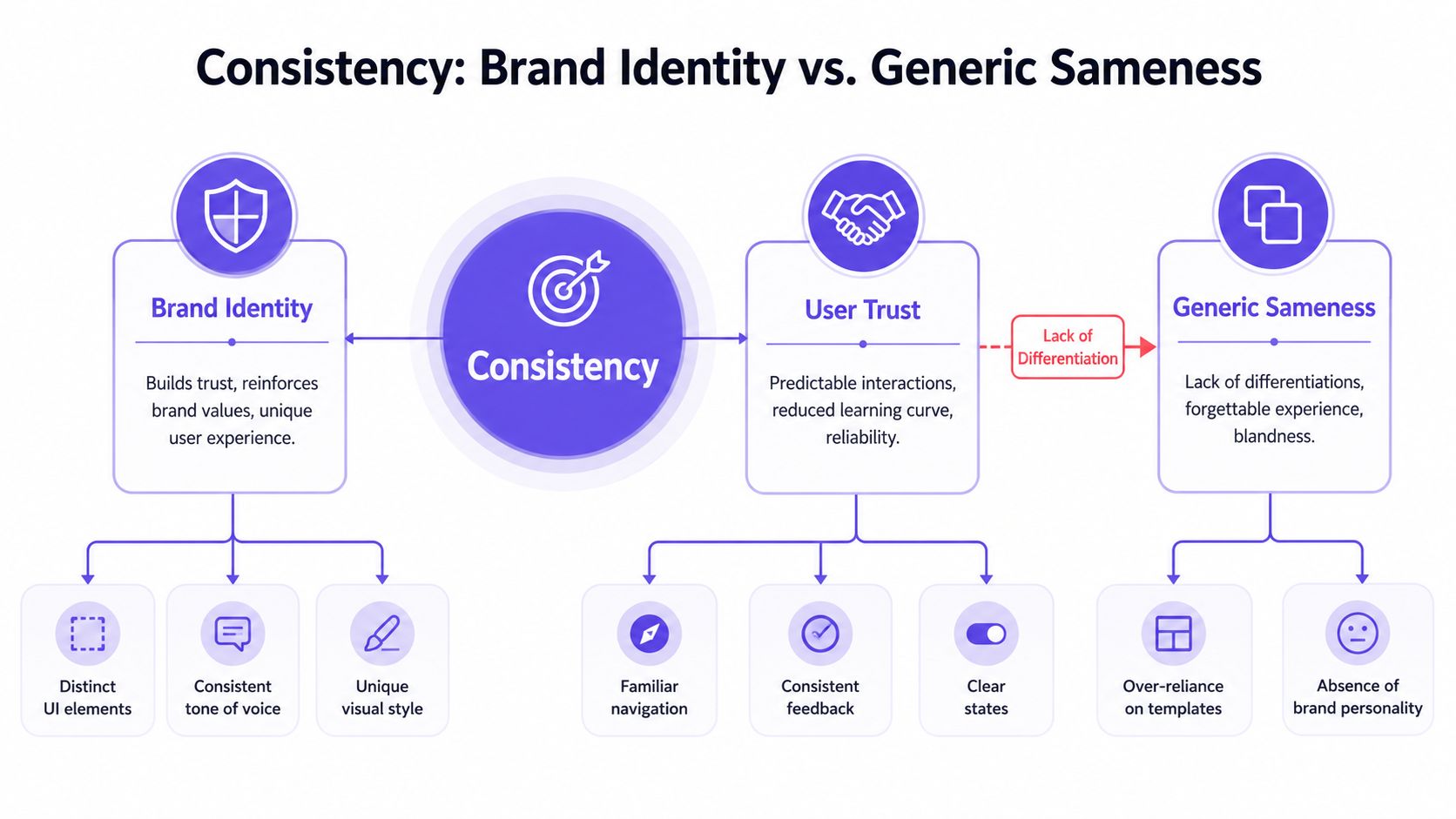
Consistency matters because users notice drift faster than teams do.
Consistency teaches the product's grammar
Good products repeat decisions so people can build accurate expectations. A primary action should carry the same visual weight in every key flow. Validation should speak in the same tone whether it appears in onboarding, billing, or admin settings. Tables, filters, and destructive actions should follow patterns that feel learned rather than reinterpreted on each screen.
That is the difference between a branded interface and a generic one. Brand in UI is not just color, type, and logo treatment. It lives in pacing, default density, error language, motion restraint, emphasis rules, and the level of formality in interaction design. Those choices tell users what kind of product they are using and how carefully it was made.
AI tools often copy the visible layer and miss the operating logic underneath. They reproduce familiar SaaS patterns because those patterns are common in the training material. The output looks reasonable in isolation. Across a real product, it starts to blur into the same competent, forgettable software.
I see this most often in teams that treat the design system as a parts catalog. They preserve components but lose judgment about where each pattern belongs. A quiet analytics screen and a high-risk permissions flow should not carry the same visual tempo, even if both use the same button and input styles.
If you're thinking seriously about where human judgment belongs in AI-assisted workflows, this piece on AI collaboration frameworks for creators is a good framing device.
Consistency makes interaction predictable, so moments of novelty can carry meaning instead of noise.
The practical review question is simple. Is the interface repeating decisions that support the product's identity and task model, or is it repeating whatever pattern the generator reached for first?
Standards still matter here. Shared conventions reduce hesitation and help users feel oriented. But product consistency gets stronger when teams know where to stay conventional and where to express product-specific intent. Duplication creates sameness. Disciplined predictability creates trust, and trust is what makes a product feel coherent rather than assembled.
Mastering Whitespace as an Active Element
A dashboard can contain the right components, the right data, and the right actions and still feel exhausting within seconds. In product reviews, that feeling usually traces back to space. The screen asks the eye to process everything at the same intensity, so nothing gets to lead and nothing gets to rest.
Whitespace sets pace, but pace is only part of the job. Space also defines what belongs together, what deserves attention first, and where a user should slow down before committing to an action. That is why whitespace works less like polish and more like syntax. It shapes meaning between elements, not just around them.
Teams new to interface work often leave spacing until the end, after cards, buttons, charts, and labels are already in place. Experienced designers do the opposite. They use spacing to establish the reading order before they refine visual styling, because a layout with weak spatial logic rarely gets fixed by adding more lines, fills, or dividers.
AI-generated UI often fails here in a predictable way. It preserves every option, every hint, every metric, and every control because each item seems individually reasonable. The result is a screen with no silence in it. Users can still operate it, but they have to work harder to separate navigation from content, summary from detail, and safe actions from high-consequence ones.
A simple review method
Step 1. Squint at the screen.
The main groups should still hold.
If the page collapses into one gray texture, spacing is not carrying enough structure.
Step 2. Mentally remove the borders.
Grouping should remain clear through spacing alone.
If it falls apart, the layout depends too heavily on containers to explain itself.
Step 3. Inspect decision zones.
Primary actions, warnings, totals, and irreversible choices need room around them.
Dense spacing works best where users are comparing rows, scanning tables, or working through repeated inputs.
This trade-off gets sharper in enterprise products. A procurement screen, policy editor, or permissions matrix often needs high information density. The answer is not more openness everywhere. It is selective compression. Keep related data tight where comparison matters, then open up space around transitions, section breaks, and actions that change system state. That is how complex software stays powerful without becoming visually flat.
Good whitespace choices come from product context. A finance tool, support console, and creative editor should not share the same spatial rhythm just because the same generator produced them. Space has to reflect task frequency, risk, scan behavior, and the cost of mistakes. That is the difference between applying a principle and speaking the product's visual grammar.
Affordance and Feedback The Silent Conversation
A user clicks Delete card, the modal closes, and nothing else changes for a beat. That beat is where trust starts to leak.
Affordance tells people what actions are available and how risky those actions are. Feedback tells them whether the system received the action, what changed, and what they can do next. Together, they form a quiet exchange between product and user. When that exchange is vague, even polished screens feel unreliable.
Buttons are the obvious example, but the principle is broader than button styling. Filters should look adjustable. Drag handles should read as draggable. Destructive actions should carry more caution than harmless ones. After interaction, the response has to match the stakes. A saved draft can confirm inline. A bulk permission change may need progress, audit visibility, and a way to verify the result.
Speed matters, but specificity matters just as much. A spinner without context often creates more doubt than reassurance. Good feedback answers the user's actual question: Did it work? What changed? Do I need to wait, review, or fix something?
Many generated interfaces frequently fail. They can apply a familiar button pattern, add a toast, and still miss the product's context. A generic success message after a billing change, access revocation, or policy update is weak feedback because the user is not looking for decoration. They are looking for proof. An AI design tool that thinks through UX has to reason about consequence, reversibility, and user confidence, not just component states.
Tolerance is part of the same conversation. Interfaces need recovery paths that fit the cost of the action. Undo works well for lightweight mistakes. High-stakes actions need clearer confirmation, stronger labeling, and visible reversal options where reversal is possible.
I saw this clearly with a Series C company's billing flow. The screens looked clean in mocks. In production, they felt stressful. Destructive actions used subtle styling, confirmation copy was vague, and the reversal path was hard to find. Nothing was technically broken. The issue was that the interface signaled too little at the moments where users needed the most certainty.
If an interface makes mistakes expensive, users slow down, reread, hesitate, and second-guess every click.
That is the standard for affordance and feedback. The screen should tell users what they can do, what just happened, and how safe they are if they get it wrong. When those signals are clear, polish turns into confidence.
How to Apply UI Design Principles in Real Product Reviews
A review goes sideways fast when the team is looking at a screenshot and reacting to taste.
I have seen the same pattern in design crits, stakeholder reviews, and late-stage QA passes. Someone asks for more contrast. Someone else wants to tighten the layout. A PM asks whether the chart should be larger. Those comments may be valid, but they rarely get to the core question: what user judgment or action does this screen need to support, and do the visual choices make that easier or harder?
That shift matters because UI principles are not a checklist you lay over every frame. They behave more like grammar. Hierarchy, contrast, spacing, consistency, and feedback only make sense in relation to the product's context. A settings screen for legal permissions needs a different visual emphasis than an analytics dashboard, even if both use the same component library.
A review framework that holds up in product teams
Step 1. Define the user decision.
State the decision or action the screen supports.
If nobody can name it clearly, the review will drift into preferences.
Step 2. Check the hierarchy against that decision.
Ask what the eye lands on first, second, and third.
Confirm that sequence matches task priority, risk, and expected user intent.
Step 3. Inspect relationship cues.
Review alignment, grouping, labels, and spacing together.
Related elements should read as related before the user has to parse every word.
Step 4. Compare the screen to product context.
Look at adjacent flows, neighboring states, and known user expectations.
Reuse patterns where they reduce cognitive load. Break them only when the situation genuinely changes.
Step 5. Review interaction consequences.
Check affordance, feedback, error handling, and recovery paths.
The screen should make the next action, the resulting state, and the available fallback clear.
A strong review also tests edge conditions. Empty states, partial completion, permission constraints, and irreversible actions often expose whether the design understands the product. Polished happy paths can hide weak thinking.
What this changes organizationally
Teams get better reviews when they can attach visual choices to product logic. PMs can evaluate whether the screen supports the decision flow they intended. Engineers can catch missing state definitions before implementation drifts. QA can identify ambiguous transitions and risky edge cases earlier, while the fix is still cheap.
The operational benefit is real. Screens get revised fewer times because the discussion starts closer to intent. Design debt usually shows up as repeated interpretation work across design, engineering, and QA, not just as messy visuals.
For less experienced stakeholders, a lightweight shared vocabulary helps. Give them a way to ask, "What is this screen trying to help the user decide?" and "Does the hierarchy reflect that?" Those two questions improve review quality more than another round of preference-based comments.
What Changes in Complex Enterprise Workflows
A purchasing manager is reconciling exceptions across hundreds of invoices. A support lead is triaging escalations with SLA risk, account history, and permission limits all in play. In these environments, a clean-looking screen can still fail badly if it hides the information needed to make a decision with confidence.
That is where generic advice about reducing options starts to break down. Enterprise work is often dense because the work itself is dense. Users compare records, inspect status, verify scope, and handle edge cases under time pressure. If the interface strips out too much, the product shifts effort from the screen into memory, extra clicks, and side-channel communication.
Simplicity still matters. It just has to be applied with more precision.
A key design principle is calibrated density. Put the decision-making inputs where people can scan them quickly. Keep nearby controls available when they affect interpretation. Push supporting detail behind disclosure only when hiding it does not slow down judgment or increase error risk.
I usually review complex workflow screens with three filters:
What needs to stay visible at all times
- Current status, scope, selected entities, active filters, irreversible consequences
What should appear at the point of need
- Secondary actions, diagnostics, exception details, role-based options
What can stay collapsed until requested
- Advanced configuration, historical references, low-frequency tools
UI principles begin to act less like a checklist and more like grammar. Hierarchy, proximity, contrast, and whitespace still matter, but their job changes. They are no longer just making a screen look orderly. They are helping experienced users read complex situations without losing context.
The common failure mode in AI-generated enterprise UI is easy to spot. The screen looks plausible. Spacing is tidy. Components are consistent. But the wrong things are prominent, related controls are separated, and hidden context forces users to reconstruct the workflow on their own. The result feels polished in a review and frustrating in production.
Better enterprise design stages information by decision risk, task frequency, and domain importance. Less-used controls can stay out of the way. High-consequence context cannot. Better staged information lets dense screens stay readable without becoming thin, generic, or evasive.
How Figr's Visual Context Graph Applies Principles Intelligently
A screen review usually breaks down in the same place. The layout looks clean, the components are familiar, and the spacing is respectable, but the interface still reads like a template wearing the product's colors. The missing piece is context.
That is the problem Figr is trying to solve with its Visual Context Graph. The point is not just to generate a polished frame. The point is to carry forward the information a designer uses to decide what deserves emphasis, what must stay connected, and what would create risk if it were treated like a generic pattern.

The five layers matter because screens don't exist alone
Figr calls this structure the Visual Context Graph, built from five connected layers:
Visual context
- Existing screens, layouts, pacing, hierarchy patterns, interaction surfaces
Behavioral context
- How users move through the flow, where they hesitate, what actions matter
Design system context
- Tokens, components, variants, states, and usage rules
Product knowledge context
- PRDs, research, requirements, domain logic, edge cases, constraints
Implementation context
- Technical realities, handoff details, and what the built product can support
UI principles are relational. Hierarchy only works when the system knows which decision the user is trying to make. Contrast only helps when emphasis maps to meaning instead of decoration. Consistency only builds trust when repeated patterns carry the same behavioral promise from screen to screen.
That is the difference between a model that imitates interface shapes and an AI design tool that thinks through UX. One can produce something plausible. The other has a better chance of producing something that belongs in the product.
In practice, that changes the quality of review. Teams spend less time fixing screens that are tidy but misweighted. Designers can push further into the core work: checking whether the right state is visible, whether dependencies are grouped correctly, and whether the UI respects the product's actual operating conditions.
Used well, this kind of context graph gives teams better starting points, stronger design reasoning, and fewer expensive corrections after the screen already looks "done."
Conclusion
A screen can follow every standard principle and still miss the mark.
The difference is judgment. UI design principles work more like grammar than a checklist. The same rules apply across products, but the meaning changes with the situation. Hierarchy has to reflect the user's real decision. Contrast has to point to what carries consequence. Consistency has to support trust in a specific product, not just visual neatness.
That gap explains why so many AI-generated interfaces look competent in a review deck and feel off in use. They reproduce familiar patterns, but often miss task priority, domain logic, edge cases, and brand tone. The result is a screen that reads cleanly at first glance and creates friction once someone tries to do the work.
A useful next step is to test this on one live screen.
Pick a screen that matters. Name the decision the user needs to make. Check where the eye lands first, what the layout groups together, which states are visible, and whether the interface helps people recover from mistakes. Then ask a harder question. Does this screen belong to this product, or could it have come from any template library?
That is where principles become practice. They stop being a list of rules and start acting as a way to judge fit. Good UI is rarely about applying more patterns. It is about choosing the right emphasis for the context in front of you.
FAQ
What are UI design principles in simple terms
I think of UI design principles as the visual grammar of an interface. They include hierarchy, contrast, alignment, consistency, whitespace, affordance, and feedback.
How are UI design principles different from UX laws
UX laws describe behavioral patterns and cognitive tendencies. UI design principles focus on how the interface is visually structured so people can read, trust, and use it.
Which UI design principle matters most
I wouldn't rank them as isolated rules. In practice, hierarchy usually sets the tone first because it determines what gets seen and acted on.
Why do AI-generated screens often feel generic
They often reuse common visual patterns without enough product context. That produces plausible layouts that miss system fit, brand language, and task priority.
How can I improve a screen quickly
I start by naming the user decision, then I review hierarchy, grouping, consistency, and feedback. That catches more real problems than purely aesthetic critique.