
A product team ships a clean new checkout on a Tuesday. Spacing is even, the primary button is obvious, and the design review ends with a nod. By Friday, support tickets name the same screens. People cannot tell why a card failed, a few were charged twice, and others never found the control that fixes a billing address.
Those failures looked minor in review. They show up later as abandoned tasks, duplicate charges, and compliance risk. A menu behind an icon, a red outline with no sentence, or a pay button that stays clickable on a slow network does not fail a visual QA pass. It fails the person trying to finish, and it leaves the team explaining a flow they already called done.
I use the ten usability issues examples below as a ranking map, not a style guide. Each one names the problem, what it costs, and a test you can run this week. Score findings by user impact, product risk, and design effort, then fix the top two before the next release.
1. Hidden Navigation Behind a Hamburger Menu
A three-line icon can make a desktop app look calm. It also hides the map. People cannot compare Reports, Billing, and Settings at a glance, so they search, guess, or never open the section that would have answered the question.
On products where a few areas compete for attention, that cost is feature neglect. A dashboard that tucks reporting behind an icon often shows healthy logins and weak report use. The layout saved a column. Adoption paid for it. In a study of 15 large U.S. commercial websites, people successfully located requested information only 42% of the time, which is a blunt reminder that findability is a task outcome, not a visual one, according to the Nielsen Norman Group summary of early website tests.
Practical rule: If the product has five or fewer primary areas, keep them visible on desktop.
Say a PM asks five new users to export last month's numbers. Watch whether they open the icon at all. If they hunt in the page body first, the menu is not doing its job. Pair that with click counts before and after you collapse a menu, using the same tasks. For the layout basics behind that choice, start with user interface design basics.
2. Form Errors That Do Not Explain How to Fix Them
A shopper gets "Invalid entry" at payment and has three unknowns: which field failed, which rule it broke, and what a correct value looks like. Retries rise, cards get swapped, and the session ends with no clear culprit.
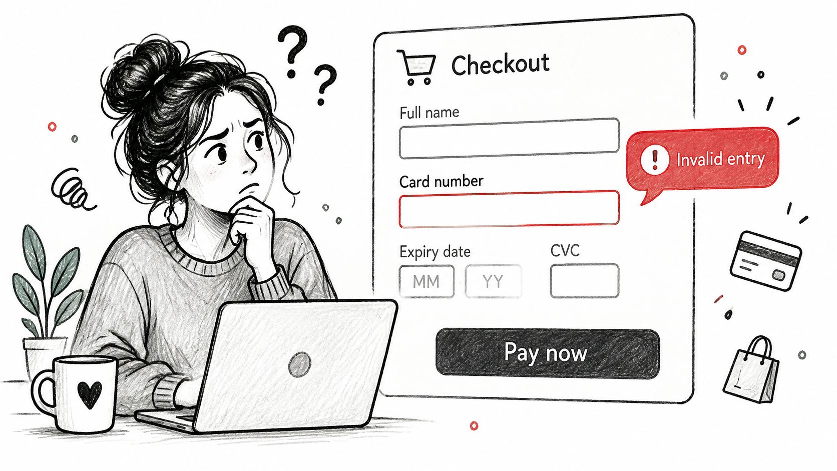
The W3C guidance on error identification draws a clean line: "Email is not valid" names the failure, while "Please provide a valid email address in the format name@domain.com" shows the repair. A lone "Invalid card" is worse because it can mean an expired date, a mistyped number, or a bank decision. A password field that rejects input without listing the rules creates the same guessing game.
Checkout length makes every vague message more expensive. Baymard reports that 17% of U.S. online shoppers abandoned an order in the previous quarter because checkout was too long or complicated, and that the average U.S. checkout held 23.48 default form elements against a tighter range of about 12 to 14. Extra fields plus opaque errors multiply retries.
- Name the field and the fix: high user impact, low design effort. Write "Enter a date in MM/YY format," put the message beside the field, and keep what the person typed.
- Split the checks: medium effort, lower risk. Validate format when the person leaves the field, then save server or bank rules for submit.
- Mine the tickets: strong evidence, low effort. Sort the exact error lines people quote back to support and rewrite those first.
The same repair-first wording matters anywhere buyer details are collected, including high-stakes intake paperwork such as a compliance reference for independent dealerships. For field patterns that hold up under bad input, use practical field and validation guidance.
3. Placeholder Text Used in Place of Field Labels
Grey text inside an empty box feels tidy until someone types. The hint vanishes, and a long form becomes a memory test.
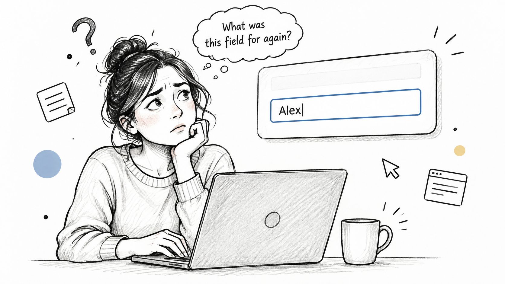
Imagine a PM reviewing a five-step onboarding form on a phone. A colleague leaves to grab a laptop, comes back, and cannot tell whether the filled field was work email or personal email. The label lived only in the placeholder. A date-of-birth field that shows its format the same way fails the moment typing starts.
The W3C notes on labels or instructions treat a date as something that needs visible format text, such as dd/mm/yyyy, and a state field as something that should ask for a two-character abbreviation while still offering the valid list. People get blamed for "input errors" when the rule was never on screen.
Keep a label above or beside every input. Use the placeholder only as an example, like name@company.com. Check that the grey example is still readable, and run the form with someone who has not seen the spec, including a full state name and a date with slashes in the other order.
4. Touch Targets That Are Too Small to Tap Reliably
Dense mobile toolbars fail in the hand, not in the mock. Archive and delete sit a few pixels apart. A thumb hits the wrong one, and the message is gone.
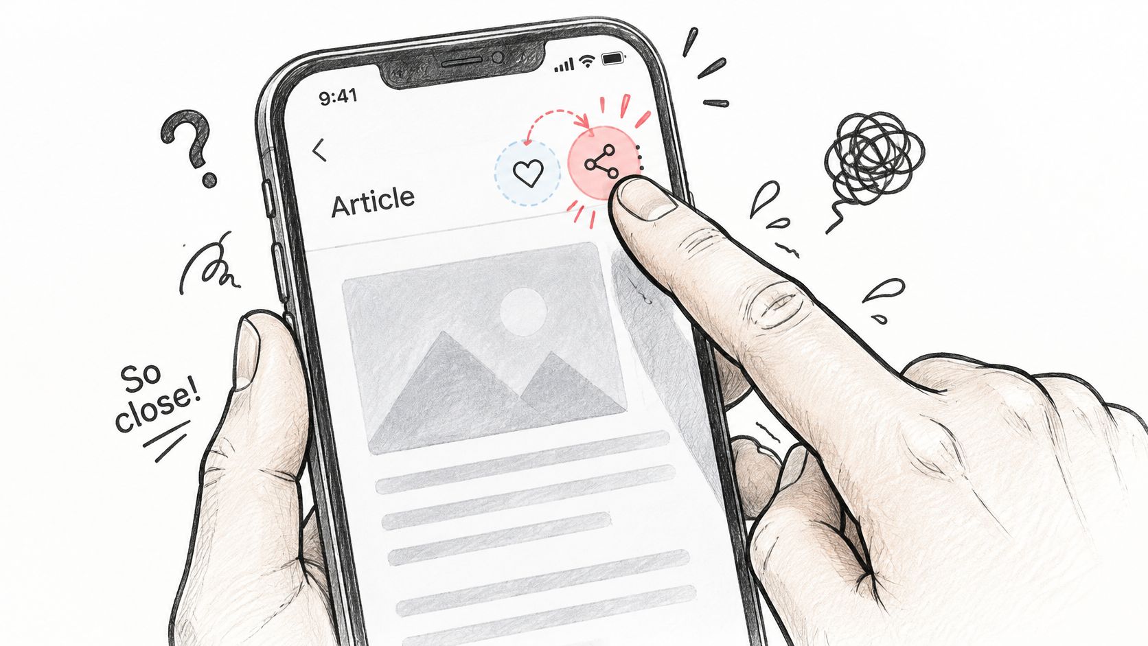
I treat this as a motor problem with a product cost. Mis-taps create accidental deletes, repeated attempts, and support threads that look like "user error." Older adults and people with motor impairments pay first. Everyone pays on a moving bus.
Desktop emulators hide it. A mouse is precise. A finger is not. The same pattern shows up in admin tables where edit and remove are identical icons with no gap.
- Give the icon a larger hit area. I aim for at least 44 by 44 points on mobile even when the glyph is smaller.
- Separate neighbors. Leave clear space, about 8 pixels, between archive and delete or edit and remove.
- Test on a phone. Complete the task with a thumb, not a trackpad.
Say you ship a row of three actions in a billing table. Ask someone to remove one test invoice without touching edit. If they hesitate or miss, the target is the defect, not their aim.
5. Low Color Contrast in Text and Controls
Light grey on white can look refined in a bright design file. Outside, on a cheap laptop, plan details fade and an "off" toggle disappears into the card.
In 2025, WebAIM's Million report, as published by Cardan, recorded 50,960,288 accessibility errors across one million homepages, averaging 51 errors per page. Contrast is a steady member of that class of failures, and it slows reading for people without a diagnosed impairment too.
A pricing page that sets details in faint grey fails a simple ratio check against body text. A settings switch that signals off only by a pale fill fails a second way, because state rides on color alone.
- Check text and key controls before release. A browser contrast checker is enough to catch the obvious pairs.
- Add a second cue. Use an icon, label, or underline so status does not depend on hue.
- Put the check on tokens. Review color pairs when a token changes, not after marketing pastes a new grey.
For a concrete way to run those checks, see how Figr approaches accessible UI colors.
6. Cookie Consent Banners With Lopsided Choices
Accept is a bright button. Reject is a text link, three screens deep, behind dozens of toggles. People do not experience that as a preference. They experience it as a toll.
The basic gist is this: the banner is shaping the record you will later call consent. In short, equal choices mean the same layer, similar weight, and a reject path that does not require a second product tour.
European regulators have treated that asymmetry as a data-protection problem, not a branding choice. You do not need a dramatic case to see the risk. If refusal takes more steps than acceptance, the interface is doing legal work whether or not legal reviewed it.
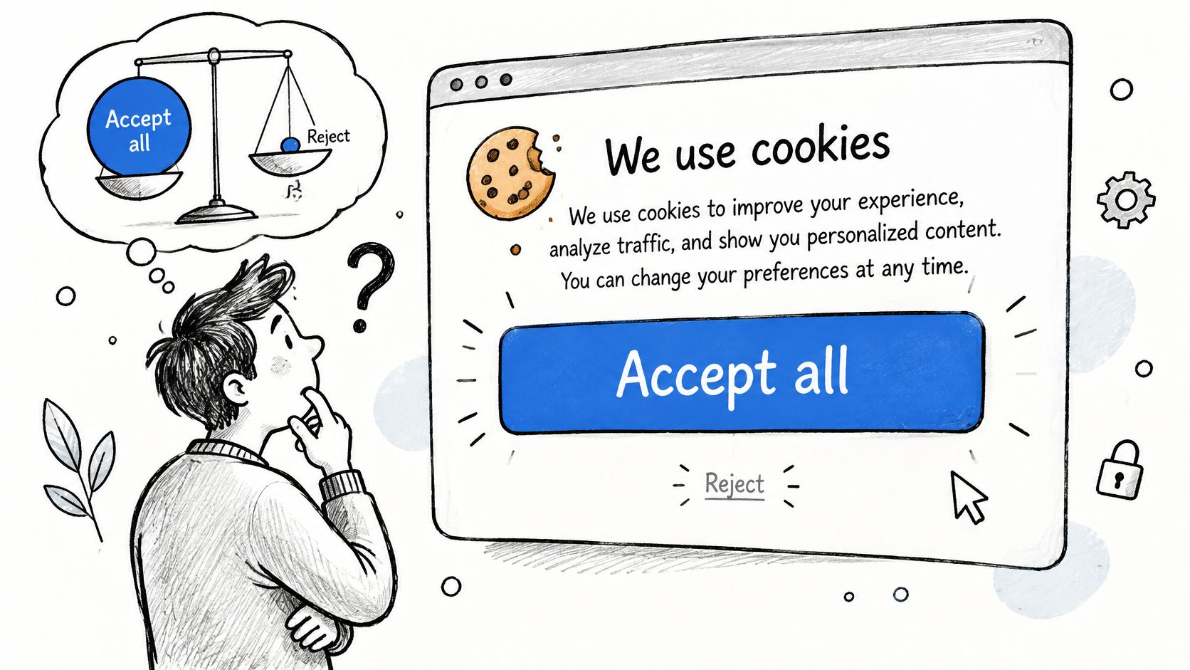
- Match the actions. Put reject and accept on the first layer with comparable size and contrast.
- Confirm the market. Have counsel review the flow for each region you serve.
- Retest clean. Open a fresh browser profile, log the stored choice, and confirm reject sticks.
A banner that only looks balanced in the design file still fails if "Manage preferences" is the only way to say no.
7. Subscriptions That Are Easy to Start and Hard to Cancel
One click starts the plan. Cancel hides behind retention screens, a phone queue, or a settings hunt. Harry Brignull named this pattern a roach motel: easy to enter, hard to leave. The short-term metric looks like retention. The later metrics look like chargebacks, complaints, and regulator attention.
The imbalance is something you can measure on your own product. Time the path from "I want to cancel" to a confirmed end, then count the steps. Run the same clock on sign-up. If sign-up is self-serve online and cancel requires a call, the gap between those two numbers is the finding.
An easy exit also protects future revenue. In a market where HearSmart's streaming subscription data tracks how readily people add and drop services, a clean cancel leaves the door open to resubscribe. A hostile one closes it for good.
- Match the exit to the entry. If sign-up is self-serve online, cancel should be too, on the same surface with comparable steps.
- Cap the retention pitch. One offer at most, then let the person finish.
- Confirm the end in writing. Show the final billing date and send a confirmation the user can keep.
8. Slow Pages That Lose Users Before They Engage
A headline that arrives after a chat widget and two analytics tags is a usability failure, even when the layout is correct. People leave before they can read or act. The loss is larger on slower networks, which is exactly where a demo on office wifi looks fine.
I do not need a single bounce percentage to justify a budget. I need a line in release review that says what "usable" means. Large scripts, uncompressed images, and third-party tags are the usual culprits. Each one is reasonable alone. Together they push the first meaningful paint past the moment someone is willing to wait.
- Read field data, not only lab scores. Watch Largest Contentful Paint and Interaction to Next Paint on the landing template you ship.
- Defer what is not the decision. Load chat and extra tags after the headline and primary action are usable.
- Set a budget per release. If a tag blows the budget, it does not merge because a vendor asked nicely.
Say the marketing page must show the offer and one button before anything else runs. Throttle the test to a slow mobile profile. If the button is late, the tag is the defect.
9. Actions With No Visible System Feedback
Save, Send, and Pay go quiet for a few seconds. The person clicks again. On a fast demo you never see it. On a hotel network you get two charges and a ticket.
Jakob Nielsen's first usability heuristic, visibility of system status, asks the product to say what is happening in time for the person to stop guessing. Silence reads as failure. Failure invites a second click.
In Baymard's checkout usability study, participants hit problems such as an unresponsive server and error pages. In 8 of 9 documented instances, the participant abandoned the cart immediately. A technically valid button still fails if nobody can tell whether the transaction landed.
- Lock the action while it is in flight. Disable submit and show progress next to the control.
- Say what happened. Put success or failure beside the button, not only in a corner toast.
- Throttle the test. Repeat pay and save on a slow connection and confirm you cannot double-submit.
A document editor with no saved state creates the same doubt without a charge. People keep a local copy because the product would not say it kept theirs. Tie the behavior back to user experience design principles so the review has a shared name for the miss.
10. Search and Empty States That Dead-End the User
"No results" with no next step teaches the wrong lesson. People decide the thing does not exist, or that they typed it wrong, and they stop.
Stacked filters make it worse. An admin report goes blank, and the only exit is a refresh that also throws away the rest of the query. Catalog search fails the same way when the index says "trainers" and the shopper typed "sneakers."
Research on web browsing found that blind or visually impaired participants hit inaccessible menus and unsearchable dropdowns. In one flight-booking task, those barriers produced a 0% success rate for some otherwise non-frustrating tasks, as described in this study of inaccessible browsing tasks. A single dead control can block the whole job, not just annoy.
- Read zero-result queries every week. Map them to synonyms or to a real content gap.
- Show reset while filters are on. "Clear all filters" should be visible, not buried in a menu.
- Offer a next click. Related categories or corrected terms belong on every empty state.
For patterns that turn a blank page into a continuation, see turning empty search states into next steps.
How the 10 usability issues compare on cost, evidence, and first fix
| Item | Main Cost | Key Standard or Source | Quick Fix |
|---|---|---|---|
| Hidden Navigation Behind a Hamburger Menu | Lower discoverability and feature engagement | Nielsen Norman Group research | Keep key desktop sections visible |
| Form Errors That Do Not Explain How to Fix Them | Retries, abandonment, and support requests | Nielsen Norman Group error-message guidance | State what went wrong and how to correct it |
| Placeholder Text Used in Place of Field Labels | Confusion and slower form completion | NN/g guidance; WCAG 1.4.3 | Use persistent labels; reserve placeholders for examples |
| Touch Targets That Are Too Small to Tap Reliably | Mis-taps and accessibility barriers | WCAG 2.2 SC 2.5.8; Apple HIG; Material Design | Provide adequately sized, spaced tap areas |
| Low Color Contrast in Text and Controls | Poor readability and inaccessible controls | WCAG 2.x AA contrast requirements | Check contrast and add non-color cues |
| Cookie Consent Banners With Lopsided Choices | Regulatory risk and reduced user trust | CNIL; European Data Protection Board | Give accept and reject equal prominence |
| Subscriptions That Are Easy to Start and Hard to Cancel | Complaints, chargebacks, and regulatory risk | FTC Amazon case; dark-pattern “roach motel” | Make cancellation no harder than sign-up |
| Slow Pages That Lose Users Before They Engage | User abandonment, especially on mobile | Google and SOASTA mobile research | Defer non-critical scripts and monitor performance |
| Actions With No Visible System Feedback | Duplicate actions and reduced trust | Nielsen's visibility-of-system-status heuristic | Show progress and success or failure feedback |
| Search and Empty States That Dead-End the User | Abandoned tasks and avoidable support requests | Nielsen Norman Group search and empty-state guidance | Offer suggestions and a clear reset action |
Audit One Flow This Week and Rank What You Find
Pick one high-traffic flow. Signup, checkout, or cancellation is enough.
Walk it once as a first-time user, then again while you break it: a bad date, a declined payment, a zero-result search, a throttled network. Write every finding with a location, a plain description of what went wrong, and a score for user impact, product risk, and design effort. That three-part score is what turns a list of complaints into an order of work.
Fix the top two before the next release. Do not boil the backlog. A redesign can cut errors and still slow the task, so set a floor for both completion rate and time on task, then watch novices and experienced users separately. Across 42 website redesign cases, Nielsen Norman Group found large average gains in conversion, traffic, performance, and use of target features. Results like those are why a scored list beats a vague polish pass.
As teams and surfaces grow, the coordination cost grows with them. A hidden menu, a quiet payment button, and a lopsided consent banner stop being one designer's taste. They become support load, failed self-serve, and the kind of risk legal hears about after launch. A PM reviewing checkout with QA on Thursday can tag only the two issues that block completion or create a duplicate charge and leave contrast polish for the token pass. That is a release decision.
Early interface versions in iterative studies were full of traps that still look familiar: unclear errors, no real help, a missing Cancel, ambiguous labels. Median usability rose sharply once teams tested and revised, with a median 38% gain per iteration across Nielsen Norman Group's iterative design cases. Small interaction changes moved task success more than another visual pass.
Figr can group these observations by user impact, product risk, and design effort, so the team starts with the problems that cost the most. Bring screens or a walkthrough of that one flow, list the missing states, and leave the meeting with two fixes and a way to retest them.
Figr reviews a live flow before you polish screens, flags usability gaps and missing states, and turns analytics signals into questions your team can rank and test. If you want that ranking on a real signup, checkout, or cancel path, visit Figr and run one flow through it this week.