
A gray #9A9A9A label on white has a contrast ratio of about 2.8:1. It may look muted and balanced in a mockup, but it falls short of the WCAG AA threshold for normal text. A color contrast checker calculates the relative luminance of the foreground and background, reports their ratio on a scale from 1:1 to 21:1, and compares it with the threshold for the text or interface element you are checking. The ratio is useful evidence, not a guarantee that every user can read the content comfortably.
The scale of the problem shows up across websites. WebAIM's 2024 Million analysis found low-contrast text on 81.0% of the top 1,000,000 home pages, with an average of 34.5 distinct low-contrast instances per page, up from 30.4 in 2023, a 13.7% increase. A single failing text token reused throughout a design system can create many instances. Correcting it while exploring a palette is usually simpler than tracking down every affected component later.
The right checker depends on where the decision happens. Palette tools help compare color pairs; in-design checkers keep review close to components; sampling tools inspect rendered pages; shareable results can help settle a discussion with stakeholders. For each tool, consider where it fits, whether it helps you find a better color or only reports a result, and what it cannot inspect.
1. WebAIM Contrast Checker
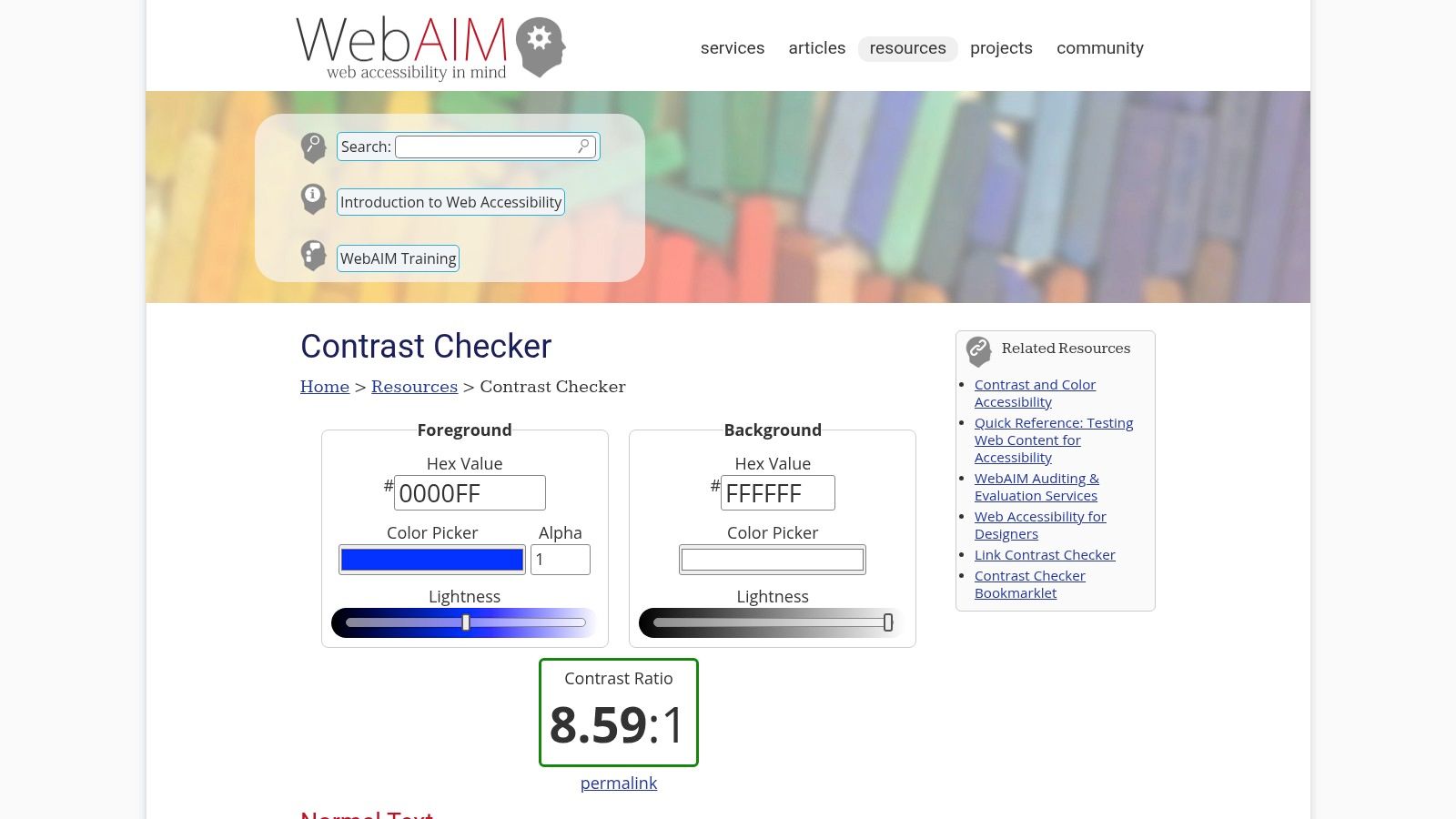
This is the one that many designers and developers already keep open in a tab, and that's the right default. The WebAIM Contrast Checker takes a foreground and a background value and returns a ratio with separate pass or fail lines for normal text, large text, and graphical objects. No account, no install, no project setup.
What it gets right
- The verdict splits by category. Normal text, large text, and UI components each carry their own threshold, so you can't accidentally grade an icon against 4.5:1.
- The preview is honest. Type a pair and you see it as body copy immediately, which catches combinations that look fine as two swatches side by side.
- The bookmarklet travels. Add it once and you can pull colors off a rendered page without switching windows.
Where the thresholds come from
The W3C explanation of contrast minimum sets the AA bar at 4.5:1 for normal text and 3:1 for large text, defined as at least 18-point regular or 14-point bold. It also settles a common argument decisively: 4.47:1 does not round up to 4.5:1.
What it can't do
You supply both colors, which means you've already decided what to test. There's no page scan, no Figma file read, and no context about whether that gray is a caption, a disabled label, or a decorative divider. For a single pair it's perfect, and for a 40-screen library it isn't a plan.
New to the criteria a checker applies? The primer on how to test against WCAG AA walks through the success criteria behind the number.
2. Adobe Color Contrast Checker
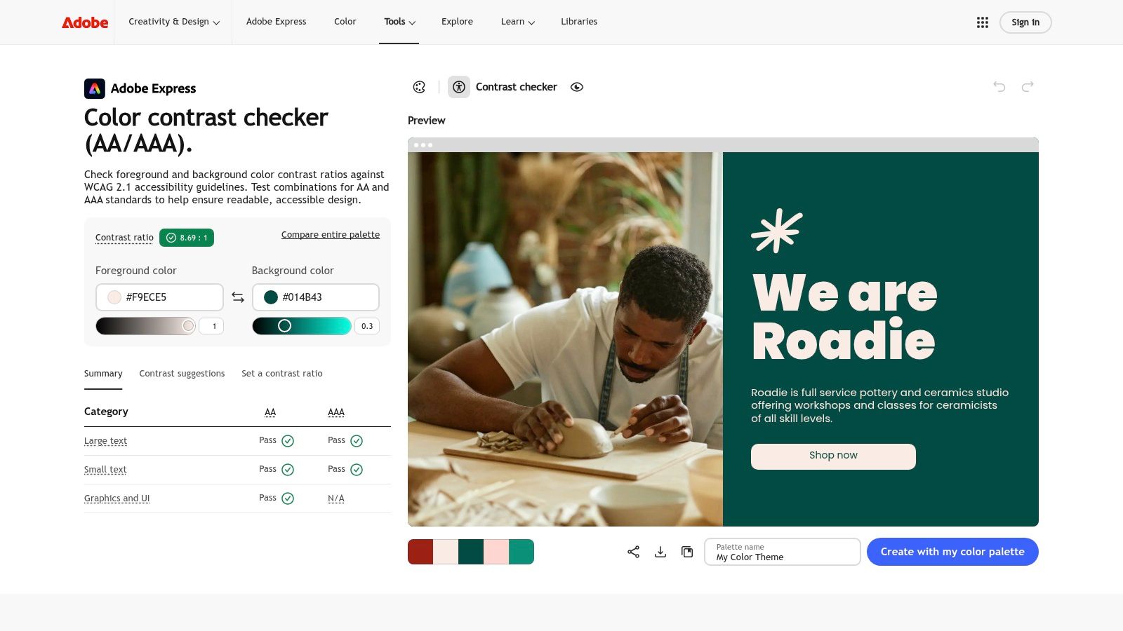
When contrast decisions get made while a brand palette is still moving, Adobe's tool fits better than a bare calculator. The Adobe Color Contrast Analyzer checks pairs against WCAG 2.1 AA and AAA for text and for graphics or UI, previews the result at small and large sizes, and suggests alternatives when a pair fails.
Strengths worth the tab
- Suggestions instead of a dead end. A failing pair comes back with nearby colors that clear the threshold, which shortens the loop from "this fails" to "which one do we pick".
- Graphics get their own check. The graphics and UI category applies the 3:1 bar to shapes and boundaries, not the text bar.
- It sits beside palette tools. If your team already builds brand palettes in Adobe Color, the contrast pass is one more panel rather than another site.
Why the category selector matters more than it looks
The W3C guidance on enhanced contrast is explicit that a checker should classify text by its actual rendered size and weight, test text against its real background including gradients, images, overlays and transparency, and evaluate non-text boundaries and focus indicators separately. Most single-field checkers skip the first and third of those, which is how a palette passes in isolation and fails in the product.
Where it's the wrong tool
It checks the pair you type in, not the page you shipped. Saving and related color features can also depend on account state, so assume nothing persists until you've tried it.
If all you need is one ratio before a standup, the surrounding color workflow is more product than task. Reach for this one when the palette itself is still under review.
3. Stark
Contrast checks that happen after handoff get argued about. Contrast checks that happen on the canvas get fixed. Stark brings the test into Figma, where you select a text layer and read AA and AAA results for the actual fill and background, with a suggested alternative when it fails.
What earns it a seat
- Selection-based checking. You test the layer that exists, not a hex pair retyped from memory.
- Fixes at the point of failure. Color suggestions on the selected layer cut the loop from finding a problem to resolving it.
- Library awareness. It works with local and remote Figma color libraries, so suggestions can stay close to tokens your team already maintains.
The APCA option is a different measurement
Stark exposes APCA as a beta option, and precision matters here. APCA is not a WCAG ratio under another name, and an APCA score is not evidence of conformance. Keep audit reporting on WCAG numbers and treat APCA as a second opinion about perceived lightness contrast.
Label the number. When you paste a contrast result into a ticket or a client email, say which method produced it. A bare "passes" invites someone to challenge it with a different tool and a different figure.
What it doesn't replace
Plugin capabilities and plan access vary, and the check only sees what's in the file. Hover, focus, error, and disabled states often live in code or in variants nobody selected, so a canvas pass is still a first pass. Run it on every text style in the library, then verify states in the browser.
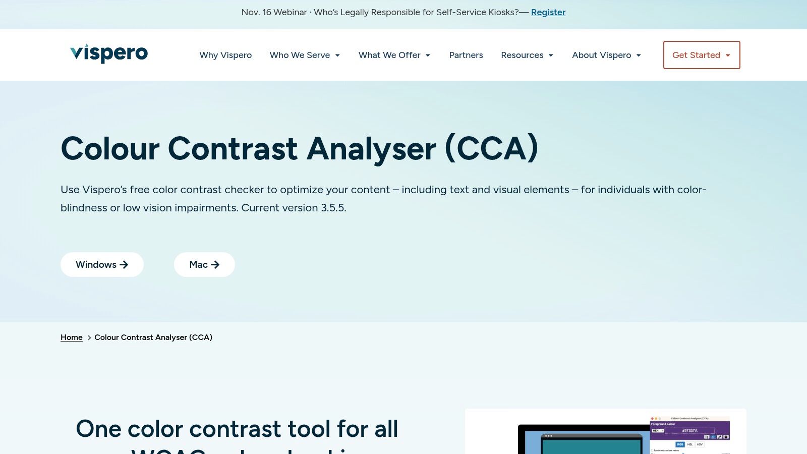
4. TPGi Colour Contrast Analyser
Sometimes the color you need to test isn't in a design file at all. It's in a PDF from legal, a competitor's screen, or a legacy admin tool nobody has the source for. The TPGi Colour Contrast Analyser is a free desktop app for Windows and Mac whose eyedropper samples pixels off anything on screen and reports the ratio.
Why an eyedropper still matters
- It tests the artifact, not a guess. Whatever rendered is what gets measured, including the font smoothing and the overlay nobody documented.
- Two samples, one number. Pick foreground, pick adjacent background, read the ratio.
- It works beyond the web. Mockups, slide decks, exported reports, printed proofs.
Sample the worst case, not the average
Text over a gradient or a photograph has no single background color. Sample the lightest region behind the glyphs, then sample again at a mobile breakpoint where the crop shifts. A hero headline that clears 4.5:1 on desktop can fail on a phone because a different part of the image now sits behind the same words.
Text isn't the only thing with a threshold
The W3C non-text contrast requirement asks for at least 3:1 against adjacent colors for the visual information needed to identify UI components and states: form-field boundaries, focus indicators, selected controls, meaningful graphics. A button label can pass while its boundary, focus ring, or icon fails. A text-only review never finds that.
The tradeoff is a download, and semi-transparent layers or shadows can make a single sampled pixel misleading. Sample twice, compare, then trust the lower number.
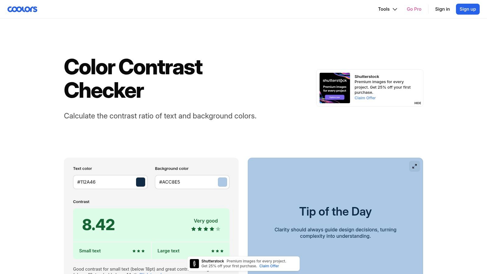
5. Coolors Contrast Checker
Contrast problems usually enter a product at the palette stage, when a pleasant five-color combination gets promoted into a design system. Coolors folds the check into the palette builder, so you can test combinations and generate variations in the same window.
Where it helps
- Test while you explore. The ratio updates as you adjust, so a failing hue gets caught before it becomes a token.
- Variations in place. Nudge lightness in the same tool that holds the rest of the palette.
- Saved palettes. Some palette management sits behind Coolors Pro, so treat the free tier as the checking layer and the paid tier as the library.
Set the palette against AAA, ship at AA
The W3C AAA contrast criterion asks for 7:1 for normal text and 4.5:1 for large text. I treat AAA as a resilience target for dense dashboards, small metadata, and cheap displays, not as the release gate for every label. A pair at 5:1 passes AA for normal text and still misses AAA unless the text qualifies as large, which is why "we pass contrast" needs a level attached to it.
A palette isn't an interface
Coolors shows color relationships, not typography, state, or hierarchy. A combination that reads beautifully at swatch size can be unusable as 12-point secondary text on a matte laptop screen in daylight.
If your palette leans on one dramatic hue, the notes on building palettes around dark red cover the value and saturation traps that appear when you push a hue that far.
6. Color.review
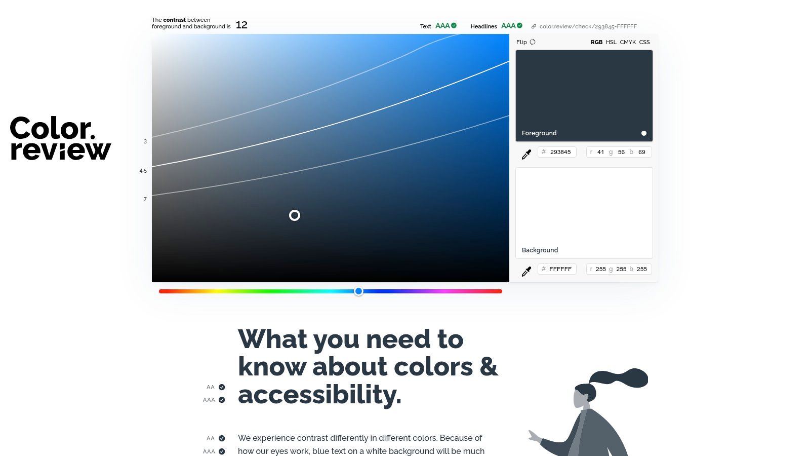
This one wins on the thing that unblocks design debates: a link. Color.review tests a foreground against a background, shows sample content, states the WCAG thresholds the pair does or doesn't meet, and produces a shareable URL that preserves the exact combination.
Why the shareable link matters
- It ends the screenshot argument. Everyone opens the same pair with the same numbers.
- It previews rather than scores. You see the combination as text, not as two chips.
- It's fast enough for a live conversation. Retype the hex while the call is still happening.
The question it answers indirectly
"Why did this color pass in one place and fail in another?" is the most common contrast question inside product teams. The Access Board's contrast baseline explains the machinery: thresholds shift with context, from 4.5:1 for normal text to 3:1 for large text to 7:1 for enhanced AAA, and categories such as inactive controls, decorative text, logos, and text embedded in an image may be exempt.
Imagine a PM reviewing a failed gray in a dashboard. The same hex passes as an 18-point heading and fails as a 14-point caption. Nothing about the color changed. The typography did.
Maximizing contrast everywhere isn't the goal either. Push every label to 12:1 and hierarchy flattens, brand voice disappears, and the interface starts to read like a compliance document.
Limits
It tests the pair you hand it, so text size and element role remain your job. If you're matching a specific brand value, the brass hex and RGB values reference keeps the pair consistent across light and dark surfaces.
7. Figma Color Contrast Checker
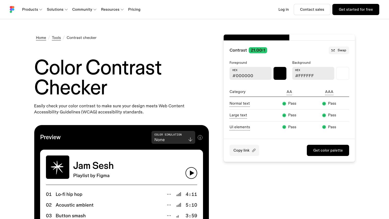
Teams that live in Figma get a familiar face here, and the color-vision simulation is the reason to use this one. The Figma color contrast checker accepts foreground and background values, swaps them with one click, and reports AA and AAA status separately for normal text, large text, and UI elements.
What it adds
- Three verdicts, not one. Text size and element type change the threshold, and the tool shows each.
- Color-vision simulations. Enough to catch a red error state that collapses into gray.
- A palette path back into design. Checked colors can move into a palette workflow and open in Figma Design.
What a simulation can and cannot tell you
Simulations approximate. They model a form of color-vision deficiency and show how a pair might read under it. That's enough to reveal that your success and error states look identical to a deuteranope. It isn't enough to conclude a real user will read the screen comfortably, because acuity, display, and glare all sit outside the model.
The workflow gap
Entry is manual, so the tool checks the colors you remembered to bring. It won't sweep a frame and list every failing pair in a component library, and on a 40-screen file that difference is the whole job. Run it against your token set once, fix the palette, then check components in context where the background isn't a token at all.
8. Polypane Color Contrast Checker
Polypane splits the job in two, and the split is the point. The free online checker at Polypane's contrast page handles WCAG 2 ratios and APCA for a color pair, with previews and suggested alternatives. The paid Polypane browser goes further and inspects text against its actual rendered background, accounting for opacity and text shadows that a hex-pair tool cannot see.
Two modes, two questions
- Free checker, proposed palettes. Best for "would this combination work" before anything is built.
- Browser inspection, shipped pages. Best for "is this caption failing" on a real build.
- Suggestions that stay suggestions. Alternatives get you moving, but the final call is still yours.
WCAG and APCA are not two scores for one thing
They use different math and different scales, and a number from one is not a rebuttal to a number from the other. If your audit response or legal exposure runs through WCAG 2, report WCAG ratios and keep APCA as a design-quality input. Mixing the two in a single ticket is how a team ends up defending a score nobody can reproduce.
The unstyled edge
Image backgrounds still need manual sampling, and the deeper inspection features require the application. The basic gist is this: the tool can read CSS, but it cannot read a photograph, so the worst case behind your text is still your responsibility.
9. Accessible Web Color Contrast Checker
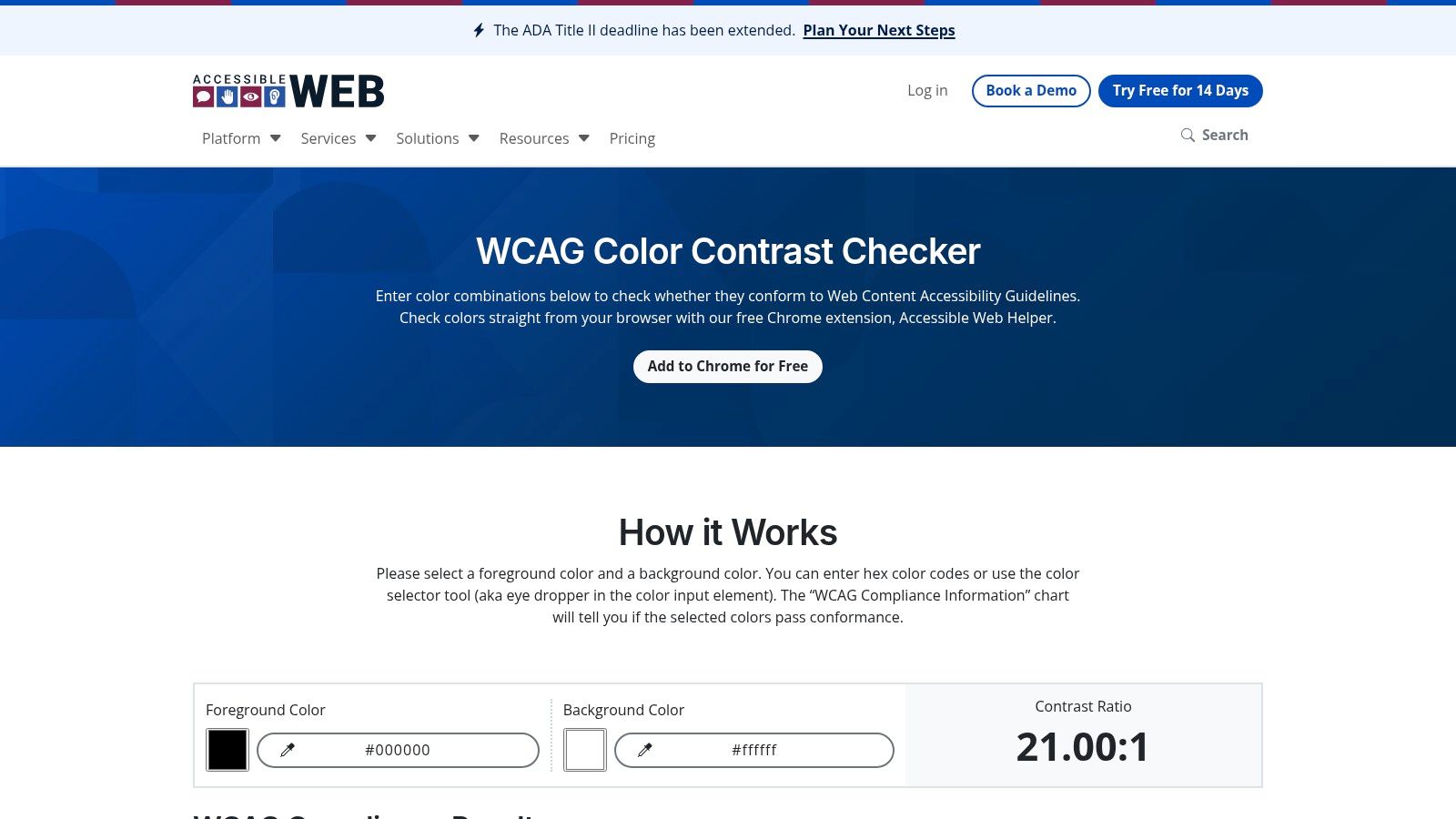
Accessible Web covers both directions of the same task. You can type hex values into the Accessible Web color contrast checker, or install the Chrome extension and sample colors straight off a page or component. That second path is what makes it useful for teams auditing an existing product rather than a fresh mockup.
The combination that works
- Manual entry for known tokens. Paste the token values and confirm the palette before you touch components.
- Extension sampling for live interfaces. Pick the color off the rendered button, error message, or metadata line.
- A path from pair to page. The same vendor offers broader tooling, so a spot check can grow into a page-level review.
Sampling is a spot check, not a survey
One sampled pair represents one state on one screen. Hover, focus, error, disabled, and dark mode variants each carry their own foreground and background, and you measured whichever one you happened to hover. Write down the state, the viewport, and the element in the ticket, or the fix won't reproduce.
The coordination problem
Contrast rarely regresses because a designer stopped caring. It regresses because the decision lives in one place, a palette or token file, and gets applied in another, a component library owned by a different team, with nobody owning the join. A checker that reports "one failing text token, affecting 22 components" gets fixed in a sprint. A checker that reports 22 separate failures gets triaged into next quarter.
If you're still building the fundamentals of screens and states, this UI design guide covers the component structure that contrast fixes need to land in.
10. Who Can Use
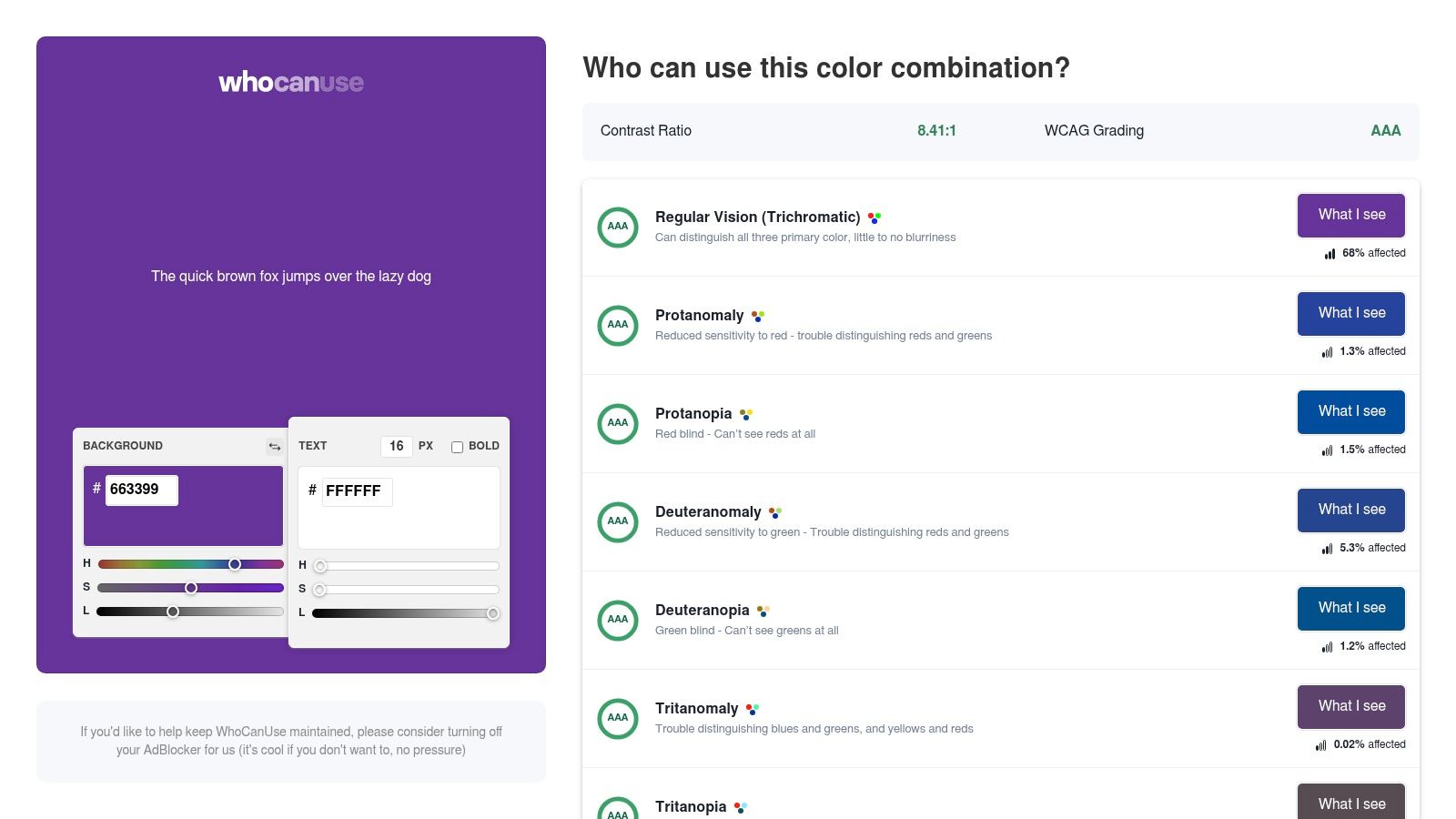
Most checkers answer a compliance question. Who Can Use answers a persuasion question, and that's a different job. Enter a foreground and a background, and you get the ratio and WCAG grade alongside a visual treatment of how the combination may read for people with different vision conditions, from low acuity to cataracts, glaucoma, and color deficiencies.
Why it belongs in the list
- It makes the cost visible. A number is abstract; a simulated view of the same screen is not.
- It's the best stakeholder tool here. Marketing leads and executives respond to the visual, not to the ratio.
- It reframes the discussion. The question moves from "does this pass" to "who does this exclude".
Use it in the room, not in the audit
Reach for this one when a debate has stalled on aesthetics. A ratio of 3.4:1 means little to a brand lead; the same pair shown through a cataract simulation ends the discussion in about ten seconds.
A passing ratio is the floor of perceivability, not the ceiling of accessibility. Color is only one channel, so if an error state, a required field, or a chart series is distinguished by hue alone, a perfect ratio doesn't fix it.
Approximations, clearly labeled
Simulations can't represent any single person's vision, and the tool tests manual pairs rather than scanning a site. It's a communication aid that happens to include the math. If you want the broader principles behind these calls, the collection of UX design principles covers hierarchy, redundant cues, and feedback in more depth.
Color contrast checker tools at a glance
Each checker fits a different part of the design workflow. Palette tools help compare combinations early; design integrations check colors in context; browser and desktop tools sample rendered screens. A passing ratio confirms a specific color pair at a specific size. It does not confirm that a whole interface is accessible.
| Tool | Best for | WCAG AA/AAA results | Works inside design tools | Free to use |
|---|---|---|---|---|
| WebAIM Contrast Checker | Quick checks of a known color pair | Reports AA and AAA pass/fail | No; browser-based checker | Yes |
| Adobe Color Contrast Checker | Checking pairs while exploring palettes | Checks against WCAG 2.1 AA and AAA | No; connects to Adobe Color palette tools | Online tool |
| Stark | Contrast checks in design and browser workflows | Reports AA and AAA results | Yes; integrates with Figma | Some features require a paid plan |
| TPGi Colour Contrast Analyser | Sampling colors from screens, mockups, and documents | Provides WCAG contrast indicators | No; desktop application | Yes |
| Coolors Contrast Checker | Checking contrast during palette development | Provides contrast results for color pairs | No; part of the Coolors platform | Checker available; some features require Pro |
| Color.review | Interactive exploration and sharing of color pairs | Provides contrast results and guidance on WCAG thresholds | No; browser-based tool | Yes |
| Figma Color Contrast Checker | Checking entered colors and previewing color-vision simulations | Reports AA and AAA status for text and UI categories | Partly; palette workflow can open in Figma Design, but it does not scan a canvas | Free online checker |
| Polypane Color Contrast Checker | Pair checks and deeper inspection of rendered pages | Offers WCAG 2 results; APCA is separate | No; deeper page inspection uses the Polypane browser | Online checker is free; deeper inspection requires paid application |
| Accessible Web Color Contrast Checker | Checking entered colors or sampling them from a live page | Reports WCAG contrast results | No; Chrome extension supports in-context sampling | Free checker |
| Who Can Use | Comparing color pairs and considering visual conditions | Provides contrast and WCAG grade information | No; browser-based tool | Yes |
Pick Your Checker, Then Fix the Failing Pair
The decision rule is simpler than the tool list. Use one checker per stage, and stop expecting one tool to cover all four.
- Palette stage: Coolors or Adobe Color, so bad combinations die before they become tokens.
- Canvas stage: Stark inside Figma, run against every text style in the library, not just the ones you like.
- Rendered stage: the TPGi eyedropper or the Polypane browser, sampling the worst case behind the text.
- The conversation: Who Can Use, for the meeting where someone still thinks the gray looks elegant.
For everything else, the WebAIM checker in a pinned tab is enough.
A worked fix in hex
Take a brand orange, #FF6600, used as a button fill with a white label. White has a relative luminance of 1.0. The orange resolves to about 0.31 once the channels are gamma-adjusted and weighted (0.2126 red, 0.7152 green, 0.0722 blue), so the ratio is (1.0 + 0.05) divided by (0.31 + 0.05), or roughly 2.9:1. That fails 4.5:1 for the label, and it doesn't even reach 3:1 for the button boundary against a white page. Darken the fill to #C2410C and its luminance falls to about 0.15, giving a ratio near 5.2:1. Same hue family, still reads as orange, clears AA for the label and 3:1 for the shape. Then change the token, not the 40 places it appears.
That channel weighting is why green text needs to be far darker than blue to reach the same ratio, and why designers who eyeball "brightness" keep getting surprised by the result.
What checkers still cannot see
Four blind spots deserve a place in your review checklist. Dark mode is a separate pairing problem, and raised surfaces with translucent overlays produce backgrounds no hex value describes. Interactive states (hover, focus, pressed, error, disabled) each carry their own colors and rarely appear in a static check. Images and gradients have no single background, so the lightest region wins. Color-only meaning passes every ratio check while remaining unusable, because a required field marked only in red is still a required field marked only in red. And a borderline pass at exactly 4.5:1 leaves no margin for antialiasing, compression, or a user who dimmed their screen.
In short, a checker tells you whether two colors can coexist at a given size and role. It cannot tell you whether the screen makes sense.
The next 20 minutes
Teams that want contrast checks to land alongside flow mapping, state coverage, and token enforcement can see how Figr reviews UX decisions and runs accessibility checks in context; GreyOrange reported 90% faster UX alignment on a warehouse operator interface built with it. That's the difference between a number in a tab and a fix that survives the next release.
Run your primary button's label and fill through a checker today. Write down the ratio and the level it meets. If it's below 4.5:1, change the token before you close the tab.
Figr is an AI design agent that runs accessibility checks in context, enforces your design system tokens, and reviews UX decisions before screens get polished. Capture your live app with one click and it maps flows, states, and edge cases while keeping output close to the components you already ship. Visit Figr to see how a contrast fix moves from a checker into a real product workflow.