

You open a settings screen, click Save, and the button stays the same color for two full seconds. That silence is a GUI interface design problem. People act on on-screen objects by pointing, clicking, typing, and dragging, and the screen has to show whether the action landed.
When the screen stays mute, people click again, abandon the form, or assume the product failed. Support tickets pile up. Engineering rebuilds a control that looked finished in the file. The cost shows up as rework, not as a prettier palette.
This article treats every control as a set of states, thresholds, and error paths you can test before handoff. You will leave with principles, a component lookup, contrast and size checks, a recovery matrix, and a one-screen test you can run this week.
Core Principles That Shape Every Usable Screen
A graphical user interface, or GUI, lets people act on on-screen objects by pointing, clicking, typing, and dragging rather than by memorizing commands. Usable GUI interface design is the set of rules that keep those objects predictable from one screen to the next.
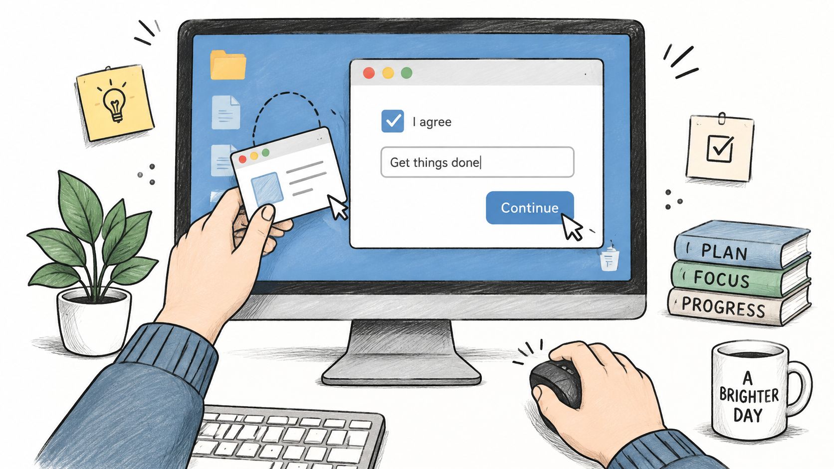
The same lens works on a product dashboard and on a public site. Teams that build a sport club website still need members to find a schedule, pay a fee, and undo a wrong click without learning a private language.
Seven checks before you ship a screen
Use one question per principle. If the answer is no, the screen is not ready.
- Visibility of system status. Does the screen show what just happened?
- Match with the world. Do labels use words users already know?
- User control and freedom. Can users undo a mistake or leave a flow?
- Consistency. Does the same action look and behave the same everywhere?
- Recognition over recall. Can users see their options instead of remembering them?
- Error prevention. Does the design stop the mistake before it happens?
- Minimalist content. Does every element earn its place?
These questions are the lens for the rest of this article. Components, contrast, and error paths are ways of answering them with evidence, not taste. The same checks sit inside broader core UX principles when a team writes acceptance criteria.
Practical rule: If two reviewers disagree, write the failing test question on the frame. Taste arguments end. A missing undo or a silent save does not.
The idea is older than modern design systems. In 1973, Xerox PARC built the Alto prototype with a bit-mapped display, mouse input, windows, menus, and graphical files. More than 1,200 Alto systems were built and tested. Xerox introduced the Star in 1981 as the first user-friendly graphical workstation sold to the public, with a desktop metaphor, visible documents, direct manipulation, and consistent controls, as Britannica's account of the graphical user interface records. Apple's Lisa shipped in January 1983 and the Macintosh in January 1984. By 1990, Windows 3.0 made a graphical interface acceptable on IBM-compatible PCs.
Pick the two principles most at risk on a screen you own this week. Write one pass-or-fail test for each, and put both tests in the design file before review.
Components and When to Use Each One
A country field with nearly 200 entries cannot be a stack of radio buttons. People would scroll past the task just to see the list. A searchable dropdown fits because the set is long and known, and the chosen country stays visible after selection. A plan choice with three prices fits radio buttons, because every option stays on screen for comparison.
In short, the control is a promise about what the user can do. A wrong promise confuses people before they read the label.
| Component | Use it when | Design rule |
|---|---|---|
| Button | Triggers one action, such as Save or Send | Use a verb label that states the outcome, and keep the hit area at least 24 by 24 CSS pixels |
| Text field | Collects free text or numbers | Show a visible label above the field, not placeholder text alone |
| Dropdown | Picks one option from a long, known list | Add search when the list is long, and keep the selected value visible |
| Radio buttons | Picks one option from a short list where all options must stay visible | Pre-select only when a sensible default exists |
| Checkbox | Turns one setting on or off, or selects several items | Label each box with the full statement it represents |
| Toggle switch | Changes a setting that takes effect immediately | Avoid it where the user must confirm changes with a Save step |
| Tabs | Switches between related views of the same object | Keep tab labels short and avoid nesting tabs |
| Modal dialog | Forces a decision before the user continues | Reserve it for consequential or irreversible actions |
| Menu | Holds secondary commands | Keep frequently used actions outside menus |
| Data table | Compares many records across the same attributes | Allow sorting and keep the key column visible while scrolling |
Why three rows get teams in trouble
A toggle applies the change at once. If the screen also has a Save button, people cannot tell which control committed the setting. Use a checkbox, then save, when the change must wait for confirmation.
A modal stops the rest of the product until someone chooses. That is right for deleting a paid invoice. It is wrong for a filter, a help note, or a setting people will change often. Frequent actions belong on the page.
A menu hides commands to keep the screen quiet. Hide Export or keyboard shortcuts there. Leave Approve, Send, and Pay where the eye can find them without a click. The same sorting belongs in what to include in pattern libraries, so designers and engineers pick from one list.
Before review, match every drawn control to a row. If the job in the file does not match the "use it when" cell, change the component, not the label.
Feedback and Interface States Users Depend On
A user clicks Save. For two seconds the button looks exactly as it did before the click. They cannot tell whether the click registered, the request is running, or the product ignored them.
Feedback has to answer three questions after every meaningful action. What happened? What is available next? Did it succeed or fail?
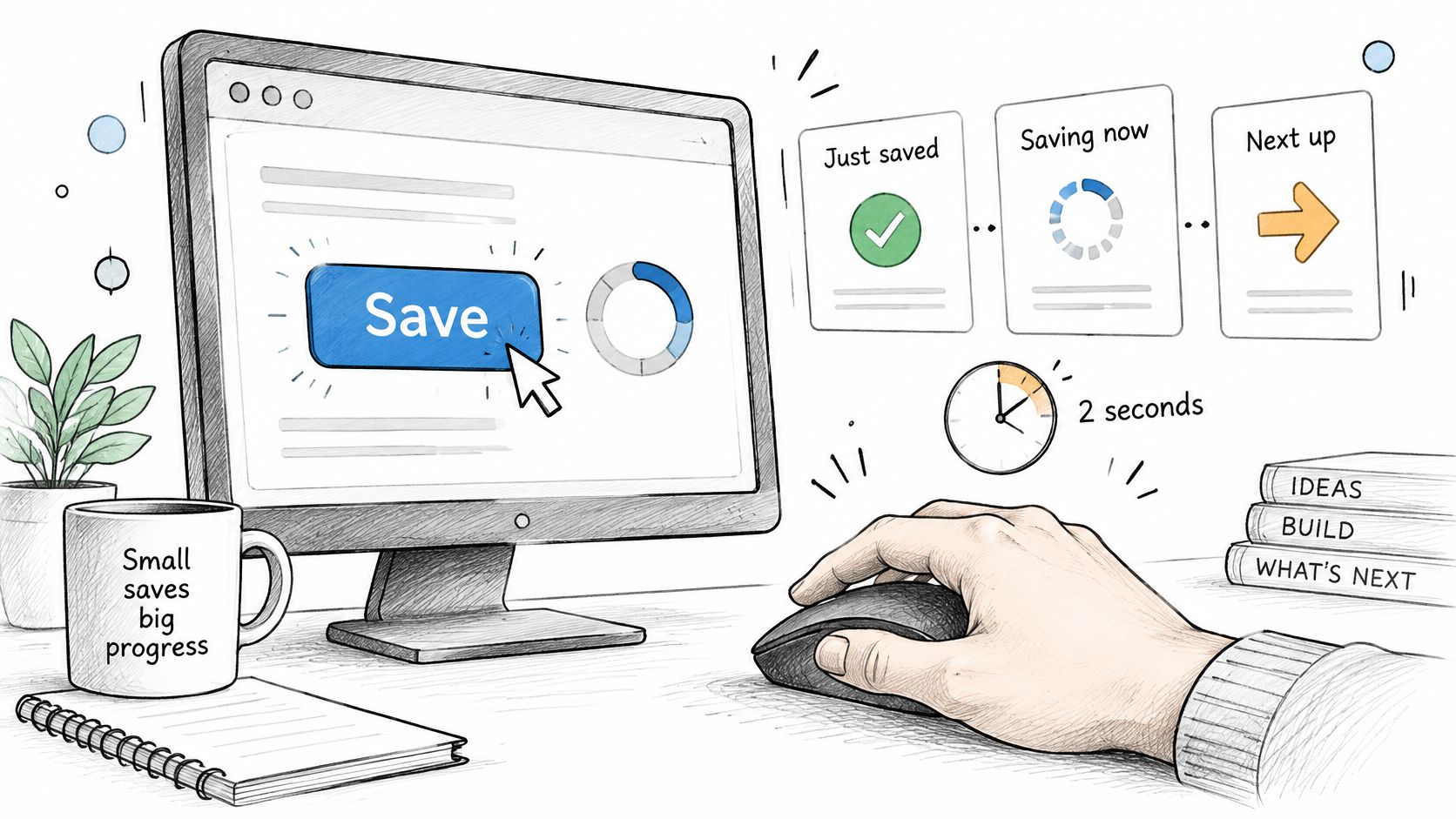
Apple's Human Interface Guidelines describe feedback as signals that show when controls are available, indicate when content changes, and use system patterns for alerts and choices. A save may need a changed status label. A destructive action may need confirmation. A loading state needs progress, not a frozen screen. The same pattern should work through more than one channel, so people who miss color or motion still get the result.
The state list for one control
Each control needs default, hover, focus, pressed, selected, disabled, loading, error, and success. Screens with no records yet also need an empty state that says what to do next.
On Save, the sequence can be concrete. The button enters loading and shows a spinner plus the word Saving. Then a status label reads "Saved at 10:42," and the next choice, such as Send or Edit, stays visible. The user never has to guess which click counted.
A disabled Save is not feedback by itself. Put the reason beside it, for example "Add an amount to continue." Color alone is not enough. Pair the state with text, an icon, or a progress label. People learn one pattern on the first screen and trust it on the tenth. When Success is green text in billing and a silent checkmark in settings, they stop trusting both. The repair paths in error UX patterns for product teams only work if the failure state is named before engineering starts.
After every meaningful action, can someone name the result, the current state, and the next choice without guessing?
List every state for each control in the design file before handoff. If a state cannot explain itself in one short label, it is not done.
Contrast and Target Size Thresholds to Build In
Treat these numbers as acceptance criteria during design, not as a surprise in QA. A control that looks refined in a file can still fail the moment someone with low vision, or a thumb on a phone, has to use it.
| Requirement | Threshold | Applies to |
|---|---|---|
| Normal text contrast | 4.5 to 1 minimum against background | Body labels, helper text, error messages |
| Large text contrast | 3 to 1 minimum against background | Headings and text at large sizes |
| Control boundary and state contrast | 3 to 1 minimum against adjacent colors | Input borders, focus rings, checkbox outlines, selected states |
| Pointer target size (AA) | 24 by 24 CSS pixels minimum | Buttons, icons, links in pointer interfaces |
| Enhanced target size (AAA) | 44 by 44 CSS pixels | Frequently used controls and mobile touch targets |
| Target spacing | A 24-pixel circle around each undersized target must not overlap a neighbor's circle | Dense icon clusters and adjacent delete or overflow actions |
| Exempt elements | No text contrast requirement | Inactive controls, purely decorative content, logos |
WCAG 2.2 sets 4.5:1 for normal text and images of text, and 3:1 for large text. Visual information that identifies an active control or its state needs at least 3:1 against adjacent colors. That covers input borders, focus rings, checkbox outlines, and selected states, including hover, focus, and error. Inactive controls, pure decoration, and logos do not carry the text-contrast requirement. A muted gray caption on a hero image can be decoration. The same gray as a live Retry link is an action, and it fails.
Pointer targets at Level AA need at least 24 by 24 CSS pixels, with exceptions such as inline text links. If a target is smaller, a 24-pixel circle centered on it must not intersect the circle of another undersized target. The stricter 44 by 44 CSS pixels benchmark fits controls people hit often, or hit on a phone. Measure the hit area, not the visible glyph. What's new in WCAG 2.2 is the place to confirm those target rules before you lock spacing.
What the ratios still miss
Say a Retry link is drawn in the same gray as disabled text, but it still submits the form. Reviewers call it "subtle." It fails because it carries an action and does not separate itself from the background or from inactive controls.
Encode the ratios as design tokens for text, borders, icons, and focus rings. Check hover, focus, error, selected, and dark mode, not only the default frame. Contrast and size do not cover keyboard operation, focus order, or screen reader names. How to test against WCAG AA is the wider pass after these tokens are in place.
The gap is large on the public web. WebAIM's 2025 analysis of one million home pages detected 50,960,288 distinct accessibility errors, an average of 51 per page. Pages using ARIA averaged twice as many errors as pages without it. The sample is home pages only, and that ARIA comparison is correlational, not proof that ARIA causes failures.
Error Prevention and Recovery in Forms
A payment form's amount field can reject letters before submission. That prevents one mistake, but a timeout can still interrupt the payment. If the form then clears every field, the person must re-enter the amount, reference, and note. Keep the draft, put Retry beside the timeout message, and explain what happens next, such as “We did not charge the card. Try again.”
Nielsen's error-prevention heuristic is straightforward: eliminate error-prone conditions where possible, and check for errors before the user commits. When prevention cannot cover a failure, the message should appear near its source, preserve what the person entered, explain how to fix the problem, and make recovery straightforward.
Stop the mistake, then plan the miss
- Validate early, where it is safe. Check a format when someone leaves a field, rather than waiting until submission.
- Constrain the input. A date picker or numeric field can prevent an invalid entry.
- Set a sensible default. Pre-fill the currency or current month when that choice is usually right.
- Confirm what cannot be undone. Add a confirmation step before deleting, sending a payment, or overwriting information.
Long forms need recovery too. A timeout in government proposal software could erase a narrative someone has already typed. Preserve the draft so the person can continue rather than start again.
Build an error-state matrix for each form. Include missing values, invalid formats, authorization failures, network timeouts, conflicts, and destructive actions. Figr's guide to form design offers guidance on deciding which fields to constrain and which to leave free.
After release, track validation retries, abandonment after failure, time to a successful retry, and repeat errors on the same field. If repeat errors rise, the form may be reporting mistakes without helping people prevent them.
Frequently Asked Questions About GUI Interface Design
Does adding ARIA markup make a GUI accessible?
No. ARIA can describe a control's name, role, and state, but it cannot make a control easy to find or operate. In its 2025 analysis of one million home pages, WebAIM found that pages using ARIA averaged twice as many errors as pages without it. That comparison is correlational, so it does not show that ARIA causes defects. Check the control's keyboard path and each state as well as its markup.
Can AI design tools replace an accessibility review?
No. Tools can flag missing labels or weak contrast, but a person still needs to judge whether the flow supports the task. A review that synthesized 127 publications, interviews with 18 experts, and 12 case studies describes generative UI as co-creation and adaptation, not a finished audit, in work published through the ACM Digital Library. A generated screen may look coherent while missing a required state.
Does a disabled-looking control need a contrast check?
Inactive controls are exempt from the text contrast requirement. An active control is not. A gray Retry link that still works must meet the contrast requirements for active text, and its boundary or state must be distinguishable where needed. If a working control looks disabled, users may skip it. Decide whether the control is available, then make its appearance match.
Is GUI design the same as visual styling?
No. Styling covers color, type, and spacing. GUI design also covers component choice, states, error paths, keyboard behavior, and what the screen communicates after a click. A polished default can still fail if focus is invisible, Save gives no feedback, or a timeout clears the form. Judge the control across its states, not only by how it looks at rest.
Design One Screen and Test It Before Handoff
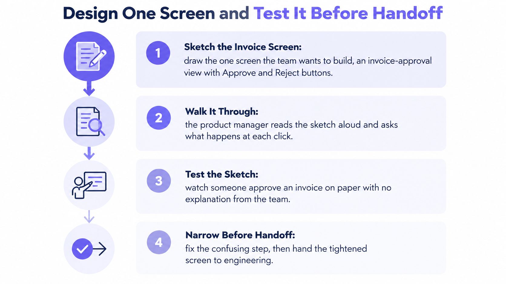
An invoice-approval screen can look finished with an amount, a vendor, and Approve and Reject buttons. Then an approver without permission clicks Approve, or the request fails and nothing explains what to do next. A useful design test starts with those moments, not just the default screen.
Each step below narrows the next. Skip one, and later checks may test the wrong screen.
Write the user task in one sentence.
Use “Approve or reject one invoice without leaving the screen.” If the sentence needs “and also,” split it into separate tasks.List the objects and actions, then cut.
Keep the invoice, amount, Approve, and Reject. Drop charts and settings that do not serve this task. A common detour is designing a dashboard instead of the screen the task needs.Map states for each object.
Include empty, loading, error, success, and permission-denied states. Empty and permission-denied states are easy to overlook when the happy path appears complete.Choose a component for each action.
Approve and Reject are buttons, not toggles, because each triggers a single action. Choose the control based on what it does, then review its visual treatment.Place the primary action where reading ends.
Put Approve after the invoice summary, and separate Reject so the actions are not mistaken for one cluster. A clear priority helps people decide without scanning a row of equal-weight buttons.Check contrast and target size before review.
Measure text, borders, focus indicators, and the hit areas of both buttons. A small icon button beside Reject can be difficult to see or select.Walk the error paths.
Consider a missing amount, a timeout, a conflict with a newer edit, and a rejected invoice. If a request fails, preserve typed notes and explain how to recover.Run a short task test.
Ask people to approve one invoice without narration from the team. Note where they hesitate, which label they misread, and which state they cannot find.
The resulting screen has one primary Approve action, a separate Reject action, and a status line that names the invoice state. Before pixels harden, the team should check accessibility, map flows and states, find edge cases, and compare choices with established UX patterns. The handoff can include the flow, edge-case map, UX review, acceptance criteria, and a prototype that reflects those decisions.
Figr analyzes UX before designing. It can create flows, edge-case maps, reviews, acceptance criteria, and high-fidelity prototypes grounded in a product's context and design system. The sketch remains a test of the task, not merely a decoration of it.
A defect found after build can require changes across design, code, and QA. Testing the sketch first makes it easier to spot a missing state before the team builds around it. As more people use the screen, that gap becomes a coordination problem as well as a usability one.
Record findings from one current screen. Fix the top issue before the next sprint.
Figr checks accessibility, maps flows and states, and turns those decisions into prototypes and handoff artifacts that fit the product. To test an invoice screen or another feature before engineering starts, bring the flow to Figr.