
Your product already has a UI pattern library problem: the same interface problems get solved differently every sprint. The library exists somewhere, in Figma or Storybook or a wiki nobody opens under deadline pressure.
When that happens, a new designer rebuilds a date picker that already shipped three times, engineering maintains four subtly different inputs, and QA finds the same focus and error-state bugs in every release. Users pay for the drift too, because navigation, forms, and feedback behave differently depending on which team built the screen.
A working library stops that repeat work by recording each recurring solution once, with its states, accessibility thresholds, and reference code attached. The basic gist is this: treat the library as an operating model with owners and exception rules, and consistency becomes something teams reuse rather than something reviewers chase.
Where a Pattern Library Ends and a Design System Begins
Teams often document colors and typography while leaving interaction decisions unsettled. A date picker may have a polished visual style, yet designers and engineers still need to decide what happens after an invalid range, how keyboard users close the calendar, and where an error appears.
A UI pattern library records how recurring interface problems should be solved, including usage rules and expected behavior. A style guide defines visual standards; a pattern library adds the decisions people need to apply those standards consistently. A design system connects patterns with components, tokens, guidance, and governance.
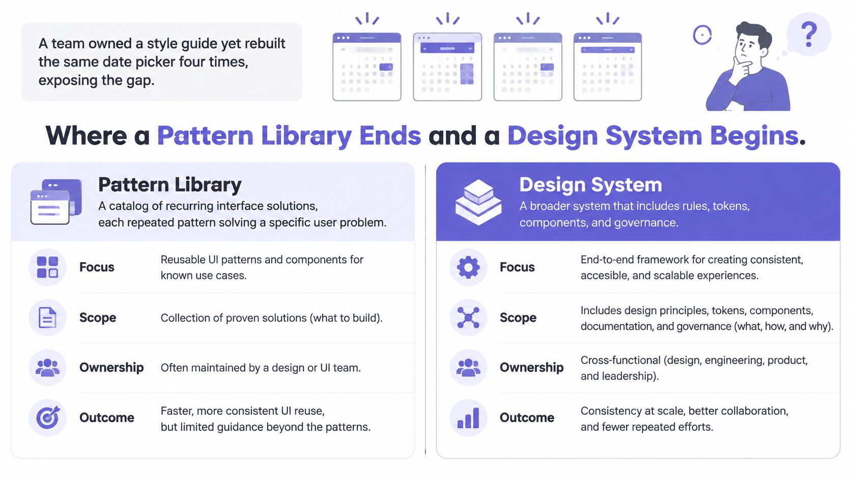
Four artifacts teams confuse compared
| Artifact | Core content | Typical owner | Question it answers |
|---|---|---|---|
| Style guide | Colors, type, logo and tone rules | Brand or marketing team | What should it look like? |
| UI pattern library | Reusable patterns with usage rules, states and code samples | Design and front-end teams | How do we solve this recurring problem? |
| Component library | Built, versioned components with props and code | Engineering | What can I import and reuse? |
| Design system | Tokens, components, patterns, guidance and governance together | Shared design system team | How do we keep every product consistent over time? |
A library needs more than entries. It needs an operating model: owners, rules for exceptions, and a way to tell whether teams adopt its patterns. Without those, documented decisions can sit unused while local versions multiply.
The 2018 survey of 499 design-system practitioners found that 90% said their system included a component library and 83% reported having a style guide, yet roughly two-thirds were still at stage 1 or 2, meaning undocumented or without a dedicated team.
A shared pattern can carry a fix to every surface that uses it. Separate local versions require separate fixes and reviews. For help distinguishing these layers, see a decision framework for product teams.
Can a new designer find the approved date picker and its error state within five minutes? If not, the library may be hard to use when decisions are being made.
Discoverability is a practical adoption check. Track whether teams use the approved patterns, and document how to handle valid exceptions. A pattern that cannot accommodate a real product need will be bypassed; one with clear boundaries can guide consistent decisions without forcing every case into the same screen.
Anatomy of a Pattern Entry
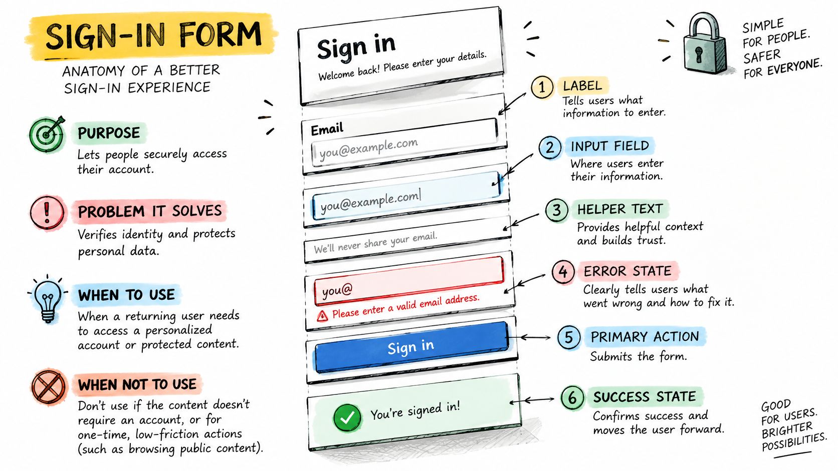
Take a sign-in form. It looks simple until a team has to decide label placement, error timing, password recovery, and what the submit button does while a request is pending. A useful entry answers those questions before a designer opens a blank frame.
Start with purpose. The pattern collects credentials for a known user and returns clear recovery paths when entry fails. Use it for returning users with an existing account. Don't use it for registration, magic-link-only access, or step-up verification, because each of those carries different trust and recovery needs.
Name every part
The anatomy names label, input, helper text, inline error, and submit action, plus the forgot-password link where your product supports it. Each name should match the design file, the code prop, and the QA testcase. When those names drift, handoff turns into translation work and small details disappear between tools.
Include one rejected version too. What should readers avoid? A placeholder doing the job of a label is the classic anti-pattern here, because the instruction vanishes as soon as someone starts typing and the field loses its visible name. Showing the rejected version saves the next designer from re-proposing it in review.
Tokens, code, and change history
The entry should list the tokens it references rather than hard-coded values. The U.S. Web Design System guidance identifies tokens for color, spacing, typography, and opacity as foundational units, and says the system includes more than 40 accessible, mobile-friendly components.
That architecture creates efficiency. Change a spacing or text token once, and every entry referencing it changes together. Pull back for a second: that's an economics argument, as one maintained decision replaces dozens of manual checks across sprints and products.
Attach the production code sample, the design file link, a version number, and a changelog line that says what changed and why. Pair that discipline with guidance on how to build design system documentation engineers use, and the entry stays usable after its author moves teams.
Before publishing a first entry, check six fields:
- Purpose and problem: The recurring need in one sentence
- Use and avoid rules: Approved contexts and clear exclusions
- Named anatomy: Every part labeled consistently
- Tokens referenced: Values pulled from the shared token set
- Code and design links: Working links, checked at publication
- Version and changelog: A dated record of what changed
The States Every Component Entry Must Document
What does your primary button look like when it's hovered while selected? What happens when a text field gains focus while already showing an error? A static preview hides exactly those moments, and those moments are where users decide whether the interface heard them.
Material Design's interaction states guidance identifies enabled, disabled, hover, focused, pressed, and dragged as distinct conditions, notes that states can combine, and requires consistent application across components. Consistent application matters because users learn your feedback language once and expect it everywhere.
Record four things per state
For each state, I'd record the visual treatment, the behavior for pointer and keyboard, the screen reader announcement, and the priority rule when two states apply at once. That's more work than pasting screenshots. It's also the difference between a reference engineers can build from and a gallery they have to interpret.
The priority rule needs one concrete example. Disabled overrides hover, so a disabled button never shows a pressed style or responds to activation. Without that sentence, two engineers will implement two behaviors and both will claim they followed the library.
Teams also forget content states while perfecting interaction states. Loading, empty, error, and success shape whether users trust a result or abandon a task. a PM's guide to development readiness helps teams surface those cases before handoff rather than during QA.
Audit rule: If a state can occur in production, it belongs in the entry, even when the default screenshot looks finished.
A writer can audit an existing component against four groups:
- Interaction states: Enabled, disabled, hover, focused, pressed, dragged
- Content states: Loading, empty, error, success
- Combination rules: Which state wins when two apply together
- Announcement rules: What assistive technology reports at each change
Can your team answer all four for your most-used button today?
Accessibility Rules You Can Encode Once
Say your library ships an accessible button, then a product team overrides it with a 16 pixel target to fit a dense toolbar. The component was tested. The shipped screen was not. Who owns that failure, the library team or the team that overrode it?
That question is why thresholds belong inside the pattern entry, in tokens, and in acceptance criteria. Encode the rule once, test the override path, and product teams inherit the protection without redoing the research on every screen.
Accessibility thresholds a pattern entry should record
| Requirement | Threshold | What the entry records | Test method |
|---|---|---|---|
| Target size, WCAG 2.2 | 24 by 24 CSS pixels minimum, with listed exceptions | Minimum hit area and spacing for each pointer control | Automated check plus manual pointer test |
| Focus appearance, WCAG 2.2 | Indicator at least a 2 CSS pixel perimeter, 3:1 contrast between focused and unfocused states | Focus ring token and its contrast values | Keyboard walkthrough |
| Keyboard operation | Every control reachable and operable without a pointer | Tab order, activation keys and escape behavior | Keyboard-only run of each state |
| Screen reader announcement | Accessible name, role and state announced correctly | Name, role and live-region rules | Screen reader test with two tools |
| Text contrast | Ratios meeting WCAG AA for the text size used | Approved foreground and background token pairs | Automated contrast scan |
The WCAG 2.2 guidelines require a minimum target of 24 by 24 CSS pixels for pointer-operated controls, with exceptions such as equivalent larger controls or sufficient spacing. The same guidance specifies a focus indicator area at least equivalent to a 2 CSS pixel perimeter and a 3:1 contrast ratio between focused and unfocused pixels.
Why focus on geometry? A library that records only colors and spacing can still leave hit areas too small to tap reliably and focus indicators too faint to follow. Interaction geometry decides whether someone can operate the control, and that's a prior question to whether the control looks on-brand.
Encode, automate, then test by hand
Put each threshold in the component specification and the relevant token, then run automated checks in CI on every change. Automated checks catch missing names and contrast failures quickly, but they can't judge focus order or announcement quality. Add manual keyboard and screen reader passes for each documented state, following the design system accessibility testing steps your team adopts.
Record evidence per variant rather than declaring a component accessible in general. What was tested, on which date, with which tools, and what passed? A dense variant, a localized variant, and a long-label variant can fail in different ways, so the evidence should travel with the variant itself.
Accessibility evidence ages. Record the test date and tool beside the result, or the claim means little six months later.
In short, a pattern entry should make the accessible path the default path and make overrides visible when teams take them.
Build Your First Pattern Library in Six Phases
Where should a small team start when everything looks inconsistent? Start from what shipped, because shipped screens show the patterns users already depend on and engineers already maintain.
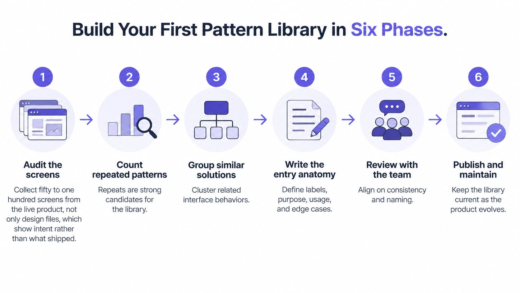
Step 1. Audit the screens.
- Collect fifty to one hundred screens from the live product.
- Don't rely only on design files, since they show intent rather than what shipped.
- Screenshot mobile and desktop views where behavior differs.
Step 2. Shortlist five patterns.
- Count repeats across the audit, because repeats are what the library exists to serve.
- Rank by frequency and risk, usually buttons, text inputs, navigation, tables, and feedback messages.
- Cut anything used once, however elegant it looks.
Why rank by risk as well as frequency? A rarely used payment confirmation can cost more when it fails than a common but harmless tag. Frequency tells you where reuse saves time. Risk tells you where inconsistency hurts users.
Step 3. Write one entry per pattern.
- Apply the anatomy, state, and accessibility fields for each shortlisted pattern.
- Name one writer per entry so decisions don't stall in committee.
- Include the rejected variant you want teams to stop building.
Step 4. Build each component in code.
- Read the same tokens the design file uses, so both draw on identical values.
- Match component and prop names to the anatomy names.
- Version the first release, even if only one team consumes it.
Step 5. Test each pattern.
- Run keyboard-only use and a screen reader pass on every state.
- Place the pattern into two real product screens and fix what breaks.
- Check long text, empty content, and error recovery before calling it done.
Step 6. Publish with an owner.
- Add a named owner, a version number, and a changelog to each entry.
- Tell two product teams which pattern to use first and on which upcoming screen.
- Book the first review date at publication, not after complaints arrive.
Two slips derail most first attempts. Teams audit only design files and document an imaginary product, or they build twenty components before any has a consumer. Which slip is more tempting on your roadmap? Each phase sits where it does because the phase before supplies its input, so skipping ahead usually means inventing that input and paying for it later.
I'd rather see five patterns with real consumers than thirty patterns awaiting adoption. Consumers generate the questions, edge cases, and pressure that turn documentation into a shared habit.
Governance and Adoption Numbers That Keep Libraries Alive
Who decides whether a pattern is mandatory? Who approves an exception when a product team has a genuine reason to deviate? Those questions arrive right after launch, and a library without answers becomes advisory within one quarter.
Rules I'd set on day one
Give each pattern one named owner who can accept changes, reject forks, and answer usage questions. Define contribution rights, so product teams know how to propose a variant instead of copying one. Keep an exception log that records the reason, the approver, and an expiry date, because permanent exceptions are just undocumented patterns.
Add a deprecation policy with a migration path and enough notice for consuming teams to move. Set an evidence threshold for new patterns too: show the recurring problem in shipped screens, name the first consumer, and explain why an existing pattern fails. Why demand evidence upfront? It keeps the library focused on repeated needs rather than one team's preference.
Maintenance needs a fixed review cycle. Re-test each pattern against its accessibility thresholds after every release that touches it, and update the evidence record at the same time. The USWDS developer documentation states the system meets WCAG 2.0 AA and conforms to Section 508, while its workflow uses ANDI, axe-core, and axe DevTools and provides a VPAT 2.5-based conformance report.
That model is worth copying in spirit. Document intended behavior, test with named tools, and preserve evidence that PMs and QA can inspect without chasing the original author.
Adoption and reuse bands for growing and mature libraries
Practitioner-reported benchmarks in the Design Systems One measurement guide classify growing systems at roughly 60–80% team adoption and 50–70% component reuse, with mature systems reaching approximately 80–95% adoption and 70–85% reuse.
| Maturity stage | Team adoption | Component reuse | Reported delivery effect |
|---|---|---|---|
| Growing library | 60-80% | 50-70% | Baseline before well-adopted gains |
| Mature library | 80-95% | 70-85% | Well-adopted systems typically report 20-30% faster delivery |
Treat those bands as directional rules of thumb, not a public benchmark dataset. Measure adoption by product surface, such as the share of eligible screens using approved components, rather than counting installs. Pair that number with release-cycle time and accessibility defects, which is how you prove the value of design systems to product leadership.
A larger library can worsen consistency when teams fork components they cannot maintain.
Pull back to incentives for a moment. Central teams have limited capacity, product teams have deadlines, and forking always looks faster this sprint. Governance works when the approved path is also the easiest path: searchable entries, working code, responsive owners, and a fast exception answer. Can your teams get that answer within one working day?
Start With Five Patterns This Week
You don't need a platform migration to begin. Which five patterns would remove the most repeated decisions from next week's design reviews?
Start with these five:
- Primary button: Every product surface needs one clear main action style
- Text input with inline error: Forms generate the most repeated accessibility defects
- Date picker: Complex enough that rebuilding it invites inconsistency
- Top navigation: Users feel drift here on every screen change
- Modal dialog: Focus management and escape behavior must be settled once
Write a single entry for each with its anatomy, states, and accessibility thresholds. Keep each entry short enough to finish this week, because a published imperfect entry with an owner beats a detailed draft in someone's private file.
Then ask two product teams to use one entry on their next screen. Their questions will show you which fields are missing faster than any internal review. Did they find the entry quickly? Did engineering need information the entry didn't carry?
Set a two-week check. Count new screens that reused an approved pattern, count screens that forked one, and log the reason for each fork. Those fork reasons become your next entries, your next variants, or evidence that a rule needs changing.
A drafting aid can help while you write those first entries. Figr's Design System Intelligence keeps generated designs aligned with your components and tokens, PRDs work as a strong input when paired with screens and design system context, and Figr UI templates can be adapted to your own product's design system. The library itself remains the asset your teams own.
Tomorrow, open your most-used screen and list the three patterns it repeats.
Bring your PRD, product screens, and design system context into Figr, and draft your first five pattern entries against your real components and tokens rather than a blank canvas. You'll leave with screens and states your product teams can test, hand off, and reuse on the next release.