
A designer opens the style guide, quotes the approved spacing, and engineering ships a different interface because the documented rule never reached the code.
The consequences appear in ordinary product work: duplicated components, contradictory states, accessibility fixes found late, and reviews that debate which artifact deserves authority. Teams lose time translating guidance into implementation, then lose more time repairing the drift that translation introduced.
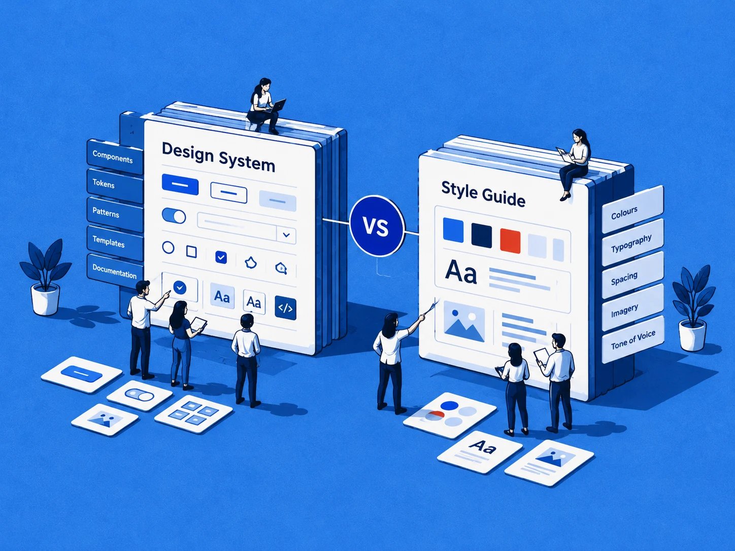
The practical answer is to treat design system vs style guide as an operating-model decision. A style guide can establish a visual language. A design system connects that language to reusable components, tokens, code, accessibility, ownership, and release decisions.
The Team Stuck Between Two Documents
A release review stalls over a button. The designer cites the approved spacing in the style guide; the engineer points to a component repository using another padding value. Each artifact is internally coherent, yet the product still presents two answers to the same question.
The team has a polished reference and working code, but no operating model that connects them. A new feature adopts the coded component, design checks it against the guide, and a visual inconsistency reaches release because the disagreement surfaced after implementation.

Teams encounter this pattern when they treat two different artifacts as interchangeable. A style guide is a visual layer. It records choices about colors, typefaces, spacing, logos, imagery, tone, and sometimes component behavior. Its job is to state how the product should look and sound.
A design system is an operational framework. It links those choices to reusable components, coded implementations, interaction patterns, accessibility practices, contribution workflows, and governance. The difference is whether the artifact produces consistency or merely describes it.
That distinction appears in metrics product teams already track. Time-to-design rises when people must translate guidance into implementation. Token overrides and one-off component variants reveal where the shared language is failing. Accessibility defects found late show whether documented intent reached the shipped interface.
The human cost is visible too. Designers stop trusting libraries after repeated engineering overrides. Engineers stop consulting documentation when code is consistently newer. Product managers inherit a coordination problem that looks like a documentation problem.
For a useful view of the people and rituals involved, see Figr's guide to design collaboration. In roadmap terms, choose the model that defines who can change a pattern, how that change reaches code, and which signals will show whether adoption is working.
What Each Term Actually Means
A style guide begins with prescription. It defines visual and verbal rules, including color, typography, logos, iconography, spacing, imagery, and brand voice. Some guides also document button behavior, interaction principles, or component examples, but their primary job remains descriptive.
A design system includes that guidance and connects it to production. It can contain design tokens, reusable design and code components, interaction patterns, content guidance, accessibility requirements, usage rules, anti-patterns, contribution paths, release processes, and ownership. The decisive question is whether a team can only look up a rule or can repeatedly apply and maintain it across products.
Why the terms diverged
The distinction developed gradually through several milestones. Christopher Alexander's work on patterns in the late 1960s, discussed at a NATO Software Engineering Conference and later developed in A Pattern Language, helped establish the idea of organizing recurring design solutions. The conceptual move was significant: teams could capture solutions as reusable patterns rather than treat every design problem as new.
Apple's major interface guidance in 1987 showed how visual and interaction rules could be applied systematically to software, as described in Figma's history of design systems. Yahoo's Design Pattern Library and Yahoo User Interface Library, released in 2006, brought reusable interface patterns into mainstream product practice.
Brad Frost's 2013 Atomic Design methodology supplied a component-based structure for assembling interfaces. Google's Material Design, introduced in 2014, became an influential example of a publicly articulated design language. These milestones didn't erase style guides. They expanded the surrounding practice from visual reference toward reusable, implemented, and governed infrastructure.
That history gives product leaders a defensible definition. A style guide documents approved appearance and language. A design system combines those prescriptions with implementation assets, decision rules, reusable components, and continuous maintenance.
Decision for the roadmap: call the artifact a style guide when it primarily documents rules. Call it a design system only when those rules connect to implementation, adoption, and governance.
The practical building blocks are covered in tokens and components explained. The distinction sounds semantic until a team must change a shared color, deprecate a component, or support another platform. Then the operating model becomes visible.
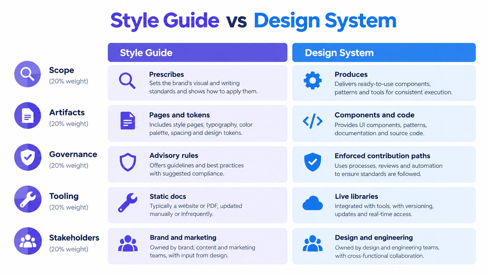
Scope, Artifacts, Governance, Tooling, Stakeholders
A roadmap review needs criteria that show what the team owns, how people use it, and which operating work remains unfunded.
Scope and artifacts
A style guide fits a team whose immediate problem is visual divergence. It gives designers and content teams a reference for color, typography, tone, and brand usage. That clarity can reduce unnecessary variation without requiring engineering to adopt a new delivery model.
A design system carries a broader operating burden. It explains when to use a component, when to avoid it, which states exist, how it behaves, where its code lives, and how accessibility requirements are tested. The wider scope can support faster delivery and more consistent interfaces, but it also creates ownership and maintenance work.
A component library alone does not settle the question. Coded buttons and inputs are useful artifacts. Without guidance, tokens, contribution rules, and a design counterpart, the library remains an implementation asset rather than a complete system.
Governance is the dividing line
Governance determines whether a shared language can evolve safely. A mature system defines ownership, contribution, release, and deprecation. Teams need clear answers about when a component belongs in the shared library, how breaking changes are communicated, who may contribute, how product teams request additions, and what happens to outdated patterns.
A shared library gains infrastructural value when it has defined ownership, release processes, and a contribution path.
Tooling should reflect those decisions. A static document can sit beside a Figma library. A design system usually connects design assets, component repositories, token pipelines, documentation, review workflows, and a method for observing adoption. These tools do not establish accountability by themselves, but they make decisions executable across the workflow.
For a practical example of governance within the design workflow, see how Figr handles design systems. The relevant test is operational: can the team trace a change from request to implementation, release, and adoption?
Product managers can measure that model through time-to-design, token overrides, and accessibility defects. Rising design time may indicate missing patterns. Frequent token overrides may show weak adoption or poor component fit. Accessibility defects can reveal gaps between documented intent and shipped behavior.
Decision for the roadmap: score the current setup across scope, artifacts, governance, tooling, and stakeholders. If governance, tooling, and engineering integration are absent, fund a maintained guide first. If the team needs shared production infrastructure, budget the ownership and release work required for a design system.
Why Tokens Change the Equation
Tokens are the mechanical hinge between documentation and infrastructure. A style guide can state that a product uses a particular color, spacing value, or type scale. A token gives that decision a name and a reusable representation that design tools and production code can consume.
The W3C Design Tokens Community Group format describes a vendor-neutral approach for sharing decisions across tools and platforms. Each token is represented as a JSON object with a required $value property. Optional metadata includes $type, $description, $deprecated, and $extensions, while groups are objects without a $value property.
That structure matters because it turns an abstract design decision into a maintained object. A token can represent a color, typography decision, spacing value, or another property. Teams can then reference the named decision rather than repeatedly copying a raw value into separate files and codebases.
From recorded value to reusable decision
Tokens support aliases and inheritance, which lets teams express relationships between decisions instead of storing isolated values. They can also support themes such as light and dark modes and generate platform-specific outputs for web, iOS, Android, and Flutter.
A static style guide might say that a surface uses a particular background color. A connected token architecture can assign that decision to a semantic name, map it to different theme values, and distribute the result through the relevant implementation channels. A designer and an engineer are then working from the same decision rather than interpreting the same sentence independently.
This is why token adoption changes the cost of consistency. The value isn't that tokens look tidy in a file. Their value is that one decision can be referenced, transformed, versioned, and audited across the workflow.
Teams still need naming discipline and review. Poorly named tokens can preserve confusion in a more technical format, and a token pipeline can spread a bad decision efficiently. Automation increases the reach of governance, so governance must come first.
For teams working toward this connection, automating token updates in components is the practical direction. The result is a stronger distinction: a style guide describes values, while tokens help make those values executable and centrally maintainable.
Decision for the roadmap: begin the system investment with the decisions that recur across products and platforms. If the team can't name, version, and consume those decisions, it isn't ready to claim a connected design system.
Migrating From Style Guide to Design System
A migration stalls when the team treats it as a documentation redesign. The operating-model decision comes first: who owns shared decisions, how teams contribute, how releases work, and how outdated patterns leave the system.
Start with the smallest useful surface. Select repeated decisions and high-friction components where a shared source can reduce translation work without slowing product delivery. Use how teams create design systems as a reference for treating implementation as an operating process rather than a file-cleanup exercise.
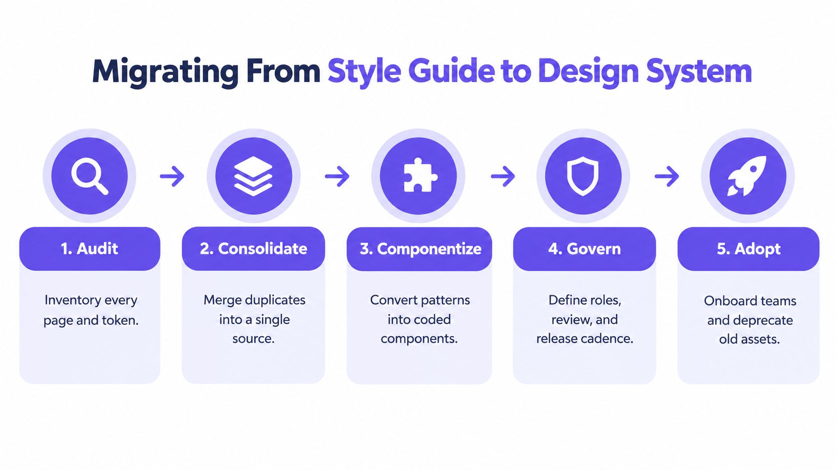
Step 1. Choose ownership. Assign an executive sponsor and a working owner across design and engineering. The system needs a decision-maker who can resolve trade-offs, not a committee that only approves documents.
Step 2. Begin with tokens. Inventory recurring color, typography, and spacing decisions. Name them clearly, connect them to design assets and code, and record unresolved values. This creates a visible boundary between decisions the system supports and decisions still under review.
Step 3. Lift components into code. Choose components teams already reuse. Define their states, variants, behavior, usage guidance, and accessibility expectations. A component enters the system when designers and engineers can use it reliably, not when its documentation is complete.
Step 4. Define contribution and release rules. Specify how teams propose additions, how maintainers review changes, how breaking changes are communicated, and how deprecated components receive a migration path. Without these rules, adoption depends on personal relationships and local workarounds.
Step 5. Instrument adoption. Track approved-component coverage, token-override frequency, accessibility defects per release, time-to-design, and rework after engineering handoff. Segment results by feature complexity so staffing changes do not look like system impact.
Figma reports that designers with access to a design system completed tasks 34% faster than designers without one. Its cited examples report 20% to 30% time savings on straightforward work and up to 50% on complex projects when tokens and variables are used, as documented in Figma's design-system metrics guidance. These figures are benchmarks, not a universal return-on-investment guarantee. Coverage, component quality, searchability, adoption, and task complexity shape the outcome.
The migration earns its place when teams use the system during real feature work. How teams create design systems depends on giving the system a roadmap, ownership, and feedback from delivery.
Decision for the roadmap: approve a staged migration when ownership, contribution, release, deprecation, and measurement have named owners. Otherwise, improve the existing guide instead of creating a second neglected artifact.
Which One Your Team Actually Needs
The right choice depends less on ambition than on coordination cost. A small team shipping one product surface may gain more from a maintained style guide than from a system whose governance consumes scarce product capacity.
A scaling team often needs a hybrid. Keep the style guide as the visual and verbal reference, then add tokens and selected coded components for the decisions that recur most often. This arrangement limits investment while giving engineering a dependable path for high-volume interface work.
A multi-product organization usually needs a full design system with dedicated ownership. Multiple surfaces create more opportunities for divergent components, contradictory interaction behavior, token overrides, and accessibility findings. Shared infrastructure becomes defensible when teams repeatedly pay the cost of solving the same interface problem separately.
Triggers that justify the next stage
Watch behavior rather than labels. A team should reconsider its current approach when:
- Surface count expands: More than two product surfaces create stronger pressure for shared decisions and cross-platform implementation.
- Overrides rise: Frequent token overrides signal that teams don't trust the available values or that the system doesn't cover real needs.
- Accessibility findings repeat: Recurring defects suggest guidance isn't reaching implementation or component tests.
- Engineering drifts: Code that regularly diverges from documented components shows that the reference lacks operational authority.
Situational rule: one surface and one product team, maintain the guide. Several surfaces with repeated reuse, build the hybrid. Multiple products with shared interaction and platform needs, fund the system as a product.
The choice should appear in the roadmap as an operating-model commitment. A full system creates ongoing work around ownership, releases, support, and deprecation. A style guide creates less overhead, but it leaves more translation and enforcement to product teams.
Decision for the roadmap: choose the smallest model that matches your coordination problem today, then define the behavioral trigger that will justify moving up a level.
Measuring Adoption and Using AI to Enforce It
A design system doesn't automatically create speed or accessibility. The team must verify whether people use the approved components and whether those components behave correctly in the product.
The U.S. Web Design System organizes accessibility around four principles: content should be perceivable, operable, understandable, and resilient as browsers and assistive technologies evolve, according to its accessibility guidance. An accessible component library provides only a foundation for meeting WCAG AA criteria. Teams still need correct integration, appropriate content, labels, and context, so component tests should map to WCAG success criteria while product teams remain responsible for usage.
Measure median time from approved requirement to production-ready design, approved-component usage, token overrides, accessibility defects per release, and rework after engineering handoff. Figma's benchmark evidence is useful for framing speed, but internal baselines are what make a roadmap decision credible.

AI-grounded tooling can make enforcement part of daily work rather than a wiki ritual. Figr can learn a live app through a one-click Chrome capture, import existing Figma systems and tokens, and use that context to generate PRDs, flows, edge cases, test cases, UX reviews, and high-fidelity prototypes. It also surfaces patterns from analysis of 200,000+ screens, runs accessibility checks, enforces design-system tokens, and exports to Figma in one click.
The useful principle is simple: context should travel with the decision. When the tool generating a screen or review can reference the actual product language, teams have fewer opportunities to substitute generic patterns for approved ones.
Figr helps product teams connect live product context with Figma assets, style guides, tokens, and everyday design decisions. Visit Figr to evaluate how grounded PRDs, flows, prototypes, accessibility checks, and token enforcement could fit your design-system workflow.