
User flow vs user journey gets confused in the exact moment teams need clarity most, right before a feature leaves strategy and enters design. I've seen this happen in handoff meetings where everyone nods at the same diagram, even though half the room thinks it's a task flow and the other half thinks it's the end-to-end experience.
When that confusion stays unresolved, teams polish the signup screens and still lose people before activation, or they produce a beautiful journey map that engineering can't build from. Edge cases go missing. QA writes guesses instead of test cases. Designers fill in logic later. Product Managers realize too late that the feature solved a narrow interaction while the broader experience still feels broken.
The fix is simpler than often assumed: define the user journey at the strategic level, define the user flow at the execution level, and connect them deliberately. That shared language is what keeps rework down, alignment up, and handoffs sane.
What Is a User Flow? The Micro-Map for a Single Task
A user flow is the screen-by-screen logic for one specific task inside your product.
That sounds obvious, yet teams blur it constantly. A flow is not the story of the relationship. It's the route. If a person wants to change a password, upload a profile picture, invite a teammate, or freeze a card, the flow captures each step needed to finish that task.
According to Nielsen Norman Group's explanation of user flows, user flows function as a linear or branched logic diagram defining the happy path and edge cases for specific interactions like sign-ups or purchases, focusing on interface mechanics and usability efficiency rather than user sentiment.
What belongs in a real flow
A useful flow goes beyond a row of boxes.
It should show:
Entry point: Where the task starts, such as settings, email link, dashboard, or notification
User actions: Taps, clicks, form entries, confirmations
Decision points: Valid or invalid input, permission checks, account status, existing data
System states: Loading, success, empty, blocked, failure
Exit point: Where the user lands once the task is complete or interrupted
That's why flows are so valuable in handoff. Designers use them to shape screens. Engineers use them to define logic. QA uses them to derive test cases. Without that specificity, the team starts improvising.
Practical rule: If engineering can't infer the states and branches from your flow, you don't have a flow yet. You have a sketch.
A simple example
Take a password change flow.
The clean version is short: open settings, choose password, enter current password, enter new password, confirm, save, see success. The actual version is more honest. It includes invalid current password, weak new password, mismatched confirmation, timeout, and what happens if the session has expired.
That's the difference between a diagram people admire and one people can build from.
If you want a few grounded references for how this looks in practice, Figr's user flow examples are useful because they show flows as working product artifacts rather than abstract workshop outputs.
So What Is a User Journey? The Macro-Story of an Experience
A user journey maps the broader experience across touchpoints and time.
The journey starts before someone enters your product and often continues after they leave it. A person might first hear about your product from a colleague, visit the site on mobile, compare plans on desktop later, sign up the next day, get stuck during setup, contact support, return a week later, and decide whether your product becomes part of their routine.
That wider frame is the point.
What journeys capture that flows don't
Journeys track the pieces that usually explain why task completion alone doesn't tell the whole truth:
Stages over time: awareness, evaluation, onboarding, usage, support, renewal, churn
Touchpoints across channels: website, email, product UI, sales conversation, support thread
User mindset: motivation, uncertainty, trust, frustration, confidence
Context: what the person is trying to achieve in their work or life, not just in your interface
This is what I mean: a team can optimize the checkout flow and still leave the purchase journey broken if trust erodes earlier on the pricing page or later during support.
A good journey map gives Product Managers and Designers a common strategic lens. It clarifies where pain starts, which moments carry the most emotional weight, and which flows deserve detailed design attention first.
Why the journey matters upstream
A journey helps you prioritize.
If you map the full experience and realize users hesitate during evaluation, your biggest design problem may not be the form fields in signup. It may be the handoff between pricing, proof, and first use. That changes what gets worked on first.
For a deeper grounding in the concept, journey mapping explained is a strong companion read, especially if your team currently treats journeys as a research deliverable rather than a decision-making tool.
Why Do So Many Teams Confuse User Flow vs User Journey?
Teams confuse them because both describe a path, but they operate at different altitudes.
Last week I watched a Product Manager present an “onboarding journey” in a review. The Designer started asking about empty states and branching screens. Engineering asked where the API failures were shown. Nobody was wrong. They were just looking at different maps while using the same word.
That's the common failure mode. A Product Manager thinks in terms of the broader customer experience. A Designer hears “flow” and expects task logic. The handoff friction starts there.
User flow vs user journey at a glance
Attribute: Scope
User Flow: One task inside a product
User Journey: End-to-end experience across touchpoints
Attribute: Timeline
User Flow: Short, immediate interaction
User Journey: Extended over time
Attribute: Focus
User Flow: Steps, screens, decisions, states
User Journey: Goals, emotions, context, transitions
Attribute: Primary use
User Flow: Design, development, QA
User Journey: Strategy, prioritization, experience diagnosis
Attribute: Typical output
User Flow: Flowchart or logic map
User Journey: Narrative map or stage-based experience map
Attribute: Main question answered
User Flow: How does the user complete this task?
User Journey: What is the user experiencing across the relationship?

The language problem beneath the work problem
The basic gist is this: “onboarding” can refer to a journey stage or a specific flow.
When teams don't name that difference, they create mismatched artifacts. Strategy gets pushed into a flowchart. Interaction detail gets dumped into a journey map. Both become less useful.
User journey and user flow also attract different kinds of ownership. Product often owns the journey lens. Design and engineering often own the flow lens. Unless someone stitches them together, each function optimizes its own map and assumes the rest of the experience will sort itself out.
Teams rarely fail because they had no map. They fail because they had two maps, and nobody reconciled them.
That's why the user flow vs user journey distinction matters beyond semantics. It prevents false alignment.
The Hidden Costs of Mapping Flows Without Journeys
Mapping flows without journeys creates local wins and system-level losses.
A team can make a task feel faster, clearer, and more polished, then still see weak retention because the broader experience remains frustrating. That's the trap. You fix the visible interaction, but the actual problem lives one stage earlier or later.
The retention risk is real. Amplitude notes that 88% of online consumers are less likely to return to a site after a bad experience. That's why journey context matters. People don't remember your flowchart. They remember the experience they had across the whole interaction.
Where rework actually comes from
In my experience, design rework often starts with a missing layer of context, not a missing screen.
A team improves the signup flow because drop-off appears there. Later they learn the core hesitation originated from unclear pricing comparison, weak trust cues, or a channel switch that broke continuity. The flow was fine. The journey around it wasn't.
That leads to familiar symptoms:
Requirements shift late: The original flow solved the wrong moment
Design expands mid-build: New states appear once the surrounding experience is understood
QA finds hidden branches: Support, billing, or permissions introduce cases nobody mapped
Teams lose confidence: People feel like they're rebuilding work they already “finished”
If that pattern sounds expensive, it is. Figr's guide on design rework gives a useful lens on how unclear early decisions multiply later across design, engineering, and testing.
The economics behind the confusion
At scale, teams are rewarded for shipping visible pieces of work. A flow is visible. A journey often feels softer, slower, and harder to defend in a sprint review. So organizations overproduce flow artifacts and underinvest in journey understanding.
Then they wonder why polished features don't move the right outcome.
That incentive mismatch matters. Product teams need both lenses because customers experience one continuous reality, not the internal boundaries between acquisition, interface design, and support.
How to Use Flows and Journeys Together for a Complete Picture
The strongest teams start with the journey, then zoom into the flow.
That sequence works because the journey tells you where the friction matters most, while the flow tells you exactly how to resolve it inside the product. Skip the first step and you risk solving the wrong problem. Skip the second and you can't build a precise solution.
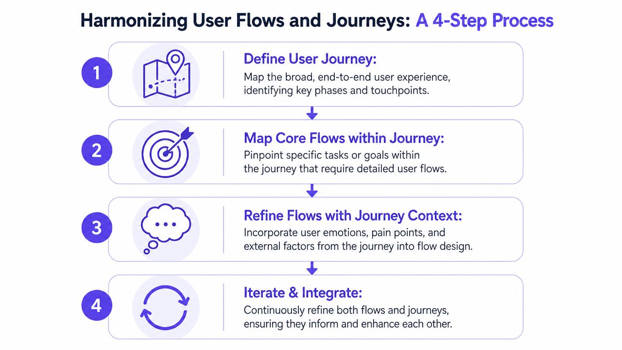
A working process
Step 1. Map the broader journey.
Identify the major stages from awareness to ongoing use
Capture the touchpoints where users enter, leave, hesitate, or ask for help
Note the emotional signals, especially uncertainty, trust, confusion, and relief
Step 2. Choose the moments worth zooming into.
Find the journey stages with the highest friction or ambiguity
Isolate the task inside that stage that needs detailed design
Name the user goal in plain language, such as “complete account setup” or “freeze a card”
Step 3. Build the flow around that task.
Define the entry point and desired exit state
Map the happy path, then add branches, failures, and permission states
Make the system behavior explicit so engineering and QA can work from the same source
Step 4. Reconcile the flow back to the journey.
Check whether the flow resolves the emotional friction seen in the journey
Validate that transitions into and out of the task still make sense across channels
Update both artifacts when new learning appears
What good teams do differently
They don't treat the journey as a workshop poster and the flow as a separate deliverable.
They treat them as nested maps.
That mental model helps. The journey explains why a moment matters. The flow operationalizes that moment. If you're refining how people move through key product tasks, optimize user experience flows with that hierarchy in mind and the decisions get much cleaner.
What a Truly Buildable User Flow Looks Like
A buildable user flow is detailed enough that engineering, QA, and design all infer the same product behavior.
That's where most diagrams fall short. They show happy-path movement between screens and hide the states that usually create bugs. A flow becomes buildable when it includes logic, system responses, and user conditions that affect what happens next.
A good reference point is the Wise card freeze flow in the Figr gallery. It works because the task is narrow, the user intent is clear, and the flow naturally exposes branches the team has to respect. Can the card be unfrozen later? What confirmation appears? What if the network call stalls? What if the card is already blocked for another reason?
The anatomy of a buildable flow
Here's what I look for when reviewing one:
Start conditions: Where the user enters and what account or product state they're already in
Decision logic: Choices, permissions, validations, and dependencies
System states: Loading, success, failure, disabled, empty, pending
Content requirements: What labels, guidance, warnings, or confirmations appear
Exit conditions: What the user sees next and what data state has changed
The difference is subtle until it isn't. A vague flow invites follow-up meetings. A buildable flow reduces them.
Review heuristic: If QA can derive test cases directly from the flow, the artifact is probably mature enough for handoff.
How to validate the flow before build
You don't need a huge research ritual for every flow, but you do need structured questions.
One practical resource is this set of essential user study questions for usability sessions. It's useful when you want to probe where a task feels unclear, risky, or incomplete before engineers commit to implementation.
A short walkthrough also helps teams spot assumptions in motion:
When the flow is real, handoff gets calmer. Designers stop carrying hidden assumptions in their heads, and engineers stop discovering product rules during implementation.
How AI Is Redefining Flow and Journey Mapping
AI is changing mapping by turning static artifacts into living models tied to the product that exists.
For years, teams created journey maps in workshops and flow diagrams in design files, then watched both drift away from reality. The product changed. The maps didn't. That gap is now one of the biggest reasons documentation stops being trusted.
Slickplan's discussion of user journey vs user flow captures the tension well: the industry standard of static mapping is increasingly misaligned with how modern product teams operate, who need to maintain alignment between flow logic and journey emotion as user behavior shifts weekly.
What changes when the map stays connected to reality
When AI works from real product context, mapping becomes less about drawing and more about reasoning.
Teams can ground flow logic in current screens, product behavior, research notes, and analytics instead of reconstructing everything manually. That matters because edge cases rarely emerge from imagination alone. They emerge from seeing how real systems behave.
A similar pattern shows up outside software tooling. In healthcare, for example, AI-driven healthcare journey strategies are useful to study because they force organizations to connect fragmented touchpoints into one coherent experience rather than optimizing isolated interactions.
What to watch for
AI helps most when it reduces document drift and preserves context between decisions.
It helps less when it generates pretty but disconnected outputs. If the tool doesn't understand your existing product, your design system, your research, and your actual user behavior, the artifact may look polished while still being misaligned.
That's why I'd evaluate any mapping workflow with one question: does it reflect the live product, or just a prompt?
If you're thinking through where AI fits into product design work more broadly, AI strategies for product teams is a useful next read.
Where teams still go wrong in practice
Most mistakes happen in the seam between strategy and execution.
A journey exists in one deck. A flow exists in one file. Support pain lives in another tool. Analytics sits elsewhere. Then a Product Manager asks for “the onboarding experience” and every function answers from a different slice of reality. Sound familiar?
The recurring failure patterns
I keep seeing the same ones:
The journey is too abstract
It names phases and feelings
It doesn't identify which tasks need design intervention
Teams leave the workshop aligned but not actionable
The flow is too narrow
It maps the in-product path well
It ignores what happened before entry and after completion
Teams improve micro-logic while the surrounding experience keeps leaking trust
The artifact freezes at handoff
Nobody updates the map when product behavior changes
New branches appear during implementation
The document becomes historical instead of operational
A better operating habit
Treat every major user problem as a pair: one journey moment, one flow problem.
For example, “new users hesitate before setup” is a journey problem. “users get stuck choosing an import method” is the flow problem inside it. Framing work this way keeps the strategic story tied to a concrete build target.
You can also keep adjacent artifacts connected. If you're defining the structure around a feature, information architecture outputs help bridge navigation decisions with the flow details teams need later.
A practical workflow for Product Managers and Designers
Product Managers and Designers need one shared operating model, or they'll keep producing different truths.
I'd keep the workflow light, but strict enough to prevent ambiguity.
The weekly rhythm that tends to work
Step 1. Name the journey stage.
Write the stage in user language, such as evaluation, first setup, first success, or support recovery
Add the user's main concern in that stage
Keep it short enough to survive a planning meeting
Step 2. Identify the critical task.
Choose the single task inside that stage that most affects progression
Avoid broad labels like “onboarding”
Use a clear task statement, such as “connect calendar” or “freeze card”
Step 3. Map the flow with edge cases.
Define entry, branches, system states, and exit
Include blockers and recovery paths
Make the artifact detailed enough for QA and engineering
Step 4. Validate against the journey.
Ask whether the flow reduces the friction seen in the broader stage
Review transitions before and after the task
Update the journey if the task reveals a deeper issue
The handoff test
If a Product Manager, Designer, engineer, and QA lead can each explain the same user problem in the same words after reviewing the artifact, you're in good shape.
If each function describes a different problem, the mapping is still fragmented.
For teams building or documenting those task-level artifacts, user flow outputs and map user flow actions are the kinds of formats worth studying because they keep the work anchored in actual product movement rather than abstract labels.
The Five Layers of Context a Modern Map Needs
A modern mapping system needs context deeper than screens, and Figr's Visual Context Graph is useful precisely because it names those layers clearly.
Static flowcharts usually stop at visible interaction. Real products don't. They carry design rules, business logic, historical decisions, implementation constraints, and user behavior that shape every path. When those layers are missing, teams get generic maps that look plausible but don't belong to the product.
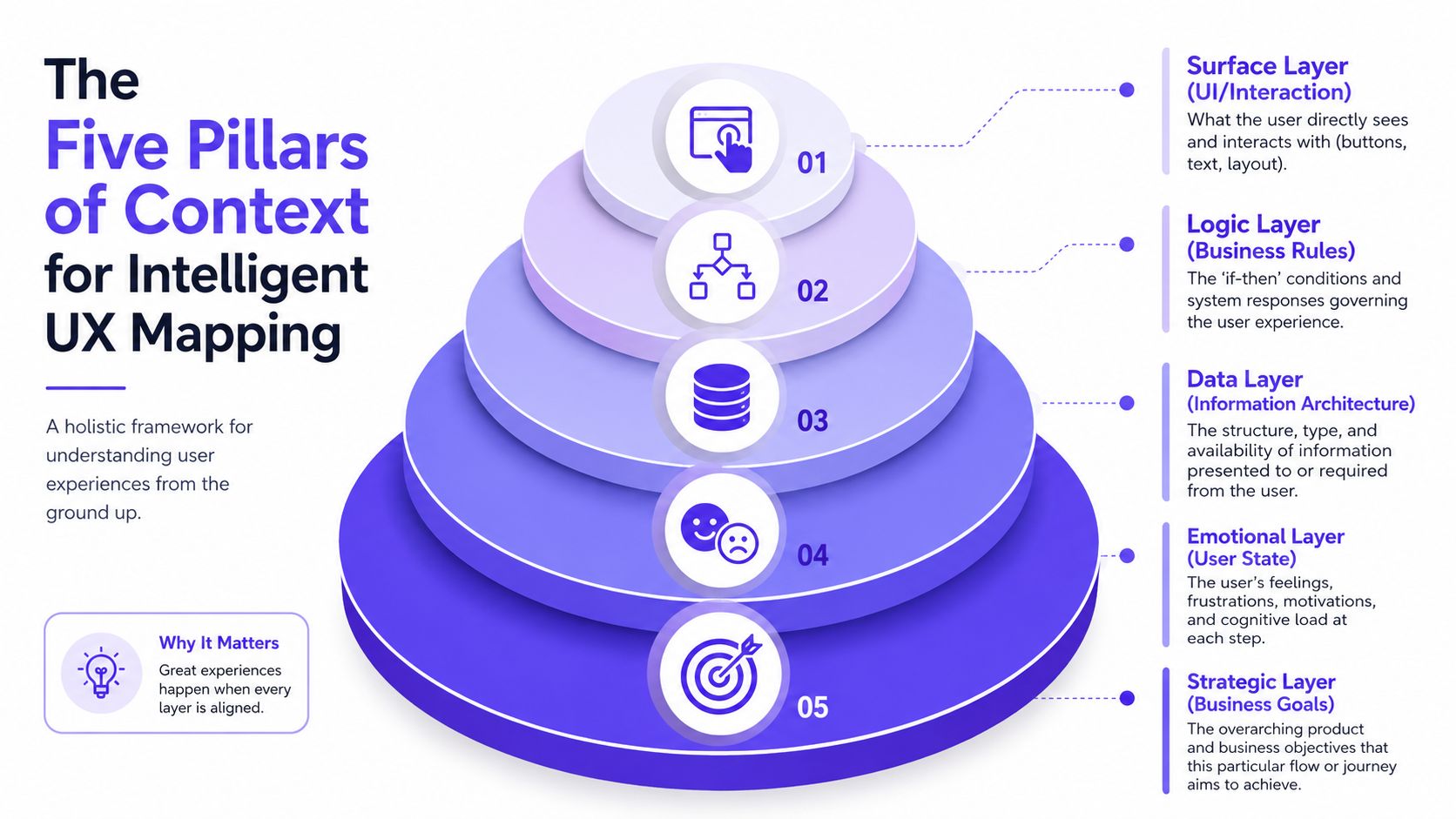
The five layers
Visual context
Current screens, interaction patterns, layout expectations
The visible language users already know
Behavioral context
Flow logic, state changes, branches, edge cases
The product behavior that determines what happens next
Design system context
Tokens, components, variants, states, usage rules
The consistency layer that keeps outputs Figma-ready and aligned
Product knowledge context
PRDs, research, strategy notes, prior decisions
The reasoning behind why the product works the way it does
Implementation context
Technical constraints, existing structures, practical handoff realities
The layer that keeps ideas grounded in what teams can ship
Why this matters in practice
When these layers stay connected, the map becomes far more than documentation.
It becomes a working model of the product.
That's the shift many teams need. Instead of rebuilding context every time a new feature starts, they can reason from existing product memory. Instead of inventing a fresh diagram for every handoff, they can extend a living system that reflects the product as it evolves. A broader set of examples in the Figr gallery shows what that looks like across different product surfaces.
If your team keeps debating whether a diagram is a journey or a flow, the underlying problem is usually shared context. Figr approaches that problem by grounding UX work in the actual product, from live screens and Figma files to design systems, docs, and behavior. If you want to see what that looks like in practice, you can try Figr.
The distinction between user flow and user journey becomes simple once you respect the altitude of each map. The journey shows the broader experience across time and touchpoints. The flow defines the exact task logic inside the product.
Teams get into trouble when they substitute one for the other. They either produce strategic maps no one can build from, or they ship polished flows that never address the underlying source of friction. The fix is to pair them deliberately, keep them current, and treat them as connected artifacts rather than separate exercises.
I've found that one small habit changes a lot: before kickoff, ask whether the team is discussing a journey problem or a flow problem. That single question prevents hours of ambiguity later.
If you want a next step, audit one live feature this week. Map the surrounding journey stage, then redraw the actual flow with edge cases and system states. You'll almost always find at least one gap worth fixing. If you want help operationalizing that process, explore user flow solutions.
FAQ
When should I use a user flow instead of a user journey?
I use a user flow when the team needs to design or build one specific task. I use a journey when we're trying to understand where friction starts across the broader experience.
Which comes first, the user journey or the user flow?
I'd start with the journey in most cases because it helps prioritize the right problem. Then I'd zoom into the flow for the task-level design and handoff work.
Can a product team ship with only user flows?
It can, but I wouldn't recommend it for anything meaningful. You'll likely miss cross-channel friction, emotional hesitation, and transition problems around the task itself.
What makes a user flow buildable?
For me, it needs entry points, decisions, system states, edge cases, and clear exits. If QA and engineering can't work from it directly, it still needs refinement.
How do I keep journeys and flows from going stale?
I'd tie them to real product changes, analytics, support signals, and review rituals. Static maps age fast, so the upkeep has to be part of the workflow, not an afterthought.