

Six people are looking at the same pricing page, and the comments arrive in a familiar order: the button feels heavy, the spacing looks off, someone wants to see the other blue. None of the comments names a user, a task or a goal. That's the failure mode of the design critique many teams run, where the meeting is real but the criteria are missing.
Nothing gets decided, so the designer rebuilds the page twice, and the same six comments return next sprint with new wording. Meanwhile the issues that block people, a focus ring you can't see and a label that vanishes once the field fills, wait for an accessibility audit after the code ships, when a fix costs engineering days instead of a design hour.
The correction is to treat each critique comment as a decision record. It names the user goal affected, the evidence behind it and the decision it should inform. What follows is how to run a session that produces those records: the roles, the testable criteria, the ways to choose between competing designs, and the metrics that tell you afterwards whether the change worked.
What a Design Critique Is and Why Teams Run One
A design critique is a structured session where peers examine a design against an agreed goal and leave with ranked, actionable feedback. That definition separates it from the meeting many teams hold, where whoever speaks with the most conviction sets the direction and the designer leaves with a list of preferences.
Say a checkout screen goes in front of five colleagues on a Friday. The comments are specific but unanchored: the button feels heavy, the summary block is busy, the top spacing is off. Nobody states which user goal the checkout serves this quarter, so nobody can rank the comments. The designer rebuilds twice, and by the second rebuild the original reasoning is gone. The cost isn't the two days of work. It's that the team can no longer explain why the screen looks the way it does.

A critique is one of four reviews a design passes through, and each answers a different question. Treating them as substitutes is where teams get into trouble.
| Review Type | Core Question | Who Attends | Typical Output |
|---|---|---|---|
| Design critique | Does this design serve the user goal well? | Designer, PM, engineer, peers | Ranked, actionable feedback and next steps |
| Stakeholder review | Does this meet the brief and business needs? | Leadership, product owner | Approval or change request |
| Usability test | Can real users complete the task? | Researcher, participants, observers | Observed failure points and task success data |
| Accessibility audit | Does this meet WCAG success criteria? | Accessibility specialist, QA | Pass or fail findings tied to specific criteria |
Rely on only one of these and you inherit its blind spot. A critique without a usability test is expert opinion about real users. A usability test without a critique ships a working flow that nobody on the team can defend in a design review six months later.
Here's the test I'd apply to any comment in the room: can the person making it name the user goal it affects? If not, the comment belongs in a stakeholder review, a brand conversation or a separate thread. A critique that accepts unanchored comments stops being a critique within two sessions.
Criteria That Turn Taste Into Testable Checks
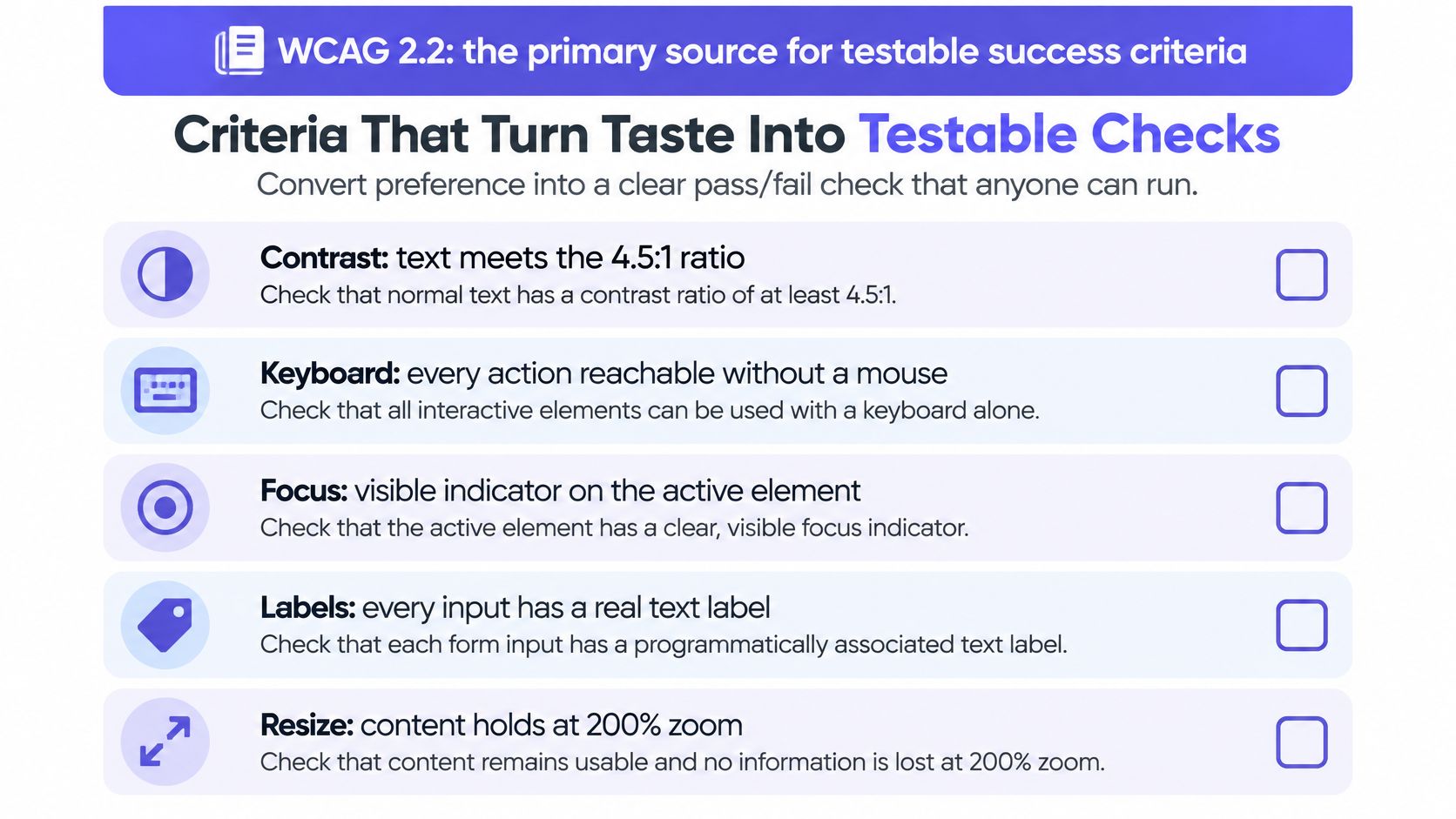
A note you can act on sounds different from a note you can only agree with. The difference is evidence. A useful critique comment turns a preference into a check that someone else can run without you in the room.
The strongest public source of those checks is the Web Content Accessibility Guidelines (WCAG) 2.2, which defines its success criteria as testable statements suitable for design specifications and conformance testing, organized into A, AA and AAA levels. That structure is exactly what a critique needs: a statement you can pass or fail, not a matter of taste.
The thresholds worth recording
| Check | WCAG 2.2 Threshold | What to Record |
|---|---|---|
| Normal text contrast | At least 4.5:1 | Token name, foreground and background colors, calculated ratio |
| Large text contrast | At least 3:1 for 18 pt text or 14 pt bold text | Font size, weight, calculated ratio |
| Non-text UI component contrast | At least 3:1 against adjacent colors | Component name, state, adjacent color |
| Focus indicator (AAA, SC 2.4.13) | Contrast of at least 3:1 and area of at least 2 CSS px perimeter | Each interactive state, not only the default screen |
WCAG defines large text by size and weight, so confirm the size before you pick the threshold. Getting that wrong in a critique is how a legitimate finding gets dismissed as a nitpick.
An illustrative finding: a grey placeholder token on a white field measures 2.9:1. The comment that follows records the token name, the foreground and background values, the calculated ratio, and the replacement token that clears 4.5:1. Whoever picks it up next doesn't have to re-derive the math or argue about the shade. Contrast, focus and labels are the measurable end of UX design fundamentals, and the fundamentals are what make the measurement worth anything.
Why focus needs its own review
A focus ring can technically exist and still be unusable. WCAG 2.2 specifies measurable focus-indicator requirements, including area and a 3:1 contrast relationship in applicable cases, because a faint ring turns a keyboard-operable flow into a keyboard-theoretical one. Review every interactive state, not just the default screen: hover, focus, error, disabled and the state after a failed submit.
Compliance isn't the whole judgment, either. A study of 10 designers from five Global South countries, published in the ACM Digital Library, found that accessibility guidance can conflict with local preferences around typography, color, whitespace and client expectations. A screen can clear every threshold and still read as wrong to the people using it, which is why the review needs someone who knows the market in the room.
Put these fields in the critique template and in your design system's component acceptance criteria, and outcomes become repeatable across screens and release candidates instead of depending on who showed up.
How to Set Up and Run a Critique Session
The session works when the room knows what it's looking at and what kind of help the presenter wants. This write-up of critique and feedback process makes the point cleanly: a critique is most effective when it evaluates work against an agreed goal rather than personal taste.
Roles that keep a session honest
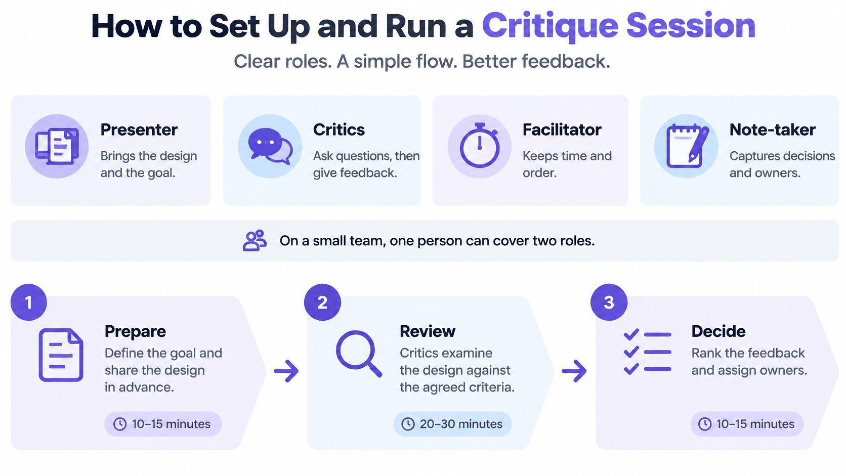
Four roles do the work, and on a small team one person can hold two of them.
- Presenter. Brings the design, the user goal and a specific request for help, such as reviewing a flow, checking hierarchy or examining the content.
- Critics. Ask questions before offering opinions, and tie each observation to a goal, a principle or a measurement.
- Facilitator. Keeps time, stops drift into redesign, and makes sure quiet people speak before senior ones do.
- Note-taker. Captures decisions, open questions and owners. Not a transcript. A record.
The three phases
- Step 1. Prepare.
Define who attends, which design is in scope and which outcome is under review. Share the work a day ahead so critics arrive with structural questions instead of first impressions. - Step 2. Review.
The presenter asks for one kind of help. Critics respond to that request, not to whatever else catches their eye. The facilitator parks off-topic points in a visible list so people feel heard without derailing the hour. - Step 3. Decide.
End with what will change, what stays open and who owns each follow-up. The note-taker circulates it within a day, while the reasoning is still fresh.
A 60-minute shape that works: 5 minutes of context from the presenter, 35 minutes of critique, 10 minutes of decisions, 10 minutes of buffer for the conversation that always runs long.
The failure case is predictable. A session with no stated question becomes a debate about color, the loudest person wins, and the team leaves without a decision. Then the same comments return in the next review, which is exactly what happens when follow-up isn't traceable.
Choosing a Direction When Several Designs Compete
A vote tells you what the team likes. It doesn't tell you whether the design works. The Google Ventures design sprint turns that distinction into a sequence, described in Zapier's walkthrough of the sprint critique: sketches go up together in an art museum, dot stickers mark promising details in a heat map, then a speed critique of about three minutes per solution, a straw poll of roughly ten minutes, and a supervote worth three votes for the designated Decider.
| Method | Time Box | What It Decides | Limit |
|---|---|---|---|
| Art museum | Set up before the session | Which sketches the team examines | Shows no preference yet |
| Heat-map dot voting | Quick, individual | Which details the team finds promising | Preference is not validation |
| Speed critique | About 3 minutes per solution | Strengths and concerns for each concept | Shallow coverage of each concept |
| Straw poll | About 10 minutes | The group's leaning | Advisory only |
| Decider supervote | Final call with three votes | One chosen direction | Needs user testing to confirm it works |
The mechanism that saves this from committee design is the Decider. The straw poll is advisory rather than binding, and the Decider makes the final call so the group leaves with an outcome instead of an unresolved debate. In short, the vote narrows the field and the Decider closes it.
A hypothetical run: three onboarding concepts, one afternoon, clusters of dots landing on the progress indicator in concept B. The Decider picks B and the next step is a five-participant test of that concept, not another vote.
The boundary matters. When the top two concepts are close and the risk is high, the Decider should fund tests for both rather than call for a tiebreaker. Before you commit engineering time, it pays to validate design choices before committing, because a room's enthusiasm is cheap evidence and a user's completed task is not.
Giving and Receiving Feedback That Gets Acted On
"Feels off, make it cleaner." The designer can't act on that. There's no target, no diagnosis and no way to tell whether the fix worked, so the comment usually produces a small arbitrary change and a follow-up round.
The pattern that works has three parts: observation, user impact, suggestion or question. Here's the rewrite: "The primary button sits below the fold on a 375 px phone, so a new user may miss the next step. Could we test moving it above the summary?"
Habits for the person giving feedback
- Describe before you judge. Say what you see on the screen, then say what worries you about it.
- Name the user and the goal. "A first-time admin" beats "a user". Specificity changes the fix.
- Label taste as taste. If it's a preference about weight or color, say so. That lets the designer weigh it correctly.
- Propose a test instead of a verdict. A question like "could we try this with five people" resolves more than a strong opinion.
Habits for the person receiving it
- Ask what problem the reviewer saw. The stated fix is rarely the underlying issue, and the issue is the useful part.
- Sort every comment into act, test or reject. Three buckets, decided in the room, written down after it.
- Reply with decisions in the thread. A short note on what changed, what's being tested and what's being dropped with a reason closes the loop.
Practical rule: the reviewer describes the problem, the designer owns the solution. Reverse those and the session becomes design by committee.
A hypothetical eight-comment review ends with two acted on, one sent to testing and five rejected with a written reason. That isn't defensiveness. It's what keeps the next critique focused on the three things that still matter. A receiver who defends every choice kills the flow of comments, and reviewers stop offering them, which is a much quieter failure than a bad build. For a fuller version of these habits aimed at product managers, this PM guide to design feedback covers how to frame a request so designers can act on it.
Where AI Fits in Design Critique
AI feedback on a design is a hypothesis generator, not a verdict. Treating it as one of the reviewers is where teams get hurt, and the evidence for that is getting harder to ignore.
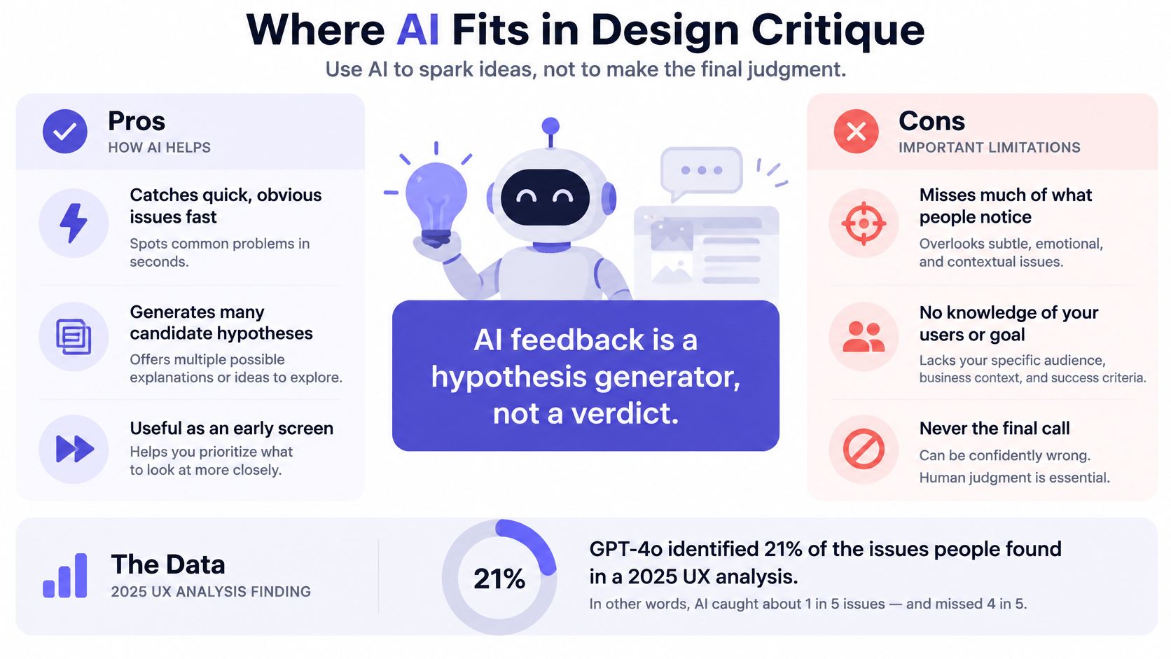
A 2025 study reported in UX Army's analysis of AI and user testing found that GPT-4o identified only 21% of the usability issues human experts found, and produced false positives alongside them. Research on AI interface tools in the same analysis found that these systems can reproduce accessible patterns but struggle when a context calls for a deliberate departure from standard rules.
A model that reproduces conventions well is least reliable exactly where design judgment matters most.
The same work reports something more useful. A multi-perspective critique produced competing viewpoints that participants found more convincing and realistic than a single unified critic, which generated cleaner but more generic advice. Participants also described a full critique cycle, from internal review through cross-functional alignment, as taking about five hours. The basic gist is this: the bottleneck was never the first pass of comments.
Validation rules for AI-assisted reviews
- Label confidence. Each AI finding carries a level: clear defect, likely issue, speculative.
- Require a human confirmation. No AI finding becomes a change request until a designer or researcher has checked it against the product context.
- Escalate conflicts to users. When AI and the team disagree and both arguments hold, run a test rather than settle it in the room.
- Rank by repair value. Score findings by whether they lead to a decision someone can make, not by volume.
An illustrative case: an AI pass flags 12 issues, a human confirms 4, and user testing shows 2 matter. That's a good outcome because it saved reviewer attention and preserved judgment. The premise hasn't changed, and it's why designers still review, refine, and apply judgment before anything ships. It's also why Figr surfaces the questions it needs answered and the assumptions it is making before design work continues, rather than issuing verdicts. If faster feedback arrives unranked, it doesn't reduce rework; it multiplies it. The practical use of AI here is catching UX issues before the meeting so the humans spend their hour on the problems only they can settle.
Design Critique Questions Readers Ask
These come up most often in working sessions, and the short answer usually resolves them.
How often should a team run a design critique?
Weekly for active work, plus one per milestone. Tie the cadence to your release cycle rather than the calendar: a team shipping fortnightly needs a session mid-cycle, while a quarterly release only needs a formal review at the point changes are still cheap. A session held after the code is written isn't a critique, it's a notification.
How many people should attend?
Keep the group small enough that every critic speaks, roughly three to six plus the presenter and facilitator. One person can cover two roles on a small team, so the note-taker might also be a critic. Invite the engineer when feasibility is in question, and leave out anyone whose only contribution would be rank.
Is a design critique the same as usability testing?
No. A critique judges a design against a goal using expert reasoning, while a usability test observes real people completing tasks. They answer different questions, which is why a team should run both. A critique finds problems before the build. A test tells you whether the built thing works. Confusing the two leads teams to over-trust the room.
What should a critique produce?
Ranked, actionable comments, each tied to a user goal, plus a logged decision and an owner for every follow-up. Add what stays open, so the next session has a starting point. If the output is a list of opinions with no ranking, the session didn't produce a decision, and the same conversation will repeat.
Can AI replace a human critic?
No. AI works well as an early pass that surfaces obvious issues before the meeting, and it can imitate several viewpoints at once. It can't observe a real user, weigh a business trade-off, or recognize when a standard pattern is wrong for this product. Use it as a first pass with a human gate.
How do I stop critiques from becoming debates about taste?
State the question before the meeting and have the presenter name the kind of help they need. Then attach a criterion to every comment: a goal, a threshold or a user observation. When a comment has no criterion, the facilitator should ask what user problem it points to and park it if the answer isn't there.
Measure Your Next Critique Before You Ship
A critique that ends in approval has measured nothing. The useful version connects an observation to an outcome, which is what Google's HEART framework is built for: Happiness, Engagement, Adoption, Retention and Task Success, with product goals mapped to specific metrics before design work starts.
Take a hypothetical onboarding form. Simplifying it should reduce cognitive and interaction load, so reviewers should look at task completion rate, time to completion, validation-error frequency and subsequent activation. Reviewer approval isn't on that list, because approval doesn't tell you whether the change helped.
The chain to write down
Proposed change, expected behavior change, measurable outcome, decision threshold. Four links, no gaps. A critique that can't fill in the third link is asking the team to spend a sprint on a feeling.
Separate leading indicators, such as click-through or successful task completion, from lagging indicators, such as retention. This is the guard against shipping a change that lifts a local interaction metric while hurting longer-term value. A prettier onboarding screen that boosts button taps and drops week-eight retention is a loss dressed as a win.
Five fields every recommendation needs
- Affected user goal. Which task this changes and for whom.
- Baseline measurement. The current number, with its source and date.
- Target segment. New users, admins, mobile visitors, whichever group the change touches.
- Test method. Experiment, usability test or instrumented rollout.
- Instrumentation. The event or query that will show the result.
Illustrative numbers: onboarding task completion sits at 62%, the recommendation targets 75%, and the team agrees in advance that anything below 68% triggers a rollback. Now the critique has a decision threshold, and the next review starts with data instead of preference.
Zoom out and this is why the pattern compounds. Each team defends its own taste, each unmeasured preference becomes precedent, and a product with forty shipped opinions and no baselines is a product nobody can improve deliberately. Unmeasured preferences get cheaper to keep and more expensive to undo. For the measurement side in more depth, Figr's take on UX metrics covers which numbers survive contact with a real roadmap.
Before your next critique, write one recommendation per design using those five fields, and agree on the number that would change your mind.
Design critique gets easier when the evidence already exists before the meeting starts. Figr analyzes your flows from a live capture, a Figma file or a screen recording, runs accessibility checks against your own design system, and surfaces the assumptions behind a direction so the room can argue about the right things. Take your next review into Figr at Figr and walk in with findings instead of first impressions.