A Product Manager once told a Designer, “can you make it feel more premium,” and the room went quiet because everyone knew more work had just been created, but nobody knew what work.
That kind of feedback slows the team in a very specific way: the Designer starts guessing, stakeholders pile on opinions, and the original product question disappears under color tweaks, alignment comments, and relitigation of decisions that were never framed clearly in the first place.
The fix is better context, not louder critique, and that's where a system grounded in real product inputs helps. Figr connects the design conversation back to product reality through its Visual Context Graph, pulling together screens, flows, design system context, written decisions, and implementation constraints so feedback starts from what the product is trying to do, not from whatever catches the eye in a review.
Why Most Design Feedback Fails
Most design feedback fails because it reacts to the artifact without naming the problem underneath it.
Last week I watched a Product Manager leave comments across a flow that said “clean this up,” “make this stronger,” and “not sure this is working.” None of it was hostile. All of it was useless. The Designer had no clear priority, no user context, and no way to tell whether the Product Manager was pointing to a business risk, a usability issue, or a personal preference.
That pattern is more prevalent than often acknowledged. Approximately 70% of design feedback is considered ineffective due to vagueness, lack of context, or misalignment with project goals, and it leads to 3.5× more revision cycles, according to Atlassian's 2023 research on improving team design feedback.
The real failure mode is missing craft
Bad feedback rarely comes from bad intent. It usually comes from a Product Manager trying to move fast with an underdeveloped language for design review.
A lot of Product Managers have a strong grasp of the product, know the market, and know the customer pain. Then the review starts, and that knowledge gets compressed into vague comments like:
“Make it pop” because something feels weak
“This looks busy” without saying what user task is being crowded out
“Can we modernize this?” without tying the request to trust, clarity, or conversion friction
“I don't love this layout” when the underlying issue is decision fatigue
The team hears surface commentary. The Designer has to reverse engineer intent.
Practical rule: If a Designer has to guess what problem you mean, you haven't given feedback yet. You've handed over interpretation work.
Vague feedback creates organizational drag
This matters beyond one awkward review. When design feedback is loose, teams lose their decision trail. Engineering gets handoffs shaped by unresolved debate. QA tests screens that still carry hidden disagreements. Stakeholders keep reopening old questions because nobody can see the logic that closed them.
That's why the keyword phrase how to give design feedback PM matters more than it looks. It sounds tactical, but it's really about how a Product Manager creates decision quality inside the product process.
The basic gist is this: weak feedback turns design into a taste contest, while strong feedback turns design review into diagnosis.
And diagnosis is faster.
How to Shift from Pixels to Problems
The fastest way to improve design feedback is to stop commenting on appearance first and start naming the user problem.
That shift sounds small, but it changes the entire conversation. In A PM's Guide to Working with Designers featuring Yuhki Yamashige from Figma, the advice is direct: Product Managers should stop talking metrics and start talking about users, framing concerns around what users will do. That's a better review language because Designers can solve for behavior far more effectively than they can solve for taste.
What pixel feedback sounds like
Pixel feedback usually arrives as a prescription:
“Make the button bigger”
“Use a brighter color”
“Move this card up”
“Try a different icon”
Sometimes those suggestions are fine. The issue is that they jump to a solution before the team agrees on the problem. Is the action being missed? Is the hierarchy weak? Is the label unclear? Is the page overloaded for a first-time user?
You don't want to skip that step.
What problem feedback sounds like
Problem feedback gives the Designer a constraint and a goal.
Instead of “make the button bigger,” say:
- “The primary action doesn't stand out enough for a first-time user scanning this page.”
Instead of “use less text,” say:
- “The explanation is doing too much work before the user has decided whether this feature matters to them.”
Instead of “this feels cluttered,” say:
- “The supporting content is competing with the main decision, and I'm worried users won't know what to do first.”
That's the language of intent.
It also builds a better partnership. If you care about stronger critical thinking in the AI era, this is the same muscle: separating signal from reaction, naming the actual issue, and resisting the urge to mistake confidence for clarity.
Good design feedback gives the Designer room to solve. It doesn't narrow the path too early.
This shift makes collaboration less defensive
When Product Managers prescribe visuals, Designers often hear, “you're being art directed by someone who hasn't shown the reasoning.” When Product Managers describe user friction, Designers hear a product problem worth solving.
That difference is huge.
If you want a broader operating model for this relationship, Figr has a useful piece on PM-designer collaboration in the AI era. The same principle shows up there too: shared context creates better decisions than stronger opinions.
And yes, this applies directly to how to give design feedback PM in practice. The better question isn't “what should change on this screen?” It's “what user outcome is this screen failing to support?”
What Makes Feedback Actionable vs Ambiguous
Actionable feedback gives a Designer a clear issue, a reason it matters, and enough context to respond without guessing.
Ambiguous feedback usually arrives dressed as taste, tone, or instinct. It feels expressive in the moment. It creates cleanup work later.
Side by side examples that actually help
Here's what I mean.
"Can we make this cleaner?" becomes "The page asks the user to process too many choices before they understand the main action."
"This doesn't feel modern." becomes "The visual hierarchy makes key information hard to scan, which hurts trust and speed."
"Make it pop." becomes "The primary action needs more prominence than the secondary links."
"I don't like this section." becomes "I'm not clear what user question this section is answering or why it appears at this point in the flow."
"Can we simplify?" becomes "The user is being asked to decide before they have enough context, and that creates hesitation."
The difference isn't word count. It's diagnostic precision.
The traps Product Managers fall into
A Product Manager often sees a real issue and names it in a fuzzy way. That's normal. The fix is to translate the instinct before you hit comment.
Common traps include:
Using aesthetic adjectives
Words like “clean,” “sharp,” and “premium” can be useful internally, but they're weak review language unless attached to a product outcome.Combining conflicting goals
“Add more detail, but keep it simple” is a classic way to create churn.Turning preference into authority
“I prefer this style” can be honest, but it's not a product argument on its own.Skipping the user moment
Feedback gets much clearer when you anchor it to a task, a hesitation point, or a likely misunderstanding.
A simple translation pattern
When you feel a vague comment coming, rewrite it with three parts:
Observed issue
What seems hard, confusing, buried, or overemphasized?Likely user effect
What might the user misunderstand, miss, or delay?Decision context
Is this a blocker, a risk, or an advisory suggestion?
Ambiguous comments tell Designers what bothered you. Actionable comments tell them what needs to work better.
That distinction keeps the review grounded. It also makes it easier for the Designer to push back productively, because now the conversation is about evidence, trade-offs, and intent instead of whether someone “likes” the screen.
A Practical Framework for Written Feedback
Written feedback works best when it follows a repeatable structure that separates observation from judgment.
The most useful async pattern I've seen is built around the Situation-Behavior-Impact model. The core idea is simple: describe the situation, point to the specific behavior in the design, and explain the user impact. That's the framing recommended in this guide to constructive feedback for Designers.
A checklist helps because async comments tend to drift when people are busy.
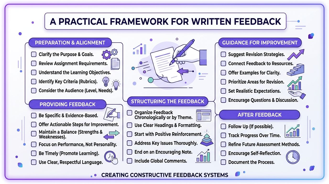
The async template I'd use
Step 1. Start with the product moment.
Name where the user is in the flow and what they're trying to do.
Situation: “This screen appears right after account creation.”
User goal: “The user is trying to understand the next best action quickly.”
Step 2. Describe what the design is currently doing.
Point to the visible behavior, not your emotional reaction.
Behavior: “The supporting cards have similar visual weight to the primary action.”
Avoid: comments like “feels messy” or “not strong enough”
Step 3. Explain the consequence.
Tie the issue to confusion, delay, trust, or task completion.
Impact: “A first-time user may scan the page and miss the main next step.”
Priority: mark whether this is blocking or advisory
Step 4. Ask a question before prescribing a fix.
Questions keep the review collaborative.
Helpful: “How might we increase the prominence of the primary action?”
Less helpful: “Make the button blue and 20% larger”
A short walkthrough makes this easier to internalize.
A sample comment that travels well
You can write async feedback in a compact format like this:
Blocker
Situation: Returning users on the billing page are deciding whether to upgrade
Behavior: The downgrade and upgrade actions sit close together with similar emphasis
Impact: Users may hesitate because the page doesn't make the recommended path obvious
Question: Can we make the intended path clearer without hiding the alternative?
That format scales well across Slack, Figma comments, docs, and tickets.
If your team uses AI support for artifact creation, a tool can help pre-structure review notes, summarize flows, or pull relevant context from PRDs. The useful part isn't automation by itself. It's reducing blank-page feedback so comments begin with shared context rather than fresh opinion.
Navigating Sync vs Async Feedback Sessions
Sync and async feedback serve different jobs, and teams get in trouble when they use one as a substitute for the other.
Sync sessions are for alignment, trade-offs, and decision-making under uncertainty. Async feedback is better for precise reactions, documentation, and comments that benefit from reflection. When Product Managers blur those modes, reviews become crowded and contradictory.
Use sync for judgment calls, not line edits
A live review is useful when the team needs to answer questions like:
What's the core user risk in this flow?
Which trade-off matters more right now, clarity or speed?
Is this issue blocking the release, or can it ship with follow-up learning?
That's where conversation matters. People can surface assumptions, check constraints, and leave with a real decision.
What sync is bad at is detailed markup from a large audience. The more voices in the room, the easier it is for the team to drift into design by committee. According to McKinsey's report on the business value of design, 78% of Product Managers who failed to limit feedback to key stakeholders generated conflicting input, leading to 3.2× more rework and a 37% increase in QA case failures.
That pattern is painfully familiar, isn't it?
Use async for specificity and traceability
Async feedback shines when a screen or flow is mature enough for targeted review. The Designer can read the comments in order, compare them against the file, and respond with changes or trade-offs. There's also a written trail, which matters later when someone asks why a decision was made.
A simple decision rule helps:
When the team is split on the problem, use sync. When the problem is clear and details need review, use async.
When constraints need discussion, use sync. When comments need precision, use async.
When priorities are still moving, use sync. When the direction is mostly stable, use async.
When stakeholder alignment is the goal, use sync. When documentation is the goal, use async.
Keep live reviews small enough that responsibility stays visible.
If your team is struggling with review sprawl, Figr's design review guide offers a practical way to structure stakeholder input without turning every review into a referendum.
The economic point matters here too. Every extra reviewer adds more than comments. They add interpretation cost, reconciliation work, and handoff risk. At scale, that becomes an operating tax on the product org.
How to Give Feedback on Complex User Flows
Feedback on complex flows has to evaluate logic, state changes, and edge cases, not just the beauty of individual screens.
Single-screen reviews are deceptive because they make design look static. Most product problems aren't static. They live in transitions: what happens after the user clicks, what changes after an error, how permissions alter the path, where a half-completed state creates confusion.
Review the journey, not the frame
A checkout flow, approval system, onboarding sequence, or billing change path can't be judged from one polished frame. The Product Manager needs to ask:
What does the user believe at each step?
Where can the flow branch?
What happens in empty, loading, error, or partially completed states?
Which decisions are reversible, and which carry risk?
Static comments often fail. A screen may look reasonable by itself and still create a broken experience in motion.
For teams trying to reason through multi-step paths, flowchart process examples are useful because they force the hidden states into view. That alone improves the quality of feedback.
The better comment is about logic
A weak flow comment says, “screen three feels off.”
A strong flow comment says:
“The user has to commit before seeing enough information.”
“The error path doesn't help them recover.”
“The success state doesn't clearly prepare them for what happens next.”
“This branch seems to assume prior knowledge that new users won't have.”
That's system-level feedback.
I've also found gallery-style walkthroughs helpful when the flow itself is the object under review. A checkout redesign, for example, becomes easier to discuss when you can trace state transitions and exception paths instead of debating isolated components. The Product Manager's role is to make the journey legible enough that the Designer can tune the right layer of the experience.
The Art of Debugging Constraints Not Designs
Great design feedback starts by asking what constraints produced the current solution.
Experienced Product Managers differentiate themselves. They don't look at a screen and immediately decide whether they like it. They ask what the Designer was optimizing for, what trade-off was accepted, and what limit shaped the result.
That posture changes the conversation from critique to investigation.
The three pillars behind useful feedback
A durable way to review design is to ground your thinking in user needs, business goals, and technical effort. That framing comes from this guide to giving Product Designers effective feedback, and it matters because it keeps personal preference out of the center of the room.
If a design feels weak, one of those pillars is usually under tension.
User needs
Is the design failing to support comprehension, trust, speed, or confidence?Business goals
Is the screen trying to satisfy a revenue, retention, or compliance requirement that creates friction?Technical effort
Did implementation constraints force a pattern that looks awkward but solves something real?
Ask better diagnostic questions
When I see a design that looks compromised, I'd rather ask these questions than start prescribing changes:
What constraint is carrying the most weight here?
What did we optimize for that the user may not see?
Which trade-off was intentional, and which one was accidental?
If we changed this, what would get harder for engineering or worse for the business?
A friend at a Series C company told me about a review where the Product Manager kept pushing for a cleaner settings page. The Designer finally explained that the page had to expose a legacy permission model that engineering couldn't safely abstract before launch. The issue wasn't weak design taste. It was unresolved product architecture.
That happens all the time.
Design artifacts are usually evidence of a compromise somewhere else in the system.
The zoom-out matters because product work is full of incentive collisions. Teams want speed, consistency, flexibility, and low risk at the same time. A Product Manager who only comments on the visible layer will miss the actual source of the problem. That's also why design-to-dev handoff best practices matter so much. A lot of “bad design” is really blurry handoff logic wearing a visual disguise.
Building a System for Context-Rich Feedback
Context-rich feedback gets easier when the team can see the same product reality from multiple angles.
Skill still matters, of course. But skill without context breaks down under deadlines, distributed teams, and evolving requirements. The Product Manager ends up reviewing a screen with half the story missing. The Designer has the file, engineering has the constraints, research has the pain points, analytics has the drop-offs, and nobody is holding the whole thing at once.
That's the condition that creates opinion-heavy feedback.
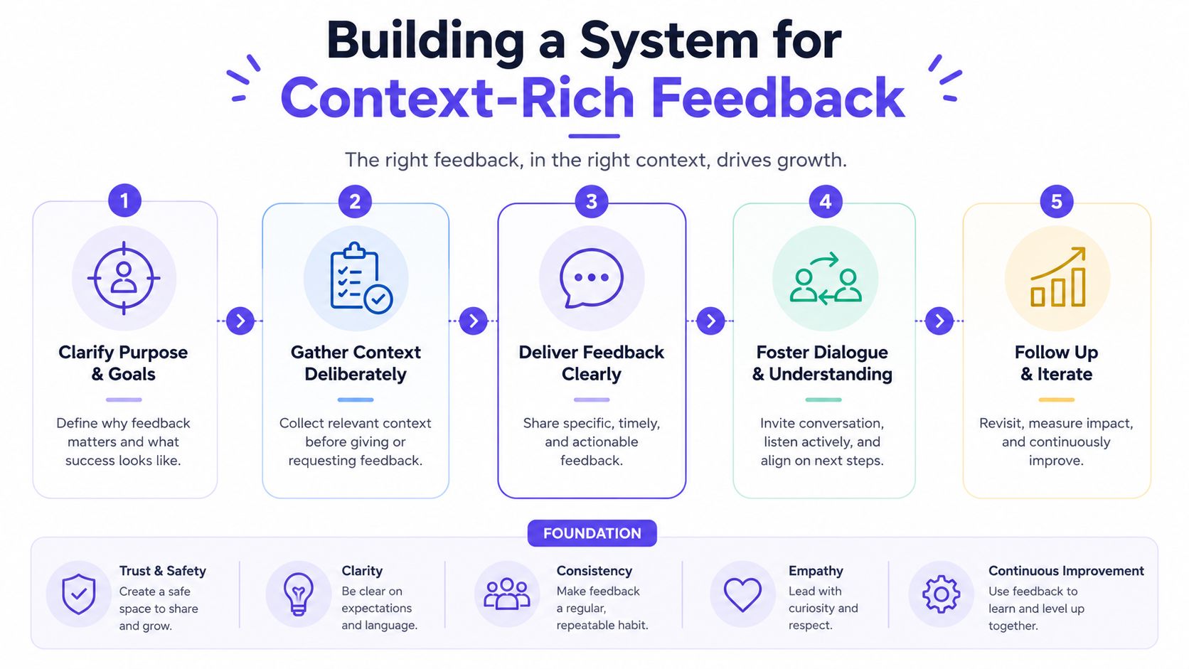
The five layers that matter
A useful review system should connect five kinds of context:
Visual context
Screens, frames, and UI patterns already in the productBehavioral context
Recordings, flows, and what users are trying to do across stepsDesign System context
Tokens, components, variants, and usage rulesProduct Knowledge context
PRDs, research, prior decisions, and open questionsImplementation context
Code constraints, existing logic, and what engineering can support
Those five layers are what Figr calls the Visual Context Graph. Used well, that kind of system helps a Product Manager review against the actual product environment instead of against memory, taste, or a single frame in isolation.
What changes when context is connected
When these layers sit together, feedback becomes more grounded:
Comments reference decisions instead of recreating them
Trade-offs are visible before stakeholders argue in circles
Design system constraints show up early so reviews don't drift into impossible requests
Flow logic and edge cases appear sooner which improves handoff quality
If you're trying to build a repeatable review practice, strategies for effective design feedback are much easier to apply when context is captured as part of the workflow instead of assembled manually every time.
That's the fundamental operational shift behind how to give design feedback PM at a high level. Strong feedback is rarely just a communication talent. It's usually the output of a team that has made the relevant context easy to access.
Conclusion
I've found the strongest PM feedback sounds less like art direction and more like diagnosis. It names the user risk, surfaces the constraint, and helps the team test whether the current design is solving the right problem.
That shift changes the quality of the conversation. Reviews get shorter. Comments get clearer. Designers spend less time decoding opinion and more time improving the work.
A useful habit is simple. In the next review, replace one prescription with one question: What user behavior is this screen trying to drive, where could it break down, and what constraint shaped this choice?
That is the core of how to give design feedback PM with maturity. You are not there to redesign the work in comments. You are there to help the team find the underlying issue faster, make the trade-off explicit, and keep decisions tied to users, product goals, and delivery reality.
FAQ About Giving Design Feedback
Good feedback protects the working relationship and improves the product at the same time. The way to do that is to diagnose the issue clearly, not to soften it into something vague.
How do I give tough feedback without demotivating the Designer
Name the concern in terms of user impact, product risk, or a constraint the team has to respect. “I'm worried users may miss the next step here” lands better than “this feels off” or “can we make this cleaner?”
Tone matters, but clarity matters more. Designers usually do not get frustrated by direct feedback. They get frustrated by feedback they cannot use. If you can point to the risk, explain why it matters now, and stay out of art direction unless you own that decision, the conversation stays productive.
What if I know something feels wrong but can't explain why
Treat that reaction as a signal, not a verdict.
Pause and inspect it. Is the concern about comprehension, trust, hierarchy, task success, policy, engineering limits, or business goals? If you still cannot name the problem, write the feedback as an observation and a question: “I hesitated here. What did we expect the user to understand at this point?” That gives the designer something real to respond to without forcing a premature solution.
Should I comment directly in Figma or discuss live
Use comments for local issues with clear context. Use live conversation for trade-offs, disagreement, or anything likely to create a long thread.
I usually leave written comments when I want a durable record tied to a specific screen. I switch to live review when the core issue sits across multiple steps, or when the team is debating constraints rather than the design itself. The goal is not to choose one format. The goal is to match the format to the kind of problem you are trying to solve.
How do I separate blocking feedback from advisory feedback
Use the release decision as the line.
Blocking feedback means the current design creates meaningful user confusion, breaks a key path, introduces compliance or implementation risk, or conflicts with a decided product requirement. Advisory feedback means there may be a better option, but the current version can still ship and be learned from. Labeling that distinction saves designers from treating every comment like a fire drill.
How do I practice how to give design feedback PM without sounding robotic
Use a repeatable structure until your instincts get sharper: what I observed, why I think it matters, and what I need clarified or tested.
That structure sounds natural when the content is specific. “Users may read this as a final confirmation before they have submitted” is strong feedback. “Can we tighten this up?” is not. The point is not to follow a script. The point is to make your reasoning visible so the team can act on it.