
A flowchart isn't just a diagram: it's a script for action. A series of boxes and arrows that translates a vague idea into a concrete set of decisions. It’s the invisible architecture that dictates whether a user glides through your product or gets trapped in a maze. The gap between a process that feels effortless and one that feels broken often comes down to lines on a canvas.
But what if those lines could do more than just describe?
What if they could diagnose, predict, and systematically de-risk the very way you build? A good flowchart is not a static artifact, it’s a dynamic tool for thinking. We will explore several powerful examples of flowchart processes that turn abstract goals into tangible, shippable logic. These are not theoretical models, they are blueprints used to reduce rework, align teams, and build products that simply work. To see these principles in action, many teams leverage dedicated workflow automation software platforms to bring their diagrams to life.
Let's look at how.
1. User Flow Mapping: The User's Road Atlas
User flow mapping is creating a visual blueprint of a user's path to achieve a goal. It's not a straight line, it's a detailed road atlas, charting every potential turn, decision, and dead end. This flowchart process is the bedrock of understanding behavior, translating an abstract user story into a sequence of concrete steps and screens.
A friend at a Series C company told me how they cut onboarding drop-off by 20%. The team simply mapped their existing flow, step by step. They discovered a single, poorly-worded confirmation screen was causing thousands of users to abandon the process. The fix was minor, but the insight was huge. This is the power of making the invisible visible.
Strategic Analysis: Why It Works
A user flow is like a conversation with your product's design. It forces the team to confront the product's actual experience, not the idealized version they imagine. It reveals the small points of friction that accumulate over time, often created by well-intentioned but disconnected feature additions.
The real power of user flow mapping is that it shifts the conversation from "what the product does" to "what the user must do."
The basic gist is this: by charting the path, you feel the journey. For instance, we recently mapped the setup flows for Cal.com and Calendly to compare their speed. Laying out each step visually made the differences in cognitive load immediately apparent. You can see the full user flow we mapped for this comparison.
Actionable Takeaways
To build an effective user flow, start with a clear beginning and a successful end state.
- Define the Scope: What is the user's goal? Is it "sign up for a trial" or "change a password"? A tight scope prevents the map from becoming unmanageable.
- Document Every Step: Use standard flowchart symbols: ovals for start and end points, rectangles for actions, and diamonds for decision points.
- Map the "Unhappy" Paths: What happens if a password fails, a page does not load, or a user tries to go backward? A robust example of a flowchart process accounts for errors and detours, not just the ideal journey.
2. Decision Tree Diagrams: Making Logic Visible
A decision tree is a flowchart that visualizes a cascade of choices and their potential outcomes. Think of it less as a path and more as a river delta. Each branch represents a condition, a rule, or a user choice that channels the flow toward a specific conclusion. This diagram is essential for de-risking complex features, from payment processing with fraud detection to tiered subscription eligibility, before code is ever written.
Last week I watched a product team struggle with a new permissions model. The logic for "who can see what" was a knot of conflicting business rules. Finally, they stopped talking and started drawing. They built a decision tree, and within an hour, identified two contradictory rules that made the feature impossible to build. The diagram didn't just solve the problem: it became the single source of truth for developers and QA.
Strategic Analysis: Why It Works
Decision trees force a team to pre-mortem their logic. They turn abstract business rules into a concrete, testable system, exposing gaps and contradictions that are cheap to fix on a canvas but expensive to fix in production. This is a powerful example of a flowchart process that translates business requirements directly into a development blueprint.
A decision tree's real power is making "if-then" logic visual. It demands an explicit answer for every fork in the road, eliminating ambiguity.
Mapping the logic for a feature flag rollout or a content moderation workflow makes it clear how every edge case will be handled. This preemptive clarity prevents frantic "what should happen if..." meetings post-launch. For those wanting to dive deeper, you can learn more about how to create a decision tree and its applications.
Actionable Takeaways
To build a robust decision tree, start with a single initiating event and branch out.
- Start with the "Happy Path": Map the ideal sequence of decisions that leads to the most common successful outcome. This forms the trunk of your tree.
- Systematically Add Exceptions: For each decision node (diamond), ask "What if the answer is no?" Chart out these exception branches and their resolutions, like showing an error, asking for more information, or routing to a different flow.
- Keep Decisions Atomic: Each decision node should evaluate only one condition. A node asking "Is the user a paying customer AND on the latest app version?" should be split into two separate nodes. This keeps the logic clean and testable.
- Use Logic for Test Cases: Every terminal end of your tree, successful or not, represents a test case. Exporting these paths gives QA a ready-made checklist.
3. Product Requirement Document (PRD) Process Flows
A Product Requirement Document (PRD) is too often a static wall of text, a document that quickly falls out of sync with reality. But a PRD process flow transforms it into a dynamic, visual blueprint. It maps feature requirements directly into the logic of development, connecting narrative to the system's actual behavior.
This is the bridge from words to workflows.
We recently built a PRD for an AI playlist curation feature in Spotify. Instead of just listing requirements, we mapped the entire process, from a user tapping "Create AI Playlist" to the final tracklist appearing. This visual specification made it clear where ambiguity lived and ensured engineering understood the intended logic, not just a list of outcomes. You can see the full PRD we developed for this concept.
Strategic Analysis: Why It Works
A PRD process flow forces clarity where prose allows ambiguity. It moves requirements from a passive checklist to an active, testable model of the feature’s logic. By visualizing every decision point and system response, teams can debate the "how" just as much as the "what," catching architectural conflicts and user experience dead ends before code is written.
The real power of a PRD flow is that it makes requirements executable. It’s not just a description of a feature, it is a simulation of the feature’s soul.
This approach is crucial for translating complex business rules into functional software. Within this framework, mastering the art of efficiently creating user story titles can significantly streamline development. It ensures each step in the flow is a well-defined, actionable unit for the engineering team.
Actionable Takeaways
To make a PRD flow a source of truth, integrate it directly into your team's workflow.
- From Words to Workflows: Start with the narrative requirements, then translate each rule and user action into a corresponding shape in the flowchart. This process itself is a powerful validation step.
- Version and Justify: Treat your PRD flow like code. Use version control and annotate key decision diamonds with the rationale behind the choice. Why this error message? Why this sequence? This creates a living document of product thinking.
- Auto-Generate Test Cases: The paths through your flowchart are your test cases. Each sequence of actions and decisions becomes a script for QA, ensuring that what you specified is exactly what gets tested. You can find more detail on building robust PRDs in our guide on how to write a PRD.
4. A/B Testing and Experimentation Flows
An A/B test is not just about choosing between a blue button and a green one. It's a structured inquiry into user behavior. An experimentation flowchart is the blueprint for that inquiry. It maps the logic of how users are segmented, assigned to variants, tracked, and how a "winner" is ultimately declared. This example of flowchart process turns a vague hypothesis into a testable, measurable system.
I once saw a team spend a full quarter debating a new pricing page design. When they finally built a flowchart for an A/B test, they realized the core disagreement wasn't about design, but about what they were measuring: lifetime value versus initial conversion. The chart forced a data-driven strategy discussion that should have happened months earlier. It proved that a clear experiment beats a loud opinion every time.
Strategic Analysis: Why It Works
An experimentation flow is the scientific method applied to product development. It forces a team to articulate its hypothesis, define success before writing code, and create a logical path from question to answer. This rigor prevents teams from falling into the trap of confirmation bias, where they look for data to support their preferred design.
The real power of an experimentation flow is that it makes your assumptions visible and testable. It transforms "I think this will be better" into "I hypothesize that variant B will increase sign-ups by 10%, and here is how we will prove it."
This systematic testing is the engine of continuous improvement. By testing every key flow, from checkout to onboarding, companies accumulate marginal gains that result in massive long-term advantages. As a cited report from Apptimize notes, companies that run more than 10 experiments a month are far more likely to see significant growth.
Actionable Takeaways
To run a meaningful experiment, your flowchart must be a complete plan, not just a picture of two options.
- State a Clear Hypothesis: Before drawing a single box, write down your hypothesis. For example: "Changing the call-to-action from 'Sign Up' to 'Start My Free Trial' will increase clicks by 15% because it clarifies the value."
- Define Your Metrics and Segments: What is the primary metric that determines the winner? How will you segment your audience? The flowchart must show where these metrics are captured.
- Map the Complete Logic: Use diamonds for decision points like "Is user in test group?" or "Has test reached statistical significance?". Use rectangles for actions like "Show Variant A" or "Track Conversion Event". Include the end states: "Declare Winner" or "Conclude Inconclusive."
5. Accessibility Compliance Verification Flows
Accessibility is not a feature you add at the end. It is a parallel track that runs from concept to release. Accessibility flowcharts are the quality control system for this track, documenting the checks needed to ensure a product is usable by everyone, in line with WCAG standards. This example of a flowchart process makes inclusive design a deliberate, verifiable act.
At a previous company, we were proud of our "accessible" color palette. Then we mapped the actual verification flow. We discovered our automated tools were passing colors that, in real-world usage on certain screens, failed contrast checks for visually impaired users. Charting the manual check, decision, and remediation process forced us to codify rules into our design system, preventing the issue at the source.
Strategic Analysis: Why It Works
An accessibility verification flow translates abstract guidelines into a concrete set of "if-then" procedures. It moves the practice from a vague ideal to a checklist-driven process, ensuring nothing is missed. It systematizes empathy, making sure the needs of users with different abilities are built into the development cycle.
The real power of this flow is that it makes accessibility a shared responsibility. It defines clear handoffs and verification steps for designers, developers, and QA. It turns "we should be accessible" into "here is how we will be accessible."
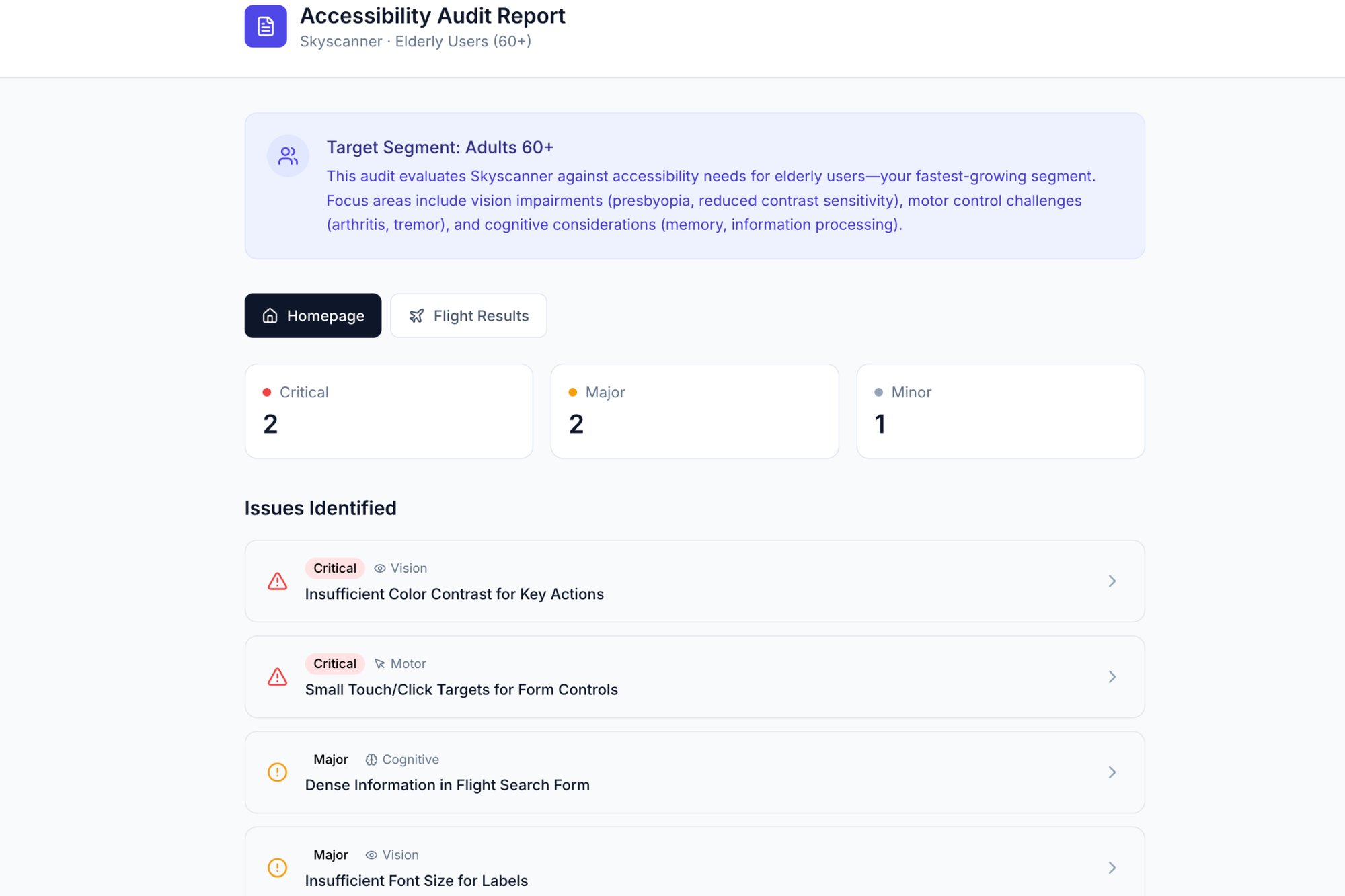
A flowchart for keyboard navigation doesn't just say "test it." It diagrams the entire tab order, what happens when a modal opens, and where focus should return when it closes. For a visual representation, our accessibility audit of Skyscanner outlines some of these critical checks.
Actionable Takeaways
To build a verification flow that ensures compliance, think like a QA tester and a user simultaneously.
- Integrate WCAG Criteria: Start with a specific WCAG success criterion, like "2.4.7 Focus Visible." The flow's start point is a component being developed, and the end state is verified compliance.
- Map Test Procedures: Use rectangles for specific tests ("Activate component with Enter key") and diamonds for decision points ("Is the focus indicator clearly visible?").
- Define Remediation Paths: For every "No" in a decision diamond, chart the path back to the responsible team and the subsequent re-verification loop. A robust flow plans for failure to achieve success.
6. Error Handling and Edge Case Workflows
A product’s character is not defined by its perfect performance. It's defined by how it behaves when things break. Error handling flowcharts are the scripts for these moments of failure. They systematically map how a system should respond to invalid inputs, network drops, or payment errors. This is not just about showing an error message, it is about designing a graceful recovery.
A file upload feature seems simple until it isn't. When we mapped the failure states for a large file transfer service, the "happy path" was one simple line. The error paths, however, branched into a complex tree: network drops, size limits, duplicate file conflicts, and permission errors. Charting this out prevented a two-week project from becoming a six-week headache.
Strategic Analysis: Why It Works
An error handling flowchart turns abstract resilience goals into concrete engineering tasks. It forces teams to confront the messy reality of how software fails in the wild, moving beyond optimistic "it just works" assumptions. This proactive mapping is the difference between a product that feels brittle and one that feels dependable.
Great error handling does not apologize for failure, it guides the user to success, even when the initial path is blocked. It builds trust by showing you have anticipated problems.
For example, when exploring Dropbox’s upload functionality, we mapped out the various failure states. Visually documenting the sequence for a network drop versus a file-size error makes it clear how to design specific, helpful recovery paths for the user. You can see the full edge case map we built for this exploration.
Actionable Takeaways
To build a robust example of a flowchart process for errors, you must think like a pessimist to create an optimistic user experience.
- Map by Severity: Categorize errors. Is it a minor nuisance (invalid coupon code) or a critical failure (payment failed)? The system's response should match the severity.
- Write Human-Centric Messages: The words in your flowchart matter. Instead of "Error 500," use "We're having trouble connecting. We'll keep trying in the background."
- Separate Automatic vs. Manual Recovery: Chart out what the system attempts on its own (like retrying a failed API call) separately from the actions required from the user (like re-entering a password). This clarifies both backend logic and frontend design.
7. Analytics Event Tracking and Instrumentation Flows
An analytics instrumentation flowchart is the blueprint for your product's data nervous system. It maps every user action that triggers a data point, what information gets captured, and how that data travels to your analytics tools. It is the definitive guide that translates user behavior into measurable metrics, serving as a single source of truth for engineers and analysts.
A PM at a SaaS company once described their pre-flowchart reality as "data chaos." Their team was flying blind, with key funnels untracked and metrics that nobody trusted. By creating an instrumentation flow for their onboarding, they identified a dozen critical events that were never implemented. Charting the flow forced a conversation that aligned product, engineering, and data science on what truly mattered.
Strategic Analysis: Why It Works
Without a clear plan, analytics tracking becomes an afterthought, leading to what is often called "data debt." Teams either track too much, creating noise, or track too little, creating blind spots. An instrumentation flowchart forces you to be intentional, ensuring every event serves a strategic purpose. It's an essential example of a flowchart process for any data-driven team.
This flowchart turns analytics from a reactive cleanup job into a proactive design discipline. It ensures that by the time a feature launches, the tools to measure its success are already in place and validated.
This process prevents the all-too-common scenario where a team launches a feature and then asks, "How did it do?" only to realize they have no way to answer. It connects the "what" of the user's action to the "why" of the business's objective.
Actionable Takeaways
To create a durable analytics instrumentation plan, treat it as a core product artifact, not a side task.
- Standardize Naming Conventions: Establish a clear, consistent event naming system (e.g., Object-Action format like
Button-Clicked) and maintain a shared glossary. This prevents confusion and ensures data integrity. - Map to the User Journey: Do not create events in a vacuum. Overlay your instrumentation flow onto a user journey map to ensure you capture every critical step, from success states to error encounters.
- Document Properties: For each event, specify the properties to be collected. For
Trial-Started, includeplan_typeanduser_source. This context is what turns raw data into actionable insight.
8. QA Test Case Generation and Coverage Flows
A QA flowchart is a product's anatomy chart, meticulously mapping every functional pathway to generate exhaustive test cases. Instead of treating testing as a reactive bug hunt, this approach turns it into a systematic exploration. It translates user scenarios and business logic into a visual grid, ensuring all paths, edge cases, and error conditions are anticipated and covered before a line of code ships.
A QA lead I know at a fintech company uses this method to prevent bugs in their complex payment processing flows. By flowcharting the entire transaction journey, they can auto-generate test scripts for every possible outcome: successful payment, failed payment, network timeout, insufficient funds, and fraud detection flags. This is how you build a fortress, not just fix a fence.
Strategic Analysis: Why It Works
These flowcharts force a translation of abstract requirements into concrete, testable actions. This process reveals logical gaps and hidden complexities that are easy to miss in a standard product requirements document. It provides a source of truth that both developers and QA engineers can work from, reducing ambiguity and last-minute debates.
The real power of a QA flowchart is that it transforms quality assurance from a final gate into an integrated part of the design process. It ensures testability is built-in, not bolted-on.
This method is about creating a living document that grows with the product. For instance, you can take a high-stakes flow like a card freeze feature and methodically map every state. We did this for the Wise card freeze flow, which generated a clear set of test cases to validate every step, from the initial request to the confirmation and eventual unfreeze.
Actionable Takeaways
To use flowcharts for test case generation, think like a cartographer mapping every possible road.
- Generate from the Flow: Use user flow and decision tree diagrams as your direct source. Each path in the flowchart is a potential test case. A path from "Start" to "End" is a positive test, while a path ending in an error state is a negative test.
- Prioritize with Precision: Not all tests are equal. Prioritize test cases based on user impact and frequency of use. The "change password" flow needs more rigorous testing than the "update profile picture" flow.
- Automate the Obvious: Use the flowchart to identify repetitive, high-volume paths. These are prime candidates for automation, freeing up manual QA to focus on more complex, exploratory testing. A good example of a flowchart process here is automating checks for form submission validations.
Make Your Next Move a Diagram
We have journeyed through the intricate wiring of product development, from mapping user onboarding to dissecting A/B test logic and planning for every conceivable error. These examples all point to a single, powerful truth.
Clarity is not a byproduct of good work, it is the prerequisite.
In short, the common thread through every example of flowchart process we've explored is this strategic shift: moving from describing complexity to diagramming it. A flowchart is not merely documentation destined to become stale. It is a thinking tool, a collaboration machine, and an alignment engine. It transforms abstract requirements into a shared, visual language that engineering, design, and business can all understand.
Your product's logic exists whether you map it or not. The only question is whether that logic is explicit, shared, and deliberate, or implicit, siloed, and accidental.
By externalizing these processes, you preempt the most common sources of project delays: ambiguity, misinterpretation, and undiscovered edge cases. As demonstrated in a classic study from Fred Brooks' "The Mythical Man-Month," visual models can significantly reduce ambiguity compared to text-only specifications. That reduction directly translates to fewer emergency meetings and less costly rework. A clear diagram is the cheapest form of insurance against shipping the wrong thing.
The real value here is the systemic improvement it brings. A team that masters the flowchart process moves faster, with more precision and less friction. They spend less time debating what was meant and more time building what is needed. Consider the detailed user flow maps, like the one we reviewed for LinkedIn's job posting flow, which unearth friction points that are invisible in a PRD's bullet points.
So, what is your next move?
Your grounded takeaway is this: pick one small, troublesome part of your product and diagram it. Start with a tricky process like the Wise card freeze flow or even a simple component's states. That single action will reveal more about your product’s hidden dependencies and unspoken assumptions than a week of status meetings ever could. Make your next move a diagram.
Ready to stop describing and start diagramming? With Figr, you can go from a simple screen recording or URL to a complete, editable flowchart process in seconds. It’s the fastest way to apply these concepts and bring immediate clarity to your team.