Most stakeholder design reviews fail before anyone joins the call. A prototype lands in a crowded meeting, half the room is seeing it for the first time, and everyone starts reviewing a different problem.
When that happens, feedback gets weird fast. An executive asks about roadmap timing, engineering jumps to edge cases, sales wants a customer promise reflected in the UI, and the designer is left defending pixels that were never the underlying issue. The meeting looks collaborative, but it produces drift, repeated review loops, and vague “let's revisit this” endings that turn one review into three.
A working stakeholder design review process fixes that by shifting the primary work outside the room. You prepare context before the meeting, narrow participation to the people needed for the decision, and leave with a written closeout that records what changed, what didn't, and who owns the next move.
Why Most Design Reviews Descend into Chaos
The chaos usually gets blamed on stakeholders. That's lazy diagnosis.
Most design reviews collapse because the room has no shared frame for what decision is being made, who has authority to shape it, or how complete the work is. That vacuum gets filled with opinion. I call this roadmap soup with a prototype garnish. A team shows polished screens, but the surrounding context is still mushy, so stakeholders import their own priorities into the review.
A review like that doesn't really review design. It reviews unresolved strategy, hidden constraints, and organizational anxiety.
The room is overloaded before the meeting starts
I've watched this happen in companies of every size. Last week, a PM at a growth-stage SaaS team showed a solid onboarding prototype to a review group. The screens were thoughtful. The flow was clean. Then someone senior asked whether the team had decided to optimize activation or reduce support burden. The whole meeting tilted. The prototype wasn't wrong, but the context was absent, so the design became a proxy fight.
That's the basic failure pattern in a weak stakeholder design review process. People are reacting to different levels of the problem.
A few warning signs show up early:
Undefined authority: nobody knows who is deciding, who is advising, and who just needs visibility
Mismatched review type: the team wants sign-off, but stakeholders think it's an evaluation review
Unclear completion state: is this early direction, a near-final flow, or a handoff candidate
Broad invitations: people join because they're adjacent, not because the decision requires them
One of the sharpest gaps in review practice is role clarity. Nielsen Norman Group recommends mapping stakeholder power, interest, and attitude, then using targeted communication to work with negative stakeholders early, especially when a project is under pressure or heading off track in their guidance on stakeholder analysis. That's more useful than the usual advice to “get everyone aligned.”
Stakeholder roles need names
If you don't classify stakeholders, the meeting will do it for you, badly.
I use four practical categories:
I use four practical categories.
The Decider makes or confirms the call. Skip naming one and the decision just gets deferred.
The Approver checks the work against constraints or policy. Leave this unassigned and the objections show up late, after the meeting is already over.
The Consultant adds expertise on risk, implementation, or customer impact. The risk is their detail overwhelming the core decision, so keep their input pointed at what the Decider actually needs.
The Observer stays informed without shaping the call. Let observers start steering and the extra voices dilute focus.
A common pitfall for many PMs is that they think they're facilitating alignment when they are hosting unresolved governance.
If you're dealing with competing demands across functions, a separate discipline matters before the review starts: resolving product manager priorities. The review room can't fix a prioritization mess it inherited.
The fastest way to ruin a review is to ask one room to perform three jobs at once: align, evaluate, and approve.
There's another nuance teams skip. Reviews should declare their type upfront: alignment, evaluation, or sign-off. Teams should also state how complete the work is, such as 50%, 75%, or 90%, because that changes what kind of feedback is valid. Without that cue, stakeholders keep reopening settled ground and you get the endless loop that feels like collaboration but behaves like churn, as discussed in this breakdown of stakeholder review cycles.
Prepare a Visual Context Graph Not Just a Prototype
A prototype answers one question: what are we proposing?
A Visual Context Graph answers the question that matters in stakeholder review: why this, why now, and under what constraints?
The moment the review goes sideways
A while back, I watched a PM present a beautiful retention feature to an executive team. The prototype was strong enough to win a design critique. It died in stakeholder review because the first serious question had nothing to do with layout or UX copy. It was, “Which customer behavior told us this mattered?”
Silence.
That wasn't a presentation problem. It was a missing artifact problem.
This is what I mean by making the meeting a formality. The design should arrive attached to its operating context, so people can inspect the decision logic instead of free-associating from a UI screen.
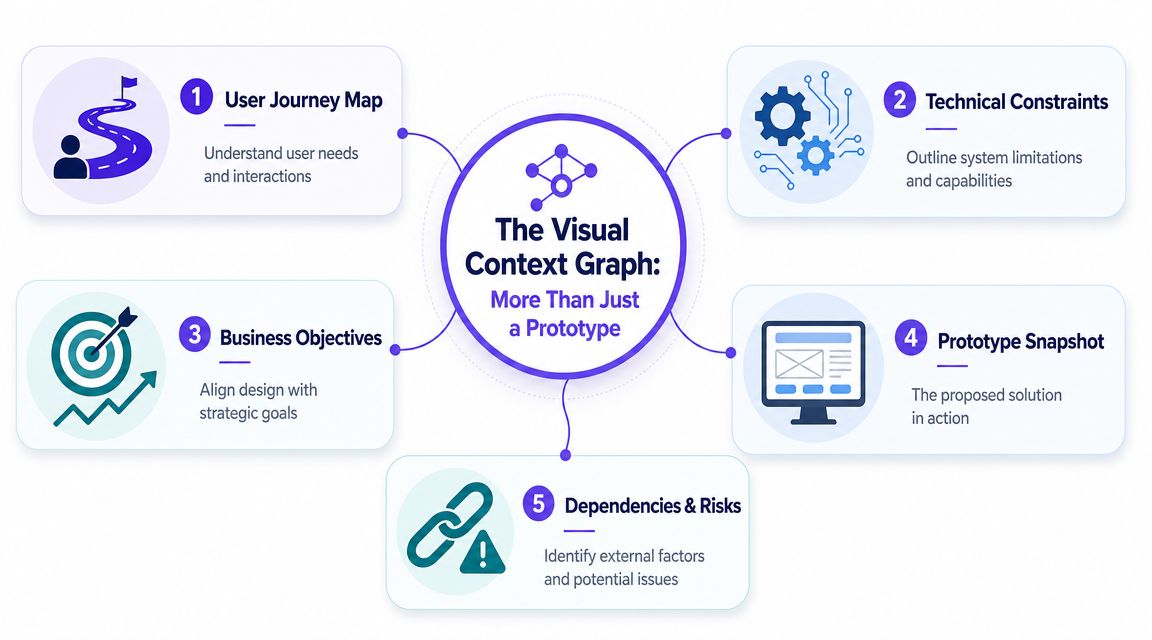
What goes into the Visual Context Graph
The graph is simple. One node is the proposed design direction. Every other node exists to constrain interpretation.
Build it with five anchors:
Business objective: the KPI, operational goal, or strategic outcome the design is meant to influence
User journey map: where the friction appears in the lived flow, not just in a single screen
Technical constraints: system limits, implementation realities, dependencies, and absolute requirements
Prototype snapshot: the proposed interaction or screen state under review
Dependencies and risks: adjacent launches, policy concerns, research gaps, or unresolved assumptions
You can represent this in FigJam, Miro, Figma, Notion, or even a slide if the links are visible. The medium matters less than the graph logic.
Teams that present context visually usually get cleaner conversations because they reduce ambiguity before anyone speaks. If you need a refresher on what makes a diagram readable under time pressure, these data visualization best practices are useful. They apply surprisingly well to PM artifacts, especially when you're trying to help busy stakeholders scan cause and effect instead of hunting through a deck.
How to build it before your next review
Use this prep sequence:
Start with the decision sentence.
Write one line at the top: “We are deciding whether to move forward with X approach for Y problem.”Attach the triggering evidence.
Add the user insight, behavioral signal, support pattern, or workflow friction that created the proposal.Map the operating boundaries.
Show technical limits, legal constraints, launch dependencies, and design system rules that narrow the solution space.Place the prototype last.
The screen should sit inside the graph, not above it. That's the difference between a concept under review and a taste contest.Mark open questions explicitly.
If something is unresolved, label it. Hidden uncertainty always returns later as “new feedback.”
Practical rule: if a stakeholder can ask “why are we doing this?” after your pre-read, you didn't send enough context.
A good Visual Context Graph also prevents fake precision. Stakeholders can see where the design is anchored and where assumptions remain loose. That makes discussion sharper and more honest.
If your team already uses systems maps, journey maps, or architecture sketches, connect this review artifact to them. It's the same instinct behind preventing scope creep with diagrams. Visible boundaries keep a review from absorbing every adjacent problem in the org.
For broader workflow habits, this also fits neatly with product design best practices. The common thread is simple: design artifacts should carry business and product context with them, or they'll be interpreted as decoration.
How to Run the 30 Minute Decision Meeting
Once the prep is done well, the meeting should feel almost boring. That's a good sign.
A stakeholder design review process works best when the room is small, the brief is already read, and the conversation is structured around a decision. Smartsheet recommends a design review agenda that starts with about five minutes of overview, then moves through background, design presentation, and feedback, with the materials shared well in advance so participants can prepare in its design review guidance. That's the right shape because it treats the meeting as a checkpoint, not a discovery session.
The roles in the room
Keep the invite list tight. You need:
Presenter: usually the PM or designer, depending on who owns the recommendation
Decider: one person with authority to move the work forward
Note-taker: someone capturing decisions, action items, owners, and unresolved risks
Selected specialists: only if the decision depends on their input
Everyone else can get the closeout.
This sounds strict. It is. Why invite spectators into a decision meeting and then complain that it became a panel discussion?
For executive-facing reviews, the delivery style matters too. If your team struggles to tell the story at the right altitude, Figr's strategy for design buy-in is worth studying.
Here's a short walkthrough before the agenda:
The agenda that keeps people honest
Run the meeting like this:
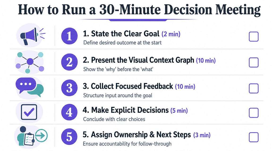
Step 1. State the decision at the top.
Open with the exact call to be made.
Also state the review type: alignment, evaluation, or sign-off.Step 2. Confirm the work's completion level.
Say whether the work is at 50%, 75%, or 90% maturity.
That tells people whether to challenge direction, mechanics, or readiness.Step 3. Walk the Visual Context Graph.
Cover the business objective, user need, constraints, dependencies, and recommendation.
Leave the prototype inside that frame.Step 4. Collect focused feedback.
Ask for feedback against requirements and decision criteria.
Park off-scope comments in a follow-up list.Step 5. Make the decision explicit.
End with one of three outcomes: proceed, revise with named conditions, or escalate a specific issue.
What the facilitator actually does
The PM's job in this room isn't to defend the design. It's to protect decision quality.
That means redirecting vague input. It means asking “is this blocking the decision?” when someone dives into edge polish. It means reminding the room what kind of review this is. If the discussion starts turning into a fresh strategy workshop, stop it.
Use language like this:
“I'm capturing that as a valid concern, but it doesn't change today's decision frame.”
Or this:
“We can open a separate thread on that dependency. Right now we need a yes, a no, or a condition for revision.”
The basic gist is this: reviews go long when the room is unclear about what qualifies as useful feedback. Once that boundary is visible, people usually get sharper.
If your team wants tooling support, this is one place where products like Figr can help. It creates review-ready artifacts like user flows, edge cases, specs, and prototypes grounded in product context, which can reduce the amount of explanation the PM has to recreate by hand before a review.
The Decision Closeout That Prevents Rework
If the meeting ends without a written closeout, the meeting didn't really end.
A lot of teams confuse note-taking with closure. They are not the same thing. Notes capture conversation. A Decision Closeout captures what the organization agreed to do.
One industry report said engineering teams lose track of over 40% of all feedback from design reviews, and the same webinar also tied late-stage design errors to launch delays across many companies in this design review discussion. You don't need to agree with every claim in that session to recognize the core truth: untracked feedback becomes rework, and rework becomes delay.
What a real closeout contains
The closeout should go out immediately after the session. Same day. Preferably within the hour.
Use this structure:
Decision made: the single sentence outcome
Why it was made: the rationale tied to requirements, risks, or constraints
Alternatives rejected: what was considered and why it wasn't chosen
Required changes: exact revisions before the next milestone
Owners and deadlines: one owner per action, with a date
Open risks: what remains unresolved and how it will be handled
That artifact becomes the memory of the review. Without it, every stakeholder keeps a private version of what happened.
Why teams skip it, and why that's expensive
People skip closeouts because they feel administrative. That's the wrong economic lens.
The closeout is what turns discussion into organizational memory. It protects the team from drive-by reinterpretation three days later. It gives engineering something firmer than “I think we landed on option B.” It gives leadership an audit trail when priorities shift.
PMI's view of stakeholder analysis is useful here too. It treats stakeholder communication needs in terms of type, frequency, and format, because governance only works when information is designed for the people using it. The closeout is the post-review version of that principle.
If your notes tend to be messy, this guide to effective meeting minutes is a useful complement. Minutes record the flow. The closeout records the outcome.
A review without a closeout creates a vacuum, and politics always fills vacuums.
A simple closeout template
Here's the format I recommend:
Start with the Decision, stated plainly: "Approved for handoff with two revisions."
Follow with the Reasoning, linking the call back to the user need, business objective, and constraints that drove it.
List the Changes required as exact updates, one line each so nothing is vague.
Assign an Owner to every task, one accountable person, never a group.
Set a Due date for each, tied to the revision or follow-up review.
Close with Deferred issues: anything you parked on purpose, plus where it will eventually get resolved.
This also strengthens aligning teams through product specs. Specs define intent. Closeouts confirm the current decision state after real cross-functional review.
Creating a Scalable System for Design Reviews
A review process becomes valuable when it stops being a hero move and starts being infrastructure.
The mature version of a stakeholder design review process looks less like a calendar habit and more like governance. Teams know how stakeholders are classified, what kind of review is being held, what prep artifact is required, and where the final closeout lives. The meeting itself gets shorter because the surrounding system gets stronger.
Build the system around staged participation
The Design Society describes stakeholder integration as a four-step flow: gap analysis, customer value chain analysis, cycle of use or monetary flow analysis, and finally stakeholder ranking in its four-step stakeholder approach. That matters because it reinforces something product teams often skip. Stakeholder involvement should move from broad discovery to prioritized participation.
PMI makes a similar point from a governance angle. Stakeholder analysis identifies requirements, influence, and importance, and can take only a few hours on small projects while expanding with complexity on larger ones. That gives PMs permission to scale the process instead of pretending every feature needs the same ceremony.
What works in practice?
Create review entry criteria.
No meeting gets booked until the team has a review type, named decider, prep artifact, and decision sentence.Store every Decision Closeout centrally.
Use Notion, Confluence, Jira, or your product wiki. Make it searchable.Tag by decision theme.
Onboarding, pricing, permissions, navigation, reporting. Over time, the archive becomes a map of how your organization decides.Revisit stakeholder maps when projects wobble.
Power shifts. Interest changes. Support decays. Governance that never updates turns ceremonial fast.
Connect reviews to the rest of delivery
Reviews shouldn't sit outside the product system. They should connect directly to design systems, accessibility checks, QA planning, and engineering handoff.
That linkage matters for scale because every undocumented exception creates future confusion. If a review approves a deviation from a component pattern, that should be visible to the people maintaining the system. If a review introduces edge cases, QA should inherit them as test inputs, not discover them later in staging.
That's also why teams investing in effective design system implementation often improve decision quality. Shared components reduce subjective debate. The review can focus on intent, trade-offs, and risk, instead of relitigating standard UI patterns.
The deeper shift is cultural
The zoom-out view is simple. Organizations reward motion, so people schedule meetings. But scale doesn't come from more discussion. It comes from better decision packaging.
When your review system is working, people don't enter the room asking what this is about. They enter asking whether the recommendation is sound. That shift changes the economics of product work. Fewer loops. Cleaner handoffs. Better memory. Less energy spent replaying the same argument with slightly different attendees.
A mature review culture doesn't chase consensus. It produces clarity.
If your team is stuck in review loops, start small. Take one upcoming design review and require three things before it happens: a named review type, a Visual Context Graph, and a written Decision Closeout sent the same day. If you want help generating those artifacts from live product context, Figr is built for product teams that need specs, flows, prototypes, and review-ready rationale tied back to the live app, not a blank canvas.