
You spent two weeks on the redesign. You have 12 minutes with the exec team. They won't look at Figma. They won't read the doc. They will ask three questions and decide.
That's the core challenge behind how to present design work to executives.
Most PMs and designers misread the failure. They think the work wasn't appreciated. Usually, the work just wasn't translated. An executive design presentation is not a craft review. It's a decision meeting about money, risk, timing, and confidence.
I learned this the hard way in B2B SaaS. The prettiest walkthrough in the room loses to the clearest business case. Every time.
Your 12-Minute Window
A friend at a Series C company told me about a redesign review that died in minute four. The team opened with the design principles, walked through interaction details, and defended spacing choices. The CFO interrupted and asked, “What problem are we solving?” No one answered cleanly. The meeting never recovered.
That's normal.
Executives don't sit through your process. They sit through a stream of competing priorities, budget asks, and operational fires. If your design review with execs doesn't quickly connect to a business outcome, it gets mentally filed as optional polish.
Winning organizations recognize presentation design as a core business competency. Companies outperforming competitors aren't just outselling them, they're out-communicating them through clearer pitch decks and executives who make strategic cases with precision, as noted by VerdanaBold.
The teams that get design buy-in from leadership understand one thing: the meeting is not where discovery happens. The meeting is where a decision gets compressed.
That changes everything.
You stop opening with rationale and start opening with consequence. You stop narrating every screen and start naming the metric, the decision, and the trade-off. You use the room to confirm judgment, not to educate everyone from scratch. That's also why strong teams obsess over accelerating product feedback loops before the executive meeting ever lands on the calendar.
What Executives Actually Evaluate
Executives are not evaluating whether the flow is elegant. They're evaluating whether the change deserves attention, resources, and organizational risk.
The business lens
This is what I mean. A design pitch to leadership is basically an investment memo delivered out loud.
Harvard Business Review research, cited in UX presentation guidance, says executives want clear answers to four questions: What business problem does this design solve, what's the projected ROI, what are the implementation risks, and what are the key milestones for measuring success in this executive communication breakdown.
That's their job. They own capital allocation, sequencing, and downside control. So when a PM says, “We simplified onboarding,” an executive hears, “You want engineering time. Why?”
What designers often present instead
Design teams often lead with internal logic:
Flow quality: cleaner navigation, fewer clicks, clearer hierarchy
Craft language: consistency, affordance, visual balance
User-centered reasoning: less friction, more intuitive handoff
None of that is wrong. It's just incomplete in an executive room.
A better framing sounds like this: “We're targeting lower funnel abandonment in onboarding, with a design change that reduces decision points and is low-risk to ship behind a flag.”
See the difference?
If you want a useful parallel, RapidNative's guide to prototyping for mobile is helpful because it reinforces a practical truth: prototypes only matter when they clarify decisions. Executives care about what the prototype proves, not that it exists.
Practical rule: If your first three slides could fit into a design critique, they probably don't belong in an executive meeting.
This is also where your broader Figr stakeholder alignment strategies matter. Buy-in rarely fails in the room alone. It usually fails upstream, when the room hasn't been prepared to evaluate the right question.
The Pre-Read Pack That Gets Read
Most pre-reads fail because they are written like PRDs and sent like homework. Execs don't need more reading. They need a faster path to confidence.
The three-page reality, compressed to one
Your pre-read should survive a 60-second scan. If it can't, it won't shape the meeting.
I use three components.
The one-pager: one sentence on the problem, one sentence on the recommendation, one sentence on the ask. That's the spine.
The before-and-after: not ten screens. One stark comparison. Show the old friction and the proposed path.
The metric you're moving: one metric, named plainly. Form fills. Activation. Demo completion. Renewal workflow completion. Pick one.
The job of the pack is not to prove everything. The job is to narrow the conversation.
What good looks like
A strong pre-read says, “We recommend replacing the current setup flow because it creates avoidable drop-off at a critical step. The proposed path reduces cognitive load and is designed to improve completion of account setup. We need approval to build and measure it.”
That's enough to orient the room.
Send the pre-read early enough that people can react, then send meeting notes with explicit actions. If your process is weak here, modern meeting minutes and action items is a useful operational reference.
The basic gist is this: the pre-read is a filter. It removes side quests before the meeting starts. If you need a sharper structure for the artifact itself, study how Figr helps align product teams and borrow the discipline, not the formatting.
How to Present Design Work to Executives in 12 Minutes
A good executive design presentation has a center of gravity. One message. A few supporting points. Evidence that earns the recommendation.
That structure has a name: Strategic Message Mapping. Expert presenters use a core message, three to four supporting points, and evidence for each, and presentations built this way show 3x higher close rates for strategic decisions according to Art Petty's write-up on executive presenting.
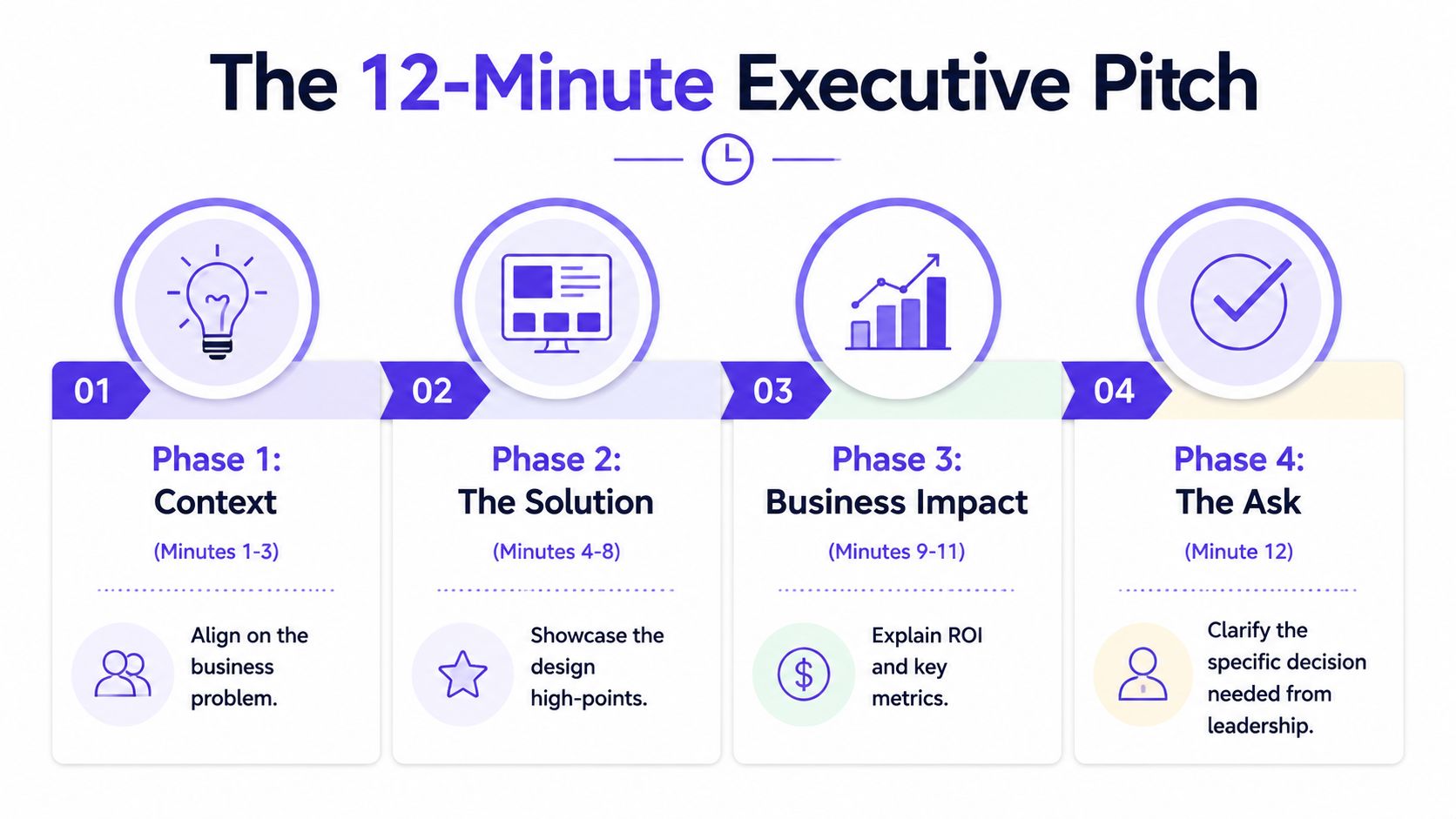
Minute 1 to 3
Open with context, fast.
Remind them why they're here. State the business problem. State what decision you need. Don't build suspense. Executives don't reward delayed conclusions.
Bad opening: “We explored several patterns for improving the experience.”
Better opening: “We're here to decide whether to ship a revised onboarding path to improve completion of account setup, with low implementation risk and a clear measurement plan.”
Minute 4 to 8
Present the recommendation.
Show the high points of the design, not every screen. Tie each visible change to a business effect. Keep it tight. If one interaction doesn't affect adoption, conversion, risk, or speed, it probably doesn't belong in the live walkthrough.
A short product demo can help if it sharpens comprehension. If you need help tightening that format, Mastering the Product Demonstration Video is worth skimming before your next review.
Here's a useful example of presentation pacing in video form:
Minute 9 to 10
Acknowledge the alternatives.
You earn credibility by demonstrating your process. Show one or two viable options you considered, then explain why they were rejected. Not to show effort. To show judgment.
A sentence like this works: “We considered a lighter version that preserved the current structure, but it leaves the core drop-off point intact and creates measurement ambiguity.”
Minute 11 to 12
Close on risks and the ask.
Name the implementation risk, the measurement plan, and the decision required today. Keep it explicit.
Decision frame: “Approve the recommended version for build, align on the rollout scope, and confirm the success metric we'll review after launch.”
If you're still too slow at producing the materials behind this, fix the operating system. Teams that can prototype faster from a PRD get more reps, and more reps create better executive presence.
Anticipating the Three Questions Every Exec Asks
Last week I watched a PM give a solid presenting UX to executives walkthrough, then lose the room in the Q&A. Not because the idea was weak. Because the answers sounded like a team still negotiating with itself.
The questions are always some version of the same three.
How much will this cost and how long will it take
Bad answer: “It depends on engineering complexity.”
Good answer: “We scoped the recommended path against alternatives. This is the smallest version that addresses the actual business problem, and we can phase rollout if you want lower execution risk.”
What's the ROI
Execs spend more time with reports and dashboards than design artifacts, so redesigns need to be framed around measurable business objectives such as increased form fills or conversion rate improvements rather than design language, as explained in UserTesting's advice for presenting UX work to executives.
Bad answer: “Users will probably prefer it.”
Good answer: “The recommendation is designed to move a specific business metric. We'll measure against that metric and compare the result to the current flow.”
Why can't we do a simpler version
Bad answer: “Because that would hurt the experience.”
Good answer: “We can do a smaller version, but here's the trade-off. It reduces delivery scope, yet it also weakens the impact and makes learning less conclusive.”
When you prepare these answers ahead of time, you stop sounding defensive. You sound like the person managing trade-offs. If you need help forcing the math into the open, use this ROI template for PMs who hate spreadsheets.
Translating Vague Feedback into Action
The most dangerous sentence in a design review with execs is, “I just don't like the feel of it.”
Not because it's wrong. Because it's unstructured.
If you accept that kind of feedback at face value, you invite weeks of churn. If you reject it, you look rigid. The move is to translate the feeling into a trade-off the room can evaluate.
Turn taste into a decision
Try this language: “To make it feel more solid, we could slow the transition and add more visual confirmation. That increases clarity, but it also adds friction. Is that trade-off worth making for this workflow?”
That response does three things. It respects the feedback. It converts opinion into a design variable. It forces prioritization.
“Can you say what outcome feels off? Trust, speed, clarity, or control?”
That single question has saved more meetings than most slide decks.
Bring evidence back into the room
A 2026 Gartner report on SaaS product leadership says 72% of VPs of Product demand immediate ROI proof in UX pitches, but only 19% of designers provide it, leading to 55% rejection rates, and it notes that emerging tools connect designs to live funnels to provide that proof, cited in this industry summary on executive UX pitching.
That matters because vague feedback often appears when the business case is underpowered. People reach for taste when they don't trust the impact.
Product tooling can help ground the conversation. Figr is an AI product agent for UX design and product thinking that ingests your live webapp, Figma files, screen recordings, and docs to learn your actual product before designing, then references 200,000 real-world UX patterns to design from your product rather than from a blank prompt. If you want to see the kind of outputs teams use to anchor these conversations, see what teams have built with Figr, including the Mercury runway forecasting feature.
This is also why PMs need tighter collaboration habits with design. The handoff isn't the problem. Shared framing is. If you want a better operating model, read the PM-Designer collaboration playbook. And if your stakeholder motion is messy before the meeting, fix the basics with a real stakeholder management plan.
Draft one pre-read pack this week. One page. One before-and-after. One metric. Then run your next executive meeting off that artifact instead of off your design file.
For the complete framework on this topic, see our guide to product management best practices.
Figr helps product teams walk into executive reviews with sharper artifacts and fewer guesses. It learns your actual product from your live app, design files, recordings, and docs, then turns that context into flows, prototypes, edge cases, and business-ready reasoning. If you want design decisions grounded in product reality instead of blank-canvas speculation, explore Figr.