
It's 4:47 PM on Thursday. Your VP just asked for the ROI on that new feature, something visual to anchor tomorrow's board discussion. You have a PRD. You have bullet points. You have 16 hours.
This is a pressure every product manager knows. The request feels simple: connect effort to outcome. But the underlying question is much deeper. Are we building the right thing? Can you prove it with more than a gut feeling?
An ROI template isn’t a calculator; it’s a storytelling tool. It’s supposed to turn an abstract idea into a solid business case. The problem is, most templates are built on a myth.
The Myth Of The Simple ROI Request
The classic ROI formula, (Gain - Cost) / Cost, is clean. It’s a lighthouse in the fog of product planning. A new feature costs $50,000 to build and is projected to bring in $200,000. That’s a 300% ROI. It looks great on a slide.
But a single percentage rarely answers the real questions.
A last-minute ROI request isn’t about the math. It’s a symptom of a deeper need: the need for a convincing story. This reframes your task from a calculation problem to a persuasion problem. You need a framework that builds a compelling case, one that draws a straight line from engineering effort to a tangible business outcome.
We need to move beyond a static number and toward a dynamic argument.
From Calculation To Persuasion
The basic gist is this: a good ROI document is a "prequel to a decision." It’s not the final answer; it’s the structured thinking that gets everyone to a confident "yes" or "no." That insight is crucial.
The goal isn't just to produce a number. It's to build a shared understanding. The 'Decision-Driven ROI Template' is a framework that puts clarity and context ahead of complex formulas. It’s designed to answer the questions your stakeholders are really asking by forcing you to articulate the "why" behind the investment. This approach is absolutely essential for handling competing priorities and stakeholder conflicts.
It helps you get ahead of the core concerns:
Clarity on Costs: What are we really spending, beyond just developer salaries? Think about marketing, support, and infrastructure.
Definition of Return: How will we measure success if it isn't direct revenue? Is it reduced churn, higher engagement, or saved operational costs?
Confidence in Assumptions: How fragile is this forecast? What happens if our adoption rate is half what we predicted?
When you start with this mindset, your ROI template transforms. It stops being just a spreadsheet and becomes a strategic document—the anchor for a productive conversation, not just a number on a slide.
Mapping The True Costs Of Creation
The most dangerous mistake in any ROI calculation happens before you touch a spreadsheet. It’s the quiet, confident assumption that the investment is just engineering hours.
That number is just the tip of the iceberg.
Beneath the surface lies the real mass, the hidden nine-tenths of the total cost that can sink a project’s profitability. A credible ROI template must map this submerged part of the iceberg. What does that actually look like?
It looks like the product manager’s life spent on discovery, user interviews, and writing specs. It’s the design cycles: the wireframes, high-fidelity mocks, and user testing sessions. It’s the QA team writing test plans, running regressions, and finding the bugs that send work right back to engineering. A simple feature isn't a block of code; it's an entire ecosystem of effort.
The Hidden Factory Of Product Development
Last week I watched a PM at a Series B company share a story. They’d just shipped a "simple" settings page. The engineering estimate was two weeks. It ended up taking seven.
Why the gap?
The two-week estimate covered only the coding. It ignored the two designers who spent a week debating interaction patterns, the security review that flagged three compliance issues, and the technical writer who needed five days for help docs. And that was before marketing’s launch email or the training session for customer support.
The feature tripled in cost because the initial estimate only saw the tip of the iceberg. These "other" costs were treated as the cost of doing business, but they were actually the cost of this specific feature.
This is what economists call "hidden factories," where unmeasured work quietly consumes resources. Research from the Harvard Business Review suggests these hidden factories can eat up 20-40% of a company's total capacity.
Failing to map these activities in your ROI template isn't a rounding error. It’s a fundamental misrepresentation of the investment.
A Framework For Fully Loaded Costs
To get to an honest ROI model, we need to assign real dollar values to these hidden activities. The best way is to break down the work and apply blended hourly rates for every role involved.
Start by listing every activity required to get a feature from idea to live, supported product:
Discovery & Planning: PM hours spent on research, stakeholder interviews, and PRD creation.
Design & UX: All the time spent on user flows, wireframes, prototypes, and user testing. Just mapping a journey, like in this analysis of Intercom’s support dashboard, shows how many states demand design time.
Engineering & QA: The core development work plus dedicated time for writing test cases, manual testing, and running automated tests.
Launch & Go-to-Market: Marketing and sales enablement time for creating launch assets, training materials, and internal announcements.
Ongoing Support & Maintenance: A percentage of the support team's time for handling tickets on the new feature, plus an engineering buffer for bug fixes.
By estimating the hours for each phase and multiplying by a role-specific rate, you finally move from a vague engineering guess to a "fully loaded" cost. If you need a good starting point, our guide on how to estimate creating a design system uses similar costing methods you can adapt.
This detailed accounting does more than just make your numbers accurate. It forces a strategic conversation about a project's true scope. When stakeholders see the full iceberg, the conversation shifts from "how fast can we code this?" to "is this entire effort worth the return we expect?"
That shift is the first step toward making better decisions.
Defining The Four Flavors Of Return
Return isn't a single destination; it's a compass with four cardinal directions. When we force every product initiative to point north toward direct revenue, we lose our way. This narrow focus is how good, foundational ideas die in committee.
It’s how technical debt festers and how user experience erodes.
A mature ROI template acknowledges this. The right analogy isn't a racehorse, where only speed matters. It's a balanced investment portfolio. You need a mix of high-growth stocks (revenue features) and stable, dividend-paying bonds (risk reduction) to build something that lasts. What I mean is, we have to account for more than one type of success.
Your template needs room to articulate all four flavors of return.
Direct Revenue
This is the most straightforward flavor, the one every stakeholder gets immediately. It’s the new money coming in the door because of your project. Think of this as the "high-growth stock" in your portfolio.
Metrics here are clean and easy to track:
New Sales
Upsells & Cross-sells
Expansion Revenue
A SaaS company launching a new premium add-on for enterprise clients is a classic example. The ROI calculation is a straight line from the cost of building the feature to the new MRR it generates. Simple.
Cost Savings
This flavor is all about making the business more efficient. It’s the return you get from spending less money to achieve the same results. Think of this as improving the expense ratio of your portfolio, making your existing assets work harder.
A team at a fintech company recently built a better onboarding flow. That feature didn't generate a single new dollar. Instead, it cut support tickets related to account setup by 35%, saving the company an estimated $12,000 a month in support staff hours. Capturing this is critical. Our guide on using AI tools to forecast MRR impact can help model these kinds of gains.
This return is just as real as new revenue. It just shows up on a different line of the P&L.
Risk Reduction
Some of the most valuable work a product team can do is preventative. This is the "stable bond" portion of your portfolio. It doesn't produce flashy returns, but it protects you from catastrophic losses. Risk reduction is about quantifying the cost of something bad not happening.
Is it hard to measure? Yes. Impossible? Not at all.
You can estimate the financial impact of a security breach, a data-privacy fine under GDPR, or the cost of failing a compliance audit. A project that hardens your application against a common vulnerability might have a massive, albeit hypothetical, return. A great way to visualize this is by mapping out potential failure states, like in this analysis of Dropbox's file upload process, to proactively address security and stability risks.
Strategic Value
This is the most abstract but often the most important flavor. Strategic value is about positioning the company for future success. It’s about building a moat, increasing customer loyalty, or breaking into a new market.
Strategic initiatives are investments in a company’s long-term competitive advantage. While their immediate financial return may be low, their value compounds over time by increasing customer retention and market share.
For instance, redesigning a core workflow to be more intuitive might not immediately drive revenue. But if it leads to a 5% reduction in annual churn, the long-term value is enormous. For a deeper dive into how ROI applies to initiatives that build strategic value, consider exploring resources on understanding return on investment in marketing.
By creating space for these four distinct categories in your ROI template, you give your team the language to justify foundational work. It’s how you build a product that doesn’t just grow, but endures.
How To Build Your Decision-Driven Template
A blank spreadsheet is a place of infinite possibility and zero guidance. Let’s change that. We're not building a simple calculator; we're building a decision-making machine that turns messy assumptions into a clear, defensible recommendation.
The basic gist is this: a good ROI template has three distinct parts. The Inputs state your assumptions. The Calculations turn those inputs into metrics. The Outputs are where you interpret the results and tell the story.
This structure moves you from presenting a number to facilitating a strategic conversation. It’s a machine for clarity.
The Inputs: Your First Draft
Your template starts with a clear, honest accounting of what you're putting into the project. This is where you ground your analysis in reality.
Create three primary sections for your inputs:
Fully Loaded Costs: Capture the entire "iceberg" of expenses. List line items for PM discovery, design cycles, engineering, QA, launch marketing, and ongoing support. Each line needs an estimated hour count and a blended hourly rate.
Expected Gains: Define which of the four "flavors" of return you're targeting. Whether it’s direct revenue, cost savings, risk reduction, or strategic value, you have to assign a dollar value. For cost savings, this means calculating the monetary value of reduced support tickets.
Time Horizon: No investment pays off overnight. Define the period over which you expect to see the return. Is it 12 months? 24 months? This single input forces a conversation about patience and long-term value.
This clear separation of inputs makes your assumptions transparent. When a stakeholder questions your final ROI number, you can point directly to the specific cost or gain assumption driving it. No more black boxes.
The Calculation Engine
With your inputs defined, it’s time to build the engine. This part of your template translates assumptions into standardized financial metrics. You don’t need an accounting degree, just a couple of key formulas.
Payback Period: How long until we make our money back? The formula is Initial Investment / Annual Gain. A shorter payback period is generally better, as it means less time your investment is at risk.
Net Present Value (NPV): This accounts for a simple truth: a dollar today is worth more than a dollar a year from now. NPV calculates the total value of a project's future cash flows in today's dollars. If the NPV is positive, the project is expected to be profitable.
These calculations aren’t just for show. They provide different lenses to view the investment, helping you see the trade-offs between a quick win and a long-term strategic bet. This is also where you can begin to use AI to help prioritize product features based on user data, feeding potential gains directly into your model.
A clear flow helps stakeholders understand how different types of return contribute to the business.
This visualization reinforces a critical point: a healthy product strategy includes projects that deliver value across all four categories, not just immediate revenue.
The Output and The Story
This final section is where you step away from the numbers and make a recommendation. Your outputs should include a scenario analysis and a concise summary.
Scenario analysis is where your template truly becomes a tool for decision-making, not just a calculator. By creating best-case, worst-case, and most-likely scenarios, you stress-test your assumptions and show stakeholders the potential range of outcomes.
For example, what happens to the ROI if user adoption is only half of what you project? What if the engineering effort takes 30% longer? Running these scenarios builds incredible credibility. It shows you’ve thought through the risks, not just the rewards.
Your final output is a simple, direct recommendation: Invest, Do Not Invest, or Invest with Conditions. This final judgment, backed by transparent inputs and rigorous scenario planning, is what transforms your template from a spreadsheet into a strategic asset.
From Static Report To Dynamic Dashboard
The ROI template is done. The green light is given. The spreadsheet gets filed away. Its purpose is served.
But what if the template was never meant to be the final report, but the blueprint for a cockpit?
A static ROI calculation is a photograph, a snapshot of a single moment based entirely on projections. A dynamic dashboard is a live video feed. The sharpest product teams know the real value isn't just in making the initial bet; it's in managing that bet over time. To do that, your ROI template has to evolve from a static document into a living tool.
Connecting The Wires
The first move is to break your model out of its spreadsheet prison. This means connecting your projections to real, live data sources.
Instead of manually typing a number into a cell labeled "Monthly Active Users," you link it directly to your product analytics. Instead of guessing at customer acquisition cost, you pull it from your financial software.
This simple act completely transforms the document's function.
From Projection to Reality: It automatically replaces your optimistic assumptions with hard, cold performance data as it rolls in.
From Snapshot to Trendline: You can suddenly see performance over time, revealing momentum or flagging a stall before it becomes a crisis.
This isn’t just about better data hygiene. It’s about changing the conversation. I once watched a PM present a quarterly review where the first slide showed the original ROI projection next to a live chart of actual revenue. The discussion immediately went to, "our adoption is slower than planned, what’s our next move?"
That is a fundamentally more strategic discussion.
The Dashboard As A Storytelling Tool
Once connected, the dashboard becomes the centerpiece for all ongoing communication. It's no longer a tool for getting a project approved; it's a tool for steering that project to success. Modern ROI reporting tools have already made this leap, evolving into dashboards critical for both product and marketing. You can see it in these examples of marketing ROI reports. They are all about summary metrics and progress trackers.
Your goal is to visualize the gap between your forecast and reality. That comparison is the most powerful story you can tell. For example, a fintech company could build a live dashboard for a new feature like runway forecasting for founders, tracking actual usage against the forecasting UI they designed.
This visual story also serves a critical purpose: it depersonalizes failure and reframes it as a learning opportunity. When a metric turns red, it’s not an indictment of the team. It’s an invitation to diagnose the problem. A great dashboard doesn't just show what is happening; it prompts the question why.
A New Cadence For Decision-Making
With a live dashboard, your review cadence shifts dramatically. Instead of a high-stakes annual review, you can have lightweight monthly check-ins centered around the data.
These meetings become incredibly focused. The data is already there, visualized and trusted. The conversation can be about interpretation and action. Is our cost-saving feature reducing support tickets? Is our new feature driving the retention uplift we modeled? Visualizing the path to an outcome, like this updated Shopify checkout setup flow, provides a clear map against which you can track what users are actually doing.
In short, your ROI template isn't a document for securing a budget. It’s the first version of the dashboard you will use to manage that investment all the way to a successful outcome.
Your First Step
All this theory is a map, not the territory. After the modeling and the strategizing, the most important thing you can do is take one, single, concrete step. You are not going to build a perfect, all-encompassing ROI template tomorrow.
Let that idea go.
Instead, your entire task is this: pick one upcoming, small feature. Something manageable. Now, apply this framework to just one part of the equation: the investment. Forget the return for a moment. Just map its true, hidden costs, from the first discovery meeting to the last support ticket it generates.
This is what I mean: focus on the "I" in ROI before you obsess over the "R".
Build The Muscle Memory
This simple exercise does one thing exceptionally well: it builds the muscle for full-cost accounting. It forces you to have conversations you might otherwise skip, putting a number on the time spent in design reviews, QA cycles, and documentation updates. This isn't about adding bureaucracy; it's about forcing clarity.
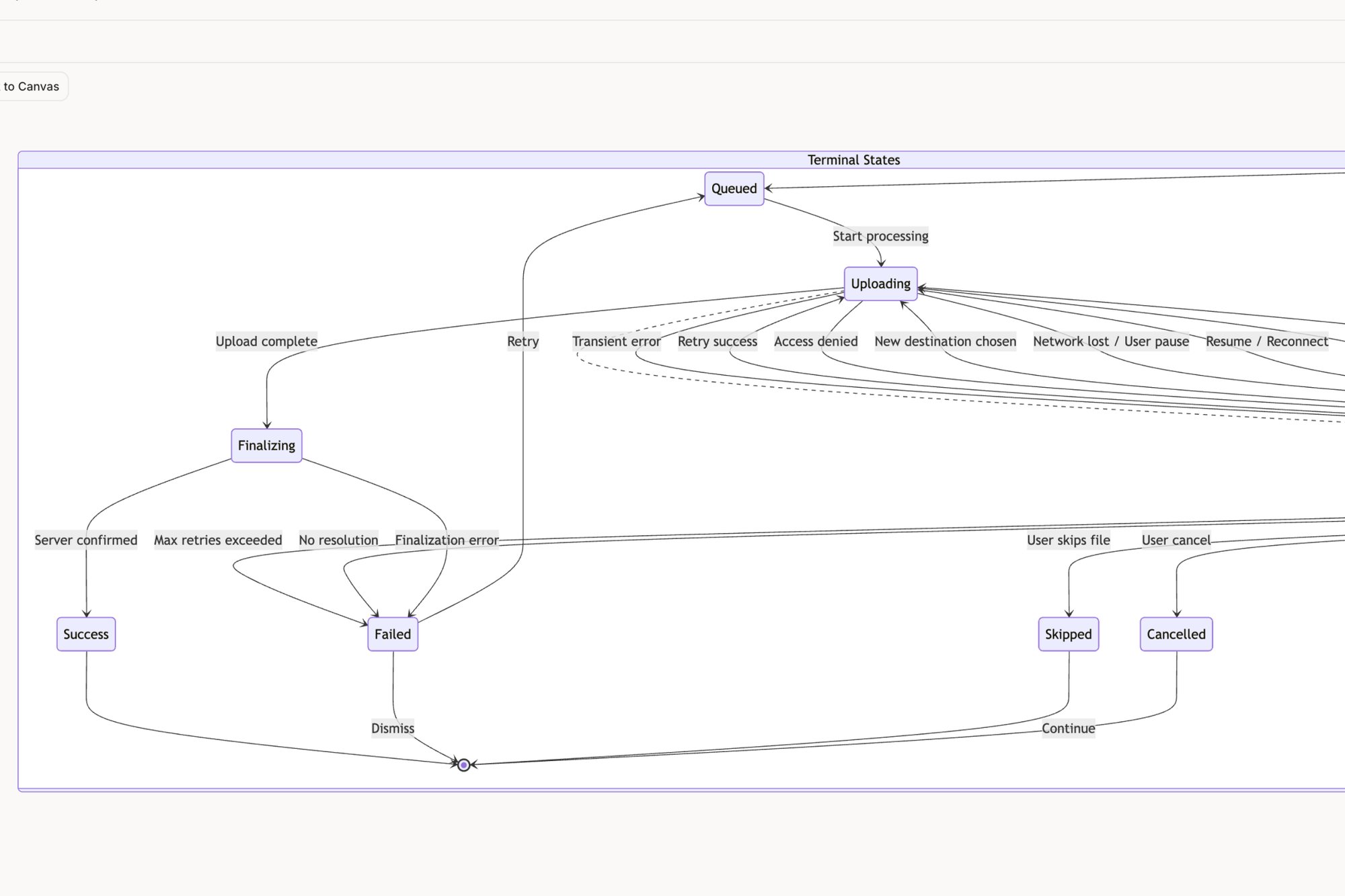
A great starting point is to map the feature’s complete user flow. Seeing every screen and interaction laid out visually reveals the true scope of work. For example, a flow map for something like the Shopify checkout setup can instantly expose dozens of hidden requirements and edge cases that quietly inflate costs. Similarly, mapping out all the potential states for a simple task assignment component, like in this Figr canvas, shows how a simple idea can balloon in complexity and cost.
By making the invisible work visible, you transform a vague estimate into a grounded forecast. This isn't just better math; it's a more honest way to make commitments to your team and your stakeholders.
This initial effort grounds your financial model in operational reality. And as you get sharper at defining costs, you can also explore how cloud computing optimization for maximum ROI can further refine your inputs, especially for projects with heavy infrastructure needs.
Start small. Map the true cost of one thing. That is the first, and most valuable, step toward building an ROI model you can actually trust.
Frequently Asked Questions
A good ROI template isn't just a calculator; it's a compass. It points your team toward a valuable destination and helps you navigate the trade-offs along the way. Here are some of the most common questions that pop up once you start using one.
How Do You Calculate ROI For Features Without Direct Revenue?
This is the big one. And it’s a great question.
Not everything you build will have a price tag attached. So, you have to focus on the other three "flavors" of return: Cost Savings, Risk Reduction, or Strategic Value.
For Cost Savings, think about time saved. How many hours will this feature save your support team? Can you quantify the reduction in support tickets? That’s real money.
For Risk Reduction, estimate the potential cost of something bad not happening. What's the price of a compliance failure or a security breach you're preventing?
For Strategic Value, you have to connect the dots. Tie the feature to a core metric like user retention or churn reduction. Then, assign a dollar value to a retained customer. Each path is a legitimate way to prove your feature’s worth.
What Is The Most Common Mistake In ROI Templates?
The single most common—and most costly—mistake is underestimating the "Investment" part of the equation.
Almost every team remembers to count developer salaries. But they often forget the "fully loaded" cost of the project. This is a huge trap. You have to include product management time, design cycles, QA testing, launch marketing, and the often-forgotten cost of ongoing maintenance.
A vague or incomplete cost estimate will always lead to a misleadingly high ROI. It sets an expectation you can’t possibly meet, and you'll fall into that trap months later.
How Often Should I Update ROI Calculations?
Your ROI calculation is not a "fire and forget" missile. It's a living model that needs to be revisited.
Think of it as a feedback loop for your assumptions. You should update the template at key project milestones: after initial discovery, immediately post-launch, and then again at regular quarterly intervals.
The whole point is to compare your initial guesses against actual performance data from your analytics. This iterative process does more than just keep stakeholders informed—it makes all of your future projections that much more accurate. You get better at this over time.
Figr is the AI design partner for product teams, turning your ideas into production-ready artifacts. It learns your live application and design system to generate user flows, prototypes, and test cases that are grounded in your actual product context, not generic templates. Design confidently and ship faster with Figr.