It's 4:47 PM on Thursday. Your VP just asked for something visual to anchor tomorrow's board discussion. You have a PRD. You have bullet points. You have 16 hours and no designer availability. A familiar pressure builds.
This moment reveals a fundamental truth about product design. It’s not a conveyor belt, moving from idea to spec to code. It's a switchboard. Every connection point, from strategy to user feedback, must be active for the message to get through. Following a checklist of product design best practices is not enough. You must understand the circuits. You have to see the system.
A friend at a Series C company told me their team spent six weeks building a "simple" file upload feature. Engineering estimated two weeks. Why the overrun? The estimate accounted for the ideal path. It missed the eleven other states: network drops, permission errors, duplicate conflicts. Each state was a new design cycle. As Don Norman noted in The Design of Everyday Things, true design excellence comes from a deep understanding of the user's world and the system's constraints.
This guide isn't just another list. It's a framework for applying timeless product design best practices to the messy reality of your software. We will go beyond the what and dive deep into the why, when, and how, ensuring every feature you ship feels like it belongs.
1. Design System Consistency and Token Management
A design system is your product’s physics engine. It’s the set of rules that governs how every element behaves, from gravity (spacing) to light (color). Design tokens are the constants in that engine, the named variables storing visual properties. They ensure every new feature obeys the same laws of nature. This transforms design from a series of isolated creations into a coherent, predictable universe.
When your primary button color needs an update, how many files do you have to touch? Without a token-based system, a designer might spend a week combing through 50 screens to find every instance. With tokens, changing color-primary-action-background from blue to green is a five-minute fix that propagates everywhere. This is what I mean: you build systems, not just pages. Maintaining this system's integrity requires more than just documentation; actively employing visual regression testing tools can prevent UI drift and ensure consistency.
When and Why to Use This
Use a design system when you need to scale design across multiple teams or products. It’s essential for maintaining consistency and increasing development speed. It turns conversations from "what shade of blue?" to "does this component solve the user's problem?"
How to Implement It
- Audit First: Document existing patterns in your live product before formalizing anything.
- Start Small: Begin with foundational tokens (colors, fonts) and your most-used components (buttons, inputs).
- Establish Governance: Define who can modify the system and the process for proposing changes.
- Sync Design and Code: Use tools that export tokens in developer-friendly formats like JSON or CSS variables.
- Review Quarterly: Hold cross-functional meetings to review system usage and component requests.
How Figr Helps
Instead of manually recreating components for every new concept, you can ground your work in reality. Figr can import your existing design system, ensuring every generated prototype uses the correct tokens from the start. This allows you to explore complex interactions, like mapping out all the states for a new task assignment component, while remaining perfectly on-brand.
Measure the Impact
- Metric: Time-to-build for new features.
- Metric: Number of unique hex codes or font styles in the production CSS.
- Metric: Design system component adoption rate across teams.
Learn more about these and other design system best practices on figr.design.
2. User-Centered Design with Real Product Context
User-centered design is the act of looking through your user's camera, not just at their photograph. It forces you to design based on what users actually do, not what you assume they do. This approach grounds the design process in real data from your live product, analyzing flows and interaction sequences. It ensures solutions address genuine problems, a critical aspect of product design best practices.
It’s easy to invent a persona in a workshop.
It’s much harder to ignore a session recording of a real user struggling to find the settings page. When Spotify refines a discovery flow based on actual listening behavior, they are not guessing. They are responding to demonstrated needs. This shift from assumption to evidence is the foundation of building products people rely on.
When and Why to Use This
Use this approach continuously, but especially when conceptualizing new features or redesigning core workflows. It’s crucial for reducing the risk of building the wrong thing. It moves the conversation from internal opinions to external evidence.
How to Implement It
- Capture the Baseline: Record and document existing user flows in your live product.
- Identify Friction: Analyze funnel drop-off points, support tickets, and session recordings to find pain points.
- Create Data-Driven Personas: Build personas based on actual behavioral data, not assumptions.
- Map Before You Build: Document the actual journey users take before designing a new one. A thorough analysis of a process like the LinkedIn job posting flow reveals where users currently struggle.
- Test with Real Context: Validate design changes against your actual user base.
How Figr Helps
Figr accelerates this by starting with your real product. Instead of designing in a vacuum, you can capture your live application and use it as the canvas. For example, you can take a screen recording of your current checkout process, have Figr map the existing user flow, and then immediately start brainstorming improvements or generating test cases to identify points of failure.
Measure the Impact
- Metric: Task completion rate for key user flows.
- Metric: Reduction in user-reported errors or support ticket volume.
- Metric: Time-on-task for core user journeys.
Learn more about mapping user journeys and other user-centered design strategies here.
3. Design-Development Handoff Excellence
The gap between a Figma file and production code is where features go to die. Handoff isn't a single event: it's a process of translating design intent into technical reality. Think of it as passing a blueprint to a builder. If the measurements are vague and the material list is incomplete, you don’t get a house, you get a mess. Excellent handoff is the systematic transfer of knowledge to prevent this chaos.
This process transforms ambiguity into clarity.
Instead of developers guessing at padding values or interaction states, they receive a complete package. This is a fundamental product design best practice because it directly reduces the most expensive part of software development: rework. A clear handoff ensures that what is designed is what gets built.
When and Why to Use This
Implement a formal handoff process for any feature that requires new UI. It is essential when teams are distributed. The goal is to create a single source of truth that empowers developers to build independently and accurately.
How to Implement It
- Create a Handoff Checklist: Standardize the process with required elements: all component states, responsive behaviors, accessibility notes, and edge cases.
- Use Spec-Focused Tools: Leverage tools like Figma's dev mode or Storybook that generate code snippets.
- Document Interactions: Use prototypes or videos to demonstrate animations, transitions, and complex user flows.
- Establish Naming Conventions: Ensure design layer names match code component names. A practical guide for turning design into code is invaluable here.
- Hold an Async Handoff: Record a short video walking through the designs.
How Figr Helps
Handoff excellence starts before the final design is ready. A common failure is not accounting for all the states a feature might have. With Figr, you can generate a comprehensive edge case map for a file upload flow, ensuring developers have a clear plan for network drops or permission errors before they write a single line of code. This preemptively answers the "what if" questions that derail sprints.
Measure the Impact
- Metric: Number of UI-related bugs reported in QA per feature.
- Metric: Time spent by developers asking for design clarifications.
- Metric: Cycle time from "design complete" to "feature in production".
Learn more from this complete developer handoff playbook on figr.design.
4. Accessibility as a First-Class Design Concern
Accessibility is not a final checklist item. It is the practice of building products that are usable by everyone. Treating it as a first-class citizen means its requirements shape the design from the very first sketch, not just during the final QA pass. This proactive stance ensures that decisions about color, interaction, and structure serve the widest possible audience.
When accessibility is an afterthought, teams accumulate "empathy debt." The result is often a frantic effort to add ARIA labels to pass a compliance audit. A core tenet of modern product design best practices is to bake accessibility in from the start. This approach not only expands your potential market but often leads to better design solutions for all users. A button with clear text and high contrast is simply a better button.
For everyone.
When and Why to Use This
Always. Accessibility is a legal and ethical requirement, not an optional feature. Start from day one on any new product. It's crucial for B2B SaaS tools, government contracts, and any consumer-facing application.
How to Implement It
- Define Standards Early: Adopt a clear standard, like WCAG 2.1 AA, in the initial brief.
- Use Accessible Palettes: Build your color palette around accessible contrast ratios.
- Specify Focus States: Design clear and visible focus states for all interactive elements.
- Test with Assistive Tech: Regularly use screen readers to navigate your prototypes.
- Write Semantic HTML: Ensure developers use correct HTML tags so assistive technologies can interpret the UI.
How Figr Helps
Figr allows you to quickly run accessibility audits on existing products. For instance, you could take screenshots of a competitor like Skyscanner, have Figr generate an accessibility audit report, and use those insights to ensure your own travel booking flow avoids common pitfalls from the beginning. This transforms compliance from a reactive chore into a proactive advantage.
Measure the Impact
- Metric: WCAG compliance score from automated testing tools.
- Metric: Percentage of UI components that are fully keyboard-navigable.
- Metric: Reduction in customer support tickets related to usability.
Explore the landscape of tools that check product UI for accessibility using AI on figr.design.
5. Data-Driven Design Decisions with A/B Testing and Variants
Intuition is a starting point, not a destination. Data-driven design trades the phrase "I think users will..." for "The data shows users do..." It’s the process of grounding design choices in observable behavior. A/B testing is the engine of this process, allowing teams to compare design variations against real-world engagement and conversion.
This practice turns design into a series of testable hypotheses. Companies like Booking.com and Netflix don’t just launch features; they launch experiments. Every headline and button color is a variable in a constant search for improvement. This transforms product design from an art of subjective taste into a science of measurable impact.
When and Why to Use This
Use this approach to optimize critical user flows where small improvements have a large business impact, such as onboarding or checkout. It’s essential for validating redesigns and settling internal debates with evidence.
How to Implement It
- Formulate a Clear Hypothesis: Start with a specific, measurable statement: "Changing the primary CTA to 'Get Started Free' will increase clicks by 10% because..."
- Isolate One Variable: Test a single change at a time to know what drove the result.
- Ensure Statistical Significance: Use a sample size calculator to get a reliable result.
- Document Everything: Create a central repository for all tests: the hypothesis, variants, winner, and learnings.
- Share Learnings Widely: Broadcast the results to prevent other teams from making the same assumptions.
How Figr Helps
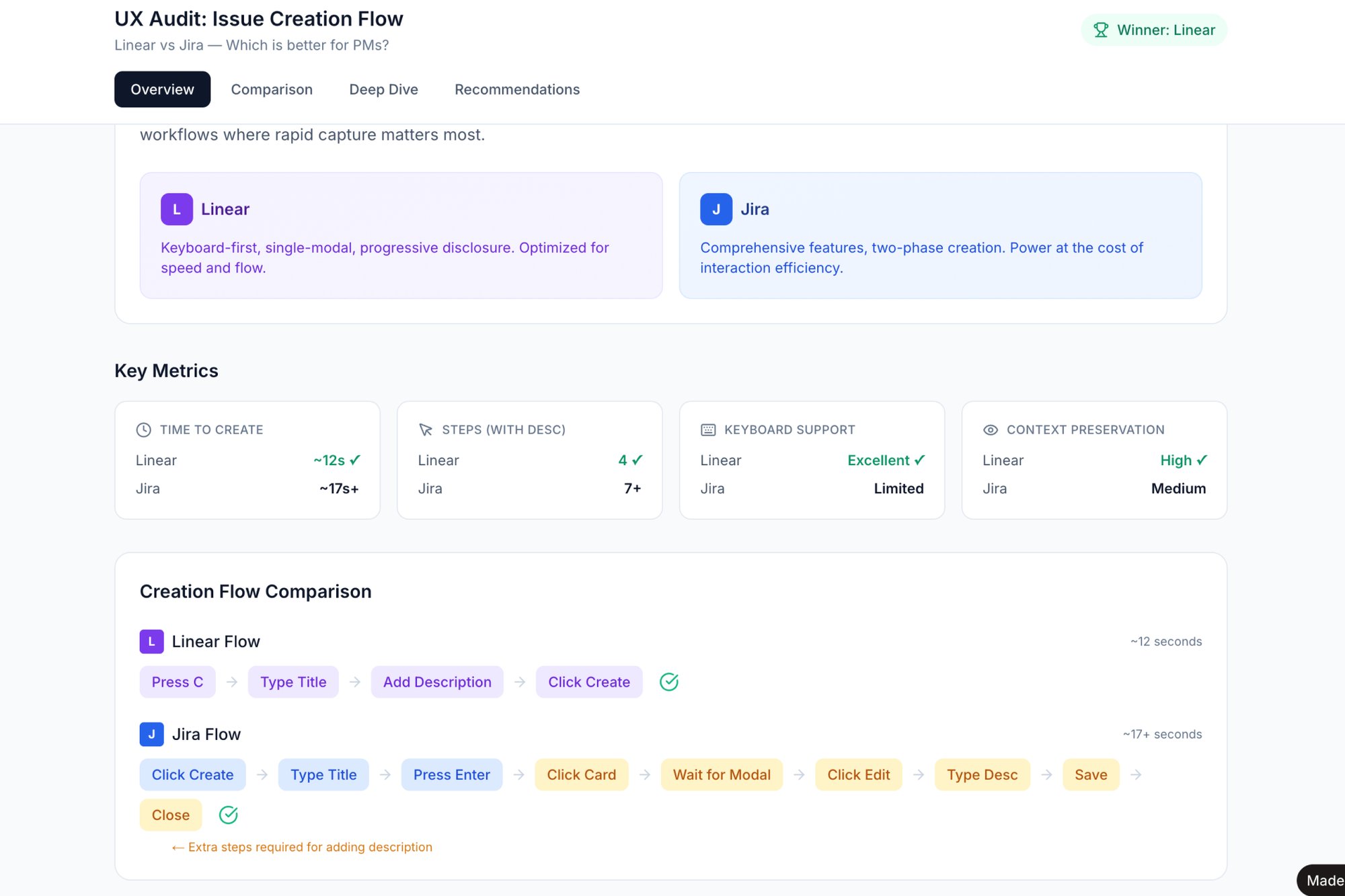
Validating which design variant works best often requires building multiple prototypes. With Figr, you can rapidly generate different versions of a user flow to compare them. For instance, you could create two distinct task creation flows, like this side-by-side comparison of Linear vs Jira, to test which one feels faster before committing engineering resources to a live A/B test.
Measure the Impact
- Metric: Conversion rate lift for the tested goal.
- Metric: Experiment velocity (number of tests run per quarter).
- Metric: Percentage of features validated by a winning A/B test.
To learn more, explore the principles of conversion rate optimization on platforms like Optimizely.
6. Comprehensive Edge Case and Error State Design
A product feels robust not when the primary path works, but when the detours are handled with grace. Most design effort focuses on the "happy path." But real-world usage is messy: connections drop, APIs fail, users enter strange data. Comprehensive edge case design is the practice of anticipating and designing for these inevitable moments.
This is a core product design best practice because it directly impacts user trust. A vague "Error: -1" message creates a support ticket. A helpful message saying, "Your file is too large. Please upload a file under 25MB" solves the user’s problem instantly. It's the difference between a frustrating dead end and a guided recovery.
When and Why to Use This
Always. This isn't an optional step. It's especially crucial for complex workflows like file uploads or payment processing where the potential for failure is high. Investing time here prevents costly post-launch fixes.
How to Implement It
- Create a State Matrix: For a key feature, list all possible user states: empty, loading, partial data, ideal, error, offline.
- Make Errors Actionable: Write clear, non-technical copy that explains the problem and provides a specific next step.
- Soften the Blow: Use illustrations or subtle animations to make error states feel less jarring.
- Document Recovery Paths: Map out how a user gets from a failure state back to a success state.
- Design for Latency: What does the UI look like during the 300ms it takes for data to load?
How Figr Helps
Anticipating every possible failure mode is mentally taxing. Figr can accelerate this process by generating a comprehensive map of potential edge cases based on your initial user flow. For a feature like a file uploader, it can instantly outline scenarios like network drops and file size limits, turning them into a visual map you can design against.
Measure the Impact
- Metric: Reduction in support tickets related to "unexpected errors."
- Metric: User task completion rate for complex workflows.
- Metric: Number of uncaught exceptions in your error-logging software.
Learn more about why these overlooked scenarios are critical and why edge cases can cost 50-100x more after launch.
7. Responsive Design and Cross-Device Consistency
Your product doesn’t live on a single screen; it’s a guest in a thousand different contexts. Responsive design is the practice of ensuring your interface gracefully adapts to each one. It isn't about shrinking a desktop layout onto a phone. It's about rethinking the hierarchy and interaction for the device at hand.
This is more than a technical task; it's a core principle of user-centric thinking. A user trying to complete a critical task on their phone won't care that the experience is "better on desktop." For them, the mobile experience is the product. Adhering to responsive product design best practices means committing to a quality experience, no matter the screen size.
When and Why to Use This
Always. Unless your product is exclusively built for a single, fixed-display device, responsive design is non-negotiable. It’s fundamental for reaching users where they are and improving SEO rankings.
How to Implement It
- Design Mobile-First: Start with the most constrained view (e.g., 320px). This forces you to prioritize core functionality.
- Establish Strategic Breakpoints: Use common device widths like 320px, 768px, and 1024px as points where the layout reconfigures.
- Use Relative Sizing: Employ units like
remand percentages instead of fixed pixels. - Prioritize Touch Targets: Ensure buttons and interactive elements are at least 44x44px on touch devices.
- Test on Real Devices: Browser emulation is a good start, but nothing beats testing on actual hardware.
How Figr Helps
Responsive design involves visualizing how components reflow across different widths. Instead of creating dozens of static artboards, Figr allows you to generate interactive prototypes that can be tested at various screen sizes. For instance, after mapping the states of a Shopify checkout setup, you could generate a prototype to see how the form fields should adapt from mobile to desktop.
Measure the Impact
- Metric: Conversion rate segmented by device type.
- Metric: Bounce rate on key landing pages for mobile users versus desktop users.
- Metric: Task completion success rate across different screen resolutions.
8. User Research Integration and Continuous Feedback Loops
A product roadmap without user research is a map drawn from memory. It might feel right, but it’s probably missing the actual dead ends. Integrating user research isn't a one-time event; it's the continuous pulse check that keeps your product relevant. This means establishing systems to pipe qualitative interviews and usability tests directly into your design and development cycles.
This approach transforms product design from a series of high-stakes guesses into a sequence of validated learnings.
Instead of a big reveal, you have a constant conversation. Teams that operate this way don’t just build features; they co-create value with their users. This continuous loop is a core discipline of modern product design best practices.
When and Why to Use This
Use this when you need to de-risk major initiatives and ensure product-market fit. It's crucial for validating assumptions before committing engineering resources and for prioritizing features based on evidence instead of opinion.
How to Implement It
- Establish a Cadence: Schedule recurring research activities, like bi-weekly usability tests.
- Democratize Insights: Create a centralized repository for all research findings and share key takeaways widely.
- Mix Your Methods: Combine qualitative insights (the "why") with quantitative data (the "what").
- Create Fast Feedback Channels: Implement simple ways for users to provide feedback directly within the product.
- Tie Insights to Action: For every major design decision, link it to the specific research finding that validated it.
How Figr Helps
Validating ideas with users often gets delayed by the time it takes to create testable prototypes. Figr shortens this cycle dramatically. You can upload screenshots of a competitor's flow, like the Cal.com vs. Calendly setup process, and have Figr generate an interactive prototype in minutes. This lets you put a realistic concept in front of users the same day the idea is born.
Measure the Impact
- Metric: System Usability Scale (SUS) score to track perceived usability over time.
- Metric: Time-to-completion for key user tasks in usability tests.
- Metric: Number of validated user insights integrated into the product roadmap per quarter.
9. Design-Driven Product Strategy and Feature Prioritization
Many teams treat design as the final step, the coat of paint applied after strategic decisions are made. A design-driven approach flips the script. It integrates design thinking into the core of product strategy, ensuring designers are not just executing a vision, but actively shaping it. This means using design artifacts like user flows and prototypes to explore and validate strategy long before code is written.
This practice transforms feature prioritization from a gut-feel exercise into an evidence-based dialogue. Instead of a product manager listing requirements, a designer can map the entire user journey, revealing hidden complexities. This is a fundamental shift in product design best practices: using design to ask what and why we should build, not just how it should look.
When and Why to Use This
Use this approach when your roadmap feels disconnected from user needs. It's crucial for ambitious new products where the problem space is ambiguous. It aligns the entire team on a tangible vision, reducing wasted cycles.
How to Implement It
- Embed Designers Early: Include lead designers in roadmap planning and strategy sessions.
- Make PRDs Visual: Mandate that Product Requirement Documents include user journey maps and wireframes.
- Map Before Building: For any significant feature, create a detailed user flow diagram.
- Establish Design Gates: Introduce a formal design critique as a checkpoint before a feature is prioritized.
- Use Prototypes for Alignment: Present interactive prototypes, not static slides, to stakeholders.
How Figr Helps
Instead of debating abstract feature ideas, you can make them concrete from day one. Figr allows product managers and designers to quickly map out a potential feature, like this PRD for an AI-powered playlist feature in Spotify, and immediately see the user flows and potential edge cases. This turns strategic conversations from speculative to tangible.
Measure the Impact
- Metric: Reduction in engineering scope changes after a feature enters development.
- Metric: Time from feature kickoff to developer handoff.
- Metric: Qualitative feedback from engineering on the clarity of feature requirements.
10. Measurable Outcomes and Design Impact Tracking
Design without data is just decoration. When a feature ships, the conversation should shift from "is it beautiful?" to "did it work?" This means moving from subjective opinions to objective results. Product design best practices demand that we treat design decisions as hypotheses to be tested, not as final artifacts to be admired. The goal is to create a direct line of sight between a UI change and a key business metric.
The basic gist is this: design becomes a documented driver of growth. When Stripe redesigned its onboarding flow, they didn't just aim for a better "feel". They tracked the impact on merchant activation rates. This data-informed approach provides the evidence needed to justify design resources. It’s about making design accountable to the same results as engineering or marketing.
When and why to use this
Use this approach for any significant design initiative, especially redesigns or new feature launches. It’s critical when you need to prove the ROI of design and build credibility with leadership. It anchors conversations in user behavior and business outcomes.
How to Implement It
- Define Success First: Before a single pixel is pushed, agree on the primary metric this design is meant to move.
- Establish a Baseline: Measure the metric for a period before the change goes live.
- Isolate the Variable: Use A/B testing or phased rollouts to isolate the impact of the design changes.
- Track Leading and Lagging Indicators: Monitor short-term user behaviors and long-term business outcomes.
- Create a Dashboard: Visualize the pre- and post-launch data in a shared dashboard.
How Figr Helps
Figr helps you define what success looks like before you build. For example, when redesigning a complex flow like the Shopify checkout setup, you can import existing analytics data directly into your canvas. This grounds your design exploration in real user drop-off points and engagement rates, ensuring your new flow directly addresses measurable problems.
Measure the Impact
- Metric: Conversion rate for a key funnel.
- Metric: Task completion time or success rate.
- Metric: Customer Satisfaction (CSAT) or Net Promoter Score (NPS) scores related to the feature.
- Metric: Reduction in support tickets related to the redesigned area.
Your Next Move: Design as a System, Not a Series of Tasks
The practices we have explored, from managing design tokens to mapping every conceivable edge case, are not isolated items on a checklist. They are interlocking gears in a single machine. Viewing them as separate tasks is like seeing a car as a collection of parts: a steering wheel, an engine, four tires. It misses the point entirely. The real value emerges when they work together.
The fundamental shift is from reactive design to proactive architecture.
Instead of just designing a screen, you are designing the conditions for all future screens to be better. When you establish a robust design system, you are not just making buttons consistent; you are buying back cognitive surplus for your team to solve harder problems. When you map the edge cases for an upload flow, like we saw with the Dropbox example, you are not just preventing bugs; you are building trust.
This transition from task-based work to systems-thinking is the single most important lever a product leader can pull. Why does this matter at scale? Because it's about incentives. A system incentivizes good decisions by making them the easiest path. It changes the economic calculus of product development, reducing the cost of consistency and raising the quality floor for the entire organization.
In short, the goal is to make excellence the path of least resistance. A well-designed system guides developers toward accessible components, prompts product managers to consider real user context, and makes data-driven decisions a natural part of the workflow. The best practices for product design are not about adding more work, they are about making the right work easier to do.
What's your next move? You do not need to boil the ocean.
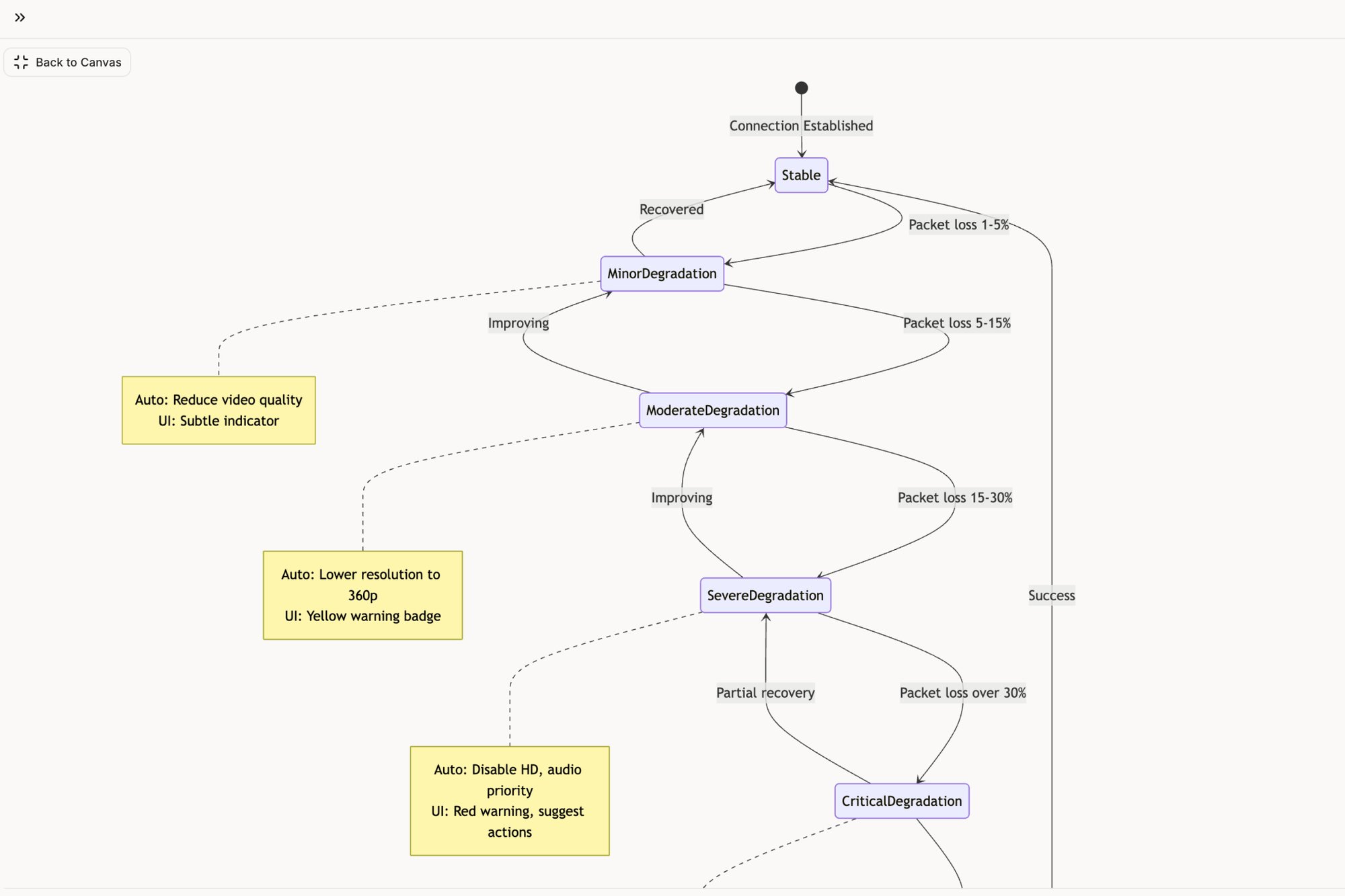
Pick one of these ten practices. Just one. For the next two sprints, focus solely on improving how your team handles that single area. Start by mapping your most critical user flow's edge cases, just like the analysis done for Zoom’s network degradation states. Or, commit to conducting one deep accessibility audit, inspired by the review of Skyscanner for elder-friendly design. Measure the reduction in QA bugs or the increase in a specific success metric. Prove the value in a small, contained way, and you will earn the right to scale it across your entire organization.
Many of the practices discussed in this article, from mapping complex user flows to generating comprehensive edge cases and test plans, require significant time and effort. Figr is an AI design partner built to accelerate this foundational work, allowing your team to move from concept to high-fidelity, system-aware designs in minutes, not weeks. Turn your product ideas into actionable artifacts and implement these product design best practices from day one by visiting Figr.