
In digital design, teams often face a lot of confusion when there’s no central system to keep everything organized. Without a proper design system, projects end up with different styles, mismatched designs, and a lack of brand consistency.
When teams don’t have a unified design system, each project can feel like starting from scratch. Designers have to repeatedly solve the same problems, and this slows down development.
Also, without a consistent look and feel, it’s hard to give users a smooth experience. In the long run, this mess can cost more time and money to fix. The solution? A solid design system that makes everything work together seamlessly.
This guide will take you through the process of creating and implementing a design system step by step. You’ll learn how to assess your current design practices, set clear goals for improvement, and build a system that helps your team stay on track.
What is a Design System
A design system is a comprehensive set of rules, components, and guidelines that helps designers and developers create consistent and easy-to-use products.
It serves as a centralized repository for all design-related elements, making it easier for designers and developers to collaborate and create cohesive user experiences that look and work the same across different platforms, like websites or apps.
Key Components of a Design System:
- Design Tokens: These are the building blocks of a design system. Design tokens store things like colors, fonts, and spacing, so you don't have to figure out these details every time. They help keep everything looking the same, no matter what platform you're using.
- UI Components: These are reusable pieces of design, like buttons or forms. Instead of designing new buttons every time, you can just use one from the system, which saves time and ensures they always look the same.
- Style Guide: This is like the rulebook for design. It tells everyone what colors, fonts, and icons to use, and how everything should look to stay consistent with the brand.
- Pattern Library: A collection of solutions for common design problems, like pop-up windows or cards. These patterns make sure that similar elements work the same way every time.
- Documentation: This is where you’ll find instructions on how to use the design system, including tips, code examples, and best practices. It’s a guide for both designers and developers to stay on the same page.
Need for a Design System for Businesses
A design system is more than just a set of guidelines—it's a strategic asset. It helps businesses create high-quality, consistent, and scalable digital products. When companies build apps, websites, or any digital platform, ensuring that everything looks and works the same is crucial.
A design system acts like a guidebook, making sure that everyone follows the same rules, no matter which team is working on what part of the product. Hence, it brings design, development, and product teams together, giving them a shared language to work from, so everyone knows what to expect. This streamlines the process and eliminates the need for constant back-and-forth adjustments, allowing teams to deliver features faster.
By investing in a design system, businesses can focus more on innovation and less on repetitive design tasks and set themselves up for long-term success in an increasingly competitive digital landscape.
Step-by-Step Process For Design System Creation and Implementation
Creating and implementing a design system might seem like a daunting task, but breaking it down into clear, manageable steps can simplify the process.
Let's walk through each crucial step—from assessing your current workflows to defining standards and testing components—so you can build a solid design system tailored to your business's needs.
Step 1: Identifying Your Organization's Style and Building on It
To develop a design system that truly reflects your organization’s brand and values, the first step is to thoroughly understand and define your current design style.
This step is crucial to ensure that the design system is customized to the specific needs of your teams, resulting in a smoother, more effective design process.
Here’s a detailed breakdown of how to assess current workflows needs and build your organization's style:
To start building a great design system, it's important to first look at what you already have. This step will help you identify what’s working, what’s not, and where the biggest challenges lie.
Here’s how you can effectively gather that information:
- Conducting a Design Audit: To do a Design Audit, gather all your design elements, like colors, fonts, UI components, and branding materials from every product you’ve made, and review them. This helps you spot patterns, find anything that looks out of place, and see what you can improve.
- Analyzing Current User Experience (UX): Now, look at how people are using your designs in real life. Are they having a similar experience on your website and mobile app? For example, does your website look the same on a phone and on a computer? This will help you figure out where things can be better.
- Evaluate Cross-Team Collaboration: You also need to assess how teams, such as design, development, and marketing, work together. Are they on the same page? Or do miscommunications cause errors and delays?
Example: Before creating its own design system, Spotify did something like this and called it a “design audit.” This helped them create their system called “Encore,” which made sure everything looked and worked the same across all of their products.
Collect Input from Everyone
After evaluating your current designs, the next thing you need to do is to get feedback from all the key people who will be using the design system or benefiting from it. These are called stakeholders, and they usually include designers, developers, product managers, and marketing teams.
- Designers: Talk to them about their daily challenges—do they struggle with inconsistent colors or hard-to-find design elements? What tools do they use, and where do they see room for improvement?
- Developers: Ask them how they feel about the current design handoffs. Are the designs clear? Do they have trouble understanding how the designs should be implemented in code?
- Product Managers: Learn what their goals are for the product and how a design system could help streamline development and keep things on track.
- Marketing Teams: Ask them how they maintain branding consistency. Is there a need for more structured design guidelines to make sure all branding stays the same across different platforms?
Identify Pain Points and Inconsistencies
After gathering feedback from everyone involved in your design process, it's time to pinpoint where things might be going wrong.
Identifying these pain points and inconsistencies is crucial for building a design system that truly improves how your team works together and creates products. Here are the most common pain points:
1. Inconsistent Branding: One of the biggest problems many organizations face is inconsistent branding. Imagine if one team uses a red button while another team uses a blue button for the same action. A study by Interaction-design.org found that when design patterns are inconsistent, user satisfaction drops significantly.
To fix this, you need to create a shared library of design components with clear rules for how to use them. With the help of Figr Identity, you can centralize all of your design components in one place.
2. Outdated Components: Another issue is using outdated design elements which is also called "Design Debt". Sometimes, teams stick with old designs because updating them seems too challenging.
3. Development Bottlenecks: Teams often face delays because designers and developers have to constantly exchange details about design elements. This back-and-forth can slow down the development process and lead to mistakes.
4. Reviewing Brand Guidelines: Your design should match your company’s brand. A brand identity represents your brand’s colors, style, and personality. So make sure your design system follows these guidelines so that all designs match your company’s identity.
Did you know that design-driven companies have outperformed the S&P Index by 219% over 10 years?
By checking what you already have, talking to your team, and setting clear rules, you can create a design system that keeps everything organized and consistent.
STEP 2: Define Clear Goals and Objectives

Now that you know the pain points, it’s time to set goals for your design system.
Establishing clear goals and objectives is one of the most important steps because without clear goals, you risk wasting time, and resources, and missing alignment with your organization's larger vision.
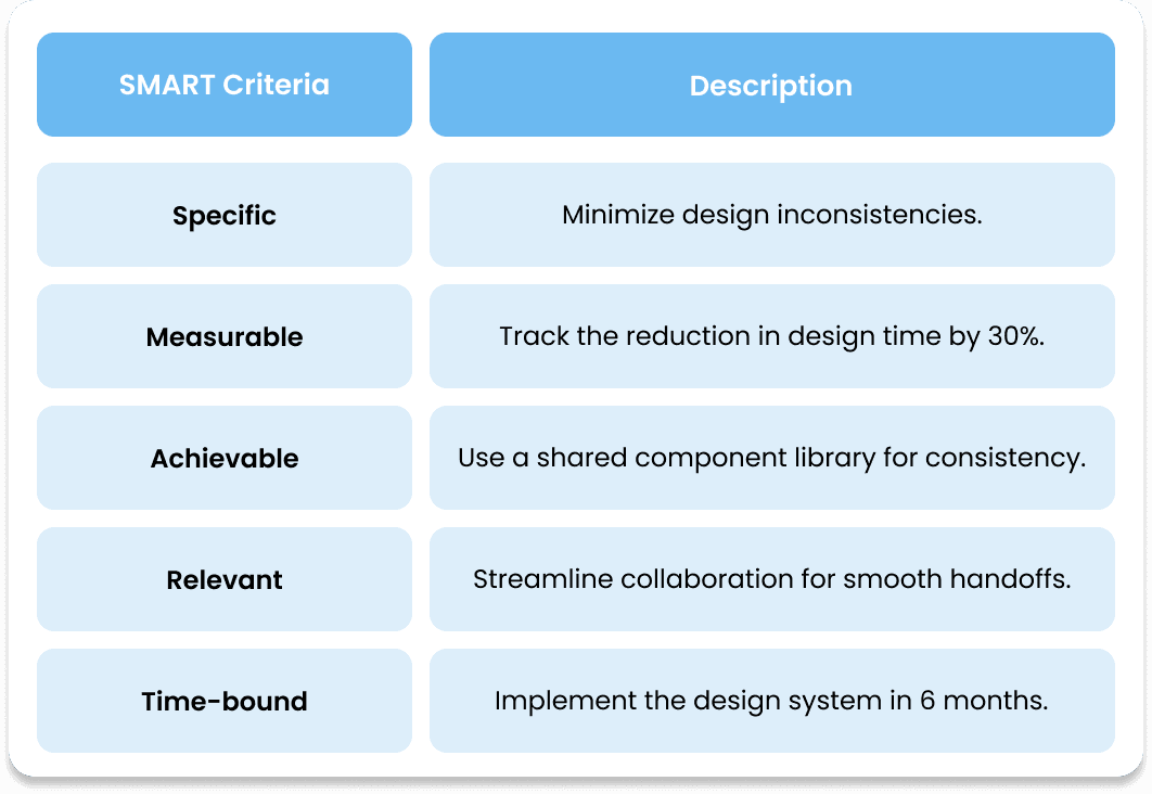
Let's break this down and see how you can set SMART goals.
S.M.A.R.T. goals (Specific, Measurable, Achievable, Relevant, and Time-bound) is one of the most popular goal-setting frameworks, first popularized by Napolean Hill in his book, “Think and Grow Rich”.
Here’s how to set SMART Goals
By establishing SMART goals, you give your team clear targets to aim for. SMART goals ensure that everyone knows what success looks like and can track progress over time.
- Specific: Clearly define the outcomes you want to achieve.
- Measurable: Quantify the goals so that you can track your progress because ‘What gets measured gets managed’.
- Achievable: Ensure that the goals are realistic and can be accomplished within available resources.
- Relevant: Goals should directly address the pain points you’ve identified.
- Time-bound: Set a deadline to motivate progress and completion.
Here’s what a SMART goal would look like:
A great example of a successful design system with clear goals is IBM’s Carbon Design System. IBM reported that its conversion rate increased by 5% and more than 50% of customers are converting to purchasing after implementing their design system, which streamlined everything from design to development.
By defining clear, actionable goals, your design system can address the real needs of your organization, from improving consistency to boosting efficiency.
STEP 3: Build a Cross-Functional Team
Now that your goals are in place, it’s time to build a team to execute those goals.
When building a design system, you need more than just one group of people working on it. Instead, you should form a cross-functional team, meaning that the team should include people from different departments.
This is important because creating a design system affects many parts of a company, from how a product looks to how it works on the backend.
So in this section, we’ll go through why this is important, who should be on your team, and the benefits of having a cross-functional team.
To form a dedicated team, here are the key disciplines to include:
- Design (UI/UX): Designers are the ones who create how everything looks and works for the users. They make sure the design is user-friendly and consistent across all parts of the product.
Example: Think about how easy it is to use Apple's products. Their designers work hard to make sure the design feels the same whether you’re on an iPhone, Mac, or iPad.
- Development: Developers bring the design to life by turning it into code. Their job is to make sure that everything designed can be built efficiently and functions properly in the final product.
Example: Facebook’s developers work closely with designers to ensure that new design features can be smoothly integrated into the app without technical issues.
- Product Management: Product managers ensure that the design system supports the company’s business goals and meets customer needs. They also make sure that everything is completed on time and in line with the bigger picture.
- Quality Assurance (QA): QA engineers test the design system to ensure that it works correctly across different platforms, like mobile phones, tablets, and computers. They catch problems early, which saves time and money.
Example: A QA engineer at Netflix ensures that the app looks and functions the same whether it’s on a smartphone, TV, or web browser.
- Marketing/Branding: Marketing representatives make sure that the design system stays true to the company’s brand. They help decide how the product should feel to the users in terms of colors, fonts, and overall style.
Example: Nike’s marketing team ensures that the brand’s bold, sporty look is carried through on their website, apps, and social media, giving users a consistent experience.
Real-World Example: A great example of a cross-functional team is Airbnb and their Design Language System (DLS). Airbnb brought together designers, developers, and product managers to create a system that unified the user interface across all platforms.
This collaboration made their design process faster and more consistent, which helped them scale their product globally.
Identify Necessary Skill Sets and Team Members
Once you know which departments need to be involved, the next step is finding the right people. You need team members who not only have the technical skills but also know how to work well with others.
Essential Skill Sets:
- Design Thinking: Designers need to understand user problems and create solutions that work for those users. This means brainstorming ideas, making prototypes, and testing them.
- Front-End Development: Developers should be proficient in coding languages like HTML, CSS, and JavaScript. These are the tools that bring designs to life on websites and apps.
- Project Management: A project manager is needed to keep the team organized, on track, and within budget. They coordinate tasks and make sure everyone is communicating effectively.
- Communication: Team members must clearly express their ideas and listen to feedback from other team members. Effective communication ensures that everyone is working towards the same goals.
Example: At Spotify, designers and developers need to collaborate closely to make sure that a new feature like playlist recommendations is easy to use and works smoothly.
- Attention to Detail: Building a design system requires making sure that every element is consistent and works perfectly across different platforms.
Research studies show that well-managed cross-functional teams are 30% more efficient than teams that lack diversity in skill sets and perspectives. According to a Harvard Business Review study, cross-functional teams solve problems up to three times faster than teams with similar mindsets.
Building a cross-functional team is essential for the successful creation and implementation of a design system and by including members from different departments, you ensure that the system will be comprehensive, efficient, and aligned with the company's broader objectives.
STEP 4: Create a Governance Model
When you build something like a design system, it's important to make sure that it's managed well. This is where a governance model comes in.
Think of a governance model as a rulebook that tells everyone on the team what they need to do, how decisions are made, and how things can change over time.
Let's break it down in more detail:
Define Roles and Responsibilities
In a governance model, roles and responsibilities tell each team member what they should do. It’s like in school when you have different roles—like the class president, treasurer, or team captain—so everyone knows what their job is.
These are key roles that you should include:
- Design System Owner: This person (usually a senior designer or product manager) is the captain of the ship. They make sure everything fits the company’s goals.
- Design Lead: This role focuses on the way things look and how users interact with the system. They ensure all designs follow the same rules and style.
- Development Lead: This person is in charge of turning designs into actual working parts. They make sure the designs can be used easily in the product’s code.
- Content Strategist: They focus on keeping the words and language in the system consistent and clear.
- Governance Committee: A group of people from different parts of the team who meet to review any changes to the design system.
Establish Decision-Making Processes
Think of decision-making processes like class rules for how decisions are made. This part of the governance model helps teams figure out how to add new things, change existing parts, or solve disagreements.
Key Steps in Decision-making Processes:
- Approval Workflow: Set up a way to approve new designs or changes. Maybe the team votes, or a leader approves it.
- Conflict Resolution: If there’s a disagreement, like two people wanting different things, you need a process to solve that problem. This could involve asking the team leader or governance committee.
- Documentation: Always write down decisions and why they were made. It’s like keeping notes so everyone remembers why choices were made.
Example: Google’s Material Design has a special team that reviews every change, making sure it fits with their overall design style.
Set Guidelines for Maintaining and Evolving the Design System
A design system isn’t something you create once and forget about. Just like an app that needs regular updates to stay current and fix bugs, your design system should continuously improve and adapt to meet new needs.
To keep it effective over time, there are some essential guidelines to follow, ensuring it remains a valuable tool for your team.
Key Guidelines for maintaining and updating the design system:
- Versioning: Versioning is like keeping track of every change made to a document so you can always go back to an earlier version if something goes wrong. In a design system, versioning allows you to track updates to your design components and maintain a clear history of changes. This way, you always know which version of a component is being used and can revert to a previous one if needed.
Figr Identity can streamline this process by automatically tracking changes and versioning components, ensuring that your team can always access the most up-to-date design elements.
- Component Retirement: Over time, some components in your design system may become outdated or less useful. Keeping them in the system can clutter the library and confuse your team.
Component retirement is like "retiring" or removing these old pieces to keep your design system clean and easy to navigate.
- Continuous Improvement: Your design system should never stay the same for too long. You need to regularly review and update it based on feedback from your team and new requirements that come up.
Think of it as checking in to make sure the design system is still doing its job and fixing anything that isn’t working.
Just like Salesforce regularly updates its Lightning Design System to keep up with new features and trends, Figr Identity helps your team keep the design system relevant and efficient.
Maintaining and evolving a design system is an ongoing process, and following a governance model ensures your system remains effective. It tells people what their jobs are, how decisions are made, and how to keep everything up to date.
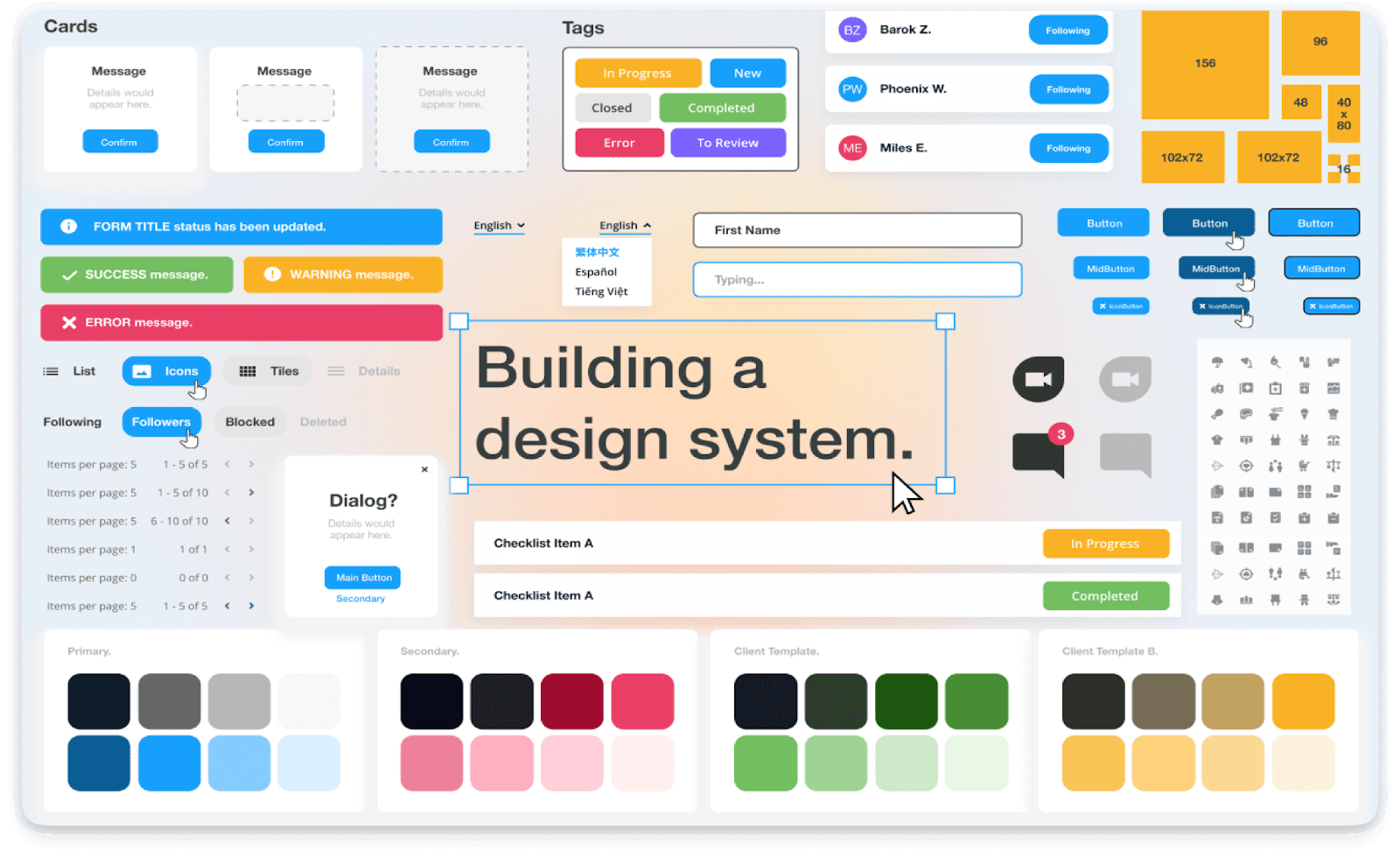
STEP 5: Set Visual Styles, Components, and Naming Conventions

When building a design system, you’re essentially creating a set of rules to make sure everything looks and works the same across different products and platforms. It’s a blueprint that keeps everyone on the same page.
Let’s break it down into three main parts: visual styles, components, and naming conventions.
Visual Styles
Visual styles are the "rules" that make sure your designs are visually consistent across different apps and websites. These rules cover things like colors, fonts, and spacing.
- Color Palettes: Think of a color palette as the main colors you use in all your designs, like how an artist picks certain colors to paint a picture. For example, your company might use blue, green, and yellow for all its branding. These colors should always be used in the same way to make everything look consistent. By busing Figr Identity plugin, you can automatically apply and standardize these colors across all your designs in minutes, making sure everyone uses the right shades and combinations.

Figr Identity helps you pick and apply these fonts across all your design components, ensuring your text always looks the same, no matter where it’s used.
- Spacing and Layout: Spacing in design is like the margins you see in a book—it makes sure everything is organized and easy to read. Too much or too little space can make designs look messy. Figr Identity helps maintain consistent spacing ensuring your designs are clean and easy to navigate.
Components
Components are the reusable pieces of your design. These are the building blocks like buttons, forms, and menus that appear in multiple places in your product.
- Buttons: Imagine if every button on your website looked different—it would confuse people. By using the same design for all buttons, users know exactly how they work.
Figr Identity makes sure all your buttons follow the same design, ensuring they look and function the same everywhere.
- Forms: Forms are where users type in information, like when signing up for an account or filling out contact details. By creating consistent form components, you make the user experience simpler and more intuitive.
Naming Conventions
Naming conventions are how you label different elements in your design system so everyone on your team knows exactly what they are and how to use them.
- Consistent Naming: Think of naming conventions like labeling files on your computer. Clear names prevent confusion. For instance, if you label a color "Primary-Blue" instead of just "Blue," it’s clear this is the main blue used in your design. Figr Identity helps set up and enforce these naming conventions, ensuring everyone uses the same labels, making collaboration smoother.
Align Standards with Organizational Values
A good design system should reflect the core values of your organization, such as innovation, sustainability, or accessibility.
- Brand Identity: Your design system should represent what your brand stands for. For example, if your brand focuses on innovation, the design should look modern and cutting-edge.
- Accessibility: Accessibility means making sure everyone, including people with disabilities, can use your product.
Document Standards in a Centralized Repository
Once you’ve set your visual styles, components, and naming conventions, you need to document everything in one place so your team can easily follow the rules.
- Comprehensive Documentation: This is like a manual that explains how your design system works, from visual styles to how components should be used. Another amazing feature of Figr Identity is that it helps you automatically update this documentation whenever changes are made, ensuring it’s always accurate. Incredible right?
- Centralized Access: By keeping all this information in a central location online, everyone on your team can access and follow the same guidelines, no matter where they are.
Creating clear visual styles, components, and naming conventions is like building a strong foundation for a house—it keeps everything in order and ensures your designs are consistent.
Figr Identity makes this process so much easier by helping you implement and maintain these standards, ensuring your design system is always aligned with your company’s values.
STEP 6: Implement and Collect Feedback

Implementing a design system is like setting up a new set of rules and tools for everyone in a company to follow when creating websites or apps. It’s a big job, and you want to make sure everything works well before rolling it out everywhere.
This section will guide you through how to start with a small test project, keep track of how things are going, gather feedback, and use that feedback to make improvements.
Start with a Pilot Project to Test the System
A pilot project is a small test run of your design system. Before you use the design system for all your projects, you test it out with one project to see how it works in real life. This helps you catch any problems early and make changes before everyone starts using it.
For example: Microsoft used a pilot project to test its Fluent Design System on the Windows operating system first. This allowed them to find and fix problems before using it on other products like Office or Xbox.
Advantages:
- Risk Mitigation: By starting small, you reduce the chance of big problems later. It’s easier to fix issues in a small project than in a company-wide rollout.
- Focused Feedback: You can get specific feedback from a smaller group of users and make precise improvements.
- Proof of Concept: Success in a pilot project shows that the design system works and helps get buy-in from other team members or stakeholders.
Track The Implementation Process and Gather Feedback
Tracking means keeping an eye on how the design system is being used during the pilot project. This helps ensure that everything is going smoothly and that the design system is being used correctly.
Tools for Tracking:
- JIRA: Keeps track of tasks and issues related to using the design system.
- Figma Analytics: Shows how design elements are being used by different teams.
- Figr Identity: Figr Identity is an all-in-one solution for maintaining design consistency across projects and teams. It automates the creation and management of design systems, saving hours of manual work by generating comprehensive systems quickly.
The tool offers incredible features like scalable token management and component libraries, enabling teams to easily manage and automatically update design elements. Figr Identity streamlines design processes and enhances workflow efficiency.
Gathering Feedback
Getting feedback from everyone who uses the design system is crucial. It helps you understand what’s working well and what needs to be fixed. Here’s how you can gather the feedback:
- Surveys and Questionnaires: Ask users to fill out forms about their experience with the design system.
- Usability Tests: Watch how users interact with the design system to see if they have any trouble.
- Focus Groups: Have discussions with key people to get detailed opinions on the design system.
According to Nielsen Norman Group, products developed with regular user feedback are more successful than those without it. This shows how important it is to listen to users and make changes based on their feedback.
Conduct Usability Tests
Usability testing is like giving a new toy to kids and watching how they play with it. You want to see if they can use it easily or if they get confused. For websites or apps, you want to make sure the buttons, menus, and other UI components are simple to use.
For example: Airbnb tests how people use their buttons and forms to make sure everyone finds it easy to book a place to stay.
Types of Usability Tests:
- Moderated Testing: Someone helps the person test the website or app and asks questions about how easy it is to use.
- Unmoderated Testing: The person uses the website on their own, without help, to give natural feedback.
- A/B Testing: You show two different versions of a button or page to see which one works better.
Why It’s Important: According to Jakob Nielsen, researcher and founder of NN Group, testing with just 5 people can show 85% of the problems with a design. This helps you fix things before more people use it.
Iterative Improvement
Iterative improvement is all about making changes to the design system based on feedback and then testing those changes. This process repeats until the design system is just right.
Advantages of Iterative Improvement:
- Continuous Enhancement: Regular improvements keep the design system relevant and useful as the needs of the organization change.
- Increased Adoption: As the system gets better, more people will want to use it, making it a standard part of the company’s design process.
- Adaptability: The design system becomes more flexible and can be used in different projects and teams.
Ensure Alignment with Design Principles:
While you keep making changes, it’s important to follow the design principles, which are the rules for how things should look and work. This keeps everything consistent and makes sure your design matches your brand’s style.
Example: Apple’s designs are always simple and easy to use. Every button and menu they create follows this rule, so people recognize it as part of the Apple brand.
Developing and testing UI components is one of the most important parts of the design system. By creating responsive components that adjust to different screens, making reusable pieces that save time, and testing with real users, you can build a design that works for everyone.
Broader Adoption
After refining the design system with feedback, it's time to get everyone in the company to use it. This involves teaching them about the system, providing resources, and making sure it's integrated into all projects.
Strategies for Broader Adoption:
- Training Sessions: Offer workshops to help everyone learn how to use the design system.
- Documentation: Create detailed guides that explain how to use the design system, with examples and best practices.
- Support Channels: Set up places where team members can get help, like a help desk or a Slack channel.
Implementing and collecting feedback is a vital step in making sure your design system works well and meets everyone’s needs. By starting with a pilot project, tracking how it’s used, gathering feedback, and making improvements, you can create a design system that is effective, user-friendly, and widely adopted.
Conclusion
Creating and implementing a design system is a complex journey, but the rewards - consistency, efficiency, and a stronger brand identity—are well worth the effort. By following the steps outlined in this guide, you can develop a design system that not only meets the immediate needs of your team but also scales and evolves with your organization.
Once your system is built, the real work begins. Our complete design system best practices guide covers everything from documentation to driving adoption at scale.
Remember, the success of your design system hinges on its ability to adapt and grow, just like the products it supports. To make this process even more seamless, consider integrating Figr into your workflow. Once your system is built, the real work begins - see design system examples for inspiration, and learn how AI can auto-generate UI components from your system.
Figr identity provides all the essential building blocks to simplify the creation and management of design systems, ensuring that your designs are consistent, responsive, and aligned with your brand’s goals.