
Most redesign briefs fail because the product people describe isn't the product people use.
A live product has hidden states, conditional actions, layered navigation, and component behavior that disappears the moment someone starts documenting it with screenshots. I watched a Product Manager spend a morning stitching checkout images into a doc, only to realize the error states, disabled actions, and inline edits were still missing. By afternoon, the brief looked polished and told almost none of the actual story.
The Figr Chrome extension guide matters because it gives teams a way to capture live product context as structure, then connect that capture to a wider system of design reasoning through the Visual Context Graph. Instead of recreating reality from fragments, you start with the actual screen logic, the actual layout, and the actual relationships that shape downstream design work.
A screenshot deck captures pixels and annotations. You lose structure, hierarchy, hidden states, and reusable patterns. Best for quick references and stakeholder comments.
A written brief captures intent and requirements but drops layout details, interaction clues, and visual density. Best for early planning and greenfield work.
Manual Figma recreation captures a visual approximation while losing the actual page structure and live content relationships. Best for explorations and polished concepts.
Chrome-based structured capture pulls live layout and UI context straight from the product surface. Some behind-the-scenes business logic still needs human input. Best for audits, redesign briefs, and flow reconstruction.
Why Screenshots Are a Terrible Way to Brief a Redesign
Screenshots flatten product reality into a set of disconnected moments.
Last week I watched a Product Manager document a settings flow by opening modal after modal, resizing the browser, and pasting images into a spec. It looked diligent. It was also fragile. The minute a Designer asked how one panel related to the next state, the whole document turned into guesswork.
I call this context collapse. A screenshot preserves appearance, then drops relationship. You can see the button, but you can't tell why it sits there, what it depends on, or which surrounding elements give it meaning. For redesign work, that gap is where rework starts.
What static captures miss
A redesign brief built from images usually misses the product grammar that teams need:
Navigation logic: Which actions are primary, nested, persistent, or conditional
Component density: Whether the page is sparse, overloaded, or segmented into repeated patterns
Action hierarchy: Which controls lead, which support, and which create risk
State transitions: Hover, loading, disabled, validation, partial success, empty and error states
Structural relationships: Whether a card, table, drawer, or form behaves like a reusable system
When those things are missing, the Designer recreates intent from fragments. Engineering reads the comp and asks follow-up questions the brief should have answered. QA joins later and finds states no one documented.
Practical rule: If your redesign brief needs long captions to explain what the screenshot “really means,” the screenshot already failed.
There's still a place for screenshots. They're quick. They're useful for comments. They're fine for visual references. But they're weak as a source of truth for complex flows, especially when the work depends on preserving product language and interaction patterns.
That's why teams looking to streamline UX design process eventually hit a wall with screenshot-first briefs. The artifact is easy to make and hard to use.
The cost of documenting the wrong thing
The primary damage isn't the screenshot itself. It's the false confidence that follows. The doc looks complete, everyone nods, and then the missing context leaks into every downstream discussion. A simple redesign suddenly needs meetings to explain spacing choices, state logic, or why one action deserves more prominence than another.
The basic gist is this: if the input is flat, the output gets vague.
A live product is messy by nature. It contains historical decisions, exceptions, and constraints that don't fit neatly into a polished brief. Good capture tools don't clean that mess by hiding it. They make it legible.
How to Install and Set Up the Figr Chrome Extension
A common failure pattern looks like this. The extension is installed in two minutes, then the first capture comes from the wrong environment, the wrong account, or a half-loaded screen. The tooling works. The brief still comes out weak because the setup never matched the product reality you needed to preserve.
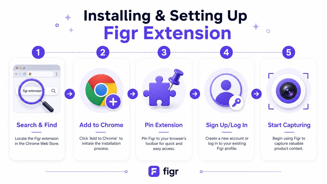
Figr's guide to product team extensions covers the product overview. The setup that matters for redesign work is straightforward, but a few choices up front will save rework later.
Setup steps that actually matter
Step 1. Find the extension in Chrome.
Open the Chrome Web Store and search for the Figr extension. Check that the listing is the official Figr product before you install it.Step 2. Add it to Chrome.
Click the install button and approve the extension prompt. Chrome will place it in your extensions menu.Step 3. Pin it to the toolbar.
Pinning sounds small. It matters during reviews, especially when you are jumping between states, accounts, and tabs and need capture to stay one click away.Step 4. Sign in to your account.
Use your Figr workspace credentials. That ties the capture to the right workspace instead of leaving it detached from the team that needs to review it.Step 5. Open the exact product state you want to capture.
Go to the live page, staging environment, or internal tool view you want represented. Then trigger the extension only after the page is fully loaded and configured.
What to check before your first capture
Enterprise products rarely have one clean default state. They have role-based access, seeded data, feature flags, empty tables, overloaded tables, drawers, modals, and permission-gated actions. If you capture too early, you freeze the wrong version of the product and everyone downstream designs around a false baseline.
Use this pre-capture check:
Confirm the environment: Decide whether you are documenting staging or production. Do not capture from whichever tab was already open.
Confirm the account and permissions: Admin, manager, and end-user views often produce different navigation, actions, and edge cases.
Load real context: Signed-out or empty states are often useless if the redesign is about dense workflows, exception handling, or decision-heavy screens.
Prepare the page intentionally: Open drawers, expand accordions, apply filters, or surface validation states before capture.
Check for sensitive data: If you work in a regulated environment, use test data or approved environments before capturing internal product surfaces.
One bad first capture can waste a full review cycle.
The installation itself is simple. The actual setup work is deciding which version of your product deserves to become design input. That is a product judgment call, and it matters more than the browser step.
What Product Context Does Figr Actually Capture
The extension captures structure, not just appearance.
That distinction matters more than most guides admit. According to Figr's Chrome extension documentation, the extension captures the actual HTML structure, component hierarchy, and visual layout of a web app, not screenshots or written descriptions. That gives downstream UX generation materially richer input because the system starts from how the page is built and arranged, not from a flat image.

What that means in practice
When teams hear “capture,” they often imagine a nicer screenshot tool. That's too small a frame. A structured capture can preserve the signals that matter in redesign work:
Layout: How sections are grouped, spaced, nested, and prioritized
Component hierarchy: Which elements belong together, which patterns repeat, and which structures dominate the screen
Navigation shape: Sidebars, tabs, headers, inline menus, drawers, and transitions
Action hierarchy: Primary actions, secondary actions, destructive actions, and utility controls
Density and rhythm: Whether a screen is compact, airy, repetitive, overloaded, or segmented into clear task zones
That's why this kind of input is valuable when you're leveraging product context in AI. The model can reason from a page's organization instead of guessing from visual resemblance alone.
Screenshot versus structured capture
A useful mental model is simple. A screenshot is a photograph of a building facade. Structured capture is closer to an architectural read of how rooms connect, where entrances sit, and how people move through the space.
That doesn't mean the capture knows everything. It won't replace the product decisions behind permission logic, regulatory constraints, pricing rules, or backend edge cases. A Designer and Product Manager still need to explain those. But the extension removes a large category of ambiguity that usually gets lost between “here's the current page” and “please redesign this.”
Here's where teams usually feel the difference first:
Page layout - visible in a screenshot; structured capture makes it interpretable as arranged UI structure.
Component relationships - implied in a screenshot; clearer for downstream generation with structured capture.
Action priority - often ambiguous in a screenshot; more legible from placement and grouping in structured capture.
Repeatable patterns - hard to inventory from a screenshot; easier to trace through hierarchy with structured capture.
Redesign starting point - a screenshot is a visual reference; structured capture is working product context.
The richer the input, the less time the team spends reconstructing what was already there.
Translating Live States and Edge Cases Is Harder Than It Looks
Teams tend to underestimate state complexity until QA or engineering forces the issue.
A button on a clean mock rarely stays a button for long. In a real product, it may become disabled when a field is incomplete, switch to loading during a request, surface inline validation on failure, and reveal a success confirmation that changes the next available action. The same card can behave one way for an admin, another way for a viewer, and a third way when account data is missing.
Why live products hide state debt
The design debt here is subtle. The default screen looks stable, so everyone assumes the rest is manageable. Then edge conditions pile up. I've seen review meetings derail because nobody had documented what happens when a user returns to an interrupted flow with stale data and a partially completed form. Was that an edge case, or the actual common path? Good question.
Figr's content already points readers toward decision criteria for messy, multi-step flows, and that matters because the extension works best when you use it to capture the product state that carries the actual design burden, not just the prettiest screen. That's the same instinct behind discussions of PMs missing edge cases. Rework usually starts in the states nobody wrote down.
What to inventory when you capture
When I'm using a live product as redesign input, I look for state families rather than isolated pages.
Entry states: First-time use, returning use, authenticated but unconfigured
System states: Loading, processing, retry, timeout, partial save
User states: Empty, invalid input, success, blocked action, role-restricted behavior
Content states: No records, too many records, unusual long labels, mixed data quality
A screen is rarely a screen. It's a cluster of states pretending to be one page.
That's also why gallery examples with many product states are useful as workflow demos. A task approval card with many state variations tells the truth that polished specs often hide: the work is in the transitions.
What works and what doesn't
What works is capturing the live page at a meaningful state, then treating that capture as the start of a state inventory. What doesn't work is assuming a single “current screen” can stand in for the whole interaction model.
The moment your redesign touches forms, approvals, onboarding, billing, or permissions, state handling becomes part of the brief. If it isn't explicit, the team will rediscover it the expensive way.
How to Use Captured Context for a UX Review
Captured context becomes useful the moment you turn it into a review artifact.
The value here isn't only that the extension can grab a live page. Figr is presented as a one-click capture workflow that parses live webpages and can capture full HTML structure and layout instead of screenshots. That matters because a UX review built on structured page context can talk about hierarchy, layout pressure, and interaction patterns with far less ambiguity.
A practical review workflow
Use the capture as the input to a fast product critique, especially when you need an objective starting point before redesign work begins.
Step 1. Capture the live page in its real working state.
Don't use a marketing sandbox state.
Use populated data, open controls, and the actual permissions that shape the experience.Step 2. Ask for a UX review focused on behavior, not cosmetics.
Look for observations around action hierarchy, navigation friction, component density, and flow clarity.
A useful review names where the user has to think too hard.Step 3. Separate symptoms from root causes.
A crowded page might reflect weak prioritization, mixed jobs-to-be-done, or legacy feature layering.
The capture helps you see the pattern instead of arguing over taste.Step 4. Turn findings into redesign constraints.
Keep what supports user orientation.
Change what creates hesitation, duplication, or hidden dependencies.
What a good review usually surfaces
A strong review of captured product context often reveals a handful of recurring problems:
Competing actions: Too many controls ask for attention at the same time
Layout fatigue: Dense interfaces force scanning without guidance
Weak grouping: Related information is split across cards, panels, or tabs without a clear logic
Unclear progression: Users can't tell what happens next after a key action
State opacity: The UI changes, but the reason for the change isn't obvious
This is what I mean when I say structured capture shortens the distance between “I know this screen feels off” and “I can explain exactly why.”
Good UX reviews don't start with opinions about visuals. They start with evidence about flow, hierarchy, and user effort.
A quick review like this is especially useful before quarterly roadmap planning. It gives Product Managers and Designers a shared artifact grounded in the product as it exists, not the version each person carries in their head.
Will This Get Approved by My IT Department
IT approval depends less on installation and more on permissions, data handling, and browser policy fit.
That's the part most extension guides skip, and it's usually the main blocker in larger teams. Chrome extensions operate inside a mature ecosystem, and a 2024 analysis counted 111,933 Chrome extensions in the market, which shows how standard this distribution channel has become for browser-based tooling and how often IT teams already evaluate software in this format, as covered in DebugBear's Chrome extension statistics analysis.
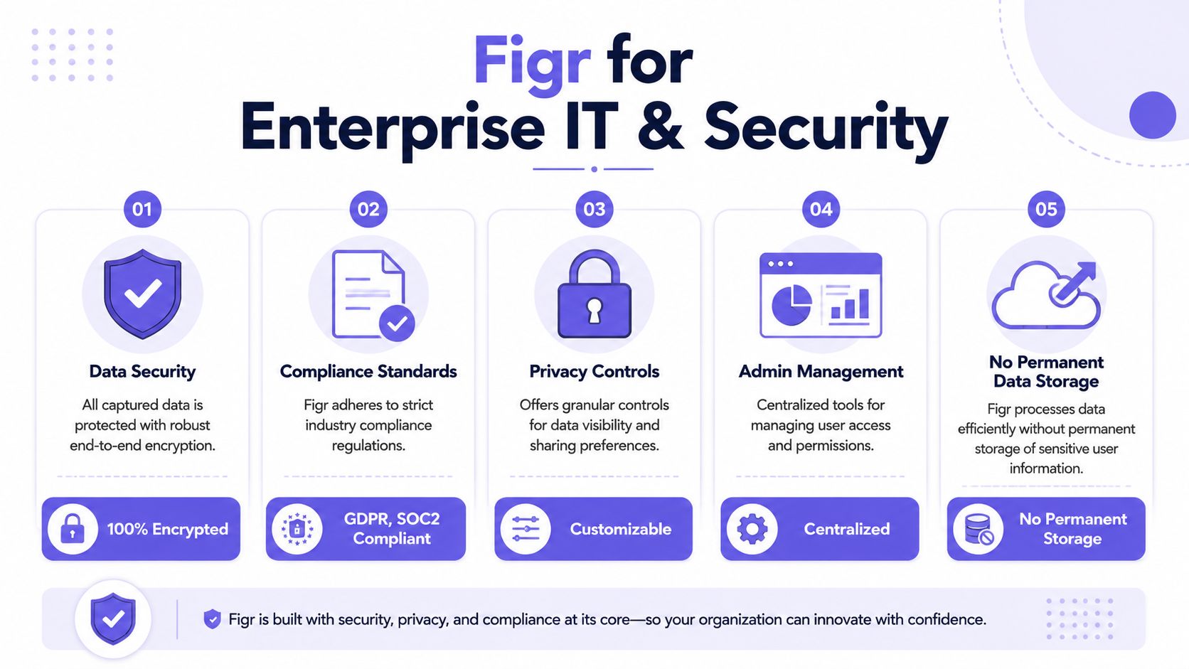
What enterprise reviewers usually care about
Procurement and security reviews rarely focus on whether an extension is “normal.” They focus on what it can access, how admins can control it, and whether the vendor can answer basic governance questions without hand-waving.
Chrome's own extension documentation shows that extension behavior can depend on version-specific permissions and settings, including access patterns that matter in managed environments. For practical review prep, teams should evaluate:
Requested permissions: What the extension needs to read or interact with
Admin controls: Whether browser policies can govern installation and usage
Identity model: How authentication works in your workspace
Environment boundaries: Whether teams can limit capture to approved apps or workflows
Data handling questions: What is processed, what is stored, and under which controls
If your company already has a browser governance checklist, pair it with broader essential browser security strategies so the review happens in the language IT already uses.
How to make approval easier
A friend at a Series C company told me their Product team thought adoption would hinge on whether Designers liked the output. It didn't. The actual gating item was admin review. Once security had clear answers on permissions and workspace controls, the product conversation got much easier.
The wider pattern is economic. Enterprises don't reject browser extensions because they're unfamiliar. They delay them when the approval path is vague. Buyers need a clear explanation of use case, permissions, and operational controls. If you can supply that, the extension becomes another governed tool in the stack.
One more practical note matters here. Approval questions often show up before usage questions. So prepare the internal memo first, then schedule the trial.
Knowing When to Capture vs When to Start from Scratch
A redesign usually starts with a messy question: are we fixing what exists, or are we defining what should exist?
That distinction matters more than the tool choice. Teams waste time when they capture a screen from a product that should be rethought at the model level. They also lose time when they open a blank Figma file even though the live product already contains years of decisions about permissions, hierarchy, exception handling, and operational constraints. The hard part is deciding whether the current experience contains useful truth or just legacy noise.
Use capture when the live product is the best evidence you have.
That usually means the interface reflects real business rules, real user workarounds, and real edge cases that never made it into the brief. In enterprise products, that context often lives in dense settings pages, admin tools, approvals, billing flows, and tables with conditional states. Capturing those screens gives the team something more reliable than a polished screenshot deck because it preserves the structure of what users face. It also helps improve AI design memory by grounding later analysis in the current product, not in a simplified retelling of it.
Use capture when the product already contains hard-won context
Capture usually earns its keep in cases like these:
Redesigning an existing workflow: onboarding, billing, admin setup, support operations
Reviewing dense interfaces: dashboards, approval queues, configuration screens, reporting surfaces
Comparing drift across products: similar screens that evolved differently across teams or business units
Preserving conditional states: permission-based views, validation errors, empty states, locked states, and exceptions
Start from scratch when the current UI would bias the team in the wrong direction.
Some products are so shaped by old technical constraints, outdated org structures, or patchwork feature requests that capturing them just imports bad assumptions into the redesign. New product areas also fall into this category. If the question is about user value, information architecture, or product direction, the team needs room to explore before it documents pixels.
Start from scratch when exploration matters more than fidelity
A blank-canvas approach makes more sense when:
You're defining a new product area: there is no credible live reference yet
The current experience is structurally wrong: the flow, model, or hierarchy needs rethinking
The work is strategic first: the open question is what the product should do, not how the current screen should change
You only need lightweight feedback: a screenshot or annotated note is enough for the decision at hand
My rule is simple: capture when the team needs evidence from the live product. Start from scratch when the team needs distance from it.
Good product work needs both. Some redesigns are translation jobs. Others are resets. The better you are at telling those apart, the less likely you are to confuse existing complexity with useful context.
How Figr Builds Your Visual Context Graph from a Capture
A capture matters because it becomes the first layer in a wider product memory system.
The Figr Chrome extension guide goes beyond a mere install tutorial. The captured screen feeds into Figr's Visual Context Graph, which connects five layers of product understanding into one working context. If you've ever felt AI output looked plausible but strangely detached, this is usually the missing middle.
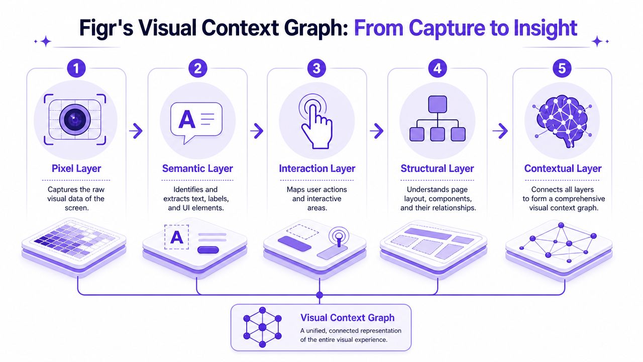
The five layers that turn capture into reasoning
The extension starts with the live screen, then that input connects to a broader graph:
Visual context
Screens, frames, and captured page structure from the live product.Behavioral context
Recordings, flows, cursor paths, and walkthrough behavior that show how the product is used.Design System context
Tokens, components, variants, and usage rules that shape consistency.Product Knowledge context
PRDs, research, decisions, and written rationale behind the interface.Implementation context
Code constraints and technical realities that influence what can ship.
That is the layer model behind the broader idea of improve AI design memory. A capture alone is useful. A capture connected to design system rules, product decisions, and implementation constraints is where UX reasoning gets sharper.
Why this architecture matters
A lot of AI design output fails for a boring reason. The system sees a prompt, then guesses the rest. Product teams don't work that way. They make decisions inside a mesh of previous screens, known constraints, research inputs, and system patterns. The Visual Context Graph reflects how real teams already think, except now the memory is explicit.
For Product Managers, that changes the quality of the brief. For Designers, it changes the quality of the starting point. For QA and engineering, it creates artifacts grounded in the same source context instead of parallel interpretations.
If you're evaluating whether the Figr Chrome extension guide fits your workflow, start with one messy screen that already causes review churn. Capture it, inspect what context becomes legible, and use that artifact to pressure-test your next redesign brief. The fastest way to understand the value is to run it on a page your team already struggles to describe. Then try Figr.
A good redesign brief doesn't make the current product look tidy. It makes the current product understandable. That's a higher bar, and it's the one that reduces rework.
The teams that move faster usually aren't guessing better. They're starting from better context.
FAQ
Is the Figr Chrome extension guide mainly for Designers
I'd use it with both Designers and Product Managers. The capture is most useful when the team needs a shared view of the live product before redesign work starts.
Can I use it for a multi-step product flow
Yes, but I'd capture the moments that carry real state or decision weight. One clean happy-path page usually isn't enough for a messy flow.
Should I replace screenshots entirely
No, I wouldn't. Screenshots still help with quick comments and narrow feedback, but they're weaker when the work depends on structure and behavior.
Will it handle all edge cases for me
No. I'd treat capture as the starting inventory, then use product judgment to expand the missing states, permissions, and unusual branches.
When would I skip capture and write a brief from scratch
I'd skip capture when the product area is new, the concept is still forming, or the current UI is the wrong foundation for the work.