
It’s 2 p.m. on a Wednesday. You’re trying to explain a subtle UX issue to an engineer. You take a screenshot. You open a new tab. You find a design file. You paste the screenshot, draw a red box, and type, “See? The padding is off here.” Fifteen clicks to communicate one simple idea.
This is the Friction Tax.
It’s the small, invisible cost you pay every time you switch context to capture, document, or explain something.
A friend at a Series C company told me he audited his team’s tool sprawl last month. He found that the average bug report traveled through four different applications before it landed in the backlog. Four context switches. Four opportunities for information to get lost. What if you could reclaim that lost time?
This is what I mean: the right browser extension isn’t a gadget, it’s a dedicated specialist for a job you do ten times a day. A powerful chrome extension is more than a utility, it’s a workflow upgrade. These tools are purpose-built lenses for seeing and shaping digital products, helping you reclaim that lost time. The rise of AI for product design is only accelerating this shift.
Why does this matter at a larger scale? It’s about cognitive load. As Daniel Kahneman argues in Thinking, Fast and Slow, focused, deliberate thought is finite. Every unnecessary click burns some of it. That’s the economic case for workflow efficiency. Tighten the micro-interactions of your work, and you free up attention for the macro decisions that matter: strategy, prioritization, and user empathy.
The browser is where the work already happens. Product reviews. competitor teardowns. QA passes. backlog grooming. Yet many teams still use an awkward stack of tools to move one observation from “I see a problem” to “the team can act on it.”
This list is organized by the core jobs product teams do: discovery, auditing, documentation, and communication. These are some of the best chrome extensions for product managers who want to pay less friction tax and ship better work, faster.
1. Figr

You are midway through a product review. The team is staring at a live dashboard, not a polished mockup. Filters stack strangely, empty states feel improvised, and the shipped UI no longer matches the Figma file. A plain screenshot captures the symptom. It does not capture the product logic.
Figr is useful in that gap.
Its Chrome extension captures a live product from the browser and turns that into structured design input. The point is not just image capture. It is faster reconstruction of flows, components, and layout patterns so the team can work from what shipped, not what someone remembers shipping.
Where Figr fits in the workflow
Figr belongs in the Discovery-to-Documentation handoff.
I use tools like this when the main task is not “grab the screen.” The main task is “turn this messy, live experience into something the team can inspect, redesign, and discuss without losing context.” That comes up constantly in PM work:
Redesigns with constraints: You need concepts grounded in the current product, not fresh ideas that ignore technical reality.
Flow mapping: You want to inspect edge cases and state changes before they become tickets.
Design drift checks: The product, the prototype, and the team’s mental model have split apart.
That is where Figr earns its place in the stack. You can capture a complex interface, review how the system interprets it, then move into design exploration or documentation with less manual cleanup. If your team is already evaluating the broader wave of best AI design tools, this is the category to watch closely: tools that start from the live product, not a blank canvas.
Two examples are worth reviewing. This Intercom dashboard example shows the kind of interface complexity Figr can ingest, and the product examples in the gallery make the range clearer.
Practical rule: Use Figr when the debate is about improving an existing experience. Skip it when a simple screenshot and a quick annotation will do.
What works, what doesn’t
What works:
Product-aware capture: Output reflects real structure better than generic mockup generators.
Stronger downstream artifacts: The same source can inform prototypes, PRDs, UX reviews, and test cases.
Useful workflow chaining: Capture in the browser, refine in design tools, then hand cleaner context to engineering.
There is also a real governance angle here. Analysts at Georgia Tech found that many browser extensions extracted sensitive data from high-stakes sites, which is why teams should review extension permissions and deployment controls before rolling anything out broadly (Georgia Tech study on browser extension data risks).
What doesn’t:
Source quality still matters: Messy inputs lead to weaker outputs.
You still need product judgment: AI can speed up interpretation, but it does not decide what should change.
Pricing requires a sales step: Enterprise evaluation will likely involve a demo and procurement discussion.
Used well, Figr is not a standalone magic trick. It is the front end of a better PM workflow. Capture the live product, turn it into structured design context, then pass that context into review, documentation, and decision-making without rebuilding the same understanding three times.
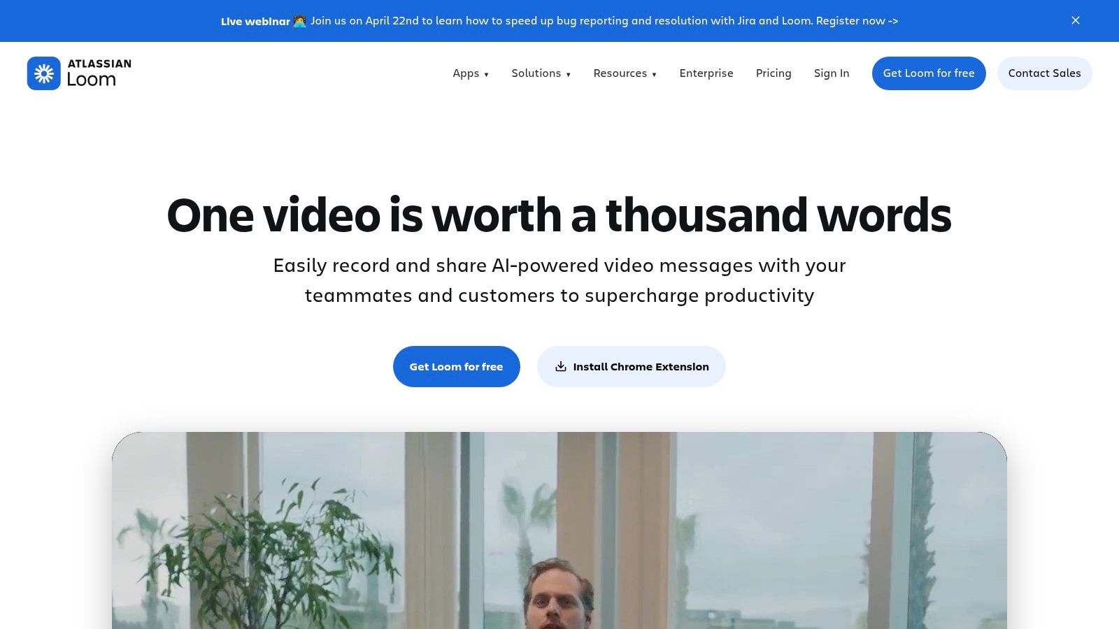
2. Loom
Some product problems need motion, not markup.
A broken hover state. A delayed spinner. A funnel that feels confusing because the transition between steps is doing something subtly wrong. You can describe those in text. You can also save everyone ten minutes and record it.
Loom is still one of the cleanest ways to do async explanation. Click, record, send link. That’s it.
Best use case
Loom shines when the issue lives inside behavior. That makes it excellent for walkthroughs of user experience flows, design critiques with narration, and bug reports where timing matters.
A short clip often beats a perfect paragraph. Especially when the engineer, designer, and PM are each picturing a different failure mode.
What I like:
Fast recording: Screen and camera capture happen with minimal setup.
Instant sharing: The share link is the product.
Good for distributed teams: Async review gets easier when context travels with the message.
What to watch:
Paid tiers matter: Some controls and AI features sit behind higher plans.
Extension vs desktop app: Some teams end up preferring the desktop version for broader capture behavior.
A good Loom isn’t a meeting replacement. It’s a context packet.
That’s the trick. Don’t record five wandering minutes. Record ninety seconds with a clear path, a single issue, and the expected behavior stated out loud.
Loom is less useful for structured audits or persistent documentation. It’s communication-first. If the job is “help everyone see what I just saw,” it earns its place fast.
Website: Loom
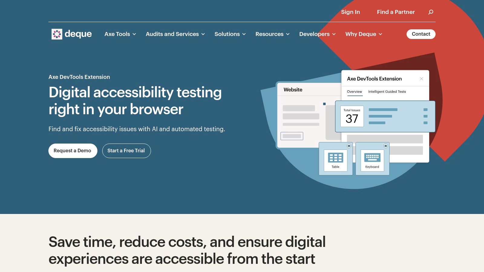
3. axe DevTools
Accessibility issues often hide in plain sight. A modal that traps focus. A button with no accessible name. Contrast that looked fine on a polished monitor and fails in practice.
axe DevTools is one of the fastest ways to pull accessibility into everyday review instead of treating it like a final-stage audit.
Why product teams should care
This isn’t just a developer tool. It’s a chrome extension for ux teams who want better design decisions earlier.
Speed of detection is the primary benefit. You can run automated checks in-browser, inspect violations, and get remediation guidance while the page is still fresh in your head. That changes the conversation. Instead of filing vague concerns, you can point to specific failures and hand the engineer a clearer starting point.
Deque’s tooling is also a useful companion to broader thinking around Tools that check product UI for accessibility using AI.
What works well:
Automated checks: Quick signal during reviews.
Guided testing paths: Helpful when automation alone won’t tell the full story.
Standards alignment: Useful for teams working against WCAG-oriented requirements.
What doesn’t:
It won’t replace manual review: Screen reader behavior, task completion, and content clarity still need human evaluation.
Advanced capabilities may require paid access: Teams should check licensing before rollout.
The browser extension market is crowded, but not evenly distributed. As of August 2024, the Chrome Web Store hosted 111,933 extensions, and 95,136 had fewer than 1,000 users, which is a reminder that most tools never become reliable daily drivers (Chrome Web Store extension distribution and Chrome usage data). axe stands out because it solves a recurring, expensive problem with a mature rules engine.
Website: axe DevTools
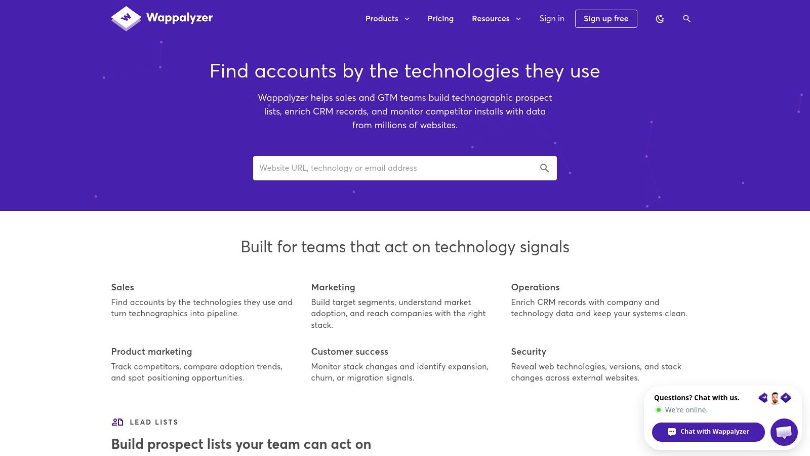
4. Wappalyzer
Competitive research gets smarter when you stop looking only at the interface.
A landing page isn’t just copy and hierarchy. It’s also instrumentation, experimentation infrastructure, chat layers, payment systems, and framework choices. Wappalyzer gives you that second layer of context.
What it reveals quickly
Open a product. Click the extension. You get a read on the site’s technology stack, from frameworks to analytics tools to ecommerce infrastructure.
That sounds technical, but the PM value is immediate.
Say you’re auditing a competitor onboarding flow. The visible experience feels polished, but you also want to understand whether they’re running A/B tooling, personalization layers, or unusual analytics implementations. Wappalyzer helps you connect the UX to the machinery underneath.
That makes it one of the more practical productivity chrome extensions for discovery work.
Useful moments include:
Competitive teardown: Pair visual observations with technical clues.
Stakeholder alignment: Explain likely implementation constraints without guessing wildly.
QA prep: Spot third-party dependencies that may affect behavior.
The interface tells you what the user sees. The stack hints at why the product behaves that way.
Trade-offs are simple. It’s fast and lightweight, but not omniscient. Custom setups and intentionally obscured technologies can slip through. And if you want deeper workflow automation, you’ll likely hit paid features.
There’s also a larger market signal here. The broader Chrome Extensions market is currently valued at USD 2.5 billion and is projected to reach USD 5.0 billion by 2033, with Productivity Extensions and Developer Tools called out as important segments in that growth (Chrome Extensions market projection). Discovery tools endure when they fit active workflows, and Wappalyzer usually does.
Website: Wappalyzer
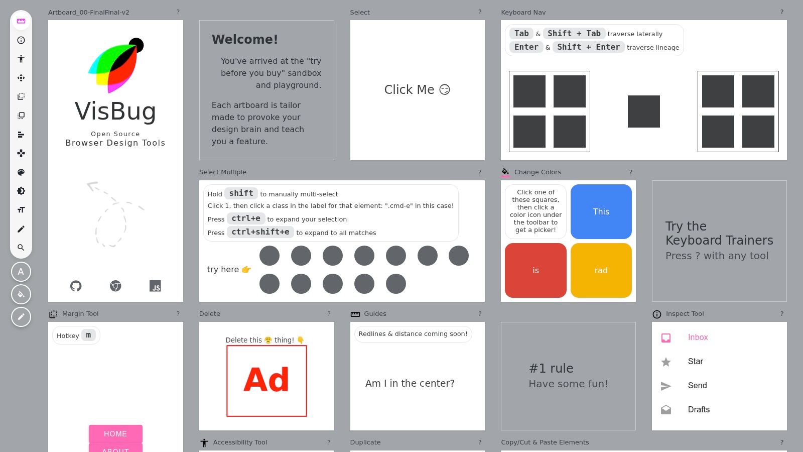
5. VisBug
Sometimes the fastest way to settle a design debate is to touch the page.
Not rebuild it. Not open DevTools and inspect ten nested divs. Just nudge the padding, change the label, move the block, and see whether the idea survives contact with reality.
That’s where VisBug earns its place.
A strong chrome extension for design reviews
VisBug is a deceptively useful chrome extension for design because it lowers the threshold for visual experimentation. Designers can tweak live pages. PMs can test a hypothesis before turning it into a formal ticket. QA can show the exact alignment issue instead of describing it badly.
You can:
Edit text on-page: Useful for copy and hierarchy checks.
Measure spacing: Helpful when something feels off but the problem is still fuzzy.
Inspect visual relationships: Good for quick redlines and layout conversations.
It’s open source, which also makes it easier to try without procurement drama.
Where it works best is in review sessions. A team is looking at a live page. Someone says, “What if the CTA moved up?” With VisBug, you can answer in seconds.
Where it doesn’t work is persistence. There’s no durable decision trail by itself. If the tweak is good, you still need to document it somewhere else.
That’s the larger lesson with visual editing tools. They’re accelerators, not systems of record.
Website: VisBug
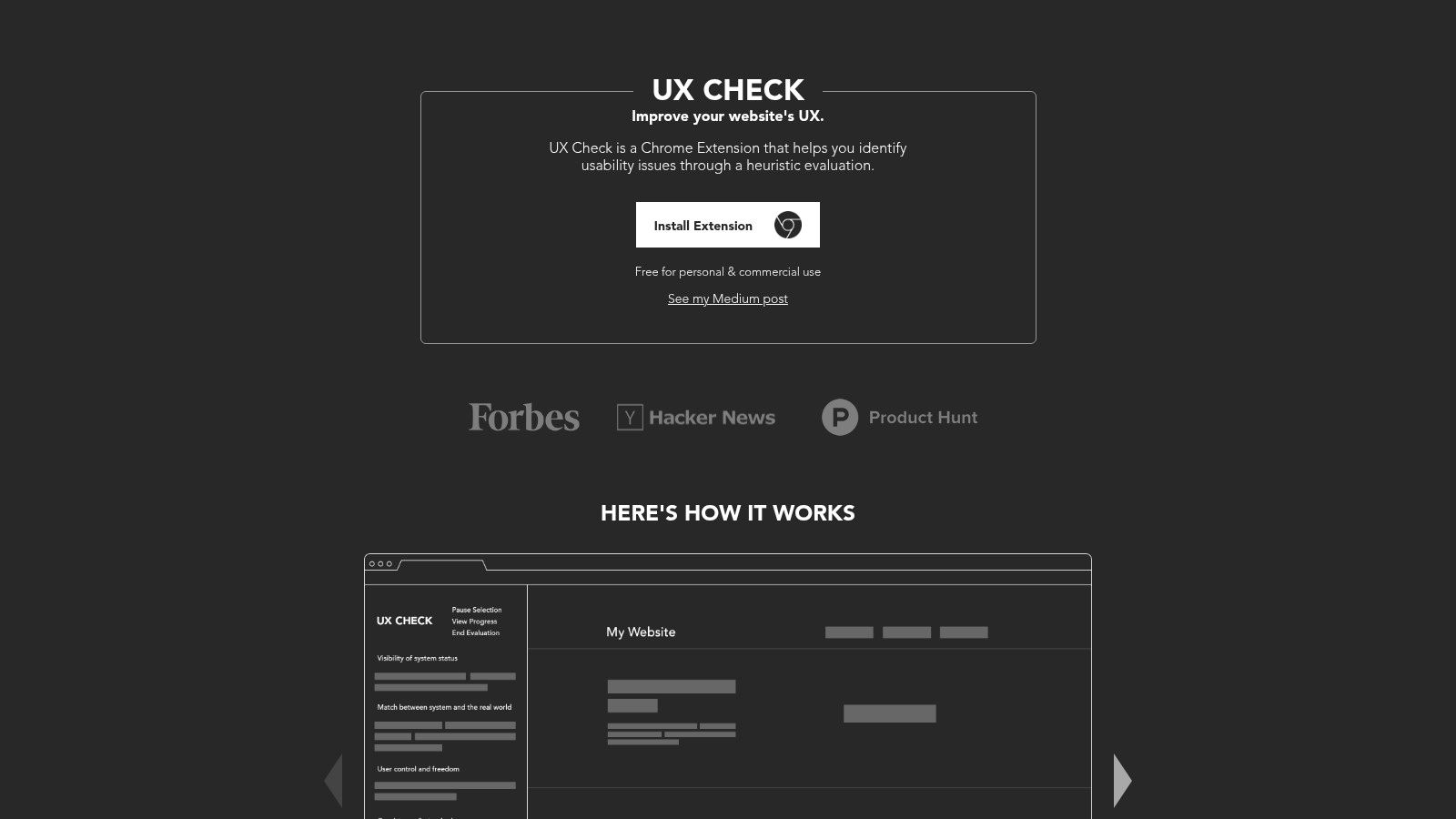
6. UX Check
A lot of UX feedback dies because it’s too loose to survive handoff.
“Feels cluttered.”
“Navigation is confusing.”
“This step is weird.”
Maybe all true. None of it is operational.
UX Check helps by forcing a little structure into lightweight audits. It overlays heuristics, lets you annotate the page, captures screenshots automatically, and exports findings into a shareable document.
When to use it
This is a good fit when you want a fast, repeatable website UX audit without spinning up a full research repository or elaborate deck.
That usually means:
Pre-sprint review: Flag obvious usability issues before engineering picks up the work.
Competitor analysis: Keep notes organized across multiple products.
PM-led evaluation: Give non-design teammates a stronger frame for critique.
The built-in heuristic model is useful because it keeps feedback from becoming purely aesthetic. The conversation shifts from “I don’t like this” to “this control doesn’t match user expectations” or “system status isn’t visible here.”
What works:
Opinionated workflow: Good constraints for teams that overtalk and under-document.
Easy annotations: Faster than trying to recreate issues in slides.
Simple export: Good enough for fast stakeholder circulation.
What doesn’t:
Word export only: Fine for some teams, awkward for others.
Limited depth: It’s not a full repository for longitudinal research.
If your team struggles to turn observations into artifacts people can use, UX Check punches above its weight.
Website: UX Check
7. Marker.io
Bug reporting usually breaks in the same place. Right after someone says, “I saw something weird.”
Then comes the scavenger hunt. Which page? Which browser? Which account? Which console error? Was it staging or production? Did anyone else see it?
Marker.io is built for that gap.
Why it works in real teams
The extension lets people annotate the page visually, then send the issue into systems like Jira, Linear, Asana, or GitHub with useful technical metadata attached.
That changes who can file a good bug. Suddenly the PM, marketer, client, or support lead can send something actionable without writing like a QA analyst.
This is especially useful for teams trying to improve the loop around integrating design critique and feedback.
What I like most:
Technical context rides along: Environment details reduce back-and-forth.
Backlog integration matters: Good reports land where the team already works.
Guest-friendly feedback options: Helpful during UAT and stakeholder reviews.
What to be careful about:
Setup is part of the product: You only feel the value once integrations are configured well.
Large reviewer groups can get expensive: Especially if a lot of occasional users need access.
A recent security analysis on the “Phantom Extension” technique shows how browser extensions can abuse obscure Chromium pathways through service workers and browser settings, which is a useful reminder to review permissions and enterprise controls before rolling out any extension involved in sensitive workflows (Phantom Extension analysis by Synacktiv).
Marker.io is best when the bottleneck is translation. People can see the bug. They just can’t package it properly.
Website: Marker.io
8. GoFullPage
There’s still a place for the humble long screenshot.
Not because it’s glamorous. Because sometimes you need the whole page, intact, in one artifact. A pricing page teardown. A long onboarding flow. A competitor comparison. A regression snapshot before a redesign touches everything.
GoFullPage does one thing cleanly: it scrolls and stitches.
Best for documentation and journey mapping
This is the tool I’d use when mapping digital customer journeys across long or content-heavy experiences. It’s also useful for preserving evidence before a page changes, which happens more often than teams expect.
What works:
Full-page capture: Much cleaner than stitching screenshots manually.
Simple export options: PNG, JPEG, or PDF covers most handoff needs.
Low learning curve: Anyone on the team can use it immediately.
What doesn’t:
Minimal editing: You’ll probably pair it with another annotation tool.
Tricky with certain dynamic apps: Virtual scrolling and unusual rendering can still get messy.
This kind of utility sounds basic until you need it urgently. Then it becomes the fastest path from observation to artifact.
One pattern I see often: teams overinvest in fancy capture workflows while ignoring the simple need to preserve complete context. GoFullPage handles that baseline job well.
Website: GoFullPage
9. Grammarly for Chrome
A surprising amount of product quality is really writing quality.
PRDs. release notes. bug reports. research summaries. design rationale. customer emails. If the sentence is muddy, the decision usually gets muddy with it.
Grammarly for Chrome is less glamorous than prototyping or audit tools, but it removes a common source of drag: unclear writing inside the apps where teams already work.
Why it belongs in a product stack
This is one of those tools people underrate because it feels obvious. But obvious tools often shape the daily operating system of a team.
Grammarly helps with:
Clarity: Cleaner specs, fewer ambiguous statements.
Consistency: Better tone across updates and shared documents.
Speed: Less time rewriting the same message three times.
It’s especially useful for PMs who live in docs and comments all day. That’s a lot of product leaders.
The limits are also familiar. Advanced rewrites and organization-level style controls typically sit behind paid plans, and long web documents can feel heavy in some environments. Still, if your bottleneck is communication quality, it’s one of the simplest improvements you can make.
The AI extension segment itself is expanding quickly, with reports sizing the AI Chrome Extension market in the low billions today and projecting further growth through the next decade, driven by use cases like productivity automation and real-time assistance (AI Chrome Extension market outlook). That macro story matters less than one local truth: product teams spend a lot of time turning thought into text, and small improvements there compound.
Website: Grammarly
10. Scribe
The worst documentation task is the one everyone postpones because it’s so obviously necessary and so obviously tedious.
“Can someone write down the QA steps?”
“Can we document the support workflow?”
“Can we show onboarding how this internal tool works?”
Scribe removes a lot of that pain by recording clicks and keystrokes, then turning them into illustrated step-by-step guides.
Where Scribe saves real time
This is a strong fit for repeatable flows. Internal ops. support runbooks. QA procedures. onboarding sequences. It’s especially helpful when you’d otherwise spend an hour manually building screenshots for something straightforward.
It also pairs well with teams thinking about AI assistants for product design documentation, because the core problem is the same: turn process into usable artifacts without wasting expert time.
What works:
Automatic guide generation: Fast path from action to document.
Editing and redaction options: Important for internal and customer-facing use.
Shareability: Links and embeds are easier to maintain than static files.
What doesn’t:
Best features are often paid: Teams should verify what’s included before standardizing on it.
Permissions matter: Especially in privacy-sensitive organizations.
A YouTube discussion on AI-enabled extension workflows points to an undercovered gap: teams want browser tools that can observe what users are viewing and help generate things like PRDs or user flows, but most guidance stays generic and misses product-team specifics (browser extension workflow discussion on YouTube). Scribe doesn’t solve all of that. It does solve the narrower, very real problem of “please document the flow without spending your afternoon on screenshots.”
If your organization loses time repeating the same explanations, Scribe pays off quickly.
Website: Scribe
From Friction to Flow
Monday, 9:12 a.m. A PM drops a bug in Slack with three words. “Checkout feels broken.” Design asks for a screenshot. Engineering asks which browser. QA asks whether it repros on mobile. Ten minutes later, nobody knows more than they did at the start.
That is the friction tax.
The extensions in this list matter because they shorten that loop. Not by doing the work for the team, but by removing the small delays that turn routine product work into a chain of clarifying questions. One tool captures context. Another tests the interface. Another preserves the steps. Another moves the insight into a form the next person can act on.
The useful frame here is job-to-be-done, not feature count. Product teams need four kinds of help over and over again. Discovery to understand what is on the page. Auditing to assess quality and gaps. Documentation to preserve a flow without redoing it by hand. Communication to hand that work to design, engineering, QA, or stakeholders without losing detail.
That is why these tools work better in sequence than in isolation.
A practical chain might look like this:
Discovery: Start with Wappalyzer when you need quick context on a product’s stack or use Figr when the primary need is turning a live interface into working product artifacts.
Auditing: Move to axe DevTools, UX Check, or VisBug when the question shifts from “what is here?” to “what is broken, unclear, or inconsistent?”
Documentation: Use GoFullPage or Scribe when the team needs a reusable record of the flow, not another one-off screenshot.
Communication: Finish with Loom, Marker.io, or Grammarly when the work has to travel clearly across functions.
That sequence matters. Teams get stuck when they ask one extension to cover every step. It never does. A visual inspection tool will not produce clean handoff. A bug-reporting tool will not replace structured documentation. A writing assistant will not fix weak evidence.
Chrome extensions also have a habit problem. The store is full of tools that look useful in a demo and disappear from real team behavior a week later. The keepers are different. They attach to recurring rituals. Triage. QA pass. Sprint review. Design critique. Release checks. If an extension does not fit one of those motions, it becomes browser clutter fast.
I have seen teams install a stack of shiny tools in one afternoon, then keep only two. The survivors were not the most impressive. They were the ones that removed one repeated annoyance everyone already felt.
So choose with some discipline.
If feedback keeps losing context, start with Loom or Marker.io. If review quality is weak, use VisBug or UX Check. If process knowledge lives in one person’s head, use Scribe. If the team keeps starting from stale screenshots, generic templates, or blank docs, Figr is the more interesting option because it begins with the live product and turns that into usable outputs, as noted earlier.
Pick one extension that fixes this week’s most expensive point of friction. Run it in a real workflow for a few days. Keep it if it saves time, sharpens decisions, or cuts rework. Remove it if it does not. Good extension stacks feel quiet. Fewer jumps. Fewer missing details. More flow.