

A product manager opens the sprint board and the onboarding flow is already in build. The designer has screens, engineering has questions about error states, and nobody can say who decided the copy. That gap is an ownership problem inside the user experience team, not a talent problem.
When decision rights stay fuzzy, the same flow gets redrawn after code is written. Research arrives after the release train has left. Accessibility checks land as bugs. Support absorbs the cost, and the next squad repeats the pattern because nobody named an owner.
This article maps roles, decision rights, and organization models so you can place UX work next to product work. You will leave with a way to name who is accountable, which metrics to pair, and which checks belong in the definition of done.
Roles Inside a User Experience Team
A user experience team is a set of specialists who learn what users need, shape how a product works, and check that it works for real people. Titles differ by company. The responsibilities below do not.
| Role | Owns | Typical deliverable | Works most with |
|---|---|---|---|
| UX researcher | Research plans, interviews, usability tests | Research readouts and insight summaries | Product managers, designers |
| Interaction designer | Flows, states and interaction logic | Flows, wireframes and prototypes | Visual designers, engineers |
| Visual designer | Layout, components and design system | Component designs and style guides | Interaction designers, brand team |
| Content designer | Labels, error messages and microcopy | Copy decks and message libraries | Product, legal, support |
| Accessibility specialist | WCAG review and assistive technology testing | Audit reports and acceptance criteria | Engineering, QA |
| Service designer | End-to-end journeys across channels | Service blueprints | Operations, customer support |
| UX lead | Team standards, priorities and hiring | Operating model and review process | Heads of product and engineering |
The UX researcher owns the plan: who to talk to, which task to watch, and how findings get summarized for product managers and designers. The interaction designer owns flows, states, and the logic between screens, and hands prototypes to visual designers and engineers. The visual designer owns layout, components, and the design system, and works with the brand team so new screens match existing ones.
The content designer owns labels, errors, and microcopy, and sits with product, legal, and support so the words match policy and real tickets. The accessibility specialist owns WCAG review and assistive-technology testing, and writes acceptance criteria that engineering and QA can run. The service designer owns journeys that cross channels, and draws service blueprints with operations and customer support. The UX lead owns standards, priorities, and hiring, and sets the review process with heads of product and engineering.
A small product company often folds these jobs into two or three people. A large organization splits them further, sometimes by platform or market. Either way, the table describes work, not job titles. If you are choosing design roles for SaaS teams, start from the missing work, not from a title you saw on a job board.
List the roles your product already has. Mark the gaps. Name who covers each gap today, even if that person also ships features.
Who Owns Decisions Between UX, Product and Engineering
When nobody is named as accountable, UX work arrives late or gets redone after engineering has started. The letters in a RACI model fix that. Responsible means the person who does the work. Accountable means the one person who makes the final call. Consulted means specialist input. Informed means visibility only.
Nielsen Norman Group's RACI guidance recommends that UX contributors be Responsible and Accountable for user research and design, while other functions are Consulted or Informed. Product management stays accountable for outcomes and prioritization. The matrix below is an illustrative starting model. Adapt the letters to your company. Do not treat them as a universal org chart.
| Activity | UX team | Product manager | Engineering | Analytics |
|---|---|---|---|---|
| Research plan | R, A | C | I | C |
| Interaction design and flows | R, A | C | I | I |
| Usability evaluation | R, A | C | I | I |
| Feature prioritization | C | R, A | C | C |
| Product outcome targets | C | R, A | I | C |
| Technical feasibility | I | C | R, A | I |
| Event tracking and dashboards | I | C | R | A |
Research plans, interaction design, and usability evaluation sit with the user experience team as both Responsible and Accountable. Product management owns feature prioritization and outcome targets. Engineering owns technical feasibility. Analytics is Accountable for event tracking and dashboards, with engineering Responsible for the instrumentation.
Practical rule: One Accountable name per activity. Two names means the decision will stall until a deadline forces a guess.
Named ownership is common and still incomplete. In 2024, 77% of respondents to Applause's global survey of more than 3,500 software, product, QA, and UX professionals said their organization had a person or group responsible for accessibility. The other share did not. The same hole shows up in research plans and state maps.
A tool can draft flows and list tradeoffs. It does not make the final UX decision. The team still reviews and decides. That split keeps speed without handing judgment to a model. Figr's take on design collaboration is useful once those rights are written down.
Pick three activities that caused friction last quarter. Assign one accountable owner to each before the next planning cycle.
Three Ways to Organize UX Around Product Work
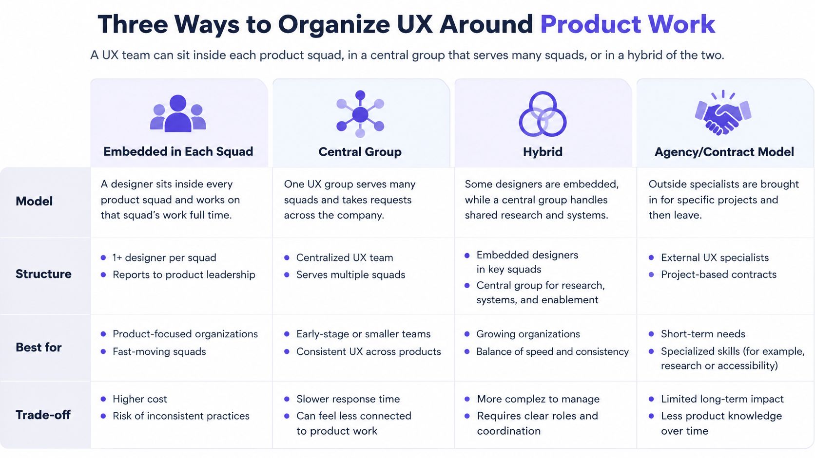
A weekly release is about to ship, and three people think they own the onboarding flow: the squad designer, the central UX lead, and the product manager. That clash is an ownership problem. Where UX sits decides who may change a flow, who may hold a release, and who only advises.
| Model | Where UX sits | Main strength | Main risk |
|---|---|---|---|
| Embedded | One UX specialist per product squad | Deep product context and fast feedback | Standards drift between squads |
| Centralized | Shared UX group serves all squads | Consistent quality and shared tools | Queues slow research and review |
| Hybrid | Central standards with embedded specialists | Balances consistency and speed | Fails without written decision rights |
| Unassigned | Product or engineering does UX part-time | Low cost and fast to start | Research and accessibility checks get dropped |
Embedded puts one specialist in every squad. Feedback is fast because the designer hears the standup. The risk is drift: each squad invents its own button, error pattern, and research habit, and those local habits become the product.
Centralized keeps one group and a shared queue. Quality and tools stay consistent. Squads wait. A weekly release can ship before the review slot opens, so engineering ships a flow UX never signed.
Hybrid keeps a central standards group and places specialists in squads. It balances speed and consistency only when decision rights are written. Product still sets priority. Engineering still judges what can be built. UX still owns interaction logic and the research behind it. Without that page, the central lead and the squad designer both think they own the flow. The org chart then works like a seating plan: people know where they sit, not who decides.
Unassigned means a product manager or engineer does UX part-time. It is cheap and fast to start. Under delivery pressure, research and accessibility checks are the first items cut, because nobody's only job is that work.
Choose the model by team count and release frequency. A company with three squads and weekly releases usually needs embedded specialists. A single product on a slower cadence can run well with a central group. If you want to compare PM-to-designer ratios, use that ratio as a staffing check, not as a target to hit on paper.
Count your product teams. Count your UX specialists. Pick the model that matches that ratio, and write down the decision right you are accepting or giving up.
A Working Cycle That Keeps UX in the Loop
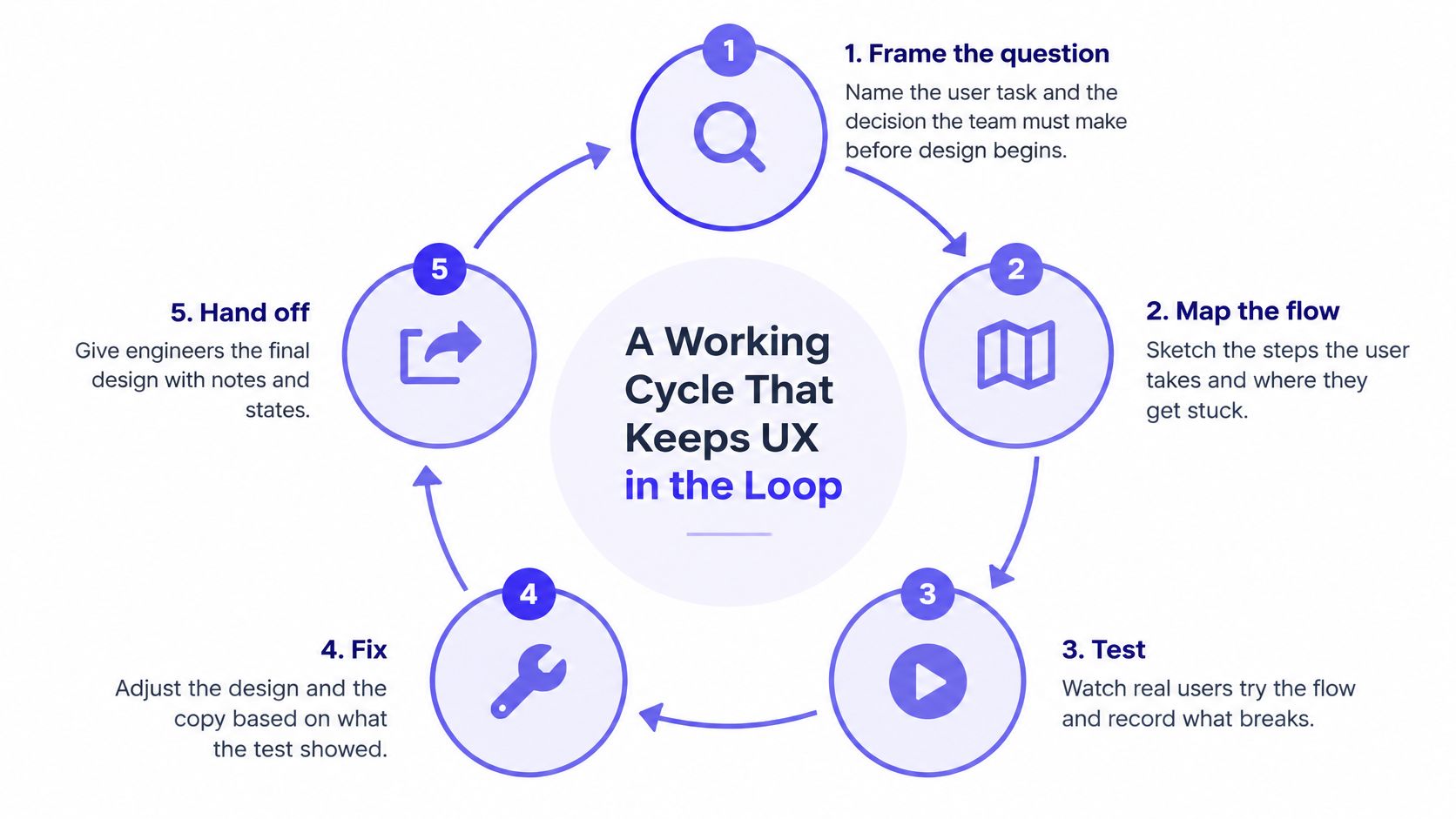
The cycle that keeps UX inside a release is short: frame, map, test, fix, hand off. One late study after code freeze does less than several small rounds while the design can still change.
Nielsen Norman Group's synthesis indicates that five users typically reveal nearly as many qualitative usability problems as much larger samples, because later participants mostly repeat issues already seen. That count fits formative evaluation. It does not estimate conversion rates or segment differences. Those need larger, powered samples.
Frame the question.
Name the user task and the decision the team must make before design begins.
The slip is a vague goal such as "improve onboarding," which cannot be tested.Map the flow and missing states.
List branches, empty states, and error paths so the team reviews logic before screens exist.
Skipping the map hides the path that breaks after a rejected import or an empty account.Test with five representative users.
Group problems by severity and how often they appear.
The slip is testing with colleagues or with users who never do this task.Fix the highest-impact problems and retest.
Change the design, then run another small cohort on the revision.
A report that nobody acts on does not improve the product.Hand off with acceptance criteria.
Write checks engineering and QA can run, including states and errors.
A pretty file without those checks gets reinterpreted in code.
Before screens are locked, a review should ask clarifying questions, map the current flow, list friction and missing states, and explain tradeoffs. That gives the team a way to judge the UX logic first. Schedule the five-user test before the design review, not after engineering has started.
Write the next feature's user task on one line. Put a five-user test on the calendar before that review.
Measuring UX Impact Without Vanity Metrics
A UX team proves value by linking its work to product outcomes, not by counting studies or screens. Activity reports show effort. Outcome reports show whether users finished the task.
In a 2003 analysis, Nielsen Norman Group reviewed 42 paired measurements from web usability projects and found that usability improvements increased desired outcomes by an average of 135%. Sales or conversion rates increased by 100% on average. These are historical averages, not guaranteed returns, and the source notes that classic ROI is hard to calculate when costs are money and outcomes are behavior or satisfaction.
| Metric | What it shows | Typical owner |
|---|---|---|
| Task success rate | Whether users finish a core task | UX researcher with product |
| Time on task | How long a core task takes | UX and analytics |
| Error rate | How often users make mistakes | Interaction designer |
| System Usability Scale | Perceived usability on a scored questionnaire | UX researcher |
| Net Promoter Score | Likelihood to recommend, from -100 to 100 | Product and marketing |
| Conversion or completion rate | Share of users who reach the goal | Product and analytics |
Pair a satisfaction score with a behavioral measure. A high score can sit next to a funnel that still leaks. Growth teams can use analytics context for funnel and activation questions, and product teams can use it to connect behavior signals to UX decisions. The same habit applies outside the product funnel: the SourceX referral quality guide shows why quality beats raw volume when you judge a channel.
In short, own task success and error rate, and influence conversion with product and analytics. A longer UX metrics guide for product leaders can help you pick the pair for a specific flow.
Choose one product question. Name one behavioral metric and one attitudinal metric. Record a baseline before the next change ships.
Accessibility and AI Checks the Team Must Own
Accessibility and AI-generated work need quality gates that the UX team runs before anything reaches production. Put the gate in the definition of done, then explain the reason to the squad.
W3C's WCAG conformance guidance says conformance applies to the entire page, and that a multi-step process such as a form or transaction must be accessible at every step. One inaccessible step can fail the journey even when the rest looks fine. Level A is the minimum: every Level A success criterion must be met, or a conforming alternate version must be provided. Level AA adds the Level AA criteria on top of Level A. The difference between WCAG A, AA, AAA is a conformance choice, not a design style.
Checks before release
- Keyboard and focus. Every control works from the keyboard, and focus order is visible.
- Text alternatives and contrast. Non-text content has a text alternative, and foreground and background stay distinguishable.
- Names that assistive technology can read. Labels, roles, and status messages match the task, not a placeholder.
Automated scans catch repeatable rule breaks. They do not judge whether a label makes sense in the task or whether focus order matches the user's path. Manual keyboard and screen-reader passes cover that. Run both.
Gates for AI-generated work
Flows, copy, and research summaries from a model need three things before release: a named reviewer, a record of what the tool produced, and a check with representative users. Without the record, the squad cannot tell a model guess from a researched decision. Without the user check, a fluent error message can still point people the wrong way.
Add one accessibility acceptance criterion and one AI review gate to your definition of done this month.
Five Questions Product Leaders Ask About UX Teams
Who should sit on a UX team at a small company?
Usually two or three people who cover research, interaction design, and content. QA can run accessibility checks until volume justifies a specialist. The gap to watch is the empty state and the error path, because those are the first items a part-time designer skips.
Is a UX team the same as a design team?
No. Visual design is one role among several. Research, content, and accessibility often sit outside a design group, and they still belong in the same operating model. A team that only produces screens will miss task failures that never show up in a mock.
How many users do we need for a usability test?
Five representative users reveal most qualitative problems in one formative round, and later people mostly repeat those problems. Estimates of prevalence or conversion need larger, powered samples. Match the count to the decision, not to a default study size.
Should UX report to product or to design?
The reporting line matters less than written decision rights. A hybrid model fails when both the squad and the central group think they own the flow. Pick one Accountable person per activity, then choose the reporting line that makes that person easy to reach.
Which metric should we start with?
Pair one behavioral measure, such as task success, with one attitudinal measure, such as the System Usability Scale, and record a baseline before the next change ships. A single score, on its own, will not tell you whether the funnel still leaks.
Test an Onboarding Change, Then Map Ownership
Imagine a product squad at a SaaS company: a product manager, two engineers, a designer, and a UX researcher. They plan an onboarding change inside a two-week sprint. These numbers are illustrative, not a benchmark. Assume 3,000 new trial users a month and a 40% drop-off between sign-up and the first project.
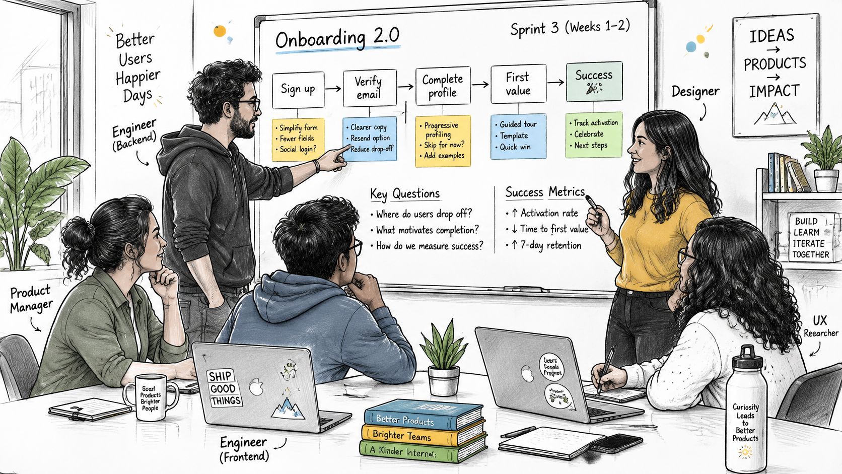
In week one the researcher runs five moderated sessions. The interaction designer maps empty states and the error path for a rejected import. The product manager sets a completion-rate target. The accessibility specialist checks the keyboard path through sign-up, import, and the first project. The ownership map says who reviews the state map before screens are approved.
On the success path, sessions show that people cannot find the import button after sign-up. The team fixes the label, reruns two sessions, and sees completion rise in staging. That rise is an observation inside this hypothetical, not a promised lift.
On the failure path, a second version skips the state map. The error path breaks when an import is rejected. Support handles the bug after release, and the completion target is missed for a reason nobody tested. The same squad, the same sprint length, a different owner for the map.
What to do this week
List every product squad and every UX activity on one page. Assign one Responsible person and one Accountable person to each row. Check for gaps, such as a squad with no researcher. Set a review date.
Each new squad adds coordination cost. Unclear ownership grows faster than headcount, because every handoff needs a decision and nobody has written who makes it. A 45-minute session with product, design, and engineering leads is enough to close the page. They should leave with a named owner for every row, and a date to check whether those names still match the work.
Figr helps product teams review flows, map missing states, and check accessibility before a design is locked, so the user experience team still makes the call. If you want that review grounded in your product rather than a blank canvas, start with a flow you already ship. Visit Figr and run the next onboarding change through that review before the sprint commits to screens.