

The critique is eleven minutes old and the board already holds thirty sticky notes. One says the primary button feels heavy. Another says the empty state is confusing. A third reports that a colleague couldn't find the export menu. Nobody has written down which screen, which user, or what would count as fixed.
Two days later the designer has implemented nine of the notes, two of them contradict each other, and the export menu is still broken. The next critique reopens the same questions because no one recorded the answers. When the room's memory is the only record, the loudest person becomes the archive.
A design critique template fixes this by turning each observation into a decision record: a located finding with an evidence label, a severity, an owner and a method for checking the fix. The working version I'd hand a product team on day one has thirteen fields, a two-pass routine, four severity levels and one hard rule about when to stop critiquing and go test.
Template Fields and Evidence-Based Findings
One table does the work. Thirteen fields, one row per finding, no separate narrative summary and no second document to keep in sync.
| Field | What to record | Example entry (hypothetical) |
|---|---|---|
| Finding ID | Short unique code for tracking | F-014 |
| Screen or flow | Where the issue appears | Mobile checkout, payment step |
| User goal | Task the user is trying to finish | Pay for an order in under two minutes |
| Observed behavior | What a reviewer can see or record | At 375 px width the Pay button sits below the fold while a secondary link renders above it |
| Principle or criterion | Standard the finding is checked against | Task suitability, ISO 9241-110 |
| Evidence | Direct observation or captured proof | Screen recording, frame 12 |
| Interpretation | Hypothesis, labeled as a hypothesis | Hypothesis: users may scroll past the button and abandon |
| Impact | Consequence for the user or a product metric | Possible drop in checkout completion |
| Severity | Rank from the severity table | High |
| Recommendation | Specific, testable change | Sticky Pay button above the keyboard zone |
| Owner | Person accountable for the decision | Mobile designer |
| Validation method | How the fix will be checked | Unmoderated test with five mobile users |
| Status | Open, accepted, rejected or resolved | Open |
How one finding fills all thirteen fields
A reviewer opens the payment step of a mobile checkout at 375 px width. The Pay button sits below the fold, and a secondary Save for later link renders above it. The finding lands as F-014 with a screen recording and frame number as evidence, a hypothesis stated as a hypothesis, High severity, a sticky-button recommendation, the mobile designer as owner and an unmoderated test as the validation method.
Separating evidence from interpretation is the discipline that makes the rest of the format work. The primary action is visually subordinate to a secondary link is an observation. Users will miss it is a belief, and it stays in its own cell, labeled, so nobody mistakes it for proof.
ISO 9241-110 gives the review a vocabulary that isn't aesthetic: interaction principles for the analysis, design and evaluation of interactive systems, including suitability for the user's tasks and self-descriptiveness. Those two carry most findings. Suitability asks whether the screen supports the task the user came to finish. Self-descriptiveness asks whether the screen explains itself without a help article, and it sits behind most complaints that a label is vague or a state is ambiguous. The standard is technology independent, which is why one field set survives the move from web to native app to an enterprise admin console.
The wording test
Take the note that reads only that the screen feels confusing, and rewrite it in front of the room. Checkout payment step. User goal is paying in under two minutes. Observed behavior is the Pay button below the fold at 375 px. Violated principle is suitability for the task. Acceptance criterion is that the user can identify the next action without opening help.
Wording test: could an engineer reproduce the issue from the note alone, without asking the reviewer a question? If not, the finding isn't finished.
The failure case is worth naming out loud. A comment that records only a taste reaction gets rejected in triage in under a minute, and it should. It has no location, no user goal and no way to tell whether a change fixed anything, so accepting it would mean shipping on the strength of who said it.
The same table serves a single review and a rolling weekly log, and the log is where the format earns its keep. A finding that sits Open for three weeks is telling you something about staffing, not about design.
Design Critique, Heuristic Evaluation and Usability Testing Compared
Three checks answer different questions. Blur them and a team spends a week arguing about button labels while the payment flow breaks on one browser.
| Method | Who reviews | Output | Best use | Main limit |
|---|---|---|---|---|
| Design critique | Designers, PM and engineers | Triaged findings with owners | Deciding what to fix or test | Can reward opinion without evidence |
| Heuristic evaluation | Trained evaluators | Defect list against usability principles | Early structured inspection | Misses real user behavior |
| Usability test | Representative users | Observed task failures | Validating high-priority tasks | Slower, needs recruiting |
The decision rule is sequential. Use a critique to generate and rank findings. Use an inspection pass to produce a defect list against explicit principles. Use a test to validate the highest-priority tasks that are still unverified.
The tradeoff is honest in both directions. Critique is fast and cheap and can reward whoever speaks with most confidence. A test is slower, needs recruiting and a schedule, and answers a narrower question with far more certainty. Heuristic evaluation sits between them: it came out of the usability inspection tradition described at the 1992 CHI workshop on usability inspection methods, where researchers framed it as faster and potentially more cost effective than empirical user evaluation. A later review of 15 years of research on that page found a limit worth remembering, that even the best evaluator and method identified only 44% of the usability problems discovered in laboratory testing.
Critique and inspection combine well when reviewers inspect independently and consolidate afterwards, which is exactly the routine below. For the full method behind an inspection pass, including severity scoring for usability issues, the heuristic evaluation guide is the companion read.
How to Run a Two-Pass Design Critique
The routine that works is two passes: everyone looks alone, then the room decides together. The order matters more than the agenda.
The flow below is the shape I use, with a synthesis step wedged between discovery and decision.
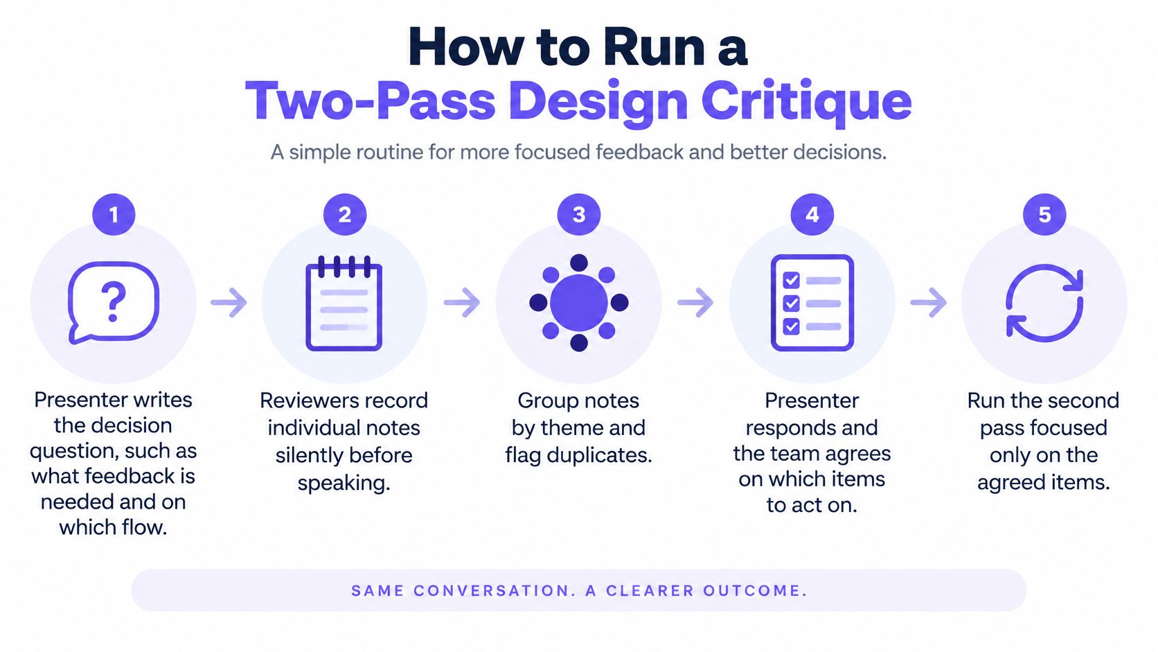
Independent review exists to stop anchoring. In UIProtoCheck, a 2023 study of a checklist-based inspection process, reviewers examined three prototypes alone and then consolidated as a team. Participants reported 35 defects and 37 false positives, and the strongest team found 8 of 12 inserted semantic defects at 67% effectiveness. The false-positive count is the number to remember: critique output needs adjudication, not acceptance.
- The presenter names the decision.
Write the question the session should answer and the flow it covers. A presenter who opens with a proposed fix steers every comment that follows. - Reviewers write alone, in silence, for about ten minutes.
Each note uses the finding fields, so it carries a location and a principle. Silence costs the quiet people nothing and stops the first opinion from becoming the frame. - The room reads everything out loud and clusters.
Duplicates merge, contradictions stay visible. A cluster of six notes with no evidence is a theme, not a finding. - Every finding gets an evidence label.
Anything without direct observation or captured proof is marked hypothesis. Most critiques fail because a confident sentence gets treated as proof. - Severity and an owner are assigned before anyone leaves.
An accepted finding with no name attached will not move, no matter how good the discussion was. - Every finding gets a disposition.
Accepted, rejected with a reason, or sent to validation. Rejection with a reason is what stops the same note returning next week under a new name.
The basic gist is this: discovery and decision are different jobs, and running them as one continuous conversation lets the second contaminate the first.
A finished session is short. Five or six accepted findings, each with an owner, a recommendation and a validation method, plus a written list of what was rejected and why. Forty notes and no owners means the session produced a mood. When reviewers need help turning a reaction into a usable question, design feedback advice from Figr covers the phrasing. We build Figr around the same principle, making the reasoning visible before the design is treated as final.
Severity Levels and What Each One Triggers
Severity decides what happens next, which makes it the field most often argued about and least often defined. Five rows settle most of it.
| Severity | Definition | Example finding | Required action |
|---|---|---|---|
| Critical | Blocks a core task with no workaround | Payment cannot be submitted on iOS Safari | Fix before release |
| High | Causes errors or abandonment on a common path | Error message does not name the failed field | Fix in the current sprint |
| Medium | Slows the task or creates doubt, with a workaround | Secondary action label is vague | Schedule and validate |
| Low | Polish or consistency issue with no task impact | Icon spacing differs between two screens | Batch in a cleanup pass |
| Unverified | Plausible issue with no direct evidence yet | Users may miss the back link | Test before ranking above Medium |
Two rules that keep the table honest
Task impact outranks seniority. A director's Low is still a Low. The reverse holds too: a QA engineer who reproduces a payment failure on iOS Safari has filed a Critical, whatever their title suggests they usually file.
Disagreement gets walked, not averaged. When two reviewers score the same finding differently, don't split the difference. Walk the task outcome together: can a user finish, how long does it take, and is there a workaround. That conversation resolves most disputes in a minute and exposes the ones that need a test.
Unverified findings have a ceiling. A finding with no direct evidence doesn't rank above Medium until someone tests it. Teams skip this rule, and it's the one that stops the log filling with plausible stories written by people who care.
In short, the table ranks task impact, not the room.
A finding can climb. A secondary label reading Continue instead of View order summary looks like a Low until testing shows a common path depends on it and users backtrack to recover. It moves to High with an evidence line attached and a participant profile behind it.
Four levels plus an unverified state is enough for a weekly log. Add a fifth and the team spends the first ten minutes of every review negotiating definitions. If the log feels long, split it by owner rather than by tier.
Severity is also a coordination device. Five people can settle priorities in a conversation. Forty people across four squads can't, so the written level becomes the shared signal that lets engineering plan a sprint without waiting for a meeting to convene.
Accessibility Checks That Pass or Fail
Accessibility survives a critique when each check has a threshold and a pass or fail cell, rather than a paragraph of concern.
The chart below is the set I'd put above the findings table, so reviewers see the numbers before they start writing.
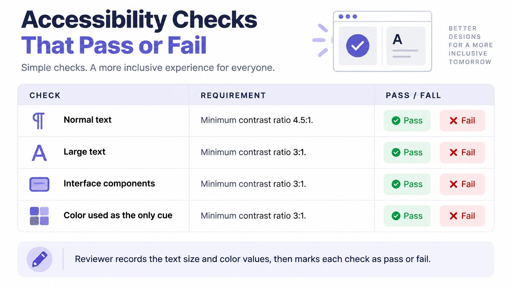
| Element type | Minimum contrast ratio | WCAG 2.2 criterion |
|---|---|---|
| Normal text, under 18 pt regular or 14 pt bold | 4.5:1 | 1.4.3 Contrast Minimum |
| Large text, 18 pt regular or 14 pt bold and above | 3:1 | 1.4.3 Contrast Minimum |
| Interface components and meaningful graphics | 3:1 against adjacent colors | 1.4.11 Non-text Contrast |
| Information conveyed by color alone | Not allowed, add text or an icon | 1.4.1 Use of Color |
Record the text size, the foreground and background colors, the measured ratio and the result. WCAG 2.2 Success Criterion 1.4.3 requires normal text and images of text to reach at least 4.5:1, with large text at 3:1, where large-scale text means at least 18-point regular or 14-point bold, per the WCAG 2.2 contrast minimum. Interface components and meaningful graphical objects carry a separate 3:1 requirement against adjacent colors.
A contrast comment that reads this looks light costs the reviewer nothing and the engineer an hour. A measured ratio costs one screenshot.
What to record beyond the ratio
Each accessibility issue needs the criterion identifier, the affected component or state, the user impact, the test method, the result, the owner and the remediation status. That structure isn't invented. WCAG 2.2 defines three conformance levels, A, AA and AAA, and supplies testable success criteria suitable for specifications, procurement and contractual requirements, with success criteria written to produce consistent results between evaluators, as the WCAG 2.2 specification sets out.
Add the conditions that make a finding repeatable: viewport, input method, keyboard path, browser, zoom level and assistive technology where relevant. A finding an engineer can't reproduce closes as won't fix, and the user impact disappears with it.
Review the states, not just the default screen. Loading, empty, error, overflow, localization, zoom, reduced motion and screen reader output each break differently, and each one is a row waiting to be found.
Most product teams target AA in the template, because AAA sets stricter contrast and cognitive requirements many marketing pages can't meet without a rebuild, while A leaves gaps the team already considers unacceptable. Writing AA into the template turns the level into a property of the review instead of a debate in the room. For the path from checklist to shipped compliance, how SaaS teams reach WCAG AA covers the sequence.
When a Critique Needs User Testing
Critique produces hypotheses. Testing tells you which ones were real, and the log should say which is which before anyone spends a sprint on a guess.
Two designers reviewing the same flow, with the research open beside them, will still disagree about where users hesitate.
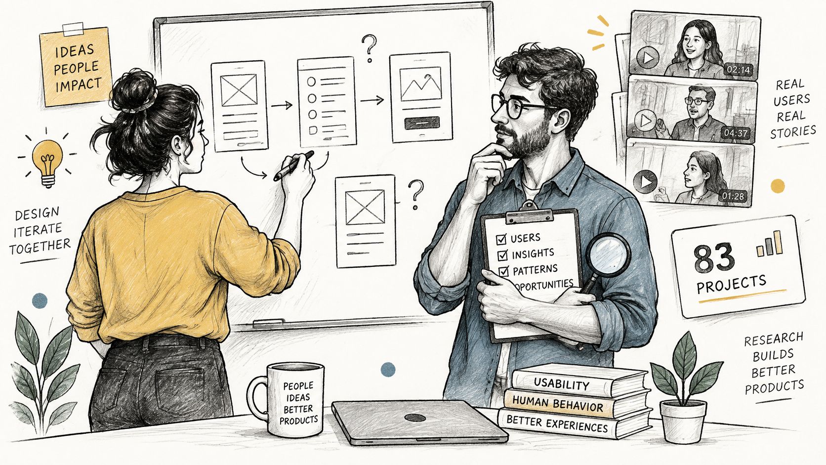
Nielsen Norman Group's synthesis of 83 usability consulting projects concludes that a qualitative study with five users finds almost as many usability problems as testing substantially more participants, though additional rounds with new users keep uncovering more. That's an argument for a small, fast test aimed at the two or three highest-priority unverified findings, not an argument for skipping tests.
Three findings that should go to testing
- A high-severity finding with no evidence.
If the log says High and the evidence cell says hypothesis, you have a guess wearing a severity label. - A disagreement about how a task will go.
Two experienced people predicting opposite outcomes is the cheapest possible signal that nobody in the room knows. - A fix that costs more than the test.
If the change needs a sprint of engineering, spend an afternoon confirming the problem exists first.
Imagine a PM reviewing a three-step onboarding. One reviewer argues the progress bar lifts completion. Another argues it adds pressure and drives abandonment. Nobody has evidence, so the finding is logged Unverified. In the test, four of five participants stop at the same step, and two name the progress bar as the reason they quit. The finding moves to High with an observed failure and a participant profile attached.
From the test, record the task, the participant profile, the observed failure, the severity and the design change. Nothing else belongs in the log, because everything else drifts back toward opinion.
Practical rule: agreement in the room is a scheduling signal, not a behavioral one.
Five participants is a practical starting point for qualitative work, not a sample size for measurement, and it won't represent every segment you serve. Figr's usability testing walkthrough covers the logistics of running the session and capturing what you see.
Design Critique Template FAQs
What is a design critique template
A shared record that turns reviewer observations into located, evidence-labeled findings, each with a severity, an owner and a validation method. The conversation produces the findings; the template keeps them comparable across reviewers, screens and weeks. Without it, the output of the meeting is a memory of who felt strongly about what, and that memory fades by Friday.
How is design critique different from usability testing
Critique ranks hypotheses and decides what to test. Usability testing watches representative users attempt real tasks and shows what fails. A critique is faster, cheaper and easier to run weekly, and it can reward opinion. A test is slower, needs recruiting and answers a narrower question with more confidence. Use the critique to choose which tasks deserve the test.
Do I need every field for every finding
No. The minimum is finding ID, screen, user goal, observed behavior, an evidence or hypothesis label, severity, owner and status. Everything else earns its place or gets cut. After a month of reviews, delete any field nobody filled in, and add one for a gap that keeps recurring, such as the interaction state the team keeps missing.
Does testing five users prove a design works
No. Five participants is a practical starting point for qualitative work: Nielsen Norman Group's synthesis of 83 usability consulting projects found that five users surface almost as many problems as a much larger group. That's a finding about problem discovery, not proof of correctness, and it can't represent every audience segment you serve.
Confirm the Template in Your Next Review
Pick one live screen the team will ship within two weeks, with real constraints attached rather than a redesign concept.
- Run a review with three reviewers.
Two passes, silent notes first, then synthesis. Three is enough to surface disagreement and small enough to schedule this week. - Count the dispositions.
Accepted, rejected, sent to validation. If everything was accepted, the room wasn't discriminating. If nothing was, the presenter framed the question badly. - Audit the High findings.
Every one needs an owner, a recommendation and a validation method. A finding missing any of the three is still a note. - Edit the template the same day.
Cut the field nobody filled in. Add the one for the state the review kept missing, whether that's an empty state, a timeout or a locale.
A design tool can draft a finding list from a captured screen. It can't decide what matters. Designers still review, refine and apply judgment before anything ships, and the log is only as valuable as that judgment.
If the log keeps dying between reviews, the fix is usually process rather than format, and design feedback in product management workflows covers where it fits into a planning cycle.
Book the validation test for the top unverified finding before anyone leaves the room, and put a fifteen-minute log review on the calendar for two weeks out.
Figr is an AI design agent that works from your live product, your design system and your existing flows, so the assumptions behind a screen are on the table before a critique rather than after it. Capture your app in one click, generate the flows, edge cases and UX review, then bring the result back into Figma for the session itself. Visit Figr and run your next critique against your live product instead of a blank canvas.