

A usability review often fails at the exact moment it should become useful. The team has a stack of plausible comments, a few screenshots, and a growing sense that the flow feels off, but nobody can say which issue matters most or what should change first.
When that gap stays unresolved, product work drifts into opinion. A hidden control gets labeled “minor” until support tickets surface. An unclear loading state gets waved through until users retry and create duplicates. An error that appears only after submission turns into engineering churn, QA retests, and a release note that reads like an apology.
Heuristic evaluation helps when it becomes a decision workflow, not a checklist. The useful version ties each observation to a usability principle, a location in the flow, a likely user consequence, a severity judgment, a recommendation, and a next design action. Tools like Figr can support that process by preserving live product context, design-system context, analytics context, and implementation context, but they don't replace Designer judgment. They give the judgment somewhere solid to stand.
Nielsen's 10 Usability Heuristics for User Interface Design
Heuristic evaluation works best when the team uses Nielsen's heuristics as an inspection language, not a memorization exercise.
Jakob Nielsen and Rolf Molich formally introduced heuristic evaluation in 1990 as an informal usability analysis method where multiple evaluators inspect an interface against usability principles, and Nielsen's original report found that single evaluators identified only 20% to 51% of usability problems, which is why solo review is such a fragile way to judge a flow in the first place, according to the original 1990 paper.
That matters in shipped software because vague review comments don't survive handoff. “This feels confusing” dies in a backlog. “After clicking Save in billing settings, the page shows no visible confirmation, which weakens visibility of system status and may lead users to resubmit” can move.
The heuristics are really prompts
The classic set asks evaluators to inspect against principles such as visibility of system status, consistency and standards, help and documentation, user control and freedom, flexibility and efficiency of use, error prevention, recognition rather than recall, aesthetic and minimalist design, and help users recognize, diagnose, and recover from errors, as summarized in the MIT explanation of Nielsen's heuristics.
In a SaaS onboarding flow, those become concrete questions:
Visibility of system status: Does the product show progress, saving, sync state, or confirmation?
Recognition rather than recall: Does the user see the next step, or do they have to remember something from a previous screen?
Error prevention: Does the form catch incomplete setup before submission?
User control and freedom: Can the user undo, edit, back out, or recover without restarting?
This is what I mean: a heuristic only becomes useful when it points to a real decision.
A practical issue card
I use a compact finding format because it forces precision:
Location: Screen, panel, modal, or state
User goal: What the user is trying to complete
Observation: What happened, without editorial fluff
Heuristic: Which principle is violated
Consequence: What confusion, delay, or failure follows
Severity: A 0 to 4 judgment for triage
Recommendation: The smallest design move that addresses the issue
Next action: Who updates what, and where
A broader website UX audit framework can cover many methods, but heuristic evaluation earns its place when the evidence trail is tight.
Practical rule: Run the first pass asynchronously. People see more when they aren't negotiating in real time.
The method also gets stronger when evaluators work independently and then merge findings. Research has long shown that aggregating 3 to 5 evaluators improves coverage materially, and that one evaluator is unreliable for severity judgments, while the mean severity from four evaluators gets within half a point of the true severity 95% of the time, based on Nielsen's discussion of evaluator effects.
Before any review starts, brief the evaluators on user type and core task flow. Otherwise, the same screen gets judged through five different products in five different heads.
A good team also knows its foundations. The best heuristic reviews usually sit on top of strong UX design fundamentals, because a broken principle is easier to name when the team already shares the language.
If your work includes family-oriented or time-constrained flows, it's also worth studying teams that craft interfaces for busy parents. Constraints sharpen design.
WCAG 2.1 Accessibility Heuristics Evaluation
A reviewer signs off a SaaS setup flow because every step works with a mouse. Then someone tabs into the form, loses focus inside a custom date picker, and cannot submit without guessing what control is active. That is not a minor usability note. It is a task blocker, and it needs its own evidence trail.
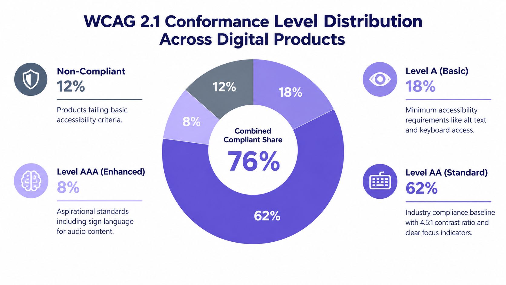
WCAG 2.1 gives that pass structure. The W3C guidance for WCAG 2.1 defines what users must be able to perceive, operate, understand, and rely on. In heuristic evaluation, I use those principles as a second lens on the same flow, then document accessibility findings separately from general UX polish so they do not get buried under copy edits and spacing comments.
The practical difference shows up fast in product work. A weak contrast ratio may also hurt clarity. Missing focus states may also weaken visibility of system status. Poor field labels may also break recognition. The overlap is real, but the handoff is different because accessibility issues often need code-level fixes, component changes, and retesting across keyboard and assistive technology paths.
A good accessibility heuristic review works best as a decision workflow, not a broad audit bucket. Pick one realistic flow. A reporting dashboard export, a user-invite modal, a billing update form. Inspect the task step by step. Tie each observation to a WCAG criterion and the closest Nielsen-style heuristic. Then record severity, expected frequency, and the next owner.
For a SaaS admin table, that might look like this:
Observation: Filter chips can be removed by mouse, but keyboard focus skips the remove action.
WCAG lens: Operable. Keyboard access is incomplete.
Related heuristic: User control and freedom.
Severity: High, because users can apply a filter but cannot reliably undo it.
Frequency: Common for power users who work in tables all day.
Next action: Design updates the chip pattern in the component spec. Front-end implements a tabbable remove control and visible focus state. QA retests with keyboard only.
That format keeps the finding tied to product reality. It also prevents vague notes like “accessibility needs improvement,” which usually die in backlog grooming.
Document these fields for each issue:
Barrier type: Contrast, focus, labeling, timing, feedback, structure
Affected task: What the user cannot complete, verify, or recover from
Interaction mode: Keyboard, screen reader, zoom, reduced precision, low vision
Evidence: Screen, state, component behavior, and failure condition
Fix direction: Design, content, front-end, or design system remediation
Figr is useful here when teams need product-context support instead of a compliance-only checklist. The value is not a generic pass/fail label. It is keeping the finding connected to the exact workflow, component state, and handoff decision that shipped software depends on.
Heuristic review still has limits. It does not prove accessibility compliance, and it does not replace manual testing with assistive technologies or sessions with people who use them. It does, however, catch expensive failures early, especially in custom components where visual QA often misses broken focus order, silent status updates, or inaccessible error recovery.
Here is a useful accessibility explainer to pair with that review workflow:
Teams that treat accessibility findings as first-class heuristic evidence make better product decisions. The issue list gets sharper. Severity becomes easier to defend. The next design action is usually obvious.
Severity and Priority Matrix for Heuristic Findings
A PM is reviewing a billing flow two days before code freeze. One finding says the “Apply coupon” control is buried behind an unlabeled icon. Another says the invoice table truncates plan names in every account view. Both are real issues. Only one should interrupt the release.
That decision gets easier when every heuristic finding is scored the same way: task impact first, reach second, then a clear next action.
Separate severity from priority
Severity answers one question: how much harm does this issue cause when a user hits it?
Priority answers a different one: how soon should the team act, given how often it appears, which customers it affects, and where it sits in the roadmap?
Keeping those judgments separate prevents a common failure in heuristic reviews. Frequent annoyances start to outrank less common blockers, even when the blocker breaks payment, setup, or recovery.
I use a simple decision pattern in SaaS reviews:
Severity: Effect on task completion, confidence, error recovery, or trust
Frequency or reach: How often it appears, which segments encounter it, and whether it sits on a core path
Business timing: Release risk, support burden, revenue exposure, contractual commitments
Next design action: What changes now, and who owns it
Heuristic reviews are still incomplete by nature. The MeasuringU review of heuristic effectiveness is a useful reminder to treat the matrix as triage, not proof that the ranked list captures every serious usability problem.
Run the matrix on a real finding
Take a common SaaS example: a teammate invites a new admin, but the system shows success only as a toast that disappears before the user verifies the result. The invited admin does not appear in the table because the list needs a manual refresh.
The observation maps cleanly to familiar heuristics. Visibility of system status is weak. Recognition rather than recall is weak because users must remember whether the table changed. Error prevention is also in play, because the interface creates avoidable duplicate invites.
Here is how that finding gets scored:
Location: Team settings, post-invite state
User goal: Confirm that the admin was invited
Observation: Success feedback disappears, and the table state does not update
Heuristic: Visibility of system status, recognition rather than recall
Severity: 3, major friction with likely duplicate action
Frequency: Medium to high for teams managing roles
Evidence: Reproducible UI state, support tickets about duplicate invites, repeated evaluator confusion
Recommendation: Persist confirmation in the table, add pending status, and prevent repeated invites to the same email
Owner: Design and front-end
Next design action: Update the state model and spec the pending, sent, and failed invite states
That is the difference between a vague note and a decision-ready finding.
Use a rubric that survives handoff
A severity scale only works if design, product, and engineering apply it the same way. Fancy scoring systems usually collapse in handoff because no one can explain why a 7 outranked a 6.
A five-point scale is enough:
0: Not a usability problem
1: Cosmetic issue with no meaningful task impact
2: Minor friction. Users can proceed without much risk
3: Major friction or probable failure on an important task
4: Critical blocker, serious recovery problem, or high trust risk
Then add a frequency label such as low, medium, or high.
A lower-frequency issue can still outrank a common one if it breaks account setup, causes duplicate billing, or leaves users unsure whether a destructive action succeeded.
Build an evidence trail, not a complaint list
Severity gets stronger when it is tied to product context. A heuristic note should point to the exact screen, state, and consequence, then connect that observation to available evidence such as session clips, support patterns, or funnel drop-off.
Figr is useful here because teams can keep the finding attached to the workflow it affects instead of turning it into a disconnected comment. That matters in shipped software. Engineers need the failing state. PMs need the release implication. Designers need the next UI change, not a general reminder to “improve clarity.”
If your team wants an operational companion to the matrix, these 47 critical UX checks are a practical cross-reference for catching issues that deserve severity scoring before they reach QA or customer support.
System Usability Scale With Heuristic Mapping
SUS is useful after a heuristic review because it tells you whether perceived usability changed, not why.
I need to be precise here: I can't support the specific SUS benchmarks and timing claims often repeated in design blogs from the verified material available, so I won't pretend the number is more exact than it is. What matters in practice is the role SUS can play. It is a short post-use questionnaire that gives you a directional read on perceived usability after users have meaningfully interacted with the interface.
Where SUS helps
A heuristic review may suggest that a flow feels too dense, too ambiguous, or too difficult to recover from. SUS can help test whether users also experience that friction at a whole-system level after using the product.
That makes it valuable in redesign work. If your evaluators flag consistency and help-documentation gaps in a scheduling flow, a follow-up SUS round can indicate whether the redesigned version feels easier to use overall. It won't tell you which field label failed. It will tell you whether perceived usability moved.
The trap is obvious, isn't it? Teams treat a single score as a diagnosis.
It isn't.
Map the score back to the findings
The better pattern looks like this:
Start with heuristic findings: Identify probable causes such as poor feedback, unclear navigation, weak error recovery
Run task-based exposure: Let users complete realistic flows
Collect SUS afterward: Capture overall perceived usability
Return to task evidence: Compare score direction with observed struggles and comments
This keeps the score grounded.
For product teams, SUS works as a validation layer after you change a design, especially when the original heuristic evaluation surfaced complexity that stakeholders argued was “just preference.” A directional shift in perception, paired with task evidence, gives the team a cleaner basis for deciding whether the redesign improved use.
When I see teams misuse SUS, it's usually because they want one neat answer for a messy product reality. Software doesn't work like that. The score is useful only when tied back to the exact heuristics, screens, and user tasks that generated the redesign in the first place.
Cognitive Walkthrough for Task-Specific Heuristic Evaluation
Cognitive walkthrough is the right move when a user can lose the thread even though every individual screen looks reasonable.
A standard heuristic pass often catches local violations. A walkthrough catches sequence failure. That's a different kind of bug, and onboarding flows are full of it.
Take a scheduling product flow: create availability, set meeting duration, generate a booking link. On paper, each screen can look clean. In practice, a first-time user may miss the timezone setting until after availability is saved, which means the system asked for decisions in the wrong mental order.
The four questions that expose flow friction
At each action, ask:
Will the user know what to do here
Will the user find the right control
Will the user understand the feedback
Will the user know they can proceed correctly
Those questions work well for admin setup, integrations, permissions, and feature discovery.
A workable walkthrough script
Step 1. Define the task.
Write the user's goal in one sentence.
Keep it concrete, such as “Generate a valid booking link for a new client.”
Step 2. State the expected mental model.
Note what a first-time user probably assumes.
This keeps evaluators from grading the product with insider knowledge.
Step 3. Walk each action in order.
Check the four questions at every step.
Pause on hesitation, wrong turns, or ambiguous feedback.
Step 4. Log the break, not just the opinion.
Capture the exact moment the flow became unclear.
Tie it to a heuristic and likely consequence.
Step 5. Convert the break into a design move.
Recommend reordering, relabeling, adding feedback, or exposing a hidden control.
Assign the next artifact, such as revised wireframe, prototype state, or copy spec.
Walkthroughs complement broader user research methods. They are fast, task-specific, and good at surfacing learnability failures before user testing, but they still need empirical follow-up for high-risk flows.
Field note: If evaluators can't explain where the user lost confidence, the finding isn't ready for prioritization.
A Gmail-style example makes the point clearly. If a user looks for “send later” and doesn't recognize “schedule send,” the issue isn't visual polish. It's a mental-model mismatch. That often slips through screen-by-screen review because the problem emerges in expectation, not layout.
Design System Consistency Heuristic Audit
A flow can feel unreliable even when each screen is individually usable, and design-system drift is often the reason.
Teams usually notice this late. A button behaves one way in onboarding, another way in billing, and a third way in admin settings. Tokens don't match code. Error states exist in Figma but not in production. Users don't describe that as “component inconsistency.” They describe the product as confusing or flaky.
Consistency is a heuristic and an operational signal
This kind of audit checks live implementation against the team's documented system:
Tokens: Color, spacing, type, elevation
Components: Buttons, inputs, alerts, tables, modals
Variants and states: Hover, focus, disabled, loading, empty, error, success
Interaction rules: Placement, sequencing, dismissal, persistence
A design system can preserve consistency and still fail users if the pattern itself is weak. But when the pattern is sound, drift multiplies cognitive load.
What to inspect in the live product
Last month I reviewed a shipped settings flow where the destructive action button changed position between pages. No individual screen looked broken. The pattern was broken.
Use screenshots and live product capture side by side. Then ask:
Does the implementation match documented tokens and states
Do repeated components behave the same way in similar contexts
Are one-off patterns solving a real need, or bypassing the system
Does the system cover edge states, or are teams improvising in production
Figr is useful here because its product context and design-system context can keep tokens, variants, states, and usage rules visible while a team is evaluating a real flow. The goal isn't auto-judgment. The goal is fewer missing details when findings move from review to handoff.
Turn drift into governance work
Good findings here usually produce one of three actions:
Fix the implementation: Update code to match the system
Fix the system: Add missing states or revise weak component guidance
Fix governance: Clarify when teams can diverge and who approves it
If your team is already feeling the cost of UI drift across shipped surfaces, this guide on how to prevent design system drift is the natural follow-on.
The zoom-out is simple: inconsistency taxes every future release. Engineering rebuilds states. QA retests exceptions. Design re-explains patterns. The audit pays off because it reduces repeat confusion inside the team as much as outside it.
Why heuristic evaluation still struggles with modern interfaces
Classic heuristic evaluation becomes less reliable when the interface no longer behaves like desktop software.
That isn't a criticism of the method so much as a scope warning. Conversational UI, multimodal systems, wearables, and tangible interfaces don't always fit cleanly inside wording designed around earlier interaction models.
The heuristics don't always travel cleanly
A 2025 literature review argues that the classic heuristic set was shaped for desktop software and is less suitable for newer interaction models, and it also notes that published work still lacks strong software support to automate or standardize the process, which leaves teams defining new heuristics case by case, according to the Springer literature review on heuristic evaluation trends.
You can feel this in product work. How do you inspect “visibility of system status” in a voice interaction that has no persistent surface? How do you judge “recognition rather than recall” in an AI-assisted workflow where suggestions appear contextually and disappear?
Those are still useful principles. They just need translation.
Generic versus domain-specific heuristics
Teams overcorrect. They create a custom checklist so specific that only the author can use it.
Research on heuristic variants has pointed to the trade-off: generic heuristics can be too broad for domains like mobile apps, while domain-specific heuristics may improve coverage but become harder to understand and apply, and changes in wording, format, and evaluator experience can materially alter results, as discussed in the comparative research on heuristic complexities.
So what works?
Keep the classic heuristics as the base language
Add a thin domain layer for the interaction model
Pilot the custom wording on one flow before scaling
Watch for tunnel vision created by the checklist itself
Would I create a fresh heuristic set for every feature? No. That's how review methods become expensive theater.
I would create a translation layer when the product mode changes. AI copilots, conversational search, and multimodal assistants often need that. A classic checklist alone can miss interaction risks that don't show up in screen-first products.
How to run a heuristic evaluation that teams can act on
A useful heuristic evaluation ends with design actions, owners, and updated artifacts.
That sounds obvious, but many reviews stop too early. They produce a stack of notes without a decision frame, then wonder why nothing ships.
A practical workflow
Step 1. Pick one critical flow.
Choose a real SaaS path such as invite teammate, create project, connect integration, or complete checkout.
Scope screens, states, and platform upfront.
Step 2. Brief evaluators on user and context.
Share the target user, task goal, and any constraints.
If you have analytics, support signals, or prior research, include them.
Step 3. Run independent reviews first.
Use 3 to 5 evaluators when possible, because a practical heuristic evaluation usually relies on multiple independent reviewers, and one evaluator finds only about 35% of usability problems while five together find about 75%, as summarized in this HCI teaching reference on evaluator coverage.
Keep passes separate before merging.
Step 4. Log findings in a consistent template.
Capture location, user goal, observation, heuristic, consequence, severity, recommendation, and next action.
Pin screenshots whenever possible.
Step 5. Merge duplicates and calibrate severity.
Review overlaps, tighten wording, and align on rating examples.
This keeps “minor annoyance” and “release blocker” from collapsing into one bucket.
Step 6. Convert findings into artifacts.
Create the actual next output:
Prototype update: For flow, hierarchy, or state changes
Copy spec: For labels, feedback, guidance, or recovery text
Component request: For missing design-system states
Engineering ticket: For implementation-level fixes
QA case: For validating the repaired interaction
Where Figr fits into the handoff
If a review tool can carry screenshots, flow logic, edge cases, design-system rules, and implementation references forward, the findings survive contact with delivery.
The Figr product overview is useful to review here because the strength isn't generic generation. It's product-context support across real artifacts. For heuristic evaluation, that means a finding can stay attached to the flow it came from rather than becoming a detached note in a doc graveyard.
A team doesn't need perfect rigor to benefit from this method. It needs consistency, multiple eyes, and a clear conversion from evidence to action.
Pluralistic usability walkthrough with multi-disciplinary evaluation teams
Pluralistic walkthroughs turn heuristic evaluation into shared product context when the team needs aligned decisions, not isolated opinions.
The strongest version starts after independent review, not before. Otherwise the loudest voice sets the frame too early.
Why cross-functional review changes the finding
A Designer may see a visibility issue. A Product Manager may know it's on a release-critical path. An Engineer may know the root cause sits inside state handling, not layout. Customer success may know users already contact support about that confusion.
Put those together and the finding matures.
The risk is conformity. Group review can flatten dissent, especially when participants jump from observation to solution too quickly. A facilitator, a scribe, and explicit rules keep the session useful.
A disciplined session format
Step 1. Bring a narrow script.
Limit the session to one flow and a small set of tasks.
Share the script in advance so people arrive prepared.
Step 2. Separate observation from debate.
Ask “is this a valid observation” before asking what to do about it.
That keeps the room from dismissing useful evidence too early.
Step 3. Capture operational consequence.
Invite support, QA, or implementation voices to name what breaks downstream.
Those details often change severity.
Step 4. Assign a next design action live.
Every confirmed issue should leave with an owner and artifact.
If no artifact follows, the finding is still too vague.
The best walkthroughs don't produce agreement on taste. They produce agreement on evidence.
Why Visual Context Graph matters here
Figr's Visual Context Graph becomes directly relevant to heuristic evaluation, because severity and recommendations depend on more than the visible screen.
A credible finding often needs all five layers:
Visual context: The exact screen, component, and state where the issue appears
Behavioral context: What the user is trying to do, and what sequence led here
Design system context: Which tokens, components, variants, and usage rules apply
Product knowledge context: Prior decisions, PRDs, research notes, support patterns, and flow intent
Implementation context: Code realities, constraints, existing logic, and what can ship safely
When those layers stay connected, a heuristic note can become a Figma-ready next action instead of a vague recommendation. That is especially valuable in cross-functional review, where the same issue gets interpreted differently by design, product, engineering, and QA.
The Figr design collaboration guide is relevant here because the review quality depends on how well evidence survives across disciplines, not just how sharp the original critique sounded.
Comparison of 7 Heuristic Evaluation Methods
Nielsen's 10 Usability Heuristics for UI Design
Implementation complexity: Low–Moderate. Expert evaluators apply heuristics across screens.
Resource requirements: 3–5 evaluators, approximately 2–4 hours per evaluator. No user recruitment required.
Expected outcomes: Catalog of heuristic violations with 0–4 severity ratings and recommended fixes.
Ideal use cases: Early-stage audits, cross-platform SaaS flows, and fast inspection rounds.
Key advantages: Repeatable, low-cost, broad coverage, and helps prioritize fixes.
WCAG 2.1 Accessibility Heuristics Evaluation
Implementation complexity: Moderate–High. Standards-focused and requires specialist knowledge.
Resource requirements: Accessibility reviewers, automated tools such as axe or Lighthouse, manual assistive technology checks, and approximately 4–8 hours per section.
Expected outcomes: Objective, testable accessibility issues based on A/AA/AAA criteria, along with remediation items.
Ideal use cases: Regulatory and compliance efforts, public-facing products, and inclusive design reviews.
Key advantages: Measurable criteria and tooling reduce subjective interpretation of accessibility gaps.
Severity and Priority Matrix for Heuristic Findings
Implementation complexity: Low. Primarily post-evaluation scoring and quadrant mapping.
Resource requirements: 1–2 hours post-evaluation. Analytics and stakeholder input are useful, with template-based scoring.
Expected outcomes: Prioritized backlog with severity × frequency mapping and traceable rationale.
Ideal use cases: Translating audit findings into roadmap and release decisions.
Key advantages: Aligns teams on impact, connects UX findings to business priorities, and facilitates trade-offs.
System Usability Scale (SUS) with Heuristic Mapping
Implementation complexity: Low. Uses a simple questionnaire but requires a sufficient sample size.
Resource requirements: 30+ respondents for robust benchmarks, 2–3 minutes per respondent, and approximately 5–10 hours for recruitment and analysis.
Expected outcomes: A single 0–100 usability score for benchmarking and before/after validation.
Ideal use cases: Validation after redesigns, stakeholder reporting, and competitive benchmarking.
Key advantages: Fast quantitative metric, easy to communicate progress, and low administration cost.
Cognitive Walkthrough for Task-Specific Heuristic Evaluation
Implementation complexity: Moderate. Requires step-by-step task inspection and clearly defined tasks.
Resource requirements: 1–2 hours per task, 2–3 evaluators, scripted steps, and task context.
Expected outcomes: Task-level findings related to learnability, control discovery, and feedback gaps.
Ideal use cases: Onboarding, feature discovery, complex configuration, and workflow tasks.
Key advantages: Pinpoints where users lose the thread and produces highly actionable findings for specific flows.
Design System Consistency Heuristic Audit
Implementation complexity: Moderate–High. Requires an existing design system and supporting tooling.
Resource requirements: 4–8 hours or ongoing evaluation with tooling, token extraction from Figma, and design and development collaboration.
Expected outcomes: Inventory of token and component drift, governance gaps, and a remediation plan.
Ideal use cases: Scaling teams, design-to-code handoff, and reducing long-term visual and development debt.
Key advantages: Prevents compounding inconsistency, makes remediation easier through tokens, and supports design-system governance.
Pluralistic Usability Walkthrough with Multi-Disciplinary Teams
Implementation complexity: High. Requires facilitation and cross-functional coordination.
Resource requirements: Approximately a 90-minute facilitated session plus preparation and synthesis, 5–8 participants, a facilitator, and a scribe.
Expected outcomes: Shared alignment, operational context, agreed severity levels, owners, and next actions.
Ideal use cases: Cross-functional decisions, complex product changes, and stakeholder alignment workshops.
Key advantages: Surfaces operational constraints and diverse perspectives while speeding up consensus and ownership.
Turn Findings Into the Next Design Decision
Heuristic evaluation earns its keep when it moves cleanly from inspection to decision. Define the task. Inspect the flow against usability heuristics. Write each finding with a location, user consequence, and principle. Then score severity with reach and evidence, not instinct alone.
That's the part teams usually skip. They review, discuss, nod, and move on. The value appears later, when a finding becomes a revised state, a clearer control, a better recovery path, or a concrete QA case.
If you want a grounded next step, start small. Pick one critical SaaS flow this week. Create a simple finding template. Run an independent pass with multiple reviewers. Calibrate the top issues together, then review the highest-severity items with product and engineering before anyone starts redesigning screens.
A friend at a Series C company once described their old review process as “good taste trapped in comments.” That line stayed with me because it captures the failure mode. Evaluation only changes products when the evidence survives the handoff. Once design, product, engineering, and QA share the same decision language, the review stops being a meeting ritual and starts acting like product infrastructure.
Figr can help with that because it keeps product context attached to the work. For teams running a context-aware UX review workflow, that means findings can stay connected to live screens, flow logic, design-system rules, and implementation realities. If you want to make heuristic evaluation more actionable inside shipped software, try Figr.
FAQ
What is heuristic evaluation?
Heuristic evaluation is an expert review method where evaluators inspect an interface against usability principles, usually Nielsen's heuristics, to find likely usability problems.
How is heuristic evaluation different from a UX audit?
Heuristic evaluation is one method inside a broader UX audit. A UX audit can include heuristic review, accessibility checks, analytics review, walkthroughs, and other evaluative methods.
How should severity be scored?
Score severity by task impact, then add a separate note for frequency or reach. Keep the rating scale consistent across reviewers and attach evidence to each finding.
How many evaluators should a team use?
Use multiple evaluators when possible. Research commonly points to 3 to 5 independent reviewers as a practical range for better coverage and more stable severity judgments.
When should heuristic evaluation be combined with user testing?
Combine them when the flow is high risk, revenue critical, or behavior is uncertain. Heuristic evaluation is strong for early screening, while user testing validates what real users struggle with.
Figr helps product teams run reviews against real product context instead of isolated screenshots. It can bring together live screens, Figma files, product knowledge, design-system rules, and implementation context so heuristic findings stay actionable through handoff. If that sounds like the missing layer in your current review process, visit Figr.