

Twenty-two minutes into the critique, the room is still arguing about the same button. One reviewer says it feels heavy. Another says it looks fine on their monitor. Nobody can point to a task, a user, or a standard, so the discussion circles until someone suggests "tightening it up," and the meeting ends without a decision. The button returns next sprint, unchanged.
That scene repeats because most critiques run on taste. Taste has no shared scale, so the loudest voice sets the direction and the designer makes cosmetic changes to satisfy the room. Meanwhile the problems that block people, a missing error state, a keyboard trap, a step with no feedback, stay invisible because nobody brought a lens that could see them.
A design critique checklist fixes that by making every comment testable. The version below stacks eight established frameworks in a deliberate order, one lens per pass. It starts with usability heuristics and design-principle checks, moves through accessibility and visual perception, reaches cognitive laws before measurement, and ends with a structured question set that forces a decision. Run the passes in sequence and each comment lands in the right category, so the room stops debating preferences and starts confirming or rejecting claims about the product.
1. Nielsen's 10 Usability Heuristics
Run this pass first. It costs an hour, needs no tooling, and clears out the broad failures before finer lenses get involved.

Jakob Nielsen's ten heuristics are broad rules of thumb for judging whether an interface supports its users. The set covers visibility of system status, a match between the system and everyday life, user control and freedom, consistency, error prevention, recognition over recall, flexibility and efficiency, minimalist design, error recovery, and help. Nielsen published them in 1994, and Nielsen Norman Group still maintains them as a core evaluation method. They sit inside a wider body of user experience design principles, and they earn the first slot in this checklist because they catch failures a taste debate will never surface.
The heuristics predict problems. They do not prove them. Nielsen's 1994 research on thinking-aloud tests is the origin of the five-user planning heuristic: under a probabilistic model, testing five users can reveal approximately 85% of usability problems when users independently encounter issues with similar probability, as the Textbook of Usability summary of Nielsen's 1994 discount usability work sets out. The economic model Nielsen built with Landauer in 1993 put the best cost-benefit ratio at 3 to 5 users per testing round, rather than one large test at the end of a project. Treat both figures as planning heuristics. They move with participant mix, product complexity, and how findable the problems are.
Run it on one task at a time
- Choose a single flow. Review "invite a teammate" or "export a report" end to end. Whole-product reviews generate notes nobody can act on.
- Score independently, then compare. Three reviewers writing before anyone speaks beats one confident voice setting the frame.
- Log the heuristic and a severity. "Visibility of system status, checkout step 3, major" goes straight into a backlog. "Feels off" doesn't.
- Test the top findings. A heuristic pass tells you where to look. A short task test tells you whether the problem blocks people.
Say a PM reviews a multi-step checkout and finds no progress indicator. The finding is visibility of system status, severity major, and the fix is a step counter before the next sprint. On a settings page, a toggle reads "Sync enabled" while the help text says "Mirror to cloud." That's a match with the physical world failure, and the fix is one vocabulary, not two.
The limit matters as much as the coverage. A heuristic pass flags that a screen may be inconsistent; it says nothing about how often that inconsistency costs a user, and it can't weigh error cost against frequency. Save the taste questions and the measurement questions for the passes built for them.
2. Shneiderman's Eight Golden Rules of Interface Design
A reporting tool asks users to confirm a draft deletion three times in a row. Every dialog is defensible on its own. Together they turn a routine action into a chore.
Ben Shneiderman published the eight golden rules in his 1986 book Designing the User Interface. The set covers consistency, shortcuts for frequent users, informative feedback, dialog closure, simple error handling, easy reversal of actions, internal locus of control, and reduced short-term memory load. These rules earn their keep on tools people use daily, where the novelty wears off in week two and the interaction cost is what remains.
The test I apply: if someone performs this action forty times a day, does the design still feel considerate on the fortieth time?
What to check in practice
- Consistency across the flow. One screen can be internally tidy and still break the pattern two steps later. Walk the flow, not the frame.
- Reversal for anything destructive. Ask whether a user can undo without contacting support. Three confirmation dialogs are not a substitute for an undo button.
- Shortcuts for repeated work. Pull the top repeated action sequences from product analytics. Those are your keyboard command candidates.
- Closure on long tasks. A multi-step process should end with a visible finish, not a silent return to a list.
The permission example is worth sitting with. A QA lead asks what happens when a user loses access halfway through a task, and the answer is a dead end with no message and no route back. Easy reversal and clear error handling would have caught it in review. The fix took an hour. The support queue it avoided would have run for months.
3. Dieter Rams' Ten Principles of Good Design
A home dashboard carries fourteen widgets above the fold. Each one had an owner who argued for it. Nobody argued for the user's attention.
Dieter Rams articulated ten principles while at Braun, and they remain a reference point for product critique. Good design is useful, aesthetic, understandable, unobtrusive, honest, long-lasting, thorough down to the last detail, environmentally friendly, and as little design as possible. The last one does most of the work in software reviews.
A second-pass lens, not a first-pass gate
- Ask what you'd remove. "What could go without losing a task?" applied to a screen usually beats any addition proposed in the room.
- Translate each principle into a question about a specific screen. "Is this element honest about what it does?" is answerable. "Is this good design?" isn't.
- Save it for the pass before release. Rams is a philosophical lens. Running it before functional checks invites debate in place of verification.
- Anchor every comment to a user task. The moment the discussion leaves what someone is trying to do, it becomes preference.
The durable product design principles that survive a rebuild tend to be the ones tied to user tasks rather than visual trends, which is exactly how Rams reads in practice. On the dashboard, "as little design as possible" cut the default view to four widgets and moved the rest behind a configuration panel. The same principle killed a decorative launch animation that added two seconds to every start.
That's the pattern worth copying. Rams doesn't tell you what to add. It gives the room permission to subtract.
4. WCAG 2.2 Accessibility Success Criteria
Accessibility is the one lens here where the answers are already written down.

The Web Content Accessibility Guidelines evolved from WCAG 2.0, published on December 11, 2008, to WCAG 2.1 on June 5, 2018, and WCAG 2.2 on October 5, 2023, as the W3C's WCAG overview records. WCAG 2.2 groups requirements under four principles, perceivable, operable, understandable, and compatible, and defines 86 testable success criteria across three conformance levels: 31 at Level A, 24 at Level AA, and 31 at Level AAA.
That count is the argument against "is this usable?" as a review question. Level A and AA checks give product teams a practical baseline, with AAA assessed where user needs and context justify it.
What the pass should actually catch
- Keyboard operation and visible focus. Tab through the critical path first. If the focus ring vanishes or lands somewhere invisible, nothing else matters.
- Contrast for text and non-text elements. Icon and border failures are quiet, and reviewers miss them by eye.
- Labels, errors, and status messages. An error that doesn't identify its field is a failure, not a copy nit.
- Single-pointer alternatives. Drag interactions and multipoint gestures need a fallback.
- Authentication that allows paste. Blocking paste breaks password managers and locks people out.
The criteria alone don't finish the job. W3C's guidance is explicit that some criteria require human evaluation and usability testing with people who understand how disabled users interact with the web, and it recommends including users with disabilities in testing groups, per the WCAG 2.2 specification. So run three evidence layers: an automated scan for detectable violations, expert review for interaction and content quality, and task testing for real comprehension.
Release gate: block launch on Level A failures, prioritize Level AA defects by task criticality, and document every criterion the team didn't test.
5. Gestalt Principles of Visual Organization
A settings page puts "Delete account" one line below "Save changes," same weight, same color, same spacing. The layout says these two actions are peers.
Max Wertheimer and colleagues described the core laws in 1923, and designers still use them to judge whether a screen reads correctly before anyone reads a word. Proximity, similarity, closure, continuity, figure-ground, and common region all answer one question. Does this layout show which things belong together?
Three checks that take two minutes
- Compare the spacing ratio. Space between groups must be visibly larger than space within a group. If it isn't, the grouping is decorative.
- Run the squint test. Blur the screen or step back. If two unrelated controls merge into one blob, the layout is lying about structure.
- Give danger its own treatment. Distance plus a different color or weight separates destructive actions from routine ones.
For the settings page, proximity and similarity fixes meant real separation and a danger treatment. For a metrics table with no dividers and uneven padding, common region explained why rows blurred together, and subtle banding fixed it. These are cheap corrections with outsized effects, which is why user interface design fundamentals start with grouping rather than color.
The limit is worth stating. Grouping that looks clean can still confuse people who don't share the reviewer's model of the task. Pair the visual pass with a task test before you trust it.
6. Hick's Law, Fitts's Law, and Jakob's Law
Three laws let you predict interaction cost before a single user touches the flow.
Hick's law (1952) describes how decision time grows with the number of choices. Fitts's law (1954) describes how movement time depends on target distance and size. Jakob's law is the observation that users spend most of their time on other sites and expect yours to work the way those do.
Where each law changes a decision
- Hick's law, navigation. Nineteen top-level menu items tax every visit. Grouping them into five categories with secondary menus cuts the count at the first decision point.
- Fitts's law, primary actions. A "Next" button parked in the far corner of a long form costs more per use than the same button beside the last field.
- Jakob's law, conventions. Use the pattern people already know unless the benefit of deviating is obvious and testable. Novelty is a cost you pay on every session.
- Prediction isn't proof. Validate with task timing. A path that should be faster can still confuse people when the labels are wrong.
Count the choices at each decision point. Then measure the distance to the action that matters.
The failure mode here is confident math without a test. A redesigned menu can reduce options and still fail because the new category names mean nothing to users. Prediction tells you where to spend a testing hour. It doesn't replace the hour.
7. HEART Framework for Measuring User Experience
Critique that ends without a number gets repeated next quarter.
The HEART framework comes from a 2010 CHI paper by Kerry Rodden, Hilary Hutchinson, and Xin Fu at Google. It organizes user experience metrics into five categories: Happiness, Engagement, Adoption, Retention, and Task success. For each category, teams define a goal, a signal, and a metric, which is the part that makes it useful in a review.
How to wire it into a critique
- Pick one or two categories. Match them to the product question being asked, not to whatever is easiest to instrument.
- Write the sentence before the session. "Goal: new users finish setup. Signal: completion of step three. Metric: share of signups who reach the workspace." One sentence forces the room to agree on what success means.
- Take a baseline before you redesign. A metric with no before number measures nothing.
- Keep the qualitative notes next to the number. A completion drop tells you where, not why.
A team's onboarding critique found users stalling at a setup step. Task success tied to completion of that step gave them a number to move. A second case is subtler: a feature with high adoption and weak retention. Linking that pattern to Happiness survey results reframed the first-week experience as the design problem, not the feature itself.
Once you have metrics, comparison gets honest. Running the current flow against a variant follows the same discipline as any A/B testing best practices program: one hypothesis, one primary metric, a baseline you trust. Compare against your own history before reaching for industry benchmarks.
What to watch: a number can close a debate too early. Ask why it moved before you ship the next change on its strength.
8. Structured Critique Question Set for Product Reviews
The seven passes before this one each apply a rule set: heuristics, golden rules, accessibility criteria, perceptual principles, predictive laws, metrics. This last pass checks the review itself. It asks whether the room is weighing evidence or trading taste, then forces a decision. It has no canonical source, and I'd rather call it a framing than dress it up as an established method.
The set asks five questions before anyone judges the design:
- What problem, for which user? Name the person and the task, not the persona slide.
- What evidence supports the problem? Analytics, interviews, support tickets, or a stated hypothesis with its assumption exposed.
- What does success look like in a number? Completion, time on task, error rate, support volume.
- What happens when it fails? Empty states, lost permissions, partial saves, timeouts.
- Who decides, and against what threshold?
That last question matters more than it looks. The U.S. Department of Commerce's accessibility guidance describes WCAG success criteria as yes-or-no statements that are objectively testable, and separates keyboard access, focus order, visible focus, and minimum text contrast into distinct requirements, per the Office of the Secretary accessibility guidance. The operating rule follows: "the hierarchy feels weak" is a discussion prompt, while "the primary action isn't distinguishable from adjacent controls at the required contrast threshold" is a finding.
Scott Berkun's essay on running a design critique names the gap most checklists leave open: they explain what to inspect, not who decides when user evidence, business constraints, accessibility requirements, and a stakeholder's preference collide, as Berkun's guide to running a design critique sets out. Label each issue by evidence source, severity, affected users, confidence, reversibility, and owner, then name the next action: iterate, research, engineering validation, or accept the risk.
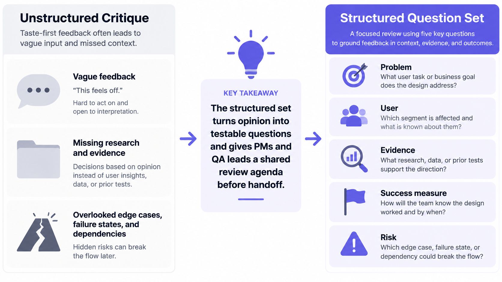
Run this inside your existing UX design workflow steps rather than as a separate ceremony. Say a PM reviews a proposed bulk-edit feature and the questions turn up no evidence of demand. The next step is customer interviews and analytics queries before anything gets approved. Or a QA lead reviews a permissions screen and asks what happens when access is lost mid-task: that single question tends to surface a missing error state early enough to fix it.
Eight Critique Frameworks Compared
| Framework | Best For | Type of Check | Main Limitation |
|---|---|---|---|
| Nielsen's 10 Usability Heuristics | Reviewing specific task flows | Usability heuristic review | Predicts problems but does not confirm them with real users |
| Shneiderman's Eight Golden Rules of Interface Design | Repeated-use tools and interfaces | Interaction quality checklist | General rules require context-specific interpretation |
| Dieter Rams' Ten Principles of Good Design | Questioning complexity and feature bloat | Philosophical design review | Subjective, with no concrete pass or fail criteria |
| WCAG 2.2 Accessibility Success Criteria | Checking accessibility of web content | Testable accessibility criteria | Automated checks catch only some issues |
| Gestalt Principles of Visual Organization | Evaluating visual grouping and layout | Visual perception review | Describes tendencies but cannot prove a layout will work |
| Laws of UX: Hick's Law, Fitts's Law, and Jakob's Law | Reviewing choices, targets, and familiar patterns | Predictive cognitive and motor principles | Predictions may not fit every context or user |
| HEART Framework for Measuring User Experience | Connecting UX goals to product outcomes | Goal, signal, and metric review | Requires reliable instrumentation and contextual interpretation |
| Structured Critique Question Set for Product Reviews | Aligning reviews with user needs and product goals | Evidence-based review questions | Adds review time and is not formally validated |
Build Your Critique Order and Start This Week
The list above is ordered by adoption cost. The order I'd run it in a single review is different.
Structured questions come first, because a design without a stated user and success measure can't be critiqued, only decorated. Heuristics and laws come second, since they're fast and predictive and they tell you which parts of the flow deserve the expensive passes. WCAG and Gestalt come third, because both reward a settled structure, and checking contrast on a layout you're about to restructure wastes everyone's time. Rams and HEART close the loop, one asking whether the thing earns its complexity, the other whether the change moved anything.
Risk decides where to point the sequence. Baymard's benchmark of 344 top-grossing US and European ecommerce sites manually scored more than 30,000 checkout elements against 110-plus guidelines and found that 65% of sites rated mediocre or worse, with only 2% rated good, according to Baymard's checkout usability research. Most flows carry known, findable problems. Start with the one tied to revenue, activation, or data loss.
The basic gist is this: a critique is a pipeline, not a conversation.
Imagine a PM running the order on a password reset flow. The question set names the user and the success measure. The heuristic pass finds no confirmation that the email went out. Hick's law flags three recovery options where one is needed. WCAG checks that the reset link is keyboard reachable, the error identifies the field, and paste isn't blocked in the new password field. Gestalt catches a resend link that merges visually with the submit button. Rams questions the decorative illustration sitting above the only task on the screen. HEART ties task success to completed resets per request, with a baseline taken first.
Two of those findings are taste. Six are checkable. That ratio is the whole argument.
AI-assisted tooling moves it further. A 2025 mixed-methods study evaluating 200 interfaces produced by five AI design tools found accessibility violations in 72% of interfaces, generally minor, as Designlab's discussion of critique checklist gaps reports. Generated screens need the accessibility pass more, not less. An agent like Figr fits here: it runs accessibility checks, maps flows and states, and surfaces edge cases before a human review, while designers still review, refine, and apply judgment before anything ships.
In short, the checklist is a routing system for evidence. It sends each comment to the lens that can settle it.
Pick one real flow this week and run all eight lenses in the order above. Timebox each to twenty minutes, log every finding with its framework, severity, and owner, and rerun the sequence after the fixes land. The first pass feels slow. The second one takes an afternoon and replaces three meetings.
Figr helps product teams run this sequence before the review meeting starts. It captures your live app, maps flows and states, flags accessibility concerns and missing edge cases, and turns the findings into reviewable UX artifacts that respect your existing design system. Bring one flow to Figr this week and see which findings it surfaces before your reviewers open the file.