
A stakeholder asks the question in the last five minutes of the design review. What happens when the card is declined? Everyone looks at the shared screen, where a generated checkout flow shows every field filled and every button in its resting state, and nobody has an answer. The flow has one path.
That gap turns into scheduled work. Engineering builds what the mockup shows, QA files the empty, error, and offline cases after the code exists, and the team reopens the flow in the last stretch of a sprint that already has a release date. The design wasn't wrong so much as unfinished in a way the review couldn't see.
An auto design app can shorten that loop or widen it, depending on what you ask of it and how you score what comes back. What follows covers what the tool produces, where it belongs next to research and a design system, which capabilities to test before you commit, and how to run a bounded pilot on one flow you already know is leaking users. The aim is a draft your team can defend in a review, states included.
When Generated Screens Hide the Real Work
Say you're the PM the night before a design review. You open an auto design app, connect the live product, and ask for a revised onboarding flow. Forty minutes later you have screens that look like your product: correct button styles, correct type scale, correct spacing, and a progress indicator that matches the one in production.
Empty, error, offline, and permission-denied states are absent. The draft implies a product where nothing fails and nobody abandons halfway through. The cost lands a few weeks later, when engineering scopes only the visible path, QA writes tickets for states nobody designed, and the flow gets rebuilt against a release date that hasn't moved.
This guide treats an auto design app as decision support rather than a screen generator. It covers what the tool does, where it sits beside research and a design system, and how to score its capabilities before you pilot it. The habits that make a flow reviewable are the same ones that make it testable, and starting with UX design fundamentals saves you from discovering that in QA.
What an Auto Design App Does
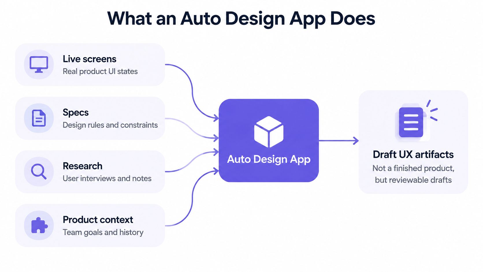
An auto design app, in this article, means automated product design software, not automotive CAD. It turns product context into draft UX artifacts a team can review. It does not hand you a finished product, and treating its first output as one is where most disappointment starts.
The inputs are the interesting part. A product-aware tool reads your live screens, specifications documents, research notes, analytics, and design system with its components and tokens. From that it proposes flows, edge cases, UX reviews, prototypes, and the rationale behind each choice. The closest analogy is a colleague who has read your product, not a poster printer that turns a prompt into something pretty.
How adjacent tools differ
| Tool type | Starts from | Knows the product | Typical output | Main risk |
|---|---|---|---|---|
| Generic image generator | A blank prompt | No | Pictures and mockups | Off-brand screens with no states |
| Design file tool | Human-made screens | Only what the designer stores | Editable screens | Slow exploration of alternatives |
| Auto design app | Live screens, specs, tokens and analytics | Yes, when connected | Flows, states, rationale and prototypes | Drafts still need expert review |
In short, the value comes from preserved context, not from more pictures. A tool that starts blank has to invent your spacing scale, your error copy, and your navigation model, and every invented detail is a review comment waiting to happen.
Figr is one product-aware example: it uses your screens, specifications, documents, analytics, and design system to produce UX reviews, flows, edge cases, prototypes, and designs that fit your product. That is a better starting point with enough context for the team to move faster, not a final design and not a replacement for the UX team. Judge any tool in the category the same way, by asking whether its drafts stay inside your components. If the output uses a button you don't ship or a color that isn't in your tokens, the context didn't survive the trip, and you're reviewing a stranger's product.
Capabilities to Score Before You Adopt
Score each row against one real workflow, not a demo prompt. Mark it yes, partial, or no, and treat two or more "no" answers as a stop sign before you spend time on a pilot.
What to score in an auto design app
| Capability | Good sign | Fail signal | Decision at risk |
|---|---|---|---|
| Product context | Uses live screens, specs and the design system | Starts from a generic template | Whether the draft belongs in this product |
| States and edge cases | Covers loading, error, disabled, focus, offline and permission denied | Shows only the happy path | Rework after engineering handoff |
| Design system | Applies components and tokens | Invents off-system colors and controls | Developer handoff and consistency |
| Accessibility | Names a WCAG level and checks names, focus and targets | Offers a contrast screenshot only | Whether people can complete the task |
| Measurement | Ties options to task success, time and drop-off | Judges screens by visual taste | Which option should ship |
| Human review | Exports an editable file with rationale | Presents final art with no trail | Accountability before release |
Context decides whether the draft belongs
Context is the row that breaks ties. A tool that reads your screens, tokens, and specifications can propose a flow that looks like your team built it. A tool that opens a blank canvas and asks for a prompt produces a template with your logo on it, and you will spend the review arguing about brand colors instead of the decision in front of you.
States are the real test
State coverage is where the draft either works or embarrasses you. Loading, validation error, disabled, focus, expanded, permission denied, offline, and success are the eight states a mobile flow passes through. A control that's perfectly usable at rest can fail once a modal opens behind it, focus lands outside the viewport, or a notification won't pause. Ask the tool to show all eight, then ask which two a designer would have missed.
Design system and accessibility
Design-system fit keeps handoff boring, which is what you want. Components and tokens should constrain the output rather than decorate it after the fact.
Accessibility needs a named target, not a vibe. WCAG 2.2 organizes its criteria around four principles and three conformance levels, A, AA, and AAA, and its mobile guidance covers native, mobile-web, and hybrid apps. Pick Level AA for most product work, with Level A as the floor and AAA only where a legal or contractual scope demands it. Then check that the tool does something machine-checkable: accessible names on icon-only controls, visible focus, touch targets around the 24×24 CSS-pixel minimum, and a non-drag alternative for every drag.
Measurement and reviewability
Measurement keeps the review honest. Google's HEART framework defines five categories, Happiness, Engagement, Adoption, Retention, and Task Success, and its Task Success category covers both effectiveness and efficiency. Judge a generated flow on task-completion rate and time-on-task rather than polish. Pair that with reviewability: an editable export, written rationale, and a named person who can reject the draft.
Figr illustrates several of these rows without defining the category. Its listed inputs include Live Product Capture, docs and PRDs, Storybook and code context, and analytics context, its design system intelligence keeps output aligned to your components and tokens, and its edge case mapping is built to catch states a designer would skip. A tool that fails context or states shouldn't reach a pilot at all.
How an Auto Design App Fits the Workflow
Automation pays off after the decision is defined and before code exists. Put the tool in that window and it compresses exploration. Point it at a blank goal and it produces confident art with no decision attached.
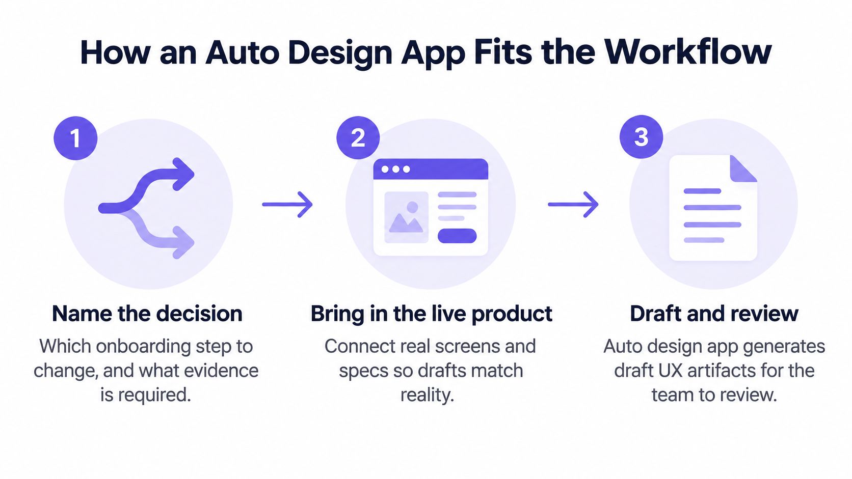
- Step 1. Name the decision. Which onboarding step changes, and what evidence would settle it. A goal like "improve onboarding" gives the tool nothing to constrain against.
- Step 2. Bring in the live product. Connect real screens, specs, tokens, and the analytics drop-off. Exclude unrelated features so the draft doesn't drift into a different part of your app.
- Step 3. Ask for two directions with states. Two directions expose a tradeoff that one polished screen hides. Require loading, validation error, disabled, focus, expanded, permission denied, offline, and success in both.
- Step 4. Run accessibility checks against the same rules on every state. Accessible names, focus order, and a non-gesture alternative for each interaction. The common slip is checking only the resting state.
- Step 5. Export an editable file and make a designer rule on it. Accept, edit, or reject. Nothing reaches engineering without an owner.
- Step 6. Test the chosen flow with a small qualitative round before build. One task, a handful of participants, scored on completion and time.
Step 3 is the one teams skip, and it's the one that matters most. The W3C mobile accessibility guidance covers native, mobile-web, and hybrid apps and points at non-text alternatives, moving or blinking content, focus behavior, and operability, which means an accessible control can still break when a modal opens behind it or an animated notice can't be paused. Checking states one at a time against the same rules is the only way to catch that before handoff.
Track state coverage as your own team metric: the share of interactive components with documented accessible names, role and state mappings, focus order, input-error behavior, and non-gesture alternatives across every flow state. It isn't a published benchmark, so set your own baseline and watch it move.
Working rule: if a generated flow can't show its error, offline, and permission-denied screens, it hasn't finished thinking.
The basic gist is this: the cost you're removing is coordination, not drawing. As products, teams, and variants multiply, a shared source of context beats a faster blank canvas every time. The same discipline of mapping a process end to end before automating it shows up in these SME workflow automation ideas, and the steps in UX design run in the same order whether a person or a tool produces the first draft.
A Checkout Flow From Drop Off to a Test
Imagine a PM reviewing a checkout where analytics show a stall on the payment-details step. The numbers say people arrive and stop, and the funnel view tells the PM where but not why. This is the flow to hand to an auto design app, because it's narrow, it's measurable, and the failure is already visible.
Baymard's checkout usability research reports an average cart-abandonment rate of 70.19%, an unweighted average of 50 studies published from 2006 through 2025. The same research has repeatedly found checkout design and flow to be the sole cause of abandonment for some users, including people who become frustrated or can't work out how to complete a field. That doesn't mean every abandoned cart is a UX failure. It does mean the field-level interaction is worth inspecting before you touch the visual design.
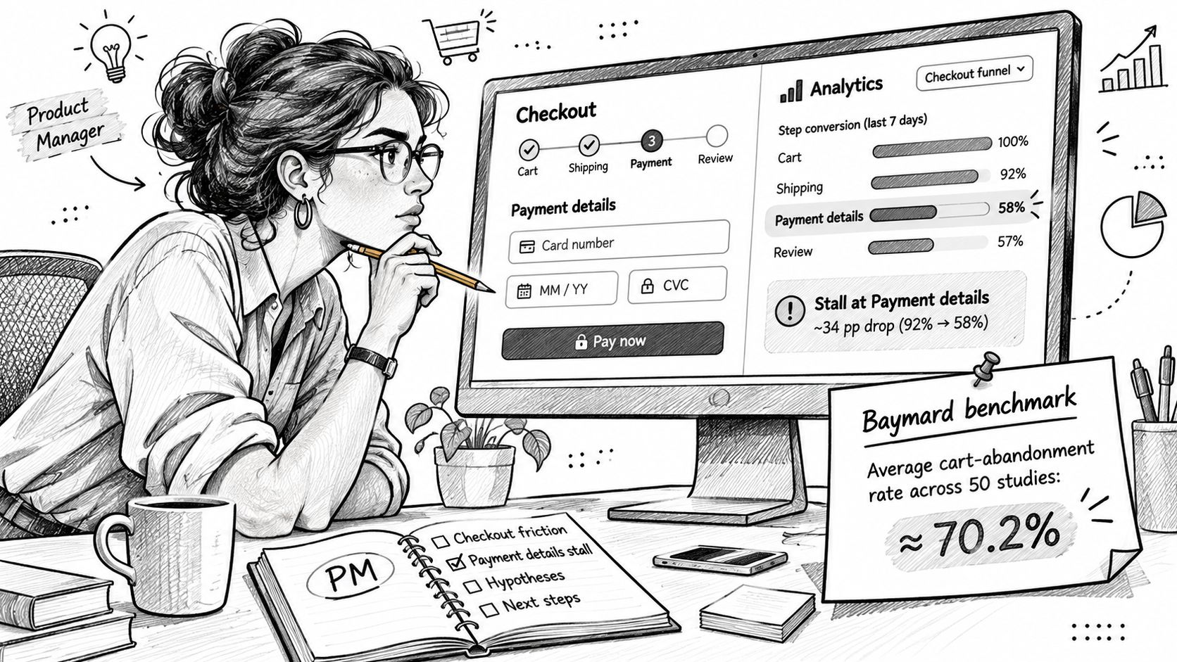
The action is specific. Inspect the exact field where people stall, generate two alternative flows, and require error, loading, and duplicate-submit states in both. A duplicated tap on a payment button is a state, not an edge case, and it's the kind a polished mockup never shows. If you want a mental model for drawing the branches, these flowchart process examples help you sketch the decision points before you generate anything.
Here's the failure case sitting beside it. A team receives a cleaner payment form with better spacing and no error copy, ships it, and the stall persists because the cause was an unclear field label, not the padding. The mockup looked improved. The behavior didn't change.
The decision rule is the part many teams skip: keep the variant only if task completion and time-on-task improve in a five-person qualitative test. Without that gate, you've swapped one opinion for another with better typography.
Vendor results belong in a separate column from published benchmarks. Adaptive reports that design output tripled with no new designers added to the team, and that concept to validated prototype now takes hours. That's one customer's report, not an industry rate, and it says nothing about checkout conversion. What it does describe is the shape of the gain: more directions explored at the same headcount. The Profit.co project shows the documentation side of that, where every design came with user journey mapping, a jobs-to-be-done framework, pattern references from successful apps, and a clear rationale for each decision. Rationale is what makes a generated flow reviewable rather than merely plausible.
Failures Automation Still Leaves With People
The most common mistake is accepting a high-fidelity screen as proof that the flow works. It proves the tool can match your visual language. It says nothing about whether a first-time user can finish the task on a slow connection with an old phone.
Qualitative testing still belongs to people. Nielsen Norman Group's guidance recommends testing five users for a qualitative usability study, because five participants can reveal almost as many problems as substantially larger groups, and its summary of 83 usability projects found that adding more users didn't produce appreciably more insight in those studies. Five is a discovery rule of thumb, not a statistical guarantee, and a different device, segment, or accessibility need deserves its own round.
Accessibility needs a named level and a real test. The WCAG 2.2 conformance criteria state that every success criterion must be testable and that conformance is assessed through a combination of automated and human evaluation. Automated checks catch detectable failures. They don't catch a flow that technically conforms and still confuses the person using it, which is why users with disabilities belong in the usability round, not just in the audit spreadsheet.
The tool can also reproduce a control that's usable at rest and broken in a modal, offline, or behind a permission prompt. And vendor speed claims describe a starting point. Designers still review, refine, and apply judgment before anything ships.
If any one of these checks is missing, the draft is research input, not a release candidate.
Before you accept a generated flow, confirm four things exist:
- Target level recorded. Someone has written down which WCAG level this flow must meet, and where.
- State list complete. All eight states are present, including duplicate submit and permission denied.
- Assumptions visible. The tool's guesses about user intent are written down where a reviewer can challenge them.
- Human owner named. One person accepts, edits, or rejects the draft before it moves.
Turn those into executable checks with a test case creation guide so the same criteria travel from prototype to release.
Run a Small Pilot and Read the Result
Pick one flow with a known drop-off. Run two generated directions in an auto design app that already holds your product context, then compare them on task completion, time-on-task, and state coverage. That's the whole pilot. Three measures, one flow, two directions, and a decision at the end.
Create three artifacts this week, before you generate anything: a one-page score using the six capabilities, a state list for the chosen flow, and a five-person qualitative test plan with the task and the success threshold written down. The state list is the artifact that keeps the pilot honest, because it turns "looks finished" into a checklist someone can fail. When you compare the two directions, treat it as a small experiment rather than a taste contest, and follow A/B testing best practices for how to frame the variants, sample, and success measure before results land.
Figr is a reasonable option for that pilot if you want the product context loaded first. Designers still approve the work, and credits bound the effort: a quick brainstorming session or flow diagram costs 0.75 to 1 credit, a design review costs 2 to 3 credits, first-generation mobile screens cost 4 to 5 credits, and a full first-generation webpage or competitor landing page costs 5 to 6 credits. Those are Figr's own credit rules, not market prices, and they're worth checking against the current pricing page before you budget.
Frequently Asked Questions
Does an auto design app replace designers?
No. It can draft flows, states, and rationale, while designers review the work, refine it, and decide what ships. Treat the output as a starting point for judgment, not a finished design.
Who should use one?
Product teams with an existing app and a clear design question can get more value from an app that works with product context. Figr, for example, can use captured screens, design-system information, documents, and analytics to generate product-specific UX artifacts.
When is it a poor fit?
It is a poor fit when nobody can review the output or when the team expects a generated screen to be ready to ship without checking its states and constraints. Even a product-aware draft needs human judgment before implementation.
How soon can a pilot show something?
A focused concept can be generated and reviewed within hours. That is enough to assess a direction, not to establish that it is ready to launch. Qualitative testing, accessibility checks, and a review of failure states still matter.
If your team knows which flow needs attention, Figr can use a capture of your app and your design-system context to create reviewable flows, edge cases, and prototypes. Evaluate whether the draft supports the task across failure states, then let designers make the final call. Take a look at Figr when you're ready to put a real flow in front of it.