
The tool
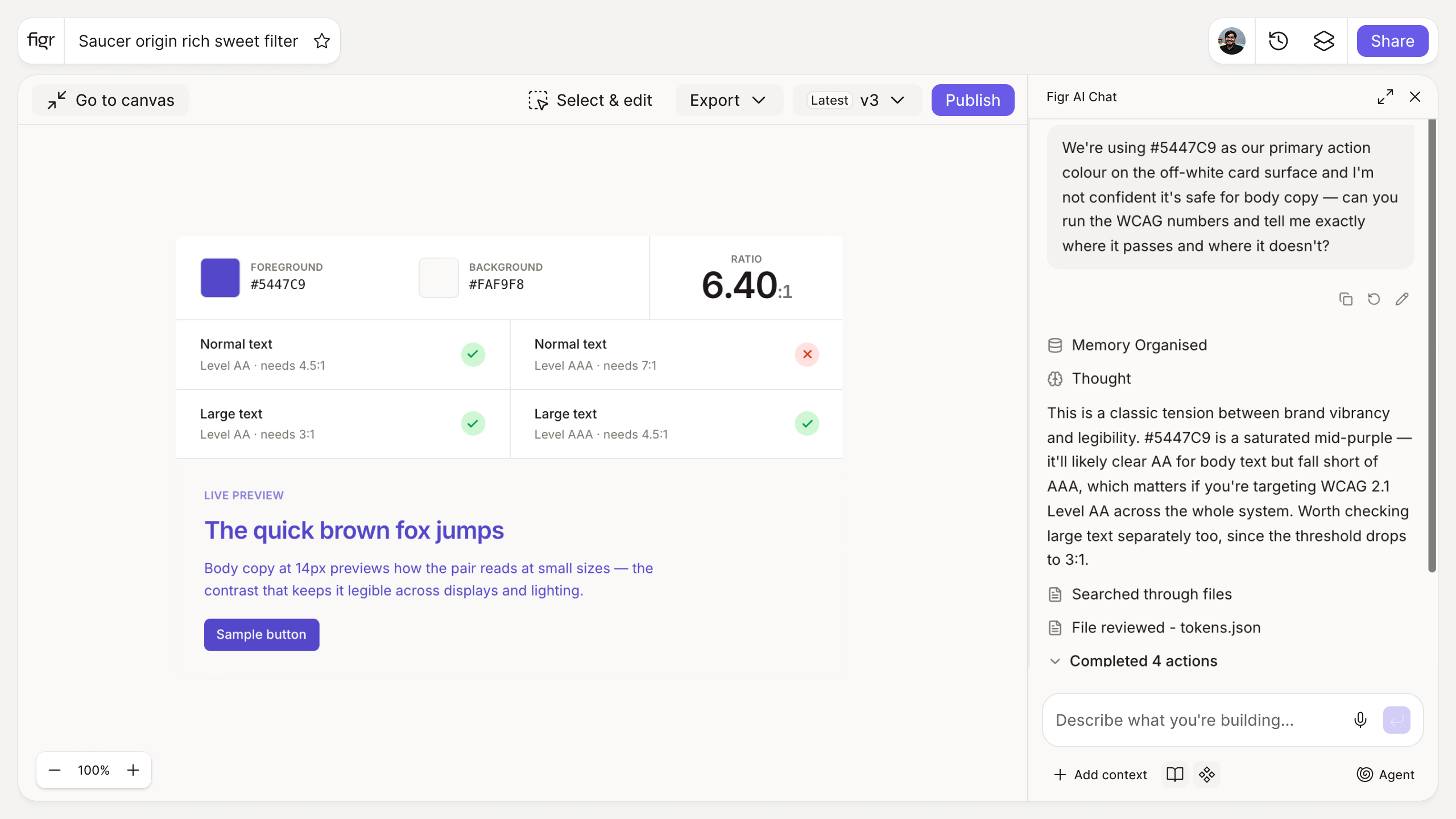
Inputs:
- Foreground color (hex, or color picker)
- Background color (hex, or color picker)
- Text size (selector): normal, large
Output: The calculated contrast ratio, plus pass/fail badges for WCAG AA and AAA at the selected text size, and a live preview of the text on the background.
Behavior: Calculates live in-browser as colors change, no login.
Low contrast is the most common accessibility miss
It is also the easiest to ship by accident. A light-gray label on white looks elegant in Figma and is unreadable for a chunk of your users. Because it passes the eye of a designer with a good monitor in a dark room, it sails through, and the people who cannot read it never file a bug, they just leave.
WCAG sets a concrete floor: 4.5:1 for normal text at AA, 3:1 for large. This tool checks a pairing instantly and shows the result on a live preview, so legibility is a decision you make on purpose. Where contrast fits into a coherent palette is covered in creating a color palette for your design system, and the wider a11y picture in tools that check product UI for accessibility.
How it works
1. Pick two colors. Enter hex values or use the picker for foreground and background.
2. Set the text size. Large text has a lower threshold than body text.
3. Read the result. See the ratio and whether it passes AA and AAA.
A worked example
Your brand blue is #4A90E2 and you want it as button text on white. The checker shows roughly 2.9:1, which fails AA for normal text, the kind of thing that looks fine until someone cannot read the label. Darken it a few steps and the ratio clears 4.5:1 without losing the brand feel. That five-second check, made while you pick the color, is far cheaper than retrofitting contrast across a shipped product, a point the essential UX interface design principles reinforce.
From color to a consistent system, with Figr
This checker verifies one pairing. The harder problem is making accessible choices stick across a whole product. Figr is an AI product designer that applies your real color tokens across everything it designs, so an accessible palette propagates instead of being re-decided per screen. Pair this with the color palette generator to build the scales and the accessibility checklist for the rest of WCAG.
Who this is for
This is for UX designers making color decisions that have to hold up across a real product and its users.
What this tool is not
Passing contrast clears one WCAG criterion; it does not make a product accessible on its own, and it says nothing about keyboard access, focus, or screen readers. It is also a free, standalone utility, not a Figr product feature.
FAQ
Is the color contrast checker free?
Yes, free and no sign-up.
What ratio passes WCAG AA?
4.5:1 for normal text and 3:1 for large text. AAA requires 7:1 and 4.5:1 respectively.
Does passing contrast make my product accessible?
It clears one important criterion. Full accessibility covers keyboard, focus, screen readers, and more.
Can I check large versus normal text?
Yes. Set the text size and the thresholds adjust.
How is this different from Figr the product?
This is a free utility. Figr the product is an AI product designer that turns product context into UX decisions and Figma-ready design.