
Your feature ships on Tuesday, and by Thursday someone asks what happens when the user is offline. The answer isn't in the shared drive. There are polished screens, a sprawling presentation, and a prototype that works beautifully as long as nobody leaves the happy path.
Say you're the product manager in that Thursday meeting. An engineer asks whether to save the unfinished form locally, while QA asks what should happen when the session expires. You open the design file, hoping an annotation settles it. Nothing does. The team makes a decision under release pressure, and someone adds another ticket for behavior that could have been settled before implementation.
Useful UX deliverables make those conversations happen earlier, while changing direction is still manageable. The basic gist is this: the deliverable is the decision, not the document. A persona helps you choose whose needs take priority; a flow settles branching behavior; a test report explains what needs fixing. Each artifact below earns its place by unblocking a specific decision. Each also has a stopping point, beyond which maintaining it becomes work without a useful return.
1. User Personas
A user persona is a research-based profile of people who share relevant goals, behaviors, and constraints. It helps a product manager answer a deceptively difficult question: whose task takes priority when requirements conflict?
For a B2B analytics platform, the administrator configuring dashboards needs control over permissions and data sources. The executive consuming those dashboards needs clear summaries and confidence in the numbers. Calling both people business users conceals the trade-off.

Make the Profile Change a Priority
Build personas from interviews, behavioral evidence, and support conversations. Choose user research methods that reveal how people complete the relevant work, rather than collecting attractive biographical details.
- Record decision triggers. Explain what prompts someone to open the product, delegate work, or abandon a task.
- Attach evidence. Put the interview reference, support theme, or analytics observation beside the attribute it supports.
- Separate assumptions. Mark unverified beliefs so colleagues don't mistake stakeholder intuition for established behavior.
A useful profile explains why an administrator checks permissions before inviting colleagues. A decorative profile explains their favorite coffee.
That distinction follows human-centred design practice: ISO 9241-220 connects context, requirements, design solutions, and evaluation through iterative activities and work products. The persona should carry relevant context into a decision.
Stop expanding it when additional detail no longer changes scope, priority, or interaction requirements. Revisit it when usage patterns or customer responsibilities change. If an existing role description already answers the decision, skip the persona presentation and preserve the evidence in that description.
2. User Journey Map
A customer can understand every screen and still struggle to reach a useful outcome. The missing work may happen in an invitation email, an approval conversation, or a spreadsheet outside your product.
A user journey map follows that broader experience. It connects actions, questions, emotions, and touchpoints around a goal, helping teams decide where intervention will matter most.
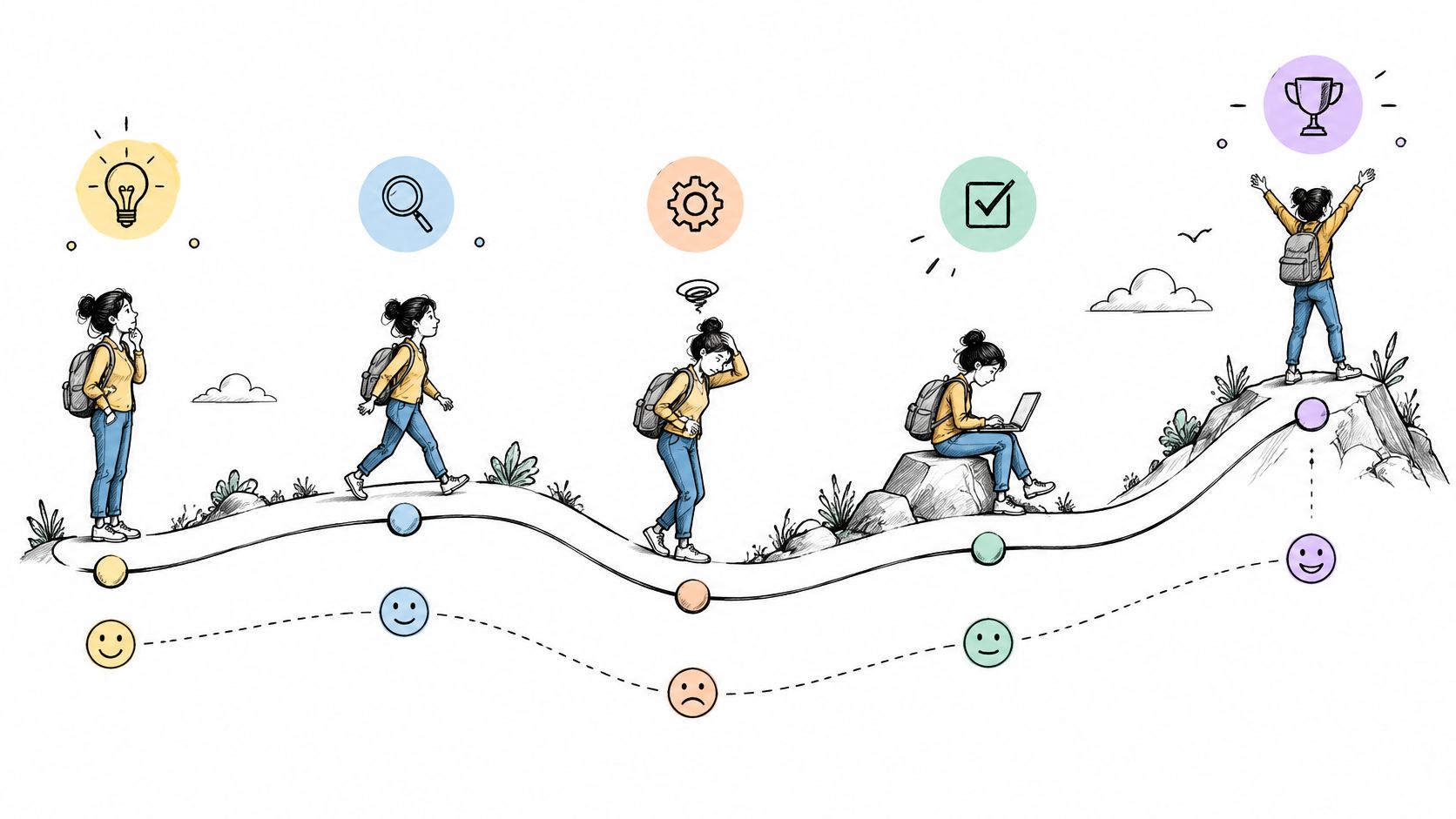
Consider a project management SaaS product. A trial user accepts an invitation, creates a project, requests permission to invite colleagues, and waits for an administrator. The visible onboarding screens might be clear. The waiting period still prevents activation.
A journey map earns its space when someone can point to a stage and name the next investigation or change.
Connect the Story to Observable Behavior
Map stages around meaningful progress, rather than copying your navigation labels. Keep the sequence compact enough to discuss without zooming through a wall-sized diagram.
- Name the outcome. Define what successful progress means at each stage, such as creating a shared project.
- Pair feelings with evidence. Distinguish observed hesitation from an emotion the workshop team merely suspects.
- Assign the handoff. Identify who owns a problem that crosses product, support, or customer-success boundaries.
Use session recordings and funnel observations to check the sequence before presenting it as established fact. The surrounding UX design process steps should connect the map to investigation and evaluation.
Stop when the team can choose which stage deserves attention. Don't maintain an elaborate emotional curve after the actionable problem has narrowed to a permission rule. At that point, a focused flow is more useful.
3. User Flows
Draw the failure branches while everyone still has time to disagree. A user flow describes how someone completes a task, including decision points, alternative routes, and recovery behavior.
Its decision is operational: what should the product do next under each relevant condition? Unlike a journey map, it stays close to product logic. Unlike a sitemap, it explains movement and consequences.
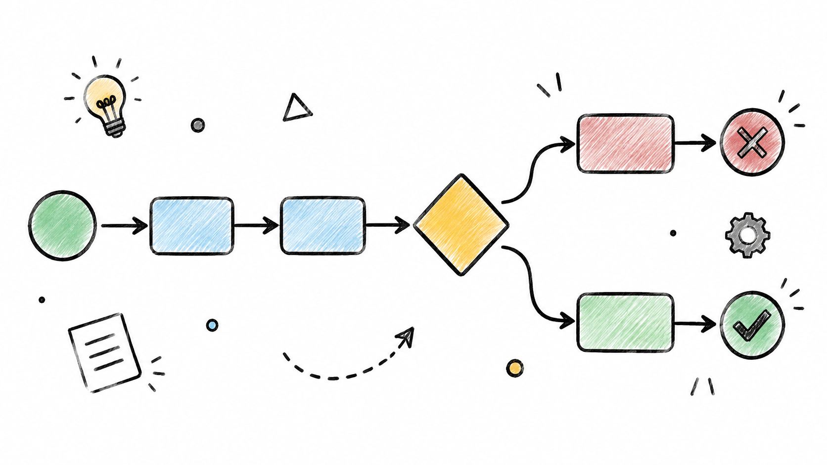
Say a fintech team is mapping identity verification. The applicant uploads a document, leaves the session, and returns after that document expires. Can they replace it without restarting? Does the product preserve previously approved information?
Those questions affect engineering, compliance review, and QA before they affect screen styling.
Turn Branches Into Shared References
Start with the user's goal and a clear end condition. Then examine interruptions, permissions, empty states, and unavailable services alongside the expected route.
- Give branches stable identifiers. Engineering tickets and test scenarios should reference the same decision.
- Label conditions precisely. Document expired is clearer than verification problem.
- Specify recovery. Show what users retain, what they must repeat, and where they can exit safely.
Use flowchart examples to choose readable notation, but don't let diagram conventions become the main debate. The team needs agreement about behavior.
Stop detailing the flow when every consequential branch has an owner and an expected outcome. Avoid duplicating field-level implementation rules already maintained elsewhere. Link to those rules instead, and update the diagram when behavior changes.
A flow becomes wasted effort when it looks complete but conceals unresolved decisions behind labels such as handle error.
4. Information Architecture and Sitemap
Where would you look for billing: Account, Organization, or Workspace settings? Your answer may differ from the team that built the billing service.
Information architecture organizes content, navigation, and labels around findability. Its sitemap shows the hierarchy, but the key decision is where something belongs and what users should call it.
A growing B2B platform might scatter settings across product areas because separate teams shipped them. A hypothetical tree test could reveal that customers look for invoices under Account while the product places them under Organization. Redrawing the sidebar without checking that expectation leaves the underlying problem untouched.
Test Labels Before Decorating Navigation
Use a content inventory to identify duplicates, ambiguous labels, and orphaned destinations. Compare the structure with help-center searches and support requests, then test whether representative users can locate important tasks.
- Explain naming choices. Record why the team selected Workspace rather than Team, including the distinction each term carries.
- Separate hierarchy from permissions. Document destinations people can discover but cannot access.
- Plan existing routes. Account for bookmarks, shared links, and redirects when navigation changes.
For a public-facing product site, industrial website testing and launch planning is relevant to the broader work of checking routes and preparing a structural change for release.
Practical rule: A sitemap needs enough detail to settle placement and naming. It doesn't need to become an inventory of every transient interface state.
Stop when users can find the priority destinations and the team has clear rules for placing future features. If you're changing a control inside an established screen, a new product-wide sitemap probably won't help. Preserve the existing structure and document the local change.
5. Wireframes
The approval dashboard contains familiar components, yet reviewers can't tell what needs attention first. That's a content hierarchy problem, and a wireframe is a useful way to investigate it.
Wireframes show layout, information priority, and interaction intent without requiring finished visual styling. They unblock a structural decision: what belongs on the screen, and what should users notice or do first?
For an HR product, sketch an approval queue with realistic employee names, lengthy request descriptions, and conflicting statuses. Compare a queue-first arrangement with a summary-first arrangement. Which helps a manager act without opening every request?
Keep the Uncertainty Visible
A low-fidelity artifact should still contain realistic content. Placeholder text conceals overflow, awkward wrapping, and the information people need before acting.
- Use representative content. Include long labels, absent values, and enough entries to reveal density problems.
- Annotate interactions. Explain whether selecting a row opens a detail view, changes selection, or performs an action.
- Mark open decisions. Tell reviewers whether layout, terminology, or behavior is still under discussion.
In a Nielsen Norman Group survey of 86 UX professionals, 82% reported collaborating with other team members on their deliverables. Give colleagues something they can evaluate, not a sketch whose intended meaning remains inside the designer's head.
The fundamentals of user interface design still apply at low fidelity: grouping, hierarchy, and clear controls don't require polished styling.
Stop wireframing once structural uncertainty is resolved. If existing components already dictate the layout, move directly into those components. Recreating an established settings form as gray boxes adds another file without answering another question.
6. Interactive Prototypes
A stakeholder can approve a static screen without understanding how the task works. Ask them to use a prototype, and the unanswered questions become harder to overlook.
An interactive prototype simulates navigation and meaningful state changes. It helps decide whether the proposed behavior makes sense before the team commits to implementation.
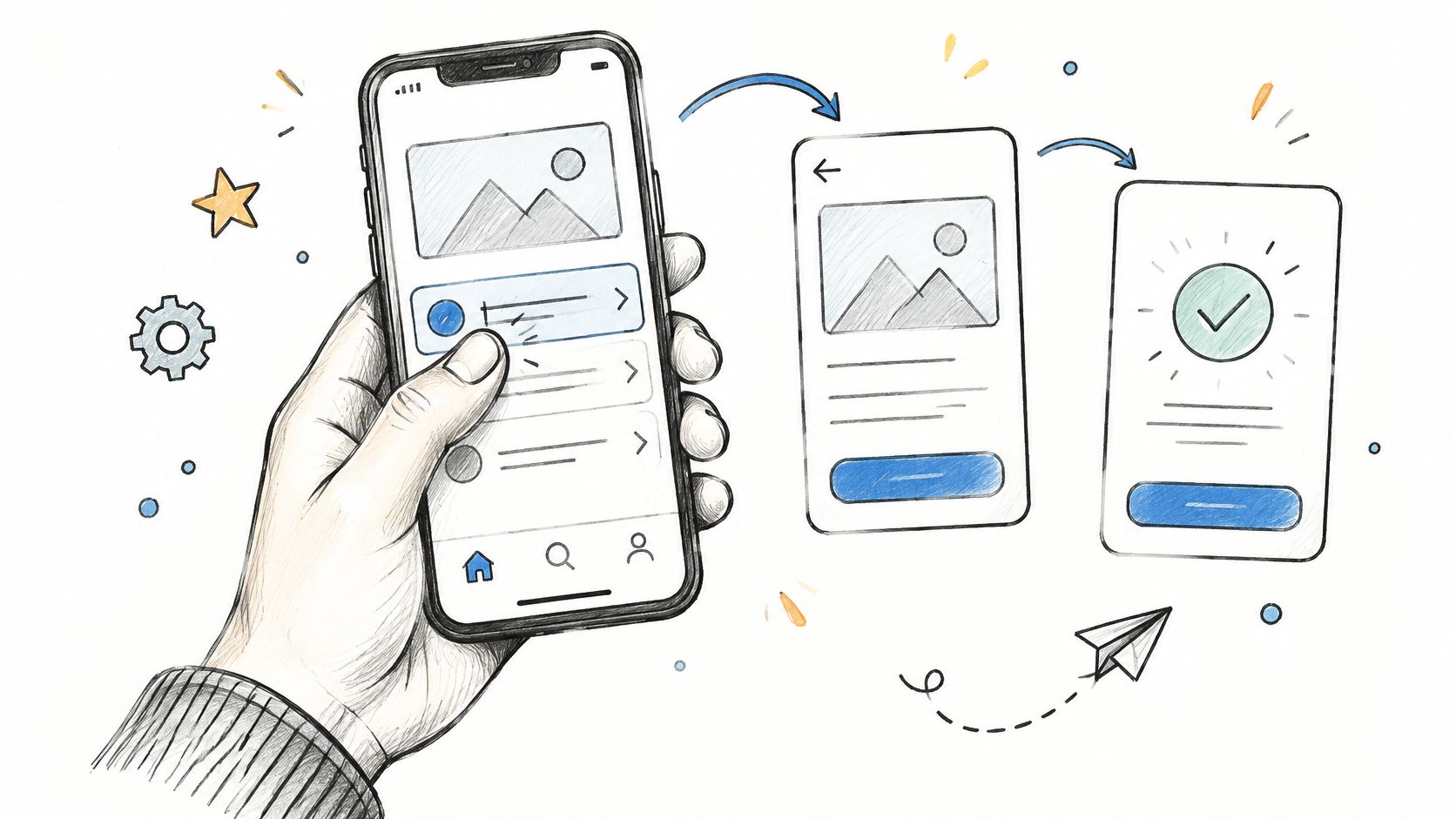
Consider a customer-success platform testing an onboarding checklist. A prototype can reveal whether users understand the next action, recognize completed work, and recover after a failed connection. A beautiful checklist screenshot can't establish those behaviors.
Prototype the Question
ISO's usability framework frames usability around effectiveness, efficiency, and satisfaction in a specified context of use. Those dimensions give the prototype a purpose beyond demonstrating the intended interface.
Define the task, the uncertainty, and what observation would justify changing the design. Then build enough interaction to expose that uncertainty.
- Include consequential errors. Simulate the failure states that could change the user's next action.
- Label the hypothesis. Record what the version tests, not merely that it's the latest.
- State simulation limits. Explain where data, response time, keyboard behavior, or persistence differs from production.
Does a smooth demonstration prove that customers can complete the task? Only testing can answer that.
Stop polishing when additional realism won't improve the decision. Conversely, move to a coded prototype when the question depends on assistive technology, real latency, or complex input behavior. A clickable mockup can mislead reviewers when it appears to demonstrate capabilities it doesn't support.
7. Design Specification and Design System Documentation
A component name doesn't tell an engineer how the component behaves. A useful specification records states, rules, responsive behavior, content constraints, and accessibility expectations.
Paired with design-system documentation, it unblocks the implementation decision: what should be built from existing patterns, and where is an intentional exception justified?
The 2026 zeroheight survey of 147 design-system practitioners found that only 7% reported full adoption across all teams. Documentation therefore needs to support migration and exceptions alongside the preferred pattern.
Specify the Contract Between Design and Code
Say a SaaS team discovers overlapping button variants across its product. Consolidating their appearance is only part of the work. Engineers also need rules for loading, disabled states, destructive actions, focus, and labels.
- Connect design to implementation. Link the documented component to its coded equivalent and identify supported versions.
- Specify behavior. Record keyboard interaction, focus movement, errors, and loading transitions.
- Own exceptions. Name the approver, explain the reason, and record whether migration is expected.
WCAG guidance provides testable success criteria and conformance levels that teams can map to component requirements. Accessibility belongs in that contract, not in a vague instruction to check it later.
Use developer handoff best practices to preserve the connection between decisions and implementation. When you compare software design document templates, choose a structure that accommodates rationale and acceptance criteria, rather than screenshots alone.
Stop documenting details that the maintained component already defines. Reference the shared rule and specify the deviation. Copying identical instructions into feature files creates competing versions that designers and engineers must reconcile later.
8. Usability Test Report
A participant opens the reporting builder, searches for filters, and gives up. The team has an observation. It still needs a decision.
A usability test report connects task performance to prioritized action. It records the scenario, relevant participant context, observed behavior, consequences, and recommended changes so the product owner can decide what to fix, investigate, or accept.
For a B2B analytics product, a hidden filter menu might explain a failed reporting task. The report should show the attempt, distinguish discovery problems from terminology problems, and identify the next design change worth evaluating.
Write Findings People Can Act On
- Describe the failure. Explain what users attempted and where progress stopped.
- Rank the consequence. Consider task blockage, recoverability, observed frequency, and exposure in the product.
- Recommend the next move. Propose a change or investigation, assign an owner, and define how to evaluate it.
W3C's guidance on understanding WCAG distinguishes conformance requirements from recommended usability testing, including participation by people with disabilities. A report should preserve both the formal requirement and the human difficulty observed.
That distinction matters: WebAIM's 2025 analysis of one million home pages found detectable WCAG failures on 94.8% of pages. Record accessibility findings with their test conditions and unresolved limitations instead of treating an automated scan as complete evidence.
Decision test: Could the product owner turn this finding into a clear ticket without asking the researcher to reconstruct the session?
Attach short clips when they clarify the struggle. For a public website, the same approach can help teams find friction in quote request forms.
Stop expanding the report when the decision-makers have enough evidence to act. Don't turn every observation into a presentation slide. Preserve detailed notes separately, and keep the decision-facing report focused on consequences and next actions.
How the eight core UX deliverables compare at a glance
| Item | Question it answers | Typical format | Best delivered when |
|---|---|---|---|
| User Personas | Who uses the product, and what are their goals and frustrations? | Research-based user profiles | During planning and prioritization |
| User Journey Map | What steps and experiences does a user go through to reach a goal? | Timeline of stages, touchpoints, actions, and emotions | When identifying friction across the full experience |
| User Flows | What paths can users take to complete a specific task? | Diagram of steps, decisions, and alternate paths | Before screen design or implementation |
| Information Architecture and Sitemap | How should content and features be organized so users can find them? | Hierarchical sitemap with navigation and labels | When structuring or reorganizing a product |
| Wireframes | How should a screen's content and interactions be arranged? | Low- or mid-fidelity layout sketches | Early in design, before visual styling |
| Interactive Prototypes | How will users navigate and interact with the proposed design? | Clickable model of key screens and states | Before development, to test flows and usability |
| Design Specification and Design System Documentation | How should components look, behave, and adapt consistently? | Documented tokens, component rules, and accessibility guidance | During design handoff and ongoing product development |
| Usability Test Report | What happened when users tried defined tasks, and what should change? | Findings, metrics, quotes, and prioritized recommendations | After usability testing, before decisions on design changes |
Start With the Artifact Your Next Decision Needs
Teams don't need every UX deliverable for every feature. They need a reliable way to identify the question that could cause the most expensive misunderstanding.
Before opening a template, finish this sentence: We need to decide whether... If you can't finish it, clarify the decision with the product owner. Otherwise, you risk producing an impressive artifact that nobody can use.
Choose the Smallest Useful Evidence Chain
- Name the decision. Write the unresolved question in the ticket or planning document.
- Choose the artifact. Select the format that makes the missing answer inspectable.
- Attach the context. Include supporting evidence, assumptions, constraints, and unresolved risks.
- Assign approval. Identify who reviews the recommendation and who accepts any remaining uncertainty.
- Set the stopping point. Agree what must be known before further documentation becomes unnecessary.
Which artifact should you skip? Skip the one whose answer already exists in a trustworthy, maintained place. A focused flow can replace a redundant journey map when the problem is branching logic. Existing components can replace fresh wireframes when layout is settled. A short findings document can replace a presentation when the owner is ready to act.
At scale, this is an allocation problem. Teams have limited attention, and maintaining duplicate documentation consumes time they could spend investigating uncertain behavior. Rewarding the volume of design output encourages polished files; asking which decision changed encourages useful evidence.
AI-assisted artifacts need the same discipline. Figma's 2025 survey of 2,500 product builders across seven countries examined AI adoption and the distinction between use and trust. A generated flow or review still needs traceable context, visible assumptions, and a person responsible for checking its recommendations.
In short, the stopping rule belongs beside the deliverable's purpose. Designers still review, refine, and apply judgment before anything ships. The goal is a shorter path from an unresolved question to a handoff that engineering and QA can use confidently.
Choose the missing answer most likely to hurt your next planning meeting. Draft the relevant artifact this week, attach it to a real decision, and ask its downstream reader what remains unclear. Let that gap determine the next piece of work.
Figr turns product context into user flows, edge-case maps, UX reviews, test scenarios, and high-fidelity prototypes. Visit Figr to bring your existing screens, requirements, and design system into the workflow, then review the generated artifacts against the decision your team needs to make.