

A Product Manager brings an AI-generated mock into review because it looks polished. The typography is clean, the spacing feels current, and the color palette matches what people expect from modern SaaS. Then the team starts asking basic questions. What is the primary action? Which text is status, and which text is marketing copy? Is that card a reusable component or a one-off layout the engineers now have to reverse-engineer?
That is where generic AI tends to fail at UI design principles. It can reproduce surface patterns, but it cannot judge whether a screen makes sense for this product, this user, and this decision. The result is familiar in product teams: users hesitate, developers guess, and designers spend the next sprint repairing a mock that looked finished too early.
I see this most often in simple flows that should be hard to get wrong. A login screen ends up with three actions competing for attention. A billing page gives warning text, plan details, and upgrade prompts the same visual weight. A settings panel groups unrelated controls together, so people change the wrong option and lose trust in the interface.
UI design principles matter because they give teams a way to critique what the screen is asking users to do, not just how attractive it looks. They also expose the difference between generic AI and context-aware AI. Generic systems copy patterns. Context-aware systems can use product structure, component logic, and flow intent to decide why one action should dominate, why one element should recede, and why a layout that works in one product will fail in another.
For a practical companion to this article, see this guide for product visual hierarchy. For broader foundational context, start with this user interface design beginner's guide.
What Happens When Visual Hierarchy Is Ignored
A Product Manager opens an AI-generated mock and sees a polished screen. The typography is tidy. The buttons are aligned. The colors match the brand. Then usability review starts, and the problem shows up fast. Users pause because the screen does not make clear what deserves attention first.
Visual hierarchy is the part of UI that sets order. It tells people what to read first, what to act on next, and what can wait. Without it, every element competes at the same volume. That is not a styling issue. It slows decisions, increases hesitation, and creates rework once the team realizes the “clean” mock does not support the actual task.
I see this most often in simple screens. A login page gives “Sign in,” “Create account,” “Use SSO,” “Forgot password,” and “Contact sales” nearly identical weight. A billing page lets warnings, plan details, and upgrade prompts fight for the same attention. Users stop scanning and start parsing.
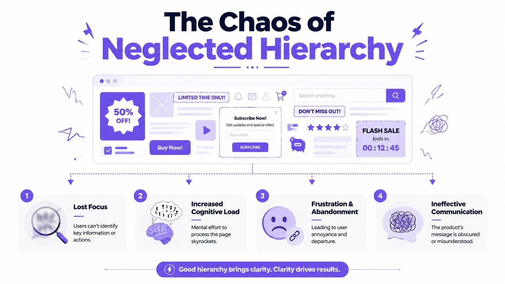
The practical rule is simple. Give the most important action the most visual weight. If the business wants one action but the layout presents three as equally important, users cannot tell what the product wants them to do. Principles of User Interface Design shows this clearly in its examples of action priority and interface clarity: Principles of User Interface Design.
A quick test helps. Blur the screen or step back from it. If the primary action disappears into the rest of the layout, the hierarchy is weak.
Generic AI gets this wrong for a predictable reason. It can copy a dashboard pattern or a settings pattern, but it does not know the product's real priority unless that context is explicit. A pending invoice screen and a first-run onboarding screen might use the same components, yet they need different emphasis because the user's job is different. Generic AI tends to distribute attention evenly across familiar elements. Context-aware AI can rank those elements based on intent, flow stage, and risk.
That difference matters in production. Weak hierarchy does not just confuse users. It creates developer churn because teams keep changing emphasis after implementation. Buttons get restyled, spacing gets reopened, copy gets shortened, and QA has to retest states that were avoidable if the screen had a clear priority from the start.
If you want examples of how shipped products handle this well, keep this guide for product visual hierarchy nearby during design reviews. For accessibility, hierarchy also depends on readable separation between elements and actions, not just size and placement. This guide to color contrast success is a useful reference when screens look organized but still feel hard to parse.
How to Use Contrast to Guide User Attention
A PM reviews an AI-generated mock and says the main action is obvious because the button is bright. Then usability testing starts, and users still pause, scan the whole screen, and ask which step matters first. The color was loud. The priority was not.
Contrast guides attention by creating difference that means something. Color is part of it, but product teams usually get better results from the full set of signals: size, weight, spacing, density, and placement. A primary action stands out faster when the screen gives it room and reduces competition around it.
Generic AI often misses this because it applies design principles as surface patterns. It knows that primary buttons should pop. It does not know whether this screen should emphasize “Pay now,” “Save draft,” or “Request approval” unless the product context is explicit. Those actions can share the same component library and still need very different contrast depending on risk, user intent, and where the user is in the flow.
Use contrast to rank decisions
Start by deciding what deserves attention first, second, and third. Then design the contrast around that order.
A practical review checklist helps:
Set one dominant action: If two buttons use the same visual weight, users hesitate.
Use type to signal meaning: Headings, values, warnings, and helper text should not all speak at the same volume.
Create quiet areas: Primary actions need surrounding calm, not more decoration.
Limit visual accents: One strong accent usually works. Three accents compete.
This trade-off shows up in build cycles. Teams often accept an AI mock because it looks polished in a static frame, then start reworking it after implementation because the screen pulls attention in six directions. That means design revisions, component overrides, and QA passes that were avoidable.
Accessibility has to survive the real interface
Contrast also has to hold up for people reading, scanning, and making choices under less-than-ideal conditions. Low-contrast text, status chips that rely on color alone, and buttons that only differ by hue tend to break once real content, error states, and edge cases appear.
The guide to color contrast success is a useful reference for checking readability in practical terms, especially when a UI looks clean in review but becomes hard to parse in use.
For product teams, the more reliable approach is to define contrast in the design system instead of handling it screen by screen. Figr on design system color tokens covers the token approach well. It helps prevent the common drift where brand color, semantic color, and component states all start competing for attention.
Good contrast shortens decision time. Bad contrast creates hesitation, and hesitation spreads across the whole flow.
The Unseen Force of Alignment and Proximity
A PM approves an AI-generated settings screen because it looks clean at first glance. Engineering builds it. Then the questions start in QA. Does this warning belong to this toggle or the next one? Is this helper text attached to the field above or the field below? Why does the destructive action sit inside the same visual group as routine preferences?
That confusion usually comes from alignment and proximity failures. The screen contains all the right parts, but the relationships between those parts are unclear.
Alignment gives the eye a stable path. Proximity tells users what belongs together. If those signals are weak, people stop scanning and start interpreting. That adds friction to simple tasks and creates avoidable rework once the team notices users are clicking, pausing, and second-guessing.
Structure explains the product before the copy does
Generic AI often gets this wrong in a very specific way. It applies layout principles as surface rules. Keep things evenly spaced. Snap items to a grid. Group related controls in cards. Those rules are useful, but they break fast without product context.
A permissions panel, an approval queue, and a billing form should not use the same grouping logic. In a permissions flow, users need to understand scope and inheritance. In billing, they need to separate editable inputs from irreversible actions. In approval workflows, status, ownership, and next steps need tighter visual relationships than decorative boundaries. Context decides what should align and what should cluster.
That is why context-aware AI matters. It has to infer which relationships are meaningful in the product, not just produce a balanced frame.
What broken structure looks like in real products
A few patterns show up repeatedly in AI-generated mocks and rushed handoffs:
Floating labels: A label or helper line sits close enough to the wrong input that users misread the association.
Split groups: Related settings get separated by cards, dividers, or ad slots that look neat in the mock and confusing in use.
False relationships: Two controls are placed close together, so users assume one changes the other.
Wobbly edges: Buttons, fields, and section headers miss shared alignment lines, which makes the interface feel less dependable.
These are not polish issues. They change how people interpret the screen.
I see this most often in enterprise products, where one panel may include defaults, exceptions, role restrictions, and warnings in the same view. AI can place all four on the canvas and still fail the task because it does not know which information users must compare, which actions need separation, and which warnings should interrupt the flow.
Good alignment reduces decisions the team never has to discuss
Strong structure lowers the number of questions users ask themselves while scanning. It also lowers the number of questions engineers ask during build. If a layout clearly shows that helper text belongs to one field, that a bulk action applies to the table below, and that a warning sits outside the primary task flow, fewer judgment calls happen in code.
That matters operationally. Poor grouping leads to margin tweaks, one-off component wrappers, and bug tickets that read like "spacing issue" but point to a broken information model. Teams then spend a sprint fixing symptoms instead of the underlying structure. aligning product teams with design systems helps because it gives design and engineering a shared way to define those relationships before they drift in implementation.
Alignment and proximity do quiet work. When they are handled well, users move with confidence. When generic AI applies them without understanding the product, the UI looks close enough to approve and wrong enough to fail.
Why Is Consistency The Hardest UI Principle to Maintain
A PM approves an AI mock because it looks polished and close enough to the product. By the time engineering starts building it, the problems show up. The primary button uses the wrong radius, the empty state introduces a new illustration style, and the form validation pattern does not match anything already in production. The screen still looks good in a review. It just adds one more exception the team now has to support.
That is why consistency is difficult to maintain. Product teams ship under pressure, and inconsistency rarely arrives as a dramatic failure. It arrives as a reasonable shortcut.
Design debt often starts with a mock nobody wants to argue about
I see this in fast-moving SaaS teams all the time. A designer or PM says, "it is only one settings page," and an engineer copies the closest component and adjusts spacing or states to make the layout work. The local decision makes sense. The system gets weaker anyway.

The expensive part comes later. Support screenshots stop matching the product. QA starts filing bugs that look cosmetic but indicate conflicting component rules. Engineers ask which modal, which badge, which input error state is correct. A designer then spends a sprint cleaning up variance that should never have shipped.
Consistency is a systems problem. It depends on decisions made in design, code, review, and release management.
What keeps a product consistent in practice
Teams that hold the line usually share a few habits:
Tokens exist before edge cases appear: Color, type, spacing, radius, and state behavior are defined early enough to guide new work.
Reviews catch drift, not just visual polish: The question is not "does this look good?" It is "does this follow the rules the product already uses?"
Exceptions become documented patterns: If a new variant is justified, it enters the system with a rule and a name instead of living forever as a special case.
aligning product teams with design systems matters here because inconsistency usually starts as a coordination failure before it shows up as a UI problem.
Consistency makes interfaces easier to learn. It also makes them cheaper to build.
Why generic AI struggles with consistency
Generic AI applies design principles at the surface level. It can produce a tidy card, a modern modal, or a clean dashboard section. What it usually cannot do is respect the product's existing logic unless that context is built into the system.
That gap matters more than teams expect. In real products, consistency is not just visual similarity. It includes which component appears in which workflow, how destructive actions are signaled, what helper text sounds like, and how interaction states behave across web and mobile. Generic AI does not know which deviations are harmless and which ones will create development rework.
Context-aware AI can be useful because it works from existing patterns instead of inventing fresh ones that merely look plausible. It has a chance of producing output that fits the product's rules, naming, and constraints. That is the difference between automation that saves time and automation that creates cleanup work two weeks later.
Use Whitespace to Create Focus and Calm
A PM approves an AI mock because it fits every requirement on the screen. Then engineering builds it, user testing starts, and people miss the primary action, skim past warnings, and pause longer than they should in routine flows. The problem usually is not missing content. It is missing space around the content that matters.
Whitespace decides what feels grouped, what feels separate, and what gets noticed first. In real products, that affects task speed, error rates, and how much UI explanation a screen needs.
Teams cut space before they cut content. A stakeholder asks for one more metric, one more badge, one more helper line, and the layout absorbs the request by tightening every gap. The screen still contains everything. It no longer helps users understand what belongs together or where to act.
That trade-off shows up fast in settings, billing, and admin flows. These are not flashy screens, but they carry consequences. If labels, inputs, warnings, and secondary actions all sit at the same visual distance, users have to work harder to parse the page before they make a single decision.
Empty space is part of the interface
Whitespace is not decoration. It defines structure.
Good spacing does three practical jobs. It groups related elements, improves readability, and slows the eye down at the right moments. Users can scan section by section instead of processing the whole page as one block.
This is one place where generic AI breaks down. It can apply spacing evenly, but even spacing is not the goal. Product context determines where density is acceptable, where separation needs to be stronger, and which action deserves room around it. A permission screen, a refund flow, and a dashboard widget should not all breathe the same way.
Why AI-generated mocks often feel off, even when they look clean
Generic AI usually treats whitespace as leftover area between components. Designers use it to signal priority and reduce decision fatigue.
The common failure patterns are familiar:
Section boundaries collapse: Titles, descriptions, and content sit too close together, so users read unrelated items as one unit.
Forms turn into stacks: Inputs, helper text, errors, and buttons crowd each other, which makes validation harder to notice.
Spacing becomes mathematically uniform: Every gap is tidy, but nothing gets emphasis, so the interface has no pacing.
Empty areas get filled for no reason: Extra dividers, icons, and cards replace breathing room and increase visual noise.
I see this often in AI-generated enterprise screens. The mock looks polished in a static review. Once real content, edge cases, and error states arrive, the layout gets tight fast and engineering has to rework spacing rules component by component.
Calm reduces effort
Users often describe a well-spaced interface as calm, premium, or easy. What they are reacting to is lower cognitive load. They can tell what belongs together, what can wait, and what needs attention now.
That has direct product value. Better spacing makes controls easier to distinguish, gives messages room to appear without breaking the layout, and reduces the chance that users miss a warning or secondary step. Figr's guide to calm experiences makes a useful product case for treating silence and space as design decisions.
A crowded screen can still function. It just shifts more sorting work onto the user, and that cost shows up later as hesitation, mistakes, and avoidable design cleanup.
The Subtle Art of Designing Clear Affordances
A PM reviews an AI mock for a settings screen and says it looks clean. Then the first usability pass starts. Users click the whole row, nothing happens, then they notice the small icon at the edge was the correct target. That kind of miss looks minor in a review. In the product, it creates hesitation, extra support questions, and follow-up design work to clarify interactions that should have been obvious on first scan.
Affordance is the part of the interface that signals action before the user commits. If that signal is weak, people slow down and start testing the UI instead of using it.
Clear signifiers reduce interaction risk
Buttons need visible containment. Links need to read like links. Inputs need enough structure that users can tell what is editable and what is just text.
Generic AI often gets this wrong because it copies a visual style before it understands the task. It makes everything soft, minimal, and visually consistent, but consistency alone does not tell users what will happen next. A muted ghost button may look refined in a static mock and still fail on a high-stakes confirmation screen where the primary action needs to be unmistakable.
Primary action clarity matters here. If several controls compete for attention, people stop trusting their first impression and start checking labels, icons, and hover states for confirmation. Teams usually catch that late, after design review, when engineering has already built the component variants.
Affordance shows up in small implementation choices
This is usually where polished mocks fall apart in production:
Button treatment: Fill, border, size, and label weight should match the importance of the action.
Hit area: A row that looks tappable should be tappable across the row, not only on a trailing icon.
Interactive states: Hover, focus, pressed, disabled, and loading states need to confirm behavior, not introduce doubt.
Text styling: Underlined or colored text suggests a link. Plain body copy does not.
Field presentation: Labels, borders, placeholder treatment, and cursor behavior should make editability obvious.
I use one simple test in reviews. If a user has to hover, tap, or guess to learn what is interactive, the affordance is underdesigned.
This short video is a useful complement if you want a quick visual pass on how interaction cues shape behavior.
Context decides what "clear" actually means
Affordance is not a fixed recipe. An admin table for trained operators can support denser controls, smaller targets, and shortcut-heavy patterns because the users come in with repetition and intent. A consumer onboarding flow needs stronger cues, simpler actions, and less ambiguity because the user is still learning the product.
That is why generic AI fails so often at UI design. It applies principles in the abstract. It knows that buttons should look clickable, but it does not know which action carries risk, which workflow users repeat all day, or where your team cannot afford a mistaken click. Context-aware AI can make better calls because it has the surrounding signals: user type, task frequency, page intent, component behavior, and product constraints.
Affordance problems are cheap to ignore in mockups and expensive to fix later. If your team wants a practical way to catch them before handoff, learn UI validation before development.
Beyond the Checklist What Real-World UI Design Looks Like
A PM reviews an AI-generated mock and sees something polished enough to approve. The buttons look right. The spacing is tidy. The page feels modern. Then engineering starts implementation and the problems show up fast. The primary action competes with an upsell, error states were never considered, the layout breaks with real data, and a flow that looked clean in a static frame creates hesitation once people use it.
That gap is the primary subject of UI principles in practice.
Good product teams do not apply hierarchy, contrast, consistency, and spacing as isolated rules. They make trade-offs under pressure from conversion goals, technical limits, user habits, and release timelines. A reporting screen may need a stronger upgrade prompt than the design system would normally allow. A risky admin action may need more interruption than the rest of the product. A dense workflow for trained operators may justify tighter layouts that would be wrong in onboarding.
The principle did not change. The context did.
That is also where generic AI breaks down. It can reproduce patterns it has seen before, but UI quality depends on knowing which goal matters on this screen, which mistake is expensive, which state engineering can support, and which deviation from the system is justified. Without that product context, AI follows the checklist and still produces the wrong interface.
I see the cost in rework more than in aesthetics. Designers revise screens that looked approved. Engineers raise questions that should have been answered in the mock. QA logs issues caused by missing states and inconsistent behavior. Product reopens decisions because the design solved the visual layer but not the operational one. Teams feel that as schedule slip, avoidable debate, and user confusion after launch.
Strong UI review sounds less like "does this follow the principle?" and more like "what job is this screen doing, what can go wrong here, and what trade-off are we accepting?" That shift matters. It turns design principles from a vocabulary exercise into a decision framework.
Teams that want automation need the same shift. An AI design tool that thinks through UX is more useful than a pattern generator because it can account for product intent, system rules, flow logic, and implementation constraints before it produces a screen.
If your team wants a practical way to catch those issues before handoff, learn UI validation before development.
How Figr Builds a Visual Context Graph
A PM approves an AI-generated mock because it looks polished in the review deck. Two days later, engineering asks which button is primary, what happens when the list is empty, and why this screen introduces a new card pattern that does not exist anywhere else in the product. The mock followed familiar UI rules. It still failed, because it had no context for this product.
That gap is what the Visual Context Graph is meant to close.
Figr uses a context model to generate screens with more than surface-level pattern matching. The point is not to apply hierarchy, contrast, or consistency in the abstract. The point is to apply them based on the product's flows, constraints, system rules, and existing decisions. That is the difference between a plausible mock and a screen a team can ship.
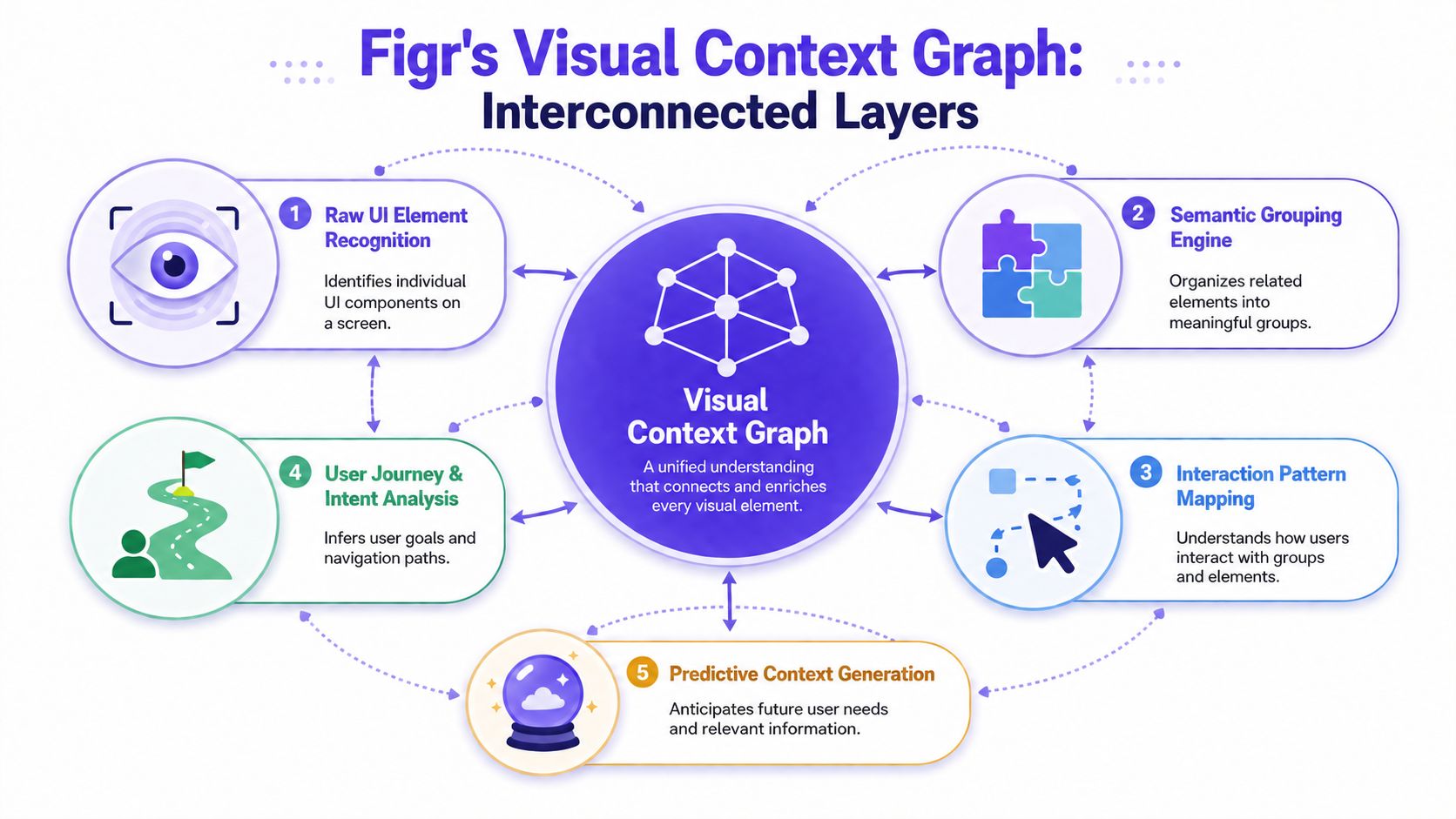
The five layers of the Visual Context Graph
Each layer answers a different question that generic AI usually misses.
Visual context: What already exists on the screen and across the product? This layer reads layouts, spacing patterns, components, and composition so a new screen looks native to the product instead of stitched together from internet averages.
Behavioral context: What is the user trying to do right now, and what tends to go wrong in this flow? This layer uses path logic and interaction patterns to shape screens around real user tasks.
Design system context: Which tokens, components, variants, and states are approved? This layer keeps output closer to the system the team maintains, which reduces custom one-off UI that creates front-end rework.
Product knowledge context: What has the team already decided about terminology, priorities, and constraints? This layer brings in PRDs, research, and prior decisions so generated UI reflects business logic, not generic SaaS assumptions.
Implementation context: What can engineering support without inventing new behavior during handoff? This layer checks screens against delivery reality, including edge cases and state handling.
Why this matters in practice
Design principles break down when they are applied without product context. A model can create strong contrast and still emphasize the wrong action. It can align everything neatly and still group unrelated information. It can reuse the same component everywhere and still create inconsistency if the component behavior changes from flow to flow.
I usually explain it this way to product teams: principles are not the hard part. Choosing which principle should dominate on this screen is the hard part.
A billing screen proves the point. If the main risk is accidental plan downgrade, hierarchy should make the destructive path harder to trigger. If the main risk is payment failure, the design should surface status, retry options, and support paths first. Both screens can look clean. Only one fits the product problem.
That is why a context-aware system is more useful than a generic generator. It can weigh what matters on this screen before it decides how the screen should look.
For teams shipping across devices and frameworks, environmental context matters too. The trade-offs change when touch targets, navigation patterns, and rendering constraints change. Capgo's piece on optimizing UI/UX for Capacitor is a good example of why interface decisions cannot be separated from the platform they need to run on.
A practical workflow for reviewing context before handoff
Teams do not need a theory-heavy review here. They need a repeatable check that catches broken assumptions early.
Start with the current product, not the prompt.
Review live screens, system components, and the existing flow before judging a generated concept. If the mock ignores patterns users already learned, it adds friction even when the visual quality looks high.Define the screen's job in one sentence.
State the primary user task and the main failure risk. If the team cannot agree on those two points, the interface is still underdefined.Check principle decisions against context.
Ask why this action is primary, why these elements are grouped, why this component is used here, and whether the spacing or contrast reflects real priority. A good answer refers to product logic, not taste.Review states before polish.
Empty, error, loading, disabled, long-content, and permission-based states expose whether the design holds up. Generic AI often handles the happy path and leaves the expensive cases unresolved.Hand off the reasoning, not just the frame.
Engineers need to know which pattern is canonical, which state logic is required, and where flexibility ends. If they have to guess, the design work is incomplete.
The AI design tool that thinks through UX is useful in that workflow because it gives the model more of the same context senior designers ask for in review. That does not replace judgment. It gives judgment better inputs.
The practical benefit is simple. Fewer attractive mocks that collapse under scrutiny. Fewer handoff debates about intent. Fewer screens that satisfy a design checklist but create user confusion, system drift, and implementation churn.
FAQ
What are UI design principles in simple terms
UI design principles are the rules that make a screen readable, predictable, and usable. They shape how people scan, decide, and act. Hierarchy shows what matters first. Contrast separates signal from noise. Alignment and proximity explain relationships. Consistency reduces relearning. Whitespace creates focus. Affordances show what can be clicked, typed into, dragged, or dismissed.
On a real product team, these principles are not decoration. They prevent hesitation, wrong taps, support tickets, and engineering rework.
How are UI design principles different from UX laws
UI principles deal with how the interface is organized and presented on the screen. UX laws describe common patterns in human behavior and perception, such as scanning habits, memory limits, and choice overload.
The distinction matters because a screen can follow a visual rule and still fail the product task. Generic AI often gets trapped here. It produces interfaces that resemble familiar design patterns, but it does not always know which user habit matters in this product, on this screen, at this moment.
Why do AI-generated mocks often look right but feel wrong
They often copy the surface pattern without the operating logic behind it.
A mock can have tidy spacing, modern cards, and a polished button set, then still fail because the primary action is unclear, destructive actions are under-signaled, table density ignores the user's job, or state changes are missing. That is the gap between principle compliance and product-aware design.
Context-aware AI is more useful because it can weigh the screen against product structure, user intent, and system constraints. Without that context, AI applies UI principles like a template. That is why the output looks convincing in review and then falls apart during edge-case testing or handoff.
What is the most common UI principle teams get wrong
Hierarchy is usually the first failure point.
Teams pack multiple goals into one screen. Marketing wants visibility for one action. Product wants another. Compliance adds warnings. Engineering exposes system status. Support asks for explainers. If no one resolves those priorities, the interface presents everything at the same volume. Users slow down, miss the intended path, or choose the wrong action.
That confusion is expensive. It shows up later as lower completion, more clarification copy, and rushed revisions after development has already started.
How can I review a screen quickly with my Product Manager
Start with a concrete scenario. A user opens the screen with one job to do and limited patience. Ask the PM to point to the first thing that user should notice, the action they should take next, and the elements that belong together. If either of you gives a different answer, the screen is not clear enough.
Then check the parts generic AI usually glosses over. Are risky actions visually distinct enough? Do disabled, empty, and error states still make sense? Does the layout hold up with real content instead of placeholder copy? Are repeated components consistent, or just similar enough to create implementation drift?
That quick review usually exposes whether the design reflects product context or just borrowed UI patterns.