

Your team has spent an hour arguing about a checklist, a chatbot, and another onboarding email without agreeing on what's stopping new customers from getting started.
The designer leaves with conflicting requests. Engineering estimates work that may not matter. The product manager gets a longer backlog, but no clearer explanation of the behavior the team needs to change. Even a polished prototype won't resolve that gap if everyone is trying to solve a different problem.
How Might We questions offer a small, practical reset: frame a problem as something the team can explore together without choosing the answer yet. My approach is to treat them as a diagnostic library, with a prompt for each common UX challenge. Find the situation closest to yours, adapt the role and moment, then check whether the question deserves design time. The challenges below cover vague briefs, onboarding, accessibility, checkout, errors, alignment, pricing, design systems, retention, and testing. Each includes an illustrative reframe, a trap to avoid, and a way to test the premise before committing to screens. The closing guidance explains how to narrow, compare, and retire prompts so they become useful working decisions rather than workshop leftovers.
1. How Might We Question for Reframing a Vague Problem Statement
A How Might We question turns a problem into an open invitation to solve it. It names a need while leaving the mechanism undecided.
Nielsen Norman Group's guidance recommends grounding questions in discovery insights, expressing a desired outcome, and avoiding a predetermined solution. That's the difference between exploring setup completion and asking someone to design a checklist.

Replace the complaint with a situation
Consider these illustrative reframes:
- Pricing confusion. How might we help a first-time buyer understand which plan fits their team size?
- Lost work. How might we help an editor recover unsaved changes after a session timeout?
- Incomplete setup. How might we help a new workspace owner finish setup during their first session?
Before designing, examine the evidence behind the complaint. Pricing confusion might mean buyers misunderstand limits, can't compare plans, or don't trust the billing terms. Those deserve different questions.
- Test the wording.
Replace users with a role and situation.
Remove feature words such as chatbot and check whether the question still makes sense.
Write five variations before choosing one. Favor the version that connects a specific observation to an outcome you can inspect, not the version that sounds most ambitious.
2. How Might We Question for Onboarding and Activation Challenges
Activation means reaching a meaningful first outcome, not merely finishing a welcome tour. Define that outcome before deciding what onboarding should contain.
In an illustrative collaboration product, a workspace owner signs up but never invites a colleague. A useful prompt is: How might we make inviting a teammate feel useful before the trial ends? Asking how to add an invitation modal would skip the more important question of motivation.
The University of Michigan's design-thinking analysis places HMW questions between research synthesis and ideation. That timing matters: understand why the owner works alone before proposing reminders.
Test the sequence before the interface
- Define the activation event.
Write down the behavior that represents delivered value.
Distinguish an invitation sent from a teammate joining and completing useful work. - Inspect the relevant funnel step.
Compare drop-offs with usability observations and support themes.
Don't assume the largest exit represents confusion rather than a legitimate stopping point. - Isolate the change.
Test a template-based invitation against the current experience.
Keep unrelated onboarding changes separate so you can interpret the result.
AI-powered in-product guidance is worth exploring when people need contextual help. It won't fix an invitation that arrives before the owner understands why collaboration matters.
3. How Might We Question for Accessibility Challenges
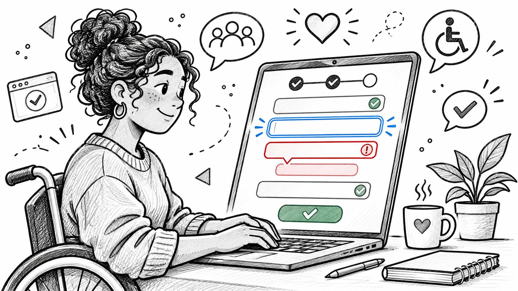
How might we let a keyboard-only buyer complete checkout without losing track of errors?
This question names a task and an access need. It leaves room for better focus handling, an error summary, clearer instructions, or a simpler form.
Make the barrier observable
For an illustrative multi-step form, ask how a screen reader user can understand their current stage. A visible step indicator with a programmatically announced state is a candidate response, not proof that the task is accessible.
For a dashboard that communicates status through color alone, ask how someone can identify status without distinguishing colors. Text labels and icons offer alternatives, but those labels still need understandable meanings.
- Check the relevant requirements.
Use WCAG 2.2 success criteria for the task before writing the prompt.
Keep required accessibility behavior explicit rather than treating it as an optional concept. - Test the actual interaction.
Include a usability session with someone who uses assistive technology.
Inspect focus order, announcements, error recovery, and task completion in an interactive prototype.
Practical rule: An accessibility prompt opens design options. It doesn't replace testable requirements.
Foundational user interface design decisions about hierarchy, labels, and feedback belong in this work from the start, not in a separate cleanup pass.
4. How Might We Question for Checkout and Conversion Funnels
A shipping-step exit doesn't explain why a buyer left. They may dislike the cost, distrust the delivery estimate, or be comparing options.
Start with How might we help a buyer understand the full delivered cost before committing to checkout? That wording is more neutral than asking how to hide shipping friction or make payment faster.
The historical soap example in the Wade Institute's HMW guide illustrates this distinction: reframing the challenge around refreshment opened alternatives beyond copying a competitor's green-striped bar. In checkout, the equivalent move is to investigate buyer confidence rather than imitate another store's payment screen.
Separate hesitation from interface effort
Illustrative worked example: Funnel events show exits at shipping. Session observations suggest buyers repeatedly return to the cart to inspect costs. The team tests an earlier cost preview and measures completed purchases alongside refunds and shipping-related support contacts.
If buyers understand the total but still reject it, the next decision concerns the offer, not another interface variation.
- Validate the suspected friction.
Ask buyers to explain the total and delivery terms using the current flow.
Observe what they can't find before proposing a redesign.
Use industry benchmarks as context, never as a target detached from your product, device mix, and customers. A higher conversion rate isn't a win if buyers later discover terms they missed.
5. How Might We Question for Edge Cases and Error States
Imagine a PM reviewing a booking flow that ends with a polished confirmation screen. An engineer asks what happens if the connection drops after payment succeeds but before confirmation appears.
That hypothetical review exposes a better prompt: How might we help a buyer confirm whether a booking succeeded without risking a duplicate purchase?
Design recovery around the actual state
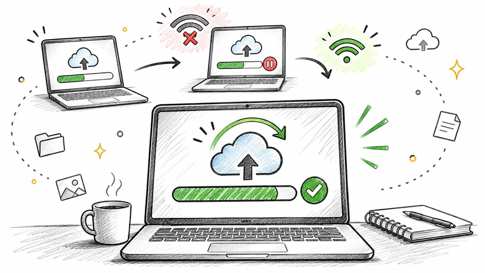
A generic retry button can be dangerous when the system doesn't know whether the transaction completed. Separate confirmed failure, confirmed success, and an unresolved result before drafting messages.
For an interrupted upload, ask how someone can resume without losing completed work. For an expired form session, ask how someone can recover input safely, including on a shared device.
- Map the failure branches.
Use flowchart process examples to distinguish interruption, rejection, timeout, and success.
Give engineering and QA an expected outcome for each branch. - Test the recovery.
Interrupt the flow deliberately in a test environment.
Check preserved data, duplicate prevention, visible status, and the next available action.
Rank these questions by frequency and impact. A rare duplicate charge can deserve attention before a frequent cosmetic error. Confirm technical feasibility early, especially when recovery depends on server state rather than screen design.
6. How Might We Question for Cross-Team Alignment
How might we give product, design, and engineering a shared view of scope before sprint planning?
Use this prompt when people agree on the feature name but disagree on its boundaries. Internal coordination is a legitimate design problem, especially when teams repeatedly discover missing decisions during implementation.
Product on Purpose's explanation describes the collaborative purpose of we and the exploratory purpose of might. Those words are useful only when the people responsible for the outcome can influence the answer.
A shared document won't resolve a decision that nobody owns.
Find the handoff that creates rework
In an illustrative team, engineering repeatedly sends designs back because permission states are missing. Reframe the problem as How might we surface permission and error states before a design is marked ready?
A short readiness artifact might work better than another meeting. Include the decision owner, unresolved assumptions, required states, and links to acceptance criteria, drawing on developer handoff best practices.
- Test the coordination change.
Try the artifact on an upcoming handoff and set a review date.
Record returned questions, missing decisions, and revisions rather than judging document completeness alone.
As teams grow, more people depend on decisions they didn't attend. Make the reasoning easy to inspect so they don't have to reconstruct it in another meeting.
7. How Might We Question for Pricing and Packaging Decisions
Pricing discussions need separate business and buyer outcomes. The business may want higher account revenue; the buyer needs confidence that the plan fits their usage.
A useful question is How might we help a buyer choose a suitable plan before reaching checkout? It allows changes to explanation, comparison, recommendations, or packaging without assuming the price must change.
Edgepedia's HMW guidance recommends identifying an action, a user, and an outcome while keeping the mechanism open. That's especially important when a pricing prompt prescribes an upsell.
Test comprehension before persuasion
Illustrative scenario: A plan page presents a dense feature grid. A small-team lead can't tell which limits affect their intended workflow. The team explores a recommended-plan panel that explains both suitability and restrictions.
Before building it, give recent buyers realistic usage scenarios. Ask them to select a plan and explain their expected bill, included capabilities, and upgrade triggers.
- Separate presentation from price.
Test clearer explanations without simultaneously changing the offer.
Otherwise, you won't know which change affected the decision. - Check decision quality.
Track conversion alongside downgrades, cancellations, and billing questions.
A recommendation that pushes unsuitable plans creates avoidable cleanup work.
If buyers understand the plans but reject their value, clearer copy has reached its boundary. Reframe around packaging or willingness to pay rather than endlessly optimizing the comparison grid.
8. How Might We Question for Design System Consistency
A custom component can represent either unnecessary drift or a genuine gap. The HMW question should help distinguish them.
Ask How might we support date selection using existing input and menu patterns without losing required keyboard behavior? This preserves the task while making current system constraints visible.
For an illustrative success-banner problem, several teams have built different versions because the library doesn't explain placement or dismissal. The question becomes how to define a shared success pattern that supports each context, rather than merely making the banners look alike.
Check capability before enforcing reuse
- Inspect the current library.
Bring the current Figma components and tokens into the workflow.
Check supported states, behavior, content, and accessibility before creating a variant. - Record justified deviations.
Name the unmet need and the person who approves the exception.
Repeated exceptions should trigger a system discussion, not automatic rejection. - Test representative tasks.
Try the existing component against the proposed local requirement.
Document where it succeeds and where the interaction breaks down.
Boundary condition: Visual consistency doesn't justify a component that can't support the task.
The trade-off is between local fit and shared maintenance. A small variant may solve a real need cheaply; a new component creates obligations for documentation, testing, and future updates. Make that cost part of the decision before approving another one-off.
9. How Might We Question for Retention and Churn Problems
Retention questions need a behavior and a timeframe, not a vague request to make the product more engaging.
Consider this illustrative pattern: customers who create another recurring report remain active longer. A candidate prompt is How might we help new analysts establish a useful recurring report during their first week?
That association doesn't establish cause. More motivated customers may both create reports and remain active, regardless of the report workflow.
Test usefulness, not reminder volume
A useful retention question leaves room for the possibility that the product no longer serves the customer's task. More messages won't solve that.
For a weekly summary that people ignore, ask how the summary can help recipients make a decision without opening the app. A shorter, more actionable format is a candidate. Increased app visits shouldn't be the only definition of success if the email itself delivers value.
- Define the observation window.
Choose a period that matches the product's natural usage cycle.
Compare equivalent cohorts rather than mixing new and established accounts. - Test the proposed cause.
Use a holdout group for the re-engagement change.
Inspect meaningful repeat activity alongside unsubscribes and support contacts.
Retire the prompt if interviews and behavior show that the supposed recurring need doesn't exist. Narrow it when different customer segments have different reasons for leaving. A question deserves revision when its premise fails.
10. How Might We Question for QA, Test Cases, and A/B Test Hypotheses
A design question becomes more useful when the team can describe what evidence would change its mind.
A study of design-thinking projects available through Imperial College London found that early and frequent experimentation positively influenced innovation effectiveness. That finding supports repeated testing, but it doesn't establish an independent performance lift from HMW wording.
Turn intent into expected behavior
Illustrative QA example: A payment form accepts discount codes. Ask how buyers can understand the outcome when a code is invalid, expired, or incompatible with another offer. Document the expected message and total for each state.
For an experiment, ask How might we reduce signup effort without collecting less useful information? A candidate defers company size until later. Measure completed signups, with subsequent activation as a guardrail, a measure that must not worsen.
- Write the hypothesis.
State what changes, for whom, and why the outcome should change.
Connect that reasoning to the original observation. - Define the test before launch.
Set sample size, duration, success criteria, and stopping conditions.
Use A/B testing best practices to keep interpretation disciplined. - Review states with QA early.
Put expected results beside the design and acceptance criteria.
Remove duplicate cases while retaining meaningful boundaries.
If a dashboard variation raises clicks but increases support contacts because controls became harder to find, don't declare victory. Revisit the question and the definition of success.
How Might We Question Types by Challenge
| Challenge Area | Example Prompt Focus | Watch Out For | Best Paired With |
|---|---|---|---|
| Reframing a vague problem | Help first-time buyers understand which plan fits their team size | Questions can be too broad, solution-led, or based on assumptions | User research and several alternative HMW questions |
| Onboarding and activation | Help new users complete their first import successfully | Arbitrary time windows, retention tradeoffs, or prompts that erode trust | Activation events, funnel analysis, and controlled experiments |
| Accessibility | Help keyboard-only users complete checkout and track errors | One access need may not represent all users; assumptions need testing | WCAG criteria and usability sessions with assistive technology users |
| Checkout and conversion funnels | Show shipping costs earlier without surprising buyers | Gains at one step may shift drop-off or harm trust; benchmarks may not apply | Funnel data, A/B tests, and downstream metrics |
| Edge cases and error states | Help users recover when an upload fails midway | Rare cases can overwhelm priorities; unclear error copy can confuse users | Risk-based prioritization, engineering review, and QA scenarios |
| Cross-team alignment | Surface edge states before a design is marked ready | Process changes can add meetings and are harder to measure | Shared artifacts, clear ownership, and review dates |
| Pricing and packaging | Help a small-team buyer identify the plan that fits their needs | Pricing changes can affect trust; small tests may mislead | Buyer research and separate tests of presentation and price |
| Design system consistency | Build a new empty state using existing tokens and components | Rigid or poorly documented systems can constrain useful work | Current design libraries and clear rules for approved deviations |
| Retention and churn | Help new users set up a recurring report in their first week | Results take time; correlation may not prove causation | Cohort analysis, a defined retention window, and a holdout group |
| QA, test cases, and A/B test hypotheses | Define outcomes for invalid, expired, and stackable discount codes | Generated tests need review; small or overlapping experiments can mislead | Acceptance criteria, QA review, and primary and guardrail metrics |
Adapt Any Prompt to Your Problem, Then Test One This Week
A useful HMW question names a person, a moment, and an outcome without pretending the answer is known. Keep it attached to evidence you already hold: research notes, support themes, funnel events, or observations from the current flow.
Capicua's HMW template guidance emphasizes keeping prompts specific enough to guide work while leaving solutions open. My recommendation is to add a decision rule: record what would make you pursue, narrow, split, or discard the question.
This is what I mean by a diagnostic library. Choose a prompt because it fits an observed problem, then change it as your understanding improves.
- Name the role and moment.
Replace a broad audience with someone doing a particular task.
Include the constraint only when it meaningfully changes the problem. - Strip out solution words.
Remove the proposed component, channel, or technology.
Check whether the desired outcome remains clear without it. - Write five variations.
Explore different explanations for the same friction.
Compare their evidence, scope, and room for alternative answers. - Choose the cheapest useful test.
Use a comprehension task, flow walkthrough, interrupted-state test, or controlled experiment.
Decide what result would justify design work before creating polished screens.
In short, the phrasing matters because it gives the team a shared problem to explore without granting an untested solution a head start.
Keep the chosen question beside the product requirements document, user flow, assumptions, and test results. As evidence accumulates, narrow the prompt toward a decision. Broad exploration helps early; a narrower question helps when engineering needs clear behavior and QA needs expected results.
Question quality matters more as products become more complex. Different teams can optimize signup, pricing, and retention against conflicting definitions of value. A traceable question makes those differences visible before people spend time implementing incompatible changes.
Take the most complained-about step in your product this week. Examine the underlying tickets or observations, write five HMW variations, and bring the strongest one to your next design review with a proposed test and a clear reason to stop if its premise fails.
Figr helps teams turn product context, research notes, and analytics signals into UX questions, flows, edge cases, and test cases before committing to screens. Visit Figr to work through a troublesome flow, surface missing decisions, and create artifacts your team can review against the evidence.