

At a sprint review, your team clicks through a new onboarding flow and stalls because nobody agreed whether success means finishing setup, inviting colleagues, or producing a useful result.
The designer defends the shorter path, engineering flags another dependency, and the PM asks which version will improve activation. Without a shared outcome, everyone evaluates a different problem. You can leave with approved screens and still have no clear reason to expect better user behavior.
A How Might We question turns an observed problem into an open but bounded design challenge. Stanford d.school describes these questions as prompts for brainstorming and examining challenges from new perspectives. The practical value is giving competing ideas the same job to do before you invest in a prototype. The How Might We examples below connect familiar product scenarios to a decision, a test, and a boundary where the prompt stops helping. You can adapt them by replacing the user, the difficult moment, and the desired outcome, while leaving room for different solutions.
1. How might we reduce time to first value for new users?
First value is the earliest useful result a user gets from your product. It isn't necessarily the end of onboarding. A person can finish every setup screen and still have nothing worth returning for.
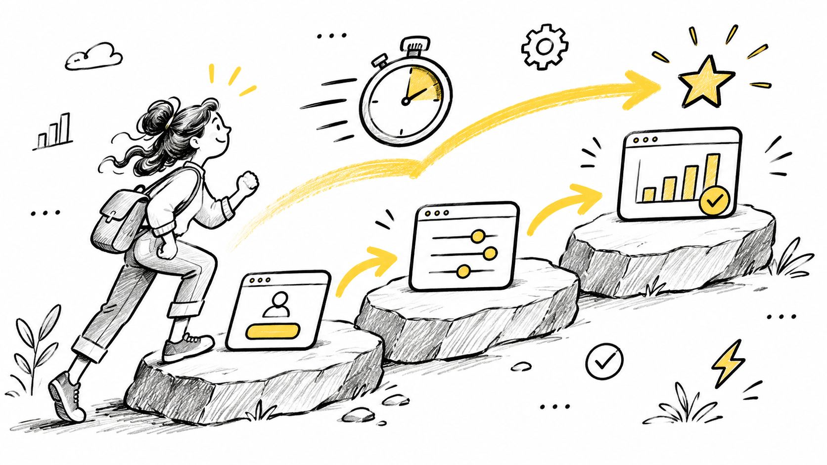
Consider a hypothetical reporting product where users must connect a data source before creating a report. The PM notices that returning users commonly complete that connection during their initial session. That's a useful lead, but it doesn't prove that moving the connection earlier will cause retention.
The decision is whether to prioritize guided import, a sample report, a template, or another starting path. NN/g's guidance on How Might We questions recommends grounding prompts in observed insights and avoiding vague challenges such as improving the entire user experience.
Define the result before choosing the route
Name the useful outcome.
Write a concrete statement, such as a user creates a report from their own data.
Keep account creation and tutorial completion separate from that outcome.Explore different mechanisms.
Consider guided import, prefilled templates, sample data, contextual help, and deferred setup.
Compare approaches that change the path, rather than cosmetic versions of the same screen.Test the uncertain behavior.
Use rapid prototyping with AI to compare whether users can reach and explain the result.
Check whether the faster path creates cleanup work later.
Failure boundary: Don't optimize speed by hiding required permissions or presenting sample output as real customer data. For another product, replace first value with a completed booking, resolved alert, or shared project, then specify what makes that result useful.
2. How might we validate onboarding drop-offs without waiting for a full research sprint?
Imagine a PM reviewing an invitation screen before planning. Analytics show that users leave there, while support messages suggest confusion about administrator and member roles. The team wants to change the labels, but the obstacle might be that users aren't ready to invite anyone.
The decision is what to investigate before committing to a redesign. A faster test should narrow uncertainty, not give a preferred idea a convenient approval.
An HMW prompt needs room for alternatives. The Design Thinker How Might We tool describes the balance as broad enough for unexpected answers but narrow enough to address a genuine user problem.
Practical rule: Choose the smallest test that could change your decision, not the smallest test you can finish.
Separate the explanations
For this hypothetical invitation flow, the PM writes competing explanations: unclear roles, missing authority to invite colleagues, or premature timing. A short usability session can expose label confusion. An abandonment survey may reveal timing or organizational constraints that a clickable prototype won't reproduce.
Use UX research methods according to the uncertainty you're investigating. Session recordings can show repeated attempts; they can't establish a person's intent without interpretation.
Worked decision: If participants understand the revised labels but still defer invitations, don't declare the problem solved. Test a skip-and-return path instead, then examine whether users eventually invite the right colleagues.
Failure boundary: Lightweight testing isn't enough for consequential permission changes or sensitive-data exposure. Rewrite the prompt for another product by naming the blocked moment and the assumption, such as helping trial administrators understand access choices before sharing customer records.
3. How might we surface edge cases before design handoff?
Start with the invitation that doesn't work: the link expired, the recipient already belongs to another workspace, or the sender lost permission after sending it. A complete happy path doesn't tell engineering what any of those users should see.
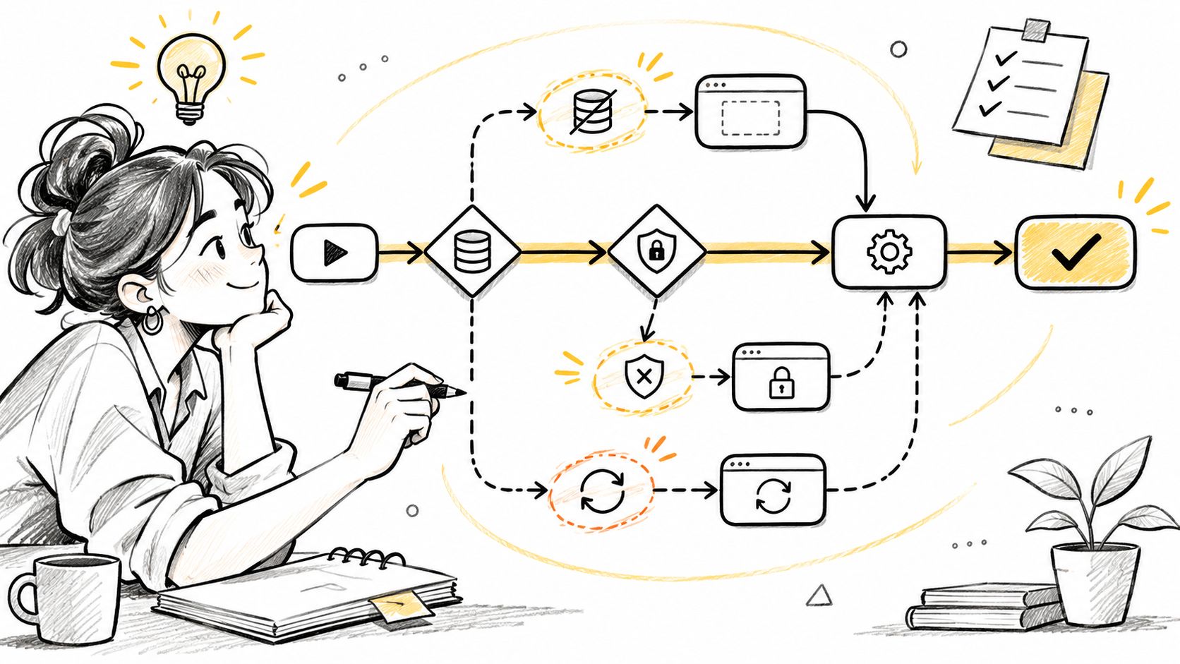
The decision is which recovery states belong in the release. You don't need to design every imaginable failure, but you do need an explicit response to failures that block important tasks or expose information.
The reframing techniques in Calvin University's ideation guide include removing the bad, questioning assumptions, and breaking a challenge into smaller pieces. Apply those techniques to the flow, not just its main screen.
Make the recovery path visible
Inspect each transition.
Ask what happens if the request fails, arrives late, or succeeds without confirmation.
Include changed permissions and interrupted sessions.Prioritize by consequence.
Separate recoverable inconvenience from lost work, unauthorized access, or blocked payment.
Don't dismiss severe cases just because they're uncommon.Carry the states into QA.
Attach starting conditions, expected responses, and recovery actions to the flow.
Give QA something testable beyond a screenshot of an error message.
In a hypothetical payment flow, the designer discovers that retrying after a timeout could submit another charge. The team decides to show payment status before offering another submission. That is a product-behavior decision, not merely an error-copy change.
Use flowchart examples to make branches and return paths explicit. Failure boundary: A growing edge-case list shouldn't become an unranked scope dump. Adapt the prompt by naming a critical journey, such as recovering an interrupted upload without losing completed work.
4. How might we reduce rework between design, engineering, and QA?
Treat rework as a missing agreement before treating it as a person's mistake. A designer may specify a disabled button while an engineer needs to know whether the underlying action is forbidden, unavailable, or still loading.
Those states can look similar and require different behavior. If the team approves appearance without agreeing on meaning, QA has to settle a design question after implementation.
The institutional history described in Dialectic's account of design thinking places HMW within a broader human-centered approach. Its useful role here is creating a common decision frame before separate disciplines commit to different interpretations.
Find the recurring information gap
Say a hypothetical team reviews revision requests and finds repeated disagreement about mobile layouts. The designer expected a stacked card layout; engineering reused the desktop table with horizontal scrolling. Neither choice was recorded as a requirement.
The team adds mobile behavior to design review and asks QA to draft acceptance criteria before sign-off. Its next decision is whether that agreement reduces revisions caused by layout ambiguity, rather than whether everyone likes the new template.
- Classify the cause. Separate missing states, unclear behavior, component mismatches, and changed requirements.
- Name the shared reference. Identify which component, token, interaction rule, or acceptance criterion governs the implementation.
- Keep necessary change visible. Distinguish corrections from new learning so a lower revision count doesn't reward silence.
Developer handoff best practices are useful when the handoff artifact needs clearer structure. They won't resolve an ownership dispute by themselves.
Failure boundary: Don't use reduced rework to discourage legitimate feedback. Rewrite the prompt around the repeated gap, such as helping engineering and QA interpret responsive behavior consistently before build.
5. How might we make design system tokens easy to follow in every screen?
A button uses the approved blue, yet its hover state comes from a copied screen. Another designer chooses a nearby gray because the token names don't explain which text color belongs on a muted surface.
Design tokens are named values for reusable visual decisions, including color, spacing, and typography. This prompt asks whether people can find and apply the right decision without reconstructing its history.
Make the supported choice easier to use than the improvised choice.
In a hypothetical Figma audit, a design lead finds local color styles that duplicate existing semantic tokens. Some are accidental copies; others support a status that the system doesn't yet cover. Deleting them all would make the library cleaner while leaving the product less expressive.
Fix discovery before enforcing compliance
The decision is whether drift comes from poor naming, missing coverage, outdated components, or unclear ownership. Each cause needs a different response.
Audit usage in context.
Inspect the screen state and component before replacing a local value.
Preserve meaningful distinctions such as warning, failure, and unavailable actions.Name tokens by purpose.
Prefer names that explain a role, such as text-muted or action-primary.
Document which backgrounds and interaction states they support.Test the library as a workflow.
Ask a designer to build a realistic state using existing components.
Note where they search, guess, or create an override.
Worked decision: If designers can find the token but the component doesn't expose it correctly, update the component rather than writing another naming guide. Check whether the revised component works across loading, error, and disabled states.
Failure boundary: Token compliance doesn't prove usability or accessibility. For another product, narrow the prompt to the source of drift, such as helping mobile designers select supported spacing values without local overrides.
6. How might we turn analytics drop-offs into testable design hypotheses?
A funnel shows where users stop, not why they stop. Pricing-page exits might reflect unclear plan differences, a budget mismatch, missing procurement information, or visitors who never intended to buy.
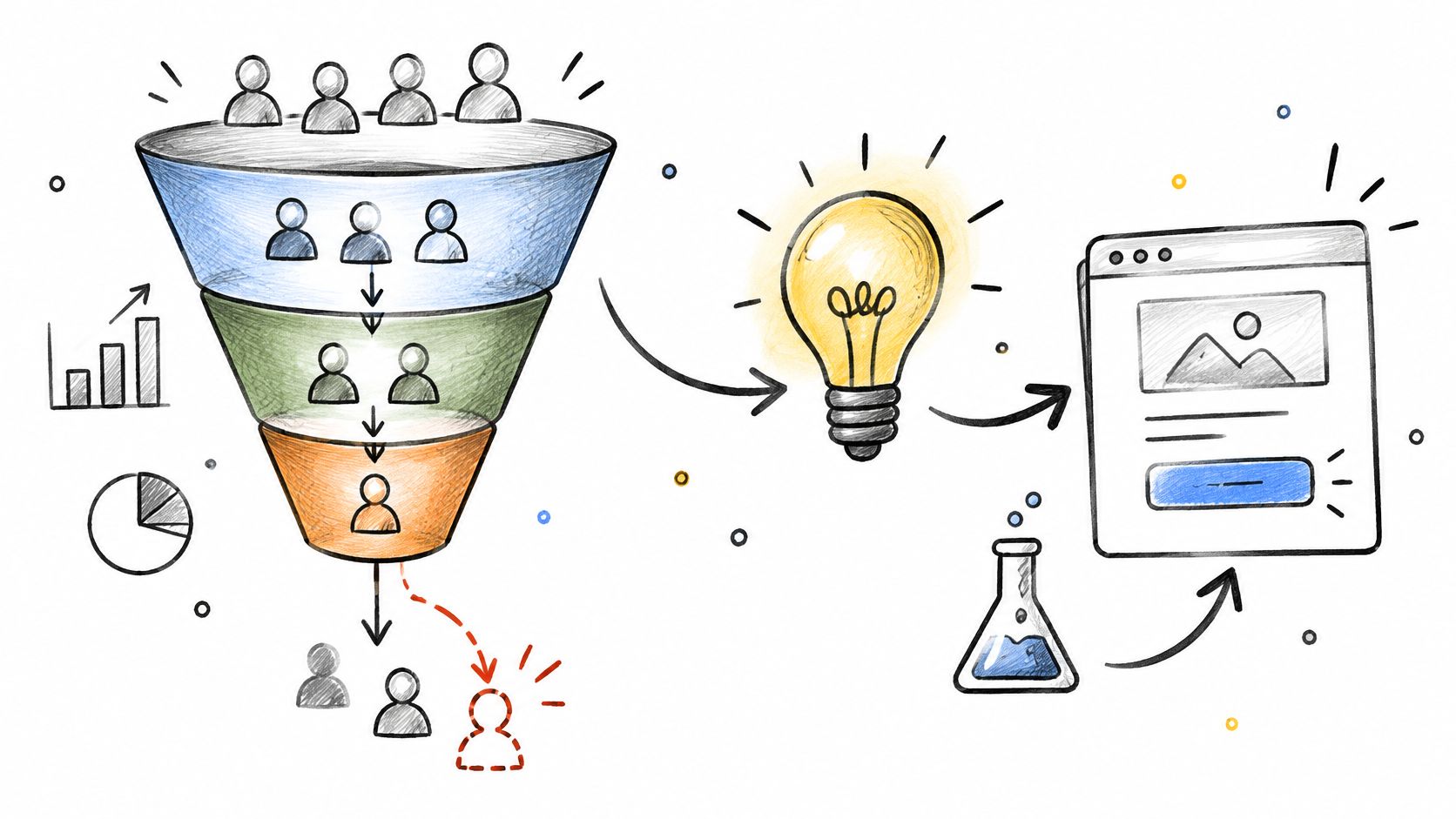
Take a hypothetical pricing flow. Write the hypothesis plainly: users postpone choosing because they can't tell which plan includes their required permission controls. The decision is whether clearer comparison content helps qualified buyers choose confidently.
A documented UX portfolio case study reports dashboard-feature adoption rising from 11% to 47% within 90 days after a redesign. That is one portfolio's reported result, not an independently audited benchmark. Read it as a directional example of tying a redesign to measurement, never as an expected outcome for your own funnel.
Connect the explanation to an observable behavior
Write the causal claim.
State what you believe causes the drop-off and which observation supports that belief.
Keep competing explanations open.Choose the measurement before launch.
Define the event that represents progress and the user group it applies to.
Add a guardrail, such as refunds, support demand, or accidental purchases.Decide what happens after the test.
Specify what evidence would justify shipping, revising, or rejecting the idea.
Use A/B testing best practices when traffic and experimental conditions support a comparison.
Failure boundary: Higher checkout completion isn't a win if customers choose unsuitable plans and immediately seek refunds. A drop-off with several plausible causes needs a test that isolates one of them. Adapt the prompt by naming the specific decision users struggle with, rather than only asking how to raise conversion.
7. How might we make accessibility checks part of every design review?
Make accessibility review part of the design decision, with a named owner and an observable result. A vague request to remember accessibility leaves the team unsure whether anyone checked keyboard navigation, field labels, or error recovery.

A hypothetical team reviews a billing-address form. An automated check flags missing labels, while keyboard testing reveals that focus disappears when an error summary opens. Correcting the labels alone would leave a user unable to continue reliably.
Guidance from BYU's Design Review on crafting HMW statements emphasizes useful scope and user-centered framing. Make that concrete by naming the access condition, such as helping a keyboard-only user recover from validation errors without losing entered data.
Review the task, not only the screen
Use WCAG, the Web Content Accessibility Guidelines, as the reference standard for your review. Translate relevant requirements into checks that fit the actual interaction.
- Visual presentation. Check contrast, text resizing, and whether meaning depends on color alone.
- Controls and labels. Check accessible names, instructions, target usability, and meaningful error messages.
- Navigation and recovery. Check keyboard order, visible focus, announcements, and where users resume after failure.
Worked decision: The team changes the error behavior so focus reaches the summary and users can move directly to the affected field. It then tests the implemented interaction, because a design file can't confirm browser and assistive-technology behavior.
Failure boundary: Automated checks are useful evidence, not a complete accessibility verdict. Don't mark a flow accessible because a scan passes.
Rewrite the prompt for the task and environment: completing approval on a small screen, understanding translated errors, or recovering work on a weak connection.
8. How might we preserve design decisions so teams stop revisiting settled questions?
A new PM proposes splitting checkout into separate screens. Someone remembers that the team considered this before, but the reasoning sits in an old chat thread that nobody can find.
The decision is what context must survive the people and meetings that produced it. Saving the final mockup preserves the answer. It doesn't preserve the alternatives, constraints, or evidence that made the answer reasonable.
Decision record: Keep enough reasoning to challenge the choice intelligently, not enough meeting detail to recreate the conversation.
In a hypothetical checkout project, the team records its choice of a single-step layout, the alternatives considered, and the unresolved trade-off with fraud review. A later PM can distinguish an outdated constraint from a still-valid requirement before proposing another redesign.
Record the conditions for reconsideration
Capture the choice and rationale.
State the user problem, selected approach, and rejected alternatives.
Link the evidence rather than copying a long transcript.Attach the record to the work.
Connect it to affected flows, components, experiments, and acceptance criteria.
Give the decision a named owner.Define a reopening trigger.
Note which user behavior, policy change, or technical constraint would justify another review.
Mark superseded decisions so they don't become accidental rules.
The HMW wording itself supports this discipline. Edgepedia's explanation of the technique describes how possibility, experimentation, and collaboration shape the question. Preserve the original question alongside the decision so future teammates understand what the team was trying to improve.
Failure boundary: A decision log mustn't become a veto against new evidence. Adapt the prompt around a recurring dispute, such as helping new team members understand permission-model choices without reopening settled access rules.
How each HMW prompt fits a product-design scenario
| Item | Best Used When | Key Benefit | Main Limitation |
|---|---|---|---|
| How might we reduce time to first value for new users? | New-user activation is slow or onboarding drop-offs are high | Focuses solutions on reaching a measurable user outcome | Needs a clear definition of first value |
| How might we validate onboarding drop-offs without waiting for a full research sprint? | A team needs timely evidence about an onboarding problem | Enables faster, lightweight tests to inform decisions | Small tests may not reflect real users |
| How might we surface edge cases before design handoff? | Complex flows risk missing failure or alternate states | Reduces late rework and helps QA plan | Edge cases can expand scope without prioritization |
| How might we reduce rework between design, engineering, and QA? | Handoff gaps are causing repeated revisions | Reveals process issues and improves cross-team alignment | Requires tracking rework and consistent process changes |
| How might we make design system tokens easy to follow in every screen? | Multiple contributors are creating inconsistent styles | Improves consistency and speeds design reviews | Requires ongoing system maintenance and adoption |
| How might we turn analytics drop-offs into testable design hypotheses? | Funnel data shows exits but the cause is unclear | Connects design choices to measurable tests | Depends on reliable analytics and clear interpretation |
| How might we make accessibility checks part of every design review? | Accessibility issues are being found late in the process | Catches common issues earlier and builds shared standards | Automated checks and short reviews cannot cover everything |
| How might we preserve design decisions so teams stop revisiting settled questions? | Teams repeatedly debate past decisions or lose context | Preserves rationale and reduces repeated discussions | Records need regular maintenance to stay accurate |
Turn One Question Into Your Next Sprint Prompt
Pick a stalled metric or recurring revision in your current backlog. Write it as a How Might We question, define success in a sentence, and list five possible answers before choosing something to prototype this week.
Keep the prompt close to an observed moment. Helping trial administrators reach a meaningful dashboard without unnecessary setup gives a team more direction than improving onboarding. It also leaves room for different approaches: importing settings, changing defaults, deferring configuration, or explaining what users need before they start.
Turn the prompt into a decision
Bring the evidence.
Attach the relevant funnel view, support theme, research observation, or screen recording.
State what you know and what remains an assumption.Name the behavior and guardrail.
Describe what users should accomplish and what mustn't get worse.
Include comprehension, access, support burden, or data safety where relevant.Choose a test with a consequence.
Build the smallest realistic prototype that can separate competing explanations.
Agree who will decide whether to ship, revise, or investigate further.
For high-impact products, the outcome may sit beyond the interface. In the UCSF and IDEO PRIME digital-health project, evaluation included conventional measures such as Patient Health Questionnaire scores and app engagement alongside measures intended to assess quality of life. That approach illustrates why activity alone isn't always the outcome worth optimizing.
The same distinction matters in SaaS. More invitations don't necessarily mean better collaboration, and longer sessions don't necessarily mean greater value. Decide what improved behavior means before making the interface more persuasive.
Keep the question useful as the team grows
As teams expand, people bring different incentives to the same review. Product may prioritize activation, engineering may prioritize predictable behavior, and support may prioritize fewer confusing states. A shared prompt helps only when those trade-offs remain visible in the decision.
This is what I mean by a useful prompt: it gives alternatives a common purpose without pretending they have equal costs. If the team already knows the required fix, such as restoring a broken control, skip the brainstorming and repair it.
In short, judge the question by the decisions it improves. Open your current backlog, choose a problem with inspectable evidence, and create a prompt, success statement, guardrail, and prototype brief that your team can review together.
Figr uses written requirements, visual product context, and research notes to generate user flows, edge cases, and prototypes that reflect your product. Visit Figr with a stalled flow and your How Might We prompt to explore design directions grounded in the same context.