
The hardest part of product work usually isn't deciding what to build, it's preserving intent as a written requirement turns into an actual interface. A Product Manager writes the PRD, the designer interprets it, engineering adds constraints, and somewhere in that relay race the original logic starts to bend.
When that gap stays open, review meetings turn into translation sessions. A prototype looks polished but misses a core branch, acceptance criteria don't match the states on screen, and standups fill with questions that should have been resolved before implementation. The result is rework, ambiguity, and a weak handoff at the exact moment the team needs clarity.
Figr for Product Managers helps by connecting the artifacts that usually drift apart. Instead of treating the PRD, live product, design system, and prototype as separate worlds, it uses product context to carry intent from requirement to flow to Figma-ready output, with UX reasoning and edge-case mapping in the middle.
Why the PRD Never Quite Matches the Prototype
The PRD and the prototype drift because they're usually created in different languages.
Last week I watched a Product Manager walk into a review with what looked like a solid feature package: a clear problem statement, tight user stories, acceptance criteria, and stakeholder signoff. Ten minutes later, the room was stuck on a prototype that solved a slightly different problem. The screen looked right. The logic did not.
That moment is common because written requirements and visual design ask for different kinds of precision. A PRD can say “users should be able to retry payment without losing progress.” A prototype has to answer much messier questions. Where does the retry entry point live? What if the card fails twice? What state does the order summary retain? What shows up in mobile? Who owns the fallback message?
This is what I mean by the translation gap. The loss doesn't happen because someone is careless. It happens because every handoff compresses meaning.
The hidden cost is decision drift
The Nielsen Norman Group's view of the Product Manager role is useful here: Product Managers are expected to bridge business, design, and engineering, translating data and technical constraints into decisions. That bridge weakens when artifacts like PRDs and prototypes are misaligned, because misalignment changes decision rights, increases ambiguity, and damages the PM-engineering handshake, as NN/g notes in its discussion of the product manager archetype.
Once that handshake breaks, teams stop arguing about the product and start arguing about the artifact. Was the PRD too vague? Did design over-interpret? Did engineering assume behavior that nobody approved? Those are expensive conversations because they happen late.
Practical rule: If your review meeting is still debating what the user is trying to do, the PRD never really became a flow.
A lot of Product Managers respond by writing longer PRDs. That rarely fixes it. More text often creates more room for interpretation unless the team can convert requirements into visible logic early. If you're still tightening your process for writing a product requirements document, the useful question isn't “did we document enough?” It's “did we preserve intent across formats?”
The problem is systemic, not personal
The chronic pain here is structural. Product work lives in standups, review calls, Figma comments, Slack clarifications, and engineering trade-off discussions. A user story sounds precise in Notion, then turns fuzzy when the team tries to decide empty states, failure branches, and component behavior.
That's why Product Managers need a system that bridges text and visuals, instead of relying on memory and interpretation alone. The fix isn't more ceremony. The fix is shared context that travels with the work.
User Stories vs User Flows What's the Real Difference
A user story captures intent, while a user flow captures sequence.
Product Managers often use the two terms loosely, then wonder why discussions keep going in circles. A stakeholder asks for a “flow,” gets a sentence. A designer asks for the “story,” gets boxes and arrows. The confusion isn't academic. It changes what gets reviewed, what gets missed, and when disagreement shows up.
Here's the clean mental model: a user story names the user, the goal, and the value. A user flow shows the path a user takes through the product to reach that goal. One frames purpose. The other exposes interaction logic.
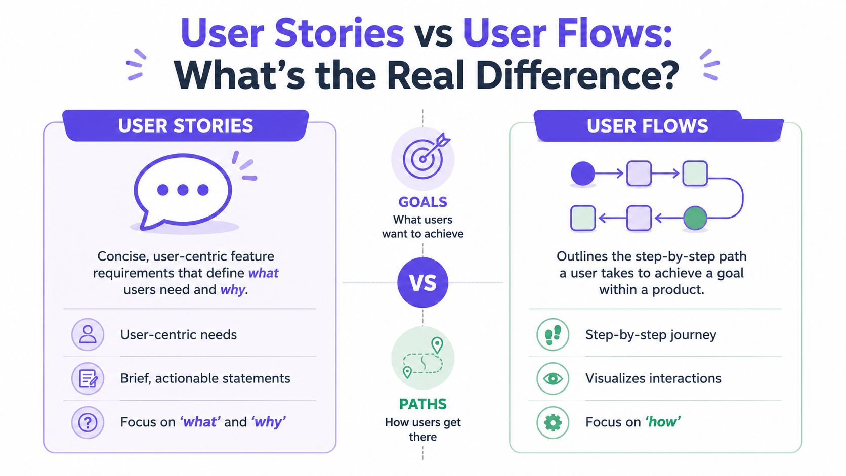
User Story vs. User Flow at a Glance
Purpose. A user story states the user need and outcome. A user flow maps how the user moves through the product.
Scope. A user story is narrow, often tied to one capability. A user flow is broader, covering steps, branches, and screens.
Level of detail. A user story is concise and requirement-oriented. A user flow is operational and interaction-oriented.
Main question answered. A user story answers what the user needs and why. A user flow answers how the experience actually works.
Typical stakeholders. A user story involves the product manager, engineering, and stakeholders. A user flow involves the product manager, designer, and engineering.
Common output. A user story produces a story, acceptance criteria, and a PRD section. A user flow produces a diagram, screen sequence, and prototype direction.
Stories are promises, flows are tests
A good user story is still useful because it keeps the team anchored to user value. It prevents the work from becoming a screen-design exercise detached from the actual problem. If you lose the story, you often get polished UI for a weak product decision.
A good user flow does something different. It pressures the story. It asks whether the stated requirement can survive contact with real interaction. That's where ambiguity surfaces. A team may agree on “edit billing details,” then discover five unresolved branches once they draw the path.
The basic gist is this: a story tells you what deserves to exist. A flow tells you whether the experience can hold together.
Product Managers need both, in sequence
Most delivery problems show up when teams over-index on one artifact. Story-only teams sound aligned until design review. Flow-only teams can build elegant mechanics for features that weren't strategically sharp in the first place.
That's why I like pairing the two. Start with the smallest statement of user value, then move quickly into the path, choices, and states needed to make that value real. Teams that do this well usually treat stories as entry points, not endpoints.
If you want a stronger bridge between planning and execution, Figr's user story mapping insights are useful because they push the conversation beyond backlog phrasing and into journey logic.
A story without a flow is usually optimistic. A flow without a story is usually mechanical.
When Should You Start with a Story versus a Flow
Start with a story when the problem is still forming, and start with a flow when the interaction risk is already obvious.
Product Managers don't need a rigid rule here. They need a decision lens. The right starting point depends on what kind of uncertainty the team is facing. Are you trying to sharpen the user outcome, or are you trying to untangle the path through the product?
Start with a story when the team needs alignment on value
Use a story first when the room is still negotiating the “why.” That usually happens in early discovery, roadmap discussions, or stakeholder reviews where people are proposing solutions before the user problem is stable.
A story-first approach works well when:
The user need is still fuzzy, and multiple solutions are possible
Stakeholders are jumping to features, before the team agrees on the problem
The scope needs trimming, because the request is broad or politically loaded
You need a discussion artifact, not a screen artifact
In those situations, starting with a flow can create false certainty. Once boxes appear on a board, people assume the team has already committed to a solution.
Start with a flow when the product risk lives in interaction
Use a flow first when the user's path is the main source of risk. Account recovery, approval loops, checkout, plan changes, and permissions work all fall into this bucket. The challenge there isn't understanding that the user wants something. The challenge is making the path coherent under real conditions.
A flow-first approach makes sense when:
Multiple branches already exist, such as success, failure, retry, and cancellation
Engineering constraints affect UX directly
The handoff is likely to break on state logic
A review meeting needs visible behavior, not abstract intent
That distinction matters more now because AI can generate both artifacts quickly. Speed helps, but it also creates a new failure mode: teams can accept output too early because it looks finished. Industry discussion around AI in product management has emphasized that Product Managers still need customer centricity and evidence-based decision-making, and that AI outputs should be treated as testable drafts rather than final deliverables, as discussed in this conversation on AI and product judgment.
The deeper incentive most teams ignore
Teams don't always choose the first artifact for product reasons. They often choose it for social reasons.
Stories are easier to circulate upward because executives can read them quickly. Flows are easier to validate sideways because designers and engineers can inspect them. So the first artifact often reflects who needs confidence first.
That's the zoom-out moment. The artifact isn't just a work tool. It's also a coordination tool. If you know where alignment is likely to fail, you can choose the format that exposes the right tension early.
A practical rule helps: start with the artifact that reveals the biggest unknown fastest. Then use AI to accelerate draft creation, while keeping judgment with the people accountable for the decision.
How to Turn a User Story into a User Flow with AI
Turning a user story into a user flow with AI works when the system has enough product context to reason about behavior, not just rephrase the requirement.
The manual version is familiar. A Product Manager writes the story, pulls a few existing screens, adds a whiteboard sketch, pings a designer for interpretation, then spends a day answering follow-up questions that were hidden inside one sentence. The output may look coherent, but the path from requirement to flow is still lossy.
Where the manual process usually breaks
The translation tends to fail in four places:
Intent compression: the user need gets reduced to a feature request
State omission: happy-path logic appears, but empty, loading, and failure branches stay implicit
Context loss: existing patterns from the live product never make it into the draft
Review lag: feedback arrives after the team has already invested in one interpretation
That's why generic prompts often disappoint Product Managers. They can generate plausible language, sometimes plausible screens, but they usually don't know your component rules, prior decisions, or current product structure.
What AI should actually do here
A useful AI workflow should take the story and expand it into design logic. That means surfacing assumptions, mapping steps, exposing branches, and connecting the output to the product as it exists today.
For Product Managers evaluating AI tools to create wireframes, that's the dividing line I'd use. Don't ask whether the tool can draw a screen. Ask whether it can preserve product intent while moving from requirement to interaction.
The right output isn't a prettier draft. It's a draft that makes the unresolved decisions visible.
That's where Figr for Product Managers becomes practical. It can ingest written product context, existing screens, design system material, and behavior signals, then generate flows and prototypes that reflect the current product instead of a generic pattern library. The value isn't that AI replaces the translation step. The value is that the translation becomes inspectable, faster, and less dependent on memory.
A PRD-to-Prototype Example Inside Figr
A Product Manager can move from PRD to prototype faster when the workflow keeps context attached to every design decision.
A simple example makes this concrete. Say your PRD describes a feature for a SaaS billing dashboard: users need to update a failed payment method without losing invoice context, and finance wants fewer support escalations caused by unclear retry steps. On paper, that sounds straightforward. In practice, it creates questions around access, failure states, saved cards, expired sessions, and what the user sees after success.
The workflow Product Managers can actually use
Step 1. Create the Context Pod.
Load the working memory for the feature before asking for screens.
PRD
customer notes or research
existing billing screens
design system references
relevant analytics observations
Step 2. Ingest the written requirement.
Drop in the PRD section or feature brief and ask a product question in plain language.
For example: “How should account admins recover from failed card billing without losing invoice context?”
Step 3. Add product context from the product interface. Use live product capture or existing Figma files so the AI sees current layout, navigation patterns, component density, and interaction hierarchy. This reduces the usual drift between requirement and visual output.
Step 4. Review the UX reasoning before reviewing the screens.
This step fills in the intermediate details.
The system should describe likely user intent, flow logic, constraints, and trade-offs before presenting interface direction.
Step 5. Inspect edge cases and state coverage.
Check what happens in the branches your PRD didn't fully spell out.
expired card
partial payment success
user lacks billing permission
duplicate retry attempt
empty invoice history
session timeout mid-update
Step 6. Generate the high-fidelity prototype.
Move from flow direction to a Figma-ready prototype that stays editable and aligned to components, variants, and tokens already used in the product.
Step 7. Sync into Figma for team review.
Use the output as a collaboration artifact, not a final decree.
Designers, engineers, and QA should still pressure-test the behavior.
What changes in the review meeting
The biggest difference isn't cosmetic. It's that the team can review logic and visuals together. Instead of asking a designer to infer missing states from a PRD and asking engineering to reverse-engineer intent from a prototype, the Product Manager brings a more complete first draft into the room.
If you're preparing a release around that flow, it also helps to pair design review with a launch-readiness checklist. I've found Saaspa.ge's product launch checklist useful as a companion artifact because it forces the team to think beyond the screen and into rollout dependencies.
A walkthrough helps more than screenshots alone, especially when you want to show how reasoning becomes interface behavior.
What good Product Managers still do manually
Even with a strong draft, a Product Manager still owns judgment. You still need to ask whether the flow solves the right problem, whether the copy creates false reassurance, whether the permissions model is real, and whether the support burden just moved somewhere less visible.
That's the trade-off that matters. AI can compress artifact creation. It can't own product accountability.
How Figr Uncovers Edge Cases Your PRD Missed
Most PRDs describe the happy path more clearly than the product users will experience it.
That isn't a writing flaw. It's a limitation of the format. A requirement document can capture goals, constraints, and acceptance criteria, but edge cases often stay compressed into short phrases like “handle errors gracefully” or “show appropriate empty state.” Those lines look complete until design review or QA exposes how much they were hiding.
UX reasoning expands what the PRD only implies
Edge cases usually live in the space between requirement and interface. That's why they surface late. A user changes plans mid-flow. A permission boundary blocks an action. A saved configuration no longer matches current system behavior. The PRD may mention the main task, but it rarely explores every deviation with enough visual and interaction detail.
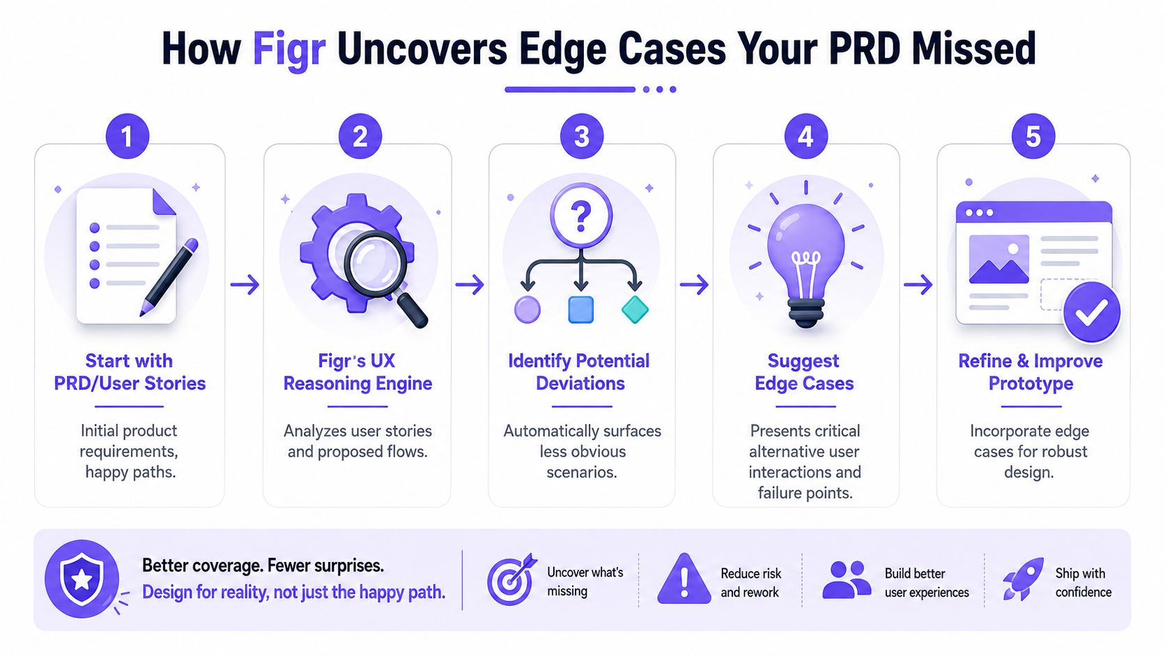
What helps is a reasoning layer that asks second-order questions:
State gaps: What happens before data exists, while it loads, or when it fails?
User deviations: What if the user backs out, retries, switches context, or returns later?
Business rules: Which roles, limits, approvals, or exceptions change the path?
System behavior: Which technical constraints shape what the interface can promise?
Why this matters before handoff
I've seen teams lose more time on missed branches than on the primary flow itself. Not because the branch was rare, but because the branch forced a late cross-functional reset. Engineering had to add logic. Design had to retrofit states. QA had to widen coverage. Support had to prepare for behavior the product had never clearly expressed.
The fix is earlier visibility. If the team can map likely edge cases while the feature still exists as a draft, fewer surprises show up after commitment. That's one reason the Product Manager should treat AI-generated drafts as a prompt for interrogation, not approval.
A practical companion read here is preventing post-launch product costs. The useful idea isn't fear. It's sequence. Catch design debt while the artifact is still cheap to change.
Missed edge cases rarely look dramatic in planning. They become dramatic when three teams discover them at different times.
The output should be reviewable, not magical
The value isn't “the system found everything.” No serious Product Manager should believe that. The value is that edge-case mapping becomes visible enough for the team to challenge, extend, and prioritize. That makes better reviews possible, and it makes design quality less dependent on whoever happens to remember the last failure mode.
What Makes Figr's UX Reasoning Different
The quality of AI design output depends on how much real product context sits behind the draft.
That's the missing distinction in most conversations about AI for Product Managers. People compare outputs at the screen level, then ignore what generated them. A polished screen can still be context-blind. A useful prototype needs product memory.
The Visual Context Graph is the part that changes the output
The key concept inside Figr for Product Managers is the Visual Context Graph. It connects five layers of product context so the system can reason from the actual product instead of improvising from generic patterns.
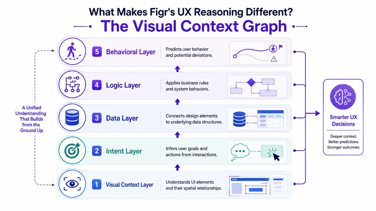
Here are the five layers that matter:
Visual context
Existing screens, frames, layouts, and spatial relationships.
This helps the system see how the product already communicates structure and priority.Behavioral context
Recordings, flows, and interaction patterns.
This adds motion and intent, not just static UI.Design System context
Tokens, components, variants, and usage rules.
This keeps drafts closer to the product's own language.Product Knowledge context
PRDs, research, prior decisions, and rationale.
These elements ensure strategic intent stays attached to the work.Implementation context
Code constraints and technical realities.
This reduces the gap between attractive ideas and buildable ones.
Why that matters to Product Managers
A Product Manager doesn't need AI that draws faster. A Product Manager needs AI that can hold the same conversation the team is already having. Why this path? Which state is missing? Which existing pattern should govern the choice? What constraint blocks the ideal interaction?
That's where the difference shows up. The system is better positioned to generate artifacts that participate in real product discussions, because it has seen more than the prompt.
Product context is the difference between a convincing mockup and a usable draft.
There's also an organizational angle. The PM role often works as a bridge across design and engineering, and that bridge breaks when artifacts distort intent or blur decision rights, which is part of the challenge described in NN/g's product manager archetype. A context graph doesn't solve collaboration by itself, but it gives the team a more faithful shared object to collaborate around.
What Is the ROI of Context-Aware Design
The ROI of context-aware design shows up in fewer avoidable loops between Product, design, and engineering.
Most Product Managers don't need another abstract argument for better UX process. They need to know whether a different workflow changes delivery economics. It does, when it cuts rework, exposes hidden states earlier, and helps the team ship with less ambiguity. Those gains may sound operational, but they connect directly to how the business performs.
Product economics start with a small metric stack
Product Managers are usually better served by a small KPI stack than a dashboard full of vanity numbers. Practical guidance on Product Manager metrics points to a focused set of measures such as retention, conversion, DAU or MAU, quality or satisfaction indicators, and regular monthly or quarterly tracking for accountability, as described in Wrike's overview of product management KPIs.
The reason that matters here is simple. Delivery quality eventually shows up in product outcomes. If the team ships confusing flows, users churn earlier, conversion suffers, or support-heavy experiences drag down satisfaction. If the team ships clearer interactions with less rework, the effect is more durable than “we made prototyping faster.”
Better context changes the cost structure of product work
Aakash Gupta's framework for Product Manager metrics is useful because it connects user behavior to growth economics through retention, churn, cohort analysis, and LTV to CAC, with a healthy product often expected to maintain an LTV of at least 3x CAC in that framework, as explained in metrics for product managers. That same perspective is the right one for context-aware design.
When product teams reduce rework and shorten the path from requirement to shippable experience, they improve the unit economics of development. Less redesign after engineering starts. Fewer interpretation gaps in handoff. Faster iteration on ideas that deserve to move. Better chances that what ships matches what the business intended to test.
What to measure after adopting a new workflow
If you want proof inside your own org, track operational signals before and after the workflow change:
Review quality: Are fewer meetings spent reconciling requirement and prototype?
Rework burden: Are engineers sending back fewer clarification loops?
State coverage: Are more edge cases identified before build?
Decision speed: Does the team reach alignment earlier on complex flows?
If you need a stronger framework for quantifying AI benefits for product teams, start there. Measure decision quality and handoff quality, not just artifact speed.
If your team keeps losing intent between PRD, flow, and prototype, the next useful step isn't another template. It's trying a workflow that keeps product context attached from the start. Try Figr.
The gap between requirement and design usually isn't a talent problem. It's a context problem. Product Managers write what the product should do, designers interpret how it should work, and engineering absorbs the cost when those two artifacts drift. That's why the bottleneck lies in the middle.
A better workflow closes that middle on purpose. Start with the right artifact for the uncertainty in front of you. Build from a shared context base. Review reasoning before you review polish. Pressure-test edge cases before implementation turns them into expensive surprises.
What I'd do next is simple. Take one messy feature, preferably one with permissions, retries, or branching states, and run it through a PRD-to-prototype workflow with visible reasoning. Then compare the review quality, not just the output quality. That's where the difference becomes obvious.
If you want to test that process in a real product environment, try Figr.
FAQ
Can I use Figr for Product Managers if I'm not a designer
Yes. I'd use it as a Product Manager to turn requirements into flows and prototype drafts faster, then bring designers in to refine and challenge the output.
Will AI-generated prototypes replace designer judgment
No. I'd treat the output as a strong draft with visible reasoning, not a final answer. Product judgment and designer judgment still matter.
What should I upload first into the Context Pod
I'd start with the PRD, a few current screens, design system references, and any relevant research or analytics notes. Better context usually leads to better drafts.
When should I review UX reasoning instead of jumping to screens
I'd review reasoning first whenever the feature has tricky branches, permissions, or error handling. That's where hidden ambiguity tends to live.
How do I know whether this workflow is actually helping
I'd watch for fewer clarification loops, cleaner stakeholder reviews, and less rework after engineering starts. Those signals matter more than whether the first draft looks impressive.